7 major dining room layout mistakes to avoid, according to designers
Designers share where we are forever tripping up. Plus, how to remedy your space
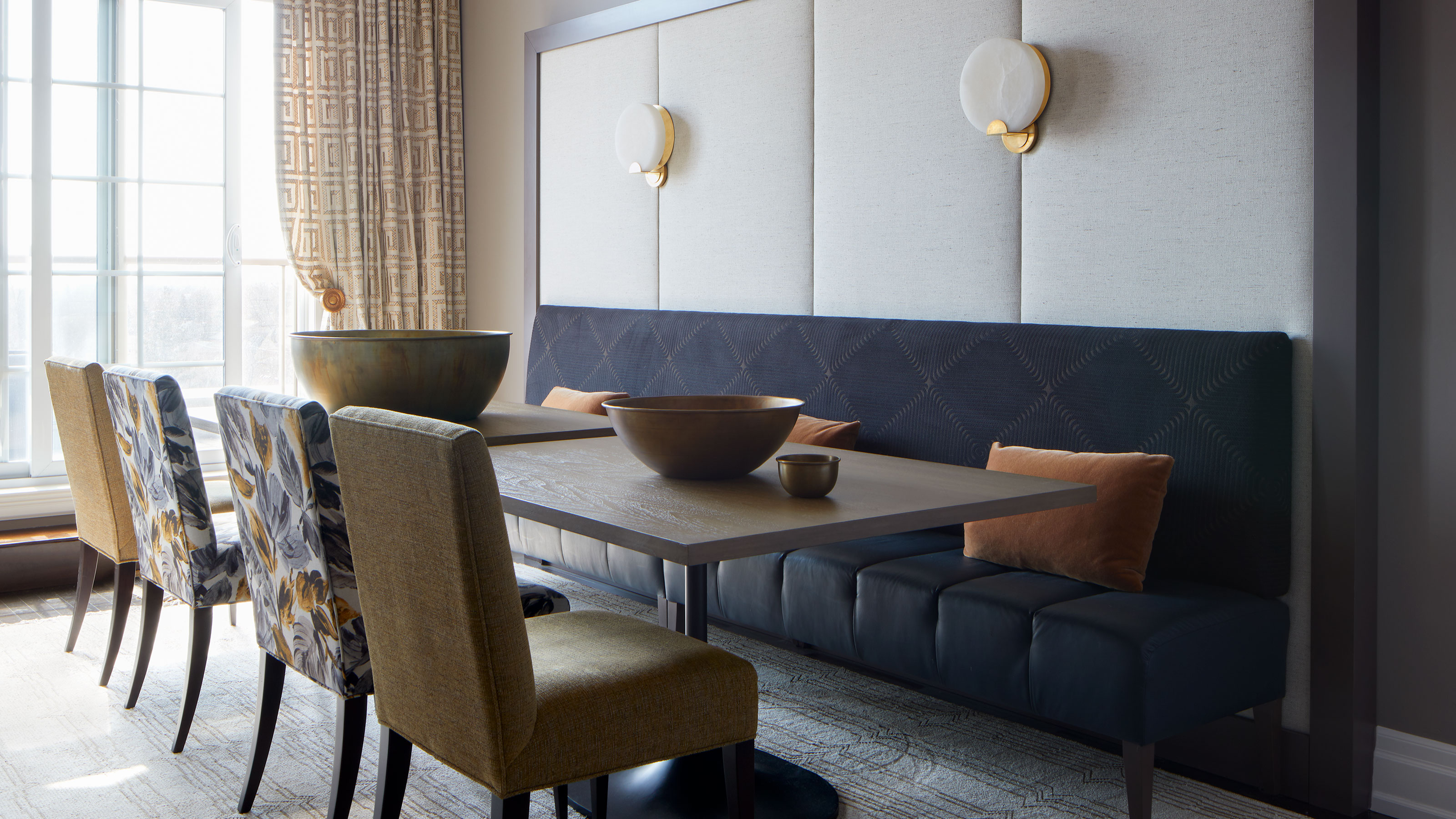

The dining room must tick many boxes in a home. It must look immaculate, feel cozy, and be inviting. It must also be somewhat of a chameleon, and ready to change with the seasons, bringing vibrancy and comfort throughout the year.
It is clear that our design efforts are well placed in this space, but if your dining room ideas are not delivering as much joy as you'd hoped, there is a chance that some common dining room layout mistakes are present.
Major dining room layout mistakes to avoid
Much of where you might be going wrong will depend on the size and structure of your space. What may work swimmingly in an open-plan kitchen that is also home to the dining table, for example, may not have the same wondrous effect in a very spacious dining room.
Kati Curtis, principal of interior design Firm Kati Curtis Design, tells us: 'Common dining room mistakes typically revolve around the choice of furniture, layout, and lighting.'
In order to enhance a dining room's qualities, it is important to be aware of its existing configuration. It is all in how you use it, after all. As with many traits of the interior design world, this is often easier said than done. According to designers, this is where we tend to trip up with our dining room layouts:
Kati energizes spaces with a fearless commitment to pattern and texture, color and motif. That commitment is invigorated by friends, mentors, and clients who share her design passions and passion for design. It’s reinvigorated by Kati’s chronic and incurable travel-bug, which has taken her around the world. Kati's work has been featured in Architectural Digest, The Wall Street Journal, The New York Times, and Interior Design Magazine, among many others.
1. We purchase the wrong sized furniture
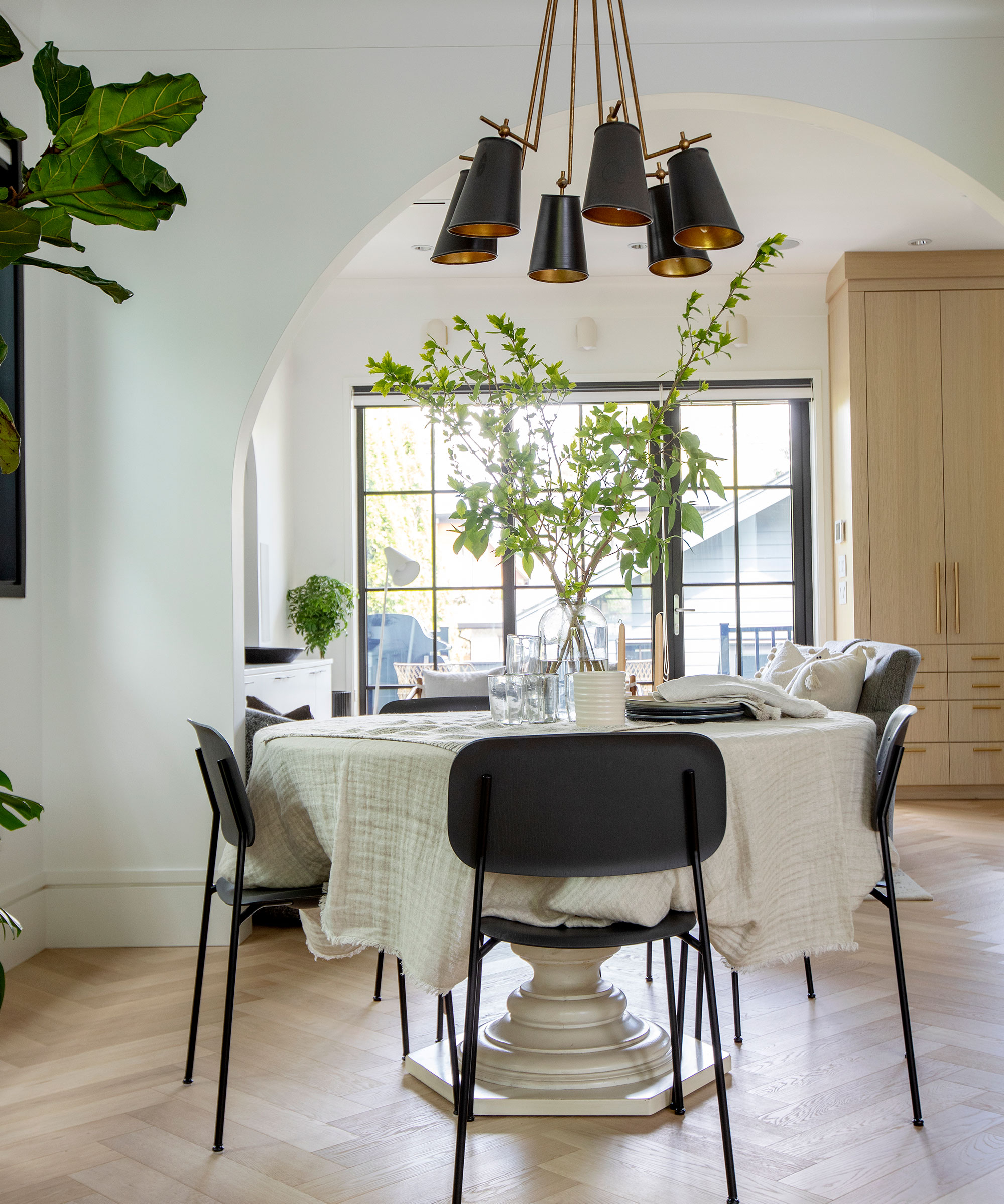
Whether dining room furniture should match or not is mostly a design choice, but something that should be closely considered is the size of said furniture. You want to ensure a balanced finish that is intimate, without feeling overly busy or – heaven forbid – cluttered.
'Oversized furniture can make the room feel crowded, while undersized pieces may render the area sparse and unwelcoming,' shares Curtis.
Work with the best proportions for your space and note what enhances the space positively, and what might not be adding as inviting and styled a finish. The wrong-sized table is an especially impactful small dining room design mistake you should avoid.
Ami McKay, creator of PURE Design: Interior Design, Build & Shoppe, emphasizes the need to get furniture on point, not just for aesthetic purposes, but also for practicality: 'Often the furniture in a dining room is too small, so consider bigger, and chairs need to be comfortable because we tend to linger and lounge in the dining room,' says McKay.
Ami McKay founded PURE Design in 2000 on the belief that design is found in the art of giving. The work that she puts into each project reflects her personal life experiences and she believes they are at the heart of her business. Today, she is proud to be named one of Canada’s Top Five Interior Designers.
2. We don't leave ample space around the dining room table
Although we typically spend a lot of time sitting down at a dining table, elbows in unwanted places are never welcome, especially when you are merely (and kindly) topping up a neighboring champagne flute.
'The layout should encourage easy movement, with ample space around the table for guests to sit or stand comfortably,' shares Curtis. A little more room to work the room will help create a convivial atmosphere, a key want for this space every day and particularly throughout the holidays.
McKay also notes that not leaving enough room around the table is a dining room layout faux pas. 'Make sure you can move around the table easily or consider a banquette in the window.'
Finding unconventional alternatives to a classic center-aligned table may work in your favor. 'The table can be off-center with a banquette, it makes more use of the entire space and allows for multifunctional use.' So don't be afraid to branch out and see what works best for your unique dining room layout.
3. We fix inappropriate lighting
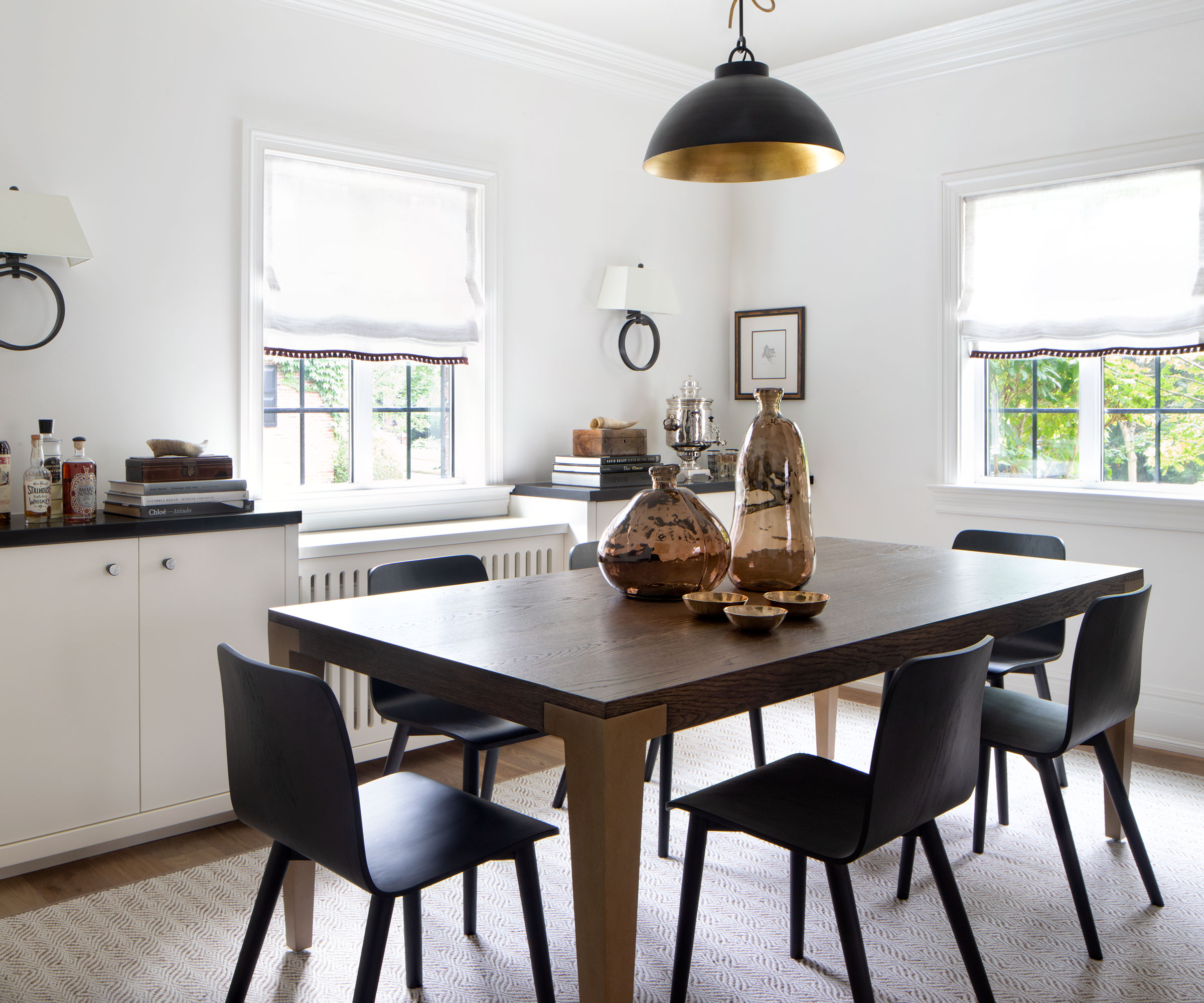
The big light debate doesn't just wreak havoc in a bed or living room. As dramatic as it sounds, poor dining room lighting could dampen the mood of even the most perfectly organized soirée. Although lighting might not seem like it can directly affect the layout of a room, it's all about how it plays off and influences the feel of the space as a whole.
'Inappropriate lighting can also affect the ambiance; a room that is too bright may feel harsh and uninviting, while insufficient lighting can strain the eyes,' says Curtis. Aim for a cozy and natural glow that makes eating and conversing delightful, rather than the root cause of a headache.
Depending on the layout, you might wish to consider matching your dining room to your kitchen lighting. Even still, Curtis notes that one of the main issues the practice comes across is usually with the size: 'The scale of the light fixture over your table is also important, most often we observe fixtures people have chosen that are too small for the room.'
Pay special attention to how much lighting you will need, as this will help to understand the best scale and placement for fixtures. McKay shares another sound piece of advice to better regulate light levels: 'A big mistake is the wrong scale of light fixtures and don’t forget dimmers! Plan your room all at once so the lighting is done properly,' says McKay.
4. We forget to include a focal point
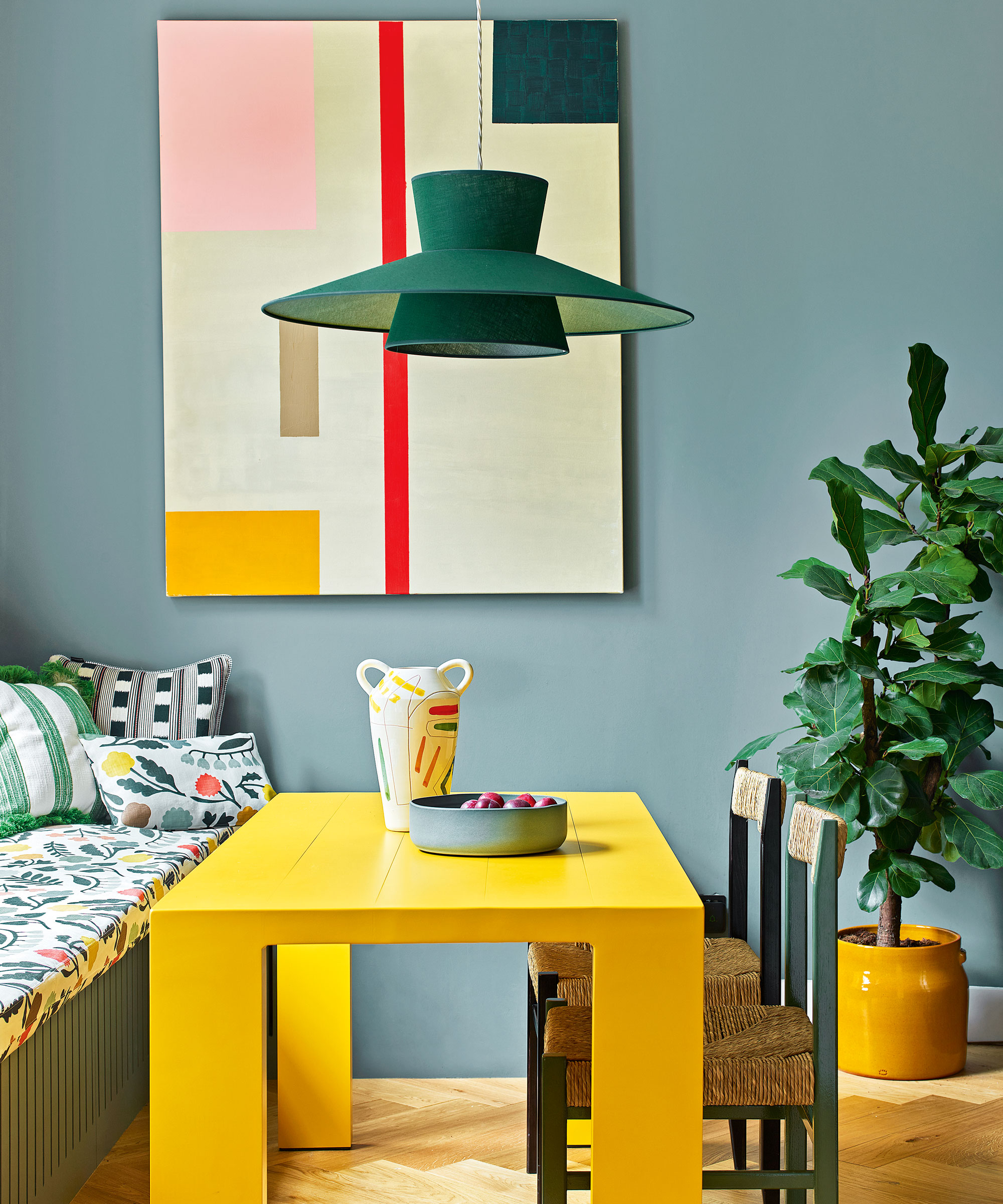
'In addition, completely neglecting the importance of a central focal point, like a chandelier or a piece of art, can result in a lackluster dining room look,' says Curtis.
A statement piece will draw the eye in and you could do this on, or around your dining room table. Depending on whether you take a minimal or maximalist approach to design, you might want to include just one, or multiple focal points.
If you are using art, McKay reminds us to hang it with precision. 'Remember to hang art lower because you will be sitting down.' noting how beautiful lighting fixtures can also enhance a dining room.
5. We play it safe
'Don’t play it safe!' Exclames McKay who urges us to pull out all the decor stops: 'Go ahead and wallpaper your walls or ceiling, add wainscotting, and an interesting paint color, hang art, and beautiful lighting fixtures.' It's surprising what wall art and paneling can do to visually enhance a room's layout.
Rugs make brilliant additions too, but this shouldn't be done by halves, and you should make sure it doesn't interrupt the flow of space either. 'A too-small area rug - go big! You don’t want the legs of the table to get caught on the rug,' adds McKay who reminds us to layer materials too – even if you are working on a simple design. Layers always bring more coziness to a space, whether you have a small or large layout on your hands.
6. We don't make it fit for all manner of occasions
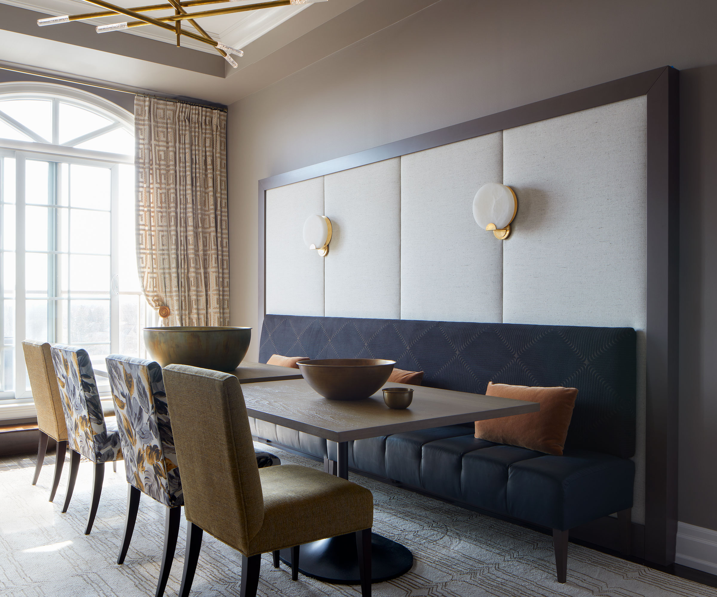
What is a dining room if not a space for sharing and enjoying one another's company?
'Designing too formal a space that you are only comfortable in on special occasions,' can be a mistake with dining room layouts says interior designer Gillian Gillies.
Laughter and joy are more forthcoming in a relaxed environment, the latter of which can be achieved by taking a more fluid approach to your dining room; one that can bounce happily between being a spot for a light-hearted catchup over a cup of cocoa, to hosting Thanksgiving and other events that might want a more formal finish.
Mixing formal with more relaxed furniture pieces will see that you enjoy the best of both worlds, as you create a unique dining room look. Consider a cozy bench, alongside more formal matching chairs as Gillies has created above.
Then by favoring smaller decorative items, you will be able to swap these out more easily; adding in 'upgraded' versions with a more polished finish when needed.
'I like dining rooms to be spaces where you can have an intimate dinner for two, a group of friends over for brunch, as well as celebrations for holidays and special occasions,' adds Gillies.

Since moving to Canada and opening her studio in 2004, Gillian Gillies Interiors has grown to become an award-winning and sought-after interior design firm. Gillian understands the power of creating a home for her clients and she knows that the right home with the correct design selections can greatly improve her client’s quality and outlook on life. She believes in frictionless living, and talks at length with her clients to get to know them and to understand their specific needs, wishes, and desires. Life can come with baggage and Gillian wants to ensure there’s a space for everything whilst also lightening the load we can all carry.
7. We let ambiance slide
One of the final, but certainly not least significant mistakes to make with a dining room layout is simply neglecting the overall ambiance of the space. A good ambiance will be achieved when successfully tapping into the aforementioned points. The room will flow, and function, just as well on special occasions as it does every day. Get it right and you could even make your dining room look more expensive...
For a more lived-in and relaxed feel, try layering lighting and incorporating curved lampshades, with playful patterns and textures. Learn what your guests notice and reimagine previous versions of your dining room layout to come up with a scheme that is inviting on all levels.
FAQs
What factors should you consider when creating your dining room layout?
For the best results, you want to think quite critically about your dining room's natural configuration and plan thoroughly. Consider how to enhance the space with the right furniture, lighting, and decorative pieces. Taking accurate measurements is important so that you can leave essential space for movement, and to get a better idea of how items will work together.
What is the biggest dining room layout mistake?
It has become clear that flawed furniture size and lighting will instantly impact your space and dining room layout, for better or worse.
'For me it comes down to the choice of furniture and lighting,' says Gillies. But rather than one design trait, in particular, being the biggest blunder to avoid, it really is more about failing to achieve a room that is welcoming. 'Having formal furniture can be a tough place to relax in and serve more casual food,' adds Gillies.
Paying close attention to the feel of your dining room space will always pay off. 'To begin, a huge mistake is a lack of ambiance - make sure it’s cozy! Sometimes people don’t give the dining room the attention it deserves as a place we gather with family and friends,' says McKay.
Thankfully, there are some quick fixes and you might not need to look too far to find the right inspiration either: 'Think of your favorite restaurant and what you love about it, lighting, art, comfort.'
If you find your dining room's ambiance is a little off-kilter, think about how you can edit the layout and other essential design features, to quickly remedy your space.
Sign up to the Homes & Gardens newsletter
Design expertise in your inbox – from inspiring decorating ideas and beautiful celebrity homes to practical gardening advice and shopping round-ups.

Camille is the former deputy editor of Real Homes where she covered a broad range of topics, including house tours, small space design, and gardens. She studied English language and Italian at the University of Manchester and during a year abroad studying linguistics and history of art in Bologna, Italy she started documenting her adventures and observations in a blog. Camille is always creating and spends her downtime painting, taking photos, traveling, and writing short stories.
-
 This once-dated kitchen is now a timeless space with the coziest details – and its the classic color palette that's made it a chic, welcoming space
Warming colors and natural materials combine to create this enduringly classic kitchen scheme
By Molly Malsom Published
-
 How to grow crepe myrtle in pots – and transform even the smallest of yards with dazzling flowers this summer
Growing crepe myrtles in pots will inject splashes of brilliant color into your outside space
By Thomas Rutter Published