Tour the colorful and joyful home of interior designer Stephanie Barba Mendoza
The Mexican-born creative's London home is designed to inspire and delight
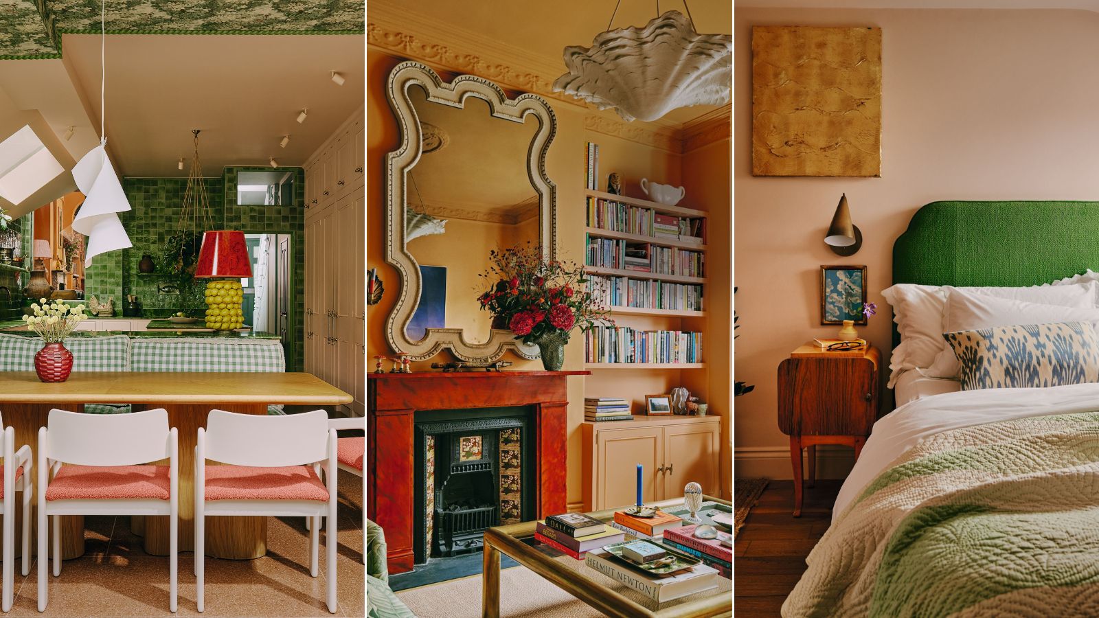

'Everything is so elaborate, each detail is so well and carefully chosen, the more you look at the house design the more you realize there is layer upon layer,’ says the Mexican-born, London-based interior designer Stephanie Barba Mendoza.
She could easily be talking about her home in northwest London, a recently finished refurbishment decorated like a treasure chest with colors and curated pieces bejewelling it.
She is, in fact, describing the apartment of the author Martina Mondadori, a visit to which was the highlight of her time at this year’s Salone del Mobile in Milan. But the biggest joy of that trip for Stephanie was returning home.
‘It’s a place that brings me such joy when I walk into it,’ she says. ‘There’s a lot of warmth to it, partly because of the people, sure - my husband and my two sons, but also because of the space, the lighting, the textures and the colors.’
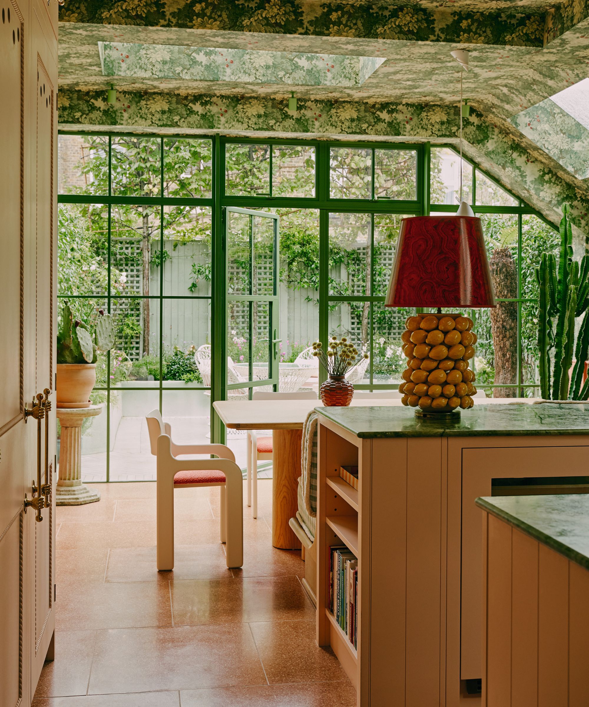
Vintage Flamingo dining chairs by Eero Aarnio for Asko Finland. Marly wallpaper, Colony. Kitchen, British Standard Cupboards. Units and ceiling in Sweet Briar, Morris & Co. Worktops in Ming Green marble, SPC. Lamp, vintage base with shade by Malcolm Scoular.
Stephanie’s use of color is legendary and is what her clients come to her for. After a decade working at Martin Brudnizki, she set up her own studio in 2019.
Its unofficial motto became the Diana Vreeland quote: ‘Exaggeration is my only reality’, a sentiment that Stephanie applied liberally when designing her own home.
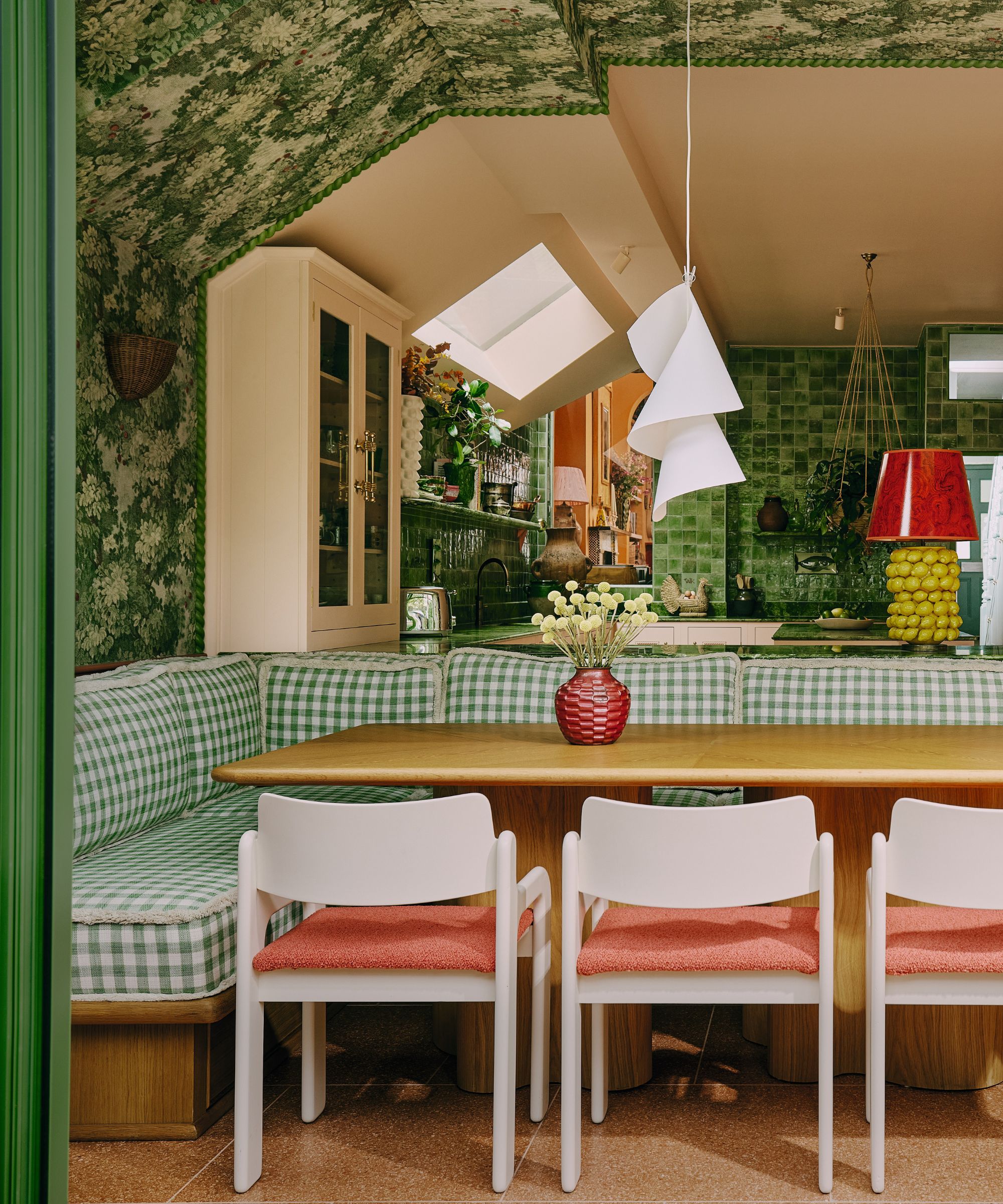
Dining table designed by Stephanie Barba Mendoza. Vintage Flamingo dining chairs by Eero Aarnio for Asko Finland. Banquette in Martina Plaid, Schumacher. Marly wallpaper, Colony. Kitchen, British Standard Cupboards. Units and ceiling in Sweet Briar, Morris & Co. Lamp, vintage base with shade by Malcolm Scoular. Willydilly pendant light, Ingo Maurer. Kale Green porcelain tiles, Artisans of Devizes, with inserts of Zodiac tiles, Gergei Erdei for Balineum.
‘It’s that feeling of “is it too much? I don’t think so!”’ she laughs. ‘It’s important to have fun with decor and I like to create some theatre and pair things in an unexpected way.’
That abandon explains the joyful use of burnt umber paint up and over the walls and ceiling of the sitting room, the powder blue stair rail that makes you feel like you’re climbing into the sky, and the vibrant green botanical print of the wallpaper that festoons the kitchen-diner.
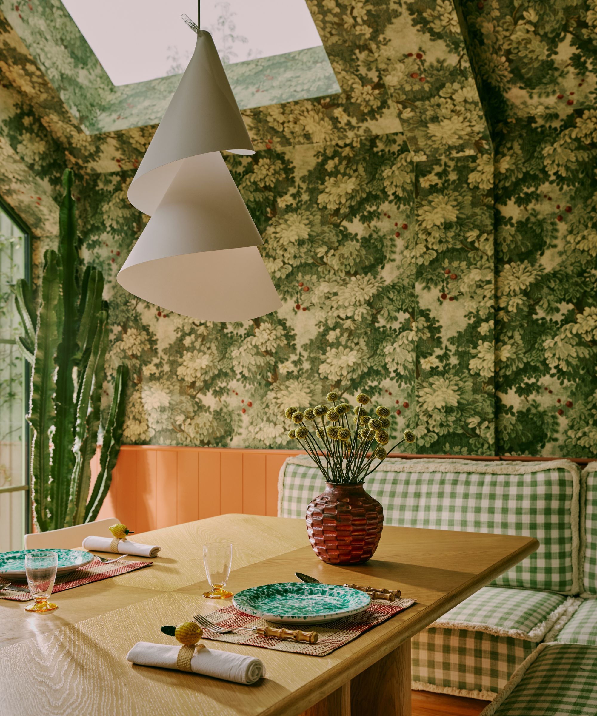
Dining table designed by Stephanie Barba Mendoza. Banquette in Martina Plaid, Schumacher. Marly wallpaper, Colony. Willydilly pendant light, Ingo Maurer.
The kitchen is now Stephanie’s favorite part of the home – and the biggest change she made. While extending the back of the house she lowered the floor by half a metre, adding steps down into it from the hallway.
‘The space now feels so generous, the ceilings now so high,’ she says. ‘It’s an extension, but you could say of the garden rather than the house. We have a small garden, almost like a patio, and what we wanted to do was for the patio to feel like part of the kitchen – to be able to have the doors open and create an indoor/outdoor space.
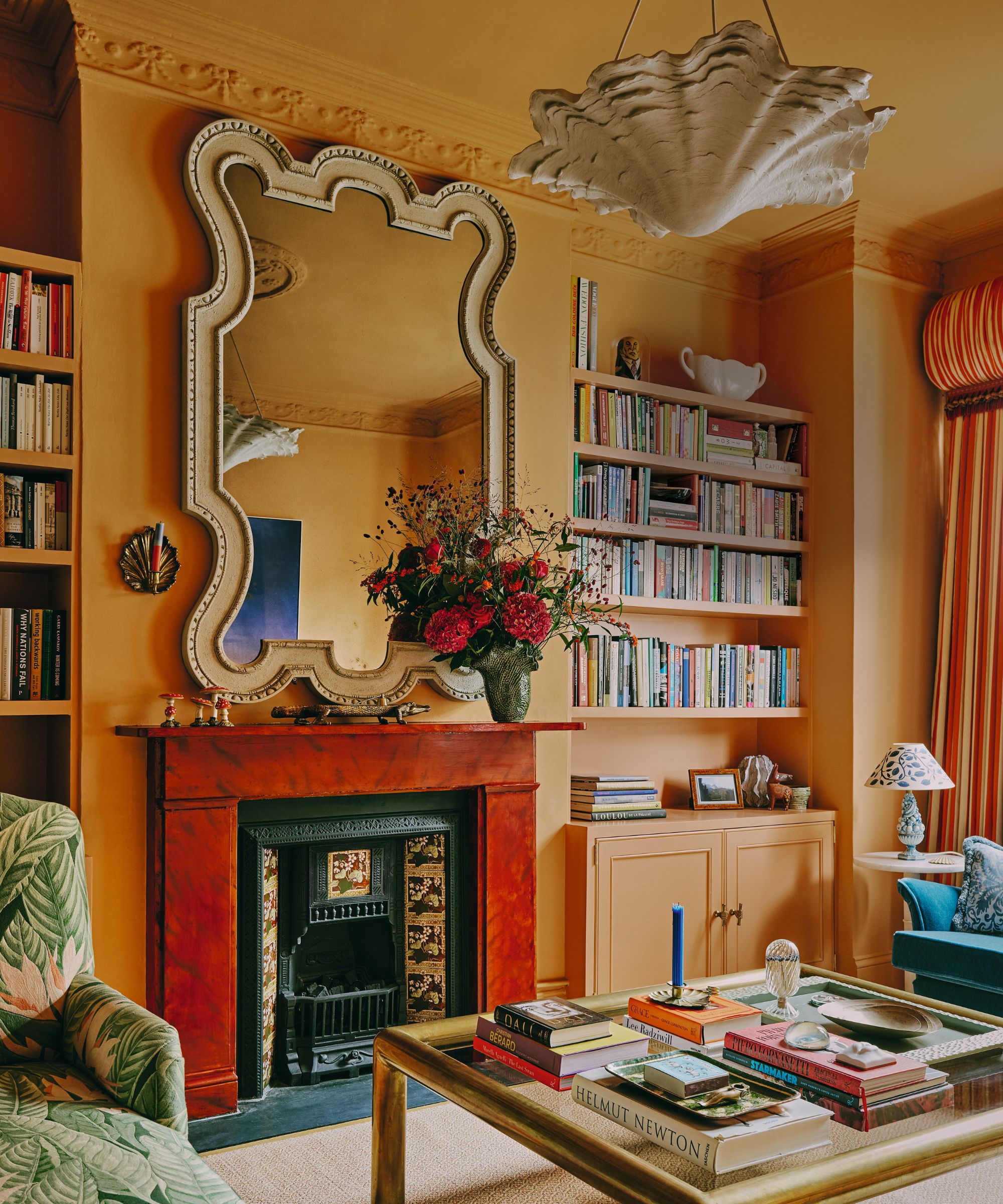
Walls in Dutch Orange, Edward Bulmer Natural Paint. Antique mirror ‘in the style of Edwin Lutyens’, Ebury Trading. Coffee table, vintage. Oyster shell plaster pendant, W.P. Sullivan.
Stephanie continues, 'To create a connection to nature is also why we decorated with green – the leaf wallpaper paired with the patio’s green floor, door, and fence - it gives you the impression there is no transition between the two'.
Green is a favorite color for Stephanie and one that pops up multiple times in multiple rooms – the accent chair in the sitting room, the headboard in the main bedroom, in the playroom’s artwork and couch.
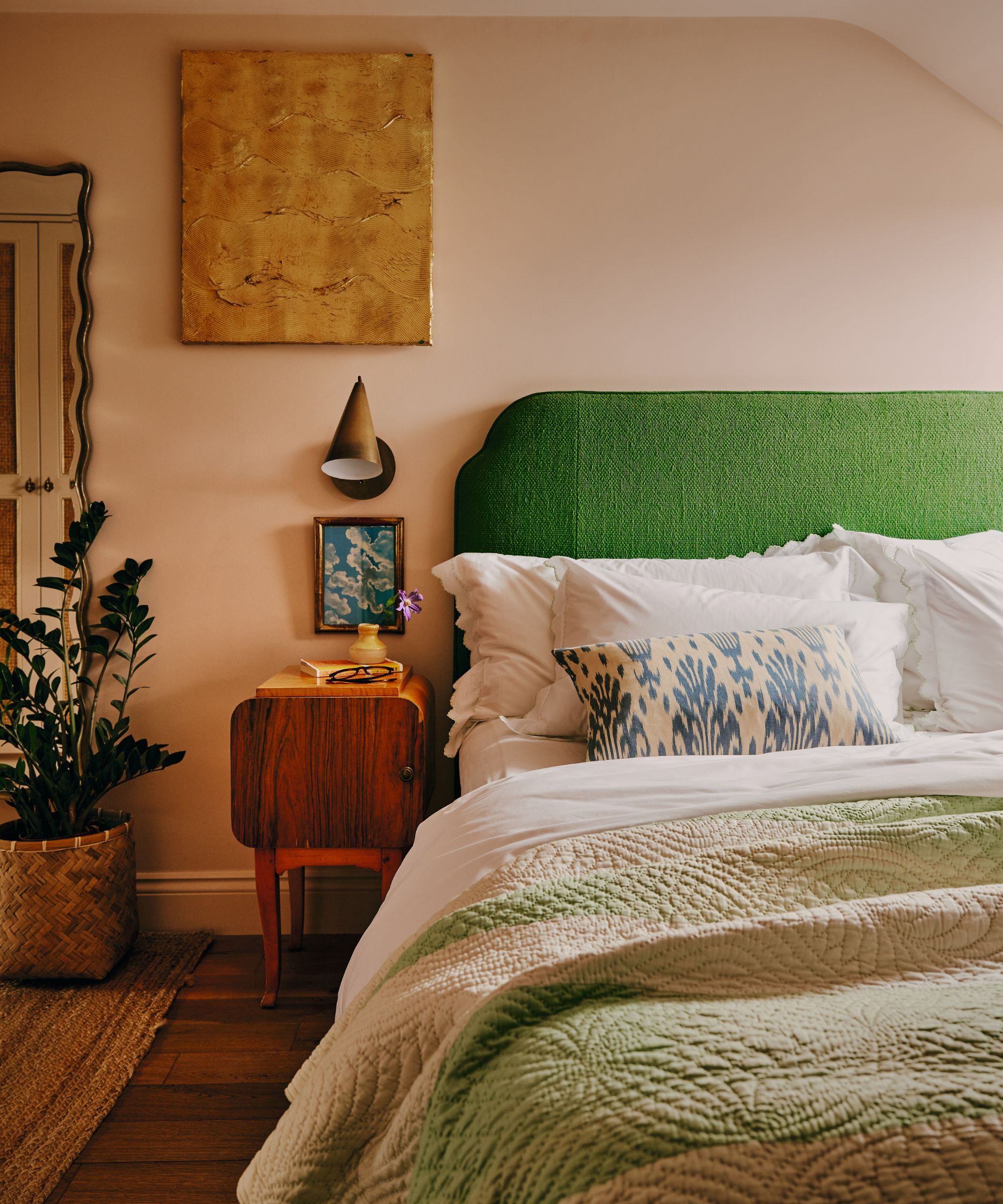
‘Green is very complementary with other colors and it makes you feel calm,’ she explains. ‘I believe you can be helped to find inner peace if you bring in green. It’s very harmonious.’
And despite the many colors Stephanie has used in many different ways, the house still manages to feel harmonious, too. ‘There is a nice flow to the spaces, although they are all very different,’ she says. ‘If you are sitting from one place and look into the other room, they may not look the same but they provoke the same emotion.’
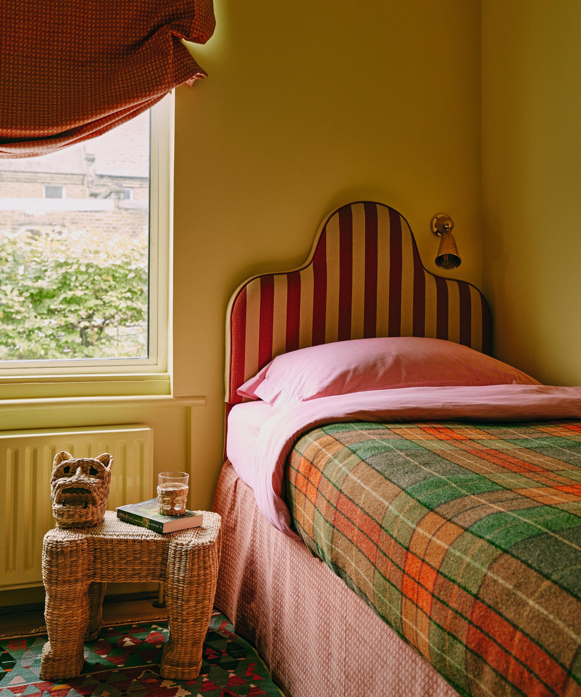
Headboard, Ensemblier London; covered in fabric from Howe London. Blind, Tissus d’Hélène. Light, Rose Uniacke.
That emotional response is the key to all of Stephanie’s projects and why her own home works so well – she wants her designs to always make you feel like you’re being bathed in warmth. ‘That sense of being cocooned is so important. It’s what makes a house a home.'
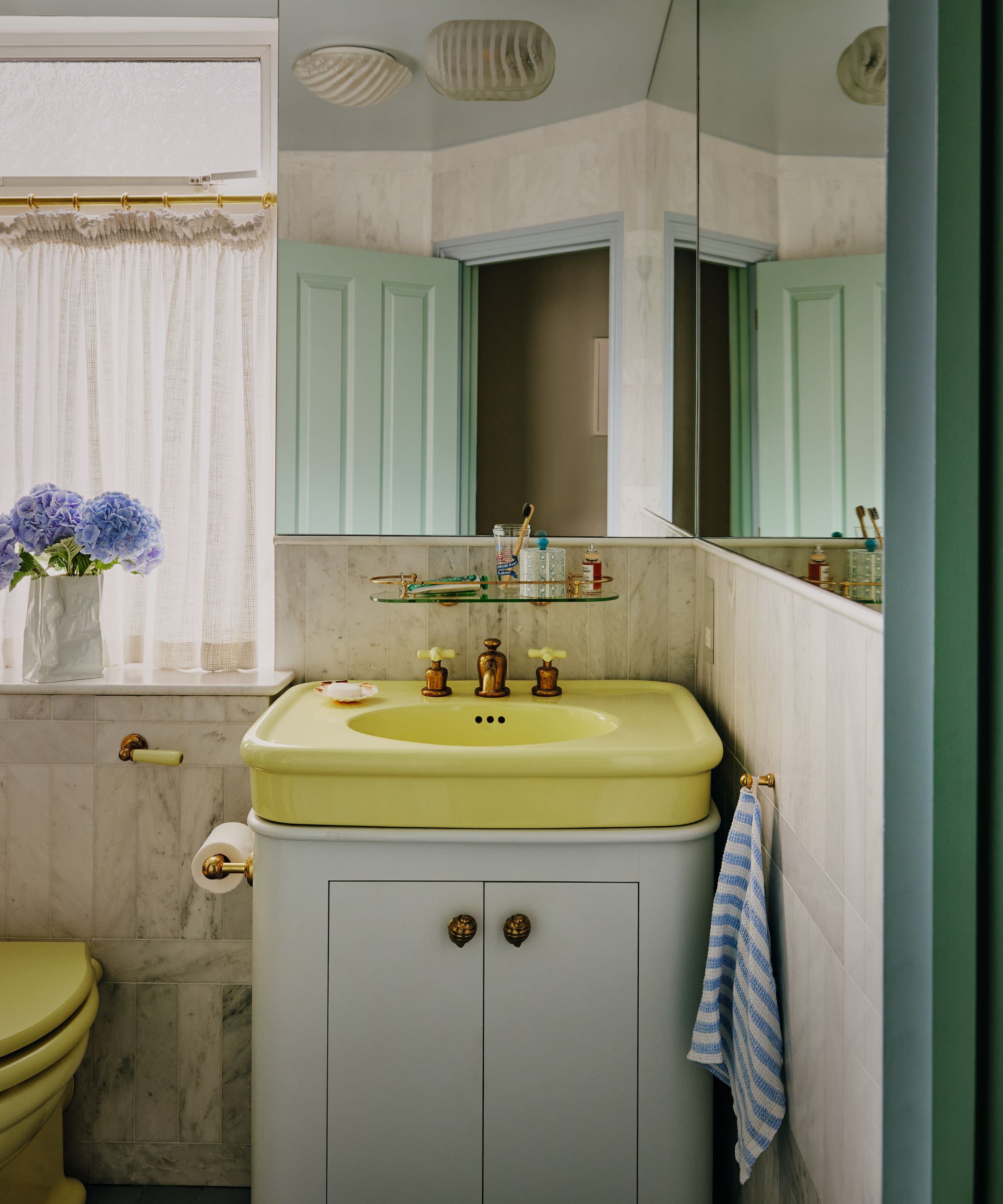
Rockwell porcelain sink, The Water Monopoly. Alsace honed marble wall tiles, Mandarin Stone.
Meet the designer and homeowner
Stephanie Barba Mendoza shares her style inspiration
What is your go-to decorative detail?
Beaded adornments – this could be a rope on a curtain or tassel on a cushion.
How do you find inspiration?
I’ve been reading a book about Michael Taylor, the person who started the whole look of the modern American aesthetic. He was first to bring in a farm table, paired with an incredible antique, and I find it fascinating that he was such a pioneer, doing something for the first time that now so many of us do.
Describe your style in three words?
Playful, warm, unexpected.
Finish the sentence, I know I'm a creative because...
I obsess about creating.
Tell us what was the last thing you bought for your home.
Flowers – they’re now in a vase in the sitting room. It’s a really interesting bouquet that includes a protea from South Africa. It’ll be just as beautiful once it has dried.
How should home make you feel?
Welcomed. It’s because this is where my family is, sure, but it’s also the colors and patterns that are just so warm.
Sign up to the Homes & Gardens newsletter
Design expertise in your inbox – from inspiring decorating ideas and beautiful celebrity homes to practical gardening advice and shopping round-ups.
Pip Rich is an interiors journalist and editor with 20 years' experience, having written for all of the UK's biggest titles. Most recently, he was the Global Editor in Chief of our sister brand, Livingetc, where he now continues in a consulting role as Executive Editor. Before that, he was acting editor of Homes & Gardens, and has held staff positions at Sunday Times Style, ELLE Decoration, Red and Grazia. He has written three books – his most recent, A New Leaf, looked at the homes of architects who had decorated with house plants. Over his career, he has interviewed pretty much every interior designer working today, soaking up their knowledge and wisdom so as to become an expert himself.
-
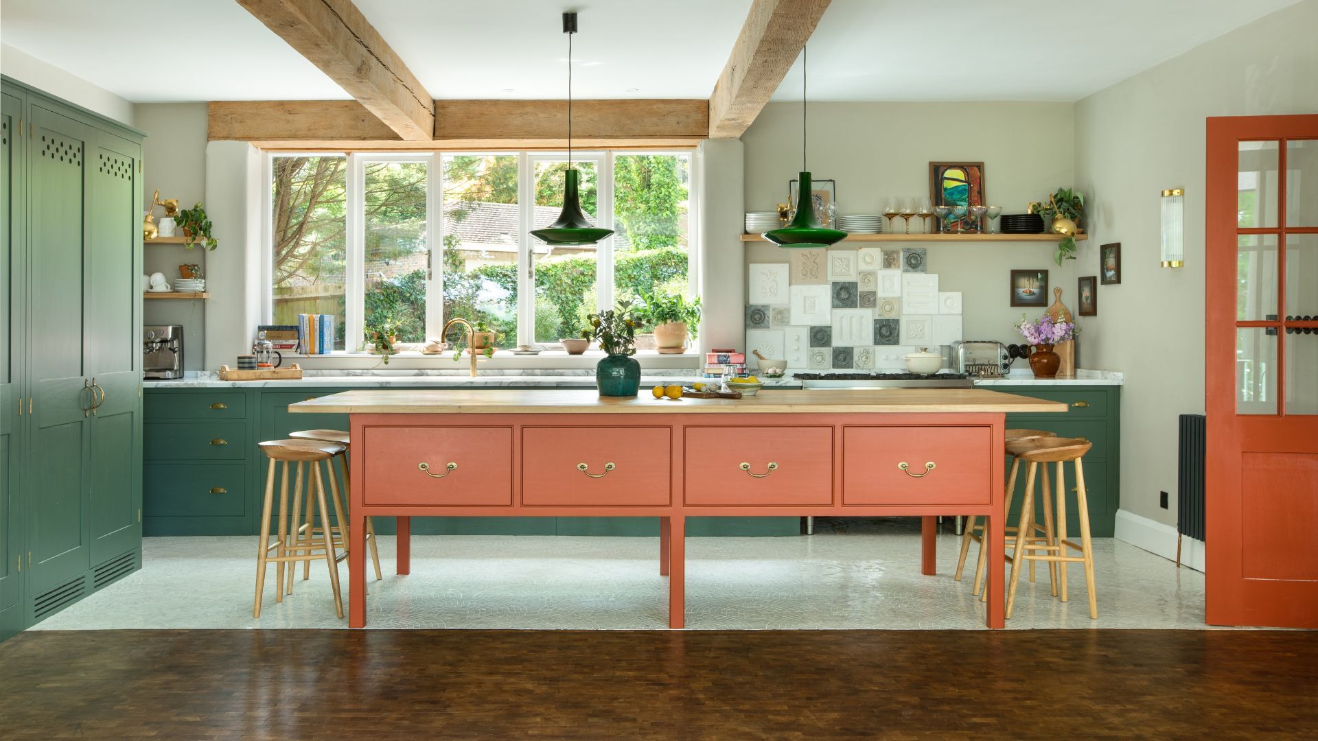 Orange and green is the bold color pairing quietly transforming homes in 2025 – here's 4 reasons why
Interior designers are making the orange and green combination work wonders – this is how you can too
By Sophia Pouget de St Victor Published
-
 This Michelle-Pfeiffer-approved chair is made of a forebodingly unusual material, opening the debate: Is it a rustic stunner, or a danger to sitters?
The actress took to Instagram with a chair made of a controversially sharp material – and fans are unsure of how they feel about it
By Sophie Edwards Published