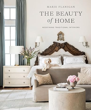
'Imperfections are often what add character and charm to a space' – here's why this designer says you should embrace a home's unique features
Think twice before concealing quirky original features in your home – they may be the secret to adding charm
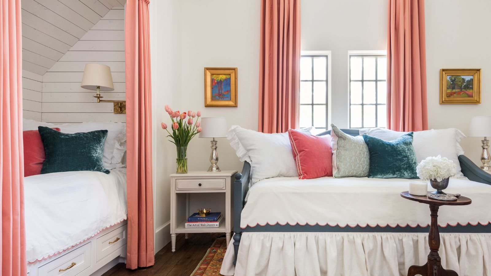

If you're in the process of remodeling your home, it can often be tempting to conceal any slightly awkward features that make your home unique. Whether that's original flooring or quirky nooks – in old homes especially there are often lots of details that may initially be tricky to design around.
But rather than hiding or covering up these features being your first port of call, choosing instead to embrace them can be an incredibly effective way of creating a home that feels charming and full of character.
Interior designer Marie Flanigan is one expert to suggest this approach, taking to Instagram to discuss the beauty of designing a home around imperfect architectural features and details. 'When struggling with a small space, odd roofline, or quirky existing finishes, look for ways to embrace them in your overall design,' says Marie.
A post shared by Marie Flanigan Interiors (@marieflaniganinteriors)
A photo posted by on
We spoke to Marie to learn how to fully embrace your home's unique features, whether you're currently in the process of doing a remodel or are trying to figure out what to do with an awkward space in your home decor ideas.
'In older homes, I really think it’s important to consider the time period in which the home was built,' she explains. 'There are often architectural elements and finishes that are indicators of the home’s history and I love preserving these details. Often, you’ll find stunning wood floors that may need a bit of rehabilitation but are worth keeping. I also love to highlight beautiful craftsmanship in original millwork or tiling.'
While it can be tricky to decorate around these unexpected details, with a little bit of thought and planning, you can find that these are what add interest to a space, making your home feel unique and rooted in history.

Marie Flanigan is an award-winning interior designer whose passion and achievements in design have positioned her as one of the nation’s best. She is classically trained and practiced architect, and her trademark style is evident through the sophisticated use of color, texture, and light. Every home she designs receives her personal signature of timeless elegance and innovative simplicity.
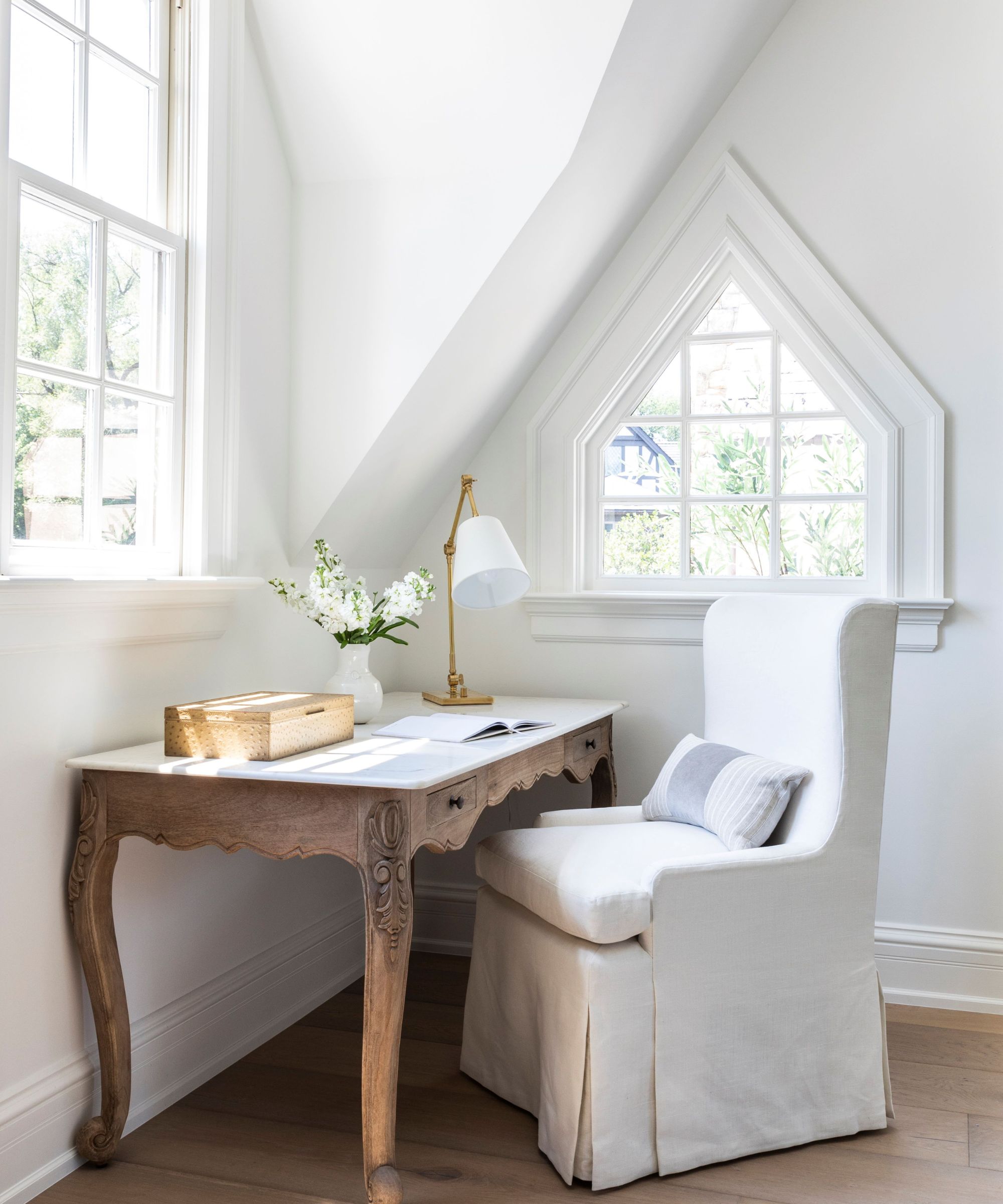
'When working with an awkward roofline, I’ll carry the paint color or wallcovering throughout the space to create a very cohesive visual experience.' As pictured above in a space designed by Marie Flanigan Interiors, the use of one color enhances the unusual roofline and avoids any awkward cutoffs.
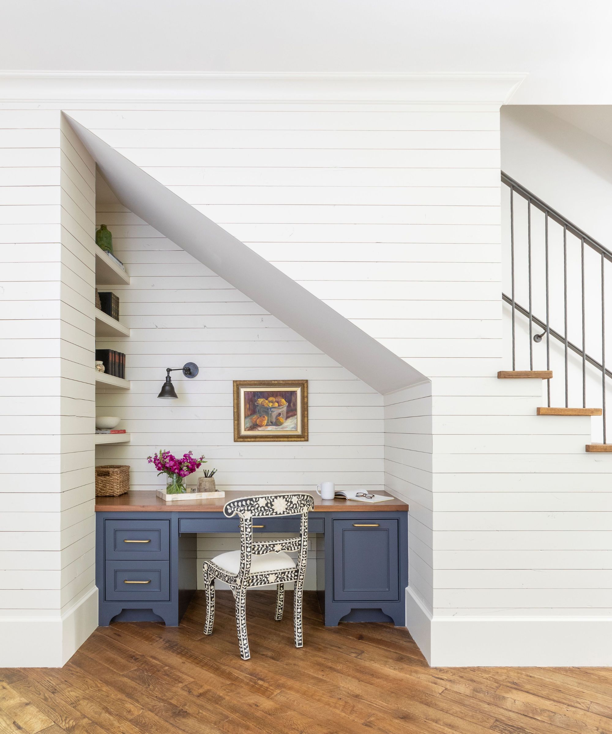
If you have a very specific awkward-shaped space in your home that you're not sure what to do with, aim to transform it into a functional space, such as a home office or reading nook.
'For awkward spaces, like a nook under the stairs, look for ways to add function. I love to use a space like this for added built-ins or even a small desk or play area,' advises Marie. Below, you can see how a home office setup has been integrated under the stairs, showing that by getting creative with the space available, you can design practical spaces that would otherwise be left empty.
'Imperfections are often what add character and charm to a space,' says Marie. Next time you're considering covering up original features or aren't sure how to utilize an awkwardly shaped nook, make sure to embrace it and lean into its charm for a home that feels full of character.
Sign up to the Homes & Gardens newsletter
Design expertise in your inbox – from inspiring decorating ideas and beautiful celebrity homes to practical gardening advice and shopping round-ups.

Emily is a freelance interior design writer based in Scotland. Prior to going freelance in the spring of 2025, Emily was Homes & Gardens’ Paint & Color Editor, covering all things color across interiors and home decor for the Homes & Gardens website. Having gained specific expertise in this area, Emily is well-versed in writing about the latest color trends and is passionate about helping homeowners understand the importance of color psychology in home design. Her own interior design style reflects the simplicity of mid-century design and she loves sourcing vintage furniture finds for her tenement flat.
-
 Charred little gem with saffron dressing
This recipe with charred little gem is both easy to make and sure to impress guests. It's the perfect side for fresh spring menus
By Alice Hart
-
 Grilled asparagus with herb and pickled red onion
This grilled asparagus couldn't be easier, and it's a wonderful way to get the best flavor from our favorite spring veg. It's perfect alongside fish or lamb
By Alice Hart
