How to use decorative plasterwork – to add instant character to your space
The centuries-old tradition of adding molded details to walls and ceilings is still omnipresent. We explore some of the tried and tested ways it can enhance your home
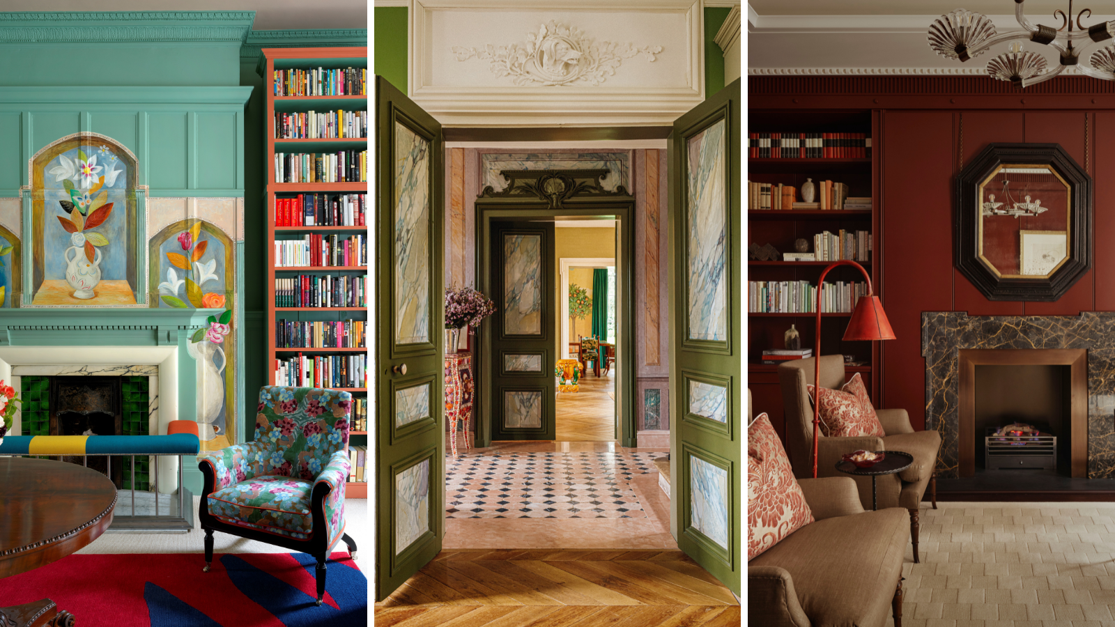
- 1. It adds depth and interest
- 2. Styles continue to evolve
- 3. It breaks up rooms of grand proportions
- 4. It adds grandeur to a space
- 5. It can be reworked to have a modern impact
- 6. It adds heritage charm to new builds
- 7. It demarcates different 'zones'
- 8. It enhances doorways
- 9. It can be pared back to simplify grand spaces

Holly Ransome
Few age-old decorative traditions continue to be as prevalent in interior design as plasterwork – its roots can be traced back to ancient civilizations. It's not uncommon today for architectural designers to go to great lengths to carefully restore pre-existing detailing in heritage properties, or commission a specialist to recreate the style in newer, unadorned spaces.
Visually, it's easy to see why – the sculptural element adds depth and interest, as well as, of course, prettiness. Yet its functional value also has a lot to answer for; wall paneling and plasterwork can break up swathes of otherwise intimidatingly empty and flat wall space, it can demarcate different 'zones', and it can inject a property with a feeling of grandeur.
This age-old interior design technique continues to capture our imaginations and few interior design trends that can be compared to it in terms of staying power.
We spoke to some industry experts about why this is, and asked them how they continue to embrace plaster molding and paneling in their work today, and how to make the design tradition feel 'fresh'.
1. It adds depth and interest

When kept architecturally intact, 19th-century houses often come with an abundance of decorative details. One option would be to embrace neutral hues and let the artistry within these details do the talking but, here, Paris-based designer Laura Gonzalez took the opposite direction.
She brings a mix of colorful prints and cultural influences, including from China, India, and France to her country house near Giverny. A pink and black marble floor and trompe-l’œil marble panels mark the entrance. They were found and repaired during the renovation.

Since founding her own practice in 2008, Laura – named Maison & Objet’s Designer of the Year 2019 – has worked for hotels, such as Saint James and Maison Malesherbes in Paris, major fashion houses Cartier and Christian Louboutin, and has her own furniture collection of chairs, tables, lights and ceramics, plus a gallery in Saint-Germain-des-Prés.
2. Styles continue to evolve
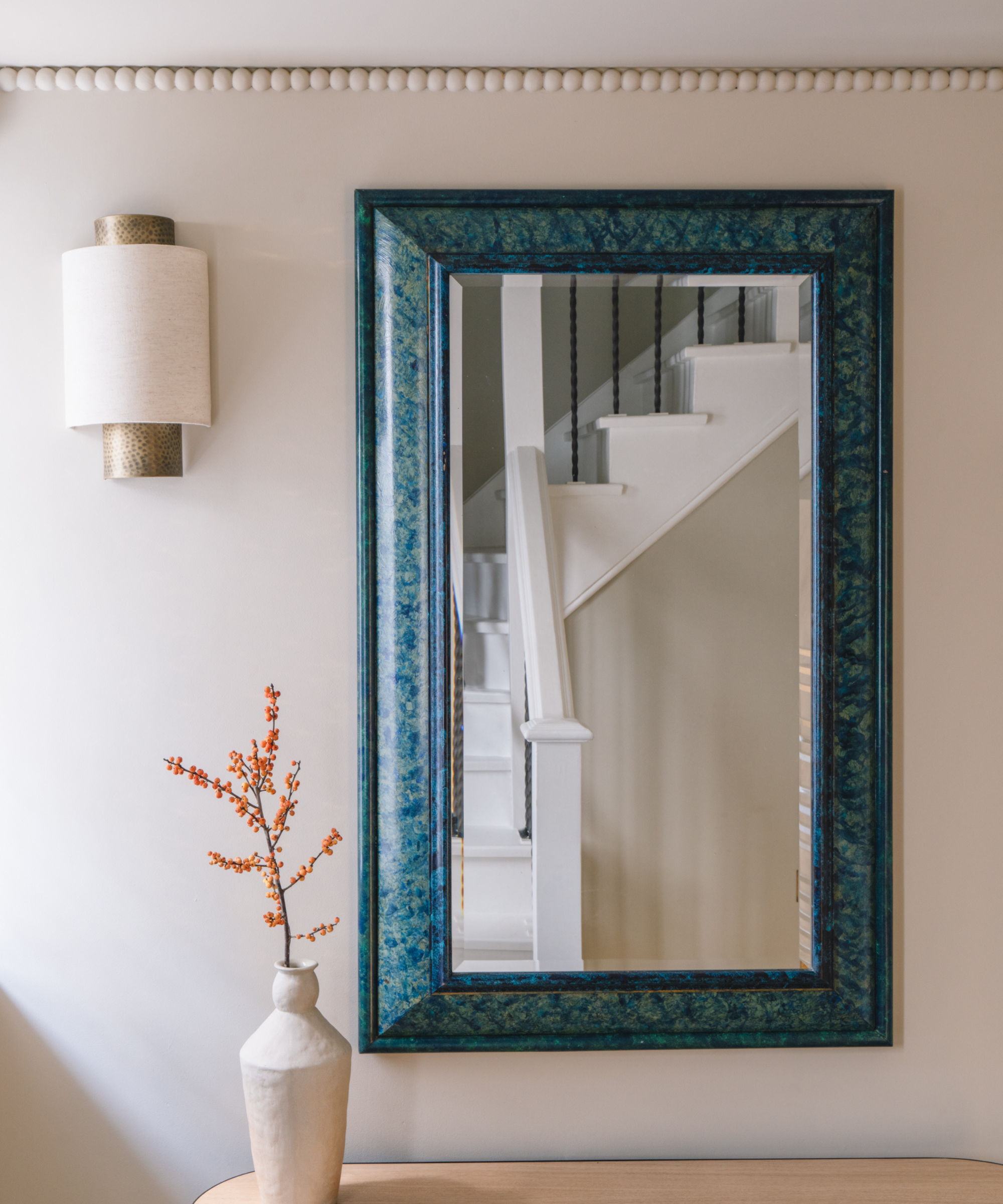
Cornicing was traditionally designed to mask the join between the walls and ceiling. By the 18th century, however, it had become something more of an artistic expression. These days, designers are more elaborate and modern with their choices, hence the birth of the bobbin cornice.
Design expertise in your inbox – from inspiring decorating ideas and beautiful celebrity homes to practical gardening advice and shopping round-ups.
‘The bobbin trend blew up last year and is still in full swing, tapping into the industry’s obsession with arts and crafts,’ says Alicia Meireles, associate director of Own London who designed this scheme for a house in Kensington.
3. It breaks up rooms of grand proportions
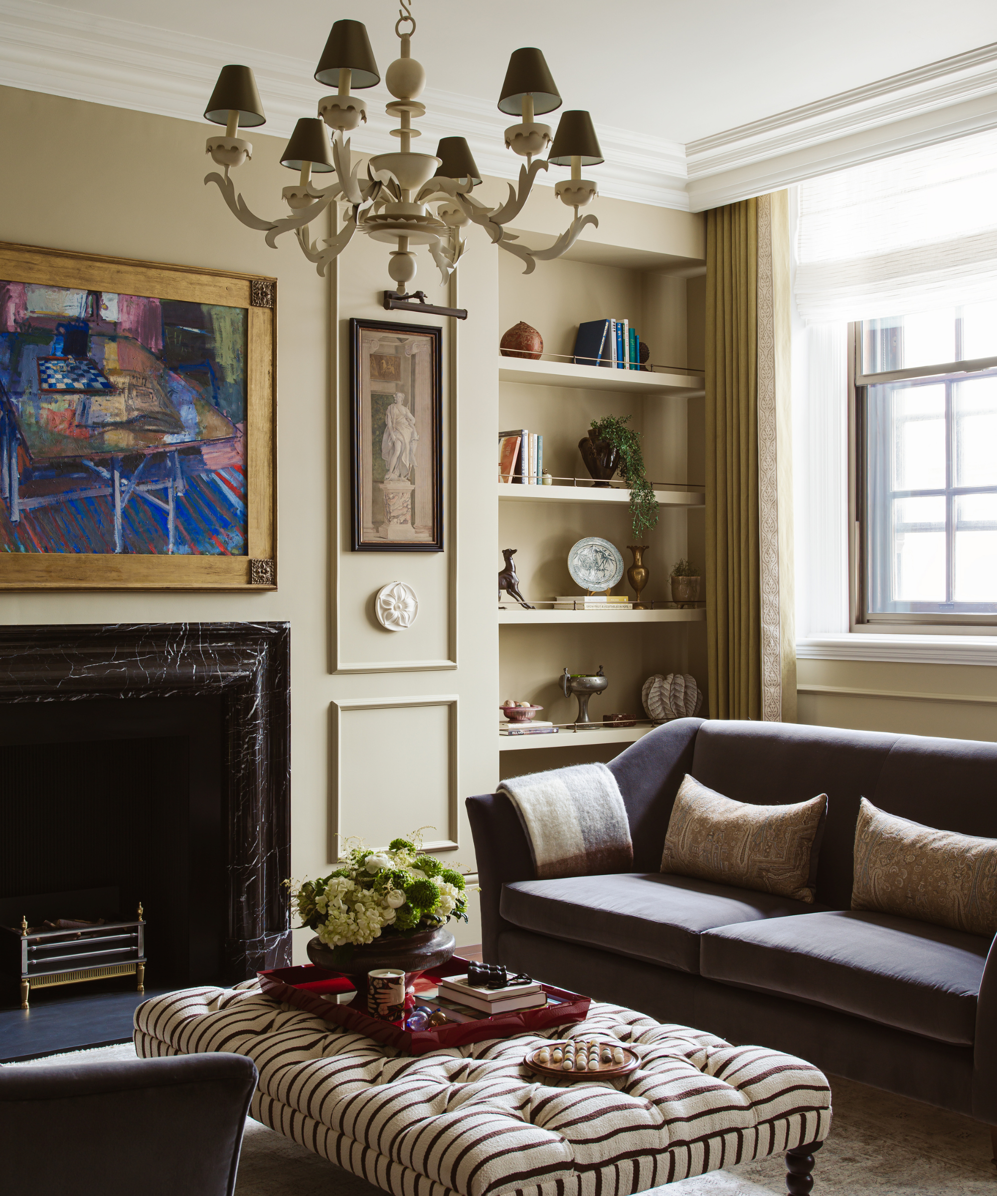
Back in time, the main rooms in the grandest houses had higher and more elaborate skirting boards and plasterwork. As rooms became less formal, so would the decoration. When working with rooms of lofty proportions, they often cry out for extra details.
That is the approach taken by Holly Beazley, creative director of Elicyon, when it came to decorating an apartment within the famous Old War Office building in Westminster. ‘The moldings in the main living space are a testament to the grandeur of the structure,’ she says.

With over 10 years of industry experience and an interior design background, today Holly Beazley is the Creative Director of London-based luxury interior design firm Elicyon, where she has worked for the last 5 years.
4. It adds grandeur to a space

In the second half of the 20th century, it became fashionable to strip historic houses of architectural features, including friezes and relief panels. In recent years, elaborate designs have been creeping back in, from spider’s web plasterwork to detailed stucco work.
For those who want to make a more modest step forward, consider the relief panel. ‘You can hang panels as you would a painting,’ says the team at Geoffrey Preston Sculpture & Design who designed this piece entitled Flower Garden.
5. It can be reworked to have a modern impact

It was the Bloomsbury Group who tore up the rule books when it came to painting interiors. They painted any surface they were inspired to embellish, as can be seen at Charleston house in the British countryside. A century later, this approach is again informing the work of decorative artists.
Here, for the offices of the Bloomsbury Publishing Group, design director of Firmdale Hotels Minnie Kemp wanted to create a more contemporary space by ignoring the border lines of the existing moldings. ‘Instead, we created a showpiece by commissioning a mural from decorative artist Tess Newall,’ explains Minnie.
6. It adds heritage charm to new builds
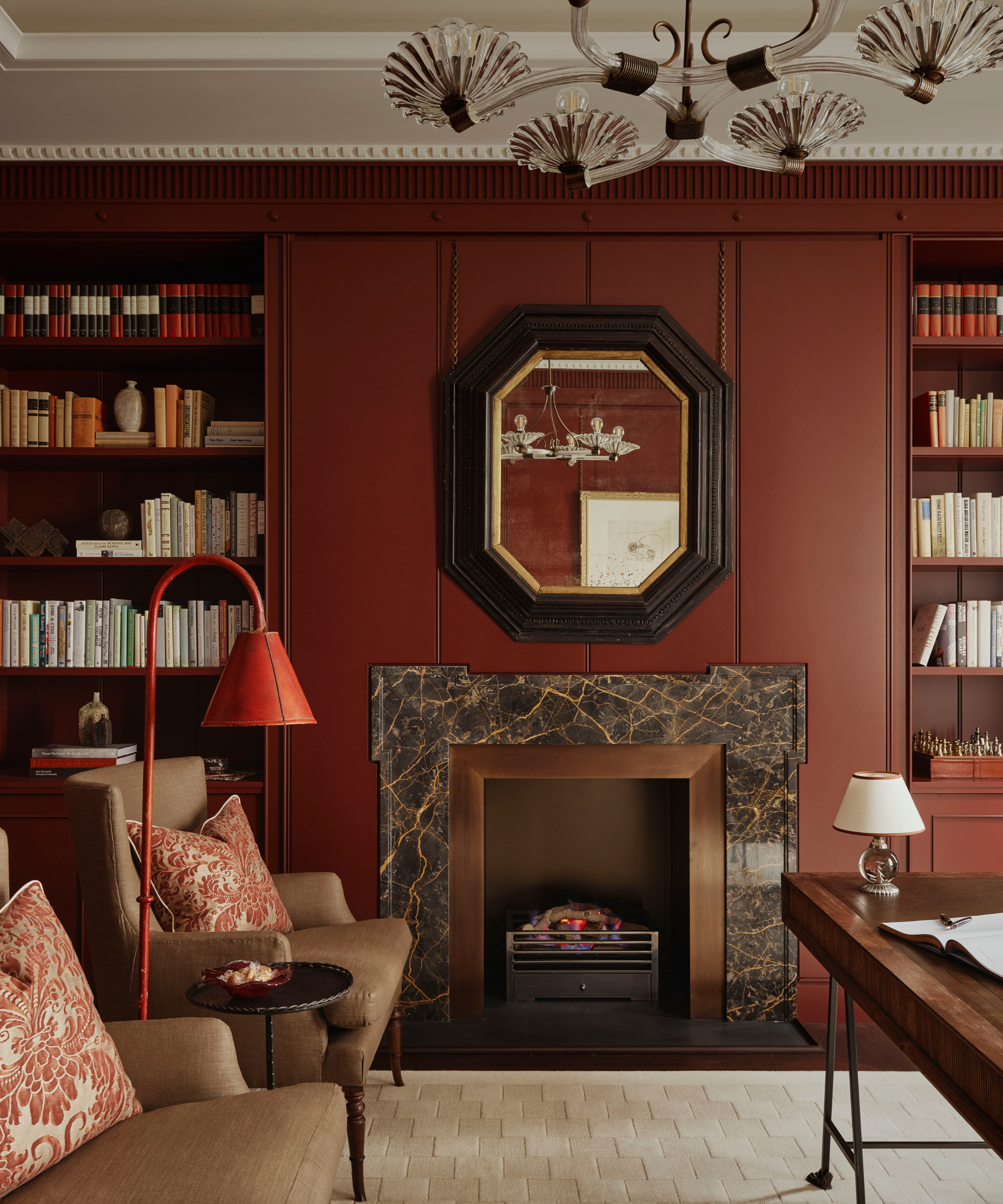
Introducing individuality into a new building is where the artistry of great interior design comes to the fore. This townhouse is part of the newly developed Chelsea Barracks.
‘As a nod to the site’s rich history, we wanted to add classical layers to the rooms,’ says Ottalie Stride, creative director of Albion Nord. Here, the cornice moldings and paneling do just that - they create a transitional look by grounding the room with traditional details in what could otherwise feel too new.
7. It demarcates different 'zones'
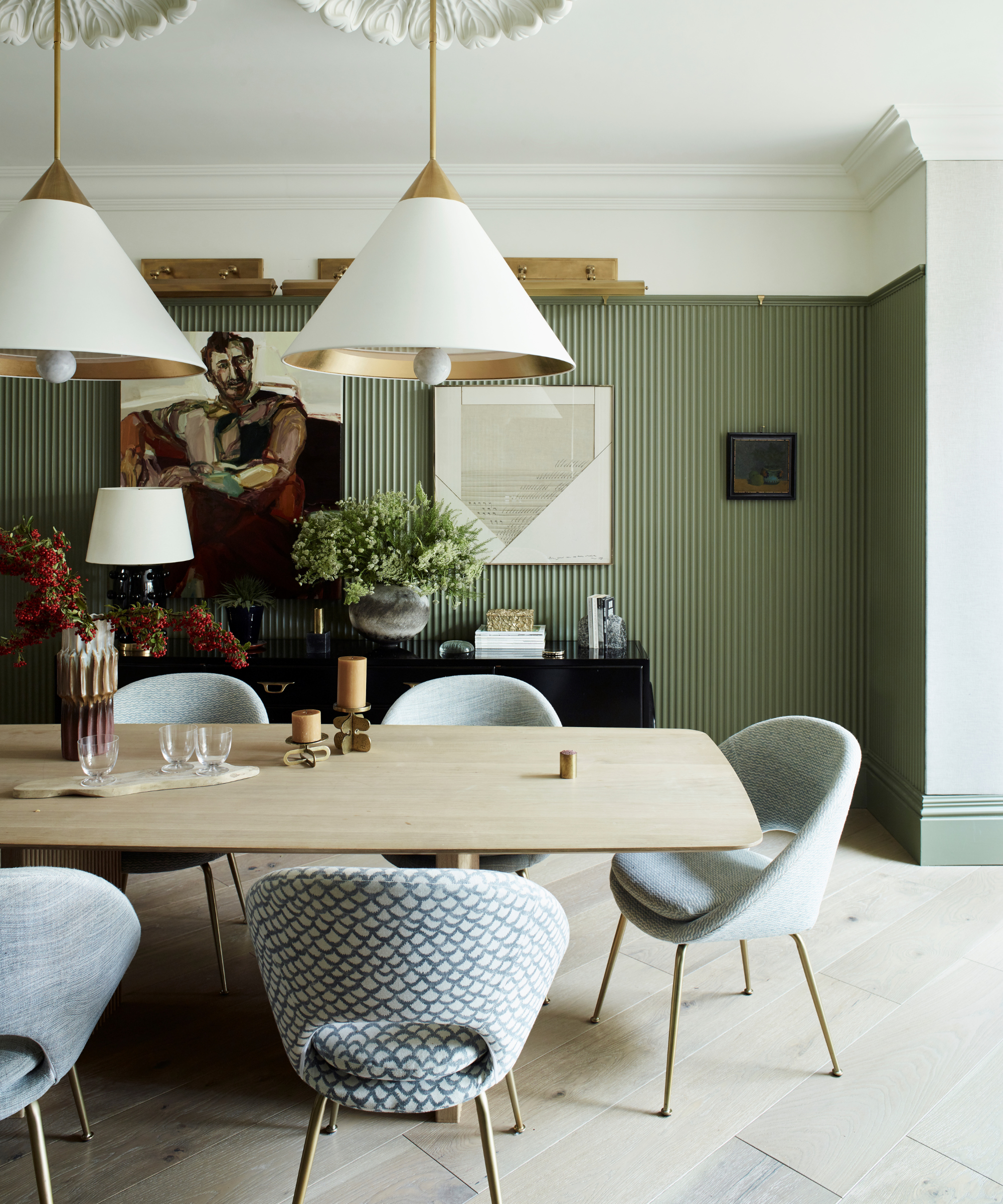
There are many tricks of the interior design trade when it comes to zoning. One option is to consider wall detailing. In the open-plan living-dining space of designer Irene Gunter’s London home, fluted paneling creates definition, separating one area from the other.
‘I’m not a fan of plain painted walls without any depth or detail,’ she says. ‘The fluting adds texture and dimension to the space and makes for a really fun backdrop for our artwork'
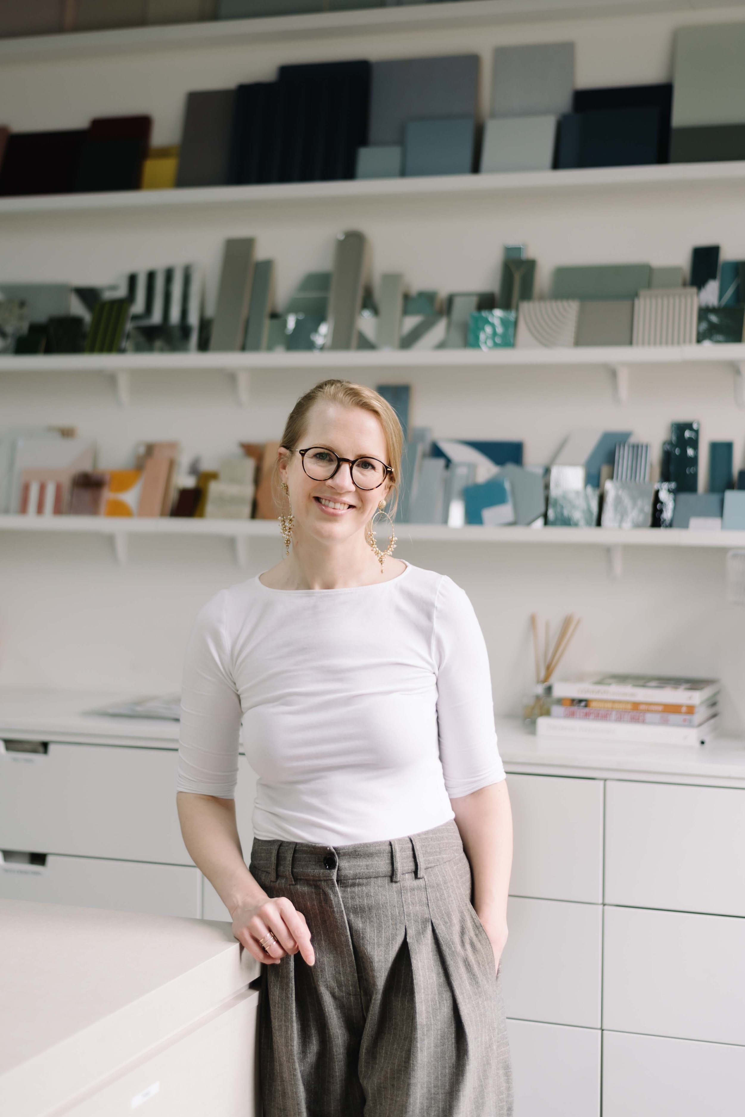
From Belgium originally, Irene Gunter founded her London-based interior design studio in 2014. The leading company provides both interior architecture and furnishing services - their portfolio includes projects on the French Riviera, in Dubai and in LA, spanning commercial designs, galleries, and private homes.
8. It enhances doorways
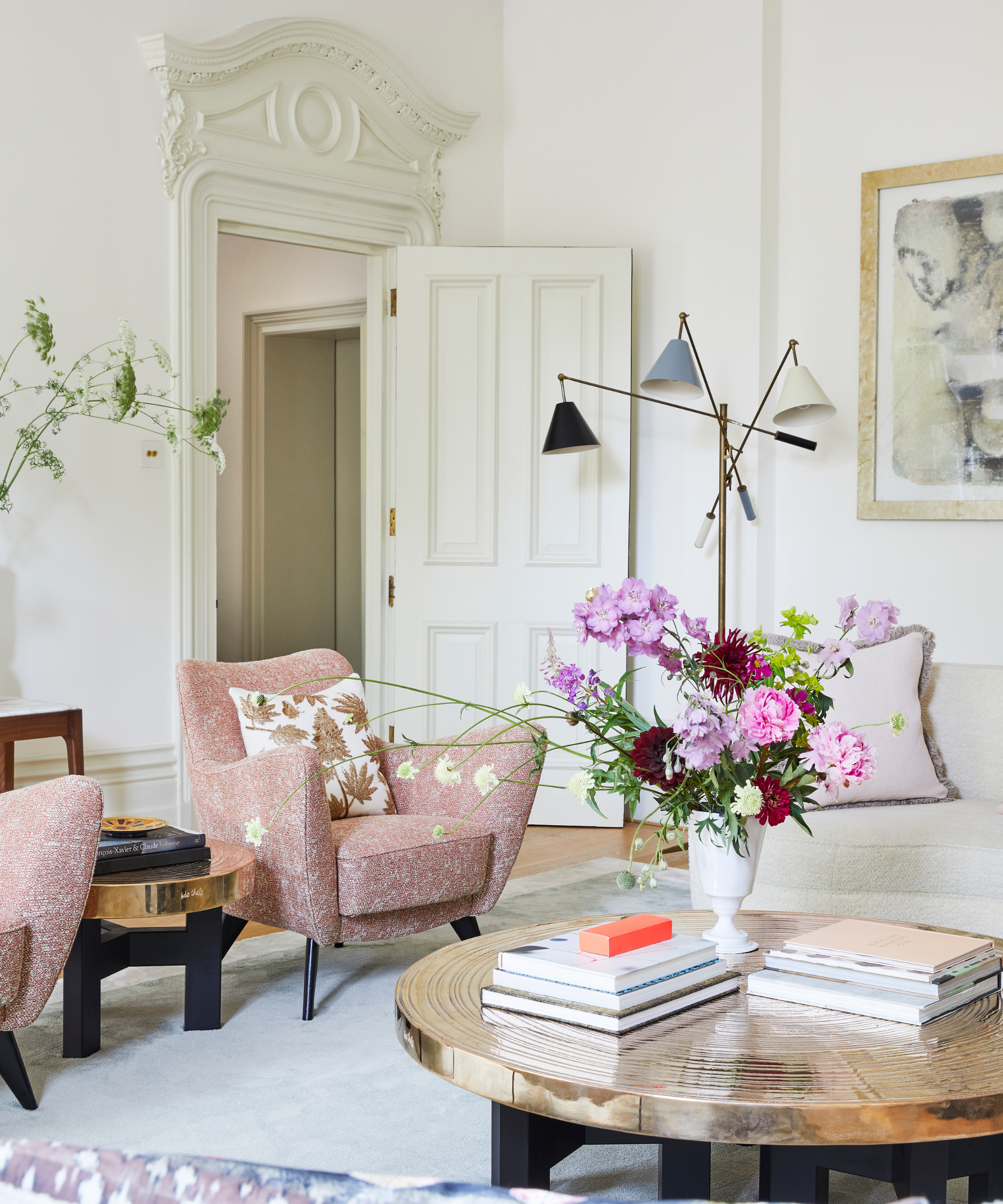
When interior designer Miriam Frowein moved from Germany to the UK, one of the first things she noticed was the attention to detail reflected in the moldings, skirting boards, cornices, and architraves.
She comments, ‘I saw them in almost all the houses and flats I visited, even homes that are not listed. In addition to the beauty and tradition of plaster molding itself, the proportions and designs are always spot on.’ It’s a decorative detail that she now embraces in her work, including in her sitting room with its decorated door pediments.
9. It can be pared back to simplify grand spaces
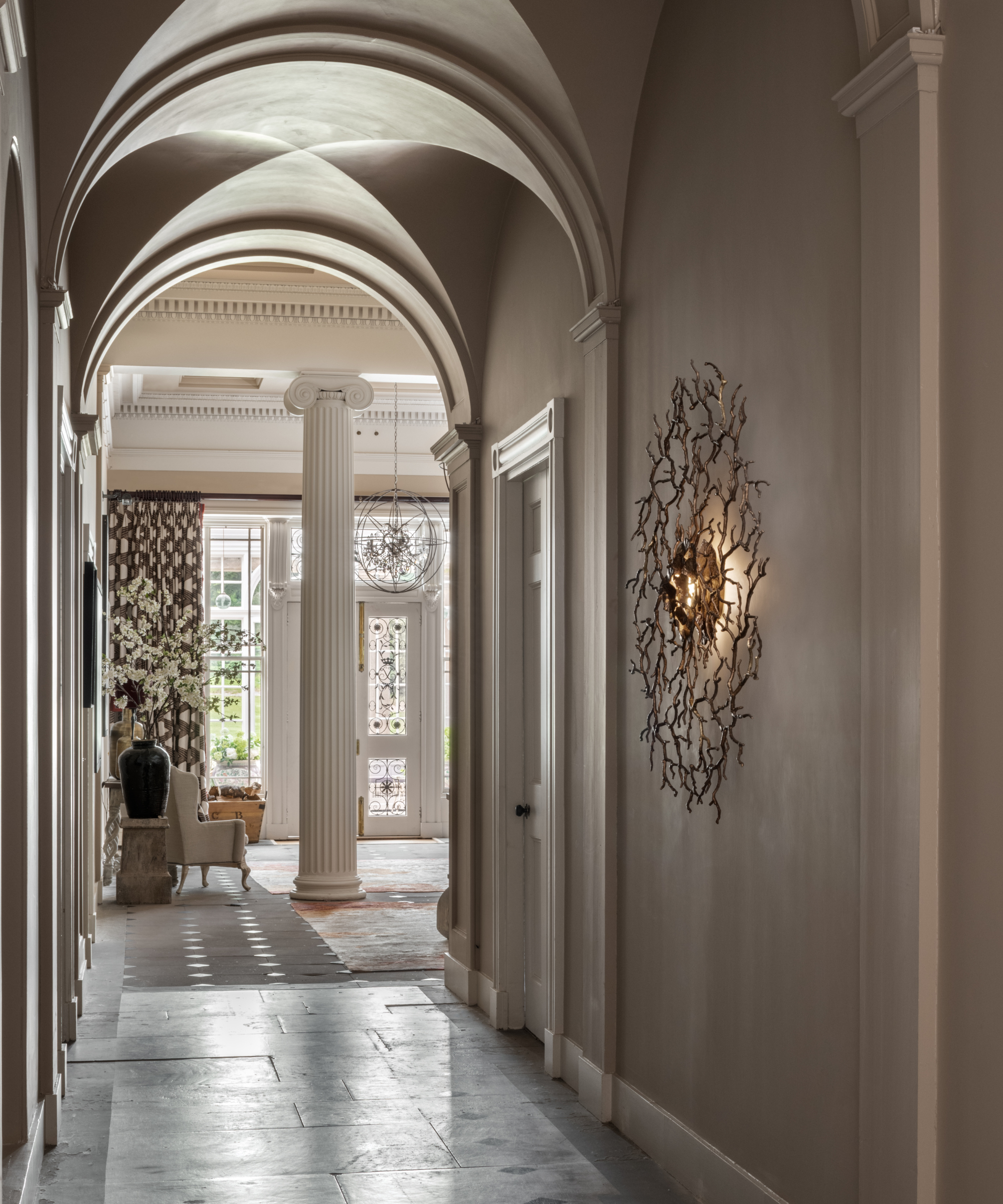
When existing architectural details are strong, sometimes the only appropriate intervention is to restore where needed. That’s what design director Jo Aynsley at Edinburgh-based Jeffreys Interiors did when decorating the hallway of this Grade A house in East Lothian.
She says, ‘The decision was made not to complicate the impact of the details with color. We painted the cornice and plasterwork in Farrow & Ball’s Skimming Stone while the pillars are in Slipper Satin.'

Jeffrey's Interiors is an interior design firm that was established in Edinburgh over 100 years ago. Jo Aynsley is Design Director of the practice today, working across residential and commercial projects. She has over 10 years of experience as an interior designer as well as a background in textile design.
The surprising durability of plaster, an unassuming mix of minerals, sand, and water has allowed the appreciation of decorative plasterwork to continue throughout the ages, yet there's a charming humility to the simple sculpting material. Relatively accessible, it adds heritage-style beauty, architectural interest, and structure to a home, and with the ways of applying the technique ever-evolving, it still feels just as contemporary today.

Arabella is a freelance journalist writing for national newspapers, magazines and websites including Homes & Gardens, Country Life, The Telegraph and The Times. For many years she has specialized in writing about property and interiors, but she began her career in the early 2000s working on the newly launched Country Life website, covering anything from competitions to find the nation’s prettiest vicarage to the plight of rural post offices.
- Holly RansomeEditorial Assistant (print and digital)