How designers decorate with burgundy – the on-trend shade that's perfect for creating cozy and sophisticated spaces
Burgundy is the way to bring red into your home right now, here we ask designers how it works best
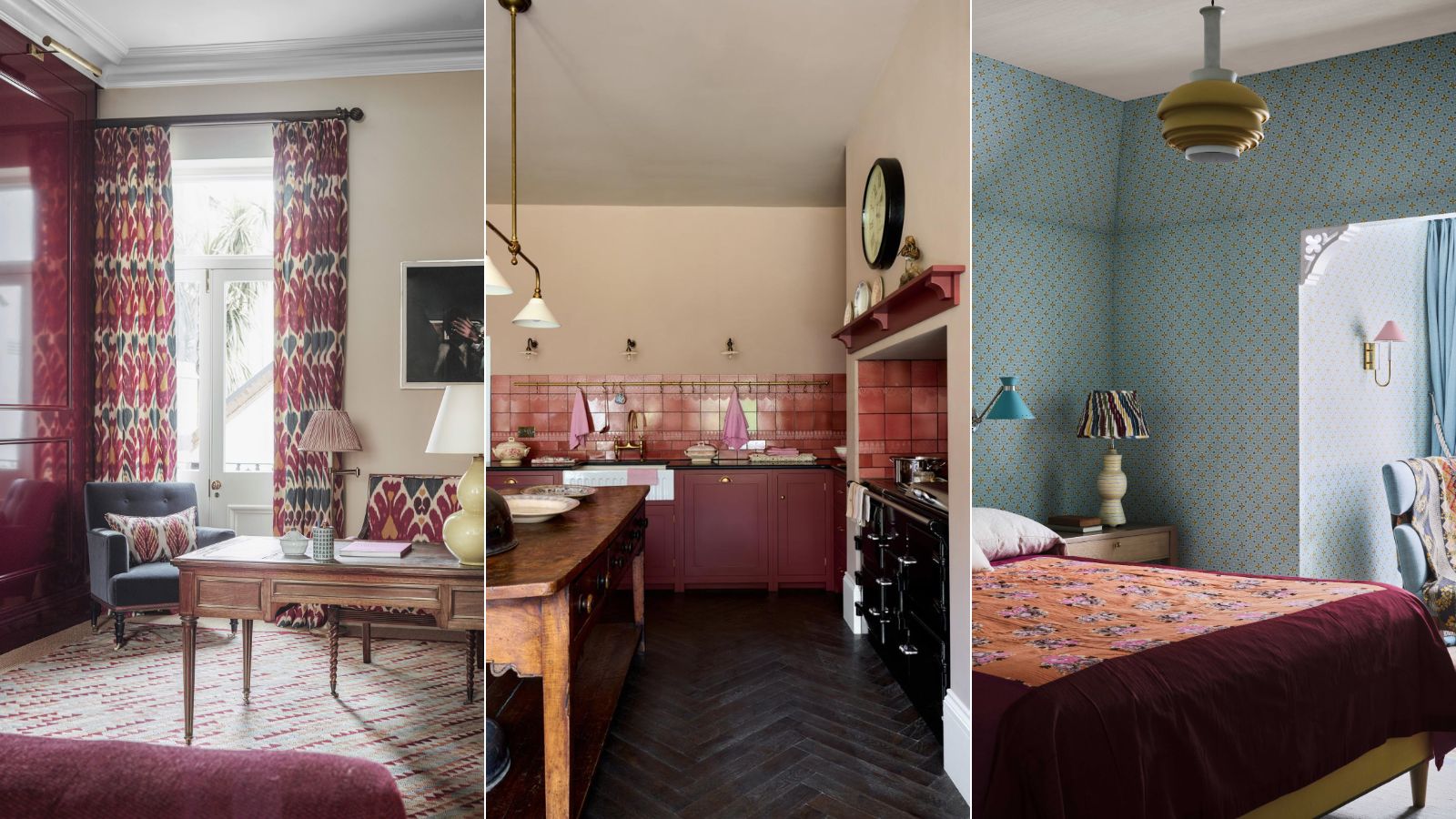
- 1. Make a room feel more luxurious with burgundy
- 2. Use burgundy for the chicest kitchen cabinet color
- 3. Use burgundy as an accent shade
- 4. Create a sumptuous cocooning space with layers of jewel tones
- 5. Bring burgundy to a neutral scheme
- 6. Add instant warmth to a cooler scheme
- 7. Pair burgundy with pink for a playful look

Red is an interesting color in the world of interior design. Whereas in fashion it's a timeless classic, always on trend in some way or another (Strawberry Girl Summer, etc, etc,), in interiors, red is a tricky shade to work with. In its most primary form especially it can overwhelm a space, be too bold and too brave to actually be livable.
However, in its deeper, richer, softer forms, red can be such a gorgeous color to bring into a home. And we are not talking just accent colors either, but in large swathes that make a room feel incredibly sophisticated, but also cozy and homey. Burgundy is the way to use red in interiors.
Unlike brighter reds, this darker, sumptuous shade doesn't have the connotations of being overly stimulating and energetic. Instead, it creates rooms that are in equal parts chic and comforting. But how can you bring this color trend into your home? We spoke with interior designers on the best ways to decorate with burgundy.
What color is burgundy?
'Various tints and shades of red have been trending this year. First, primary red (red in its purest form) hit the Paris runways and soon found its way into interiors, with decorators embracing the inherent playfulness and burst of energy it brought into their homes.' explains Matilda Martin, Lick's Trend Specialist
'This primary red was then toned down in saturation and everything from soft terracotta’s to cherry reds and even Heinz reds stole the spotlight. Now, as we enter into winter, we are seeing the emergence of even deeper, moodier burgundy tones.
'Burgundy is a dark wine red with warm purple and grey undertones. Luxurious and full-bodied, it is the perfect color for creating comforting spaces with subtle energy and undeniable elegance.'
6 designer approved ways to decorate with burgundy
So how can be bring burgundy into a space in a way that feels timeless, chic, and liveable? There's no denying it's a brave shade, but don't let that deter you from using it, in the right space burgundy over all surfaces can look so incredible. And if you are looking to make a room look more luxurious, bringing it in as an accent shade will instantly elevate the space.
1. Make a room feel more luxurious with burgundy
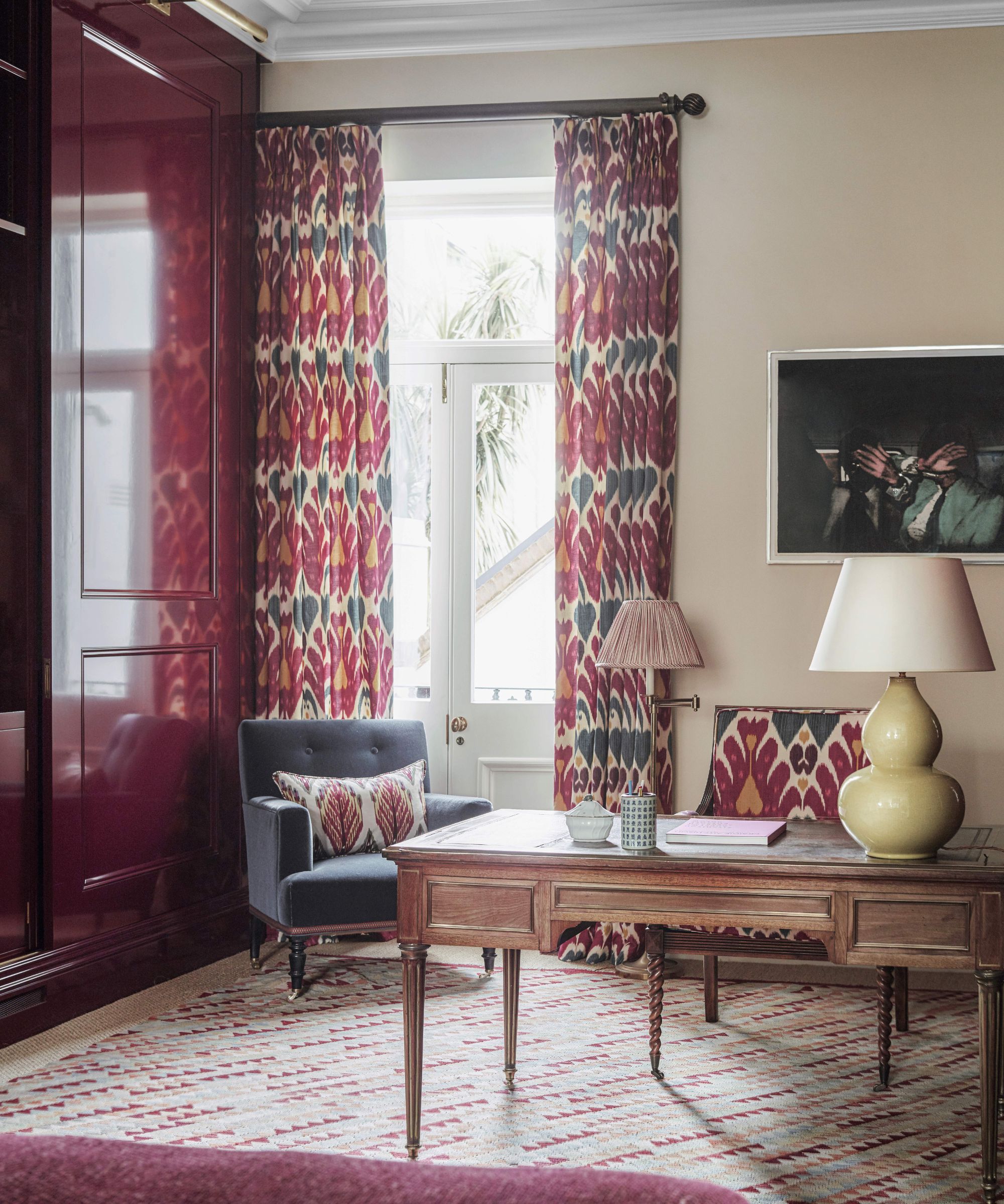
Want to make a look more elegant and expensive? Burgundy has that sophisticated feel, it's bold but quietly so, and it's a color that instantly makes a room feel more characterful and elevated.
'Incorporating the rich, bold hue of burgundy into your interior design scheme can add a sense of sophistication and depth. This dark color, with its undercurrents of warmth and luxury, can add interest and dimension, transforming a room from mundane to dramatic.' explains designer Kati Curtis.
'Burgundy, like many dark paint colors, has the unique ability to create a sense of depth, making spaces seem larger and more intriguing. Its versatility allows it to be paired with various color palettes, from neutrals to more vibrant hues, offering endless possibilities for a captivating interior design. I love it so much that I used it for our new office entryway for a warm, yet dramatic effect.
Kati Curtis is the founder of Kati Curtis Design, an design firm based in New York City specializing in classic design with a global influence. Kati founded the studio in 2005 after 12 years of working with international architecture and engineering firms.
2. Use burgundy for the chicest kitchen cabinet color
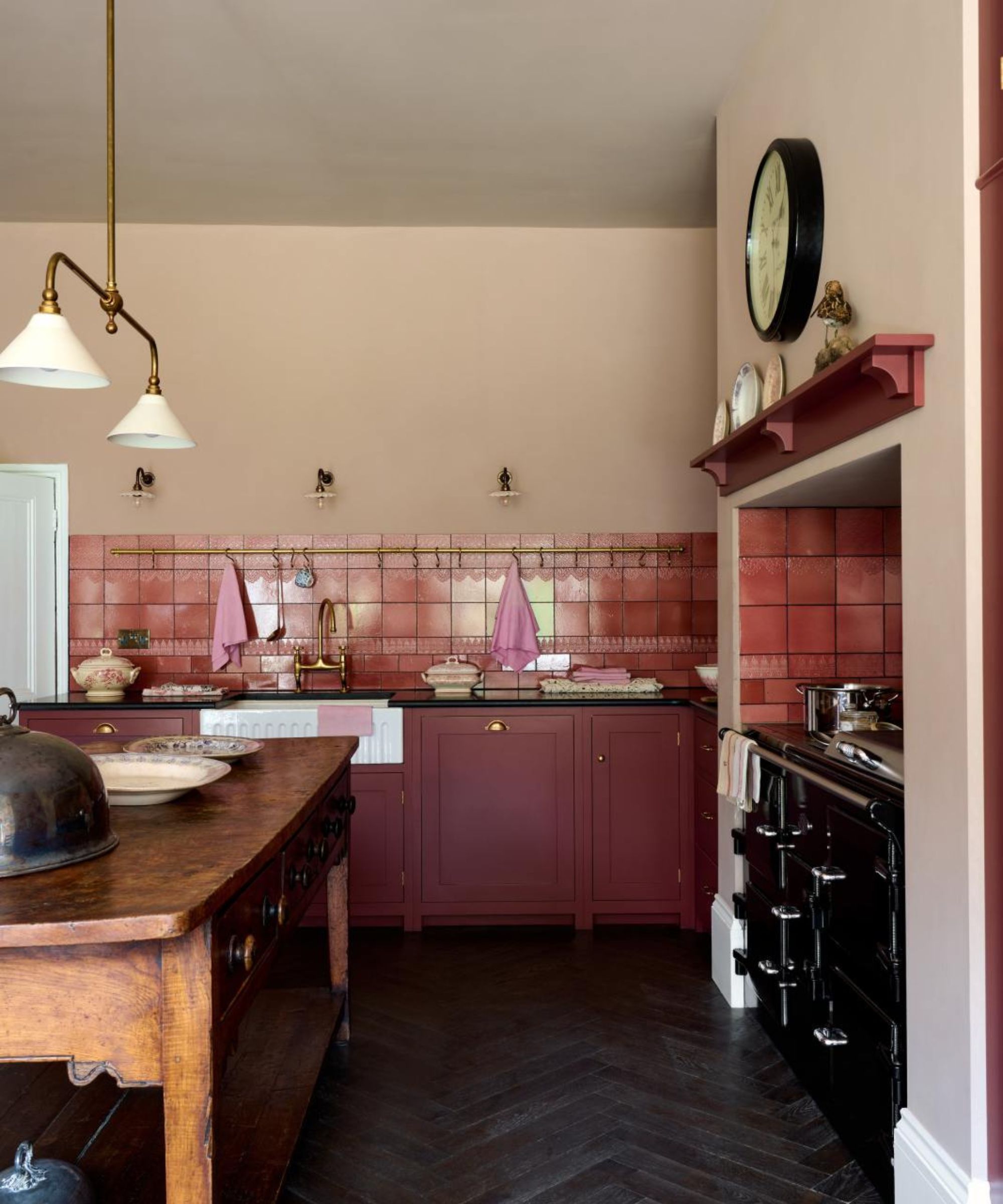
Kitchen colors have been going through a slow but steady change over the last few years. In fact, kitchen trends in general have been moving away from the once classic shades of white, grey, and blue and towards warmer earthy tones. Burgundy is such a gorgeous shade for kitchen cabinets, adding a ton of character to this usually pretty practical space.
'Burgundy is a surprisingly versatile color as it pairs well with a wide variety of hues. I love it with blush (or millennial pink if you jumped on that bandwagon a few years back), teal, or even chartreuse for a pop. I'm about to use it in a gorgeous butler's pantry on kitchen cabinetry and it promises to be a showstopper.' explains designer Bethany Adams.
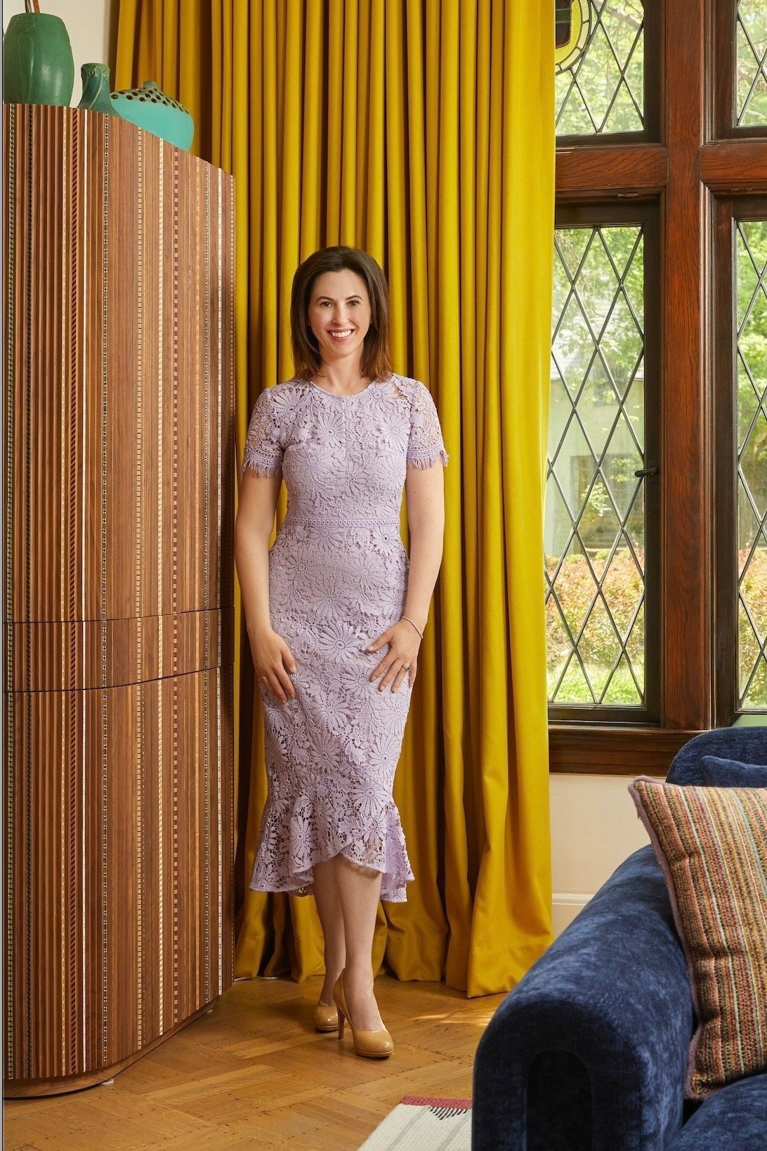
Bethany Adams is an interior designer, a member of ASID (American society of Interior Designers), AIA (American Institute of Architects), and a certified interior designer with the Kentucky Board of Architecture. Bethany holds a B.F.A.. in interior design from Harrington College of Design in addition to a B.A. she earned from Georgetown University.
3. Use burgundy as an accent shade
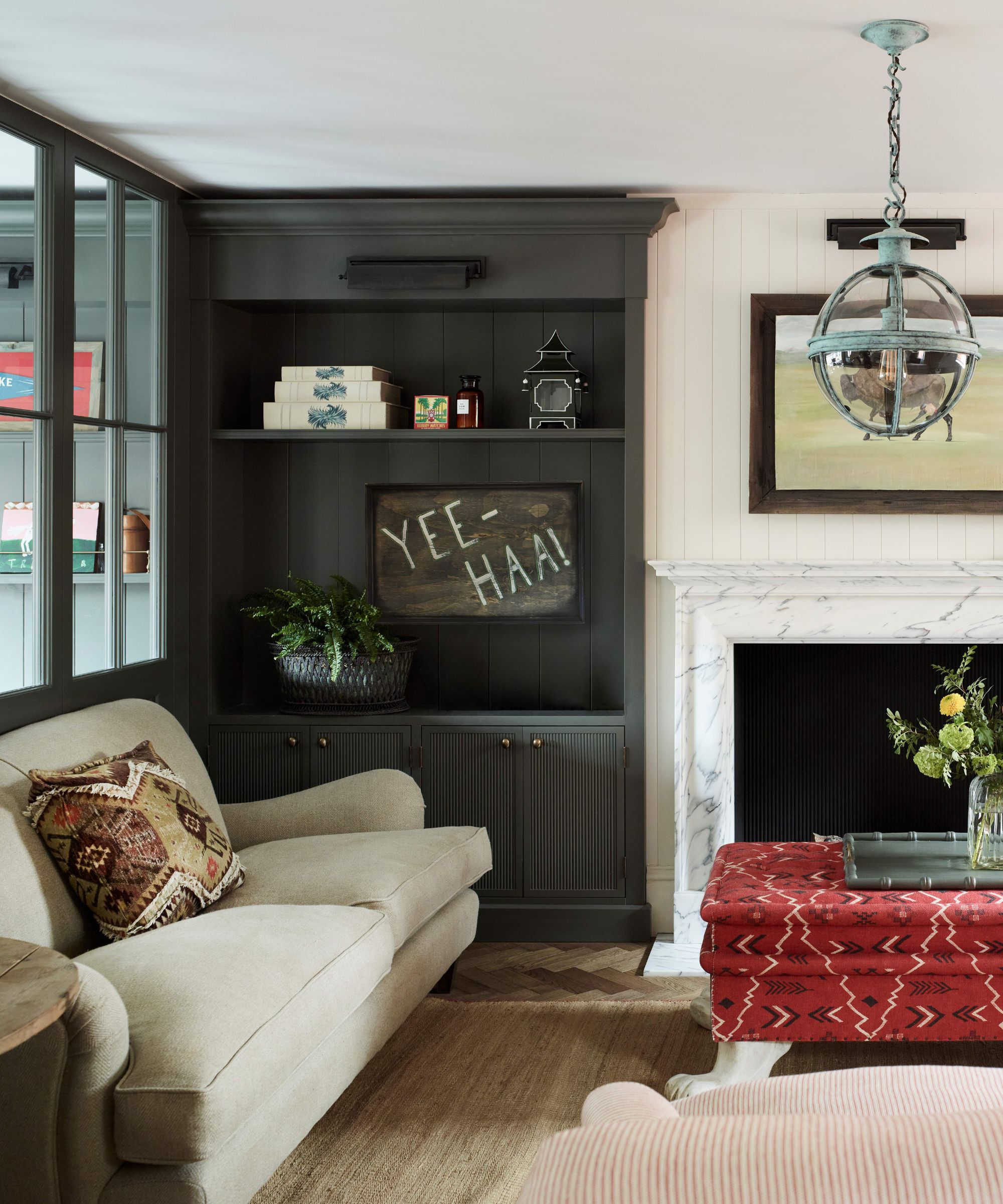
'Burgundy often evokes memories of the '90s and hospitality settings for me, but its true magic lies in its ability to infuse warmth when used as an accent rather than the main focus. As an accent, this color transforms a space, adding a touch of welcoming richness without overpowering the entire room.' explains designer Jennifer Davis.
'We incorporate burgundy through artificial floral arrangements and leaves. This is a great way to bring in color without overwhelming the space. Pairing these with patterned pillows that incorporate hints of burgundy further elevates the space, creating balance and tying the decor together.'
'Burgundy is an excellent option for all kinds of rooms and furniture and is much more versatile than you think. Decadent and cosy, its rich tones bring depth to a space and therefore suit downstairs bathrooms and darker hallways particularly well when these spaces are completely colour-drenched. However, burgundy is also a great color to introduce as accents to add a pop of drama.' agrees Matilda Martin.
'Keep the floor neutral and pair burgundy with blues, earthy beiges, warm taupe’s, and charcoal greys. When it comes to furniture, opt for warm, light oaks with golden tones.'
4. Create a sumptuous cocooning space with layers of jewel tones

'I think burgundy works nicely with jewel tones like emerald and sapphire, cream tones, or more natural woodsy tones like chocolate, cream, brass, or even light blue. It pairs well with warm metals and soft textures and adds warmth.' explains Keren Richter, co-founder of White Arrow.
'It can look great in a more rustic or New Mexico-styled environment or equally suited in a refined cosmopolitan townhouse. It’s all about the color mix and whether you want to use the color as an accent or in a grander statement.'
The dark green color drenched walls, deep blue, and burgundy create such a cozy living room, that, despite the bolder color scheme, feels far from overwhelming, in fact, it's comforting and calming. So yes, don't shy away from mixing burgundy with its fellow jewel tones, the result can be so beautiful. Note how despite being a darker scheme it works really well in this small living room too.
5. Bring burgundy to a neutral scheme
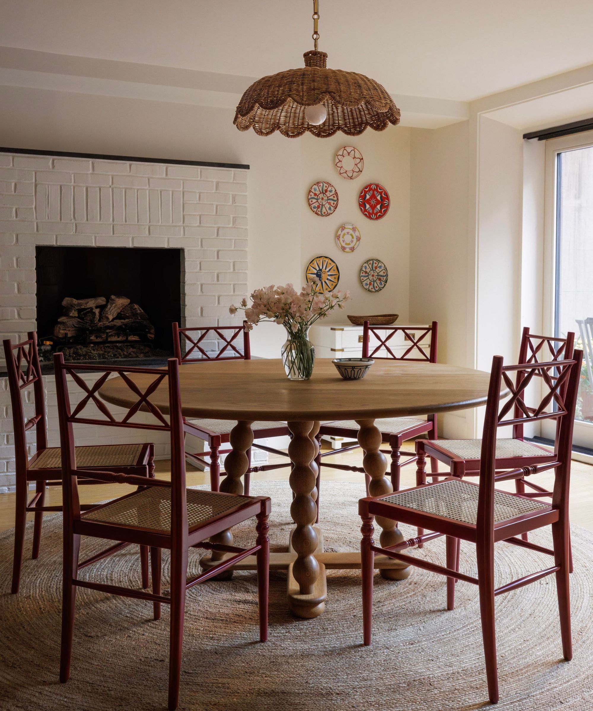
If you are decorating with neutrals, it always works best if you bring in a darker shade to ground those pale hues. Normally we would suggest a soft brown or really dark beige, but burgundy would make a far more characterful, unexpected alternative. It pairs really well with warmer neutrals, adding in some contrast
'Burgundy is such a rich, luxurious color that always adds a little bit of moodiness and intrigue to a space. Since it's darker, I recommend using it in ways that make a subtle statement - throw pillows, wall art, trays, and vases - rather than going big with a full living room set upholstered in burgundy. It's truly a shade that demonstrates the less is more theory. I also love pairing burgundy with super-luxe textural materials, like velvet, leather, and cashmere.' explains designer Kathy Kuo.
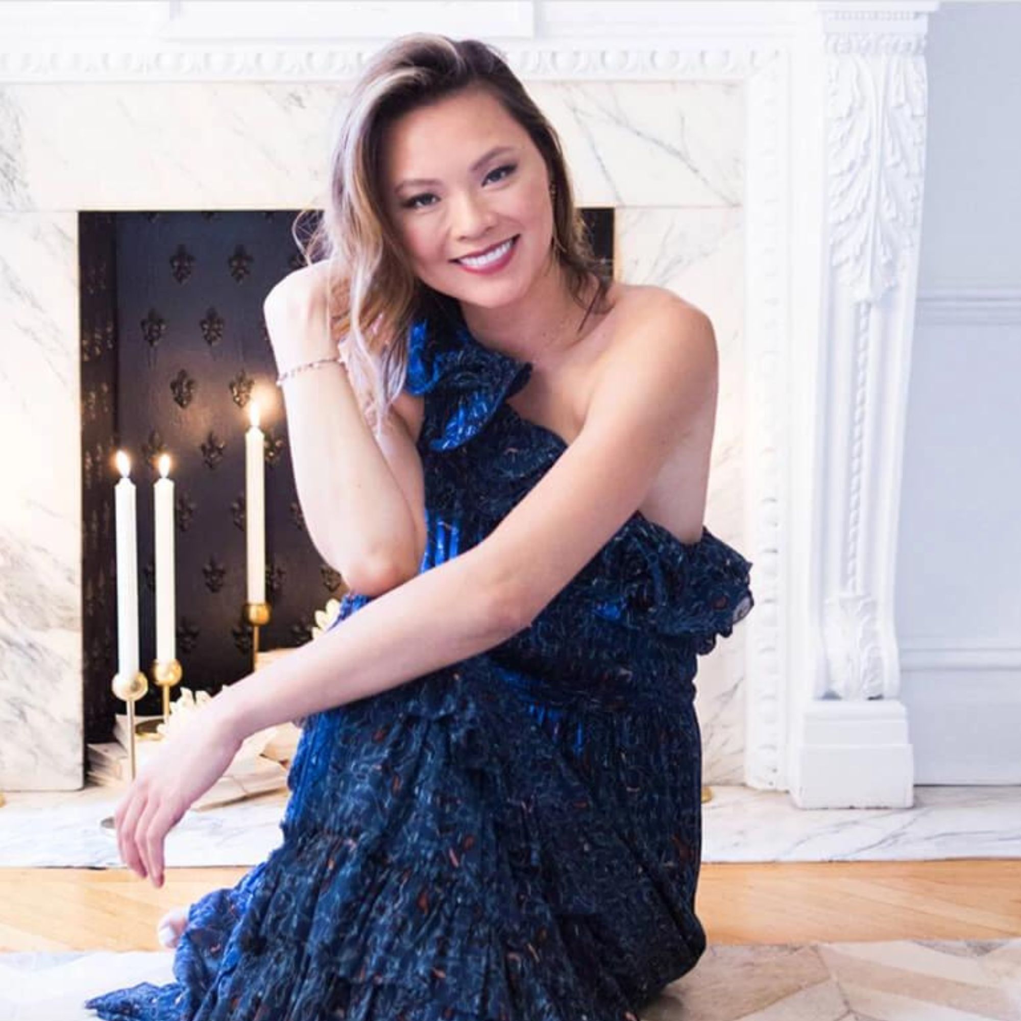
Kathy Kuo is a celebrated interior designer and international guru within the home and lifestyle space. She has 20+ years of experience in the design industry.
6. Add instant warmth to a cooler scheme
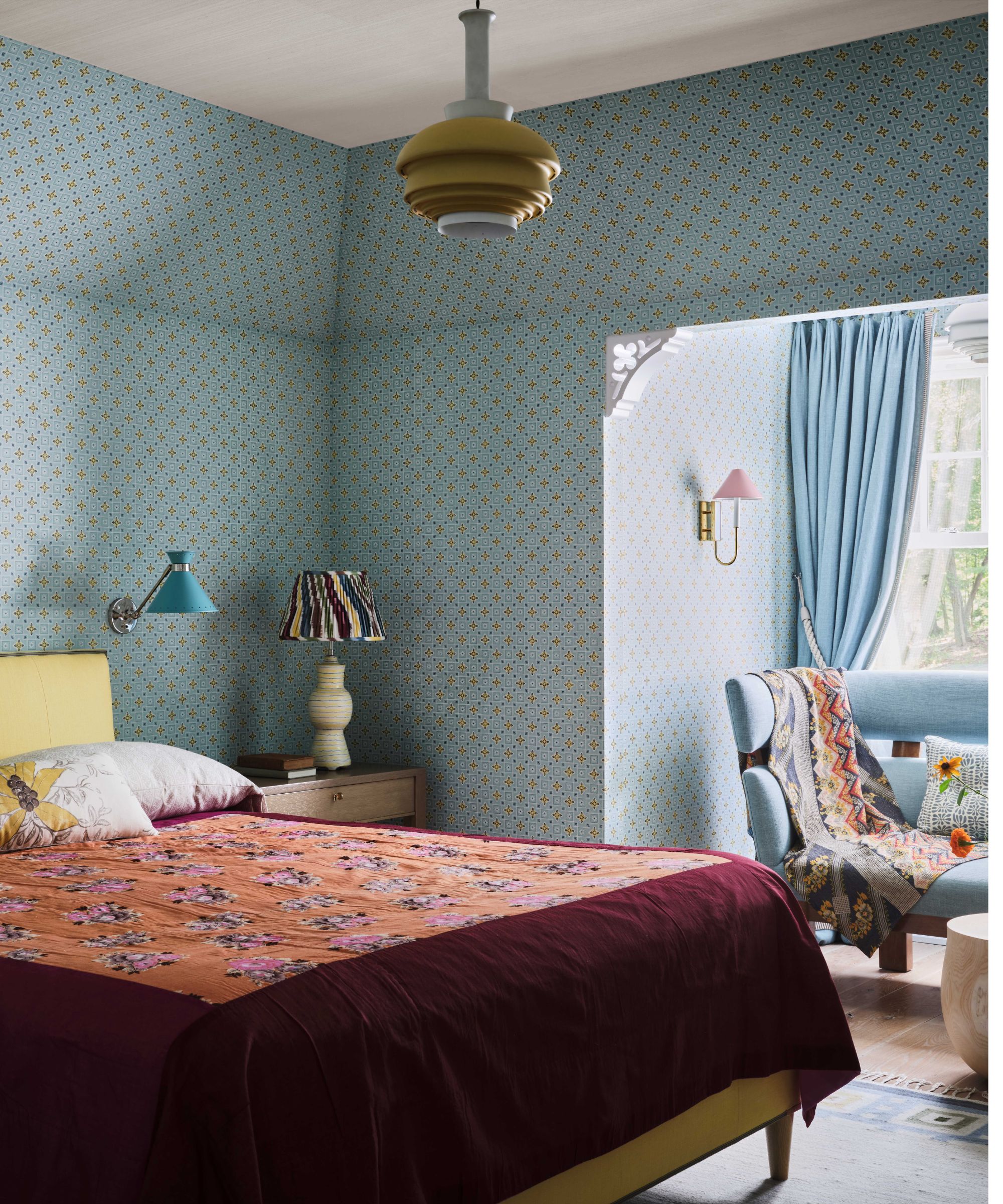
'You can achieve a lot by introducing just a hint of burgundy into a room - it’s a great accent color because it provides a great deal of depth and warmth in small doses. I like to bring burgundy into a room when I’m layering in textures and colors for some vibrancy and weight, or I incorporate burgundy into a cool-toned room to balance a space with richness and warmth.' explains Jessica Jubelirer.
This bedroom is the perfect example. You can mix warm and cool tones with wonderful results - the blue walls keep the room feeling really fresh and bright, but the burgundy grounds those frostier tones and adds an instant warmth and depth.
7. Pair burgundy with pink for a playful look
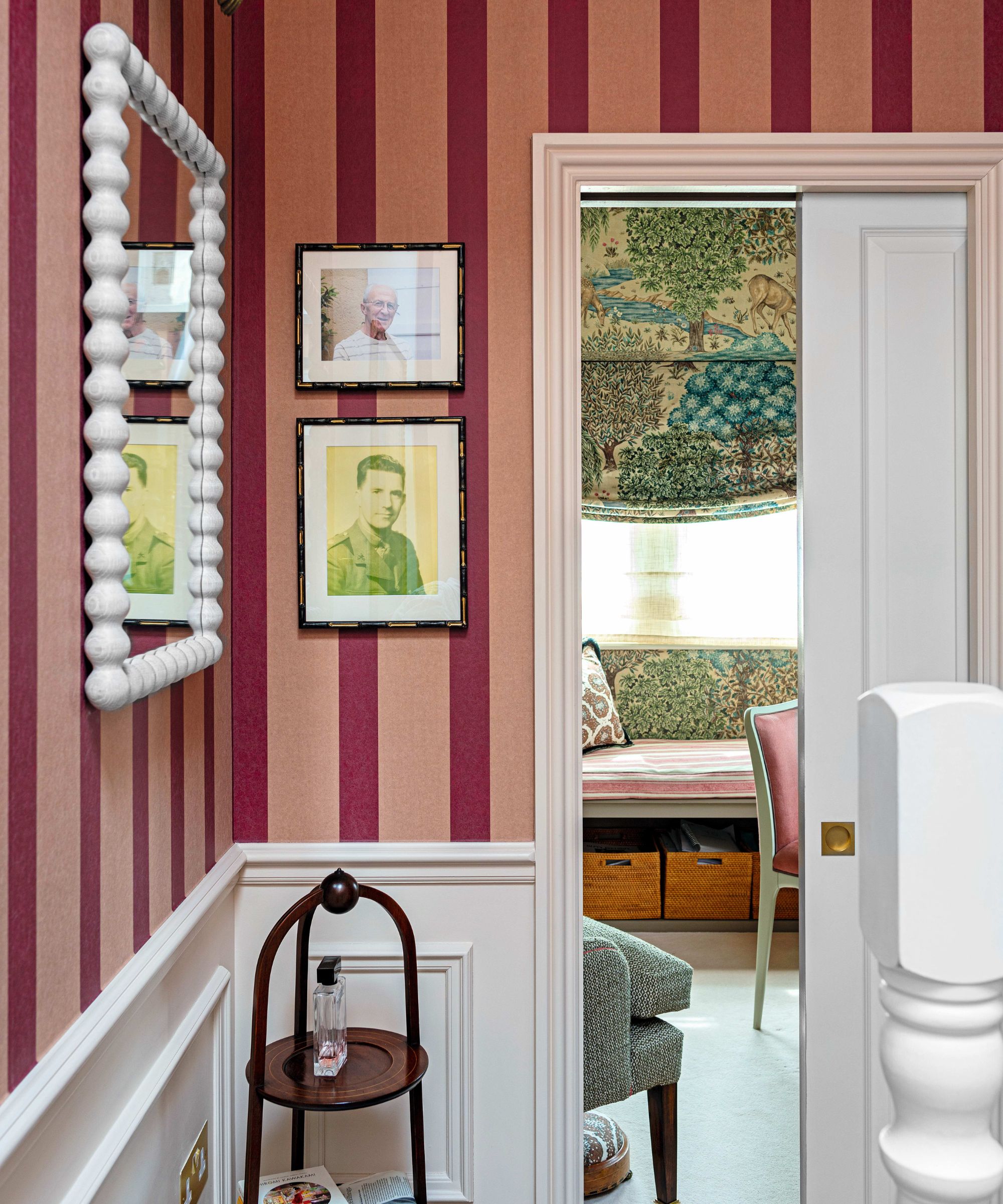
Pink and burgundy is such a playful and yet elegant color combination. Adding in this deeper, richer, more grown-up shade makes any pink feel less saccharine. But the pink also tones down the drama of the burgundy.
'You can instill a warm and inviting space with a burgundy. This distinguished, deep red with violet undertones adds the perfect balance of drama and opulence that creates a luxurious feel within your home, injecting instant character.' explains Helen Shaw, Director of Marketing, Benjamin Moore.
'Pair this rich hue with staple vintage style pieces such as traditional gold brassware to create a classic and a timeless look. Using burgundy with lighter pink shades works particularly well as it adds a sense of warmth to these more everyday shades.'
Decorating with burgundy is a simple way to bring depth and character into your home. It's a surprisingly versatile shade that's easier to pair with plenty of other shades. Depending on the look you want to create it works wonderfully as an all-over color in any sized room, but for those who are after a more subtle approach, it can layer with neutrals to create a lovely warm, earthy palette.
Sign up to the Homes & Gardens newsletter
Design expertise in your inbox – from inspiring decorating ideas and beautiful celebrity homes to practical gardening advice and shopping round-ups.

I am the Head of Interiors at Homes & Gardens. I started off in the world of journalism in fashion and luxury travel and then landed my first interiors role at Real Homes and have been in the world of interior design ever since. Prior to my role at H&G I was the digital editor at Livingetc, from which I took a sabbatical to travel in my self-converted van (not as glamorous as decorating a home, but very satisfying). A year later, and with lots of technical DIY lessons learned I am back to writing and editing, sometimes even from the comfort of my home on wheels.
-
 7 tiny chores that instantly make your home look more put together without buying anything – including shopping your stash and quick decluttering
Simple organization can make a real impact, experts assure
By Ottilie Blackhall
-
 Want to make your home look more charming? These 4 Benjamin Moore exterior shades will up your curb appeal
If you're on the prowl for a new shade to try for the outside of your home, Benjamin Moore has unveiled its most 'charming' colors
By Sophia Pouget de St Victor