Explore an interior designer's chic yet cozy beach cottage that's a lesson in sustainable design
Taking a sustainable approach to a redesign is where things can get really creative – the designer of this New Jersey weekend home explains how
We all love to see inside other people's beautiful homes and in the world of design, there's only one thing more intriguing than a designer's own home, and that's a designer's own holiday home.
This beach cottage-style getaway in Manasquan, NJ, is the weekend retreat and holiday home of Manhattan-based interior designer Laura Krey, her husband and their young son. Laura took it on knowing that the cottage had been practically rebuilt from its 1950s foundations in 2014, and says she couldn't justify ripping everything out when it all still looked relatively new. So how did she get this special family home looking so good?
Take the tour, as Laura explains how creative thinking and some serious compromises, from every member of the family, were key to a sustainable redesign, and to the home's warm and inviting vibes.
Manhattan-based interior designer Laura had hoped that her long search for a family weekend home on the Jersey Shore would lead her to a major project.
But here's the first compromise: 'As much as I treated my husband as a design client, I couldn’t sell him on any property that required a complete gut renovation, so we compromised when we found our home' says Laura. 'It was built in 2014 and was therefore still relatively new,' says Laura. 'As a proponent of sustainable design, I couldn’t justify ripping everything out, so I had to make what I did touch, count!'
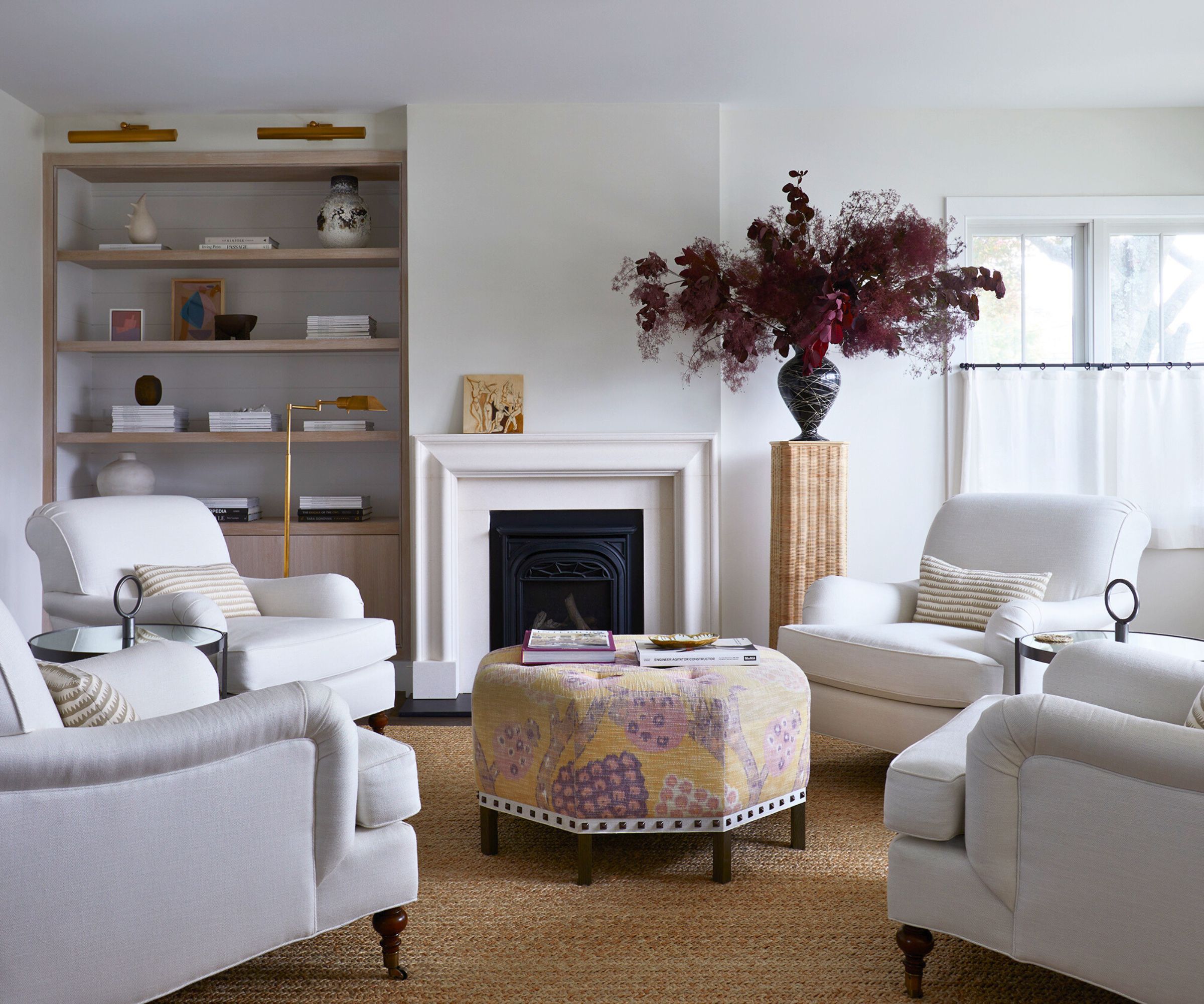
With that in mind, Laura's redesigned living room had to work with the space and layout she inherited, but since it lacked existing characterful features she decided to layer some in, starting with a fireplace update. 'I completely redid the fireplace, with a surround from Chesneys, and adding the custom millwork library,' says Laura. 'Our evenings are spent with a bevy of feet up on the custom ottoman covered in an Annabel Warp print fabric by Schumacher. Armchairs are from O’Henry House via John Rosselli.'
The room now has a warm, cozy vibe and is the perfect space to transition into fall and the cooler weather. 'This is a room that we spend a ton of time in, any season,' says Laura. 'The café curtain window treatments have been a great addition. They provide ground-level privacy, but we still enjoy the light. Every room needs a pedestal too! This one from Atelier Vime really completes the space.'
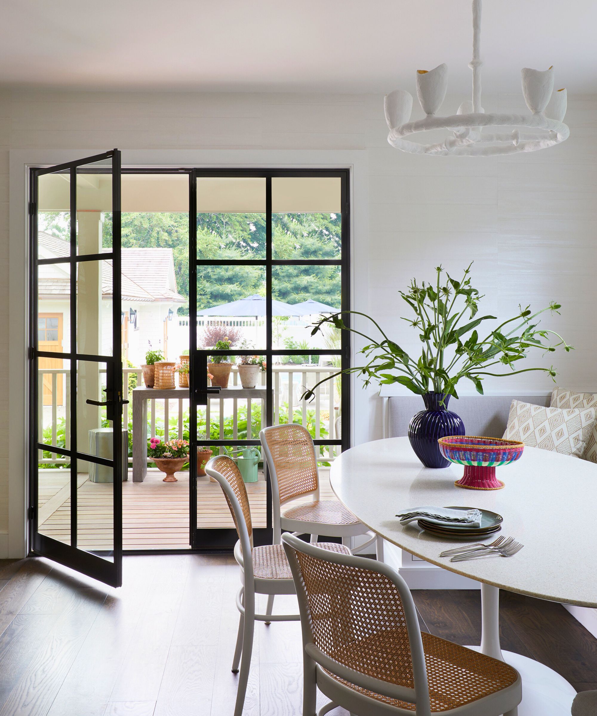
Laura's dining room ideas had to work in the context that this is an open plan dining, family room, and kitchen. Her starting point to give the space a much-needed refresh without gutting the space was to replace the existing sliding doors onto the garden.
That was an easy switch to justify since the old doors were broken and no longer fully serviceable. 'I installed my favorite, now trendy, but always timeless, steel doors from Atelier Domingue,' says the designer. 'This was a tricky room to design as it’s very rectilinear and needs to function for both our main dining and relaxing when we’re entertaining more than just us. A custom banquette, plaster chandelier, and terrazzo oval table allow for a large number of people to dine at the table. I worked with artisan Robert Sukrachand on the terrazzo table top. It’s made out of one entire piece of terrazzo and needed four people to install it!'
It was well worth the effort and the warm tones of the cane-backed dining chairs help to add another layer of texture to the space.

Laura Krey Design is Manhattan-based boutique interior design firm that specializes in creating residential spaces that feel like livable art. As this is the creative director’s personal weekend home, LKD was able to put into practice something they do for clients, sourcing highly specialized, artisan-made and often custom objects, furnishings and built-ins to create a unique, site-specific interior.
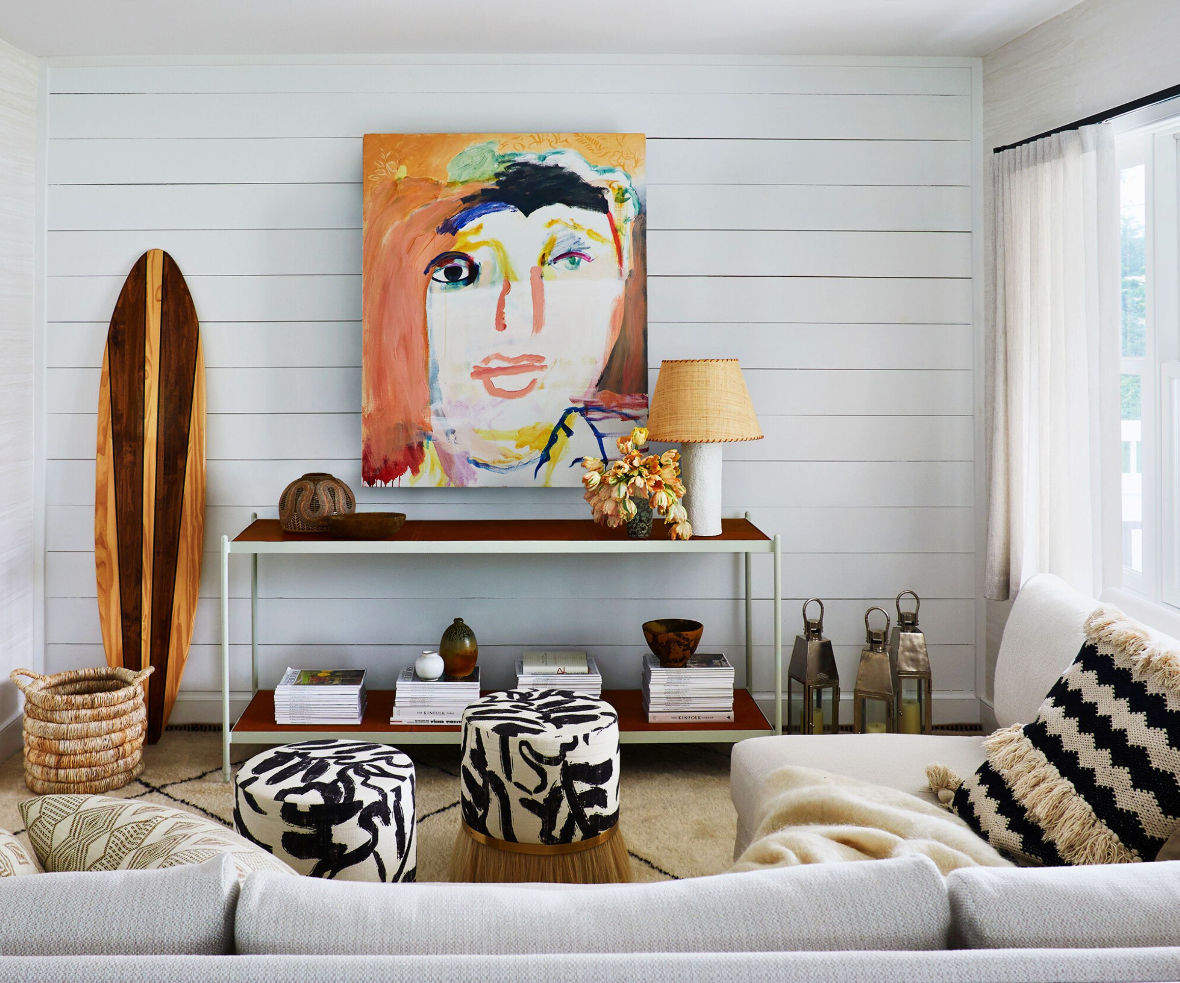
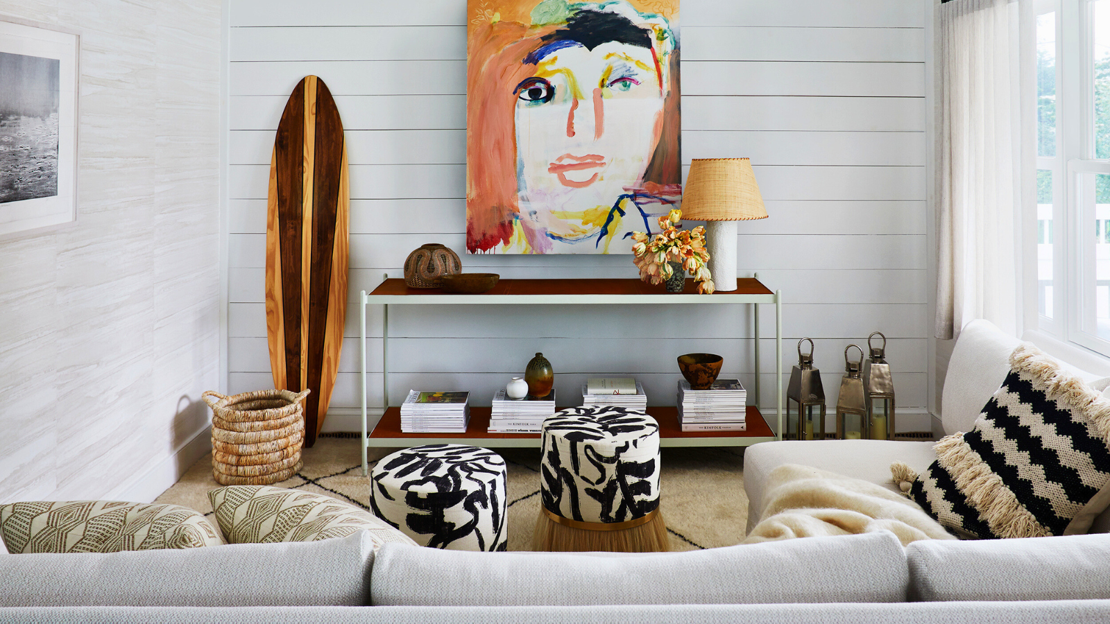
At the opposite side of the open plan family room is a relaxed sitting area.
'We use the house year-round, so I didn’t want it to scream beach house, but instead to have these fun, subtle nods to the marine world and coastal living,' says Laura. She decided to keep the existing shiplap, which fits the beach cottage aesthetic, but chose to refresh it with a soft gray-white paint. Warm, earthy shades and graphic contrasts are introduced with the wooden surfboard, patterned stools and the striking artwork by artist Margot Bergman. 'I’m an art historian prior to my design education and art always figures prominently in my designs,' says Laura. 'I particularly love art that challenges the aesthetic notion of what beauty is.'
The custom sectional, ottoman and stools are from Konekt Studio with fabric from Zak and Fox. The console table is from Casa Midy. Laura added Maya Romanoff wallpaper on the other walls.
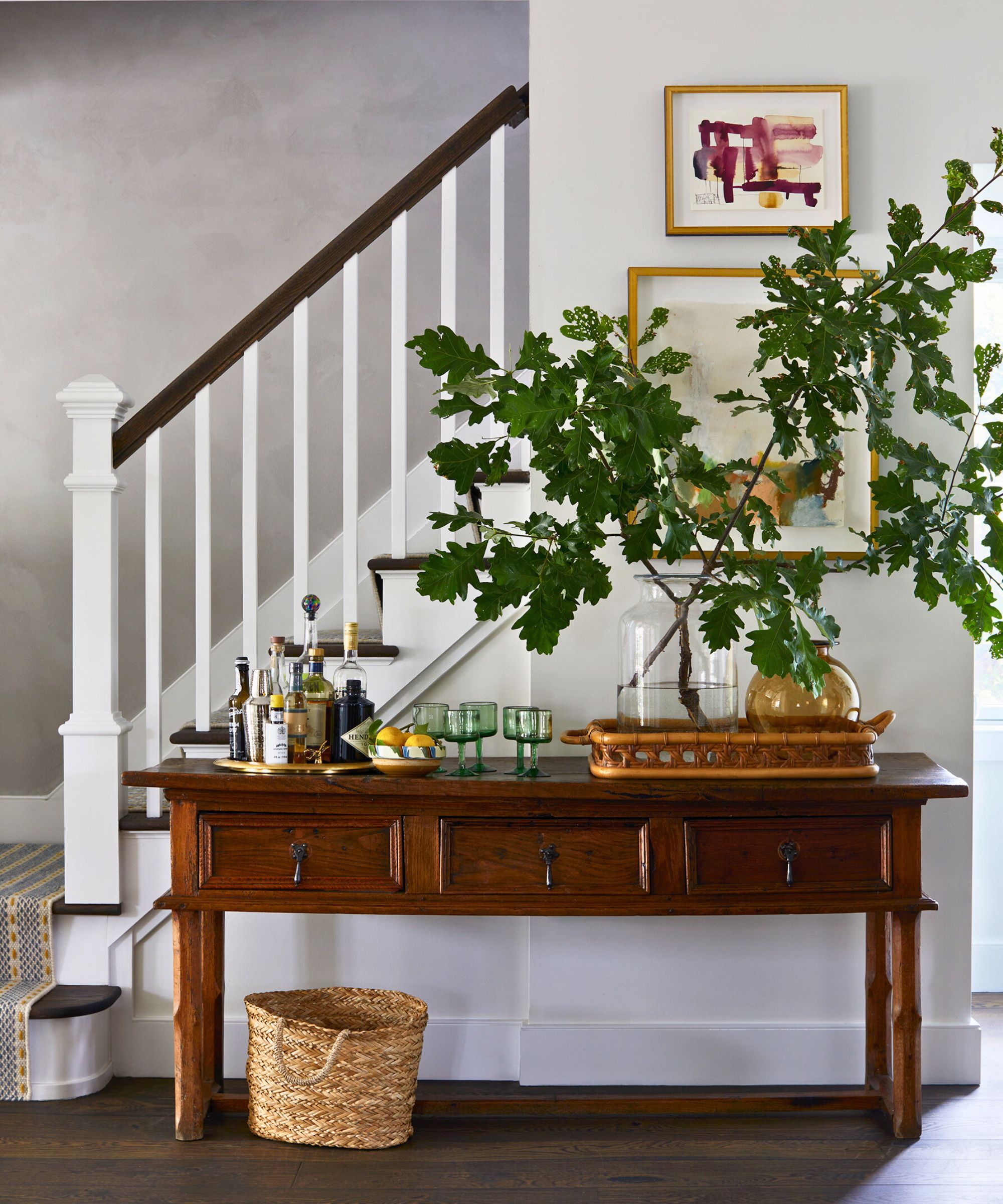
While designer Laura couldn't do anything about the footprint of the house on its long, narrow plot, she did come up with ways to work around it, and to lean into it. 'The house is feels a bit like a brownstone to me in that it goes back a long way compared with the width,' she says. 'This allows for a lot of little design moments as you progress through the rectilinear layout. For instance, I created a home bar and buffet area on this 15th-century antique Spanish table in the hallway.'
To differentiate the stairway ideas from the first floor a plaster/lime wash textured finish extends the double height of the stairwell and second floor landing.
Another great tip to update and personalize a space without making structural changes is to use artwork. Laura purchased the pieces here, by different artists, from a non-profit organization, called Pocoapoco.
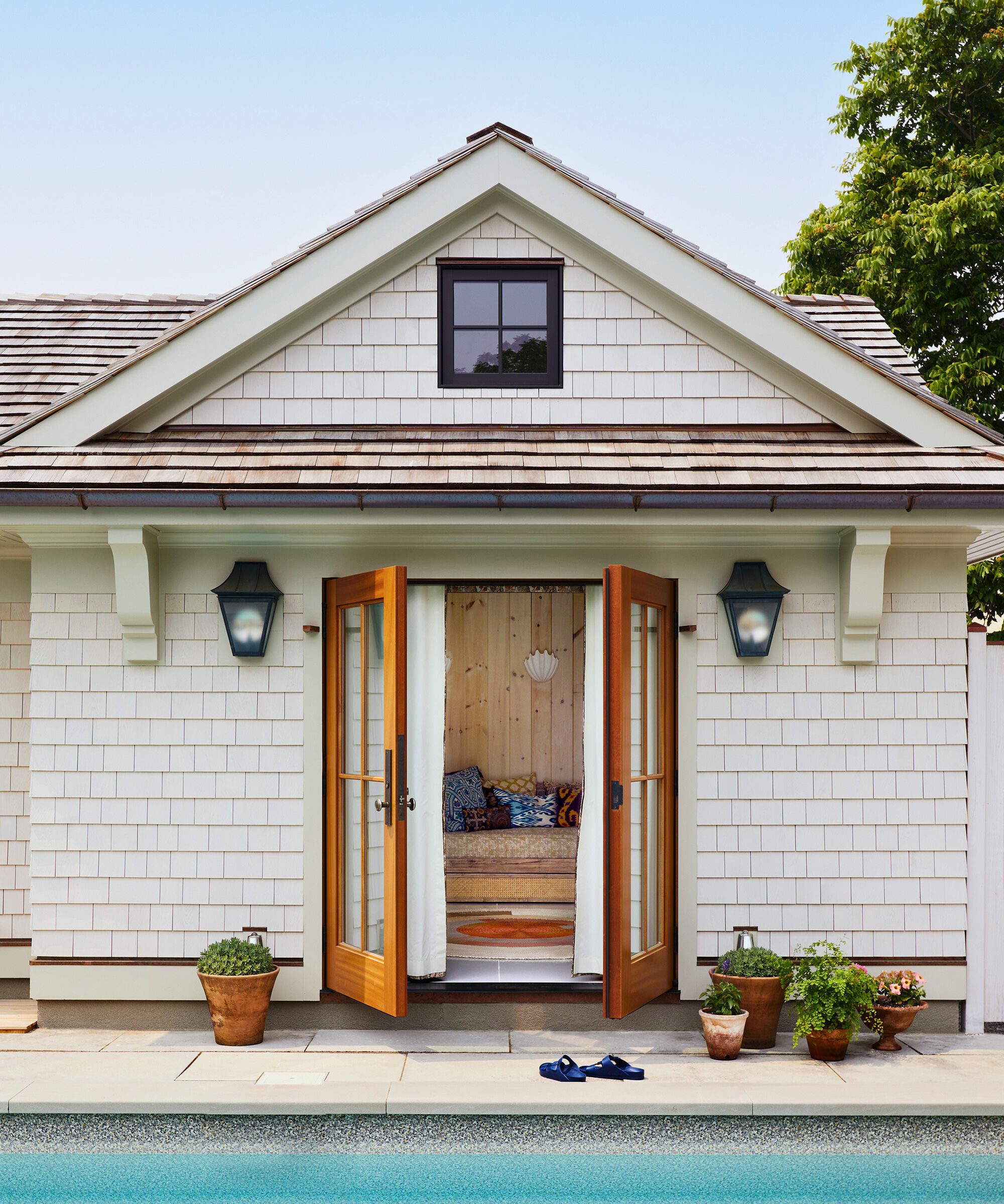
While most of the changes inside the house were decorative rather than structural, the backyard landscaping and pool house/garage received a complete overhaul, as Laura explains.
'The previous garage structure wasn’t winterized, and I ended up enlarging the footprint by an overall 9ft,' she says. 'The town’s permitting department told me I should have torn it down, but I chose to do it a harder, but slightly more environmentally friendly way. We now have a backyard with a variety of entertaining areas, plenty of seating and a big table for dining outdoors, my favorite!'
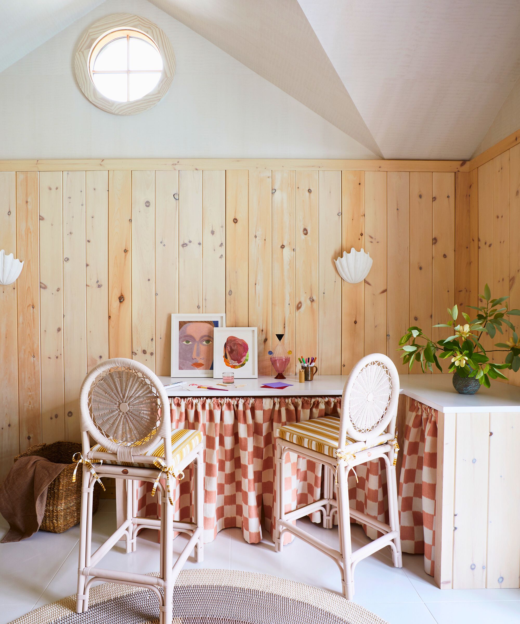
This is an area where designer Laura really has been able to create something very much of her choosing. 'Out of the renovation, we gained an outdoor shower and more utilitarian space in the garage, but also a studio,' she says. 'This space, while small, functions as pool cabana, extra guest quarters, and an art studio for projects that my son and I create. I didn’t want to design a typical pool cabana. Instead, I wanted with something both whimsical yet also refined.'
To achieve exactly that look, Laura clad the walls in whitewashed pine, with plaster sconces from Rose Uniacke. The subtle shine on the ceiling comes from Callidus Guild’s wallpaper, and the stools and fabric are from Soane. The rug is custom by Shore and the floor tiles are Concrete Collaborative. The counter skirt is Alice Sergeant via Temple Studio.
Besides the pool cabana and studio, the only other area of major works was on the second floor of the main home, which originally had five bedrooms and only two bathrooms, one of which was the en-suite in the primary bedroom. 'We needed more bathrooms,' says Laura. 'I had to get really creative with the design to make sure anything that might affect the structure made the most sense in terms of the overall use of the space. I created a Junior Suite by merging two small bedrooms and adding a bathroom and two walk-in closets.'
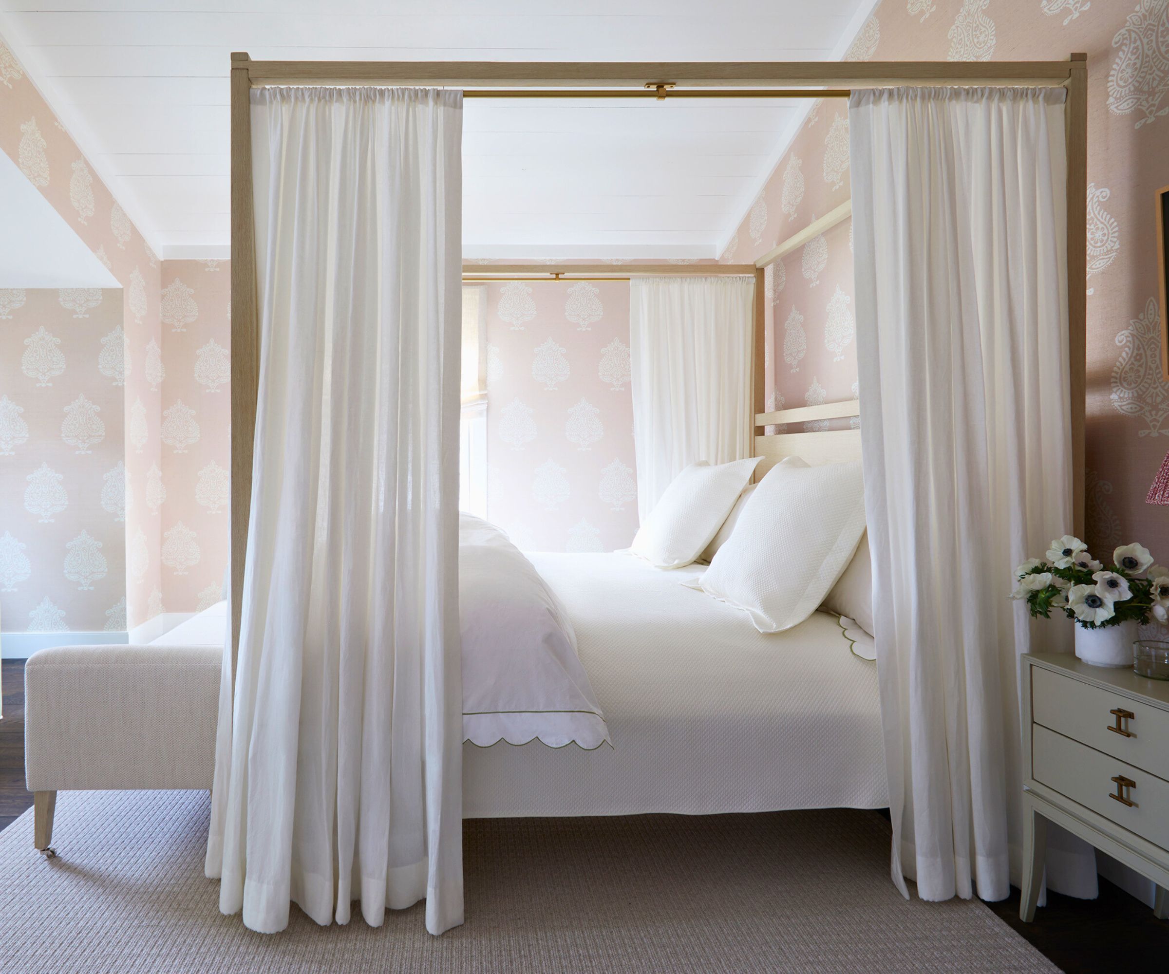
The primary bedroom ideas are 'an exercise in relaxation' adds Laura. Although the decor is simple and calm, Laura has brought an element of Manhattan sophistication to the room. The textured wallcovering also adds warmth to the scheme with its nuanced pink.
'I always wanted a canopy bed, so my drapery workroom and I customized a running line Michael Dawkins bed. The wallpaper and sconces are some of my favorite elements in this space.'
The wallpaper is an Aux Abris grasscloth via John Roselli, the sconces and shades are Soane, the nightstands are by Chelsea Textiles, and the rug is by Merida.
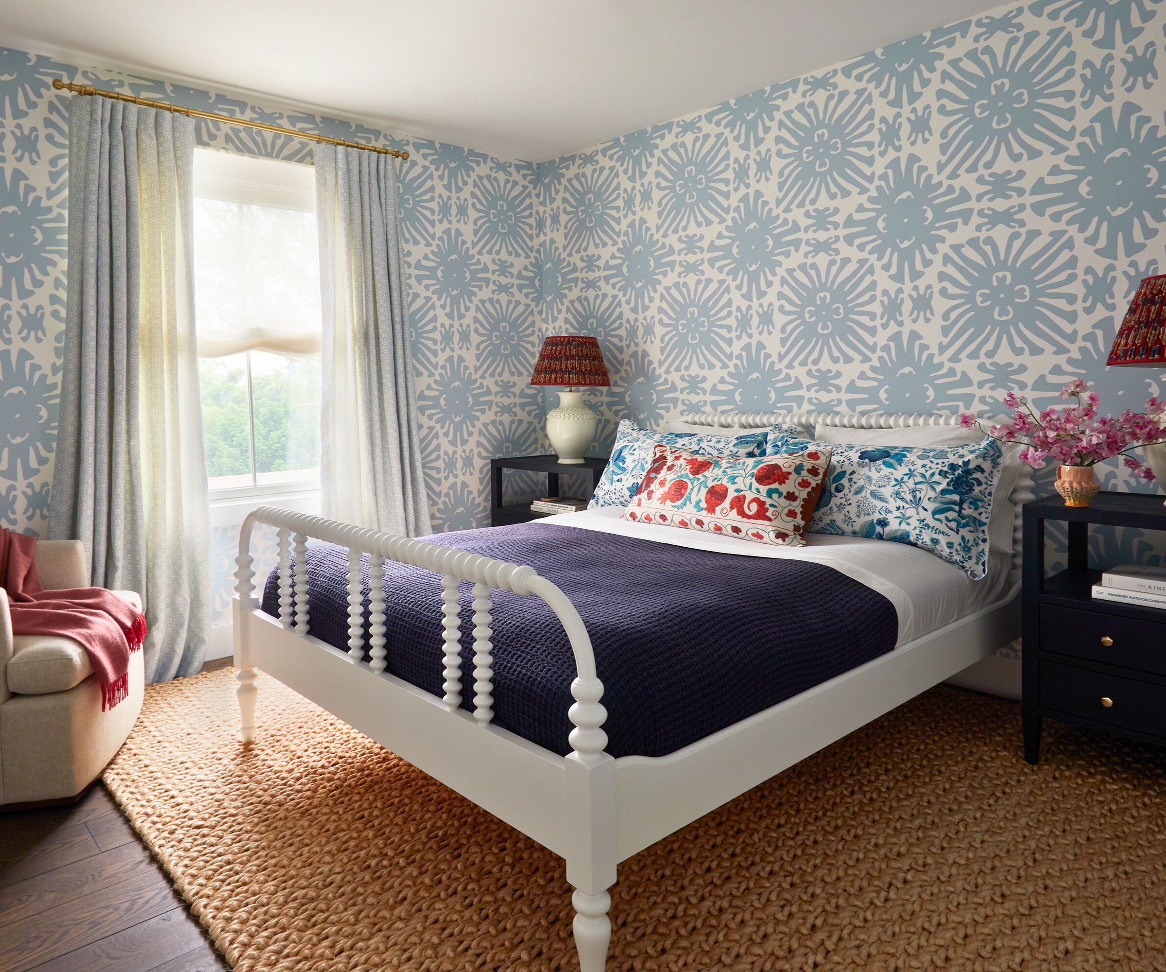
Why stick to neutral guest room ideas when you can really get imaginative with them? That's certainly designer Laura's point of view, especially since she was looking to introduce more personality into the house as a whole. A variety of blues and reds make this space extra welcoming and warm.
'I love spoiling guests and like to have fun with guest rooms,' says Laura, who chose Quadrille wallpaper and Elizabeth Eakins drapery.
The rug and bed are from Serena & Lily. The nightstands are from Made Goods, with Vaughan lamps and tribal shades. The bedding is by Matouk with a John Robshaw vintage sari pillow, which really adds to the curated look.
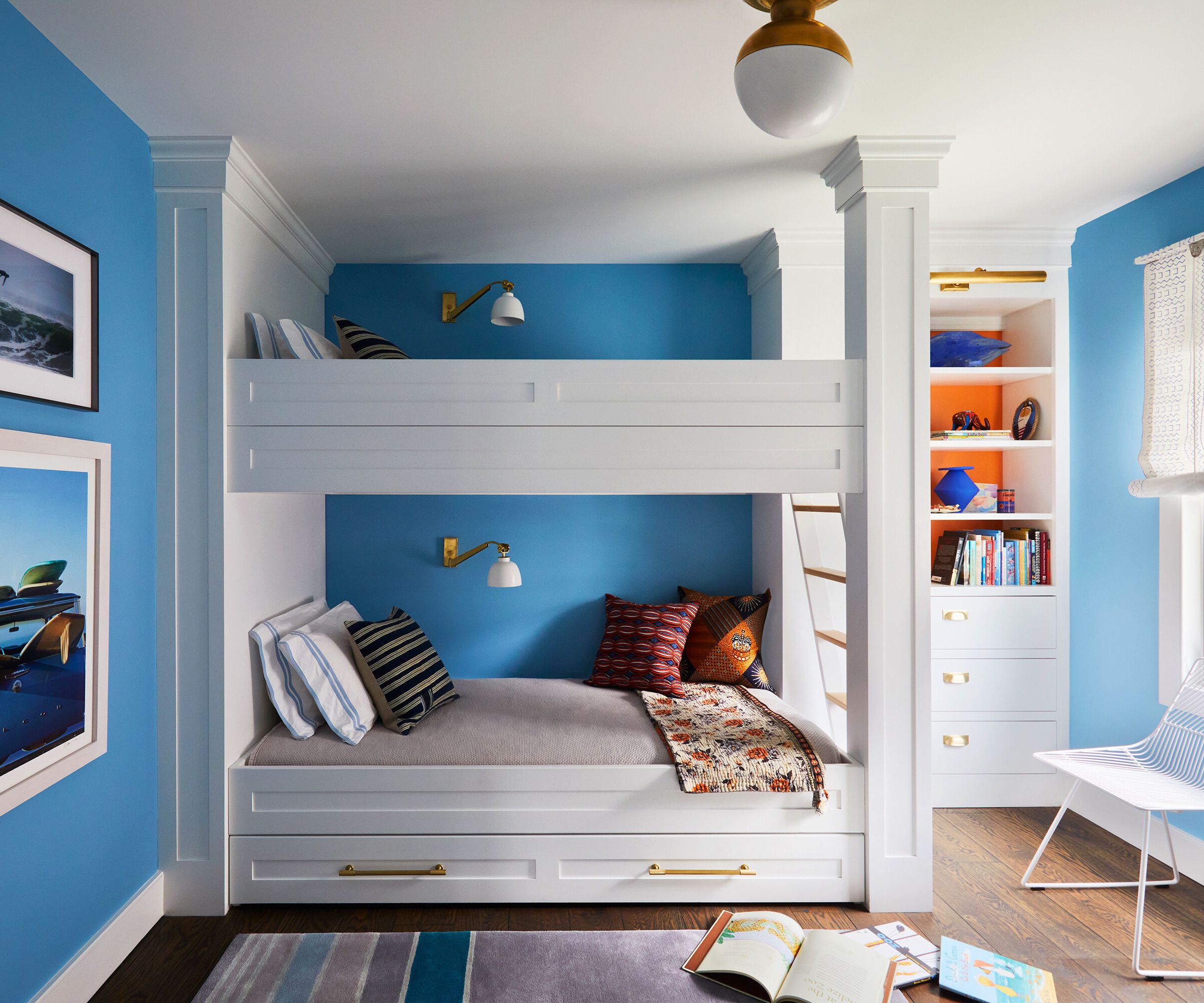
When Laura is designing homes, she likes everyone – kids and dogs included – to get on board. 'I like to give clients’ children some design agency in their kids rooms, mine included,' she says. 'My 13-year-old son's request was for Mets’ colors. I couldn’t bring myself to incorporate the exact Mets blue, but there’s a pop of orange in the custom bookshelves!'
Now that's a noble and stylish compromise if ever there was one.
Interior design: Laura Krey Design
Photographs: Manuel Rodriguez
Styling: Benjamin Reynaert
Sign up to the Homes & Gardens newsletter
Design expertise in your inbox – from inspiring decorating ideas and beautiful celebrity homes to practical gardening advice and shopping round-ups.
Karen sources beautiful homes to feature on the Homes & Gardens website. She loves visiting historic houses in particular and working with photographers to capture all shapes and sizes of properties. Karen began her career as a sub-editor at Hi-Fi News and Record Review magazine. Her move to women’s magazines came soon after, in the shape of Living magazine, which covered cookery, fashion, beauty, homes and gardening. From Living Karen moved to Ideal Home magazine, where as deputy chief sub, then chief sub, she started to really take an interest in properties, architecture, interior design and gardening.
-
 Can you paint a metal roof? Experts warn this could make or break your ‘worthy’ DIY efforts
Done right, it'll improve energy efficiency and avoid corrosion
-
 Summer House's Lindsay Hubbard has a scent-scaping tip that will impress your impromptu guests – it will change how you host in 2025
The reality TV star and new mom has teamed up with AirWick, and has shared that she loves to use different scents in different areas of the home