Designer Corey Damen Jenkins on how to create joyous interiors – 5 ways to be more daring with design
Magnetism, joie de vivre, and an enticing twist on classic design ooze from every interior Corey Damen Jenkins creates, imbuing his uplifting energy in decorative form
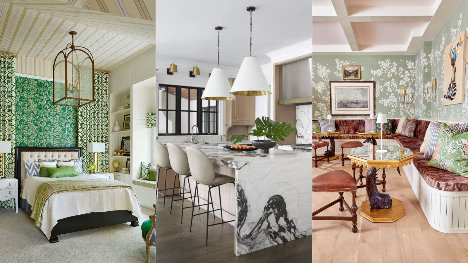

Corey Damen Jenkins & Associates are never one to do anything by half-measures. The New York-based rising star is a mold-breaker who creates joyous interiors.
His career as an interior designer began in 2008 just as a major worldwide recession kicked in but, then as now, he was not deterred. As soon as the images of his first client project were published, it was a matter of weeks before a TV producer was in touch, offering him the chance to appear on a design show.
Corey Damen Jenkins's warm and engaging personality made him a TV natural and he went on to win the HGTV competition series Showhouse Showdown and he continues to appear on TV as a design expert. Awards now fill his trophy cabinet and he is frequently called on to speak to the design industry as well as the general public.
A pandemic could have caused real problems for Corey, whose career is on a steep upward trajectory, but he seems to have taken it all in his stride. In 2021 he published his first book, Design Remix: A New Spin on Traditional Rooms (Rizzoli), launched a video series, Corey Damen Jenkins Teaches Interior Design on MasterClass, and has moved his office permanently to New York where he’s focusing on building a new team and adding to his loyal client – and fan – base.
How to decorate with color, pattern and scale
Corey's aim is to create schemes that pay homage to the principles of established methodology and are neither trend-driven nor transient. Yet, as the musical ‘remix’ reference of his book title reveals, he assuredly plays his own riff on period references, turning up the volume by incorporating jolts of room color, playful pattern, and unexpected materials and using details – especially passementerie – in a bold yet harmonious way.
Corey's talent is being noticed by industry-leading experts, too. 1stDibs, the leading online marketplace for extraordinary design, has announced this year’s 1stDibs 50, the sixth iteration of the annual compendium of inspiring work by the world’s most talented interior designers and architects. One of the 1st Dibs 50 2023 honourees, Corey is certainly one to keep an eye on for the future.
Here's why we are taking notice...
Design expertise in your inbox – from inspiring decorating ideas and beautiful celebrity homes to practical gardening advice and shopping round-ups.
1. Put the focus on the finest materials
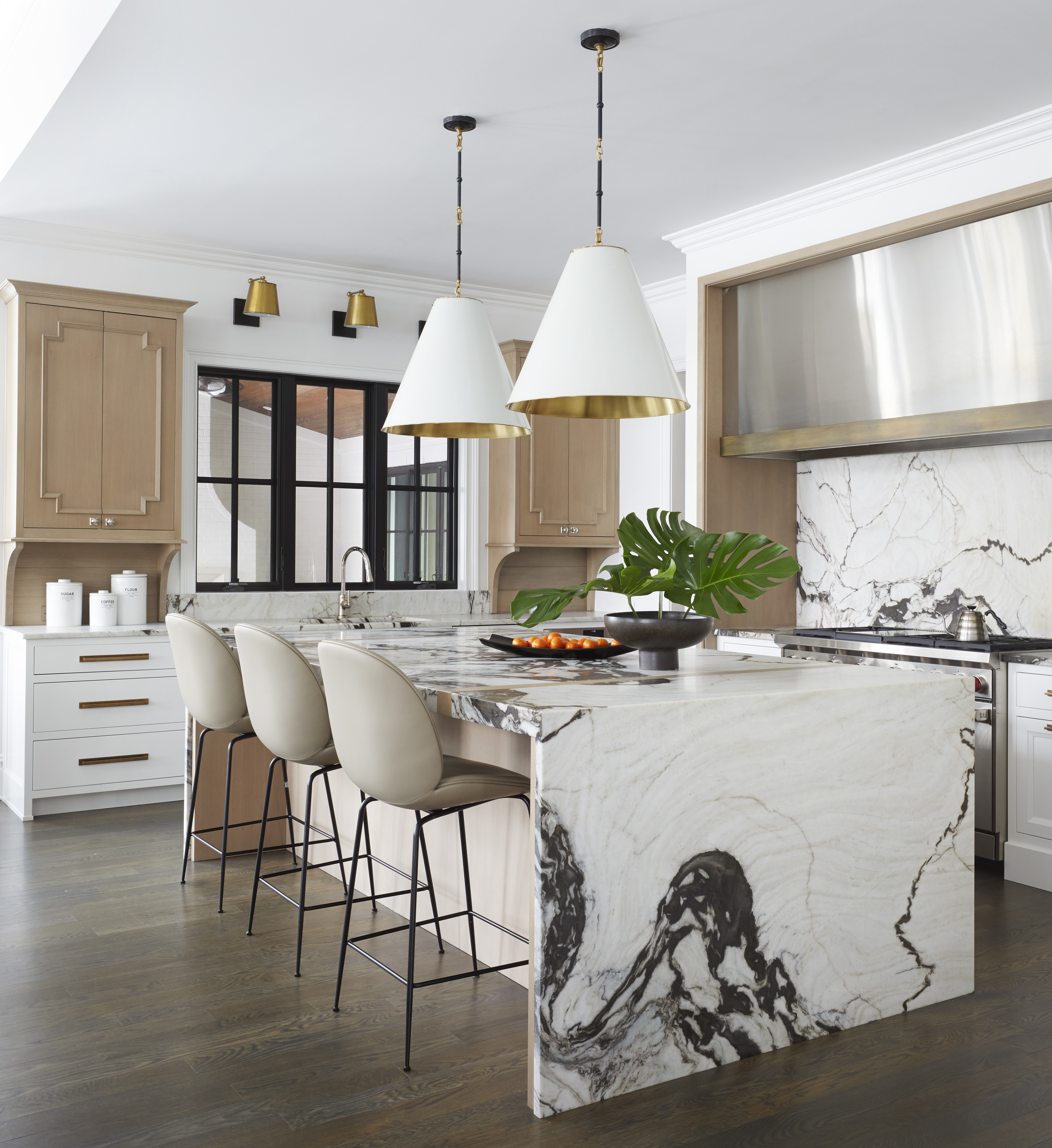
As featured in Corey Damen Jenkins book: Design Remix
Always invest in the best materials you can afford, especially in the heart of the home.
If you want to elevate luxuriousness in the kitchen, a waterfall countertop never fails to produce a show-stopping feature. Rather than a standard flat slab of stone sitting on top, the countertop ‘flows’ over the sides to the floor, which creates a very dramatic look.
Playing with shape and scale can dial up the impact of marble in a small space. Here, Corey has used the same marble on the backsplash to create cohesion and to help anchor the large kitchen.
2. Don't forget about the fifth wall

As featured in Corey Damen Jenkins book: Design Remix
Our ceilings are ripe for rediscovery, and should not be decorated in isolation from the rest of your room. Using the ceiling, the 'fifth wall', as a decorative surface can bring color and drama to a room.
Ceilings are a great way of adding another layer of interest. All too often they are an afterthought but we make sure to consider their potential. But throw out the rulebook and embrace playful design tenfold.
'There are design principles but there really are no rules,' says Corey. 'Principles are to be followed and you should honor the principles of good design, but the rules are to be bent and broken. I’ll break a rule in a heartbeat if it makes sense for the project.'
Here, Corey Damen Jenkins & Associates used a statement wallpaper on the ceiling to help extend the walls in this dining room. Luxurious finishes and layers of pattern introduce something tailored with neoclassical hallmarks.
'The detailed craftsmanship belies the age of the home, fooling visitors into thinking it is much older than it is,' says Corey. 'Adding to the Parisian flair is a recurring color scheme of black and white mixed with Bohemian-themed fabrics, saturated colors, bold artworks, and unique textile combinations.'
3. Bring the beauty of outdoors in
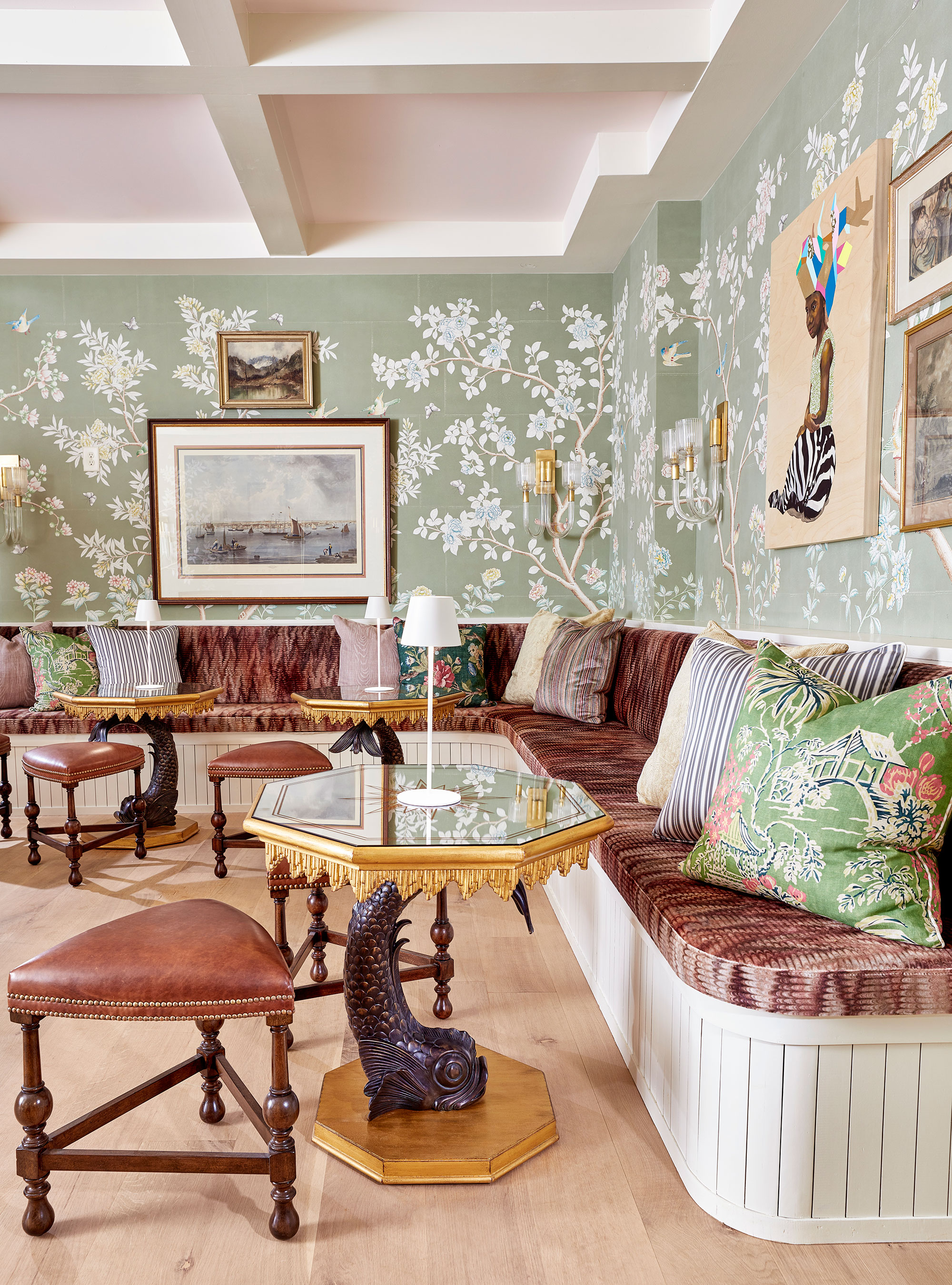
Designed by Corey Damen Jenkins & Associates for the FLOWER Magazine Inaugural Showhouse in Atlanta, Georgia in November 2022. Corey’s three spaces, the Morning Bar, the Wine Room, and the Secret Speakeasy, were among the highlights of the venue with visitors donning the speakeasy, as shown here, as the 'belle of the ball.'
Corey sought to create an underground garden that embraced elegant and fashion-forward aesthetics in a space that flipped the narrative on 'man caves' by designing the space with women’s relaxation top of mind. The idea was to design a space
The light and ethereal palette of blush pinks, mint and celadon greens, black, white, and gold mixed with reflective finishes and surfaces, great artwork, traditional and antique pieces lit with stunningly modern light fixtures, all surrounded by beautiful organic motifs brought this downstairs haven to life as if it were truly in the great outdoors.
4. Embrace the darkness with moody interiors
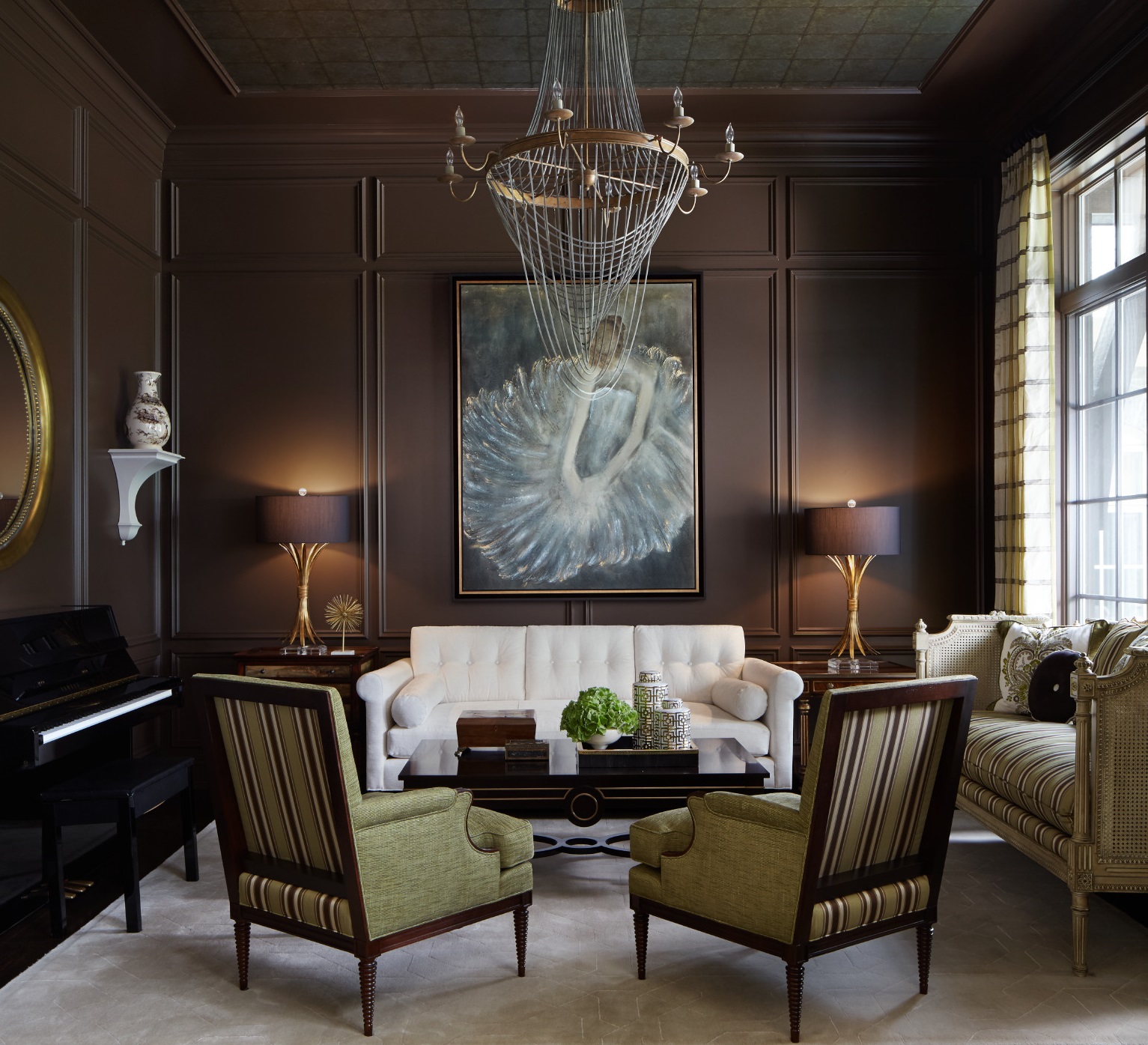
If you have a small or dark room, embrace, rather than try to fight against your space.
Here, Corey welcomes the darkness in this moody space with an all-encompassing brown color scheme. Considered a dark neutral, earthy brown is grounding but also has an elegance that is truly sophisticated. Versatile, it can be striking on its own or allow other hues to stand proud.
Being polychromatic, brown goes with everything, but in deeper, very rich hues it is particularly good at flattering beautiful, well-drawn patterns, artwork and statement pieces of furniture.
5. Mix pattern to great effect for theatrical splendor
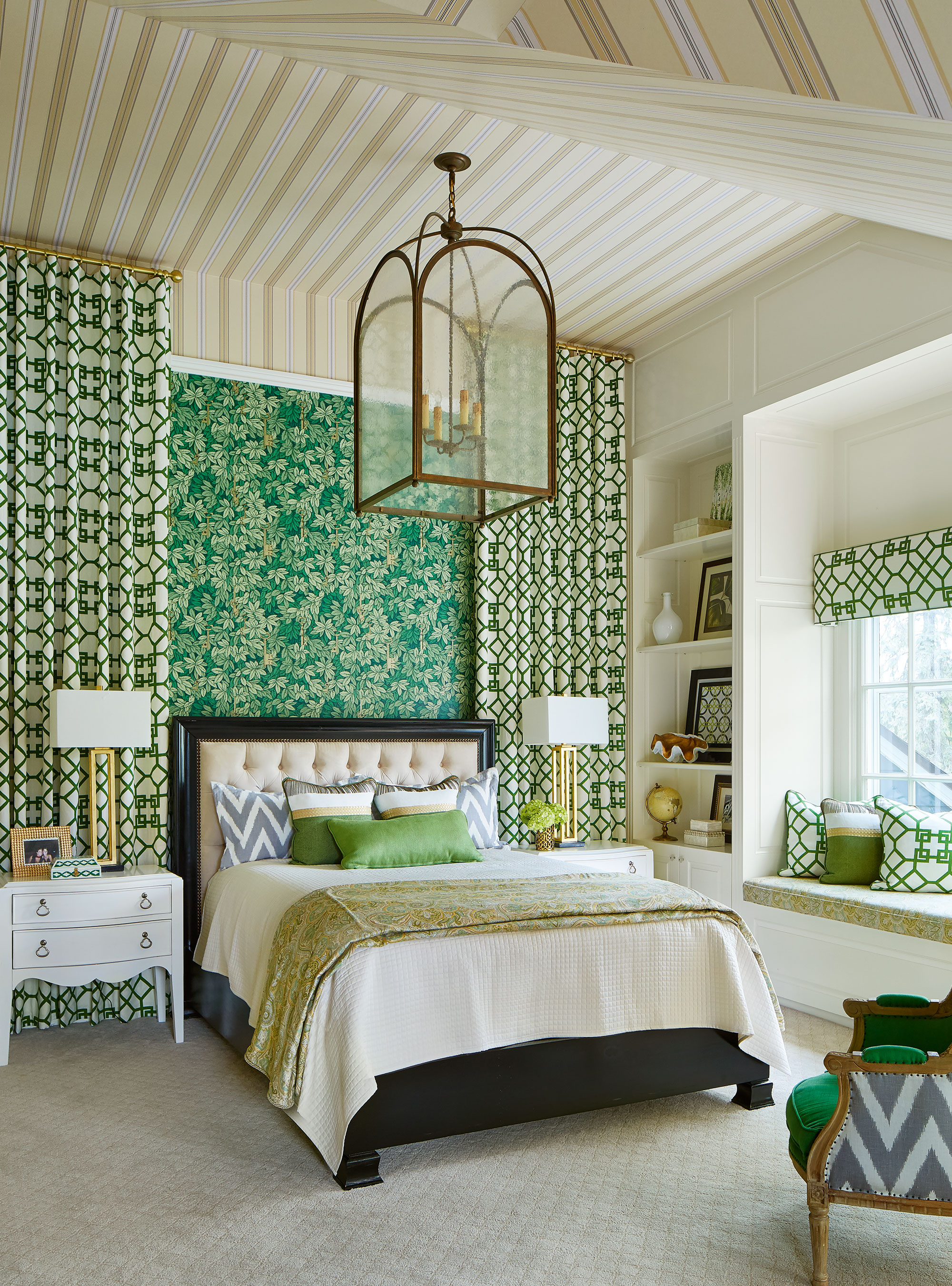
Those in the know talk about mixing patterns to great effect, and Corey is no exception. This dramatic bedroom by Corey Damen Jenkins is a masterclass in elegant maximalism; a fabulous mix of patterns adorns the walls and windows, with a restrained green-neutral palette to ensure cohesion.
Layering pattern on pattern creates a rich, maximalist look. Maximalism tends to be most successful when the patterns used share a color palette. Try using several designs in a similar tone but vary the scales of the patterns by combining large statement prints with smaller block prints, to create a layered scheme.
'You can choose a lead character to serve as a focal point, with the supporting characters providing wonderful, complementary accents – all varying in scale, tone and composition,' says Corey. 'For example, stripes are a classic, yet are very rigid. They pair well with plaids or florals to create a contrast that also feels cohesive.'
Shop the Corey Damen Jenkin edit

Jennifer is the Digital Editor at Homes & Gardens, bringing years of interiors experience across the US and UK. She has worked with leading publications, blending expertise in PR, marketing, social media, commercial strategy, and e-commerce. Jennifer has covered every corner of the home – curating projects from top interior designers, sourcing celebrity properties, reviewing appliances, and delivering timely news. Now, she channels her digital skills into shaping the world’s leading interiors website.

