Designers are swapping tonal color schemes for high-contrast hues – here's how to do this daring color trend stylishly
Contrasting colors go against the soothing appeal of tonal schemes, but designers are fully on board


Experimenting with contrast is one way to add depth and interest to your color schemes, and it's a way of decorating that's gaining plenty of appeal right now.
Going against the grain of tonal color schemes that generally feel more soothing, contrasting and clashing colors make a statement and add an element of surprise to any interior space.
But what's the best way to embrace this bold color trend? We spoke to interior designers and paint specialists who share all here. Whether you want to go bold with vibrant clashing tones or introduce a more subtle level of contrast to neutral schemes, there's lots of inspiration to be had.
What is a contrasting color scheme?
While tonal color schemes have seen plenty of appeal in interior spaces in recent years, designers are turning to contrasting color schemes as a way to add impact and make a statement. Below, Ruth Mottershead, Creative Director at Little Greene talks us through this shift towards bolder color choices, of which high-contrast colors can be used to cleverly influence how spaces in our homes look and feel:
‘There are many ways to deliver a layered approach within your interior through different paint applications. Since first introducing the color-drenching approach back in 2021, we have seen customers move away from traditional schemes to embrace deep and mid-tone hues from floor to ceiling and everything in between, creating really engaging, inviting spaces.

'Another way to add depth and dimension to an interior is to use contrasting colors that are complementary yet provide a point of difference within a scheme – combining to create a beautiful balance. You might choose to enhance your living room or bedroom by incorporating a contrasting color accent on your baseboards, cornicing, or paneling to provide a focal point.
'Alternatively, use across a wider expanse with one or two walls in a contrasting color, which can be a clever way to visually zone a multifunctional, open plan space. Red and green are a tried and tested combo – these shades are on opposite sides of the color wheel and will provide a confident contrast that will fill your scheme with character, creating an engaging and inviting atmosphere that is an excellent palette for high-traffic, energetic spaces like kitchens, utilities, and boot rooms,' says Ruth Mottershead.
How experts recommend decorating with contrasting colors
Below, we've rounded up some of our favorite rooms that embrace a contrasting color scheme. While colors that sit opposite one another on the color wheel, also known as a complementary color scheme, may seem the most obvious way of channeling this trend, it can also work with lighter and darker tones of colors that don't necessarily 'clash' with one another.
'High contrast doesn’t mean the colors have to fight one another,' explains designer Nureed Saeed of Nu Interiors. 'A saturated blue-green with a deep coral, a bright blue with a golden-orange, olive green with wine – thinking about color beyond the traditional spectrum means the possibilities are exciting and fresh.'
Use jewel tones in a contrasting scheme
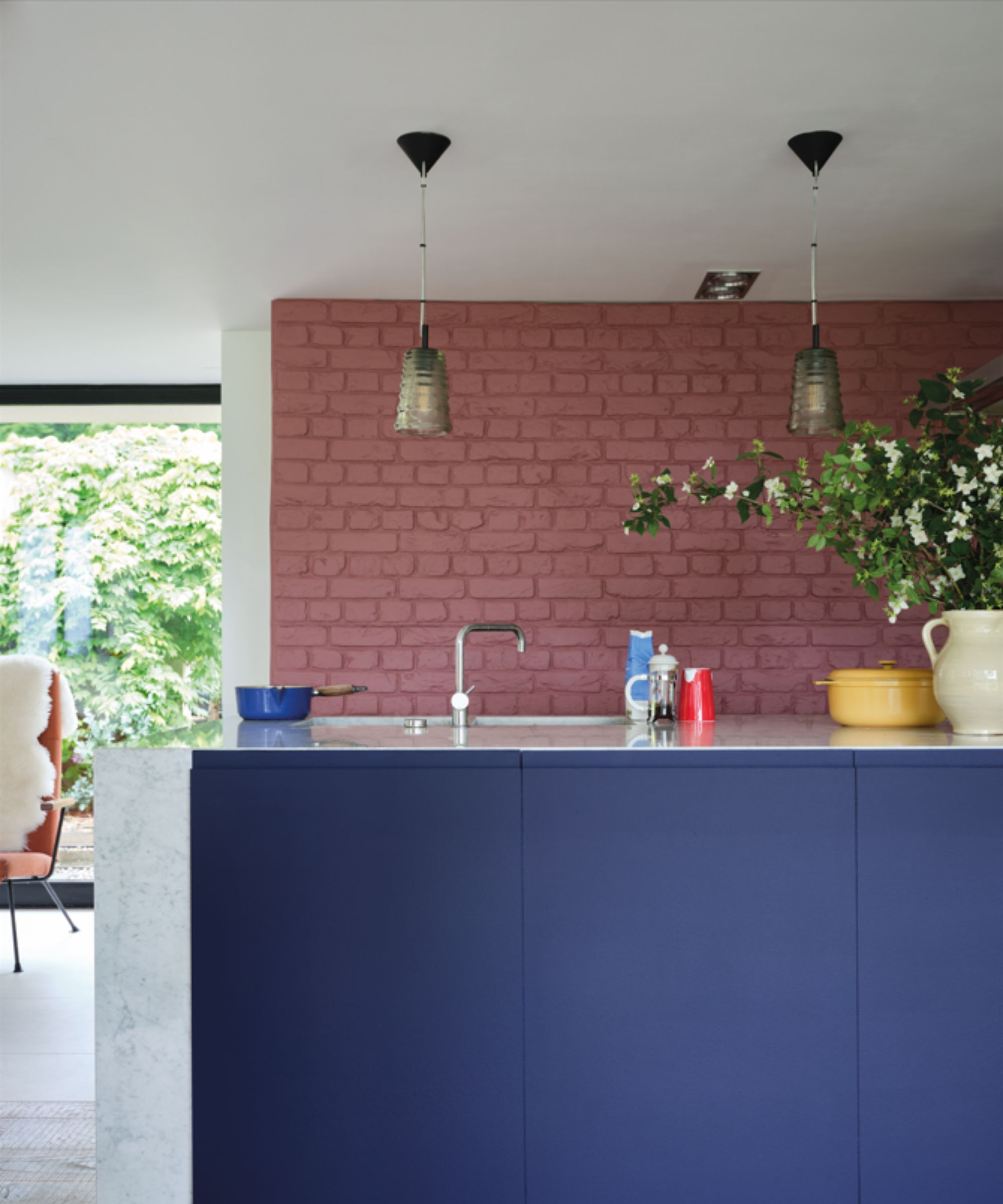
'Contrast is a wonderful design tool for when you want to make a statement without going over the top,' says interior designer Kathy Kuo.
'I love the idea of choosing an upscale darker jewel tone (like aubergine, navy blue, or forest green) and contrasting it with a warm neutral (like ecru, peach, or sand).
'By choosing two tones that read as very sophisticated and versatile on their own, you get the visual interest of high contrast, as well as sophistication and subtlety that you can easily apply to a number of design styles,' says Kathy.
In this colorful kitchen, Farrow & Ball's Titmouse Blue is used on the kitchen island, contrasted with the more muted tones of Crimson Red on the brick wall.
Use darker tones on kitchen cabinets

'For kitchens, we love the combination of light and dark,' says Patrick O'Donnell, Farrow & Ball's brand ambassador.
'Keep your dark shades below eye level on your lower cabinetry. Try something like Green Smoke in Modern Eggshell and combine it with Shaded White in the same finish on your upper cupboards, using the same color for your walls in Modern Emulsion for seamless continuity.
'If you have a central preparation island, use a contrast accent color such as Down Pipe and even consider a different finish here, such as Full Gloss, for a beautiful and glamorous contrast,' advises Patrick.
Take inspiration from this kitchen color scheme which features Peignoir on the walls, contrasted with the much darker Railings on the kitchen cabinets.
Use the color wheel to find 'clashing' colors

'We love using contrasting or complementary color schemes to harmonize a room – after all, opposites attract! The colors tend to be bold and bring a vibrancy to a space and, therefore, need to be balanced by something equally bold,' says Rebecca Roberts, Manhattan-based founder and principal designer at Method + Moxie.
'The more common contrasting colors are red and green, blue and orange, and yellow and purple, but you can play with tonal variations to strike a slightly different balance.
'In this Manhattan penthouse, we leaned into a vibrant orange, balanced it with warm blues, and varied the tones of each slightly throughout the open-plan space. The result is a living and dining space that flows seamlessly while bringing in the personality of bold colors with even-handed dispersion,' says Rebecca.
Go for a softer contrast with blue and white

Creating a contrasting color scheme doesn't need to make a loud statement, as shown in this bedroom designed by Spruce Interior. A classic color combination of blue and white feels soothing, while contrast is still achieved through the light and dark tones.
'The combination of blue and white is classic and particularly well-suited to coastal homes,' says designer Susan Galvani, founder of Spruce Interior. 'To me, this bedroom feels both restful and energizing because of the higher contrast approach.'
Add a vibrant hue to a monochrome scheme

'The beauty of contrast is that it makes everything pop – light against dark, bold colors against neutrals – it’s all about catching the eye and adding that “wow” factor,' says San Francisco-based designer Tineke Triggs.
'In this space, the fuchsia chairs are the star of the show. They bring so much energy, and because the walls are a soft gray and the floor is dark, the chairs feel bold but not over the top. The zebra rug adds a little playfulness, and that black-and-gold pendant ties everything together. It’s such a fun, vibrant look,' adds Tineke.
Go colorful with pink and green
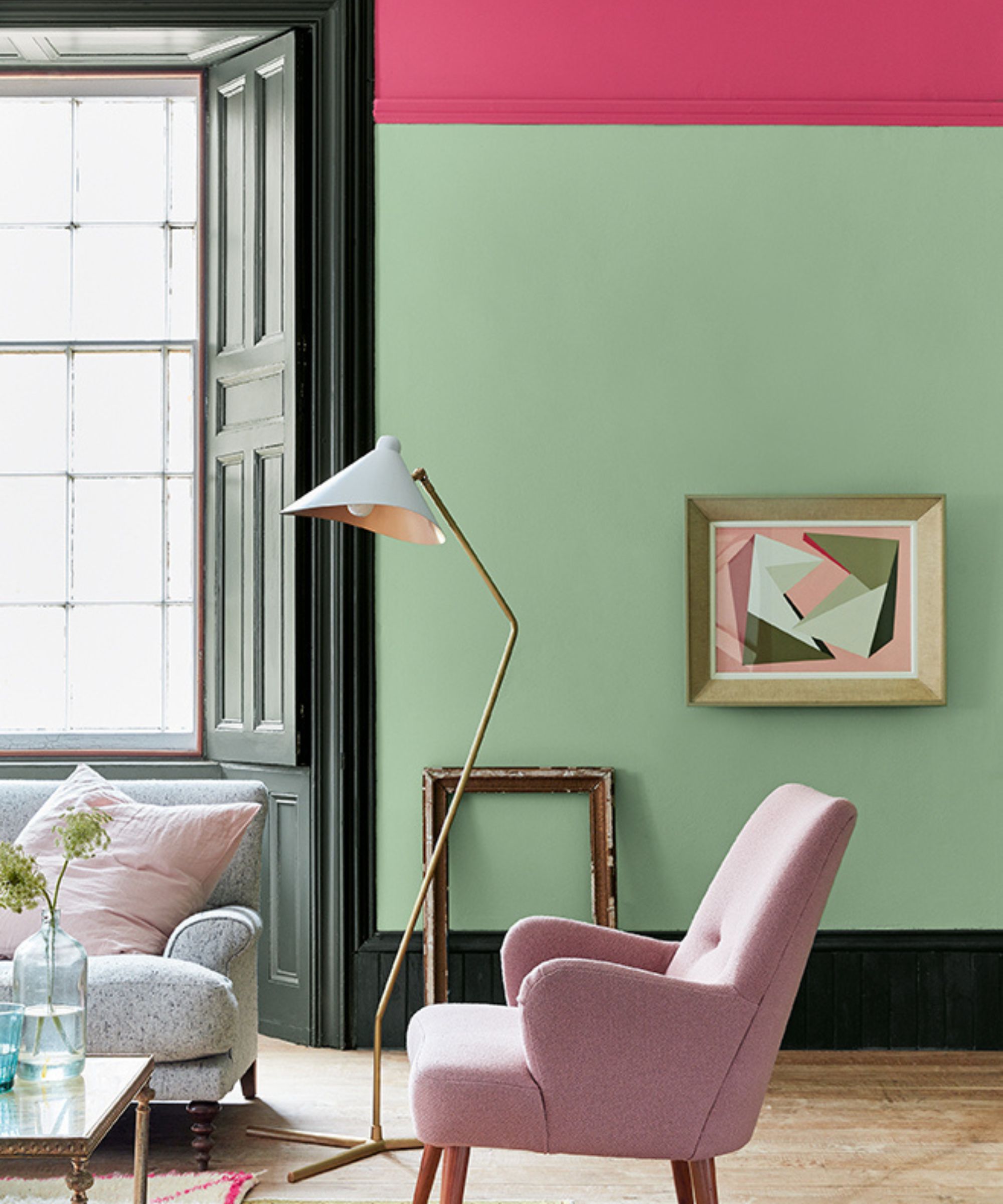
For an uplifting color scheme with contrast, pink and green is a great way to go, as seen in this playful living room.
'Pink and green work in harmony within an interior as they are a combination reminiscent of the relationship between flowers and greenery in the natural world,' explains Little Greene's Ruth Mottershead.
'The traditional pairing of a natural green and light pink provides gentleness and tranquillity, but you can also deliver a contemporary twist by incorporating unique, unexpected pink and green shades,' says Ruth.
Use stronger colors as an accent
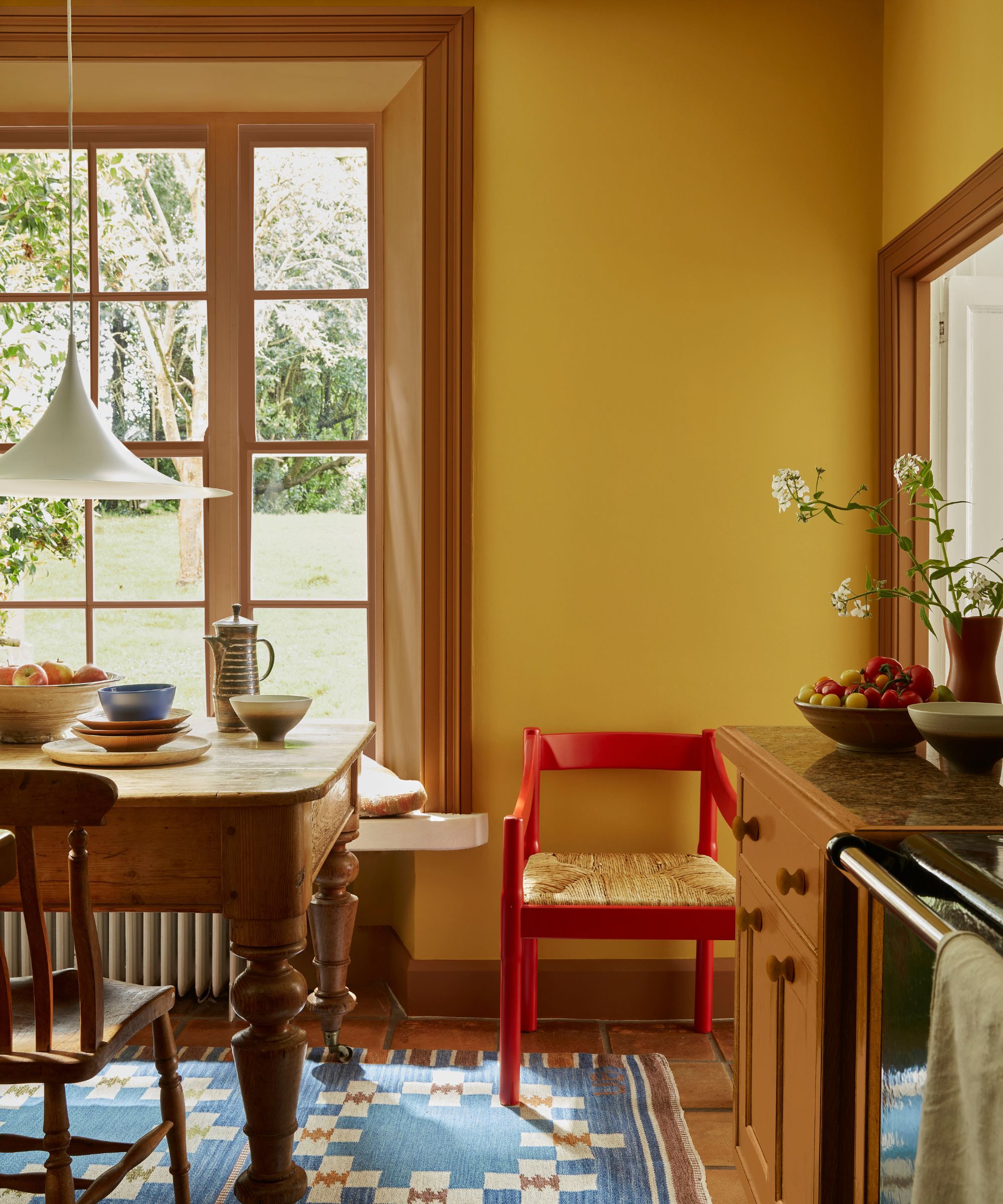
'If using stronger colors together can feel daunting, a great way to introduce a contrast is to combine a contrasting accent with a neutral,' advises Ruth Mottershead. Here, the bright red chair is used as an accent color, adding contrast without overpowering the yellow room.
'This can create a wonderful sense of flow when extended across the home; maintaining the one base neutral across walls and woodwork in different rooms and introducing a variety of coordinating accent colors in each individual space to bring design interest and personality,’ says Ruth.
Adding contrast to your room color ideas can be an effective way to add more depth, whether that's done subtly or boldly. For maximalist schemes, clashing colors can add plenty of drama, while layered dark and light tones in neutral rooms feels balanced.
Sign up to the Homes & Gardens newsletter
Design expertise in your inbox – from inspiring decorating ideas and beautiful celebrity homes to practical gardening advice and shopping round-ups.

Emily is a freelance interior design writer based in Scotland. Prior to going freelance in the spring of 2025, Emily was Homes & Gardens’ Paint & Color Editor, covering all things color across interiors and home decor for the Homes & Gardens website. Having gained specific expertise in this area, Emily is well-versed in writing about the latest color trends and is passionate about helping homeowners understand the importance of color psychology in home design. Her own interior design style reflects the simplicity of mid-century design and she loves sourcing vintage furniture finds for her tenement flat.
-
 5 key trends from Milan Design Week that are going to change the design direction of 2025
From floating furniture to silvered surfaces, here's my perspective on the key themes and new moods coming through from Milan Design Week 2025
By Pip Rich Published
-
 The rumours are true, the NYC trend for fringes and trimmings is actually happening – they are the secret weapon for making a room look expensive
A trim or a ruffle is the finishing touch that can take a scheme from ordinary to the extraordinary in an instant
By Jennifer Ebert Published