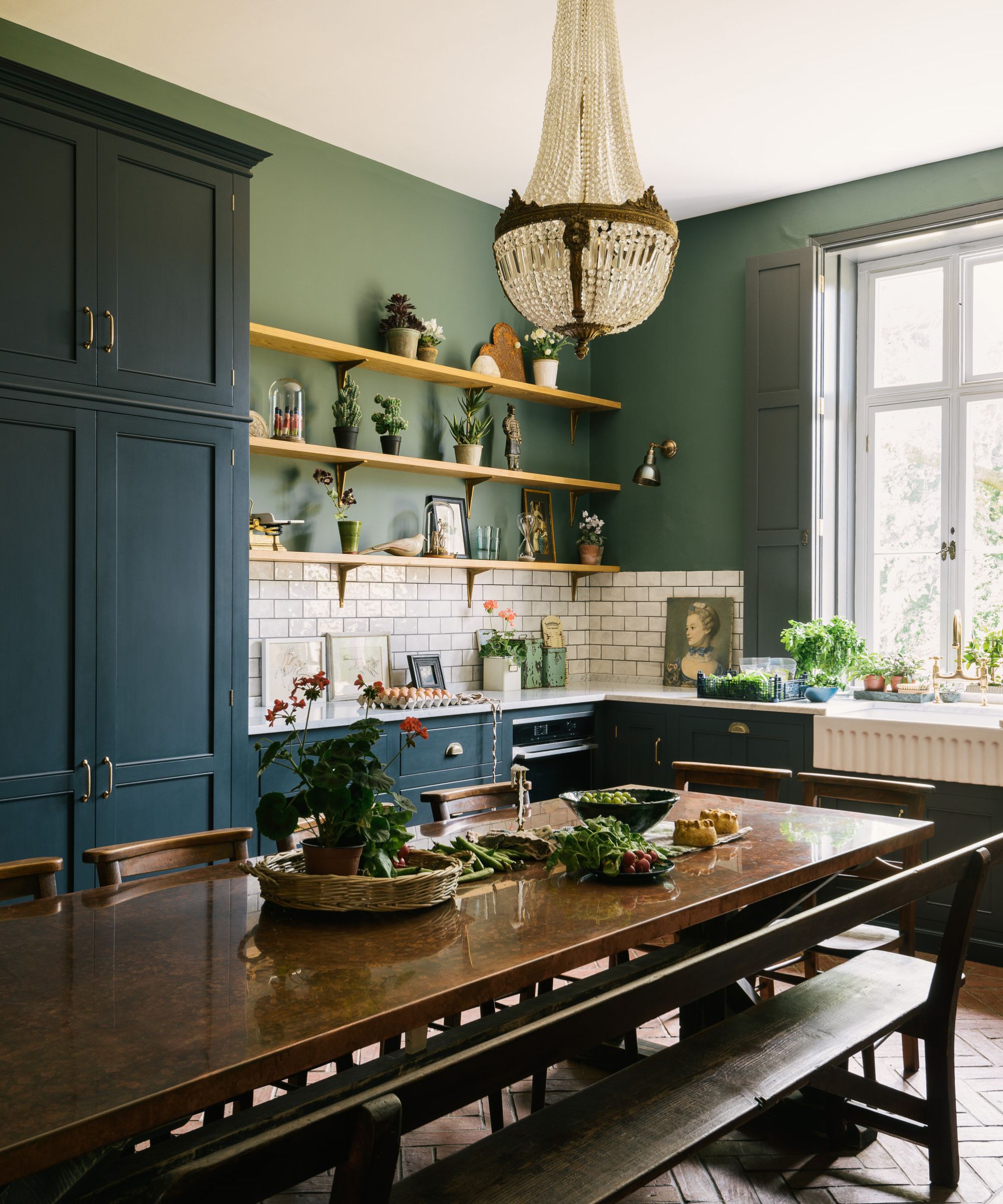
5 colors to never pair with green according to designers – and what to use instead
Avoid these combinations to ensure your green color scheme retains a calming feel


Green is one of the most universally loved colors. The color of the natural world, green evokes a calming feel when used in interior schemes and comes in so many variations, from muted sage green to dark and moody.
When it comes to decorating with green, it's important to pair this hue with the right colors, to ensure its calming feel is retained. When saturated shades of greens are paired with certain colors, it can create a visually overwhelming look that distracts from its appeal.
'Green is nature's neutral, so it can pair with almost everything,' explains Lick's Head of Interior Design Tash Bradley. 'However, how you use it entirely depends on the tonal weight of the green and the colors you pair it with, as well as the proportions of the colors used in a space.'
5 colors to avoid pairing with green
'Muted color schemes work for most color combinations, so you can rest assured that your soft sage green will look stunning with a light pink or stone beige,' continues Tash. 'However, the brighter and more saturated the colors, the more intense some color combinations can look and feel.'
Read on to learn which color combinations for rooms to avoid when decorating with green to ensure you make the most of this versatile hue.
1. Yellow
'To avoid an overstimulating look, I'd stay away from pairing primary green with saturated yellow in large quantities, as these colors can look jarring and sickly next to one another,' says Tash Bradley.
Interior designer Kati Curtis also avoids decorating with yellow in a green room, agreeing that it can be an overwhelming duo: 'This combination, especially in brighter, more vibrant shades, can quickly overwhelm the senses, detracting from the desired aesthetic.'

But that's not to say this color combination can't work well, it just requires more thought to ensure a balanced look. 'There is an art to mixing green with yellow,' says designer Betsy Wentz. 'You need to be careful to balance the saturation and brightness of both colors or it can be visually overwhelming.'
Kati adds that embracing softer variations of this color combination is much more flattering, especially when used as accent colors: 'If you must use yellow and green, either soften the hues or strategically use them as accent colors rather than the primary palette. This approach ensures the design retains its intended sophistication and depth without veering into the visually jarring territory that a stark yellow and green contrast might induce.'
2. Secondary colors
'I personally don’t enjoy secondary colors together – each color in a pairing should have nuance,' says interior designer Christina Simon of Christina Simon Studio. 'I wouldn’t pair a bold Kelly green with a bold purple, that’s just too much.'
Accounting for another of the color wheel's secondary colors is orange, which Nadia Watts highlights as another color that she avoids pairing with green: 'Bright orange with green packs a punch that can overwhelm the senses. Orange and green are opposite on the color wheel and in this case, opposites don’t attract: orange and green can have a jarring effect, a bit too bold in the wrong way.'
3. Bright white
Green and white is a classic color combination, but if the shade of white is too stark, it can create an imbalanced look alongside green. Patrick O'Donnell, color expert at Farrow & Ball says that sage green in particular should be paired with a softer off-white rather than anything too harsh.

'Try to avoid pairing sage greens with bright whites,' says Patrick. 'Instead, think about layering it with off whites which have a nuance of green through them. This will avoid any tonal fighting and instead create a soft-shaded scheme.'
4. Red
'Red and green can quickly feel like the holidays – the combination of two bold saturated colors makes for a high-contrast pairing which can be overwhelming, especially in a small space,' says Nadia Watts.
Helen Shaw, Director of Color Marketing at Benjamin Moore also flags green and red as a color combination to avoid, adding that pastel tones will create a more relaxed and calming interior scheme: 'The combination of red and green can often be overstimulating and jarring when used in the wrong way due to them being on the opposite ends of the color wheel.'

'As an alternative, soft pastels will offer that injection of color whilst achieving a more restful environment. Their calming tones won’t be overly stimulating as they require our eyes to do little to no adjusting – enhancing a feeling of harmony.'
5. Complementary colors
For interior designer Olivia Westbrooks, warm colors that are complementary to green on the color wheel are avoided, opting instead to embrace an analogous color scheme for a more calming and cohesive interior.

'As an artist and interior designer, I would avoid pairing green with complementary colors on the warm side of the color spectrum,' says Olivia. 'Together, these colors enhance each other’s vibrancy and provide the most contrast.'
'If the intention of a design is to create a sense of calm, we would pair green with analogous colors on the wheel that are cooler in hue like blue and even purple. We would also opt for muted, toned-down versions to evoke a sense of calm and sophistication.'
It's clear that the general advice from experts is to avoid pairing green with highly contrasting complementary tones, and instead pair it with soft, muted shades.
Keep in mind that these are only suggestions, and you should embrace the color pairings that bring you the most joy in your own home above following any rules.
Sign up to the Homes & Gardens newsletter
Design expertise in your inbox – from inspiring decorating ideas and beautiful celebrity homes to practical gardening advice and shopping round-ups.

Emily is a freelance interior design writer based in Scotland. Prior to going freelance in the spring of 2025, Emily was Homes & Gardens’ Paint & Color Editor, covering all things color across interiors and home decor for the Homes & Gardens website. Having gained specific expertise in this area, Emily is well-versed in writing about the latest color trends and is passionate about helping homeowners understand the importance of color psychology in home design. Her own interior design style reflects the simplicity of mid-century design and she loves sourcing vintage furniture finds for her tenement flat.
-
 Step up your pool cleaning routine with Beatbot AquaSense 2 Ultra
Celebrate National Pool Opening Day by saving up to $618 on a luxurious pool cleaning solution from Beatbot.
By Sponsored
-
 Isabella Rossellini's kitchen defines 'pantry perfection' – her sleek storage method is one of the most beautiful ways to bring order to your shelves
A custom Chilean applewood pantry lines the walls of the Conclave actress's kitchen – you can tap into her stunning technique from $42
By Megan Slack