

Rich, warm burgundy shades are having a revival at the moment, with homeowners and interior designers alike harnessing the richness and warmth of the shade to add comfort and depth to their projects.
Once used in moderation, the color has become increasingly popular in recent years as we crave cozy and comforting interiors, plus they pair beautifully with on-trend warm neutrals with sought-after natural materials and burnished metallics currently trending.
Due to its richness and intensity, decorating with burgundy can sometimes be tricky, but get it right and burgundy can make for extremely stylish interiors. Get it wrong and it can be jarring and overpowering. But what are the right colors and what are the colors to avoid pairing with burgundy?
To help you achieve color scheming success with this color trend we asked the color experts and interior designers to weigh into the debate on what colors to avoid pairing with burgundy – along with advice on what to use instead.
What colors to avoid pairing with burgundy?

With its warm undertones, burgundy naturally pairs well with a wide range of warm neutrals including warm off-white, beige, stoney neutrals and soft pinks. It also makes a wonderful foil for burnished metallics for luxe looks and cozy color schemes.
'Creamy whites add a touch of balanced elegance, while deeper tones like forest green combined with wood tones create a natural vibe. Navy blues and blacks offer bold drama and moody sophistication, especially when paired with warm metal hardware and home accessories,' says Emily Kantz, color marketing manager at Sherwin-Williams.
That said, some colors can be problematic when used with burgundy. ‘When using burgundy, it's important to consider its placement on the color wheel. As a deep, warm-toned red, it pairs beautifully with rich neutrals and deep autumnal greens, but certain colors can create unwanted visual tension such as bright pinks, lime greens and chocolate browns,’ explains designer Lauren Gilberthorpe. ‘Instead, consider soft neutrals like warm taupes, muted sages, or deep navy for a more harmonious and sophisticated pairing.’
1. Vibrant greens

Interestingly, when we consulted the experts, green was often flagged as a color to be cautious of when scheming with burgundy, yet other designers championed it as a complementary shade.
Ultimately, it seems that getting the balance right all comes down to tone. Avoid vibrant, energising greens which can conflict with burgundy, and instead move towards more mellow forest green and sage tones, say the experts. ‘I’d stay away from pairing burgundy with bright ‘brat’ greens, bright acidic yellows and bright oranges,’ explains Tash Bradley, interior design director at Lick.
Lauren Gilberthorpe agrees, suggesting that, 'high-energy shades like bold pink and lime green compete with burgundy rather than complementing it, resulting in a scheme that can feel jarring.' On the other hand, ‘deep greens can work well, but they should be carefully balanced to avoid an overly heavy, wintery feel. Using them in accents – perhaps in textiles or decorative details –can provide just the right amount of contrast,’ she adds.

Of course, when using burgundy with green you’ve always got to be wary of channelling the holiday vibe, while the pairing is perfect for a classic Christmas, it’s not something you might want year-round.
‘Green is a tricky shade to style with burgundy, as it may give off a traditional Christmas-like aesthetic, but softer shades like olive or sage are a much better match,’ advises Emma Bestley, creative director and co-founder of YesColours. ‘I would recommend pairing with cooler tones or a more tonal approach of muted pinks and mauves.’
2. Cool acidic yellows

Vibrant lemon yellows on the cooler side of the yellow spectrum are wonderful room colors for adding energy and zest to spaces like kitchens, but if you’re looking to decorate with burgundy then it’s best to avoid partnering them with this particular shade of yellow.
‘Homeowners should avoid pairing burgundy with yellow, which can be seen as too vibrant and overpowering. Also avoid bright shades of orange which can be overwhelming and create a jarring combination within the space,' explains Emily Kantz.
However, it’s important not to rule out all yellows altogether, sometimes they can work – it’s all about getting the tonal sweet spot. For example, warmer yellows with ochre undertones and softer buttery yellows can combine well with burgundy. 'Yellow is another great option, but golden, mustard, or ochre shades will complement burgundy much better than bright, lemon yellows,’ explains Emma Bestley.
3. Electric blues

As with green, blues which are too strong, such as electric cobalt blues or neon blues can clash with burgundy, and not necessarily in a good way. ‘I would avoid pairing bright neon colours, such as neon green or electric blue, as they clash with the comforting and rich tones of burgundy,’ says Francesca Wezel, founder of Francesca’s Paints.
‘The same rule applies to cool tones, such as light icy blues. As an alternative, try pairing burgundy with a warm pink or beige; these shades will perfectly complement the warmth of burgundy whilst bringing a fresh, light element to the space.’
However, carefully selected, some blues can actually complement burgundy. Choose the right shade and it can bring harmonious balance to a scheme – after all, it is opposite on the color wheel. Dark blues, for example, can pair well if you're looking to create a rich, cozy living room.
4. Chocolate browns

Like burgundy, decorating with brown has witnessed a huge revival in recent years, satisfying our yearning for grounding spaces in touch with nature. However, using them together could be a mistake, say the experts. ‘Chocolate browns can feel too similar in depth, these tones can muddle together, lacking the contrast needed to create a considered and balanced palette,’ explains Lauren Gilberthorpe.
When pairing burgundy with earthy neutrals, instead look to lighter tones. ‘Rich, dark browns can clash, making the space feel overwhelming and heavy,’ explains Emma Bestly. 'However, slightly warmer, lighter tones such as tan or beige can often work quite nicely.'
That said, furniture made from warm, dark woods can be a great complement to burgundy, particularly if you're looking to create a cozy library or snug.
5. Deep purple

Sometimes colors near one another on the color wheel can be a match made in heaven – pink and red, or green and blue are case in points. However, when it comes to burgundy and purple interior designers aren't as convinced.
'Burgundy is versatile and lovely, there can be an argument with it going with nearly all of the other colors except deep purple, in my opinion,' says interior designer, Alexandra Azat, founder of Plaster & Patina.
'Although I've seen it done, it will never cease to be a combination I am not fond of, too harsh and conflicting for my eyes.' Instead, Alexandra prefers pairing burgundy with warm earthy pinks. 'We recently used Farrow & Ball's color Dead Salmon alongside a burgundy Pratt and Larson micro tile and it looked great,' she says.
6. Gray

Decorating with neutrals such as gray, taupe and cream are loved for their versatility, yet care should still be taken when scheming with them, particularly when partnering them with strong shades like burgundy. When looking for neutrals to pair with burgundy, it’s important to consider the warmth of the neutral.
As burgundy has warm undertones, it sits in harmony with warm neutrals. Instead, 'Cool colors will feel conflicting and look jarring next to a warm, deep burgundy,' says Francesca Wezel, founder of Francesca’s Paints. Emma Bestly agrees that, ‘cool grays paired with burgundy can feel too harsh.'
When planning room schemes, interior designers and color experts suggest avoiding pairing burgundy with vibrant and neon tones such as neon greens, blues, and pink,s and zesty lemon tones as these can be jarring with the warm grounding undertones of burgundy. Experts also advise being wary of colors that are too cool such as gray and cool icy blues as these can make rooms feel too austere.
Ultimately a lot depends on what shade and tone you use. While overly bright tones might be a no-go, often softer tones of the same color can work, for example, sage green or a more warm, buttery yellows can work well with burgundy.

You must confirm your public display name before commenting
Please logout and then login again, you will then be prompted to enter your display name.
-
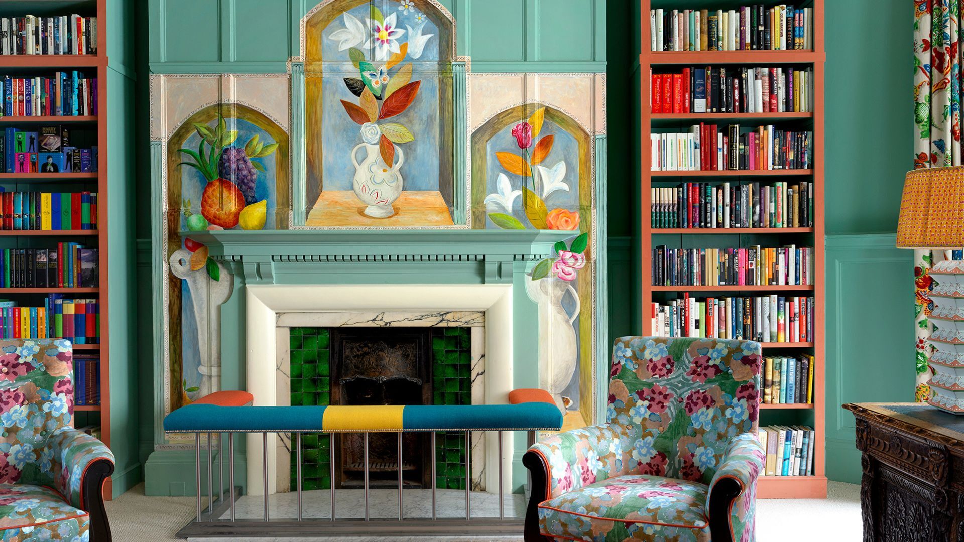 Sick of white walls? My journey from minimalist to maximalist, one paint stroke at a time
What do you do if you’re bored with plain walls? If you’re me, you go full muralscape
-
 5 vital ways a home battery backup can help with your most urgent needs in a power outage – from heating to flood prevention and calls
Experts say they're a worthy investment

