

When the seasons change, most of us don't want to entirely overhaul the color schemes in our homes in keeping with the weather outside. However, while a complete redecoration isn't necessary, there is some benefit to swapping out colors for the summer months.
With the right decor, color can play a huge role in how our homes feel, and that's especially true for summer when we want our homes to feel bright and airy. By embracing summer color trends and steering clear of certain hues, our spaces can look in keeping with the bright and breezy outdoors, and feel more comfortable too.
So, what are the colors to avoid decorating with during summer? We asked interior designers and paint color experts who share their ideas below. From colors that conjure images of winter months to those that can actually make our spaces feel warm, these hues are best left out during summer.
Colors to avoid decorating with during summer
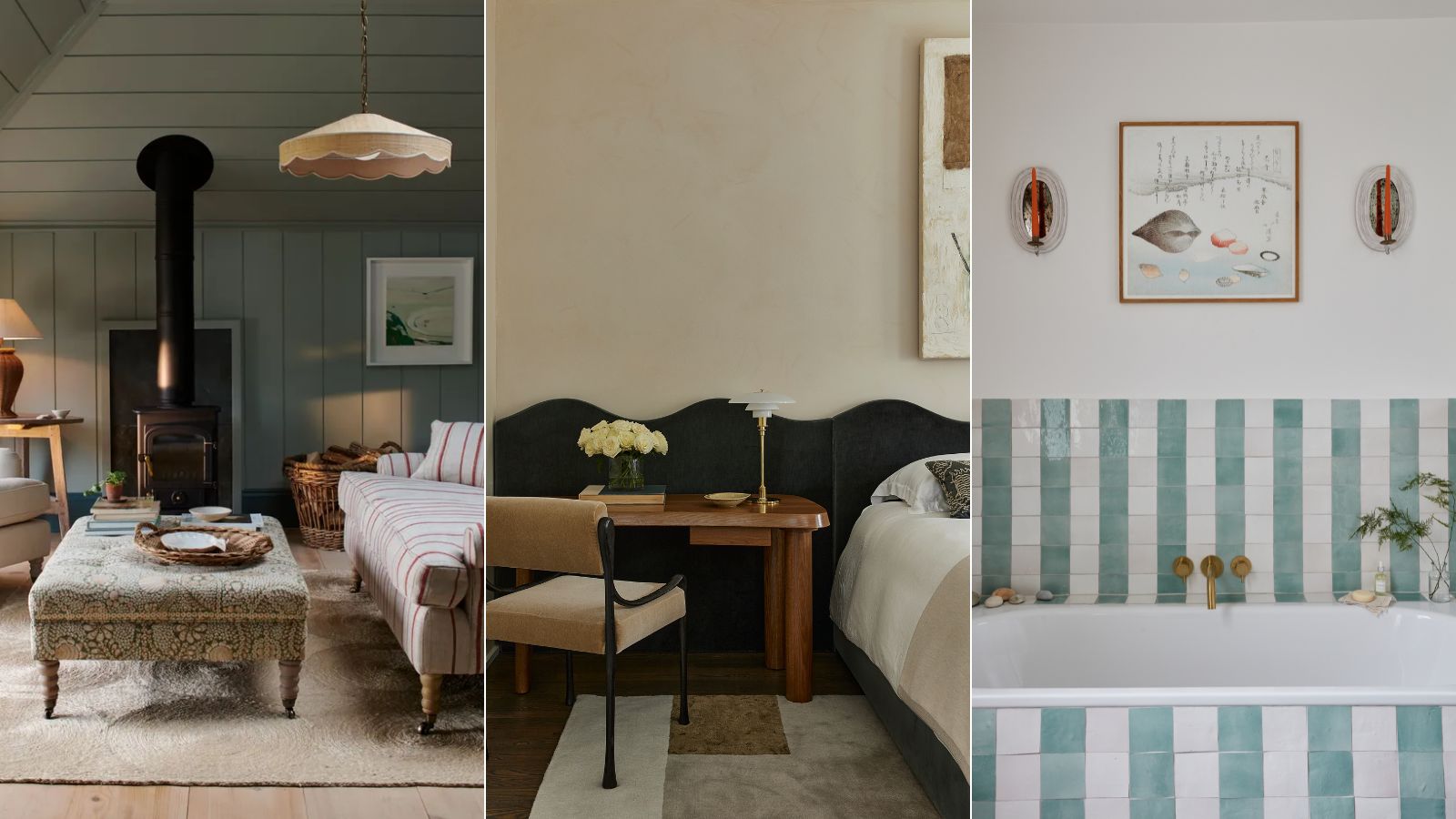
While your room color ideas can take on many forms, keeping the wall colors of each room neutral can make things easier when it comes to swapping out colors through decor. This will mean you can swap out accessories –think accent pillows and throws – to reflect each season, while you won't need to worry about a complete overhaul of your color schemes.
In addition to the colors experts say you should avoid decorating with during summer, we've also included below what to do instead to ensure a color scheme fit for summer decor ideas.
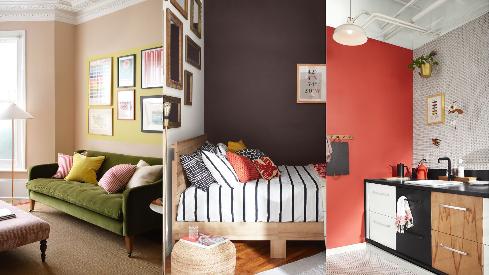
Avoid deep and dark colors

'Darker colors with cooler undertones used in excess can feel heavy in the home, particularly in the summer,' says Helen Shaw, Director of Color Marketing at Benjamin Moore.
As Helen explains, deep and dark colors can feel heavy in the home during summer. While these colors are excellent choices for cozy room ideas, this often isn't the desired effect during summer, when we want homes that feel light, airy, and comfortable. 'While personal preferences vary, you generally want to avoid anything too dark, intense, or heavy,' agrees Ashley McCollum, color expert at Glidden.
Not only will dark colors feel too heavy during summer, but they can also be associated with the winter months. Ryan Austin Hagood, principal designer at r.a.d. Interiors adds: 'I generally recommend steering clear of darker, heavier tones that evoke a wintry feel, such as dark greens and reds, particularly in patterns like plaid which can conjure images of Christmas. These hues, along with heavier blankets and cozy textures, are better suited for creating a warm ambiance during the colder seasons.'
Use rich, warm hues with caution

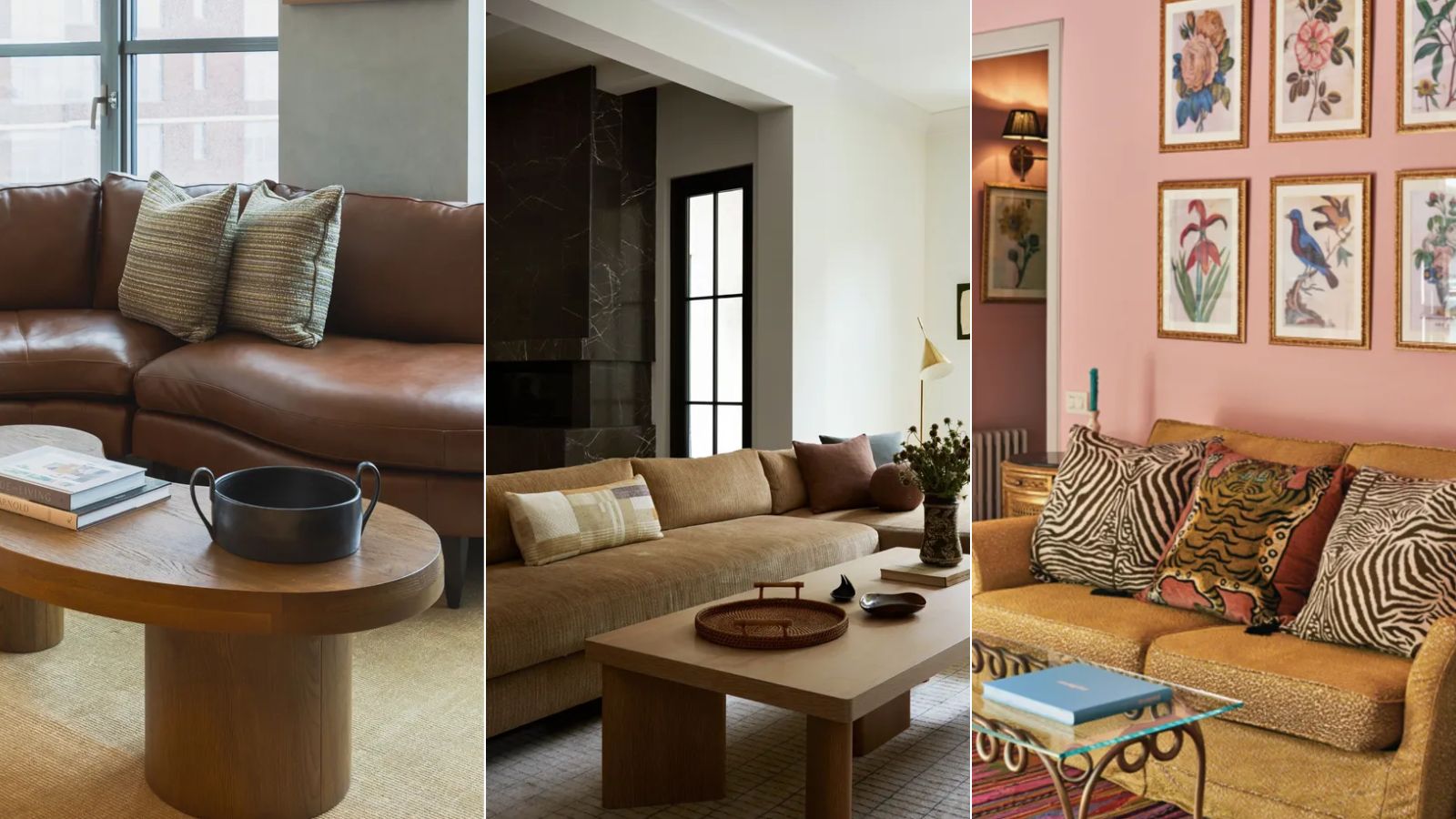
Similarly, you should think twice before decorating with rich, warm-toned hues like deep oranges and burgundy tones which can often link closely to fall color schemes.
'Opt out of selecting colors like orange or burgundy,' suggests interior designer Eugenia Triandos, principal designer at Hibou Design & Co. 'Any deep orange colors feel more autumnal and can create a heavy, less refreshing atmosphere.'
However, that's not to say you can't use these colors altogether during summer. If you do want to decorate with these rich, warm hues, designers say it's important to consider the type of fabrics you're using, which will affect how the colors feel.
'Burgundy velvet isn't going to be a great choice for a summery throw pillow, but a burgundy linen pillow sounds delightful especially if you have a cream-colored sofa,' explains interior designer Bethany Adams of Bethany Adams Interiors. 'So don't be afraid of trying different colors, just make sure they are in summer-appropriate textiles.'
Instead embrace light colors and materials

While the wrong colors can quickly make a space feel off balance during the summer, experts say that you can't go wrong with decorating with neutrals for the summertime. These hues will enhance a bright, airy feel indoors and ensure your space feels refreshing.
'For summer, it's best to opt for lighter, airier colors and materials that enhance the feeling of freshness and brightness in your home,' says Ryan.
'I transition my home for the warmer months by switching out my throws for lighter-weighted linen fabrics and replacing accent pillows with softer hues such as sand, soft grey, muted blue, and cream.'
Reaching for lighter colors can also help create a cool and comfortable atmosphere throughout the home, according to Helen: 'Opting for a lighter hue will naturally brighten a room, making even the smallest spaces feel open and airy. Light-hued wall paint will also absorb less heat, creating a cooler and calmer feeling in the room.'
Lastly, if you are considering changing the paint ideas throughout your home during summer, pay attention to the paint finishes. Helen says that high-sheen paints can further create a light and airy look instead of matte finishes: 'Choosing the right sheen is also important. Higher sheens are more reflective, so using a semi or high-gloss gives the illusion of more light and enhances the space.'
To ensure your home feels in keeping with summertime, opt for light neutrals when it comes to decor, which can be replaced with richer hues as we transition to fall. Whatever your design style, from coastal decor ideas to farmhouse decor ideas, neutral tones are timeless and a go-to summer choice for good reason. Below, we've rounded up some of our favorite neutral decor picks to help you on your way.


-
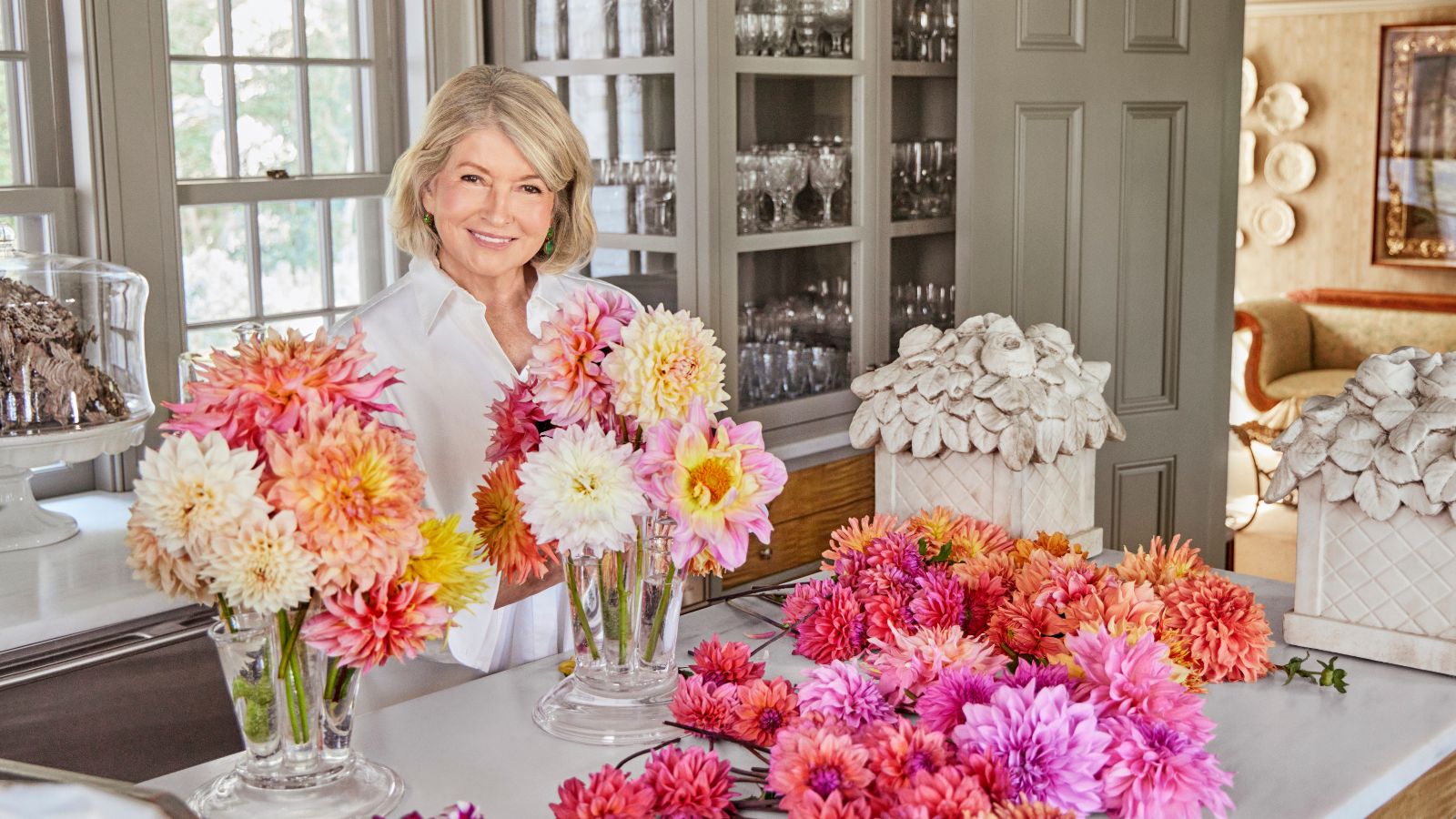 Martha Stewart's tips for arranging daffodils are unbelievably simple and effective – it's the only flower advice you need this springtime
Martha shows us that we can create gorgeous bouquets of this seasonal flower by simply trimming the stems and placing them in specific vases
-
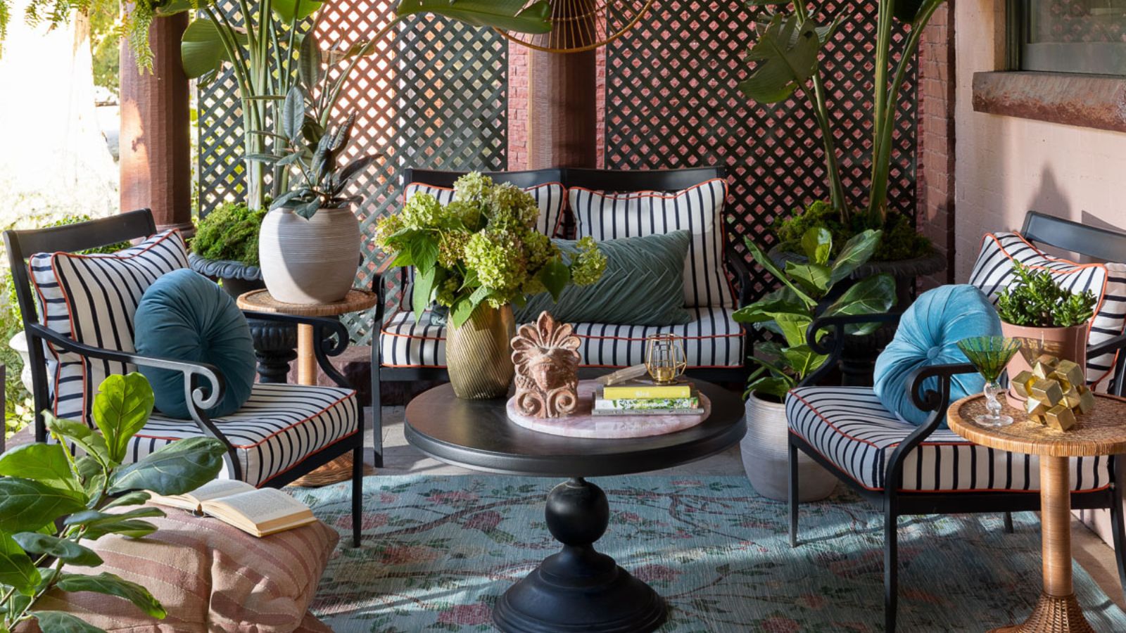 Designers share how to make your outdoor living room look more expensive – and the affordable products to get you there
From layered lighting to luxe-looking textiles, these simple swaps made all the difference


-
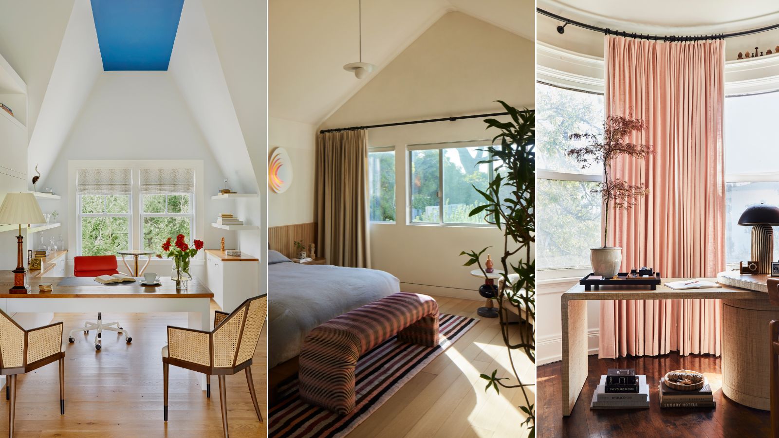 Where do interior designers buy window treatments? The tried and tested stores to add to your list
This month's Decorator's Address Book focuses on window treatments – these are the stores designers use for their projects time and time again
-
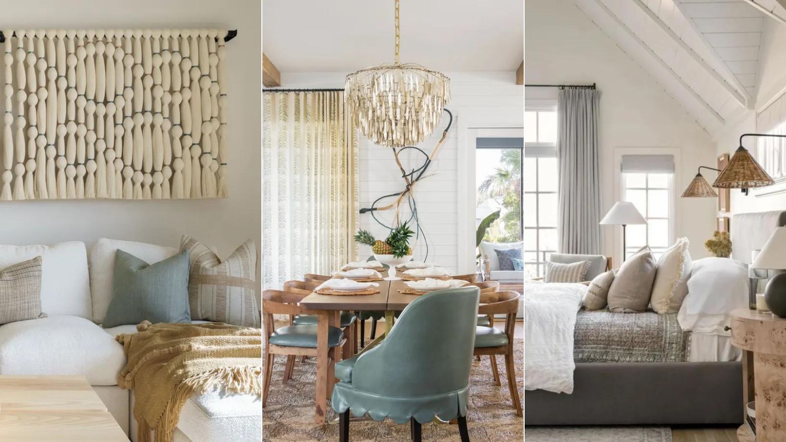 'Coastal elegance' is the end-of-summer trend to know about – designer Kathy Kuo shares how she creates the effortless look
Relaxed living meets luxurious design – here's how she introduces this elevated style to interiors
-
 Looking to elevate your rental without losing your deposit? Benjamin Moore's new paint initiative has you covered (and it includes free paint)
This month, the paint brand is offering complimentary white paint to revert rental decor upon lease-end
-
 What color is espresso? Designers weigh in on this on-trend, moody neutral and share how to decorate with it
Here's why designers can't get enough of this sophisticated new neutral
-
 5 of the best colors to decorate with in August 2024, as suggested by designers and color experts
Summery hues with a hint of the autumnal months to come, designers love these colors for August
-
 Ruggable has launched a new color-centric rug collection with Pantone – 'designed to inspire creativity'
Designed to realize the mood-boosting effects of color, these rugs reflect the essence of dopamine decor
-
 This is how to 'properly decorate a beach house' if you're bored of typical coastal design, says TikTok's favorite interior designer
TikTok's Taylor Simon schools us on how to avoid coastal cliches with her guide or what to do and what to avoid when decorating a beach house
-
 This once-dated couch color is making a comeback – designers share all on how to bring this retro style into 2024
Camel-colored couches are often associated with retro design, but designers love them in modern homes


