What colors go with a navy couch? These are the combinations designers recommend
A navy couch is a dominating piece of furniture, so how do you decorate to work with it rather than against it? Let's find out
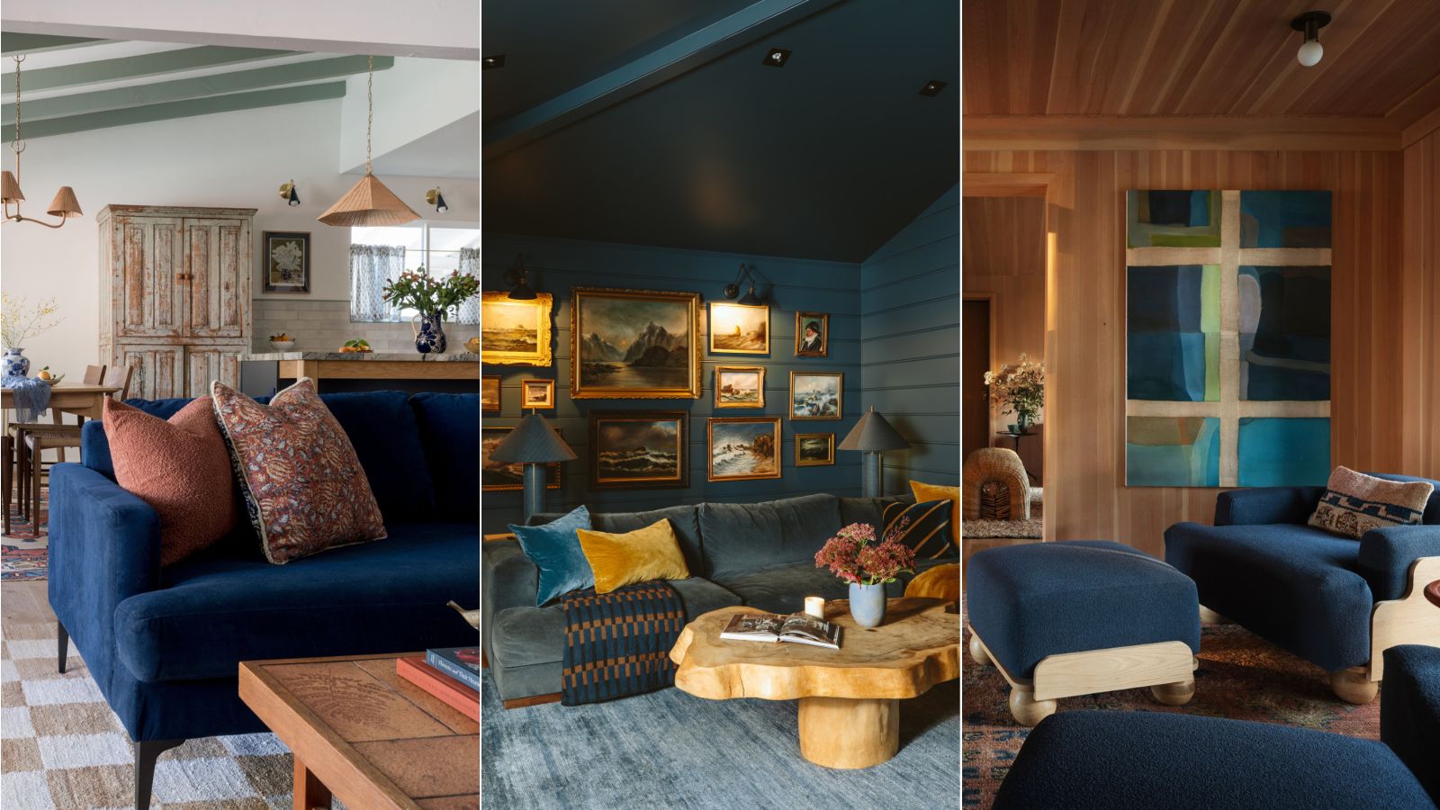

I have hit a bit of a roadblock in my slow renovating journey. For the past year, my living room has been treated as the "shed", filled with tools and endless scraps of MDF, and, rather distressingly, my navy blue Maker & Son couch. Now the time has come to uncover it, and I'm starting to consider colors that go with a navy couch.
Navy is certainly a statement hue. Deep and rich, it's elegant and endlessly versatile making this sofa trend a favorite among interior designers and those of us with pets (or children). But the question often arises: what colors will complement a navy couch? And how do I go about decorating around its bold indigo shade?
So to help me (and hopefully you, too) on this quest to find the best what colors go with navy blue, I've asked interior designers for their ideas on the perfect palettes and color combinations to pair with a navy couch.
What Colors Go Best With A Navy Couch?
The best living room ideas start with a strong living room color scheme. The colors need to work with the room's size, natural light, existing architectural details, and of course, non-negotiable pieces of furniture, like my navy couch.
Thankfully, navy is a chameleon color that blends with a spectrum of colors, offering me endless possibilities for design schemes. And therein lies the problem, there are many avenues I could take from blue couch living room ideas. From a cozy, monochromatic look to calming neutrals or bolder, vibrant accents, the right color combinations can make a navy couch appear as a statement piece or allow it to sit harmoniously in the background.
Here are the best and somewhat unexpected color combinations the experts recommended.
1. A pop of red
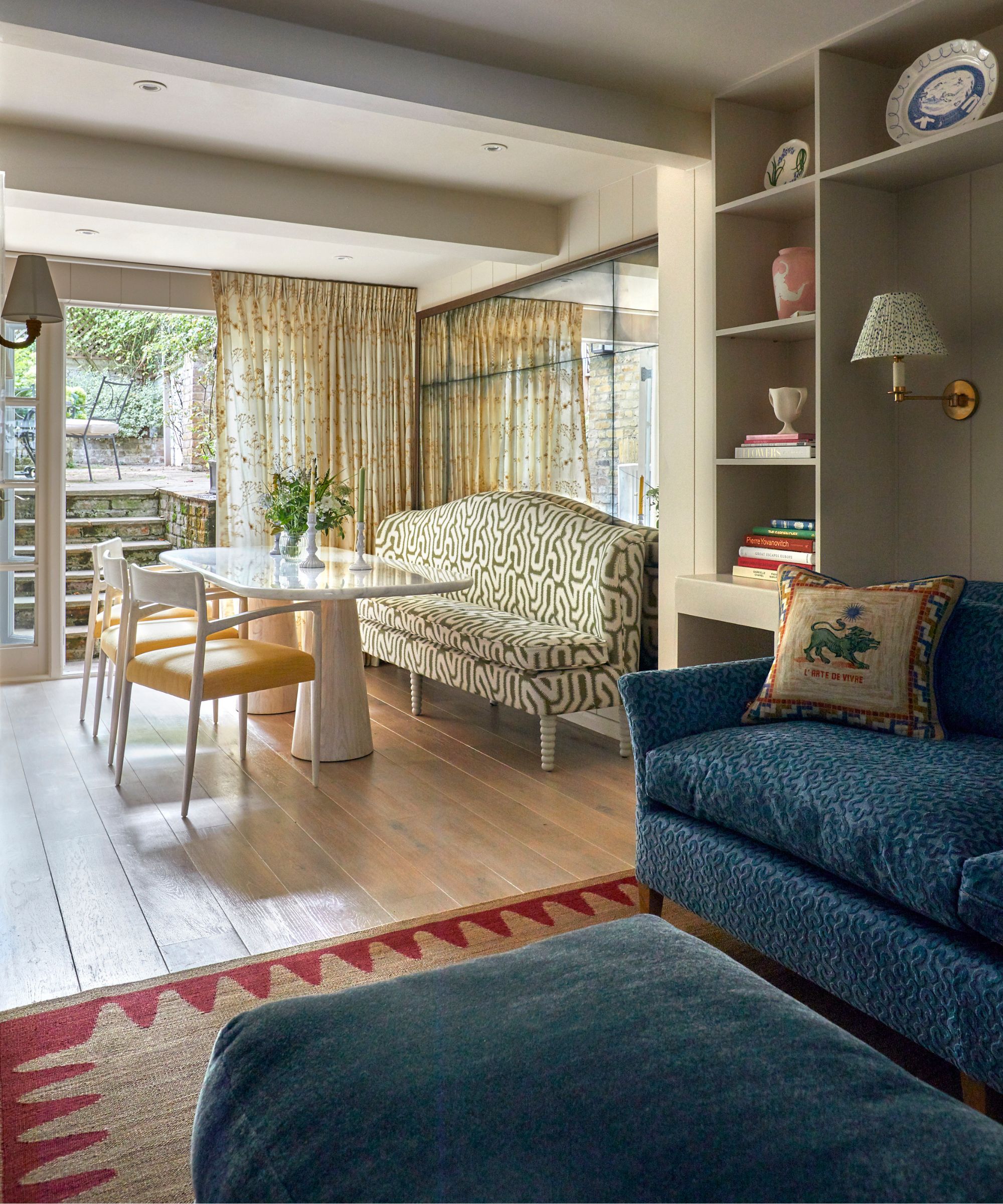
'To me, blue is a neutral that pairs well with so many colors,' says renowned interior designer Emily Henderson who is an advocate of using the unexpected red theory here. 'I tend to keep things fairly neutral, so I love pairing a navy sofa with nature-inspired greens, deep mustards, a beautiful cognac brown, and soft blushes. But if you want more of a pop, I love a little red moment to liven things up.'
Neutrals provide a calming backdrop, while red infuses energy and passion into the space. By opting for neutral tones like creamy whites, sandy beiges, or soft taupes for the walls, floors, and larger furniture pieces like cabinetry and built-ins, you can establish a serene foundation that sets the stage for bright accents.
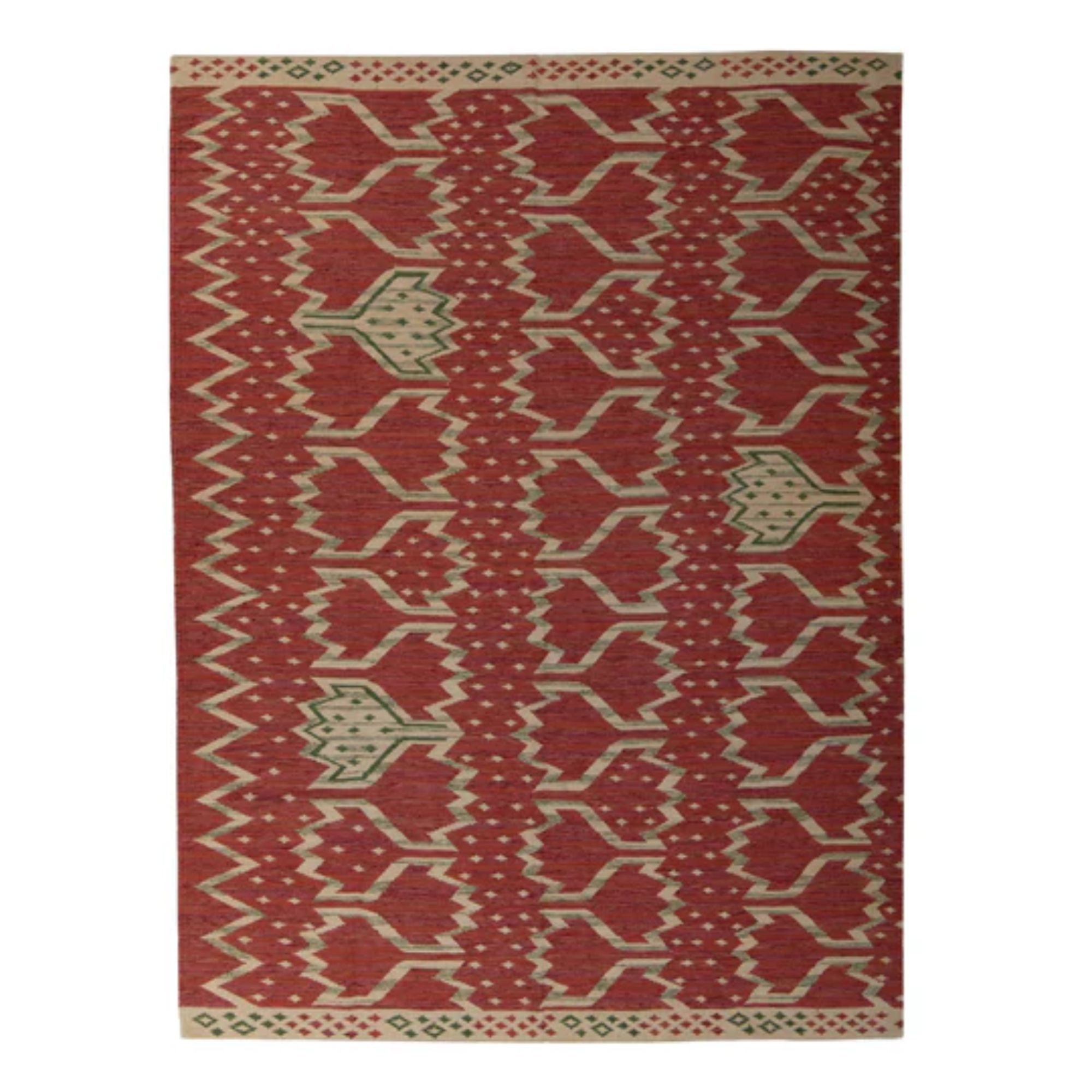
To achieve this, I'm considering strategically scattering red elements throughout the room with my throw pillows, rug, art, and decorative accessories. These pops of red will serve as a focal point that injects a sense of warmth into an otherwise calm, neutral backdrop. It's all about creating contrast in interior design – a design technique we can all adopt from the experts.
2. Crisp white walls and vibrant accessories
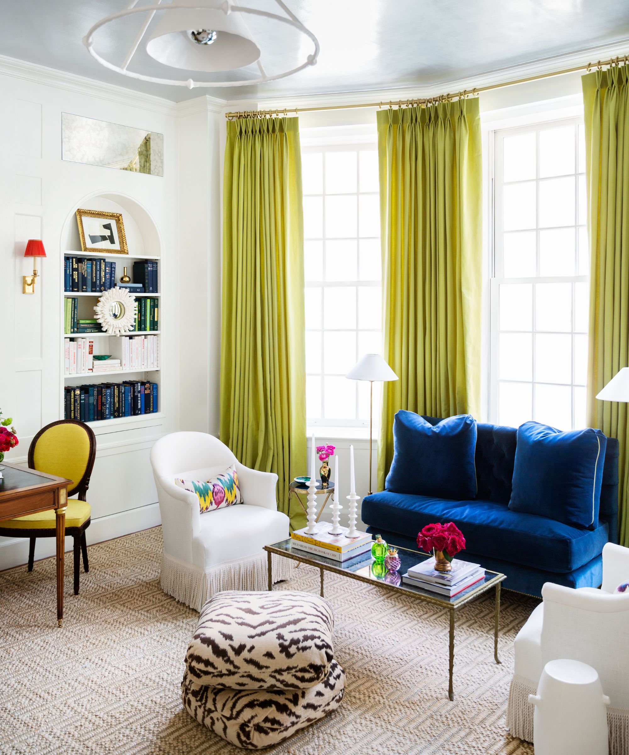
Designer Paloma Contreras created the space above with white walls and a neutral rug to allow the bolder hues to shine. 'A vibrant palette can be executed in a way that doesn’t feel overwhelming if you purposefully choose mostly solid fabrics and paint the surrounding walls white,' she suggests. 'The white in the room adds freshness and grounds it, much like the natural-fiber rug does. It prevents it from being too much.'
'A petite yet overstuffed settee in blue cotton velvet paired alongside the crisp white Napoleon-style barrel chairs with bullion fringe and Ikat pillows made from vintage fabric bring all the colors in the room together perfectly,' says Paloma.
Small details can make a big impact in the living room. Introducing vibrant accessories will allow me to infuse the lounge with personality and a sense of joy, which is an idea I can get behind. Whether that is with jewel-toned hues, playful patterns, or eclectic textures, these accents will certainly command attention.
3. Soft greens and pinks
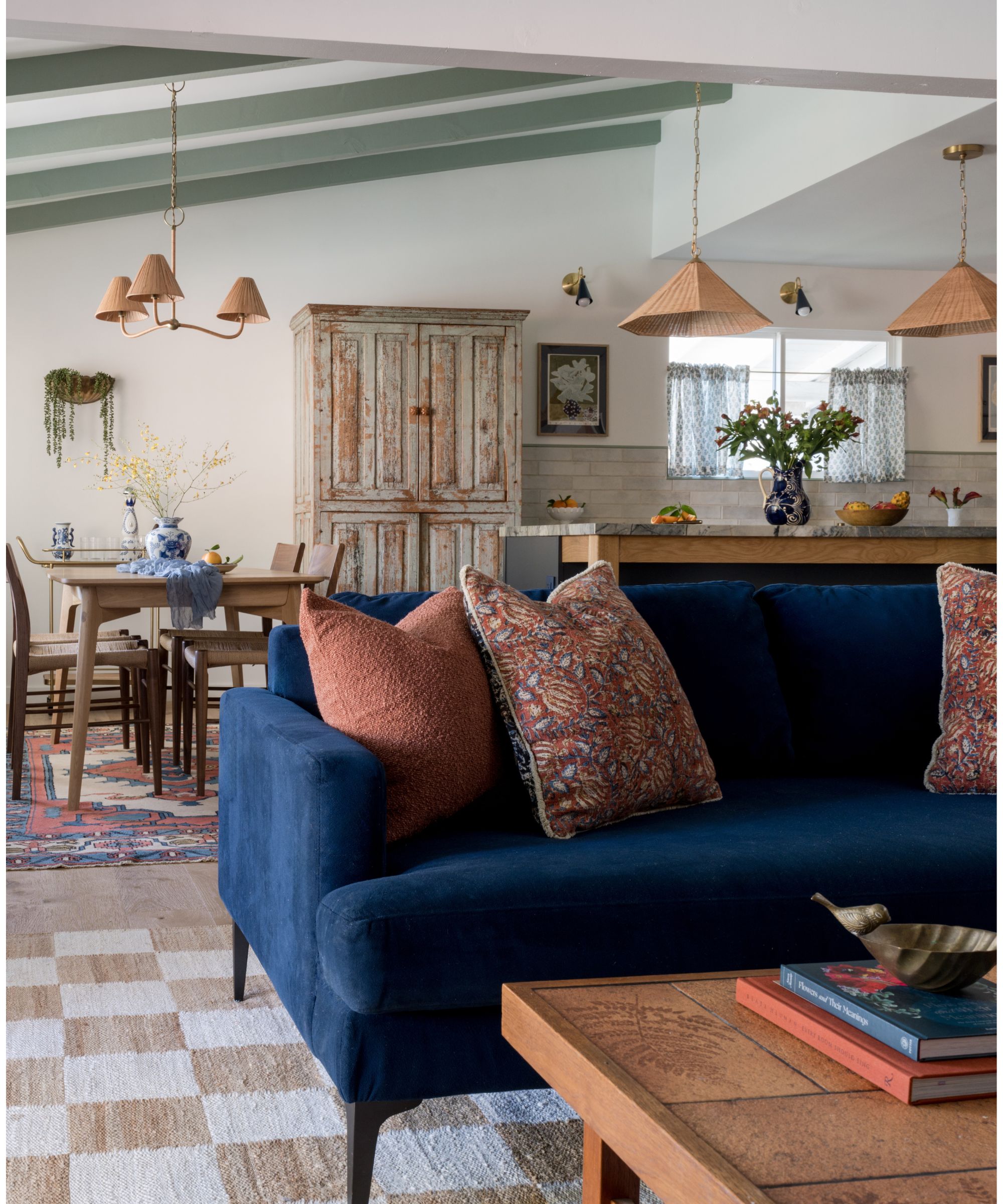
'For a modern and sophisticated look, bring in complementary jewel tones like emerald and burgundy; or for a Grandmillennial vibe, opt for light greens, Millennial pink, and even pops of turquoise and teal,' suggests interior designer Kathy Kuo.
In this 1950s remodel, seen above, designer Emily Brownell of Gilded Hearth chose a navy couch to sit in the snug area of the kitchen, where the color palette was inspired by the home's garden in Spring. Soft greens and pinks create a calming ambiance that invites relaxation and rejuvenation, perfect for a living room that you want to curl up in.
I'm considering incorporating soft green upholstery in smaller pieces of furniture like an ottoman or armchair, with pale dusty rose for the walls and cabinetry. These subtle shades will add depth and warmth and allow the navy couch to sit center stage. I'd pair these soothing colors with natural textures, such as rattan, linen, and wood, to further enhance the organic feel and create a space that feels timeless.
4. Blue-on-blue
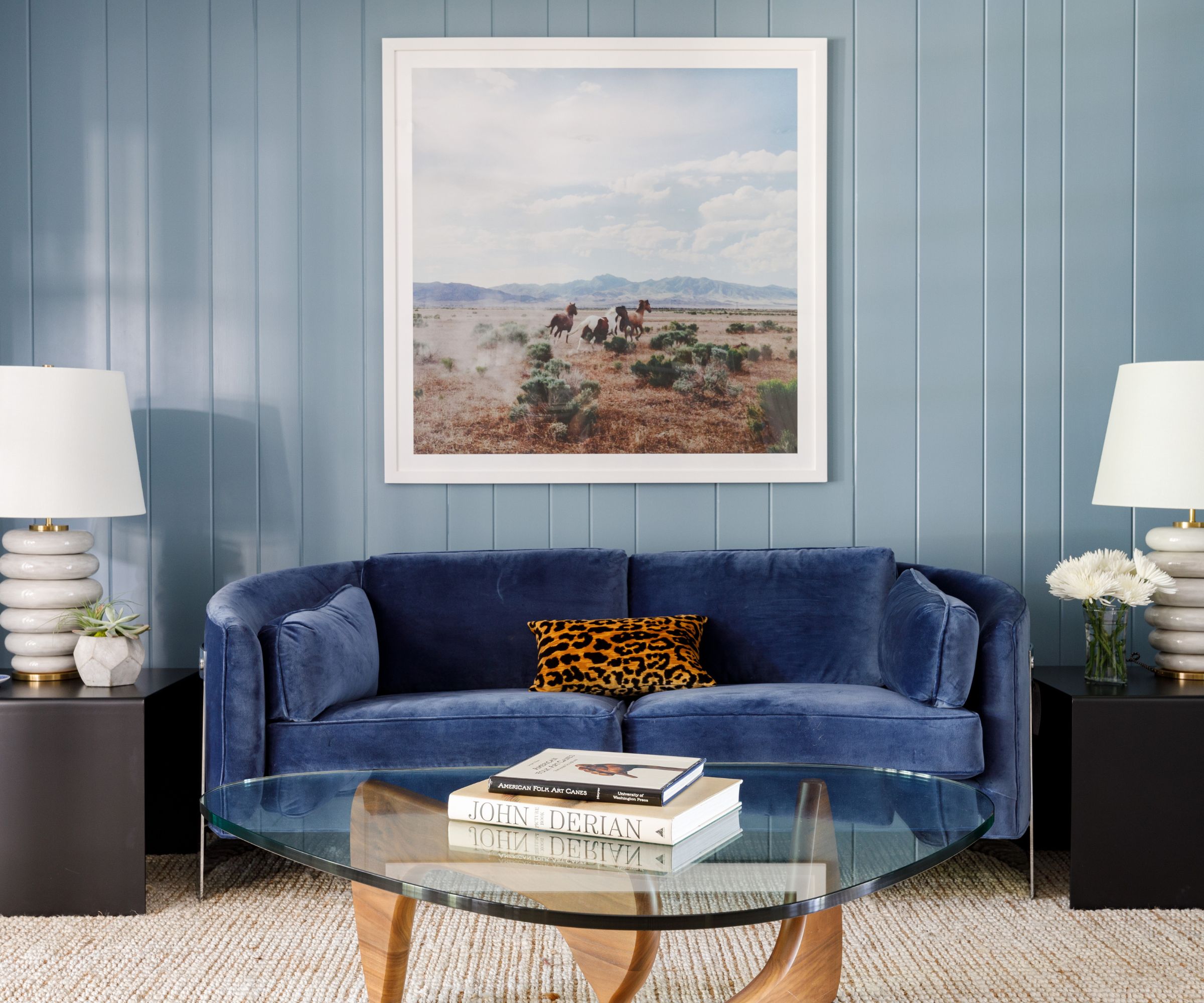
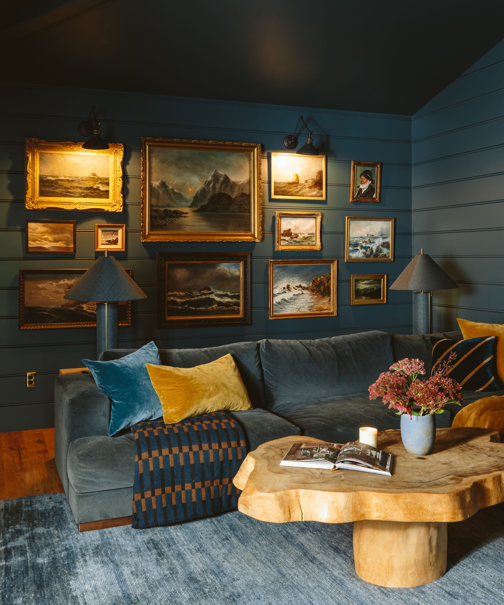
A monochromatic, blue-on-blue scheme creates a sense of calm and cohesion, making it perfect for a relaxing living space. By incorporating varying shades of blue, from soft pastels to deep indigos, the room feels cocooning and enveloping, making it perfect for Netflix Nights In.
'I love the idea of choosing one color and exploring all different tones,' says designer Alexandra Kaehler. 'Here [above] we paired a navy velvet sofa with a dusty blue wall color.' Contrasting tones and textures prevent monotony, so consider mixing different shades and finishes to achieve a layered effect. Pair soft powder blues with rich navy tones, or juxtapose matte finishes with glossy accents to create depth and interest.
'The price of blue pigment once exceeded that of gold, but now the color is more widely used in decoration than any other,' explains Charlotte Cosby, Farrow & Ball's head of creative. 'Our dark blues are extremely popular, we’ve seen a rise in popularity for Hague Blue, Stiffkey Blue, and Inchyra Blue. These darker shades are fantastic for creating a timeless feel and always adding style and drama to a room, which is why they are so popular.'
As blue can read a little cool, touches of warmth through natural materials and accents prevent the space from feeling cold. To achieve this balance, I'd consider incorporating warm wood tones, brass fixtures, and statement textiles into an all-blue room.
5. Crisp white and rustic woods
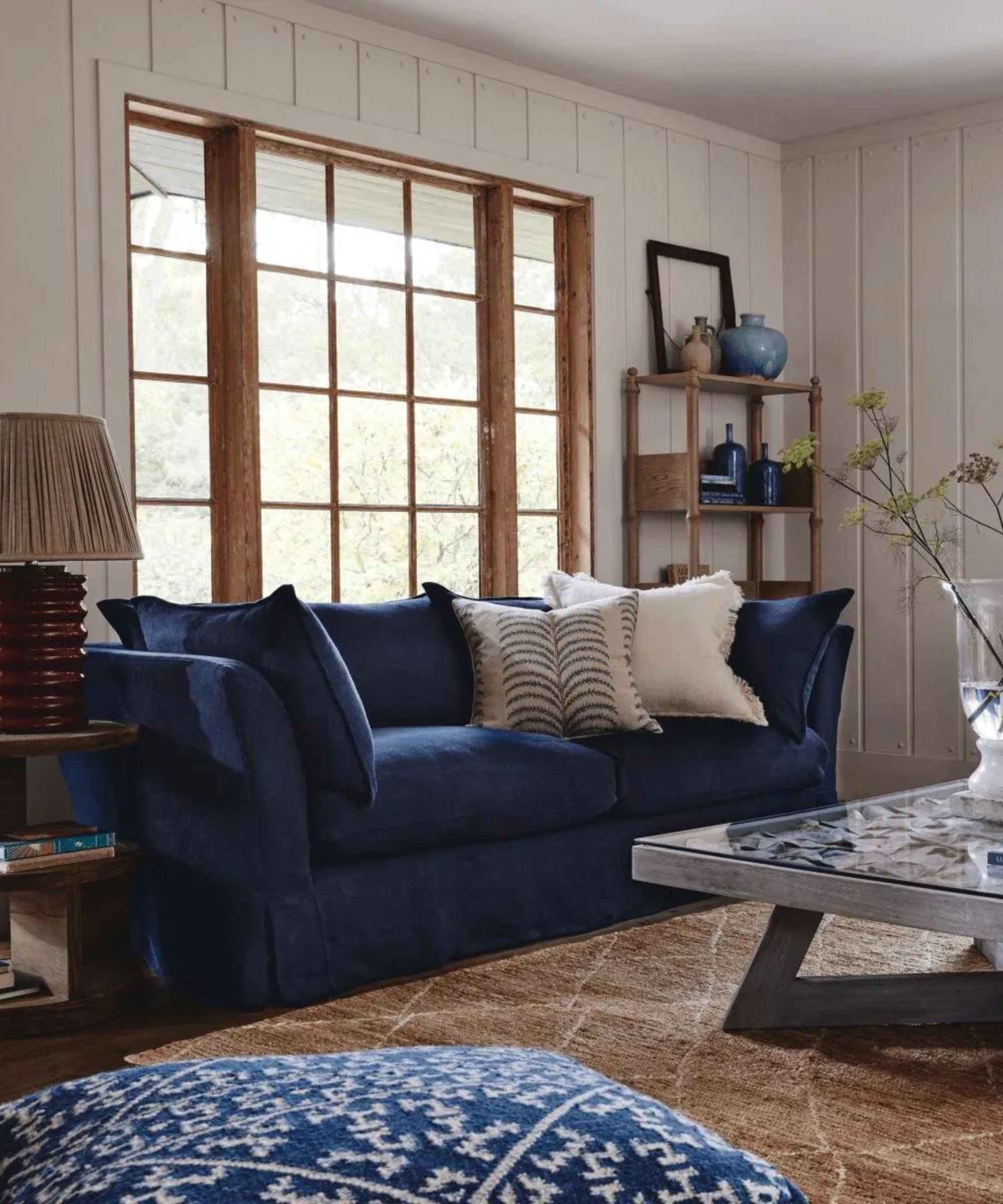
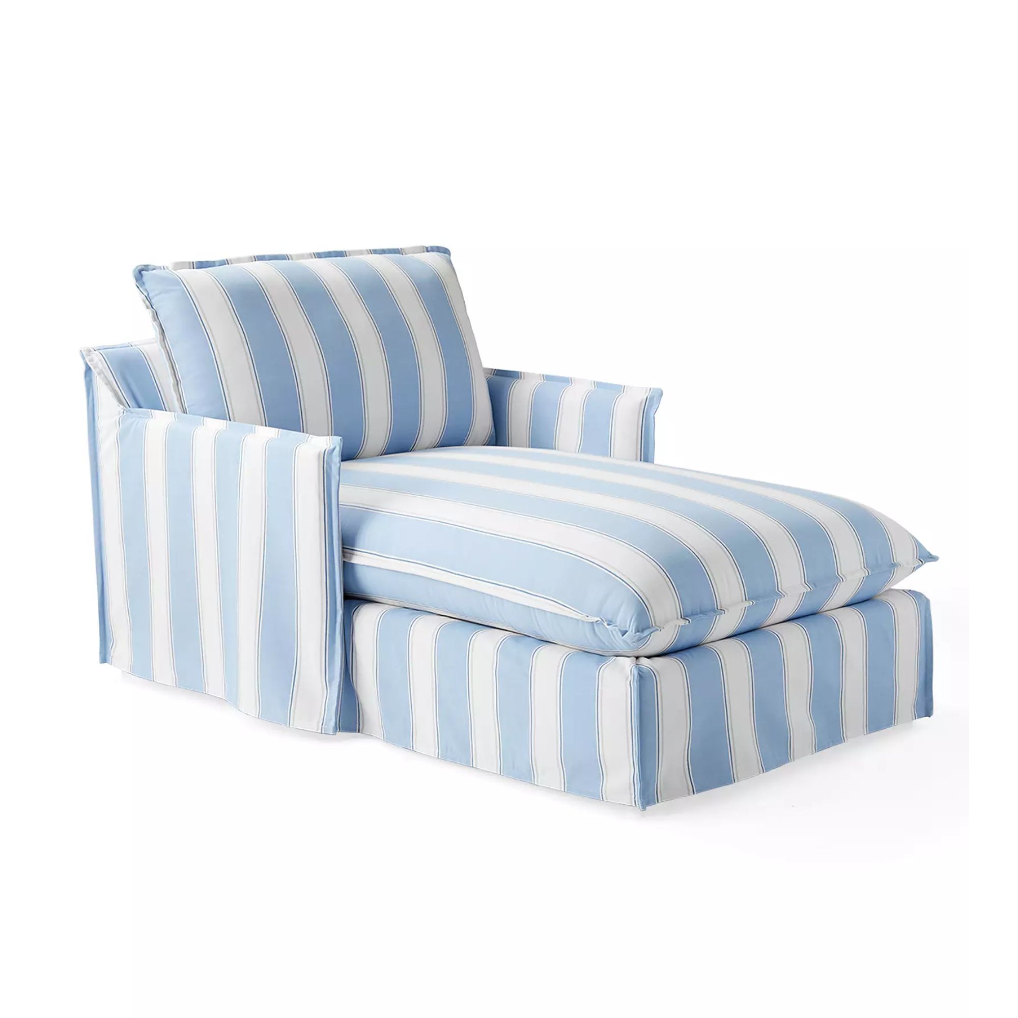
Perhaps one of the most obvious schemes is to look to the seaside for inspiration. The combination of neutral paneled walls and rustic wood evokes the timeless charm and breezy elegance of coastal living in this living space by OKA, seen above.
'Navy blue is one of the most versatile colors, so there truly are so many ways to style a navy sofa with different color combinations,' adds Kathy. 'For a coastal beach look, pair your navy sofa with warm sand and beige tones, alongside crisp whites for a nautical-inspired vibe.'
Opting for decorating with neutrals on the walls, ceilings, and furnishings creates a light and airy backdrop reminiscent of sun-bleached beach cottages, while weathered or reclaimed wood accents add a touch of storied authenticity. It is potentially not the right vibe for my Edwardian home in the English countryside, but I can certainly see the merits of this soothing color scheme.
Dress your navy sofa with organic accents and textures like linen throw pillows and a woven rug underfoot. A denim-blue footstool completes the look, as does a few beach-inspired decor pieces like artwork and ornaments.
From the timeless appeal of a breezy coastal theme to daring pops of red, the key to successfully decorating around a navy couch lies in striking a balance between harmony and contrast. By drawing inspiration from these expert insights, you too can transform your living room into a space that uplifts your blue sofa rather than works against it.
My favorite? Blue-on-blue. There's something about this cocooning, color-drenching effect that just feels so instantly calming. And as someone who values comfort above all, that's a value I'm looking to nail in my living room.
Sign up to the Homes & Gardens newsletter
Design expertise in your inbox – from inspiring decorating ideas and beautiful celebrity homes to practical gardening advice and shopping round-ups.

Charlotte is the style and trends editor at Homes and Gardens and has been with the team since Christmas 2023. Following a 5 year career in Fashion, she has worked at many women's glossy magazines including Grazia, Stylist, and Hello!, and as Interiors Editor for British heritage department store Liberty. Her role at H&G fuses her love of style with her passion for interior design, and she is currently undergoing her second home renovation - you can follow her journey over on @olbyhome
-
 5 surprising but brilliant ways to clean with old socks – from perfectly buffing stainless steel to deterring pests naturally and more
Tackle dust in tricky corners, clean your mirrors and even banish bad odors with those rogue single socks
By Andy van Terheyden Published
-
 How to grow astilbe – expert advice on cultivating this shade-tolerant flowering perennial
Shade-tolerant and pest-resistant - astilbe are hardy and tough perennials that can thrive in many settings
By Ellen Wells Published
