Colors that always work in a neutral scheme – 6 shades designers swear by for a pared-down palette
Beyond the brown, beige, ecru, and oatmeal, why not add a splash of color to your neutral scheme? Here are the shades that have designers' seal of approval

There's a reason why neutral color schemes are often the default choice among designers. Calming, timeless, and extremely versatile, a neutral foundation offers a great backdrop for a home. What's more, by virtue of their neutrality, pared-back palettes also have more widespread appeal. If you're looking to inject a little more personality into your space, however, why not add a splash of color to break up a wall of beige?
Decorating with neutrals is always a safe bet. A tonal scheme made up of ecru, oatmeal, and taupe is simple to construct and certainly easy on the eye, but playing safe doesn't always reap the best rewards. Pepper a dash of pigmented color into your scheme and you instantly add depth and contrast for a more elevated space. It's a popular trick used among designers to not only add visual interest but to make homes feel more characterful and less identikit. The question is, what colors can you count on?
'For people who are curious about trying color but neutrals have always been their comfort zone, I often find that the easiest entry point is to introduce earthy colors into your palette like olive green, rust, terracotta clay, and golden shades,' explains interior designer, Cristina Cleveland. 'These work seamlessly together and with an already neutral palette.'
The beauty of neutral tones and shades of gray is that they pair well with pretty much everything, but if you want to know some of the stalwart shades trusted by designers then you've come to the right place. Here are six colors that always work in a neutral scheme and contribute to a high-end design, as chosen by experts.
1. Mid Greens
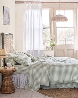
You don't need to have your foot in the interior design world to know that sage green has been one of the most enduringly popular shades in recent years. This hue – and other mid-green tones like olive, jade, and khaki – often feature in otherwise neutral rooms, favored by designers for their natural and calming qualities that echo the likes of beige and brown.
'Mid greens are always a safe bet as they're always calming and relaxing,' explains Patrick O'Donnell, Brand Ambassador and paint expert at Farrow & Ball. 'Something more nuanced like French Gray is not too bright and creates a wonderful, restful environment, especially when teamed with a relaxed off-white – rather than a pure white – for a gentle transition between walls and trim.' For the perfect neutral pairing, he suggests Farrow & Ball's shade Stirabout.
Helen Shaw at Benjamin Moore also suggests introducing the likes of sage, indigo, or teal room color ideas. 'All will add a little extra life into your space and blend beautifully with a neutral palette,' she says. 'You can easily maintain a neutral decor scheme whilst adding splashes of color by introducing these shades in accessories and soft furnishings such as cushions, vases, or curtains.'
2. Earthy pinks
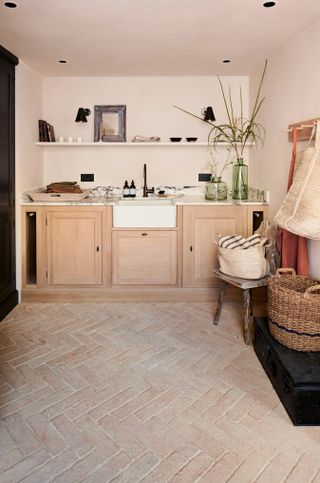
In the last few years, designers have adopted pink as a neutral in its own right. Compared to stark, true whites, earthy pinks offer far more warmth and comfort, meaning designers have crowned them as some of the best neutral paints. As Helen explains, 'we have gradually seen "new" neutrals with pink and red undertones starting to take over from traditionally popular grays and beiges, adding a touch of warmth to laid-back neutral schemes.'
These kinds of pink shades share many similarities with neutrals like cream and taupe, too, making them the perfect complementary color for neutral schemes. 'Plaster pink shades such as Whispering Peach 2014-60 and Venetian Portico AF-185 work perfectly for this look,' adds Helen at Benjamin Moore. 'The soft, dusky rose tones in both add a wonderful earthy and grounded feel, perfect for a room where we unwind and rejuvenate such as the bedroom.'
If you want a color that always works in a neutral scheme, be sure to choose subtle shades rather than saturated pinks. 'Think grown-up, earthy pinks like those with a little brown or ochre,' says Patrick, noting Farrow & Ball's Setting Plaster or Templeton Pink as great choices. 'These colors will glow in a south-facing room and bring a much-needed cozy ambiance to awkwardly lit spaces such as north-facing rooms.'

A Farrow & Ball classic, this is a not quite pink, not quite beige paint that as the name suggests imitates the color of setting plaster. It's the perfect shade for adding a not-quite-neutral to a neutral scheme.
3. Mid blues

If you want a more contrasting color, consider weaving mid-blues into your neutral living room ideas. The coolness of blue juxtaposed with warm, sandy tones will breathe new life into your space, plus it makes a great coastal decor idea.
That's exactly what interior designer Jessica Maros of Maros Designs wanted to achieve in the space pictured above. 'When working with neutrals, introducing a secondary color helps create contrast and visual interest,' she explains. 'In this Sanibel beach house, for example, a striking blue coral became the inspiration for accents throughout the space. A coral blue paired with crisp white added dimension while maintaining a serene, coastal feel.'
4. Caramel
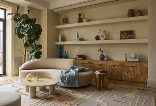
Brown is generally considered a neutral, but mix in more of an orange pigment and you'll have a nuanced golden caramel color. Nestle this shade among polenta and greige and you'll have a neutral palette that always works.
You don't have to rely on painting your walls, either. Consider using caramel tones as an accent shade through upholstery; a caramel chenille sofa would glow beautifully against a neutral backdrop, for example. Or, you could choose lustrous wood like the burl wood credenza pictured above.
If you want to find colors that always work in a neutral scheme, interior designer and color expert Cristina Cleveland recommends sticking to earthy tones, like this one, that are found in nature. 'As you gain more confidence and your comfort level goes up, you can dial up the saturation level of these colors or bring them in in larger doses such as larger furniture pieces or rugs,' she says.

A soft yellow-toned caramel shade, Middle Buff is ideal for adding just a hint of color to a neutral scheme without interrupting it too much.
5. Russet
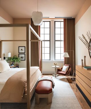
'For a richer, earthier palette, terracotta and warm brown-orange hues complement whites and creams effortlessly,' suggests Jessica. 'These tones work well in textiles, accent pieces, or as bold statements, such as a bathroom vanity painted in Valspar’s Rustic Oak. The deep warmth of the shade grounds the space, adding an organic balance to lighter neutrals.'
You could choose tones on the paler side if you want to decorate with earthy colors that blend into a neutral scheme rather than stand out. Think the likes of baked terracotta or clay. For example, Jessica suggests terracotta pillows as a great way to bring warmth into a bedroom.
'When pairing and adding colors to a neutral space, take cues from existing elements in the room, such as artwork or decorative objects, and highlight the colors that naturally stand out,' she says. 'Play off those details by incorporating complementary pieces like pillows, accessories, or even an upholstered chair. The key is to add just enough for impact without overwhelming the space.'

A nice mix of beige and brown this is the perfect paint shade for grounding a lighter neutral scheme.
6. Pale blues
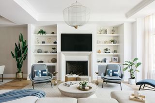
Steely blues were one of the biggest color trends of 2024. They feel fresh, chic, and contemporary, and they work best as an accent color within a neutral scheme.
'One of the best light blue neutrals for a soft and versatile look is Borrowed Light by Farrow & Ball,' says Jessica. 'This shade sits between a gentle blue-gray and a pale sky blue, shifting in different lighting conditions to create a soothing, airy effect. When used on ceilings, it adds an elegant layer of depth, complementing a wide range of colors, from muted greens and olives to warmer earth tones.'
In a similar vein, Helen suggests pairing a delicate cream hue with a light blue such as Benjamin Moore's Soft Chinchilla to ooze comfort in what she calls a 'classy and effortless way'. 'Elevate this timeless look with layers of texture such as dark woods, tactile bouclé textiles, and sleek stone surfaces like marble and quartz,' she says. 'Alternatively, build on the warm tones by layering with natural materials such as leather, warm wood, and stone to create a modern, rustic feel.'

A whisper of blue, Borrowed light appears almost as a neutral at certain times of the day, but has just enough hint of color to contrast a neutral scheme.
FAQs
How do you create a neutral color palette?
Creating a neutral color palette with the perfect tonal balance is relatively straightforward. Whether you prefer deep browns merged with sandy tones, or a simple contrast of white, greige, and gray, most neutrals complement each other beautifully. The more difficult part comes when adding a splash of color.
According to Cristina, the best place to start when choosing a color scheme is to look at existing colors in your room's accessories or decor, rather than pulling ideas out of thin air. 'It could be a small piece of art, the cover of your favorite coffee table book, or a textile from your travels,' she says. 'Pay attention to the warmth or coolness of those shades, and how saturated the colors are. Then you can intentionally introduce more of those shades into the room to create a more cohesive feeling.'
With some intentional styling and proper color consideration, you'll have a neutral palette that's calming and serene while still bursting with unique character and personality.
Sign up to the Homes & Gardens newsletter
Design expertise in your inbox – from inspiring decorating ideas and beautiful celebrity homes to practical gardening advice and shopping round-ups.

Lilith is a freelance homes and interiors writer. As well as contributing to Homes & Gardens she's written for various other titles homes titles including House Beautiful and Livingetc.
You must confirm your public display name before commenting
Please logout and then login again, you will then be prompted to enter your display name.
-
 What does it mean to 'harden off a plant'? Experts explain this gardening term – and why it's important
If you've started seeds indoors, 'hardening off' is a key step when moving them outside
By Holly Crossley Published
-
 7 things you should repair instead of replace in your home – and how to complete the job well yourself in a few simple steps
Easy steps for fixing common household items
By Eve Smallman Published