

Pink is a classic color that makes a go-to choice for filling rooms with warmth while bringing welcoming appeal. However, there's much variation between different shades of pink, and blush pink has arguably become one of the most widely used in recent years.
But as we approach 2025, are we starting to see the decline of this soft shade? According to designers, other shades of pink are beginning to take its place. While blush pink's appeal comes down to its gentle cool undertones which make it easy to decorate with; for some, blush pink is too light and can fail to add the depth we're increasingly after from our color schemes.
We asked interior designers and color experts to weigh in with their predictions of the colors that will populate pink room ideas next year, serving as on-trend alternatives to blush pink.
What's replacing blush pink for 2025?
From earthy shades of terracotta to more vibrant hot pinks, designers recommend these shades of pink for the year ahead – providing the warm and cozy appeal of blush but with slightly more depth.
1. Plaster pinks

Decorating with plaster tones is looking to be a popular way of decorating with pink next year, providing the warmth of blush pink but with a much earthier and grounding feel.
'In the upcoming year, we anticipate a shift from the blush pinks that have been prevalent to more nuanced and sophisticated shades of pink,' says Melissa Read, Creative Director at Studio Burntwood. 'Specifically, we’re seeing a growing interest in hues such as dusty rose or plaster, which offers a deeper, more muted tone.'
'In a recent project, we selected Paint & Paper Library's Plaster V for the guest bedroom. This shade was sourced to create a soft, warming atmosphere for guests. Sulking Room Pink from Farrow & Ball is another example of a mid-tone sophisticated pink, which provides a refined, understated backdrop that enhances both traditional and contemporary interiors.'
2. Hot pink

A more modern alternative to blush pink for 2025 is the more vibrant hot pink. Adding drama and richness to our homes, hot pink is great for maximalist decorating ideas, creating a statement, and energizing rooms.
In this bathroom designed by interior designer Paloma Contreras, hot pink is reflected through the wallpaper, while the rest of the room's neutral decor provides balance and ensures the space feels liveable.
'The vibrant shade of pink in this cheerful Katie Ridder Peony wallpaper was the perfect hue to complement the energy of the space as well as that of my clients,' says Paloma.
To make the most of this color trend, incorporate hot pink in small doses through soft furnishings and accents. Since it's so vibrant, you don't need much of this hue to impact your space.
3. Mauve

'I think we're going to be seeing a lot of mauve and dusty rose in the year to come,' observes interior designer Kathy Kuo. 'These subtle pink hues pair beautifully with warm neutrals, jewel tones, and earth tones, and they're very much rooted in nature while still projecting refinement and sophistication.'
The right shade of mauve paint can be a great way to bring color into your home where you'd typically stick to neutral colors. Paint colors like Farrow & Ball's Peignoir (pictured in this dining room) are muted and grounded, so they won't feel too colorful. Use them as a backdrop color to add cozy warmth and interest to your home, from bedrooms to living rooms.
4. Terracotta

'As we trend toward warm, earthy hues, terracotta will emerge as the popular new pink on the block,' says interior designer Susan Jamieson of Bridget Beari Designs.
Terracotta decor is certainly nothing new, but this earthy shade can work to replace blush pink if you're looking to create a more natural, rich color scheme. The best terracotta paints have seen plenty of popularity lately, so why not consider decorating with them for a colorful yet grounded space?
'The material terra cotta, from the Italian translation of “baked earth”, is made from clay that has been sun-dried and kiln-fired,' continues Susan. 'Its rich colors can range from burnt orange to peachy pink. In general, terracotta is a timeless neutral and we will be seeing those peachy pink variations on both the walls and in actual terracotta floor treatments. I love the old-world look and feel of terracotta-colored walls and tiles in contemporary interiors.'
5. Red-pinks

Looking for a darker way to decorate with pink? Consider those with dark red undertones which can feel a lot more grown up than blush pink. Working especially well with color-drenching ideas, pinkish-red paint colors, similar to brick tones are set to be a sophisticated way to decorate with color next year.
'I can see the deeper, red-based pinks being very popular next year such as Nether Red by Little Greene,' says designer Jenny Luck, who used this rich, earthy paint color in this relaxing bedroom.
'Going for a deeper depth of color creates a cocooning effect which is perfect for a bedroom. With its warming yet muted aesthetic it feels less overwhelming than going for a red, yet more mature than a playful pink. It feels relaxed yet considered and stylish.'
While of course, you should still decorate with blush pink if you enjoy this color, these alternatives may be better choices if you want to lean into the earthy tones trending right now. While blush pink can feel light and airy, these richer, more nuanced shades will add depth to your home while still providing all the warmth of pink.

-
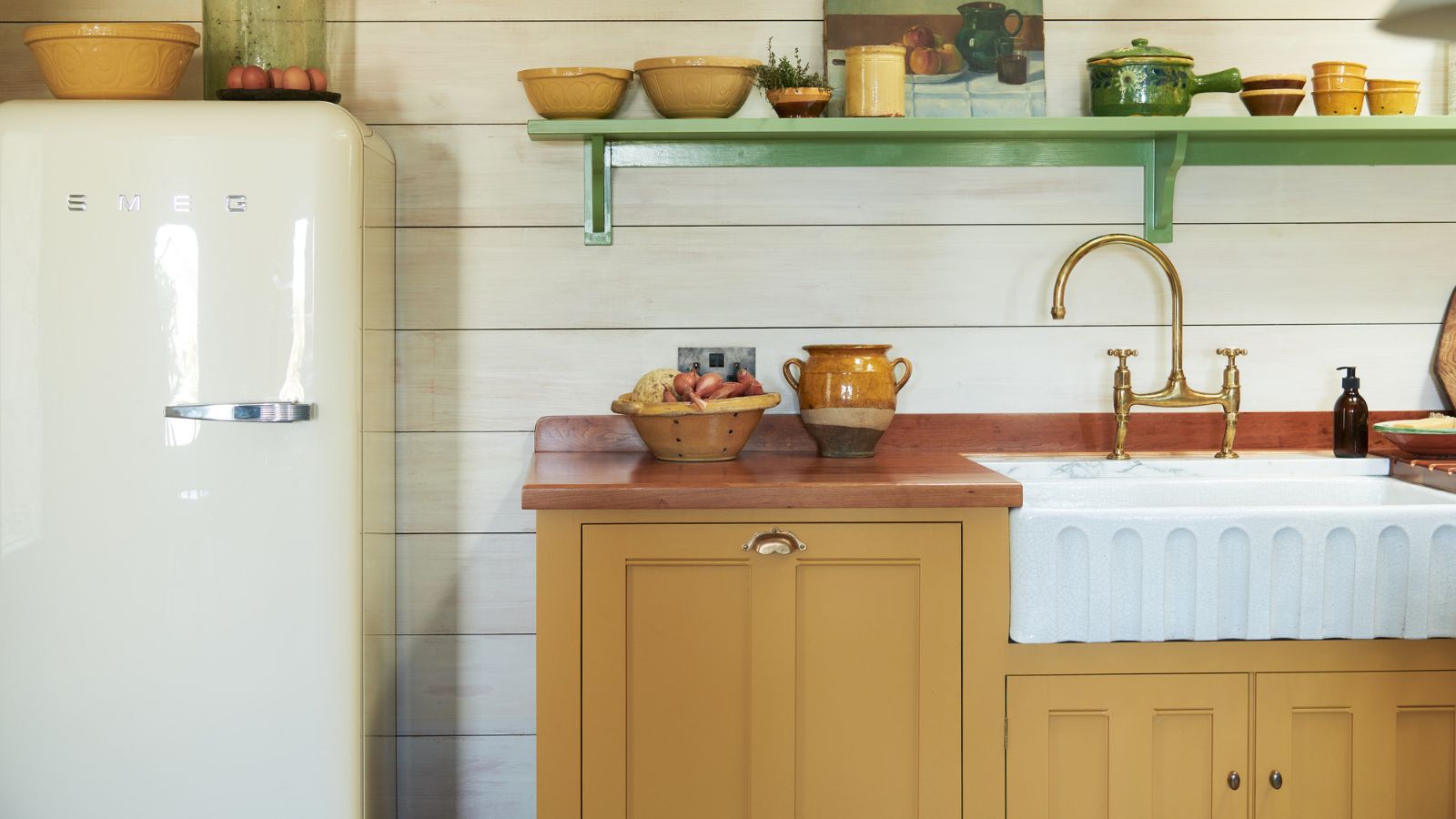 The 5 worst things you can do to your fridge – these will drive up energy costs and result in pricey and regrettable repairs
It's crucial to swerve these blunders, appliance experts warn
-
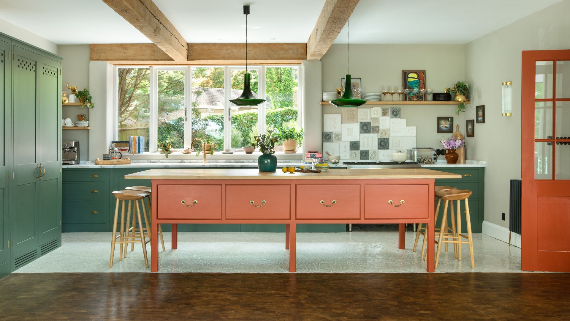 Orange and green is the bold color pairing quietly transforming homes in 2025 – here's 4 reasons why
Interior designers are making the orange and green combination work wonders – this is how you can too

