5 enduring colors designers always return to when they have trend fatigue
Feeling overwhelmed by quickly passing color trends? These are the shades to turn back to
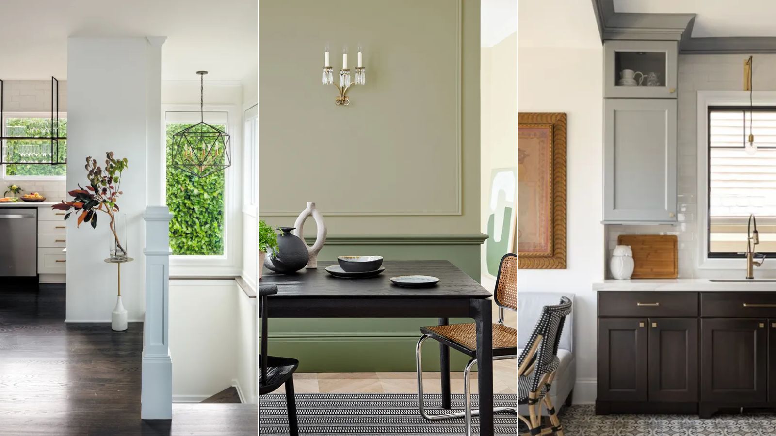

While color trends can be a great place to spark fresh design inspiration, you're not alone if you soon feel fatigued by trying to keep up to speed with the latest shades.
From rich reds to bold purples, many lively shades have dominated this year's color trends, but sometimes something more timeless is needed to ensure our design choices go the distance.
And so, we spoke to interior designers who share below the colors they always return to when they have trend fatigue. If you're looking for failsafe room color ideas for a timeless approach to decorating, read on.
Colors designers return to when they have trend fatigue
A New Day Design
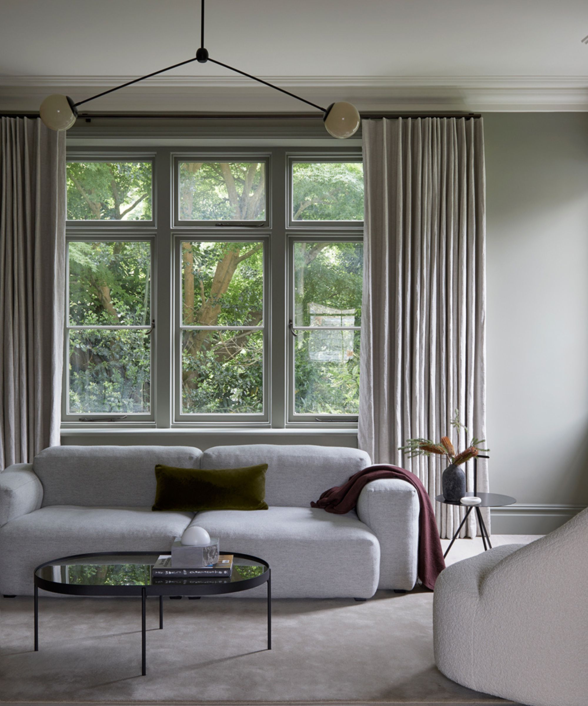
Andrew Griffiths, founder of A New Day Design, advises that focusing on how you want a space to feel makes a great starting point when choosing colors for a room, taking inspiration for a home's surroundings to inspire the color selections:
'To avoid being distracted by trends, try and focus on how you want a space to feel rather than look. While we have favorite colors we might return to, that's not where we would start. Instead, we focus on the context of the house and who lives there as a route to shaping the right color palette. In this living room design, we took the setting of the house, with its living room views out into the treetops, as a starting point to shape a color palette that reflected the juxtaposition of nature but in the urban context of London.'
That said, certain colors do generally feel timeless and beyond the trends. If you're looking for a classic color choice for the starting point of your decorating project, read on to hear designers' tried and tested favorites.
1. Sage green
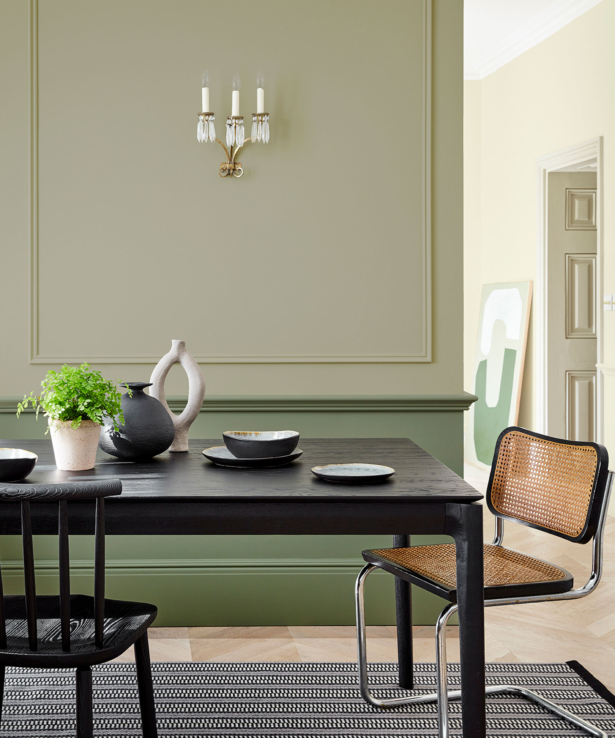
When interior design trends feel overwhelming, turning to nature never fails to spark inspiration. Decorating with green is one of the colors most closely linked to the natural world, making it a go-to color to incorporate for timeless design.
Design expertise in your inbox – from inspiring decorating ideas and beautiful celebrity homes to practical gardening advice and shopping round-ups.
'I can honestly say that I never get tired of sage green – both in my own home and in my projects,' shares interior designer Kathy Kuo. 'I love that it's equal parts sophisticated and earthy. Sage is at home in a number of design styles – from French country to modern farmhouse – and it works just as well in a statement piece as it does for subtle accents.'
When it comes to the best green paints, there are many to choose from that feel classic and beyond the trends. October Mist by Benjamin Moore is one frequently returned to by interior designer Sara Malek Barney of BANDD/DESIGN, who says: 'It is the perfect sagey green. It works across many different aesthetics and just looks so put together.'
2. Off-whites
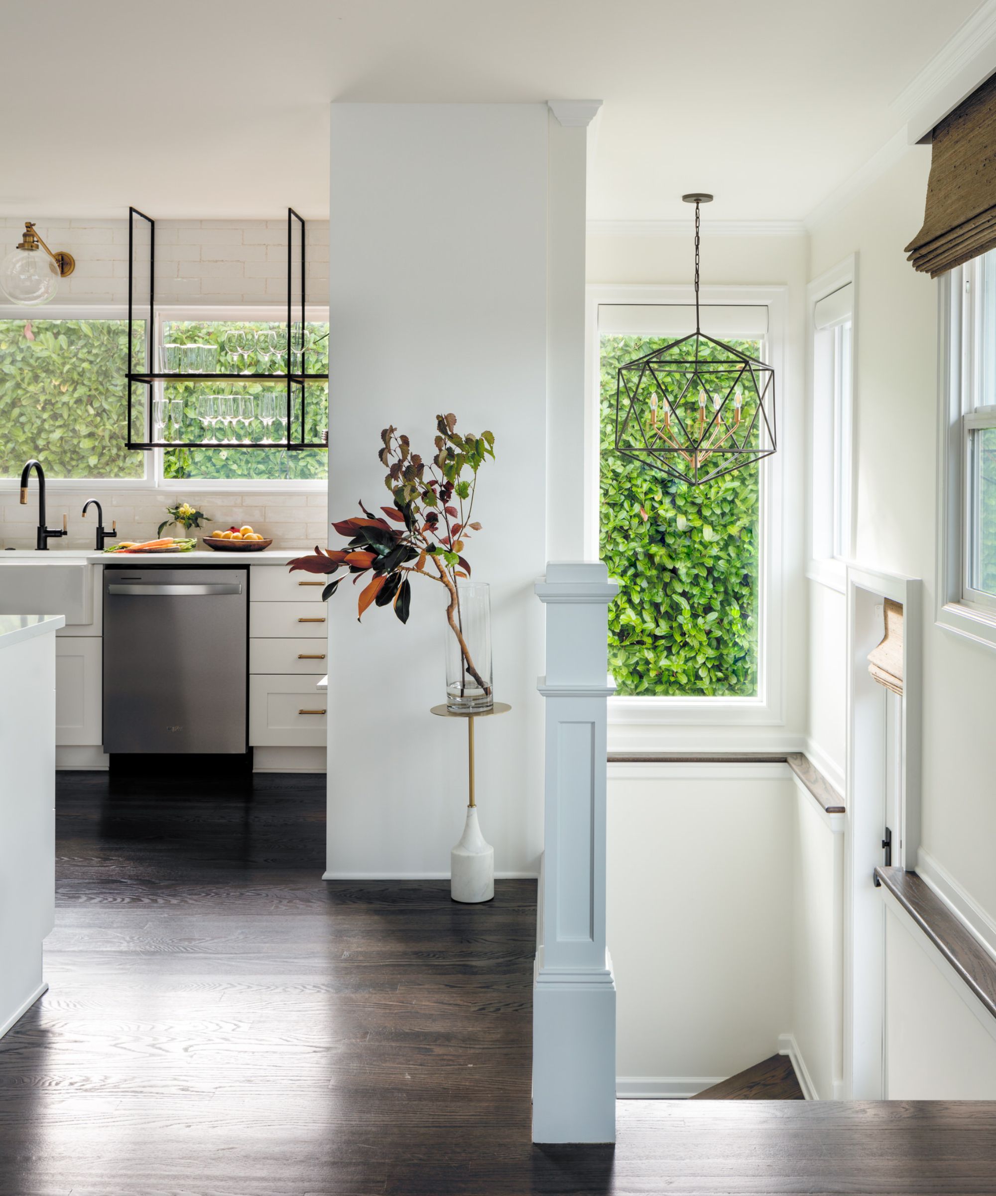
Decorating with neutrals may seem the most obvious choice when thinking of timeless colors, but you shouldn't underestimate how effective they can be. More specifically, designers often turn to warm white paints for a classic scheme that endures beyond the trends – balancing a light and airy scheme with a hint of coziness.
'My go-to paint color is Sherwin-Williams' Greek Villa,' says designer Jessica Dorling of Dorling Design Studio. 'Its perfectly balanced warm undertones create a timeless and versatile look. Whether used as a subtle supporting element or a standout feature, it consistently feels fresh and sophisticated. Greek Villa provides a sense of calm and reliability, making it my ideal choice when I want to escape the overwhelm of passing trends.'
'A warm cream paint color will never go out of style,' agrees designer Alexis Warren. 'Benjamin Moore's White Dove will always be my go-to in this shade. Reaching for a white paint may seem simple, but it's one of the hardest colors to select. Very white-whites come and go, but a warm neutral is classic and timeless. White Dove is the perfect backdrop to allow your fabrics to take center stage while bringing brightness to your space.'
Similarly, designer David Ries of Ries Hayes recommends using Benjamin Moore's Fog Mist for a timeless color scheme. He explains: 'It's extremely versatile – warm, cool, luminous, and neutral and is more muscular (meatier if you will) than a typical off-white which we love. It's our "Goldilocks" color and is just right for every situation especially when we're experiencing trend fatigue.'
3. Earthy tones
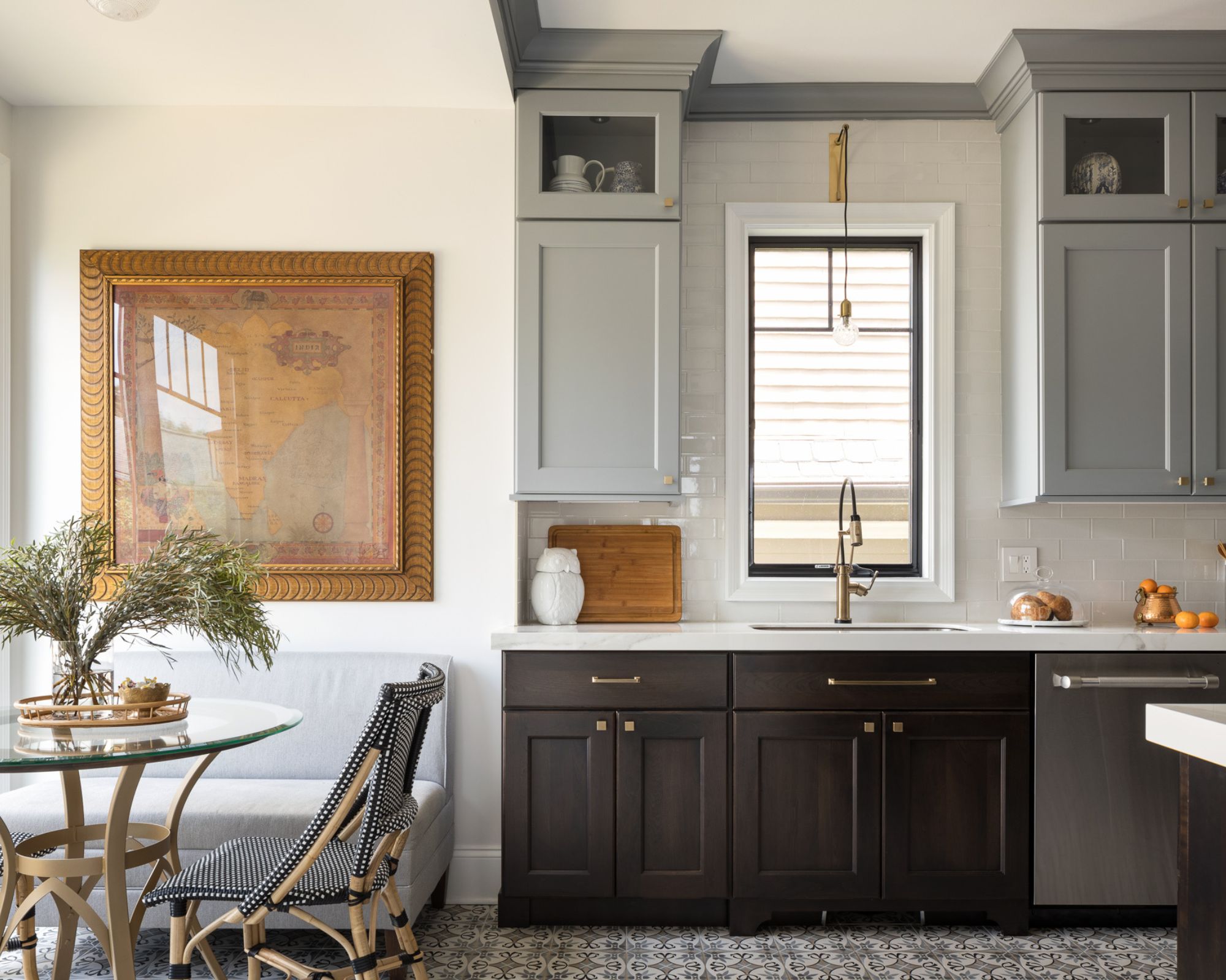
Blue is another color closely linked to the natural world, so it's no surprise designers regularly decorate with it when experiencing trend fatigue. More specifically, blue-grays like Benjamin Moore's Cobblestone Path feel grounded and liveable – a favorite for Jaclyn Isaac of Doni Douglas Design:
'I'm a firm believer in using blues as neutrals because they are found in nature. Carrara marble, the ocean, and the sky – colors pulled from our surroundings like this, and found over decades of design, are confirmation that they will never go out of style.'
Similarly, warmer earthy tones such as greige and taupe have the same enduring appeal. 'When trend fatigue sets in, I always gravitate toward Piano Room by Portola Paints,' says designer Vyanca Soto of Market Studio Interiors. 'This deeply rich and earthy tone exudes a sense of timeless elegance, bringing warmth and sophistication to any space.'
4. Navy blue
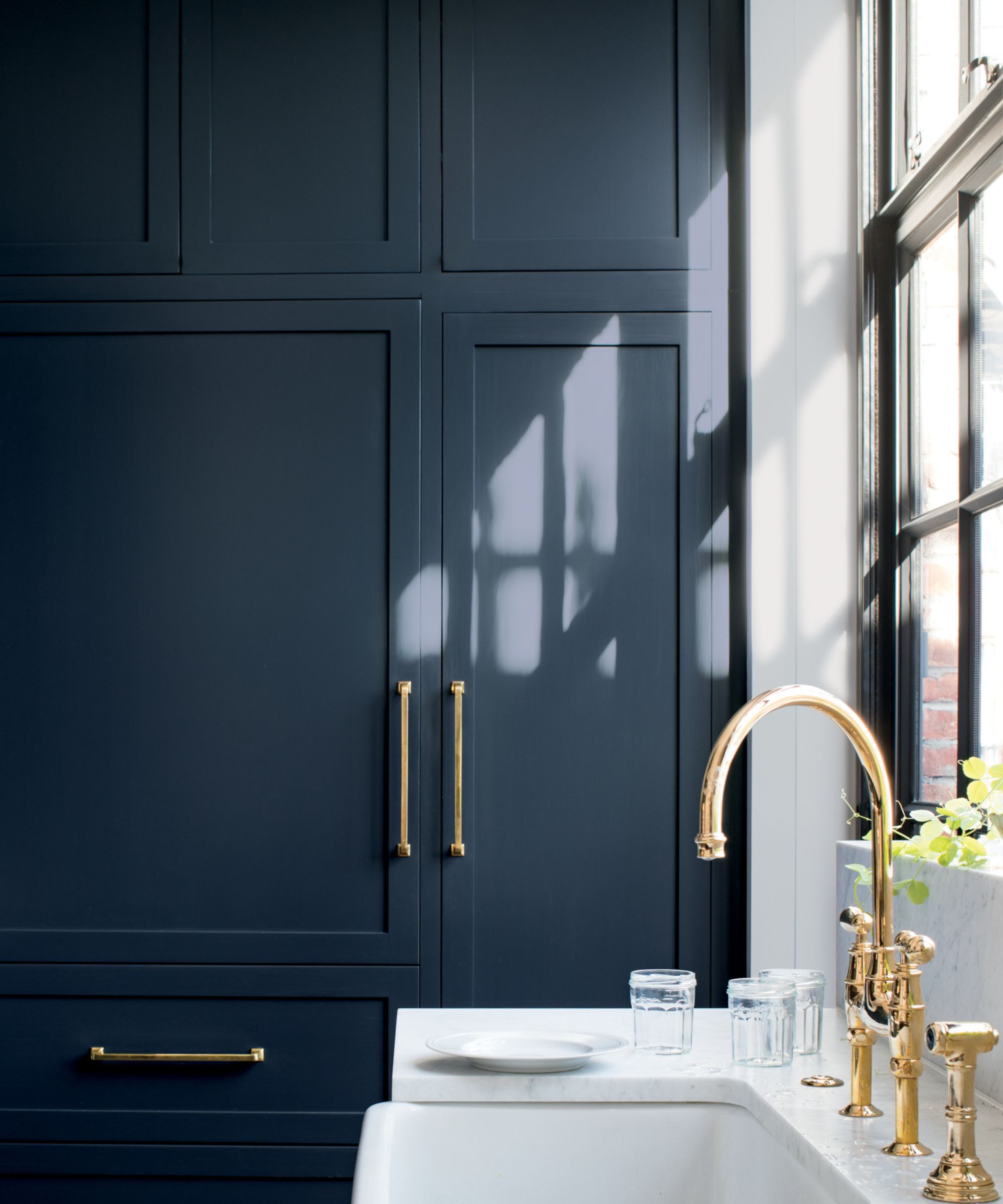
When color trends feel overdone, it doesn't need to always result in returning to a palette of plain neutrals. While light neutrals are amongst the most enduring, the right dark paint can feel just as fresh and seasonless.
Navy blue, for example, offers a rich and slightly moody appeal, a great choice if you want to create a cozy and sophisticated space. For interior designer Nadia Watts, Benjamin Moore's Hale Navy is a color she often returns to amongst trend fatigue, as used here on the kitchen cabinets.
'Hale Navy is bold, classic, and timeless,' Nadia observes. 'It works as a neutral in that everything goes with it. It’s far from boring – it's within the bounds of historical and traditional colors.'
5. Charcoal
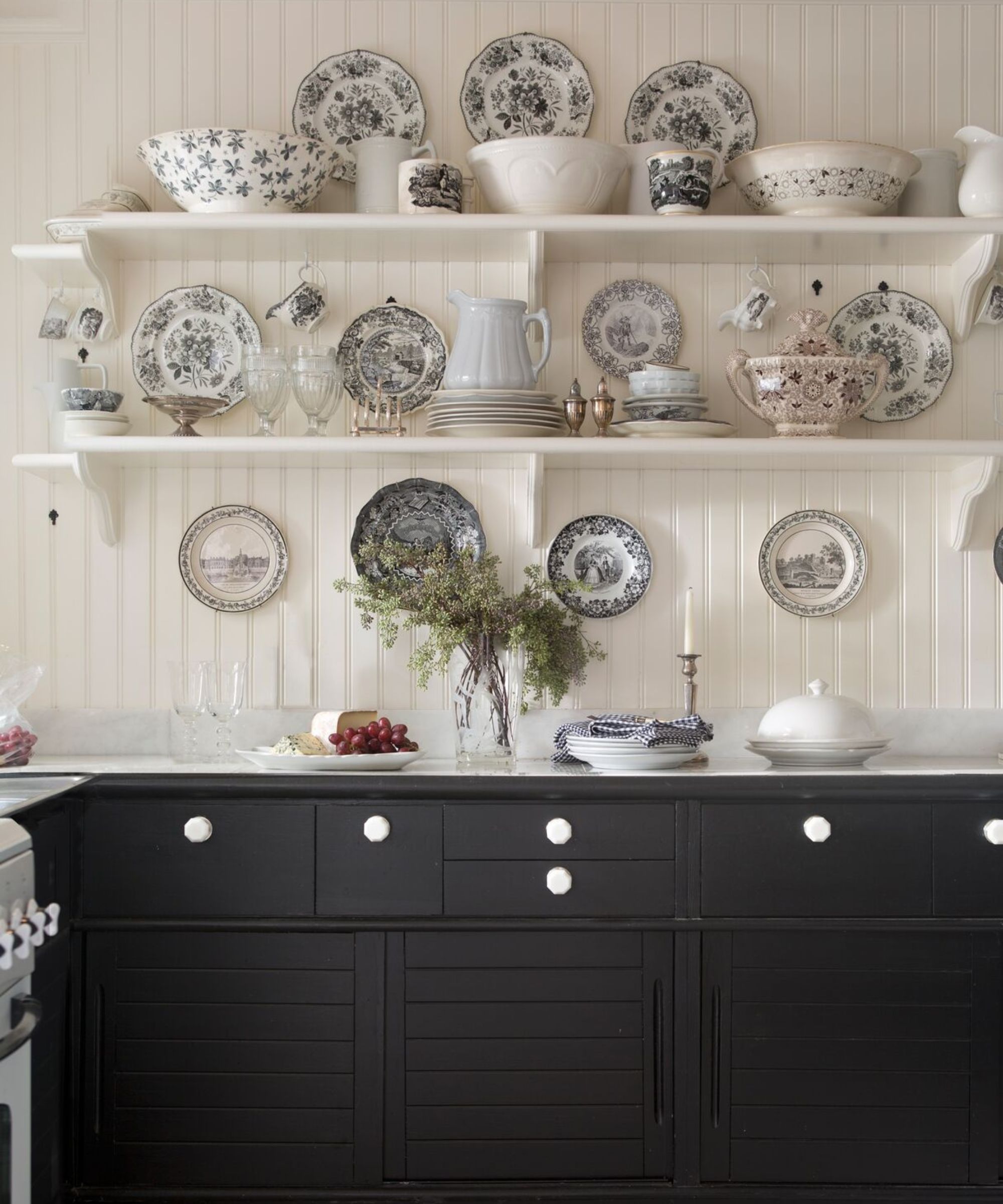
Another dark paint color that makes for a classic choice amongst passing color trends is charcoal.
'When trends feel overwhelming, I retreat to the classic pairing of an almost-black charcoal and white,' explains designer Cheryl Clendenon of In Detail Interiors. 'My favorite is Jet Black by Benjamin Moore. It’s crisp, timeless, and still has that moody allure we love so much. This pairing never goes out of style and it gives us a fresh canvas for layering textures and materials.'
Hannah Goldberg, founder and principal of Hannah Charlotte Interiors follows a similar approach, reaching for Portola Paints' Lone Cypress, an incredibly dark green paint: 'This earthy deep blue-green can pass as an off-black in some lights. It envelopes a room with richness and has a depth of hues that looks just as great on walls and ceilings as it does on cabinetry and millwork.'
While color trends can soon pass, each of these colors offers a timeless quality, since they're all generally associated with the natural world. If you're looking for a new paint color to kick-start the new year, these expert picks are a wonderful place to start.
Emily is a freelance interior design writer based in Scotland. Prior to going freelance in the spring of 2025, Emily was Homes & Gardens’ Paint & Color Editor, covering all things color across interiors and home decor for the Homes & Gardens website. Having gained specific expertise in this area, Emily is well-versed in writing about the latest color trends and is passionate about helping homeowners understand the importance of color psychology in home design. Her own interior design style reflects the simplicity of mid-century design and she loves sourcing vintage furniture finds for her tenement flat.