Designers say these 5 colors are dating your home in 2025 – and share what to use instead
From whites to cool grays, designers are replacing these colors with more contemporary alternatives for the year ahead

Design expertise in your inbox – from inspiring decorating ideas and beautiful celebrity homes to practical gardening advice and shopping round-ups.
You are now subscribed
Your newsletter sign-up was successful
Want to add more newsletters?
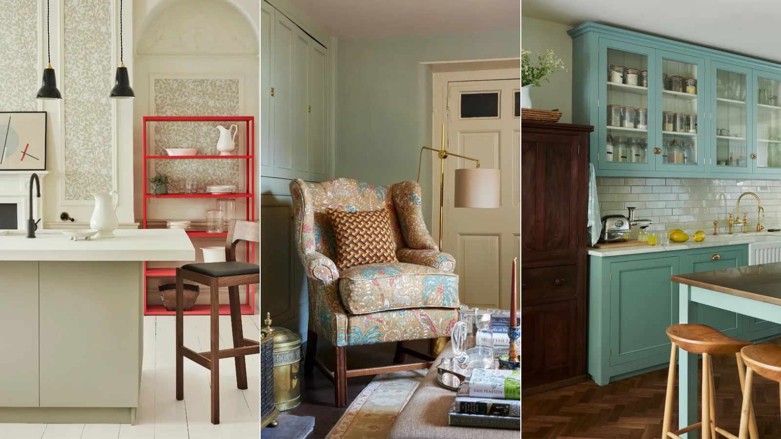
As we near 2025, you may well already be considering the best colors to incorporate into your interior schemes. But as well as observing the latest color trends, it's also worth taking note of colors that can potentially date your home in 2025.
According to interior designers, certain once-popular colors may be best avoided in 2025 if you want to create an on-trend and contemporary scheme and avoid making interior design mistakes.
So, what are the colors dating your home in 2025? We've rounded up five suggestions below from designers. While neutrals dominate when it comes to outdated color trends, certain bold hues also fit this category, according to design experts.
Article continues belowColors that are dating your home in 2025
Before we delve into the colors that can feel dated for the year ahead, it's worth saying that colors are subjective and you should always decorate with those you love most, regardless of color trends. Even though a certain color may be labeled as dated, if it aligns with your style and brings you joy, then don't get too caught up in trends.
'Every color has the potential to create a unique and interesting effect,' says interior designer Natalia Miyar. 'Color is incredibly transformative and can tie a room together. I’m a firm believer in choosing what you love and that certainly applies to color choices as well.'
1. Beige
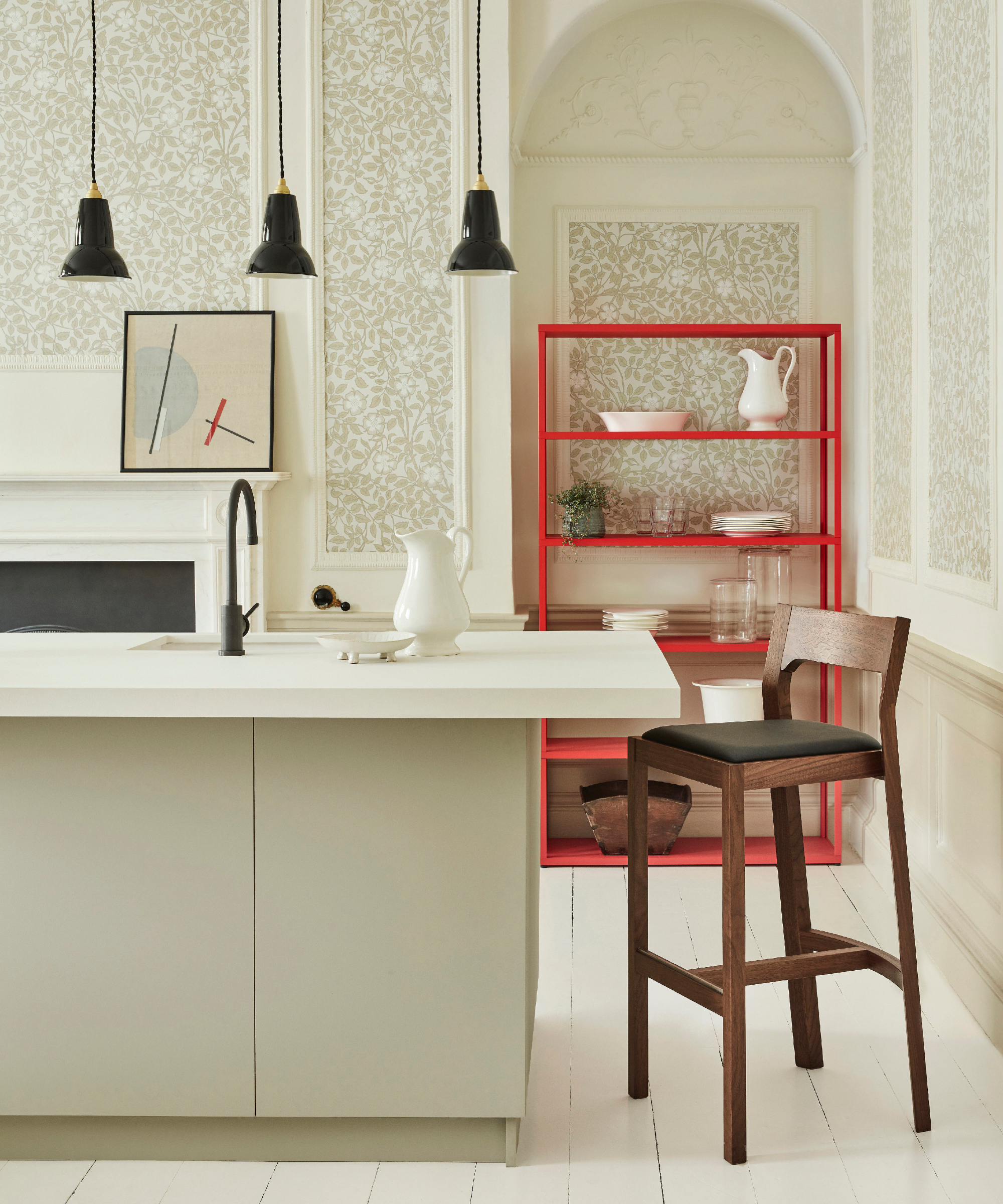
'The overuse of outdated neutrals like beige can make spaces appear flat and uninspired,' says interior designer Melissa Read, creative director at Studio Burntwood.
While beige is an inoffensive color choice, we're observing designers switch out beige hues for warm off-whites and warm grays. These paint colors can create a more modern look in the home, ensuring the space feels light and airy while also adding depth, much like this timeless kitchen color scheme.
Design expertise in your inbox – from inspiring decorating ideas and beautiful celebrity homes to practical gardening advice and shopping round-ups.
'I would lean towards warmer neutrals that add more depth,' continues Melissa. 'For example, Skimming Stone by Farrow & Ball or Little Greene's Wood Ash.'
2. Stark white
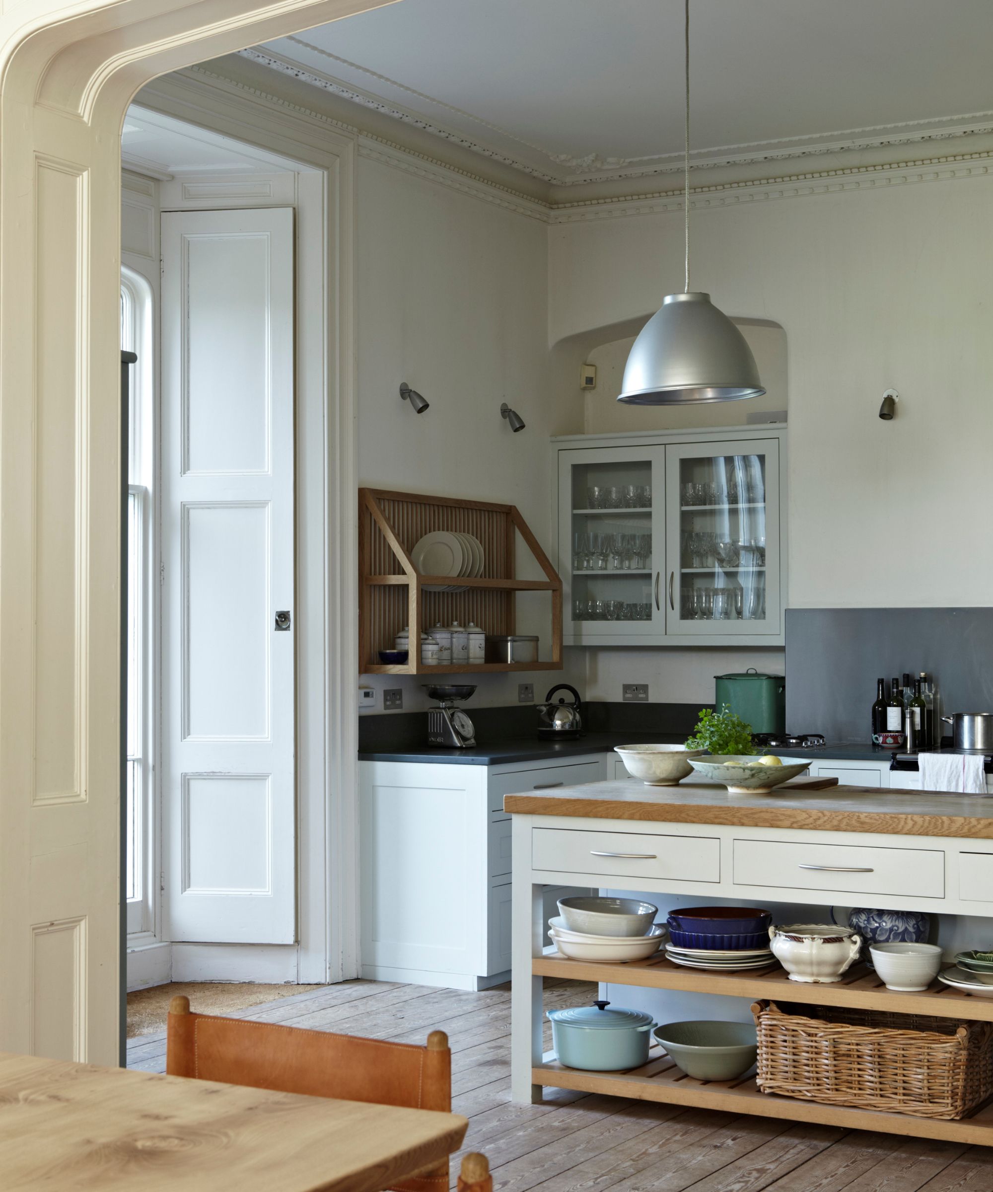
It's no surprise to hear designers reiterate the move away from stark whites toward those with richer undertones; a key design trend throughout 2024 that will endure next year, too.
'Sterile whites lack the warmth and hominess that people are craving these days,' explains designer Nureed Saeed.
Paint colors like Farrow & Ball's Strong White with subtle gray undertones are a good alternative to bright whites, adding depth and coziness to a room while still providing a clean and classic look.
Similarly, designers are favoring a layered approach when decorating with white for 2025, rather than keeping spaces purely white. 'Add some depth with texture, pattern, and color to a room to give it life,' adds designer Sarah Latham of Latham Interiors.
3. Magnolia
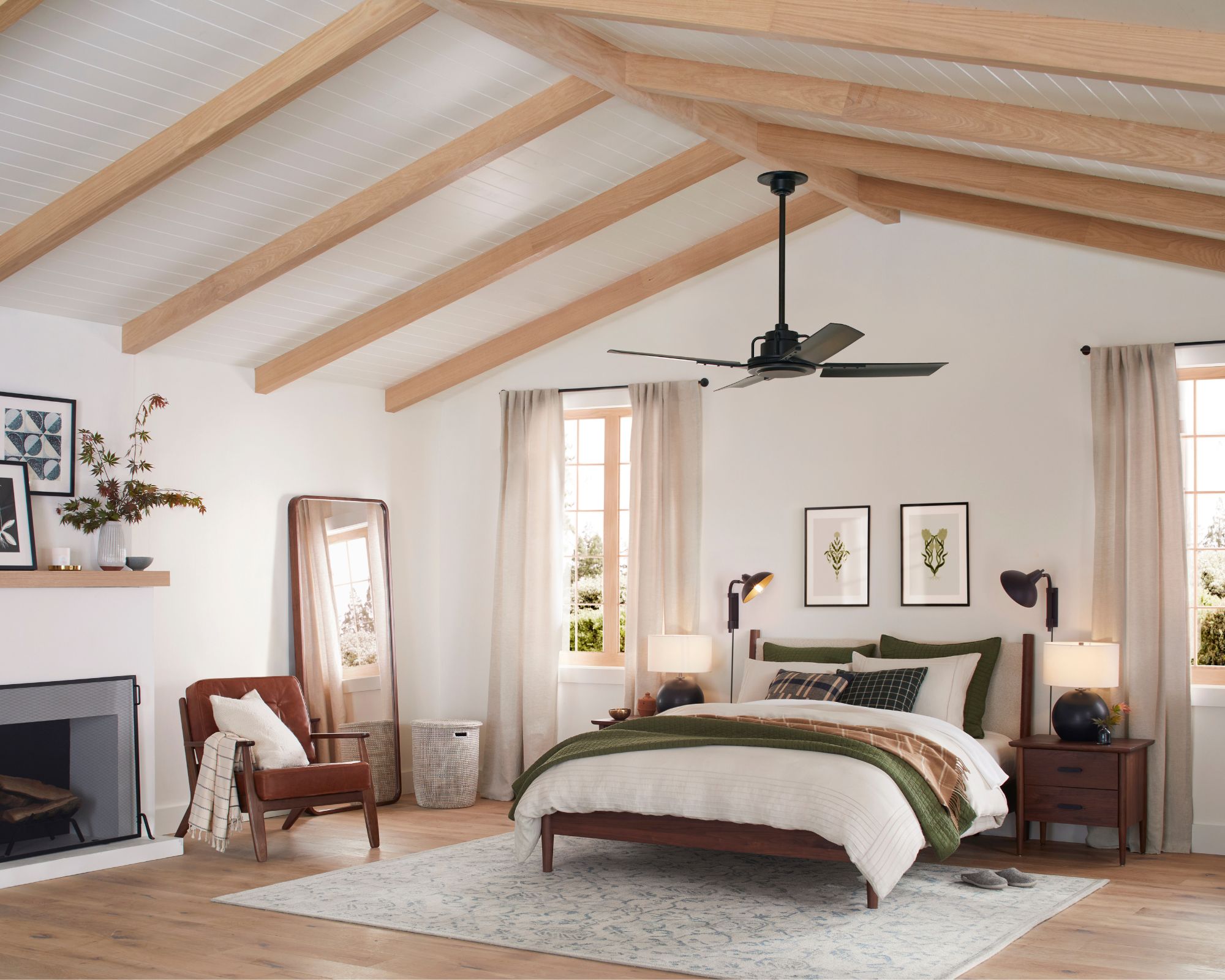
'Yellow-toned ivories, especially on trim, moldings, and cabinets, can feel outdated,' explains Mary Jones, principal designer and founder of Arpieka.
Instead of yellow whites that lean towards magnolia, fresher whites with more subtle warmth are the way forward for 2025, much like Sherwin-Williams' Pure White which was used in this bedroom.
'If it’s been a while since your last update, refreshing with more modern neutrals like Simply White by Benjamin Moore or Pure White by Sherwin Williams can make a big difference,' continues Mary. 'I like to match the wall color with trim for a cohesive, fresh look. Matte finishes are also trending for walls, though clients often prefer satin finishes for trim and cabinets for durability. It’s always a good idea to discuss with your painter to find the best option for your space.'
4. Gray
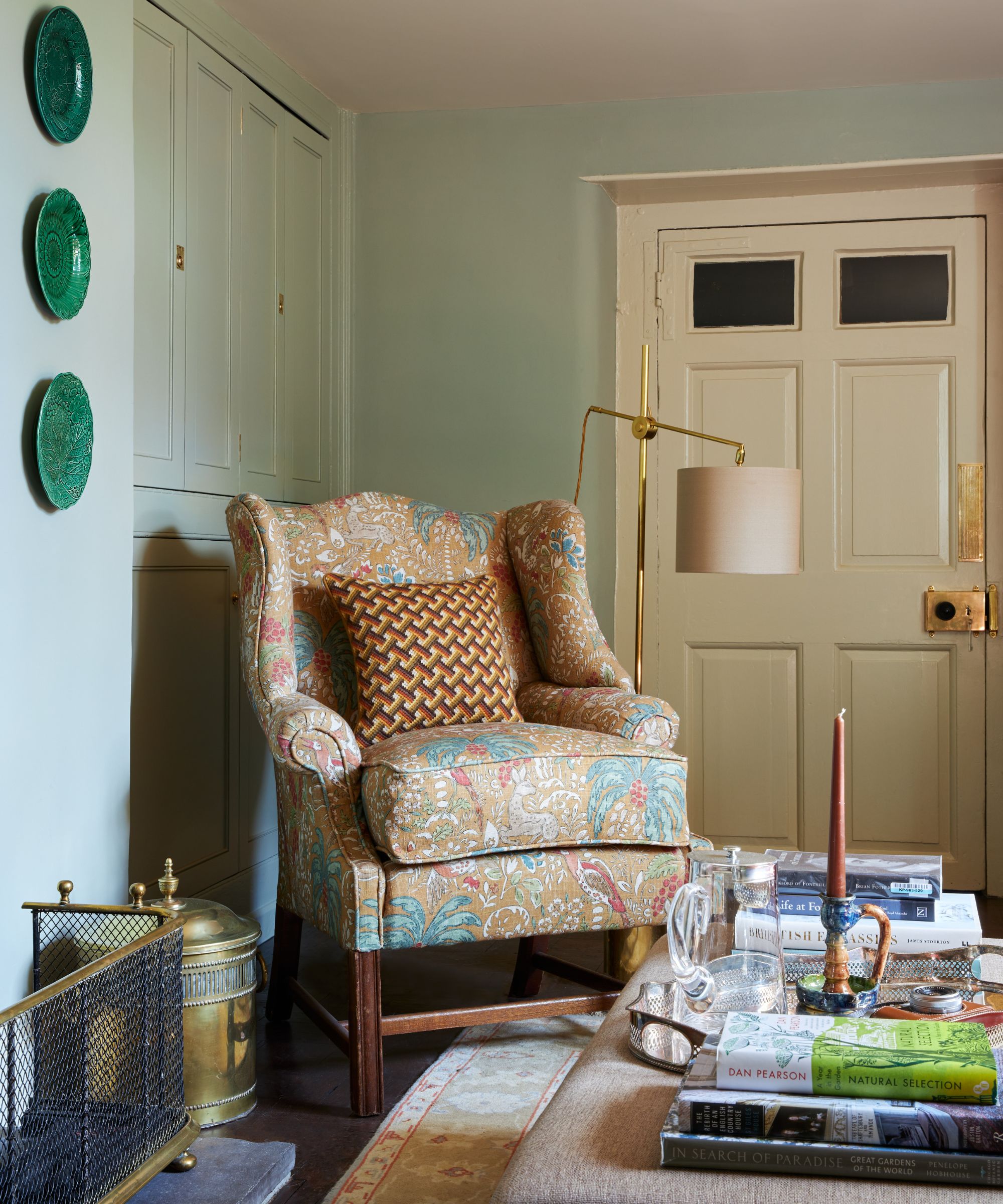
Another neutral hue that can be seen as outdated for 2025 is cool-toned grays. Notorious for making spaces feel cold, consider replacing cool grays with nuanced, cozy paint colors like Farrow & Ball's Blue Gray which was used in this living room.
'I would avoid the cooler gray tones, they have had more than enough air time and personally, I don't feel they enhance the interiors and can leave a space feeling really uninviting,' says interior designer Jenny Luck.
'Opt for warmer neutrals if you want to have a simplistic scheme. The Clay range from Little Greene works wonders as a starting point for building a warmer and more colorful paint scheme.'
5. Bright blues and purples
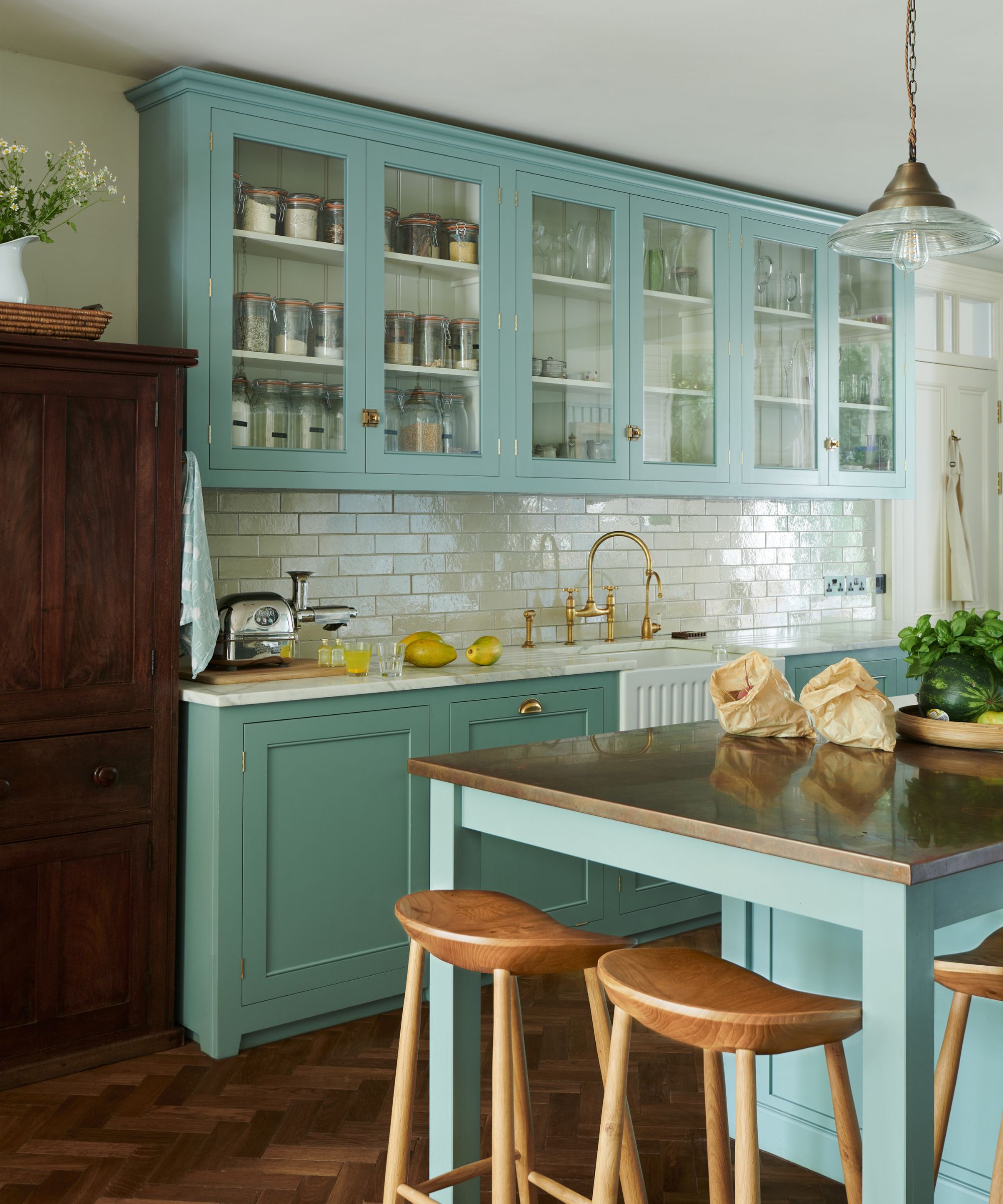
Outdated colors for 2025 aren't only about neutrals, but bolder and more saturated shades too. More specifically, vibrant blues and purples can look out of place with current interior design trends.
'Shades like electric blue and deep purples can often feel out of sync with contemporary design trends, along with many bright and overstimulating colors,' adds Melissa Read.
Although highly saturated colors can work well for maximalist decor ideas, consider slightly more livable, toned-down variations of blue and purple for a more flattering look. In this kitchen by deVOL, although bold, the aqua blue kitchen cabinets feel calming and timeless, a contemporary way of decorating with such colors.
Next year, it's all about embracing warm, gentle neutrals in place of cool, harsher tones that can overwhelm rooms. If you want your home to reflect this shift, consider reaching for off-whites, warm shades of gray, and more generally those with an earthy quality that fill rooms with depth.
Emily is a freelance interior design writer based in Scotland. Prior to going freelance in the spring of 2025, Emily was Homes & Gardens’ Paint & Color Editor, covering all things color across interiors and home decor for the Homes & Gardens website. Having gained specific expertise in this area, Emily is well-versed in writing about the latest color trends and is passionate about helping homeowners understand the importance of color psychology in home design. Her own interior design style reflects the simplicity of mid-century design and she loves sourcing vintage furniture finds for her tenement flat.