'This is going to be a great party!' is the first thing the homeowners wanted guests to think – here's how the designer created a fun yet relaxed family home
Explore a New York townhouse that doesn't take itself too seriously
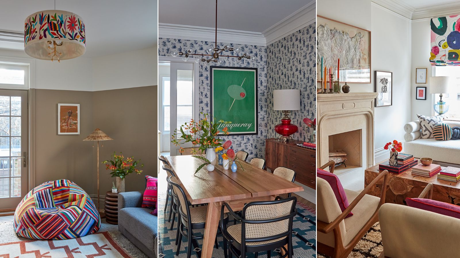

You immediately know when a home has been designed for hosting. Not just the occasional dinner or seasonal drinks, but really centered on inviting people in as often as possible, having a good time, and ensuring everyone feels relaxed and also at home in the space. This New York townhouse is one of those homes. It's elegant and considered of course, but doesn't take itself too seriously and was designed to throw a great party.
That was the brief for designer Mary Kathryn Wells and architects MADE Design/Build, design a family home for entertaining and enjoyment.
'For many years I lived a few blocks from this home so when the owner reached out to me about this project, I was thrilled,' explains the interior designer on the project Mary Kathryn Wells.
'And then when I was sent the architectural plans. I was over the moon. Ben and the team at MADE Design/Build do such extraordinary work that it was truly a dream project for me.'
'As the client and I chatted and got to know each other, we found enormous overlaps in our own stories and values. I loved that the family was eager to blend traditional and modern styles, incorporate color, and be pushed a bit outside of their comfort zone.'
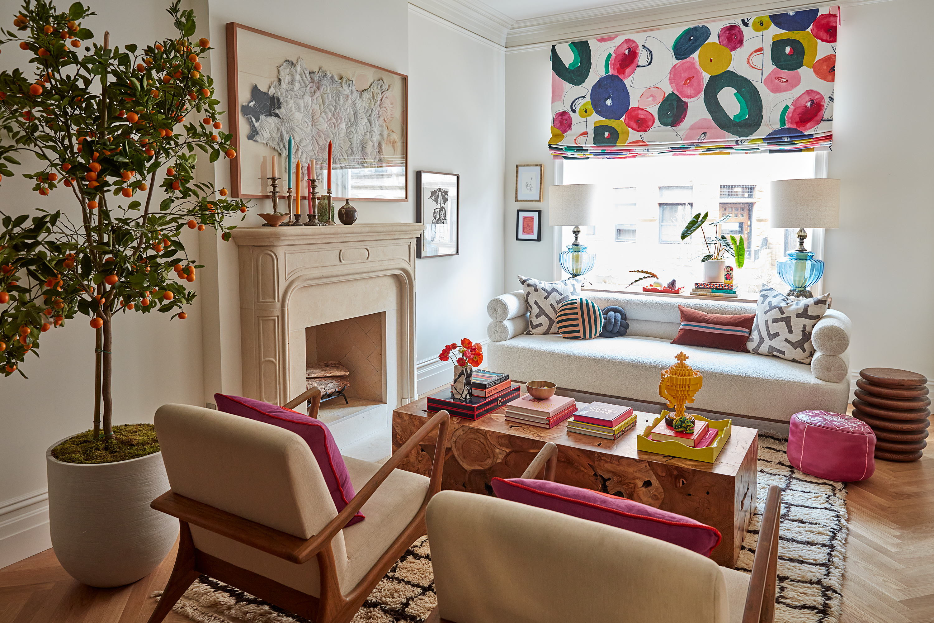
'This townhome was originally constructed in 1901, and after the home flooded in 2021’s Hurricane Ida, the owners opted to gut it with the aim of making it a highly functional family home well suited to modern life, while still respecting and preserving its history,' explains Mary Kathryn.
'We sought to honor what the owners called “the feminine grandeur” of the home while also ensuring it would be comfortable, artistically beautiful, and embrace the family’s unique quirks. And the owners wanted to ensure your first thought upon entering would be, “damn, this is going to be a great party!” (That’s a direct quote!)'.
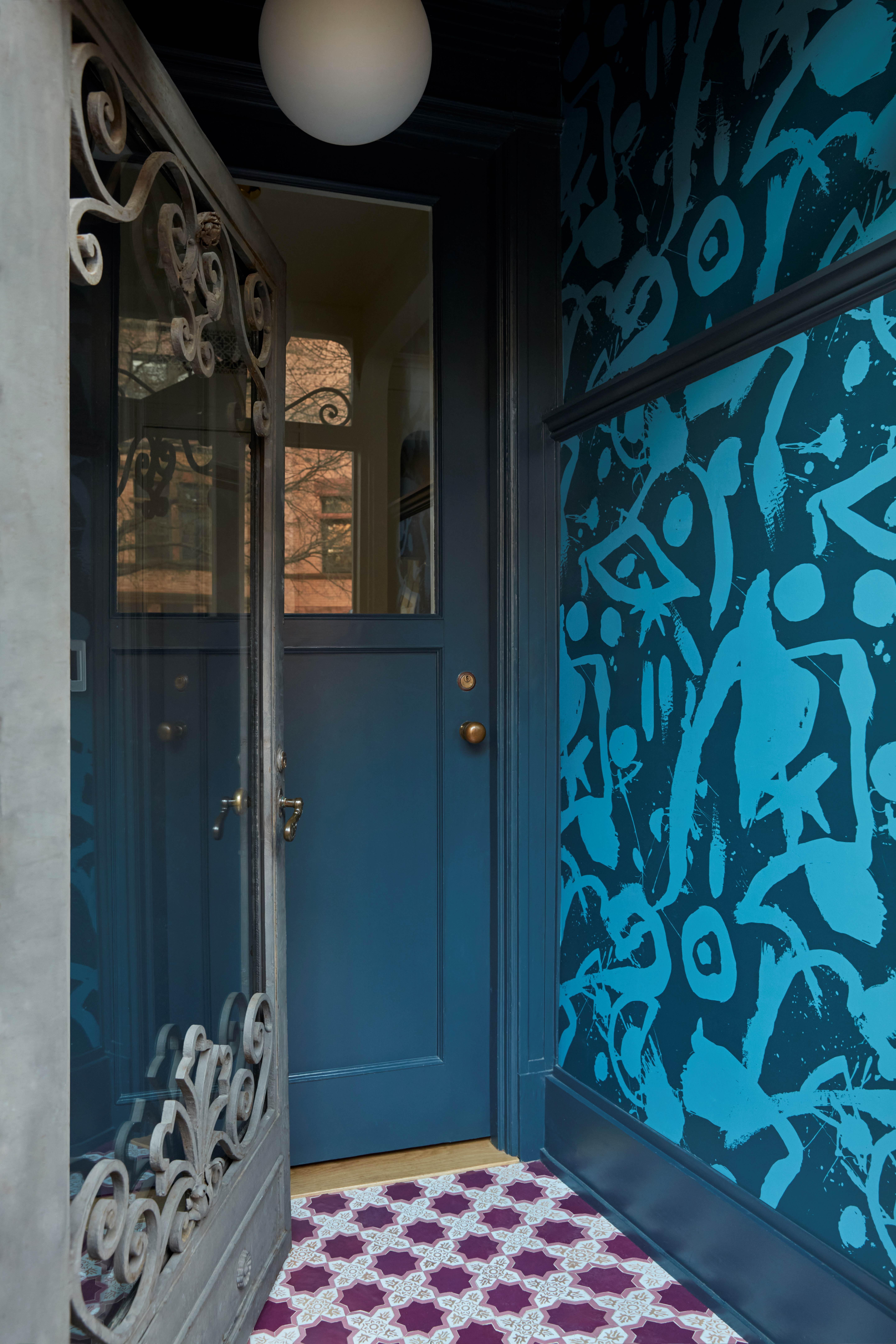
'Eclectic and playful while remaining timeless and sophisticated,' is how Mary Kathryn describes the home's interior design style. 'As mentioned, this is a historic limestone townhome; the owners have an eclectic sense of style and sought to incorporate a variety of influences, from the custom millwork in the kitchen which drew heavily from Parisian bistros, to the Moroccan zellige tile floor in the entry, and the London Basin Company sink in the powder room.'
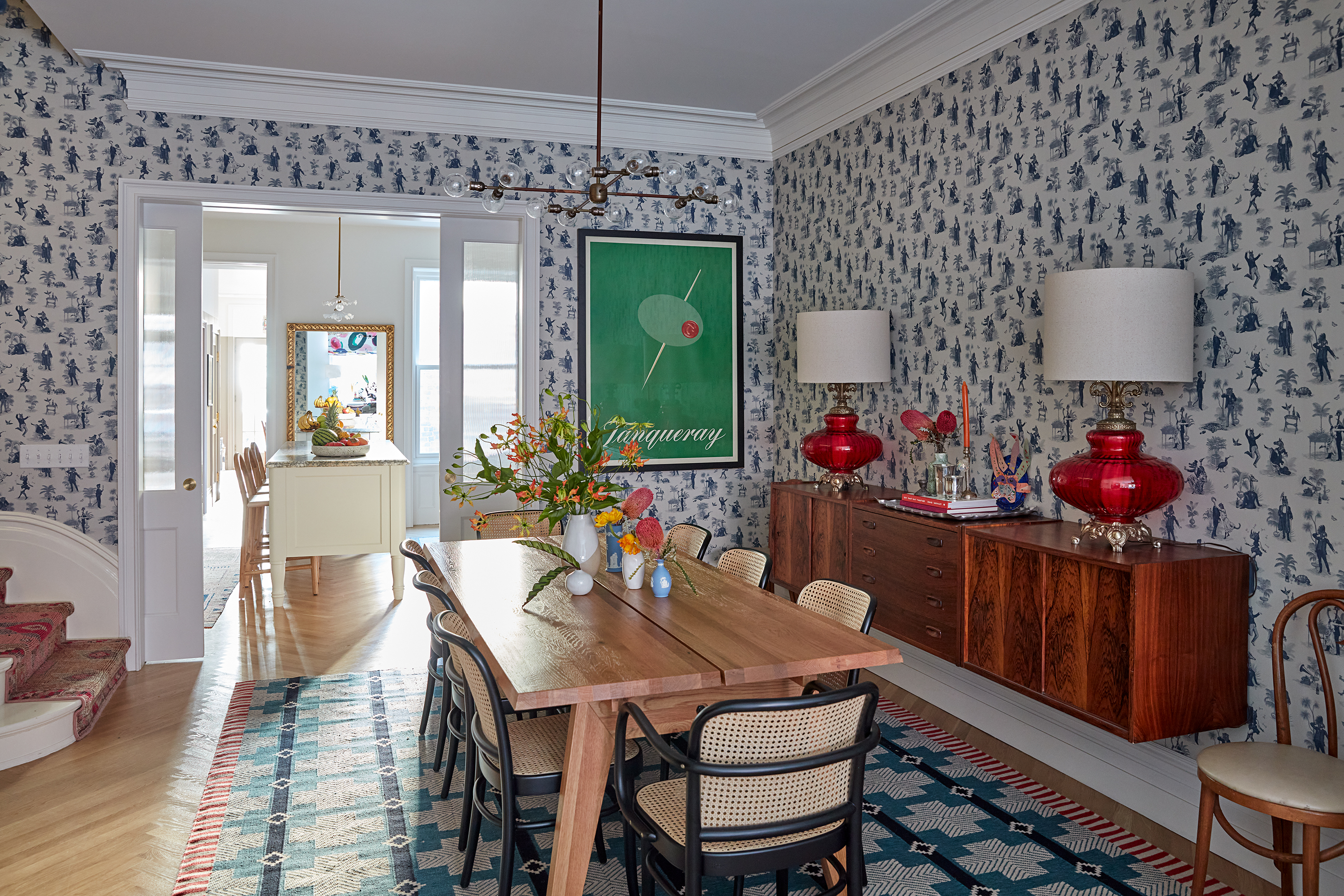
'The home incorporates the family’s variety of treasures collected on travels around the world, as well as a wry sense of humor; for example, take a closer look at the dining room wallpaper – a classic toile on first glance actually portrays on closer look what the owners call “schnockered animals."
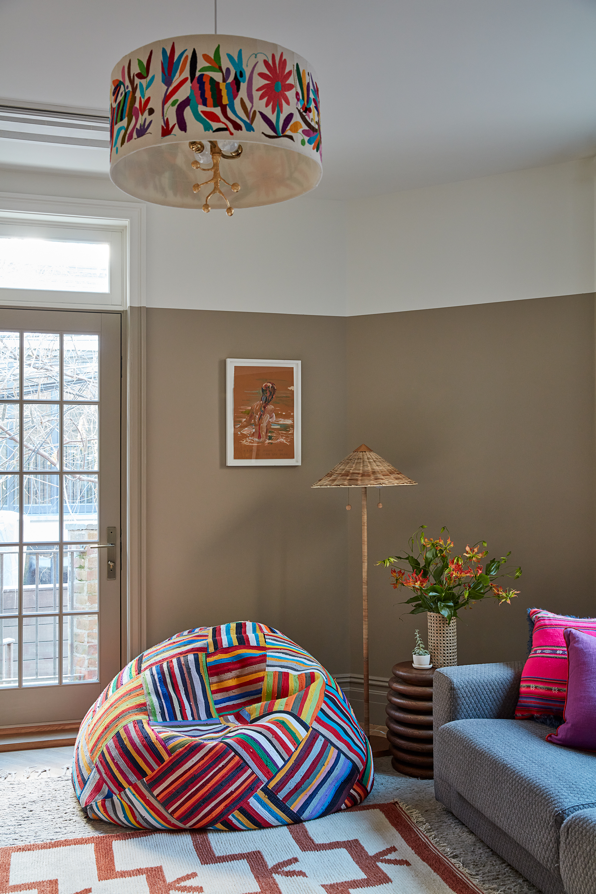
Ben Bischoff of MADE Design Build, agrees, explaining that 'Entertaining and enjoyment are the motivation behind every decision in this home. The owners desired a home that was relaxed yet inspired and therefore joyful both every day and when entertaining.'
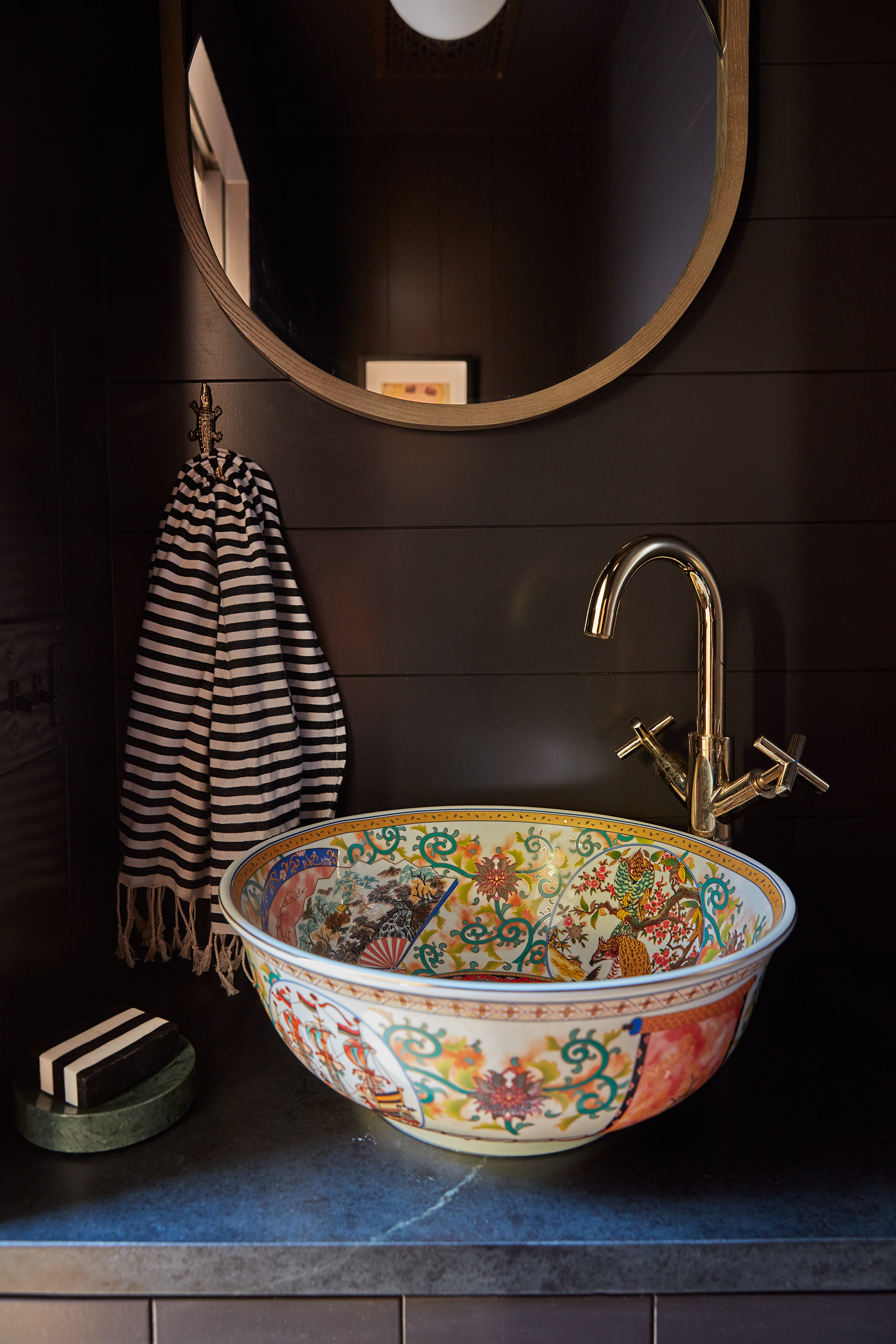
'A powder room on the parlor floor was added, an entryway that expressed their personality, flipping the second floor plan so that the lovely exterior deck is not accessed through the private primary bedroom. And most significantly, relocating the kitchen on the parlor floor from the rear of the house to the center so that it is the focus of their daily life but also the locus of their hospitality.'
The changes in layout were key to creating that party-house atmosphere that was at the heart of the project. Opening up the floor plan, adding in a glamorous powder room, and putting the kitchen at the center makes this the perfect home for hosts. You can just imagine this space filled with people, easily moving around from room to room.
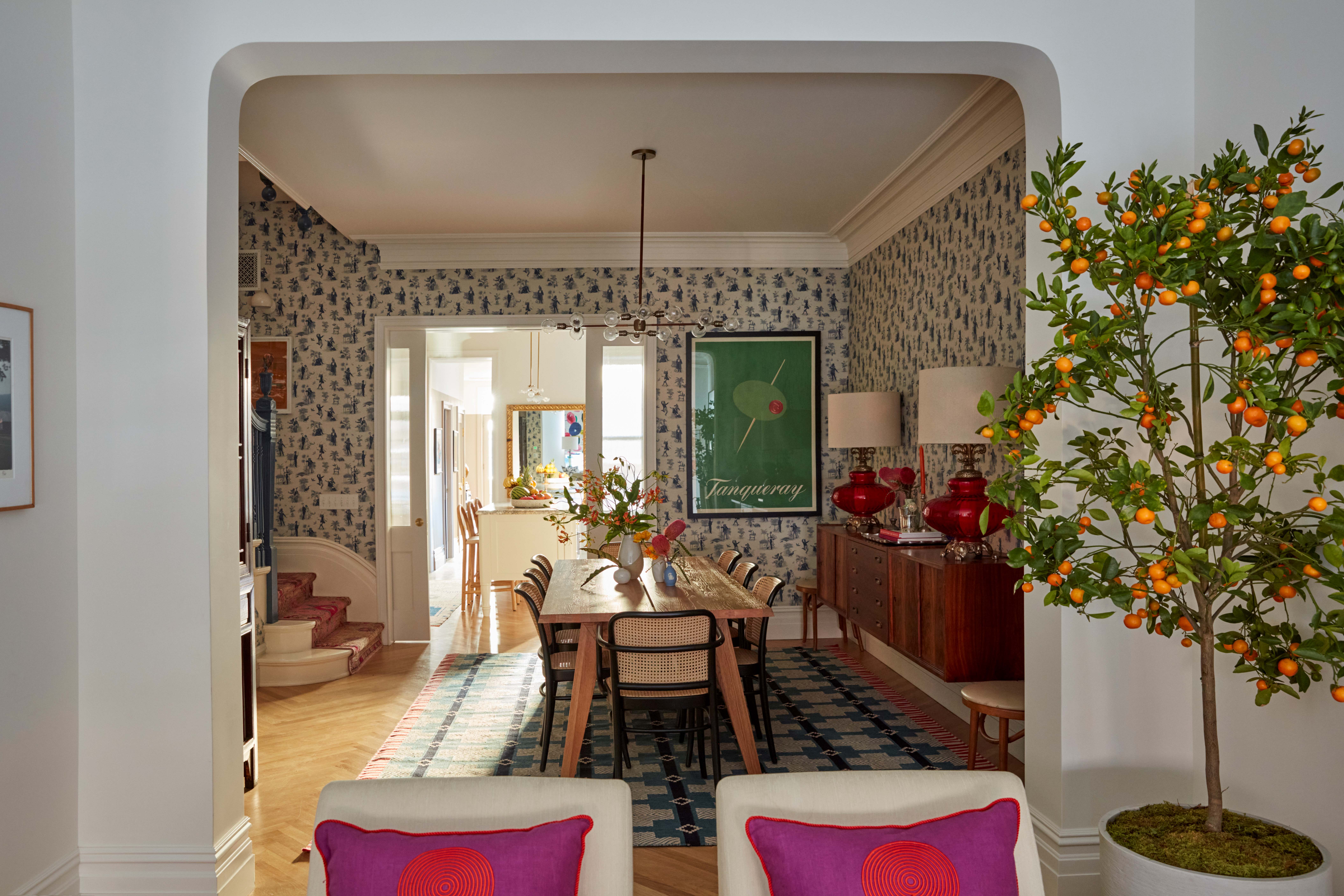
'The kitchen was previously in the very back of the home, in what is now the family room. By moving it forward it’s now connected to the dining room for a much-improved flow on the parlor floor', adds Mary Kathryn.
'And I love the pocket doors Ben and his team at MADE used to create an optional increased separation between the kitchen and the dining room. The home also previously didn’t have a restroom on the parlor floor and now has that lovely, dark powder room with the porcelain sink.'
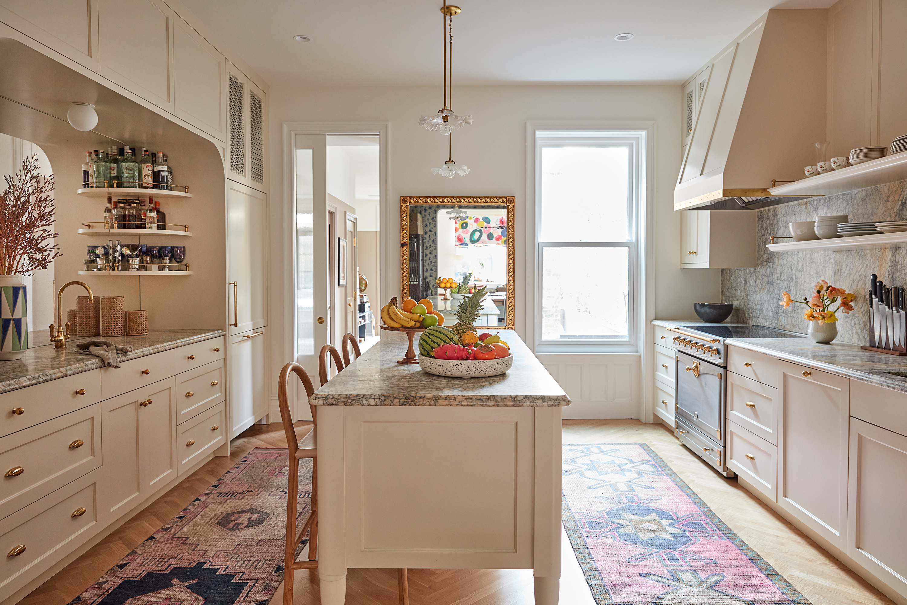
Based on the brief and the vibe the homeowners wanted to create, a warm pink-toned neutral kitchen might seem like a safe choice. But it's a timeless one, one that can withstand ever-changing trends and tastes.
Plus it allows the adjoining dining space to be bold without overwhelming the room, or having to compete with the color scheme of the kitchen. Vintage rugs, mirrors, crockery, and lighting add the edge of whimsy here.
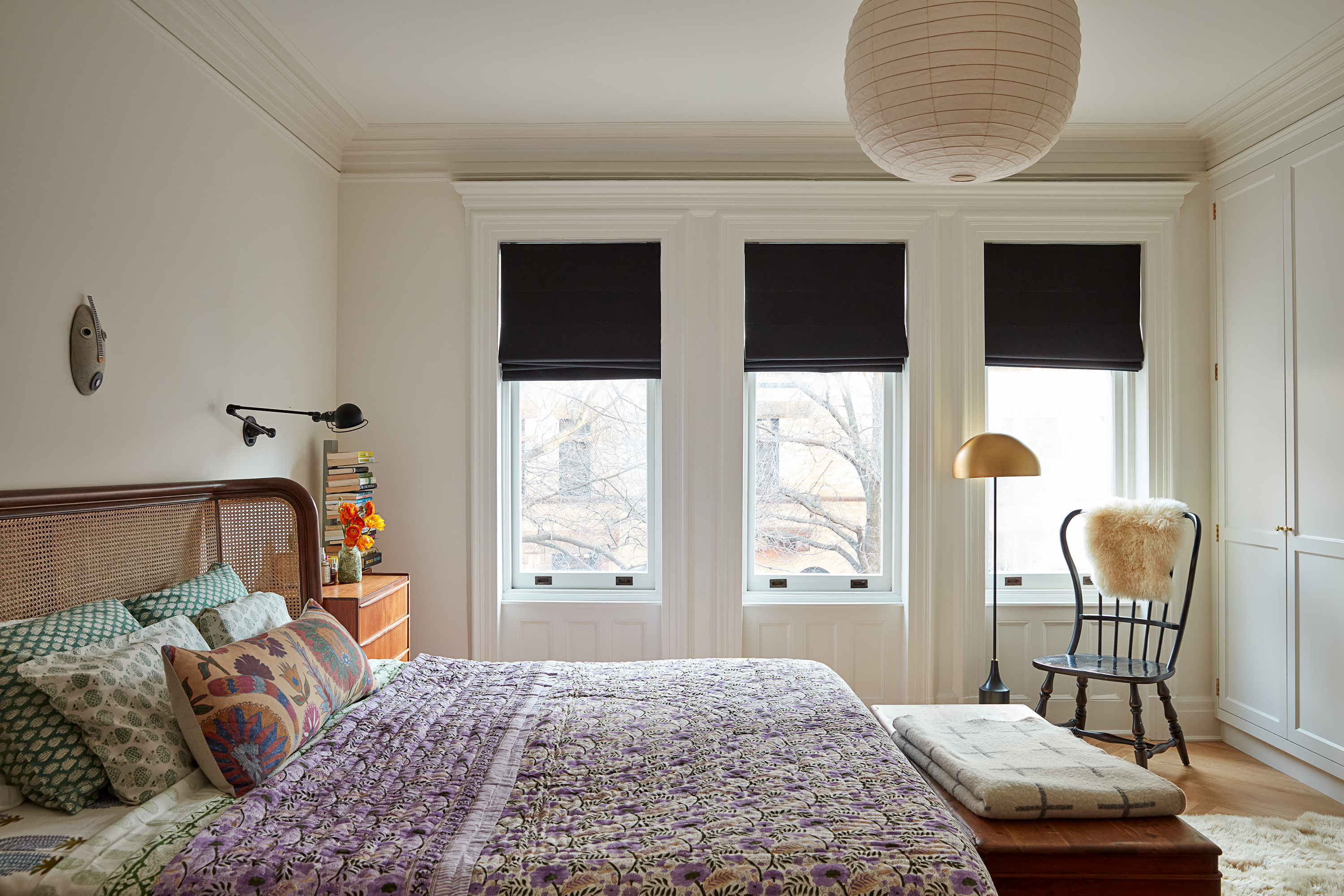
The main bedroom feels far more calming than the communal spaces below. And of course, even the most keen of hosts want their bedroom to feel like a sanctuary to escape to once the party is over.
There's still that effortless mixing of styles, plenty of unique character, and pops of color, but the fun and whimsy of the dining room and living room is slightly toned down up here.
This project nails the balance between party house and family home, effortlessly trendy and timeless, bold and relaxing. Mary Kathryn describes it perfectly – 'it manages to be unexpected, classic, and playful all at once.'
Sign up to the Homes & Gardens newsletter
Design expertise in your inbox – from inspiring decorating ideas and beautiful celebrity homes to practical gardening advice and shopping round-ups.

I am the Head of Interiors at Homes & Gardens. I started off in the world of journalism in fashion and luxury travel and then landed my first interiors role at Real Homes and have been in the world of interior design ever since. Prior to my role at H&G I was the digital editor at Livingetc, from which I took a sabbatical to travel in my self-converted van (not as glamorous as decorating a home, but very satisfying). A year later, and with lots of technical DIY lessons learned I am back to writing and editing, sometimes even from the comfort of my home on wheels.
-
 Ina Garten's storage pantry is an insightful window into all of the best cookware used by the chef – and it's easy to recreate on your kitchen shelves from $48
The beautiful dishware in The Barefoot Contessa's Hamptons pantry showcases the tools she uses most often to cook – this is exactly how you replicate it
By Sophie Edwards Published
-
 Extend the lifespan of your appliance with 5 simple but crucial washing machine maintenance tips
From cleaning the filters to keeping the door open, experts reveal the washer tips they swear by
By Andy van Terheyden Published