11 inventive ways to use color and pattern for a feelgood factor – lessons from an interior designer's own home
Designer Kate Figler's family home is an uplifting mix of color and pattern that's full of bright ideas all year round. Here's how to create a happy home
- 1. Create a fun first impression right from the front door
- 2. Embrace a quirky layout with harmonious colors and patterns
- 3. Use soft colors and patterns to create areas of calm in a busy home
- 4. Take delight in bold furniture placement
- 5. Use pattern and color to bring gentle highlights to a white kitchen
- 6. Incorporate texture to add interest in a kitchen
- 7. Make practical yet beautiful choices for family life
- 8. Turn your everyday dining space into a real feast for the eyes
- 9. Mix up a cocktail of fresh colors and textures in a compact home bar
- 10. Experiment with largescale patterns in a small space
- 11. Wrap a bedroom in rich pattern
Some homes radiate happiness and sunshine. Step inside and there's a sense of joy and wellbeing and you instantly feel right at home. It's not always easy to put your finger on why or how that's the case but a good house design combined with thoughtful interior design is a strong starting point.
There are no secret formulas for a mood-boosting home but designer Kate Figler blends rich colors and patterns in her home like a top mixologist, creating an upbeat blend of sweet and zesty flavors in one delicious cocktail of interiors. We paid a visit to her family home in Nashville, TN, where she shared her 11 top tips for using color and pattern to create a beautiful and happy home.
1. Create a fun first impression right from the front door
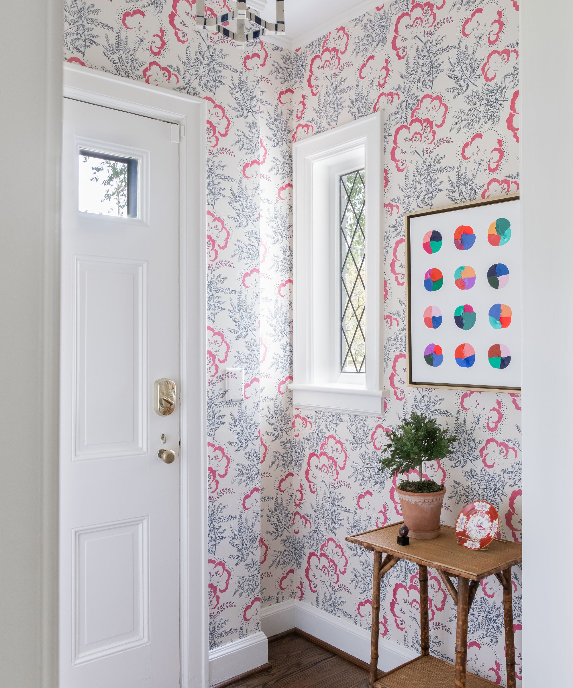
First impressions are lasting impressions and entryway ideas are an important way to preface the tone and character of the rest of the interiors to come. Although it's a small space, as is often the case in period properties of this type, designer Kate isn't one to shy away from warm colors and bright finishes.
'The house was built in 1945 and with its amazing original leaded window the entryway needed a punchy wallpaper that worked with the abstract Logan Ledford painting,' she says. 'The delicate details in Rapture & Wright’s Cloud Garden felt like the perfect fit – I think this room gives guests a really fun first impression of our home.'
2. Embrace a quirky layout with harmonious colors and patterns
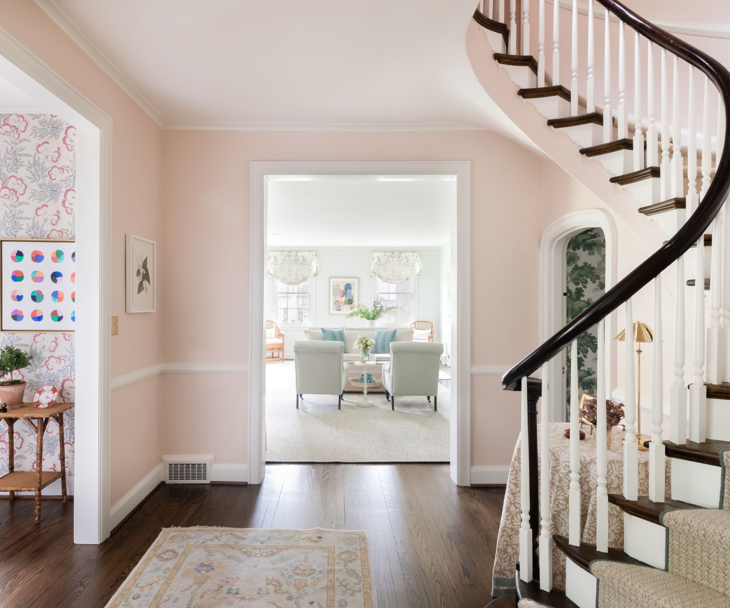
There are many ways to overcome or minimize a challenging floorplan. Kate neatly sidestepped any layout mistakes by choosing to accept and embrace the original layout of her home. Designed by well known Nashville architect Edwin Keeble, it has a traditional cottage type feel with several smaller rooms typical to midcentury design rather than the open plan style of newer homes.
A harmonious palette of warm pastel pinks, soft greens and pale blues links the rooms across the sightlines of the hallway and its original curved staircase. That way, the separate rooms each keep their own identity, while still being part of a whole house color scheme. Note the arched door to the powder room tucked underneath the stairs (more on this later). 'You almost need to duck under to get into the room. I enjoy quirky and fun original details like this,' says Kate.
'I embraced color and pattern in order to bring the house to life,' she adds. 'I gravitate towards classic design but also work to incorporate modern and whimsical touches throughout each space. We wanted to make sure that every space would be utilized so we created multipurpose floor plans throughout and have several rooms that have multiple functions.'
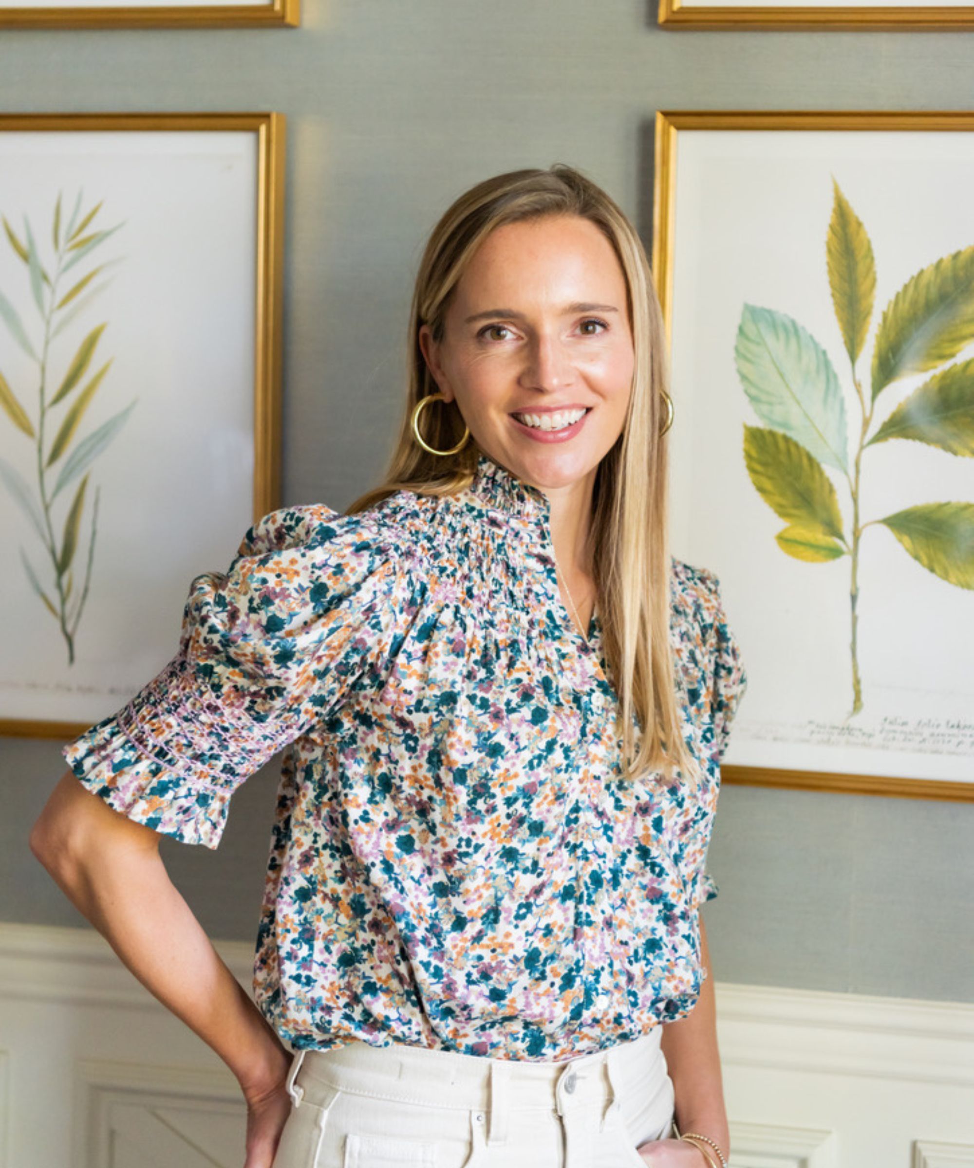
Kate Figler was born and raised in New England and now lives in Nashville, TN, where her designs for Kate Figler Interiors blend both the charm of the Northeast and the tradition of the South. Her work is full of color and pattern with luxurious fabrics, elegant antiques, natural textures and a blend of traditional and contemporary elements. As a mother of three children, she understands the importance of merging beautiful design with functionality and here, in her own family home, she achieves the perfect compromise.
3. Use soft colors and patterns to create areas of calm in a busy home
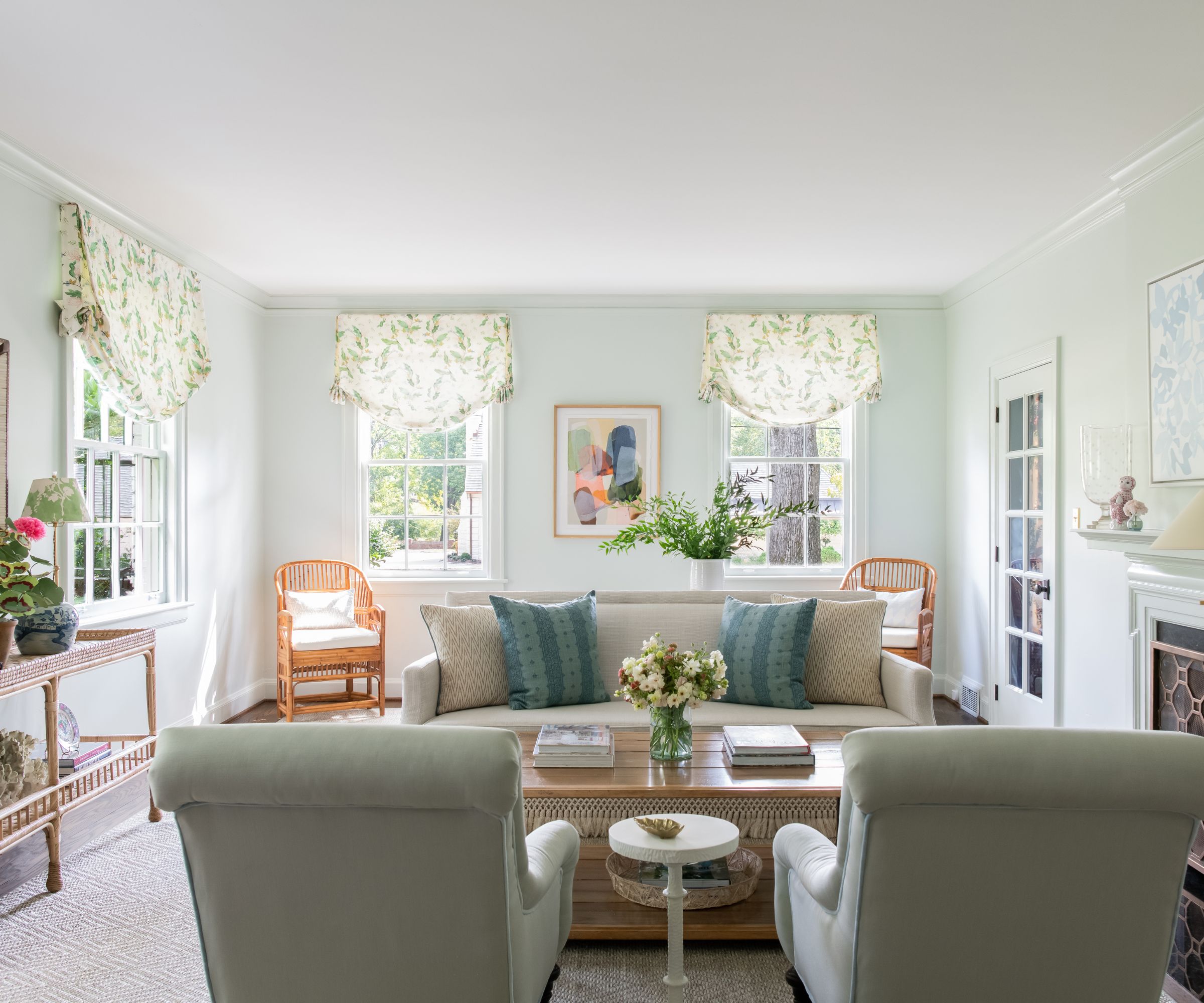
Even in a busy family home it's important to incorporate the occasional oasis of calm, a space for quieter moments and a place to appreciate the contrasts of light and shade, and pattern and plain. Living room ideas here embrace the calmer, quieter shades, providing a breathing space where you can appreciate the stronger color combinations and patterns in the rest of the home all the more.
'The color palette throughout our home feels very joyful and like a true expression of our family,' says designer Kate. 'Every room is bright, comfortable and approachable – everything is meant to be cuddled up on and lived in. The living room is perhaps my favorite room in the house as it gets the most beautiful natural light enhanced with mint walls in Farrow & Ball’s Pale Powder.'
Pattern is still present here, of course, but it's focused around the windows, where the leafy print helps to merge the space with the natural greenery outside, adding to the calm. 'I specified the Roman shades to be relaxed with tails in order to give them a dressier feel,' explains Kate. 'The art in this room by Lynn Sanders is another special piece that ties the room together.'
4. Take delight in bold furniture placement
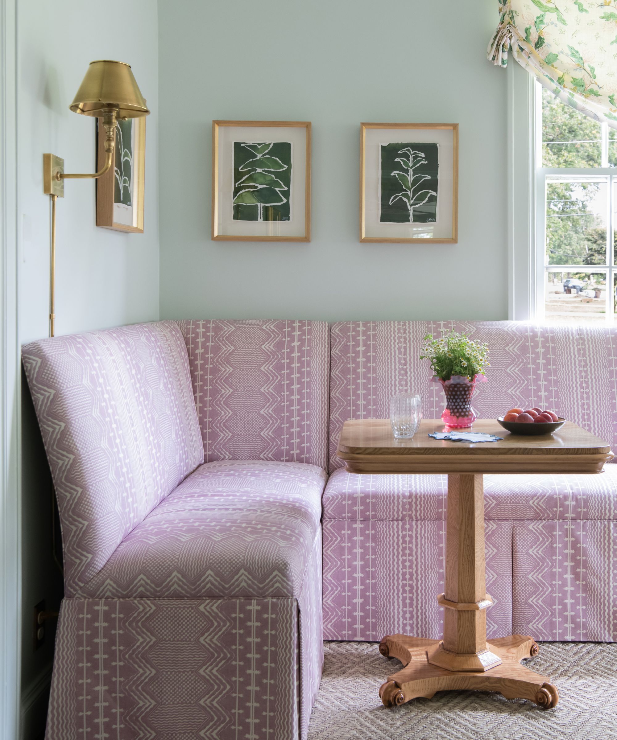
There's no eat-in kitchen in this home. Although you might be forgiven for assuming that the corner bench seat, pictured above, is in a kitchen setting, it's actually part of the home's living room. It provides an unexpected moment with style and impact, thanks to the fabric choice, Fermoie’s Abbey Stripe in pink.
Kate explains the thinking behind her unusual living room layout and why she was so certain that incorporating a banquette was the way to go: 'It’s a long, narrow room and so I knew we needed to have several different seating areas that were each uniquely enticing,' she says.
'I absolutely love banquettes and their versatility, they are the perfect spot to work from home, play a board game or even eat a quick meal. I am thrilled with how this one piece of furniture creates so many different ways to use this space. Formal living rooms tend to get a bad reputation as being unusable but often all they need are some creative thinking around furniture placement and overall layout. Between the banquette and the sofa by the fireplace, there are so many different ways to enjoy using this space.'
5. Use pattern and color to bring gentle highlights to a white kitchen
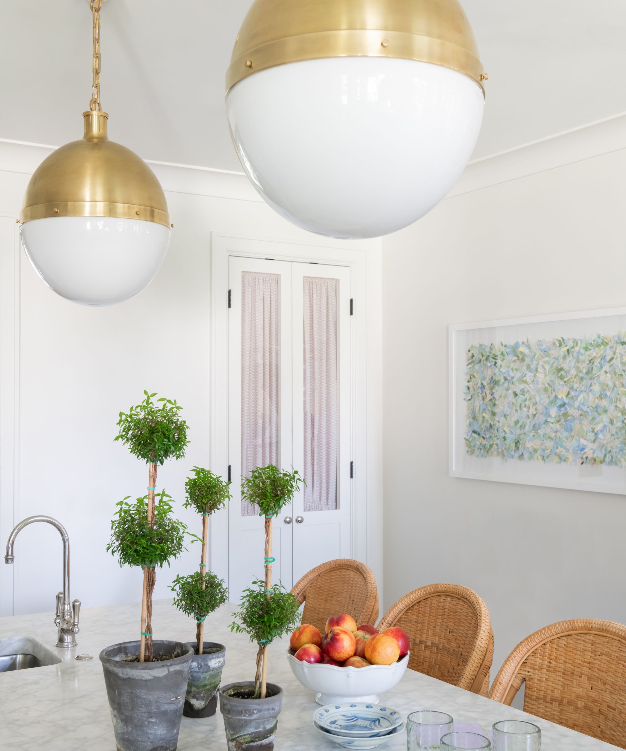
Looking for new kitchen ideas or inspiration for how to update a white kitchen? Take your cue from Kate, who made targeted changes to this space to bring it to life.
'I will always be partial to a crisp white kitchen but they can’t be completely flat and devoid of color,' she says. 'The pantry doors with their shirred panels (in Quadrille’s Carlo II fabric) introduce just the right amount of pattern into the space, while the Lauren Padian art and Visual Comfort pendants also break up all the white, bringing in the layers and warmth that this room needs.
6. Incorporate texture to add interest in a kitchen
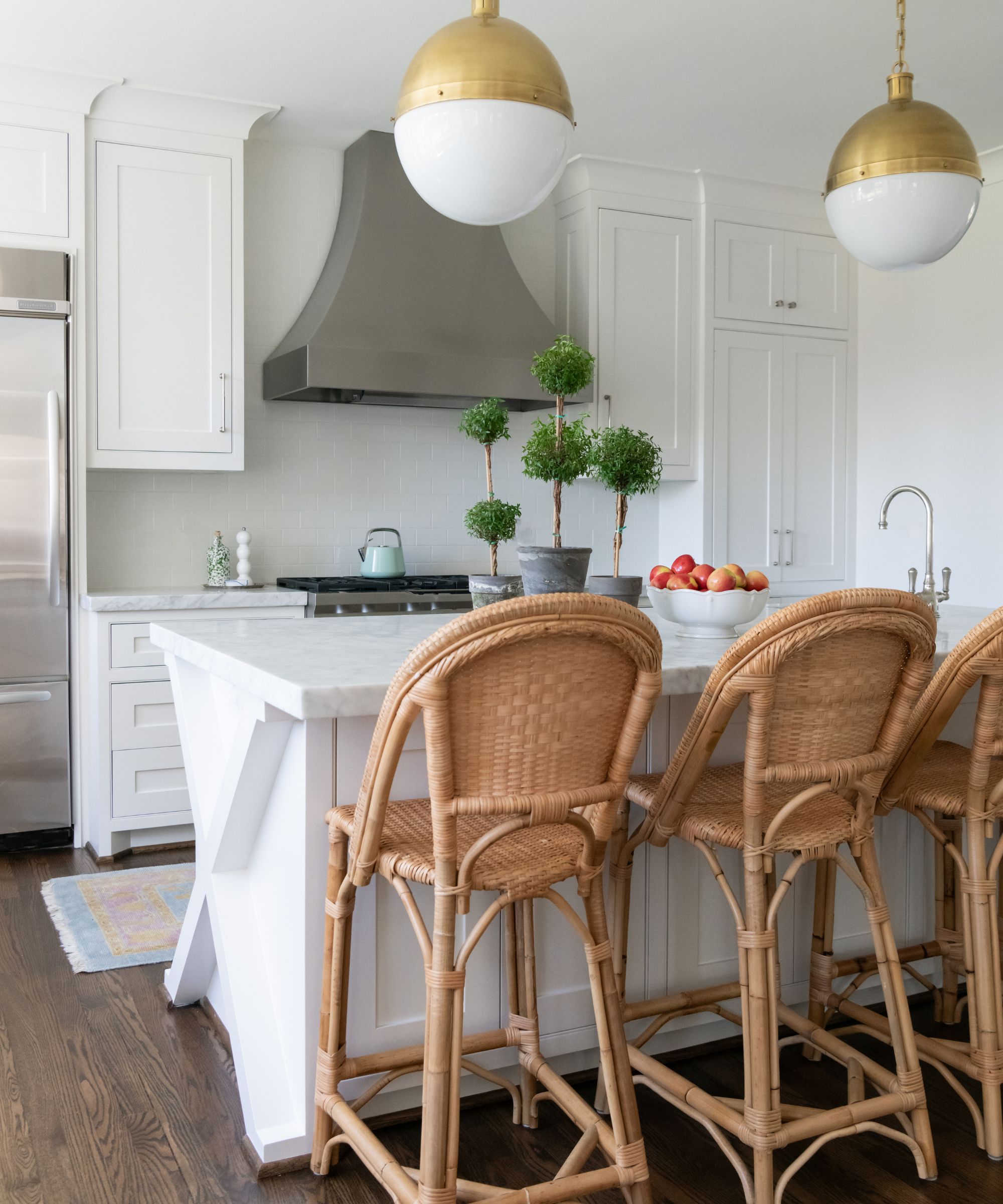
This may be a white kitchen, but it is by no means a sterile space. Thanks to the warm tones of the rattan bar stools and the room's wooden floor, plus the unusual structural detailing on the end of the kitchen island, there is plenty of textural interest here.
7. Make practical yet beautiful choices for family life
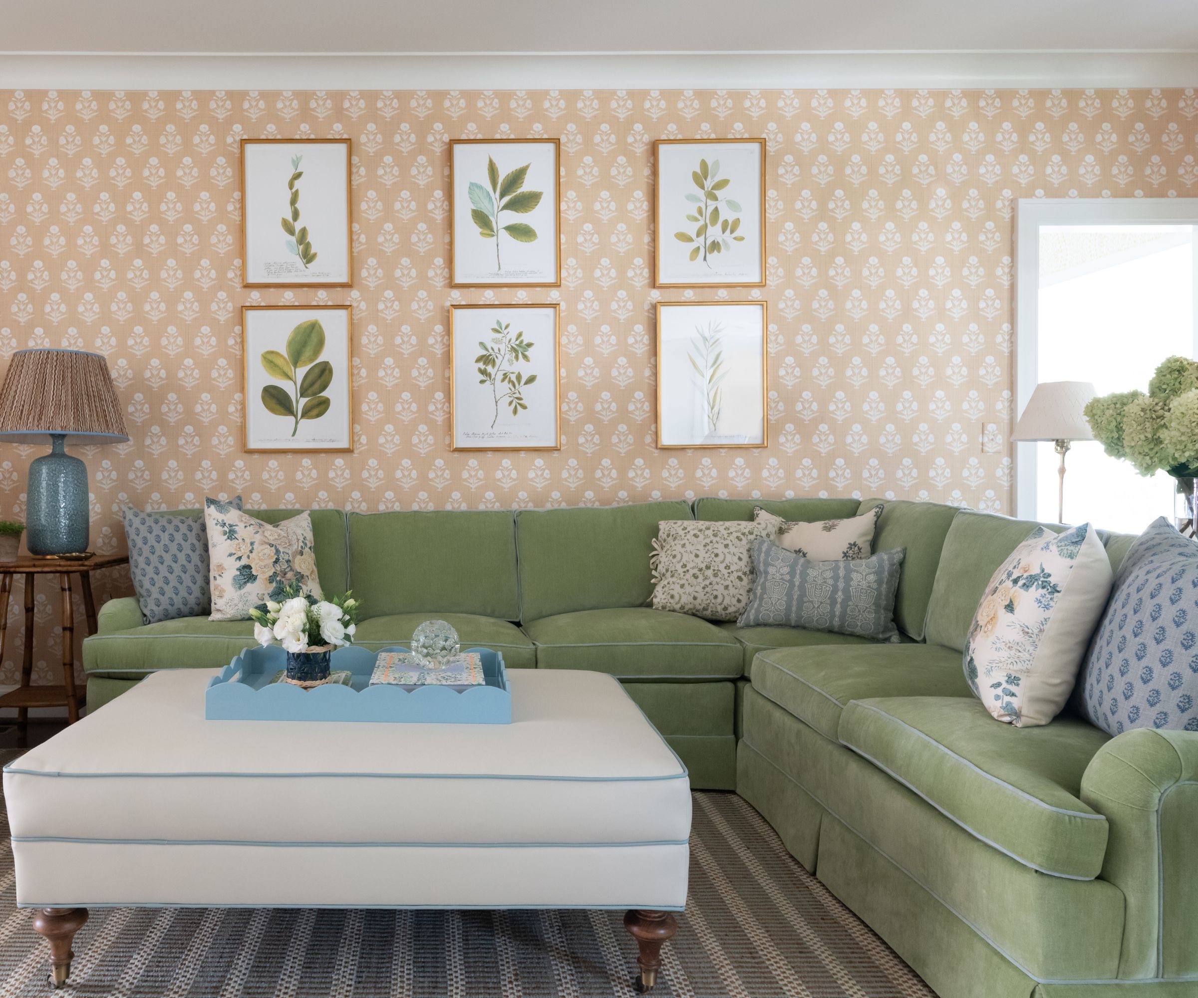
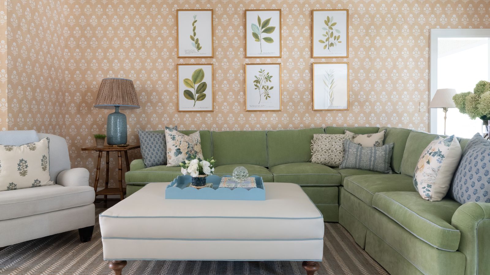
Comfort is paramount in a family living room, but the key is to not sacrifice style for practicality. Looking at the pretty room above, with its exquisite wallcovering, sumptuous velvet sectional and white, yes white, ottoman you'd never imagine the room would stand up to the wear and tear of life with a young family. Fear not, however, as looks can be deceptive, and this elegant and cozy set-up is a fully functional family room designed to last, as Kate explains.
'The custom sectional from Charles Stewart is upholstered in one of my go-to performance velvets from Pindler,' she says. 'And the ottoman is covered in a faux leather from Perennials so it too can be easily wiped down after a spill.'
And for the beautiful details? 'Lee Jofa’s Althea – one of my all time favorite fabrics – was the first pattern I knew I wanted to use in the space (on the floral throw pillows) and the rest of the scheme grew from there. Casa Branca’s Papavero grasscloth wallpaper added that extra layer of texture to the space,' says Kate.
8. Turn your everyday dining space into a real feast for the eyes
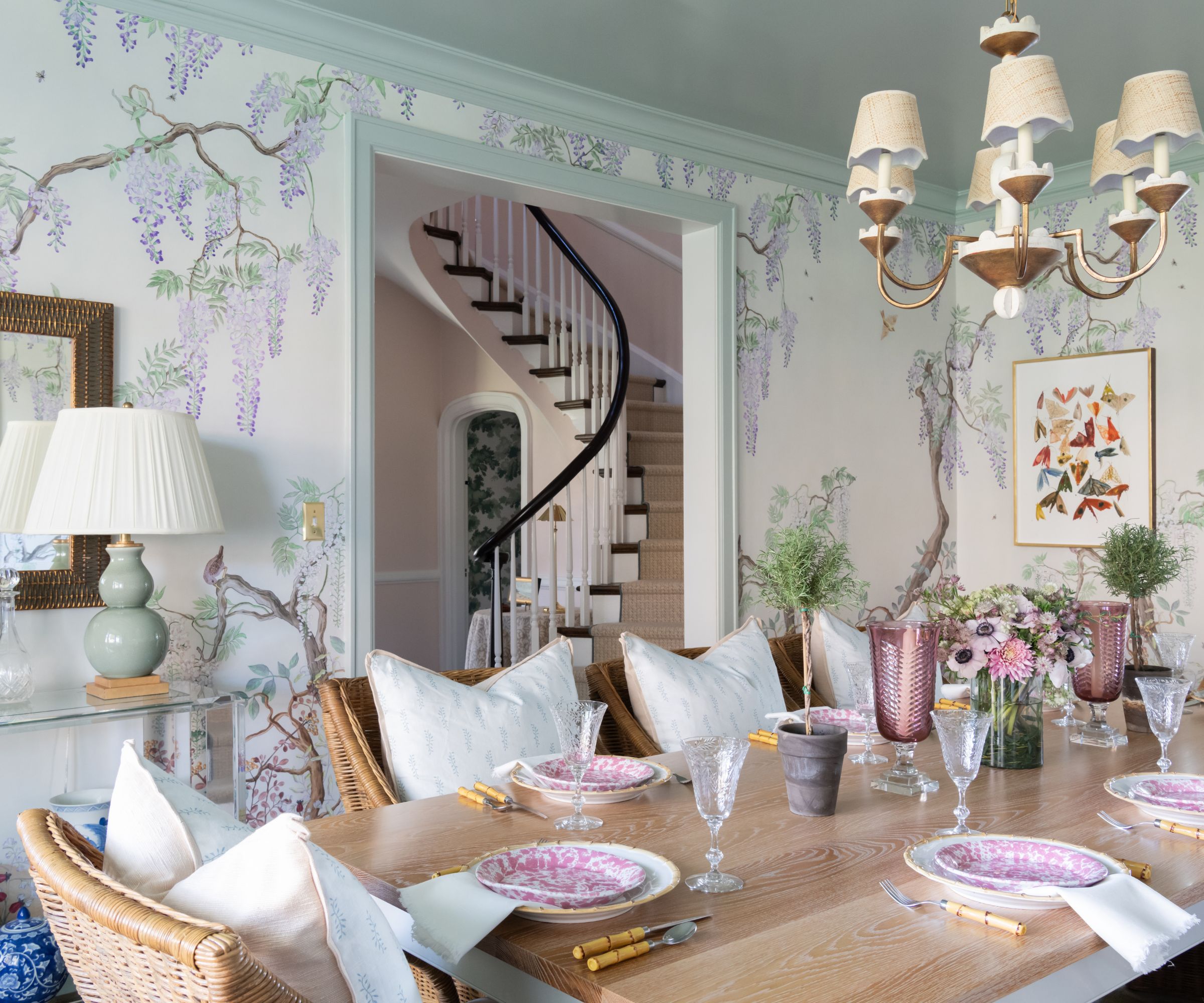
The dining room constraints of this cottage-style home mean the space has to play double duty as both a space for entertaining and everyday living. The look is sufficiently elevated for dinner parties, but relaxed and cozy for family mealtimes.
'The combination of the whimsical floral wallpaper with the casual woven chairs and white oak table creates just enough interplay between the formal and the informal while still feeling balanced – a goal that I try to weave throughout my designs,' says Kate.
'The House of Harris mural wallpaper was the launching pad for this room and much of the color story for the rest of the house. I love the purple, coral, green and blue accents throughout the paper. Our dining table is a piece from Dunes and Duchess – a fabulous husband wife team whose shop is not far from my hometown in Connecticut.'
9. Mix up a cocktail of fresh colors and textures in a compact home bar
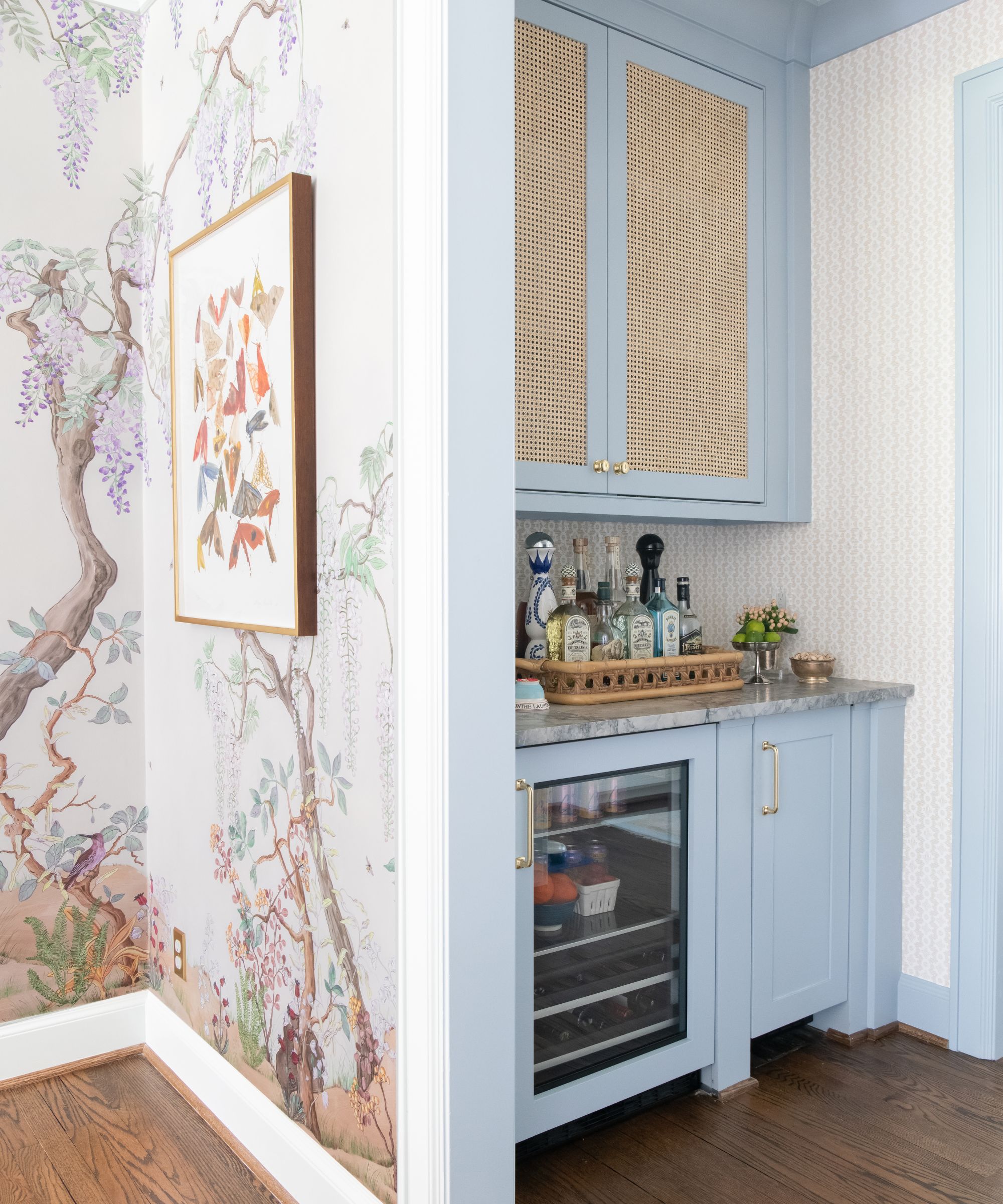
Let's face it, any home bar ideas are good ideas, so finding a corner, however small, to incorporate a dedicated wet bar already shows a commitment to indulgent luxury and fun. 'I look for any excuse to incorporate caning into a room and the cabinetry in our bar provided a great opportunity for this,' says Kate. 'The Sister Parish wallpaper and blue paint (Farrow & Ball’s Parma Gray) make this a happy little space to mix a drink after a long day.'
A happy space for a true mixologist of color and texture? That's surely what this whole house is about.
10. Experiment with largescale patterns in a small space
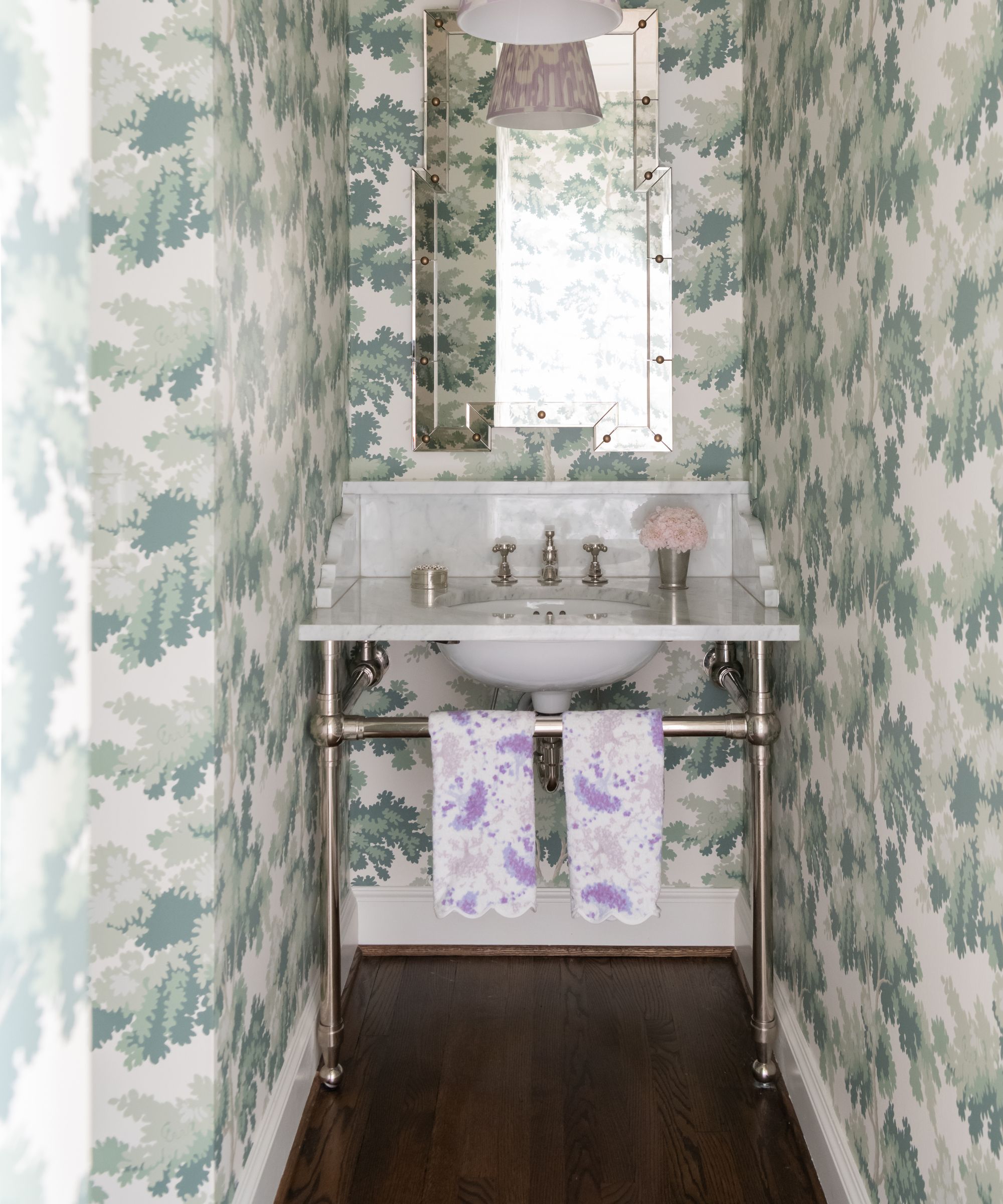
Don't be afraid of statement patterns and colors schemes, even in a small room. Go big or go home is certainly the mantra embodied in this powder room. Accessed through a low, arched doorway under the stairs, it has a flamboyant design scheme that belies its size.
'I knew I wanted this half bath to feel extra charming and special,' says Kate. 'The Sandberg Raphael wallpaper gives the space almost a treehouse-like feel. The pendant was a lampshade from Sorella Glenn that I converted into a ceiling fixture and I love this little pop of lavender along with the lilac D. Porthault hand towels.'
We can't help thinking that, with its tiny arched entrance and leafy bower wallpaper, this special powder room has a touch of a magical fairy door about it!
11. Wrap a bedroom in rich pattern
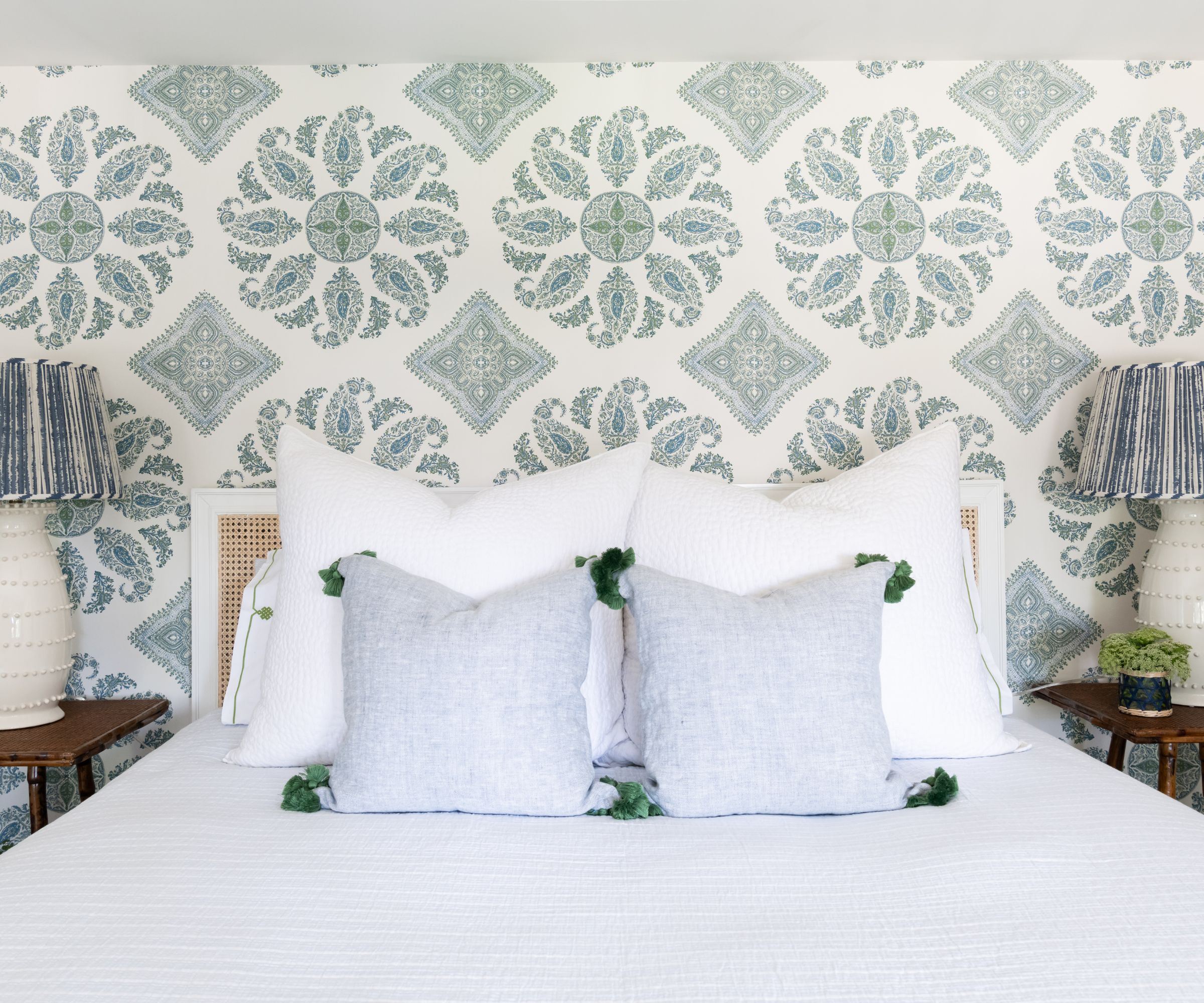
This truly is the bedroom of dreams, with its calm color palette and exquisite wallcovering. 'I will never tire of blue and green and Peter Dunham’s Samarkand is such a classic,' says Kate, of the beautiful paisley design at the heart of her primary bedroom scheme.
'The casual texture of the furnishings keeps the space from feeling too serious,' she adds. 'So that the wallpaper and fabulous Arteriors lamps with Sorella Glenn shades could be the stars of the space.'
From the front door, right up the stairs to this bedroom, every part of this home has been brought to life with color and pattern. 'Personal homes really are designers’ testing grounds where we get to push the envelope and go for the more color-forward, pattern-heavy schemes that we are usually trying to convince our clients to embrace,' she says. While some interior designers experience what she terms 'analysis paralysis' in designing their own homes, confounded by too much specialist knowledge and unable to make a choice, for Kate it was quite the opposite. She had no doubts about her design decisions for her family home.
'The other day a friend told me that our house felt like summertime and I thought that was the best compliment,' she adds. 'To me summer is carefree and fun and what better feelings to have in someone’s home than that?'
Interior design: Kate Figler Interiors
Photography: Allison Elefante
Sign up to the Homes & Gardens newsletter
Design expertise in your inbox – from inspiring decorating ideas and beautiful celebrity homes to practical gardening advice and shopping round-ups.
Karen sources beautiful homes to feature on the Homes & Gardens website. She loves visiting historic houses in particular and working with photographers to capture all shapes and sizes of properties. Karen began her career as a sub-editor at Hi-Fi News and Record Review magazine. Her move to women’s magazines came soon after, in the shape of Living magazine, which covered cookery, fashion, beauty, homes and gardening. From Living Karen moved to Ideal Home magazine, where as deputy chief sub, then chief sub, she started to really take an interest in properties, architecture, interior design and gardening.
-
 Kevin Bacon and Kyra Sedgwick's rustic kitchen island is stunning, but controversial – designers say you can get the look without the hassle
A popular material finds an unorthodox home in the couple's kitchen, but experts disagree on whether it should be used – here's how to do it instead
By Sophie Edwards
-
 How to grow grapefruit for homegrown sweet and tangy, highly nutritious harvests – a fruit tree expert shares their planting and care tips
From planting to harvesting, this is all you need to know about grapefruit trees
By Drew Swainston