

If you're looking for a new way to work with color that feels sumptuous, expensive, and cocooning – may we introduce color rich interiors?
Typically when talking about color trends in interior design, people fall into one of two camps: minimalist neutral lovers and vibrant maximalists. But if you're searching for a new approach to room color ideas that embrace deep, warm tones in a spectrum of low-saturation shades, this could be your new camp.
Color has the power to transform a space, and when used correctly, it can even evoke emotions. 'Color is what creates deep emotions, sparking visceral reactions as we experience a space,' says interior designer Young Huh. 'It influences our mood and transforms our environment into rich tapestries of human experience.'
Whether you're into soothing or joy-provoking tones, here, we speak to interior designers to get their take on working with a color rich palette.
What Are Color Rich Interiors?

If you're seeking ways to make your home more unique with interiors that are a true reflection of your individuality, embracing more color is a great first step. 'Color rich interiors are becoming more sought after because people like to have personality shown in their spaces but don't want it to be too loud,' explains Linda Hayslett of LH.Designs.
'Decorating with neutrals can make a space feel like there's no thought given to personality or the space being a home for a family, compared to it being a staged space for a family to buy,' she adds. 'So having those more luxe and deeper colors such as burnt oranges, forest greens, dark moody blues or rich plums help to make a space feel interesting, comforting and unique.'
'Deep, rich colors like aubergines, olives, and earthy browns work beautifully together to create spaces that feel interesting, warm, and comfortable,' agrees designer Molly Torres Portnof of DATE Interiors on colors that make a house look expensive.
5 Examples Of Color Rich Interiors
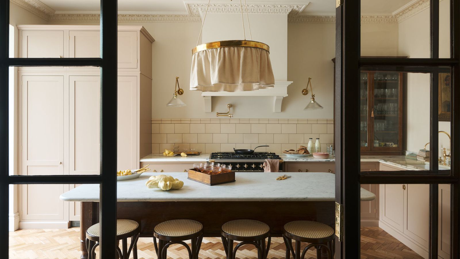
1. This moody shaker kitchen

While the premise of color rich interiors isn't about entirely drenching the space in color – you can achieve an equally opulent feel with a neutral backdrop, for instance – this traditional English shaker kitchen by the team at deVOL kitchens truly captures the essence of the trend.
'Mixing color through paint, pattern, materials, artwork, and accessories will always add an eclectic, homely aesthetic,' observes Holly Vaughan of Vaughan Design & Development. 'It will never fail to make a room feel lived in, regardless of how long you have been there.' And that's the key takeaway here – the palette helps to develop the sense of personality and familiarity in a space.
In a kitchen, mixing these deep colors with materials like wood and brass enhances the richness and creates a truly luxurious feel.
2. This eclectic living room

Interior designer Kristina Khersonsky, founder of STUDIO KEETA, worked with a mix of expensive color combinations to build the palette of this cozy living room.
'We love a room with layers of color and texture in unusual pairings,' she explains. 'It's a great way to create an eclectic, collected feel but still have a cohesive feeling.'
'At our WeHo Bungalow project [seen above], we created a space that has a punch of color and interest everywhere you look creating a visually stimulating, yet calming environment. The colors are carried through each space of the home so it feels eased,' Kristina explains of how she applied the red thread theory to choose a color scheme for the whole home.
'Each piece in the space has a personality strong enough to stand on its own, from the orange curved sofa to the cobalt blue and yellow sconces - but once placed together, they begin to create their own harmony and personality in the room. Color travels and the eye will follow, so add multiple hits of similar colors around the space in different pieces, finding common red threads in each selection to make them feel intentional and put together.'
3. This perfectly pink apartment

'Creating color rich interiors is not about simply matching colors, but about color relationships and how they interact,' suggests interior designer and gallerist James Yarosh who worked with a monochromatic color scheme to create depth.
'In this New York City apartment [seen above], the balance was all about matching intensities and patterns,' he explains. 'The saturated oxblood red silk velvet absorbs the light, pulling attention from the TV and deepening the visual richness of the space. The museum art poster collection was led by color, curating a selection not only of great artists but as a nod to the diversity of the city beyond the window.'
'Even in color saturated spaces, it's important to use color judiciously as a tool to guide the eye around the room,' James advises. 'This helps to achieve balance and reward the eye by landing on objects worth the attention. Color is an artistic form of storytelling, creating focal points and quieter moments that allow you to discover more magic the longer you look.'
4. This deep purple snug

Perhaps one of the richest and most luxurious colors to decorate with is this deep aubergine purple, seen above in a snug room painted in Brinjal from Farrow & Ball.
Decorating with jewel tones like sapphire blue, ruby red, dark purple, citrine yellow, and emerald green is an effective way to create a feeling of grandeur and luxury, whether you're a fan of maximalist spaces or would prefer to use touches of these hues in smaller accents. These hues bring depth and intensity to a space that neutral tones simply can't match.
The use of more contemporary and neutral pieces with clean lines and pops of primary colors keeps the space feeling modern and design-led. The key is to balance the intensity of these deep colors with soft textures and lighter tones to give them space to breathe.
5. This sky blue entryway

Another example of a single color being used to take over a space, this bright blue entryway certainly delivers on opulence. Blues in all shades and saturations always help to create an upscale finish.
'I like to play with color and the impact it has on a room,' says Gideon Mendelson, founder and creative director of Mendelson Group and creator of the space seen above. 'White and lighter colors can be nice too, but I want to have more fun when the client is willing to take the risk! For this entryway, the clients loved the idea of the lattice so we ran with it. The lattice makes everyone happy when they walk in.'
'This type of maximalist design really requires an experienced eye for it to be successful,' says Gideon. 'Too much in a space can feel chaotic if it's not done carefully. There should be a balance of patterns and color so an understanding of scale and color theory is critical. When a client wants this look, we aim to create a scheme where things work well together but don’t compete. Trust your decorator!'

The contrast piping really makes this forest green velvet chair pop and feel super luxurious. Available in different colors, from chocolate brown to neutral, this is a great addition to a lonely corner.

Available in 3 vibrant colorways, this snake wall art is sure to make a statement. They call this red-orange hue 'mango', which brilliantly off-sets the navy, star-adorned snake.

Christina Lundsteen is a Danish designer with a unique sense of color. The rich two-tone design and plush velvet of this bolster cushion is perfect for updating a neutral couch.
Whether used in small doses or as the foundation of a room’s color scheme, these rich hues invite a sense of grandeur and provide endless opportunities to make a bold yet tasteful statement in your home. Remember, the key to a successful color rich scheme lies in balance. Don’t be afraid to experiment with bold combinations and layer these tones with textures that complement and enhance their richness.

-
 Jeremiah Brent's new NYC-inspired rug collection has got to be the easiest way to bring his modern Manhattan style into your own home
Jeremiah Brent has teamed up with Loloi Rugs to create a contemporary collection of home furnishings inspired by his city
-
 I tried this one easy dishwasher trick and made the annoying need for manual drying a thing of the past
If you hate those little pools of water left on your cups and crockery, this towel trick is for you

