Color, pattern, and texture revive this London townhouse filling it with contemporary charm
Laura Stephens helped her client reconfigure the layout of the Victorian home, injecting it with light and bringing life to the old property
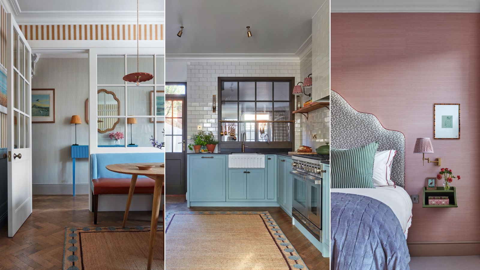

Modernizing the house design of a classic townhouse has always presented a dilemma. How do you introduce the space, light, and flow we now crave without compromising the original features – the paneling and plasterwork, the snug, fire-lit parlors or twisty staircases that make older homes so appealing to us in the first place?
This Victorian terrace in south London is a case in point. Its designer Laura Stephens was commissioned to rejig the floor plan. But instead of blitzing through walls, she has retained the 19th-century architecture, adroitly reconfiguring the layout to suit its owners, a couple and their toddler.
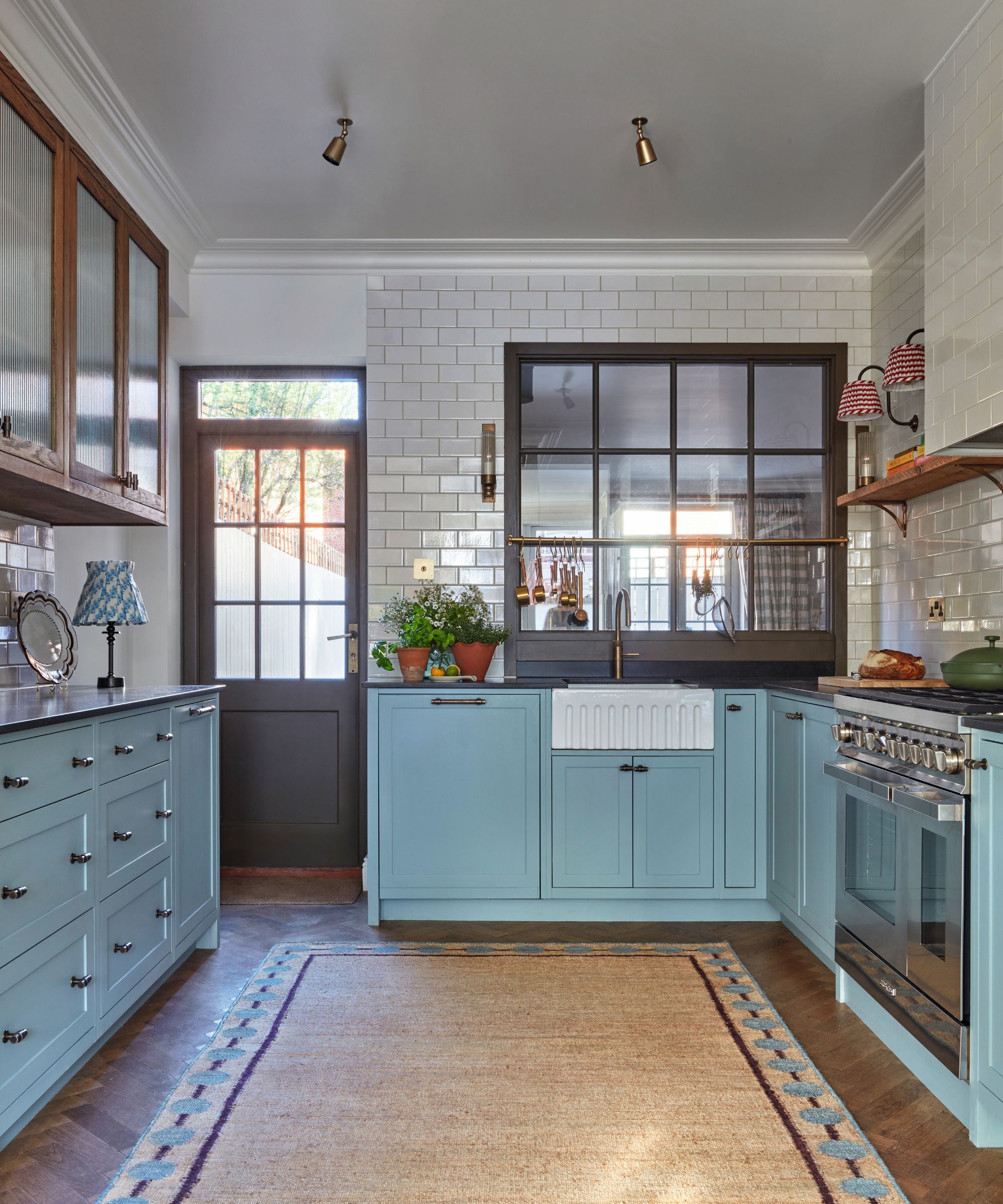
Metro Deco Grand Central tiles, Claybrook. Units in Spruce; window and door in Bronze, Paint & Paper Library. Wall lights, Pooky. Pearl rug, Bombay Sprout x Laura Stephens. Ceiling lights, Corston. Lamp (left), Pooky.
Fresh colors, textures of jute and seagrass, and Downton-esque architectural details add to the effect: bright, comfortable – and ageless.
In its last incarnation, the sitting room was at the front leading to a dining room behind. A galley kitchen, dark and narrow, lurked at the back. At first, they mulled over the conventional solutions to expanding the space: bolting on a glazed side return or knocking through the back wall to extend the house.
Eventually, both clients and designer agreed they were aiming for a different, less interventionist effect. ‘We wanted to make the house feel like a lived-in space that has evolved,’ says Laura, whose eponymous studio is based locally.
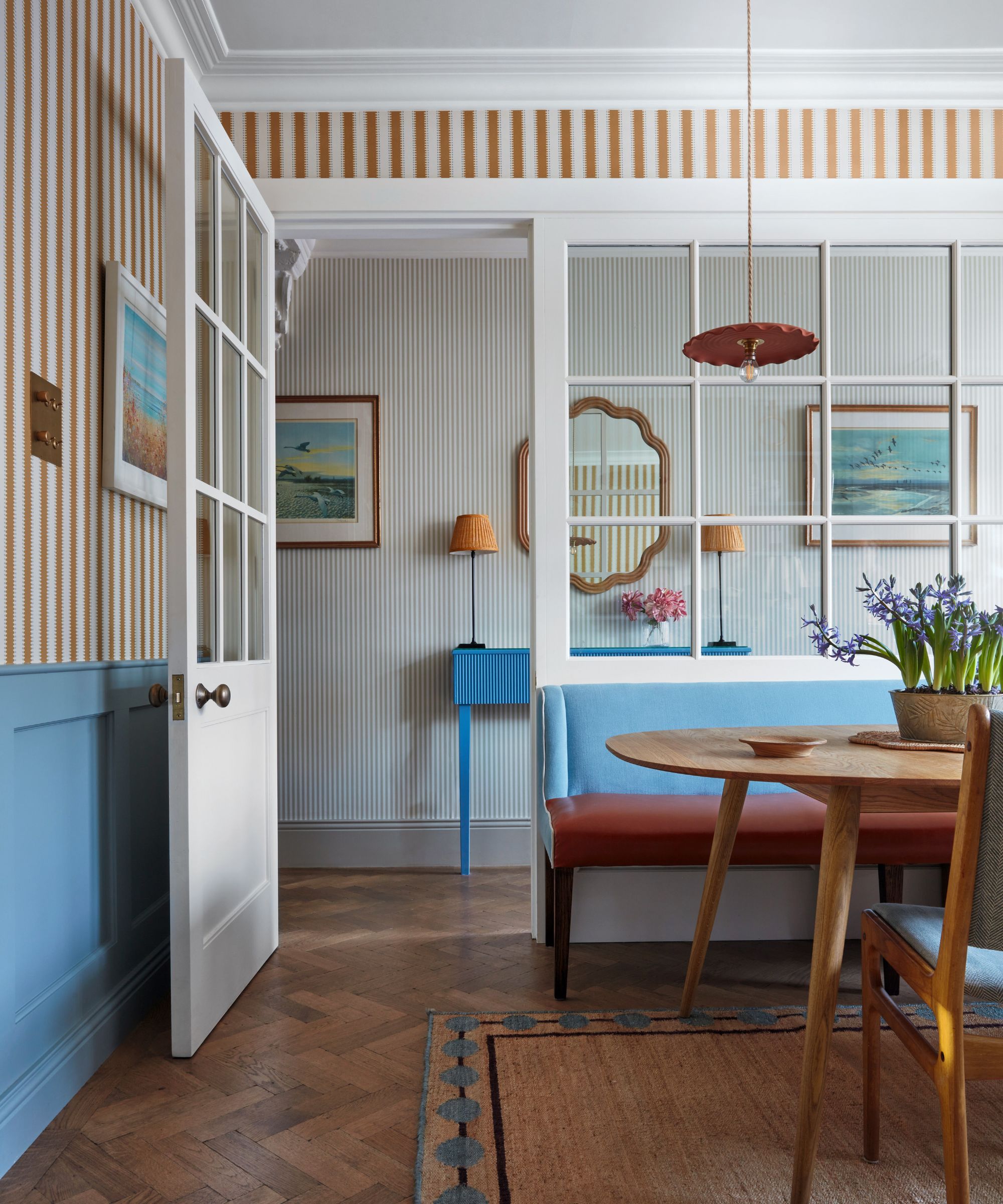
Jagged Stripe wallpaper, Ulricehamns Tapetfabrik. Bespoke console and banquette, Laura Stephens Interiors.
‘I have worked on every permutation of terraced house: I know them inside out,’ she adds. The sitting room was moved to the back of the house, the kitchen was relocated to the middle, and the dining room – which doubles as a small home office – resurfaced at the front.
However, that still left the question of how to bring in more light. True to the collaborative nature of the project, it was the clients who suggested adding the glazed screen between the hallway and dining room – like an old-fashioned office partition – bathing the front of the house in light.
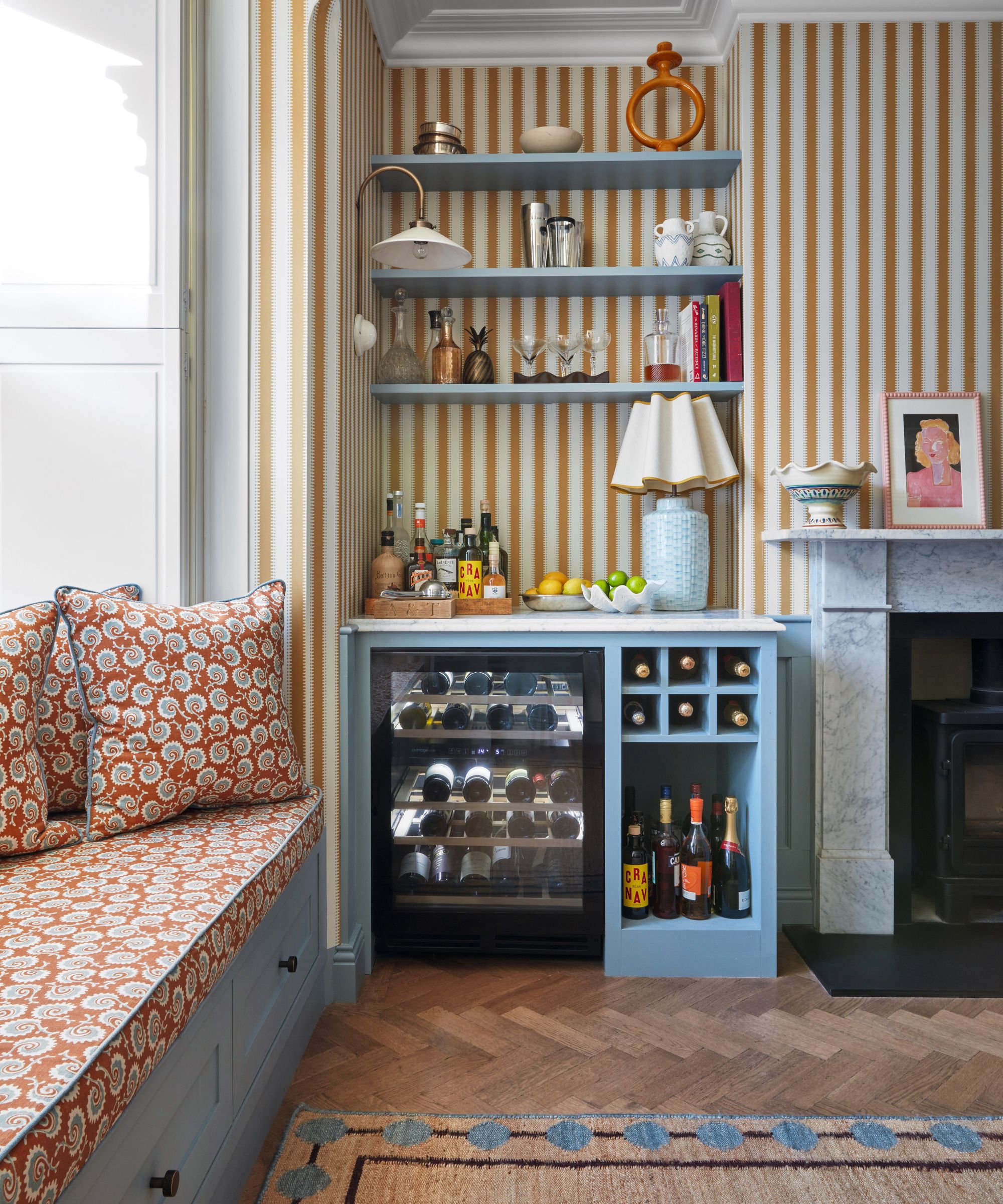
Sofa bench in Fern Frond, Sanderson, with piping from Romo. Flooring, Natural Wood Floor Company.
The fireplace is new and Laura designed the half paneling as a foil for the jauntily striped wallpaper. In the kitchen, a slice of wall was removed to insert the window above the sink – for sociable views of the sitting room behind.
‘Utilitarian’ white tiles are offset by the periwinkle blue kitchen cabinetry, specially made to suit the high ceilings. Bronze handles – instead of conventional chrome – add a patina of time. Like the architecture, Laura found ways to reinvent the clients’ furnishings. Sofas, armchairs, dining chairs, and the ottoman in the sitting room were recovered.
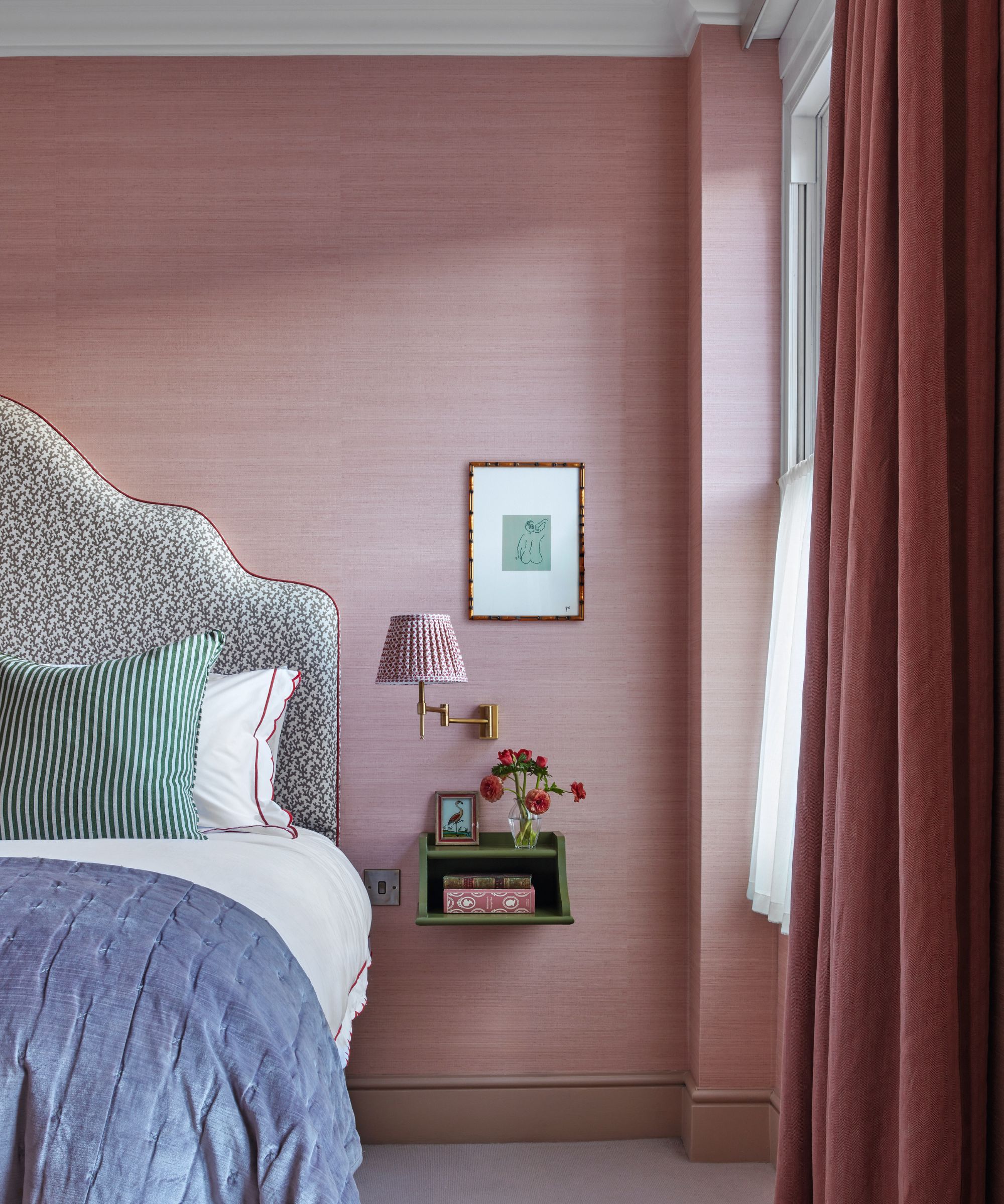
Chinon wallcovering in Petal, Designers Guild. Striped cushion, Chelsea Textiles. Headboard in Folly in Berber Brown, Veere Grenney. Wall light, Pooky.
‘We tried to keep as much as possible,’ says Laura, who traces her make-do spirit to her childhood, when she taught herself how to paint furniture (including, to her mother’s horror, a prized family heirloom).
In the main bedroom, Laura transformed the hitherto ‘bleak’ run of wardrobes with glazed doors lined in gathered fabric. A gauzy pendant light was chosen for its sculptural quality. Its texture is echoed in the pink wallcovering which wraps around the room.
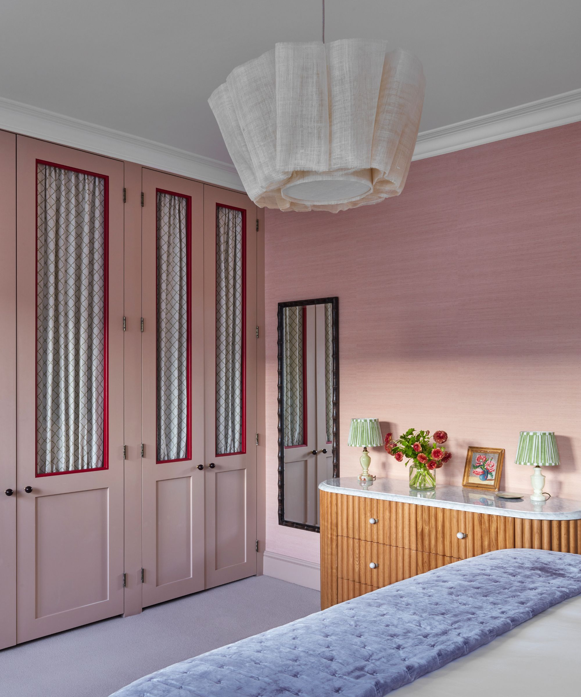
Chest of drawers, Soho Home. Doors lined in fabric from Chelsea Textiles. Doors in Templeton Pink; Frames in Rectory Red, both Farrow & Ball. Anders ceiling lamp, Pinch.
Ingenuity was also needed in the top-floor bathroom, cozily tucked under the eaves. When the supply of mustard and white tiles ran out, they improvised by installing a panel of mirror which reflects the striped design – and expands the sense of space.
The rugs dotted throughout the house, like painterly works of art, were designed by Laura in collaboration with Bombay Sprout. This is Laura’s first foray into product design and she set out, she says, to design a rug that would work in any setting. The motifs, based on antique passementerie, and natural jute textures nod to the past – and present: much like this house.
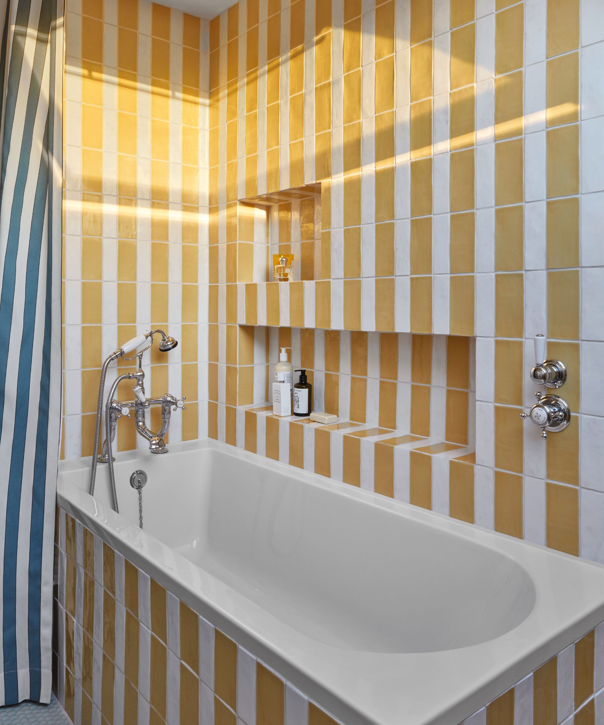
Tiles, Artisans of Devizes. Shower curtain in Plain Stripe, Flora Soames.
Meet the designer
Laura Stephens shares her style inspiration
What part of the project were you happiest with?
The glazed wall dividing the hall and dining room. It transformed the space and flooded both areas with natural light.
Do you have a go-to color?
Spruce by Paint & Paper Library – the perfect blue.
How do you find inspiration?
Mostly from my collection of interior design books, historical and current. But also from the creative mind of my youngest daughter who is constantly inspiring me.
Any design heroes?
The architect Gil Schafer. There is nothing he’s designed that I don’t love.
What is your favorite building?
It has to be the Chrysler Building in New York City. There is no more glamorous skyscraper.
Any interesting projects in the pipeline?
I am exploring a collaboration with an interesting furniture company, completing a beautiful townhouse in Wandsworth with a park view and renovating a townhouse in Battersea.
Sign up to the Homes & Gardens newsletter
Design expertise in your inbox – from inspiring decorating ideas and beautiful celebrity homes to practical gardening advice and shopping round-ups.
As the UK’s first-ever home interest magazine, Homes & Gardens has been shaping British style for 100 years. Our core pillars are inspirational interiors, stylish decorating, beautiful gardens and fascinating stories. With the values of timeless style and considered elegance at our heart, we show an affection for heritage whilst also championing the future, from emerging designers to latest trends.
The Homes & Gardens website brings all our beautiful content online, with a focus on stunning room ideas, expert advice from interior designers, architects and design professionals, and more practical expertise, too, on caring for and improving your home. Our website is updated and added to daily and we're delighted to welcome more than 6 million readers monthly. Of course, we've assembled a cracking team of experts in their fields to deliver all this stunning inspiration to you, and we'd love to introduce them. Their contact details are below, too.
-
 Charred little gem with saffron dressing
This recipe with charred little gem is both easy to make and sure to impress guests. It's the perfect side for fresh spring menus
By Alice Hart
-
 Grilled asparagus with herb and pickled red onion
This grilled asparagus couldn't be easier, and it's a wonderful way to get the best flavor from our favorite spring veg. It's perfect alongside fish or lamb
By Alice Hart