6 color mistakes people often make in their homes, and the tricks designers use to avoid them
These color mistakes are the ones designers see most often in peoples' homes. But don't worry, they know just how to remedy them
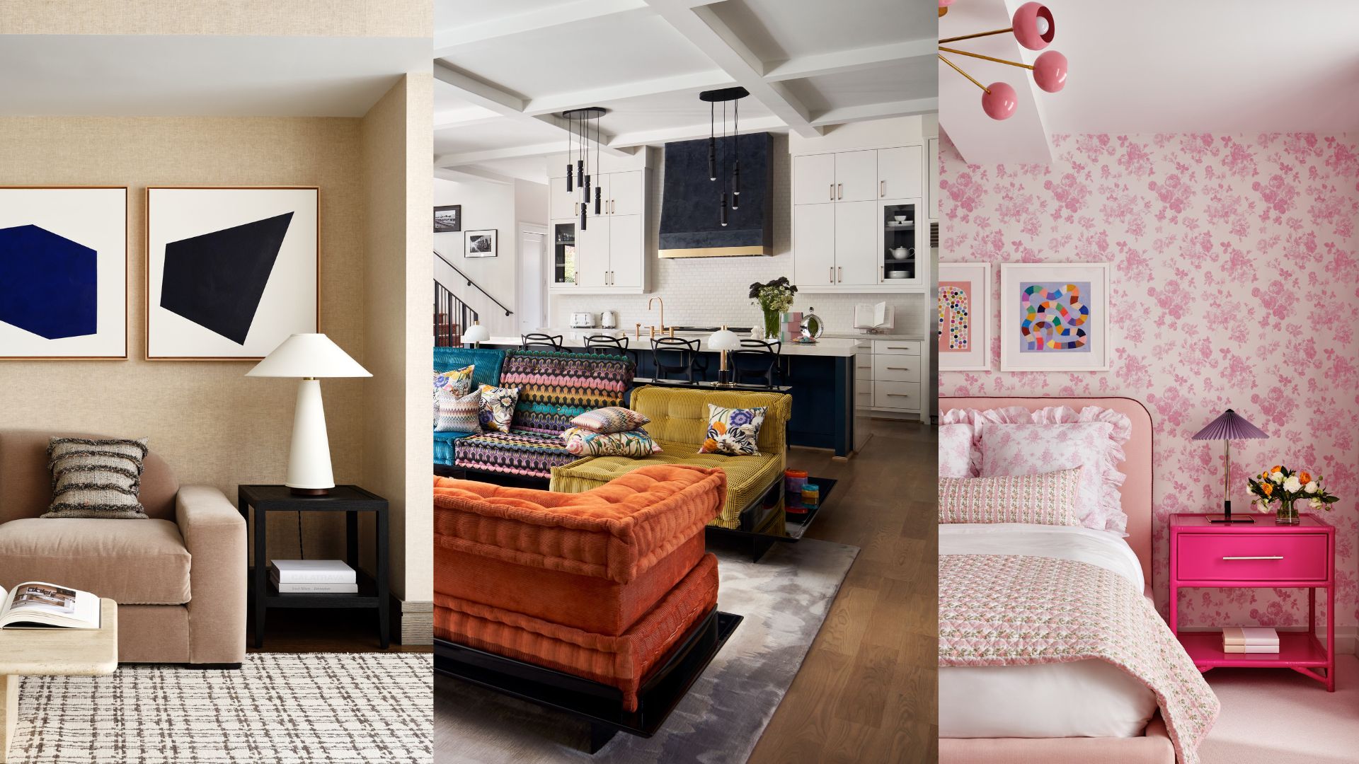
Designers often get turned to when people have made color mistakes in their own homes. Perhaps a room has lots of shades of the same hue which really ought to work, but doesn't. Or there is a pattern the decorator really wants to use that, try as they might, just won't seem to gel.
Well, never fear, as designers have solutions to the most common issues they see. 'You really need to get the tones right in order to have a balance,' says interior designer Roisin Lafferty. However, that's not to say bold colors won't work together. 'Look at art by people like Rothko and James Tyrell,' she adds. 'They play with color, but they manage to get the saturations just right.'
Don't worry, this is not as tricky to master as it may appear. In fact, using the guidance below should help you create layouts and room color ideas that flow together, spaces where nothing overwhelms and, crucially, stop you from making any more color mistakes.
1. Overwhelming your statement pieces
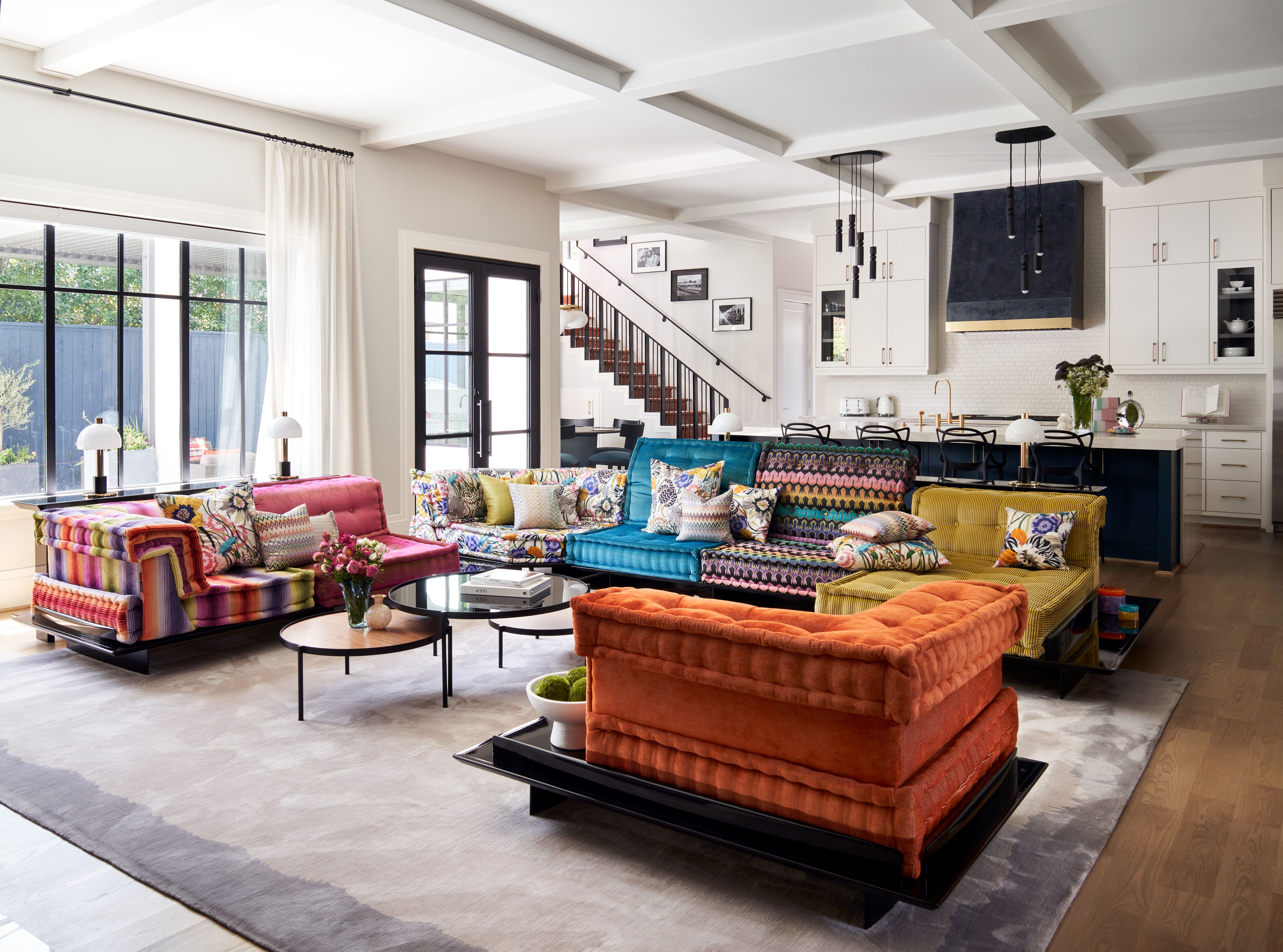
There is always a joy in choosing a big piece of furniture in a bold, bright color. It's the first thing people notice as they enter a room, it sets the tone for a fun and adventurous decor scheme and can't help but raise a smile. But what if you've gone for a kaleidoscopic pattern, like on this Mah Jong sofa above, and still want to have a home that doesn't visually bombard you the moment you step through the door?
'The secret is that we started with a very neutral palette as you entered the home – black and white and dark blue serving as a neutral as well,' says Laura Umansky, founder of the Houston-based Laura U Design Collective. 'We slowly introduced more color in pops in the formal living and dining room as you make your way to the family room. The Mah Jong sofa is a strong statement, but we have a neutral rug and draperies and the dark blue is continued into this space with the wallcovering at the fireplace and kitchen island behind.' By avoiding swamping the living area in other bold hues, the sofa becomes the centerpiece it was always meant to be, rather than lost in a vivid sea of color.
2. Mixing undertones
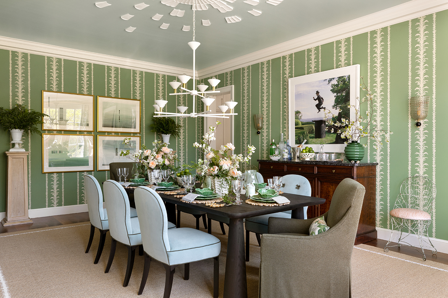
Just because two colors are from the same family, doesn't mean they're automatically destined to work. A light green may go with a dark green, for instance, but it has to be just the right light green, and just the right tone of dark.
'I think it is important to decorate with greens that have a similar undertone,' says the Illinois-based designer Alexandra Kaehler. 'So, if it's yellow greens stick with those in varying degrees of saturation. I would be careful about mixing a very muddy gray green with a very yellowed lime green. Rather than compliment each other, I find they tend to fight.'
3. Forgetting the contrasts
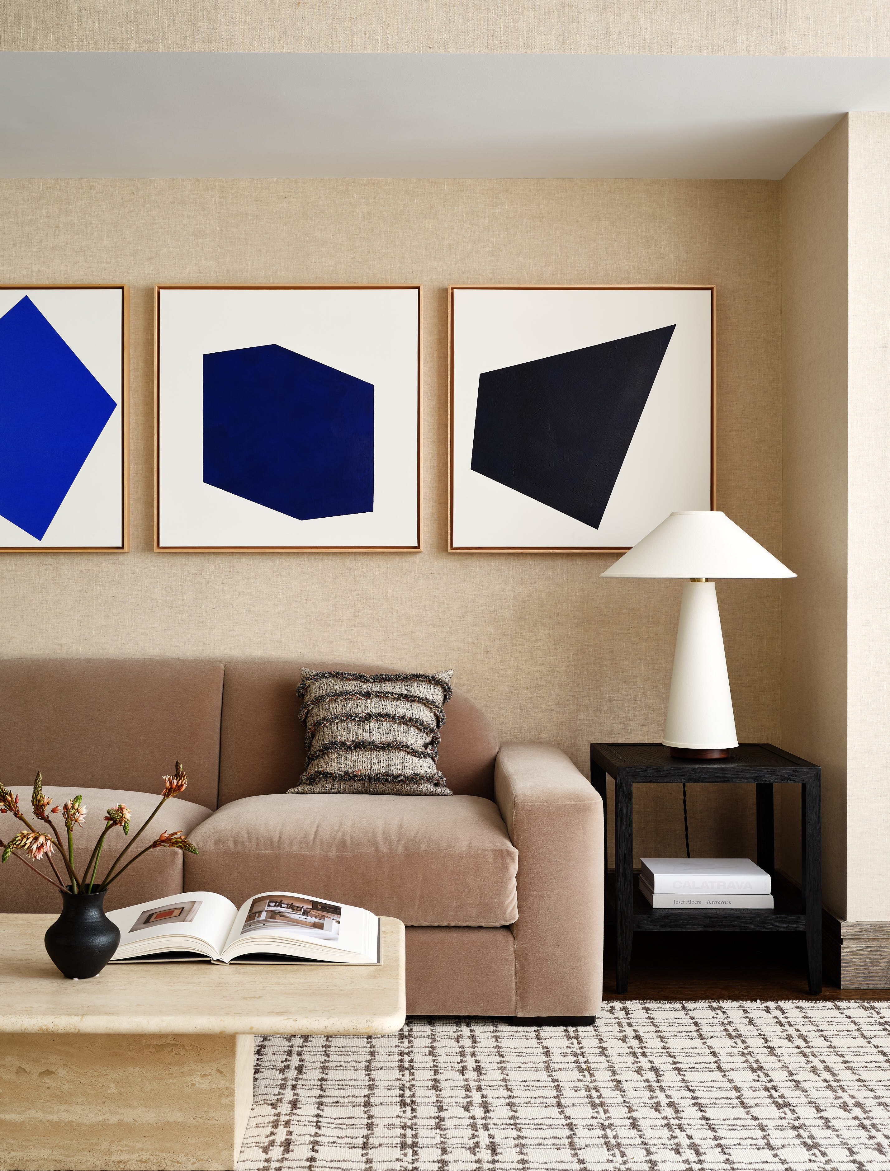
But, when playing with colors of the same family group, it's important to remember that it's the contrast that elevates the scheme, the little moment of push or pull that stops a scheme from seeming one-note.
This brown living room plays around with variations of that color, throwing in a bright blue artwork for good measure.
'The key to mixing and decorating with browns is to select beautiful hues to start with, whether that's a deep chocolate or a warm taupe,' says Susana Simonpietri, Creative Director of New York-based design studio Chango. 'We like to mix and match different shades of brown which instantly feels more modern and to play with different textures and weaves for added contrast. Here, we chose a sofa with a bit more gray in its brown, which nicely breaks up the tones of the travertine coffee table and textured wall covering.'
4. Not pairing accent colors
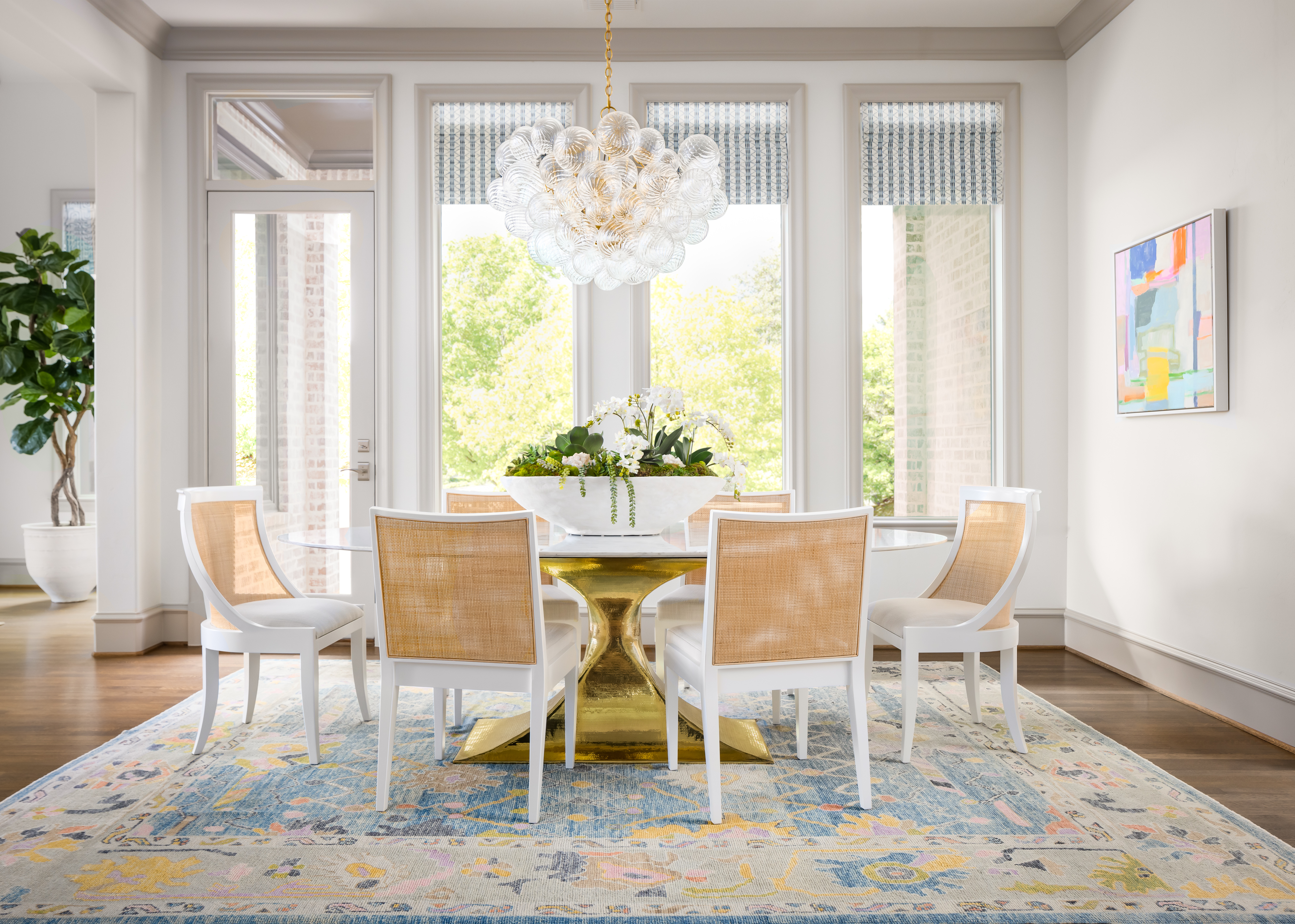
Often, you'll want to include both a patterned area rug and graphic art on the wall – and it's eminently possible to do both. Where this approach goes wrong is if they end up stealing focus from each other. Where it goes right is there is a common thread between the two, no matter how subtle.
Angeline Guido Design 'The overall color palette here is based on the rug's colors, as it was the first item we sourced for this space,' says Reno Grossi, Principal Designer at Angeline Guido Design. 'The vendor, Joey Sabb, creates stunning rugs with a brilliant variation of colors, which always leaves us feeling inspired. The client already owned the featured artwork, so it was serendipitous that we found this rug that paired beautifully.'
Notice how the art and the rug both have moments of blue and yellow in them – a clever trick to remember if you're starting from scratch. Even just a tiny accent appearing in both creates harmony and flow.
5. Not playing with saturations
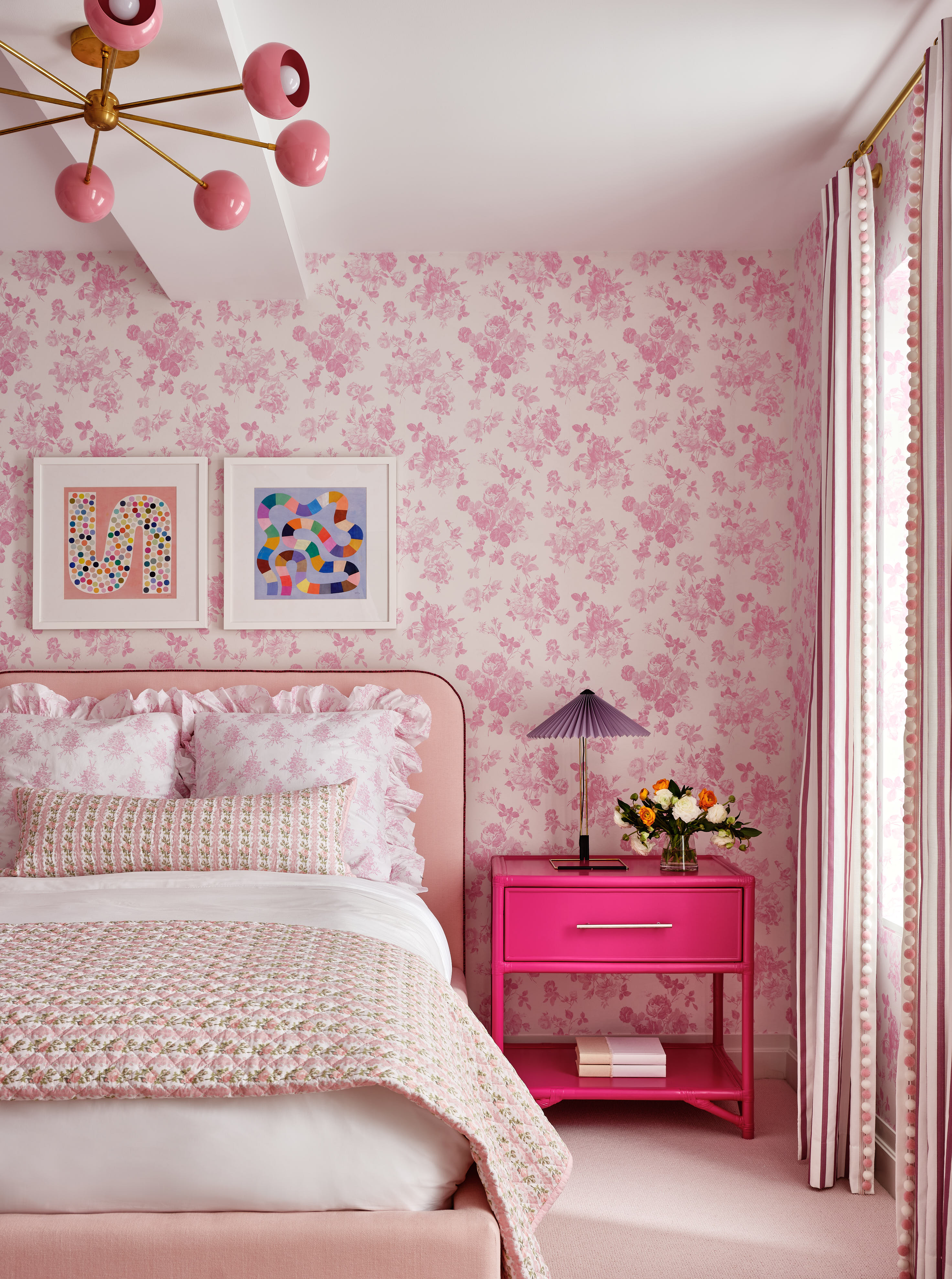
While we've already talked about undertones and contrasts, another area of decorating with color takes into account their saturations. This is where the same shade is used multiple times, but to different degrees – sometimes lighter, sometimes darker. People tend to avoid this in favor of a more matching approach, but that can lead to dull and uninspiring rooms.
'The key to mixing pinks like this is to have a variety of saturations and hues, says Susana Simonpietri. 'This room has rose pink, peachy pink, and dark pink punched up with the bold highlighter pink nightstand. Smaller case goods, lighting, art, and accessories are where we'll tend to go bolder with color and all these layers of pink are what make the room interesting and tied together.'
6. Going too large on your accent colors
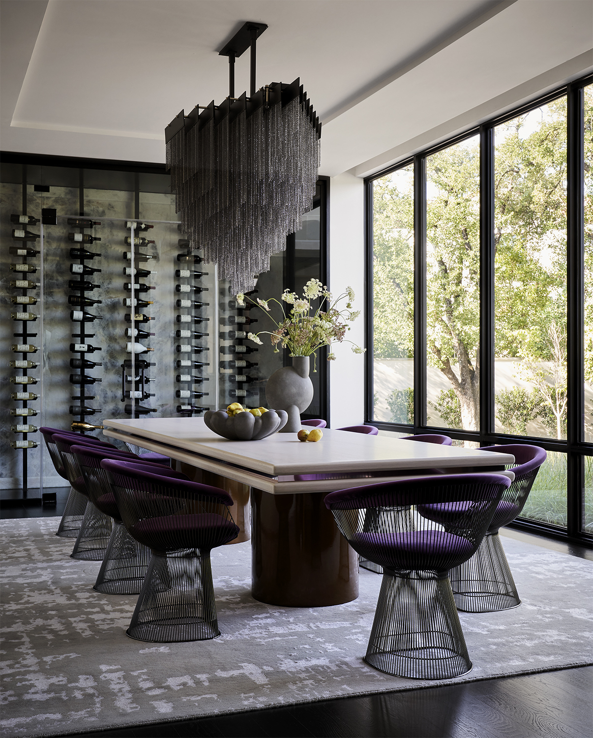
Houston-based interior designer Nina Magon knew she wanted to use a strong purple as the accent shade in this dining room, and was careful not to let it overwhelm the scheme. This was definitely a case where less was more, and where a little was able to go a long way.
'When infusing this regal purple shade, strategic placement and harmonious layering were key,' Nina says. 'Opting for carefully curated accent pieces like dining chair upholstery or decorative accessories allows for a tasteful introduction of the purple hue without overwhelming the space. Additionally, experimenting with layering different shades of gray and black alongside the purple accents adds depth and dimension to the dining area. By thoughtfully juxtaposing these colors, a visually compelling space is achieved, exuding luxury and refinement while maintaining a sense of balance and cohesion.'
When it comes to color mistakes, there's always going to be trial and error. And there are such things as happy mistakes too, pairing together colors or shades or undertones that shouldn't work but they do. But your best way to guarantee success to to order swatches of everything – paint, fabrics, tiles, the lot – see how these colors look in situ, in your space with your lighting.
Sign up to the Homes & Gardens newsletter
Design expertise in your inbox – from inspiring decorating ideas and beautiful celebrity homes to practical gardening advice and shopping round-ups.
Pip Rich is an interiors journalist and editor with 20 years' experience, having written for all of the UK's biggest titles. Most recently, he was the Global Editor in Chief of our sister brand, Livingetc, where he now continues in a consulting role as Executive Editor. Before that, he was acting editor of Homes & Gardens, and has held staff positions at Sunday Times Style, ELLE Decoration, Red and Grazia. He has written three books – his most recent, A New Leaf, looked at the homes of architects who had decorated with house plants. Over his career, he has interviewed pretty much every interior designer working today, soaking up their knowledge and wisdom so as to become an expert himself.
-
 How to grow impatiens – garden experts reveal the secrets to growing this shade-tolerant, sparkling summer plant
Both 'Busy Lizzie' and 'New Guinea' impatiens can thrive in shady yards
By Ellen Wells Published
-
 Charli XCX's dining room is a 'treasure-trove' of one-of-a-kind pieces – it's the most unique hosting space I've ever seen (and surprisingly replicable)
The singer's Tudor-style dining room features eclectic furnishings, a mix of patterns and bright colors that all work together beautifully
By Hannah Ziegler Published
