5 color combination rules to always follow – for a vibrant yet cohesive scheme
Interior designers use these rules when creating color pairings to ensure balance
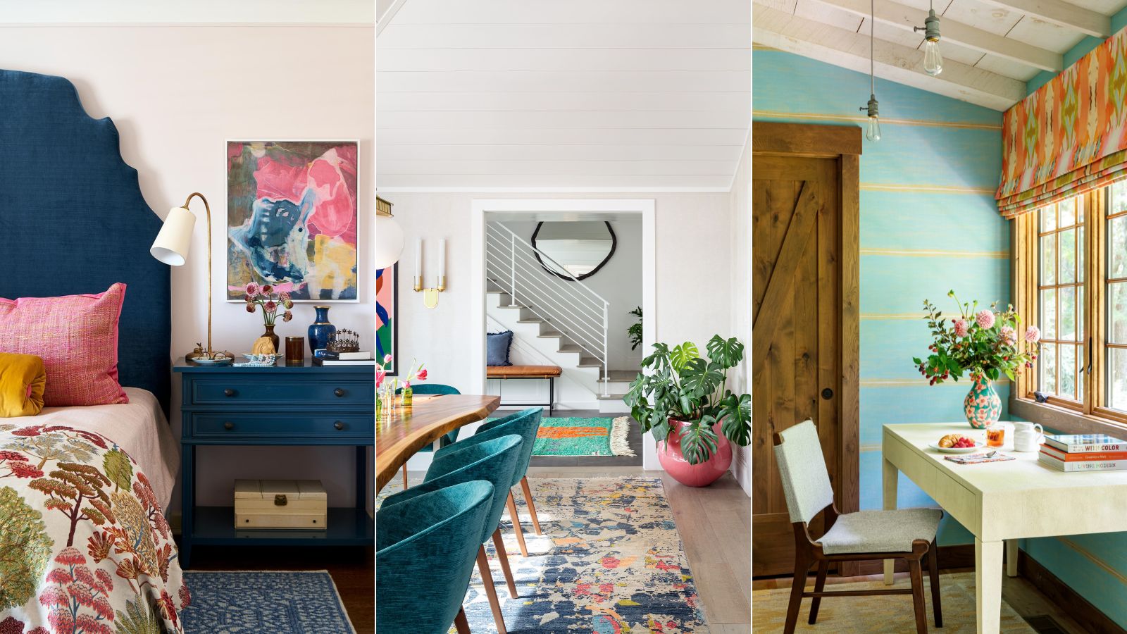

The right color combinations can be one of the most effective ways to give a room design appeal, whether that's with layered neutrals or highly contrasting shades.
However, successfully decorating with color combinations is all down to balancing colors to ensure harmony within a room. Failing to do so can result in a space that's either overwhelmed by competing colors, or on the other hand, flat and lacking in interest.
So, what are the best ways to create color combinations for rooms that work well together? We asked interior designers for their secrets, and have rounded up the top five color rules to always follow, for every room in the home.
5 color combination rules to always follow
As you'll soon see, we reference color theory a lot here, since it's generally how designers inform their color choices. Before fully understanding how to pair colors successfully, it's worth familiarising yourself with the color wheel to grasp the fundamentals.
'Creating cohesive color combinations and pairings involves understanding basic color theory, balance, and harmony,' advises interior designer Cinzia Moretti, Creative Director at Moretti Interior Design. 'To get yourself familiar with colors I always advise you to start with the color wheel, which is a useful tool if you want to learn how colors are divided.'
'Once you familiarize yourself with it you can learn how to create complementary, analogous, and split-complementary color schemes.'
1. Use analogous colors for a tonal scheme
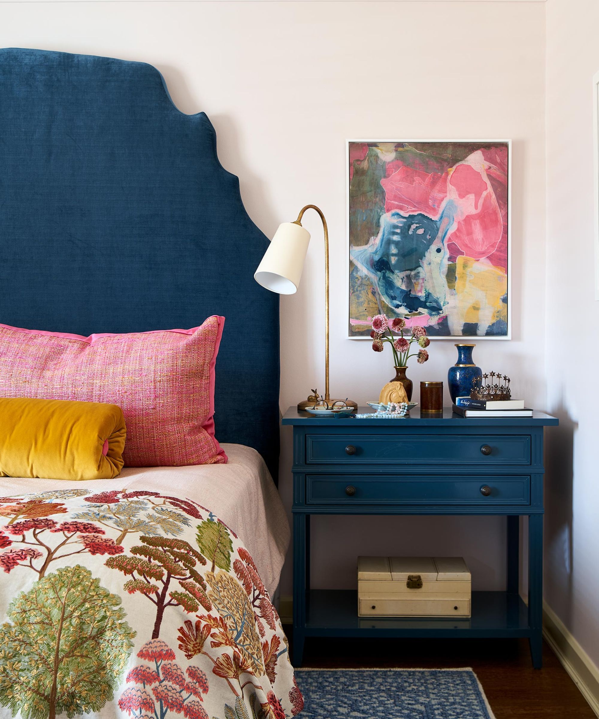
When pairing colors, there are generally two ways to go. The first is to create an analogous scheme, grouping colors that sit next to each other on the color wheel (for example, green and blue), and the second is to create a complementary scheme, which uses colors that sit opposite each other on the color wheel (such as red and green), resulting in a high-contrast look.
Sign up to the Homes & Gardens newsletter
Design expertise in your inbox – from inspiring decorating ideas and beautiful celebrity homes to practical gardening advice and shopping round-ups.
Interior designer Nadia Watts prefers the former when creating color combinations, pairing tonal colors to create a cohesive yet layered color scheme. 'I like starting with a base of tonal colors,' explains Nadia. 'Using different shades of the same color group creates a rich starting point upon which to build your color story.'
'Starting with an analogous color scheme, I am essentially starting with a blank (although colorful) canvas. I build my palette on that base color, so the pops of color I add are purposeful and pointed, bringing the whole room together through color. Using a tonal starting point creates cohesiveness and groundedness, then add your pops of color, pattern, and texture, and everything looks elevated.'
2. Or, create impact with complementary colors
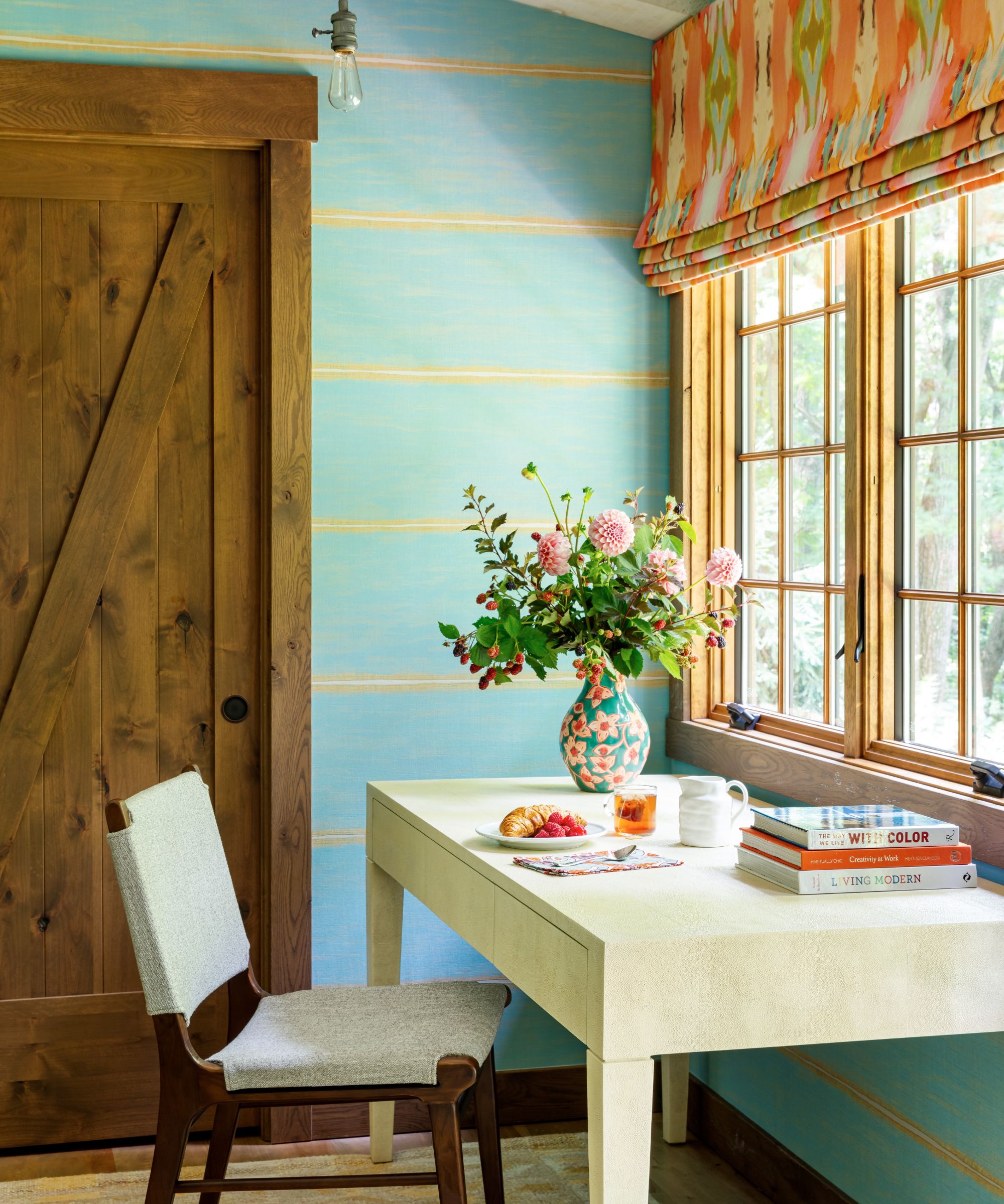
On the other hand, complementary color schemes are an effective way to create color combinations that feel more dramatic. This works especially well for maximalist decor ideas and is commonly used by NYC-based designer Kati Curtis, founder of Kati Curtis Design.
'When I’m designing any space, I focus on utilizing “complementary” or “split complementary” color schemes that create a visually cohesive environment,' explains Kati. 'Complimentary colors, which are directly opposite each other on the color wheel, offer a high-contrast look that can bring vibrancy and energy to a room. For example, pairing blue with orange can create a dynamic and engaging space that one reads as a harmonious combination.'
To tone down the intensity slightly, Kati says that split complementary schemes offer an adapted take on classic complementary colors: 'Split complementary color schemes involve choosing one base color and then using the two colors adjacent to its direct opposite. This approach offers a balance that's less intense than a direct complementary scheme while maintaining visual interest and harmony.'
'For instance, if you're working with a base color like green, you would look to the colors on either side of its complementary color (red), which could be a red-orange and a red-violet, to incorporate into your design.'
3. Use a neutral color for the base of your scheme
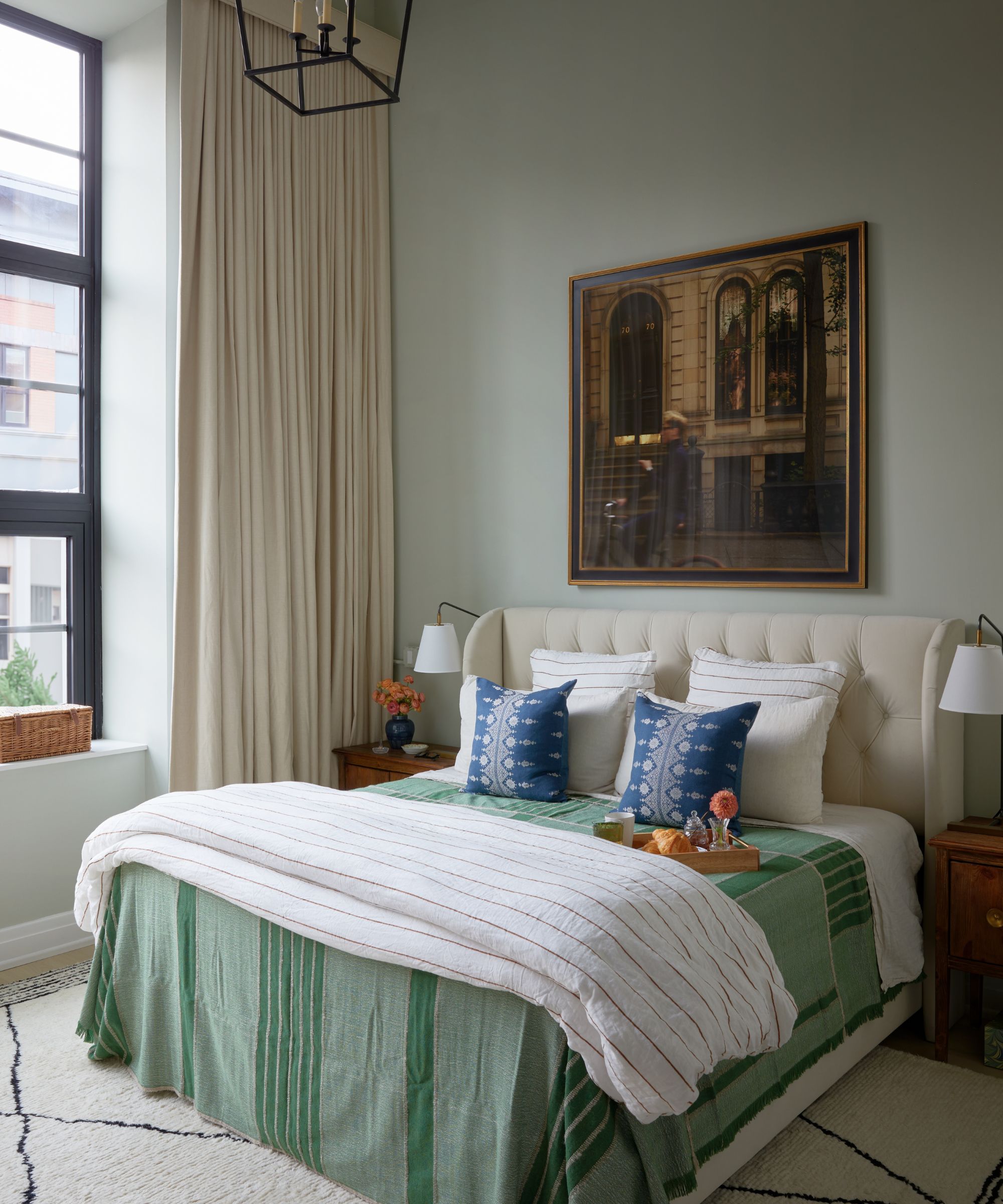
While complementary and analogous color schemes are useful references to realize effective color combinations, it doesn't always have to be so structured. This is especially true if you're decorating with neutrals, which are generally more forgiving than highly saturated shades, as depicted in this relaxing bedroom designed by Samantha Ware Interior Design.
For interior designer Kathy Kuo, choosing one neutral color is a rule she follows to inform her color combinations, serving as a base color for a room which you can then build on with contrasting accent colors.
'In general, I would advise selecting a neutral color that can serve as your primary base, and then you can add complementary shades, as well as a pop of contrast, as you like and end up with a really balanced color scheme,' the designer shares.
If you choose to use neutrals as the foundation for your color scheme, make sure to pay attention to their undertones. Neutrals with warm undertones such as beige will pair best with warmer accent colors such as pinks, whereas mixing cool and warm tones can throw the color scheme off balance.
4. Maintain balance with bold colors
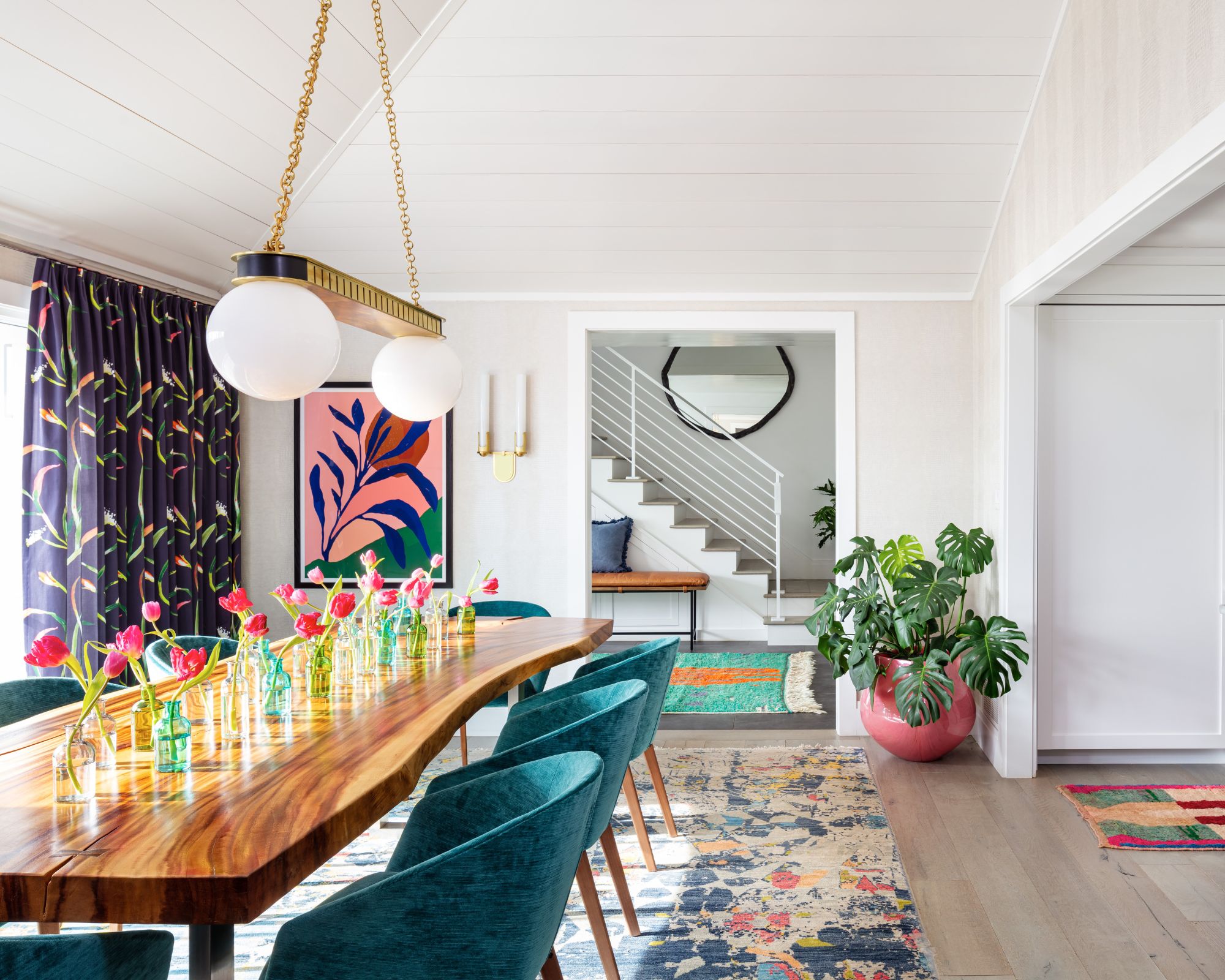
Once you've decided on the colors to include in your color scheme, it's important to get the balance right between your dominant color and accent colors. You can generally use less intense colors on the walls, whereas more saturated colors can be used in smaller doses as shown in this dining room designed by Betsy Wentz Interior Design.
Kati Curtis suggests reflecting your bolder colors through smaller decorative items: 'Select your complementary or split complementary colors for accents, such as throw pillows, art, or decorative items. The key is to maintain a balance; too much contrast can become overwhelming, and too little might make the space feel flat.'
Designers Jordan Winson and Tate Casper of Oxford Design add that this approach works for even the brightest colors, working to add interest to a space without overwhelming it: 'We love layering all colors into a room in some capacity, even if more shocking primary colors just find their homes on small details like a lamp shade trim or accessory.'
5. Stick to colors with the same hue
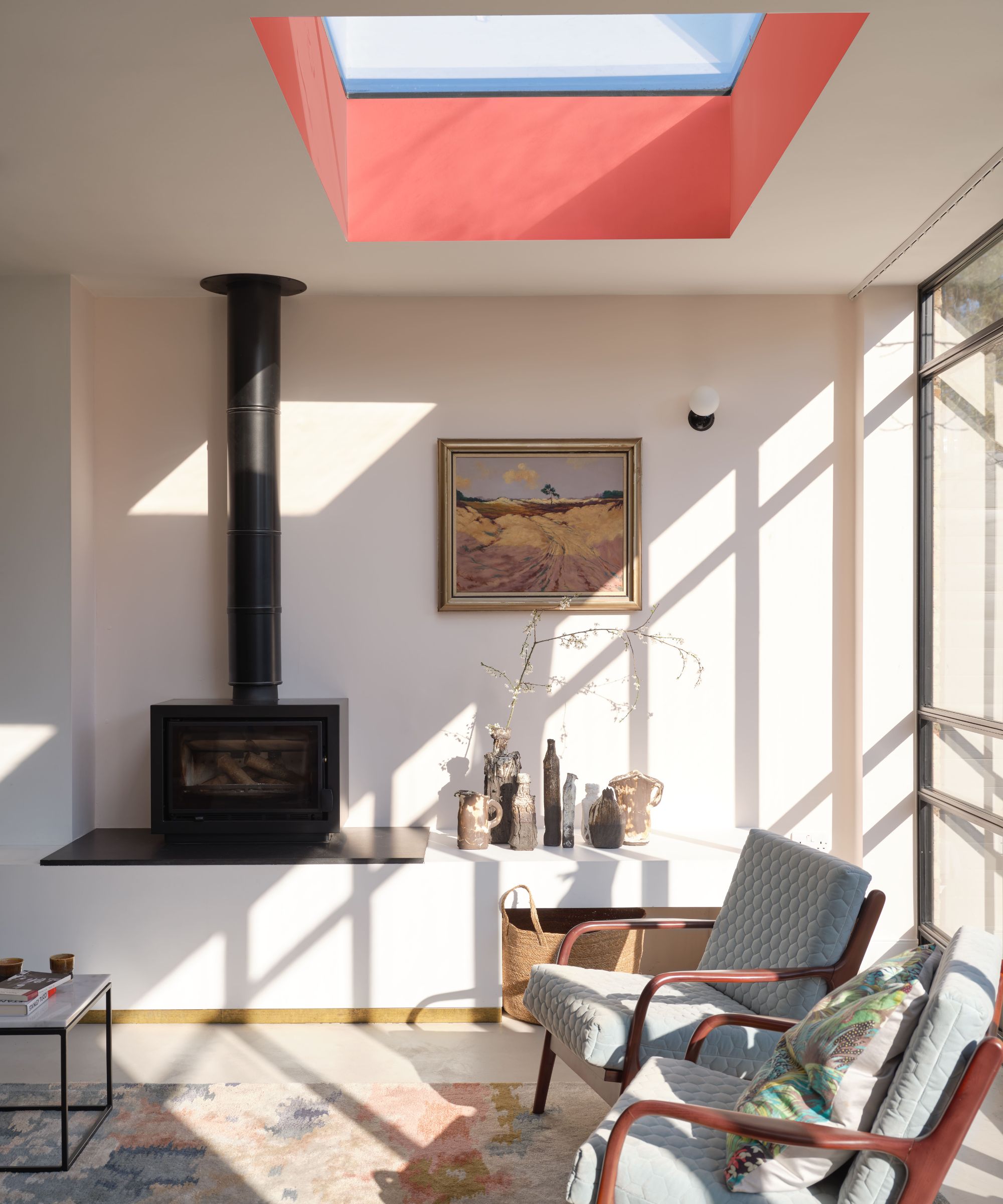
Matching hues is another color rule that designers often follow to ensure harmony when creating color combinations, whether with bold colors or a blend of soft neutrals.
When we talk about hue, we're referring to the main color family a certain shade belongs to, such as red, blue, or green to name a few. While colors with the same hue can vary a lot, sticking to matching hues throughout color schemes generally creates cohesion and avoids a mismatched look.
'I recommend using colors of the same hue, such as pastels, medium bights, or primary shades to create a harmonious design,' explains interior designer Betsy Wentz.
In this living room, two different paint colors are used across the walls and the ceiling, and while one is much darker than the other, they both have the same hue which creates cohesion.
Color is subjective, and in your own home, you should embrace whichever colors bring you the most joy. Having said that, these useful color rules will certainly ensure a level of balance, helping you to decorate with vibrant colors while maintaining a restful look and feel.

Emily is a freelance interior design writer based in Scotland. Prior to going freelance in the spring of 2025, Emily was Homes & Gardens’ Paint & Color Editor, covering all things color across interiors and home decor for the Homes & Gardens website. Having gained specific expertise in this area, Emily is well-versed in writing about the latest color trends and is passionate about helping homeowners understand the importance of color psychology in home design. Her own interior design style reflects the simplicity of mid-century design and she loves sourcing vintage furniture finds for her tenement flat.
-
 5 surprising but brilliant ways to clean with old socks – from perfectly buffing stainless steel to deterring pests naturally and more
Tackle dust in tricky corners, clean your mirrors and even banish bad odors with those rogue single socks
By Andy van Terheyden Published
-
 How to grow astilbe – expert advice on cultivating this shade-tolerant flowering perennial
Shade-tolerant and pest-resistant - astilbe are hardy and tough perennials that can thrive in many settings
By Ellen Wells Published