This 'coastal modern' beachside home blends organic charm with streamlined, sculptural details – here's a look inside
Complete with coastline views and characterful finishes, this Delaware home is a serene retreat that brings the outdoors in with ease
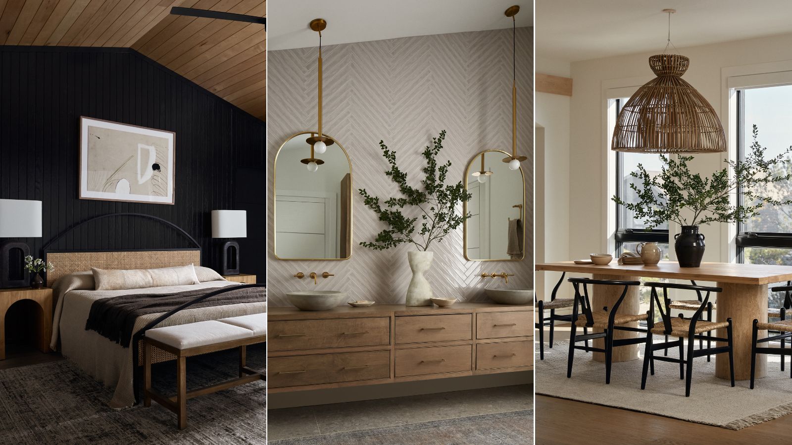

Kate Winnington is no stranger to the beach. After growing up on Delaware's sandy coast, she took the helm of C&E – a third-generation interior design studio and furniture company located on Fenwick Island. Surrounded by the Atlantic Ocean on one side and a picturesque bay on the other, the coastal views are constant. It's no surprise they've had an impact on C&E's signature 'coastal and elevated' style over the years.
But C&E's style strays far from the cliché, kitschy coastal decor that's become ingrained in seaside towns. It's elegant, luxurious, and warm. And one of the firm's latest projects – an airy, modern Bethany Beach home right on the coast – is no exception.
To hear more about the 5,445-square-foot build, H&G sat down with Kate, the principal and creative director behind C&E. Here she shares more about the home's custom finishes, why taking inspiration from nature is key, and how she gets coastal decor right.
A look inside C&E's seaside escape
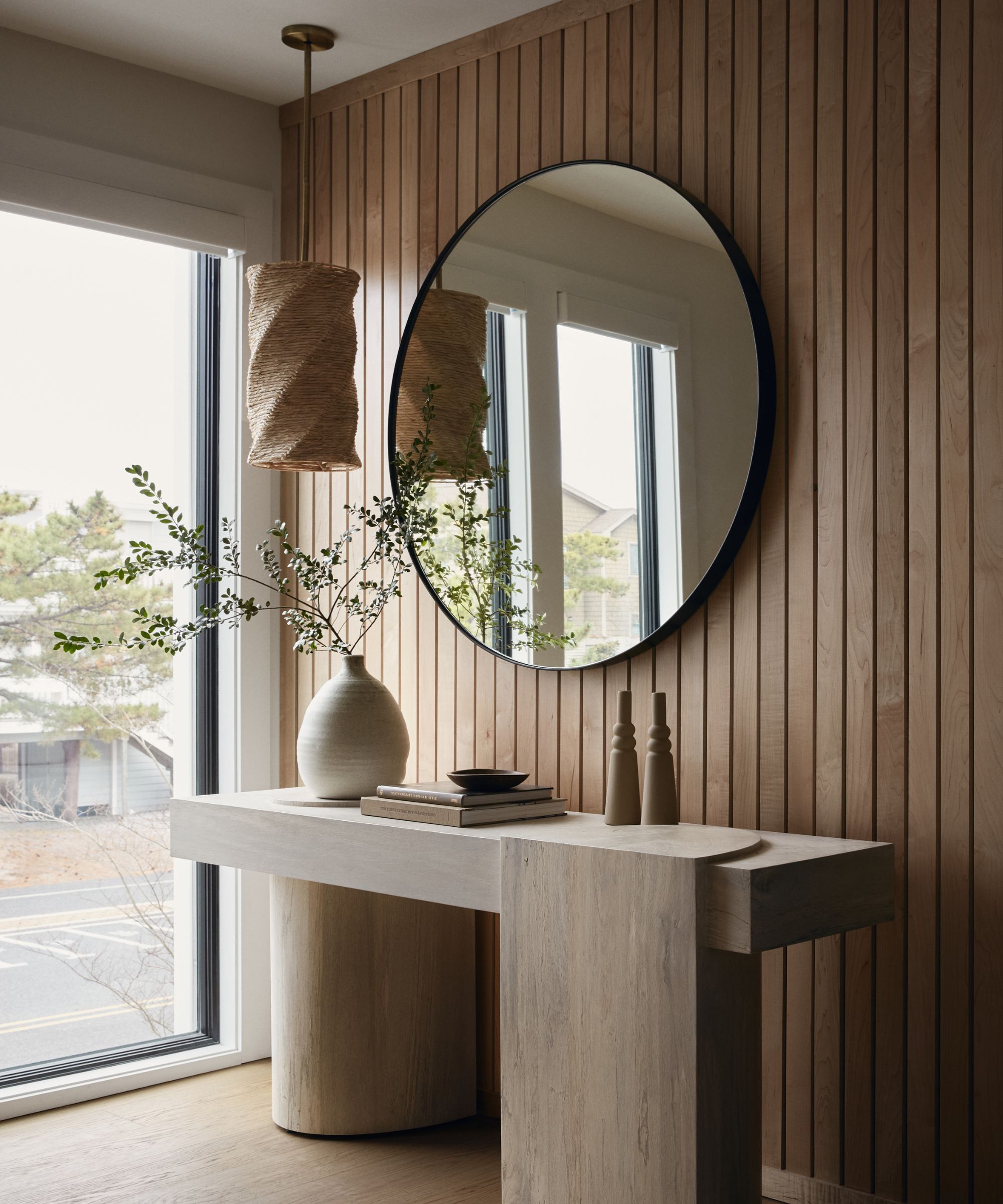
A contemporary home and a stunning natural environment don't always mesh, but finding a middle ground was one of Kate's main goals when approaching this space. She wanted to 'incorporate modern elements,' but still stay true to the oceanside atmosphere.
'It had to be organic in a way, it had to be earthy in a way. We wanted it to feel coastal, without getting into that very kitschy coastal look that isn't what was on the docket at all. It was like, "How can we layer all those elements in? How can we bring in organic touches? How can we bring different tones, keeping a relatively neutral palette, and then also add some very subtle modern touches?"
The combination came out beautifully, and everything down to corner console tables fits the bill. In this alcove, pictured above, wooden cladding on the walls is illuminated by a black-framed, floor-to-ceiling window. A characterful wooden console table, modern mirror, and thoughtfully placed light fixture bring the coastal modern look in full force.
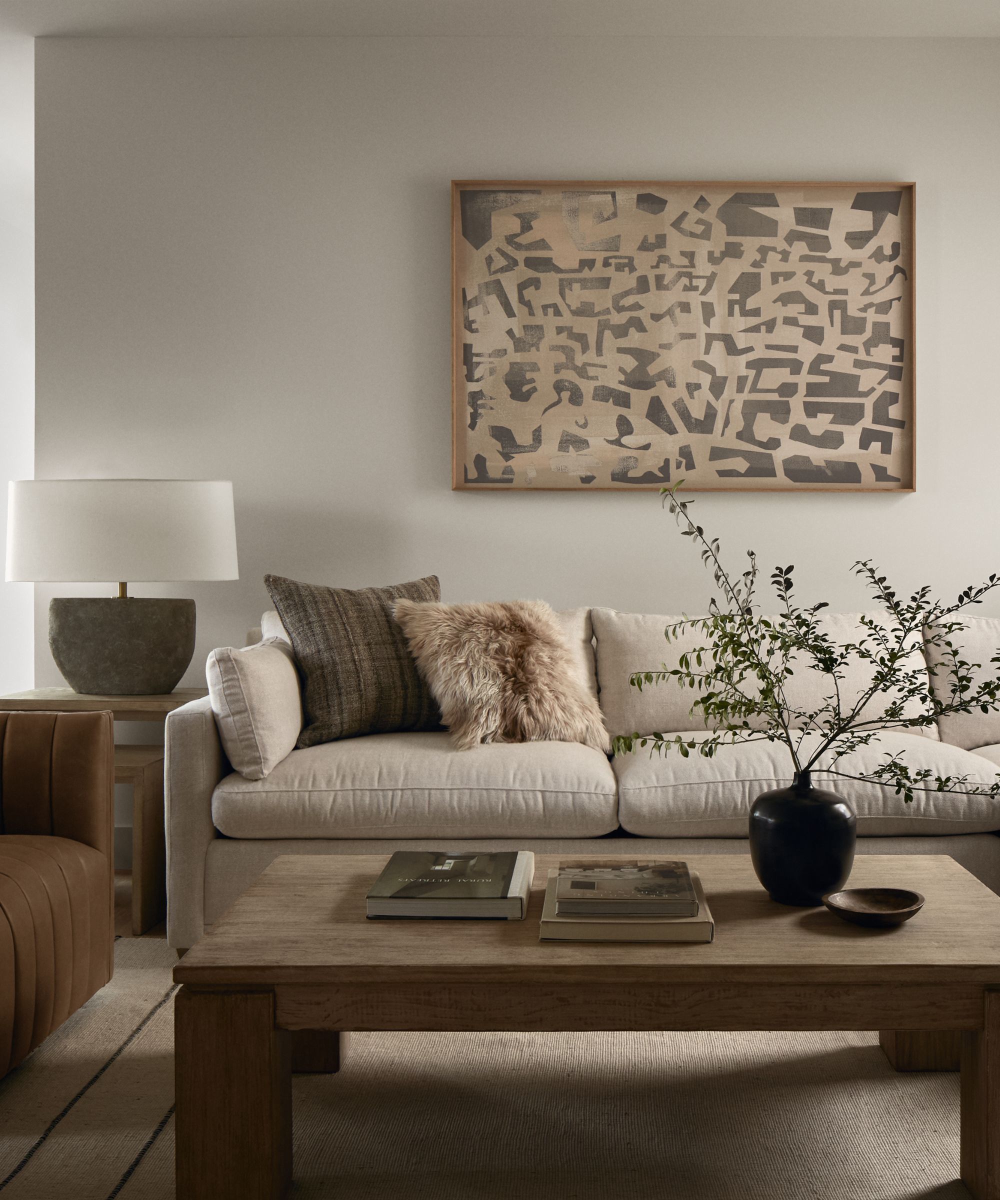
Lush, intricate texture is a key player in this home, and it came about quite naturally throughout the design process, says Kate. Though the architecture of the home felt quite modern in many ways, the outdoor views slowly but surely made their way indoors.
'With any design project, as you get going, things evolve and things show up in more volume than maybe even intended – it just takes on its shape as it goes. And I really love the different movements we were able to bring in with different organic textures,' she says.
From weathered wood and a limewash-finish fireplace, to boucle armchairs and natural stone, a symphony of natural and nature-inspired textures combine in this space. Each detail contributes to the earthy, inviting aesthetic that welcomes guests like a warm hug.
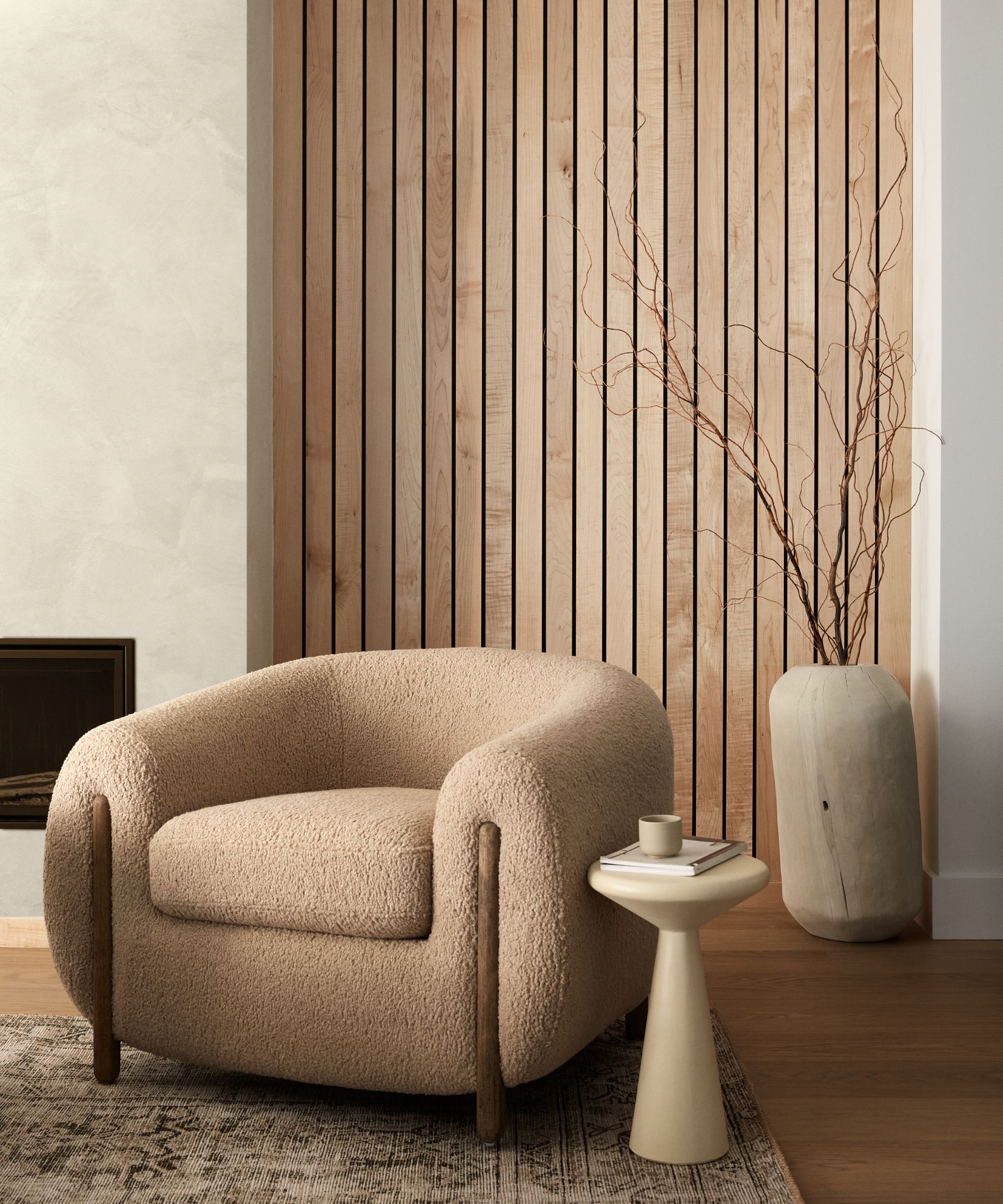
This beachside home takes on a neutral, organic color palette, making texture and dimension even more important to the final product. Kate says that finding the right shades and textures is 'very much a balancing act,' but the right combination makes the space 'even more elevated.'
'I knew I wanted it to be relatively organic when we went in, but then once we got going, it was like, “Wow, these are all manifesting in such beautiful ways, and in more capacity than I even anticipated.” I'm really happy with how that came together,' says Kate.
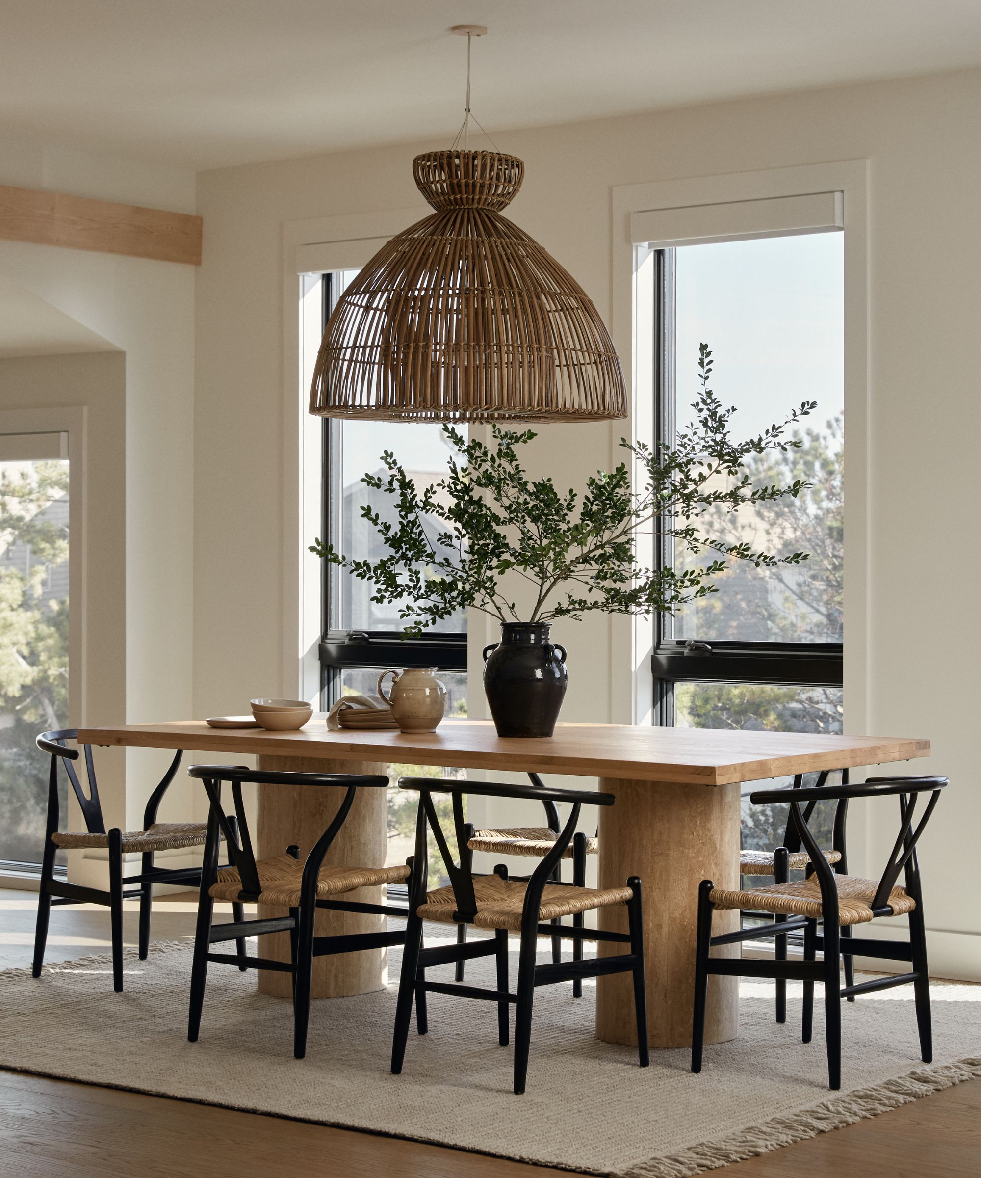
'You have to constantly be aware that there's this strong element, and that's what matters. That's why we do all of it. It's to play up the beach. That's why these guys build these houses, and that’s why we're brought in,' Kate says.
The neutral color palette and textures 'are definitely inspired by the neutral tones you see outside,' but they cannot overpower the outdoor view. Subtle touches and a pared-back design are key.
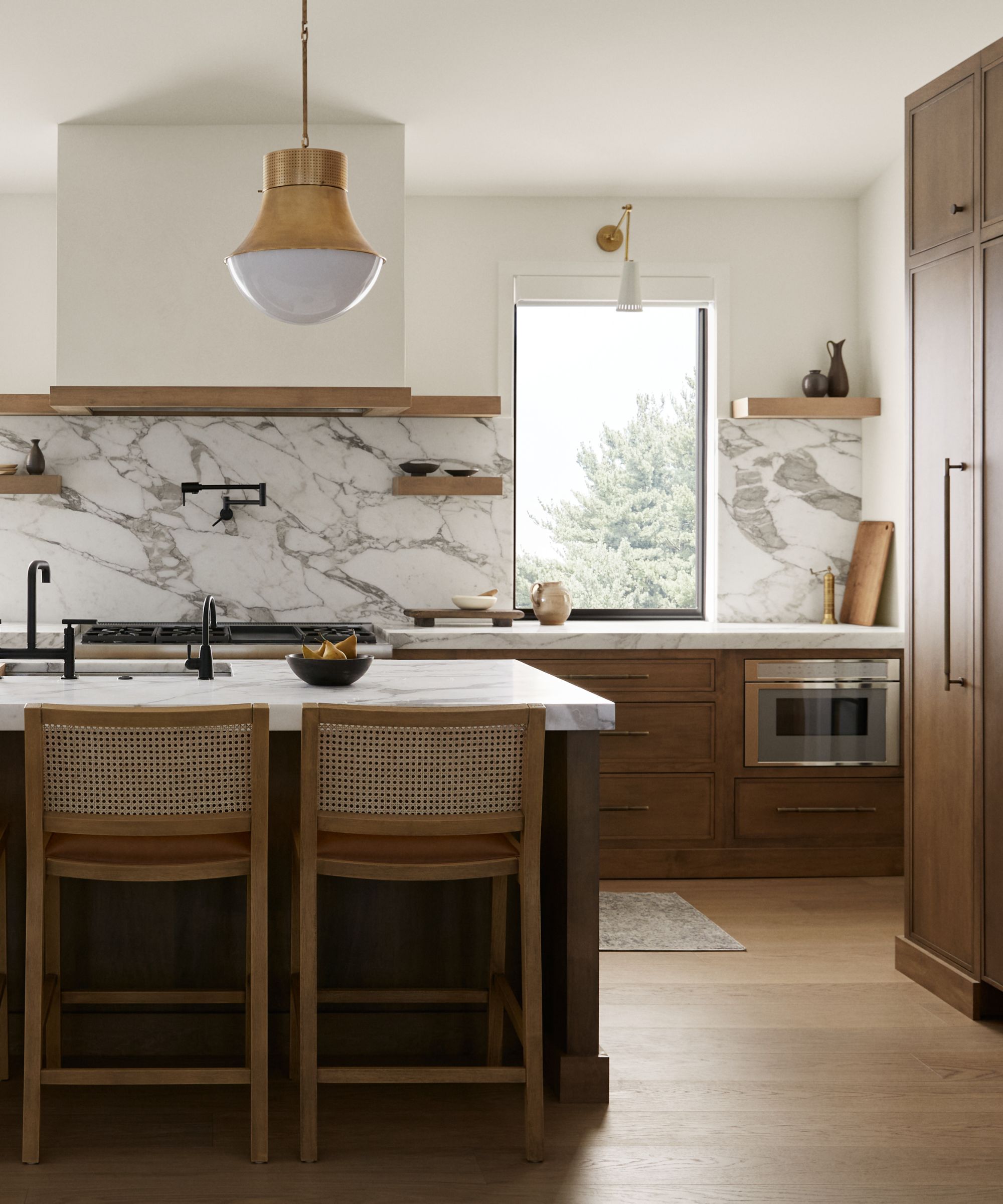
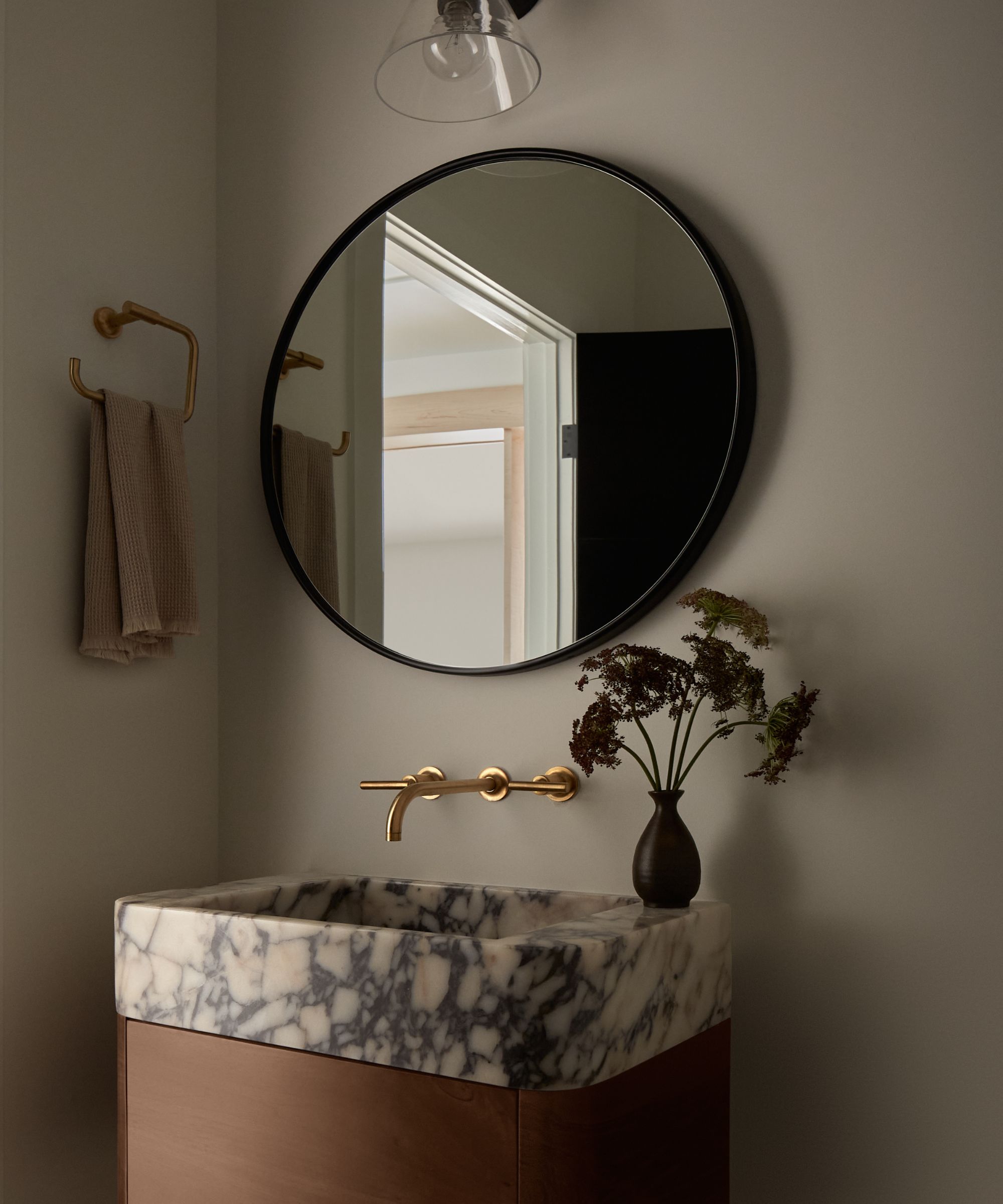
Along with the powder room (which is fitted with a bespoke vanity she designed with a fabricator in Turkey), Kate's favorite room is hands-down the kitchen. She loves 'every aspect' of the custom-built space, notably the natural stone counters and backsplash. Paired with wooden cabinetry and open shelving, and a mix of gold and matte black hardware, the stone has its moment in the spotlight without dominating the entire scheme.
'I love a custom kitchen, but that is definitely budget-driven. If you can't afford to do a custom kitchen, to imply that that's not a quality design is ridiculous, of course. There are some beautiful kitchens that are semi-custom or just stock altogether. But I think if there's one place to invest your money in, it’s the kitchen. If you think about your average person's day, that's the space you are in the most,' says Kate.
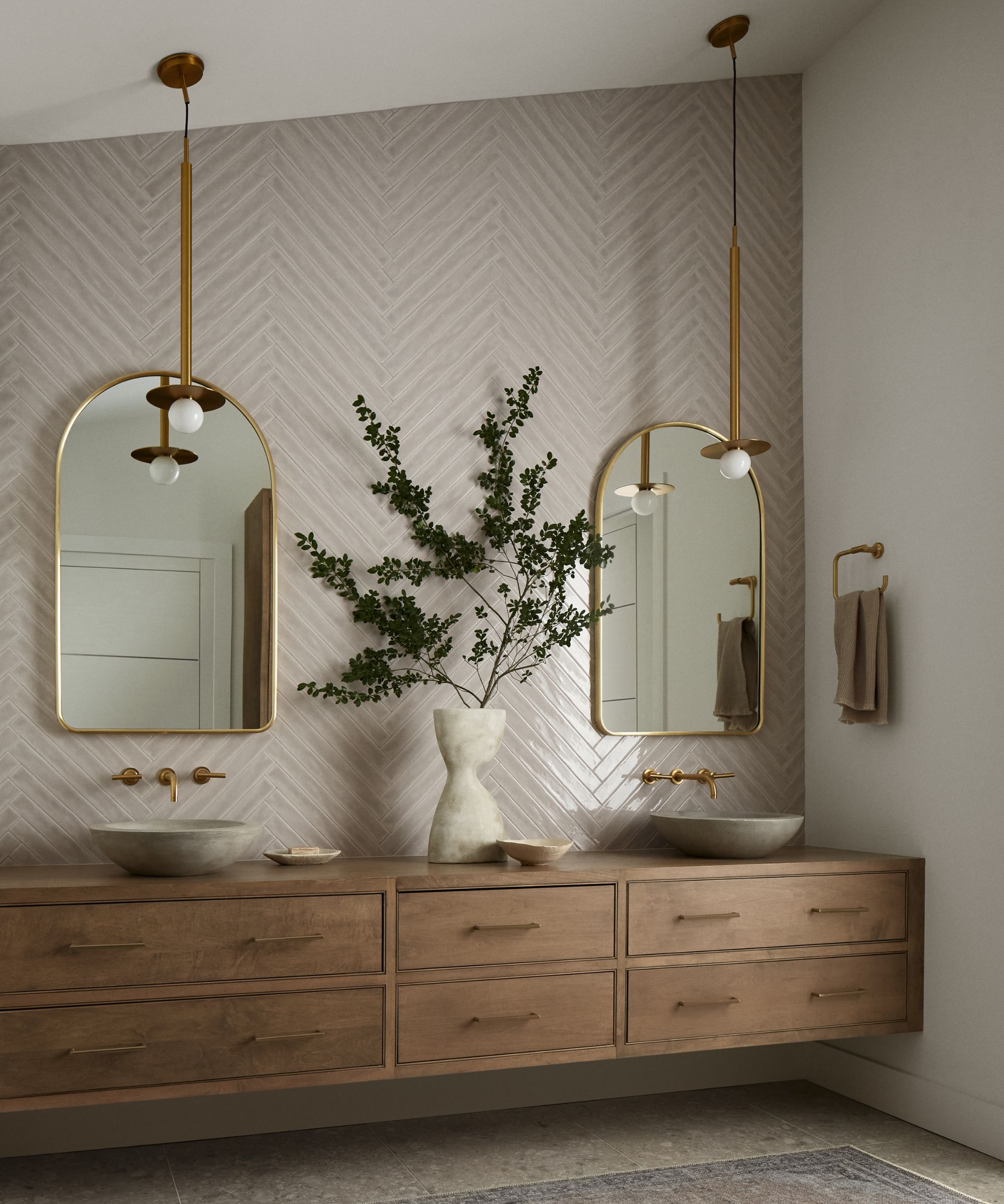
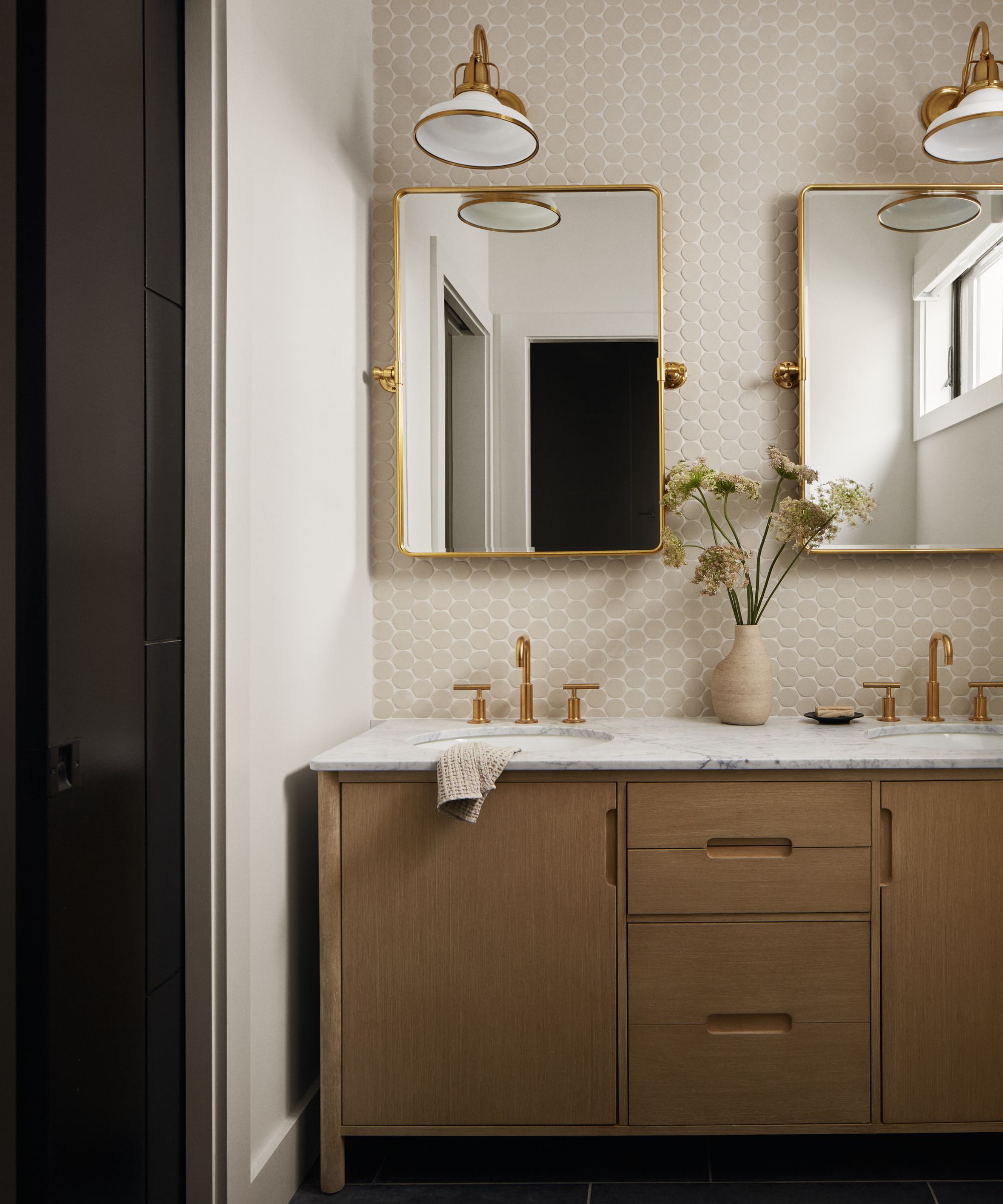
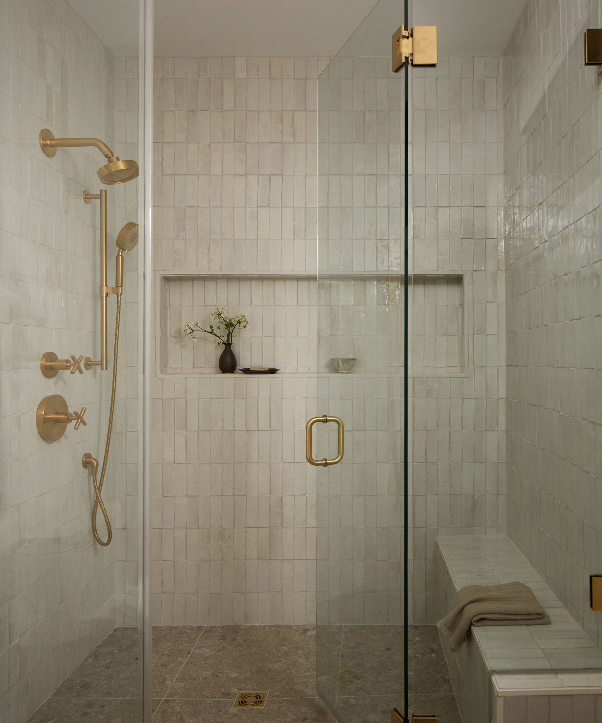
Kate says the same goes in any space, no matter where you live. Whether you're lucky enough to live by the beach, have a wooded retreat outside your door, or live on the 16th floor of a city apartment, 'there are definitely ways to incorporate organic elements in your home.'
'I love bringing in natural fibers and textures. Jute is really amazing, and I think it can straddle a lot of different genres in designs,' says Kate. 'So jute rugs – you see a ton of jute in mixed-material furniture right now. It's super trendy. Lots of bamboo, cane details, rush details, they're all over the place right now. That's an amazing design element that I think you can incorporate into a lot of different spaces. And it feels very earthy and organic.'
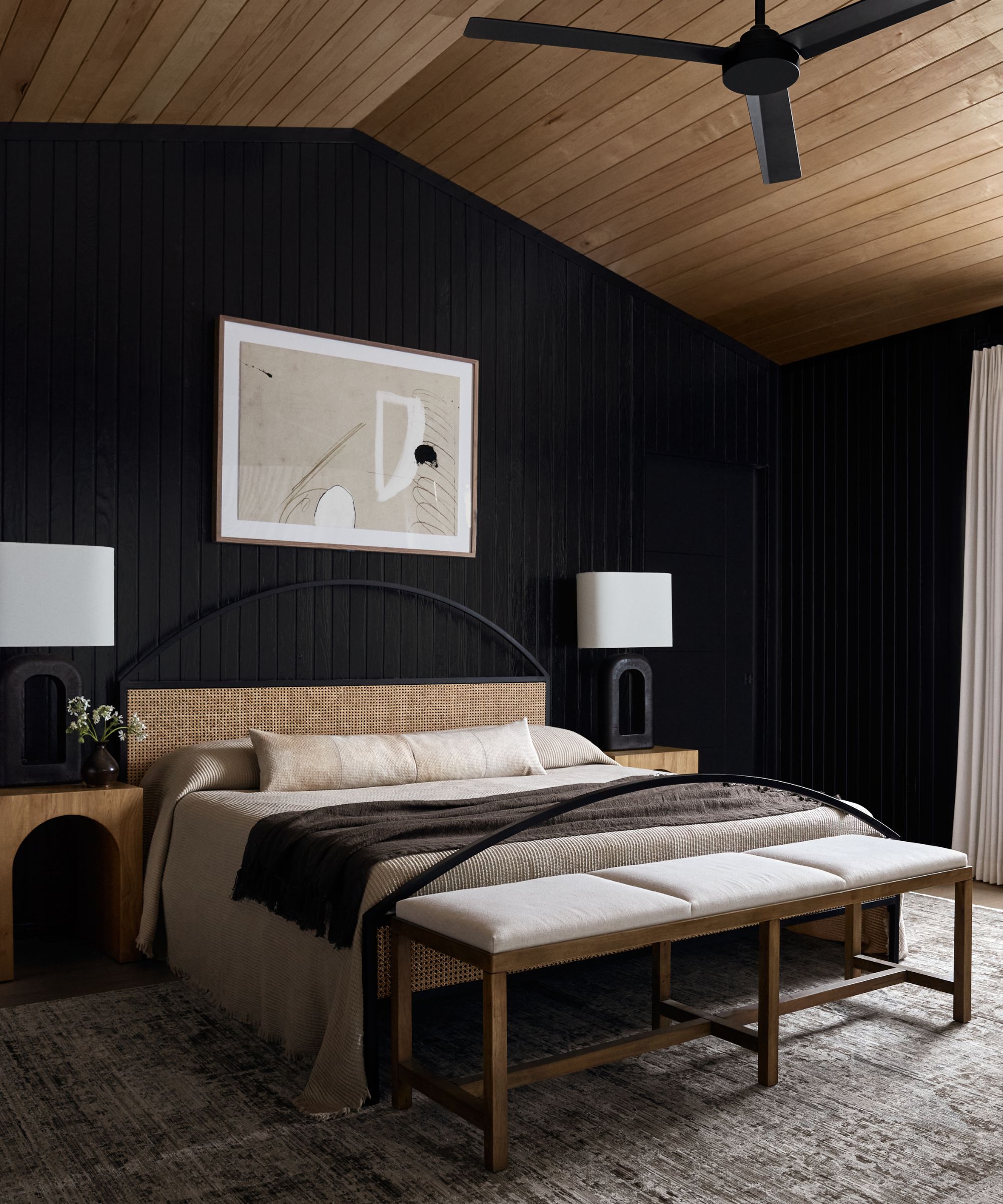
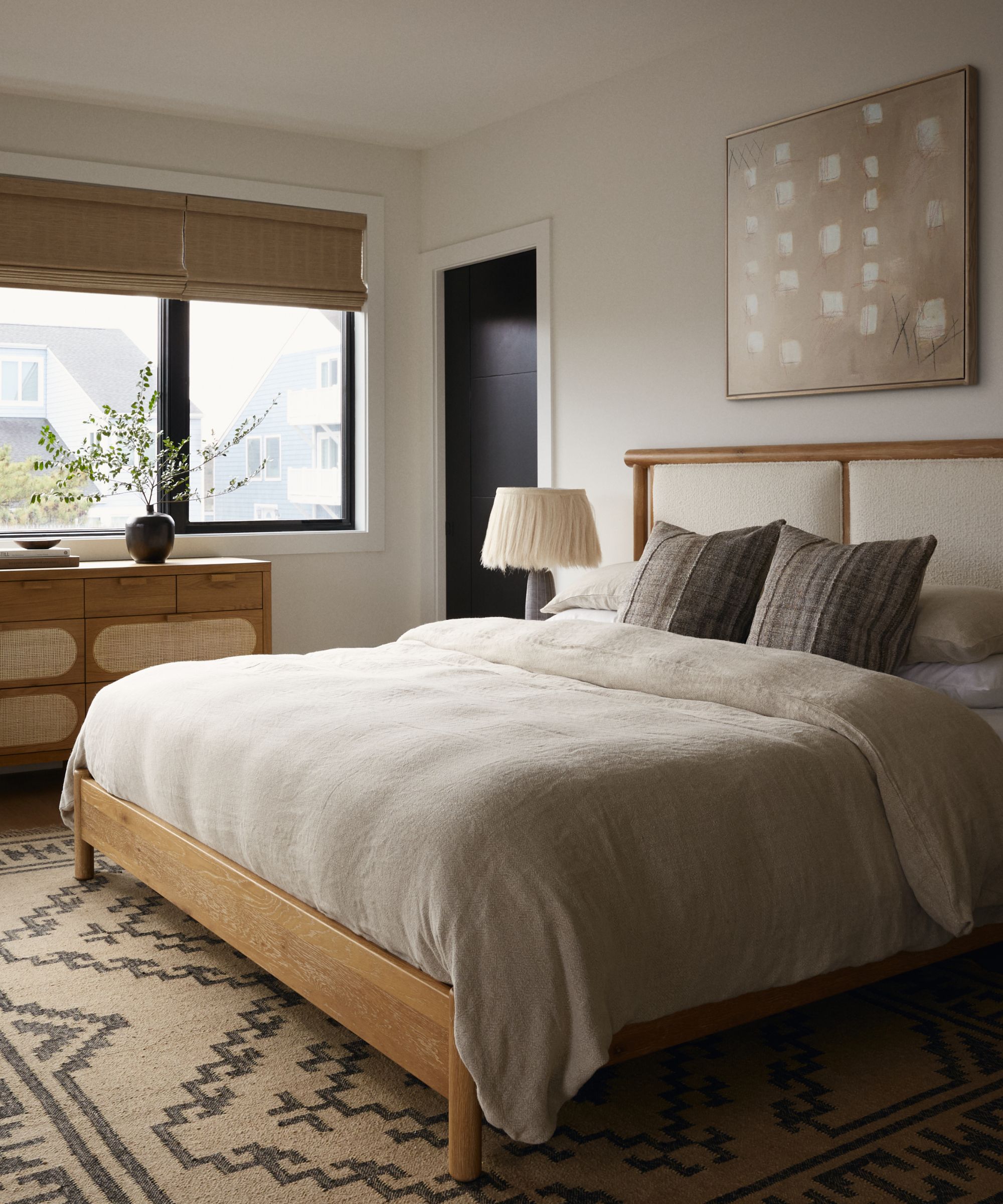
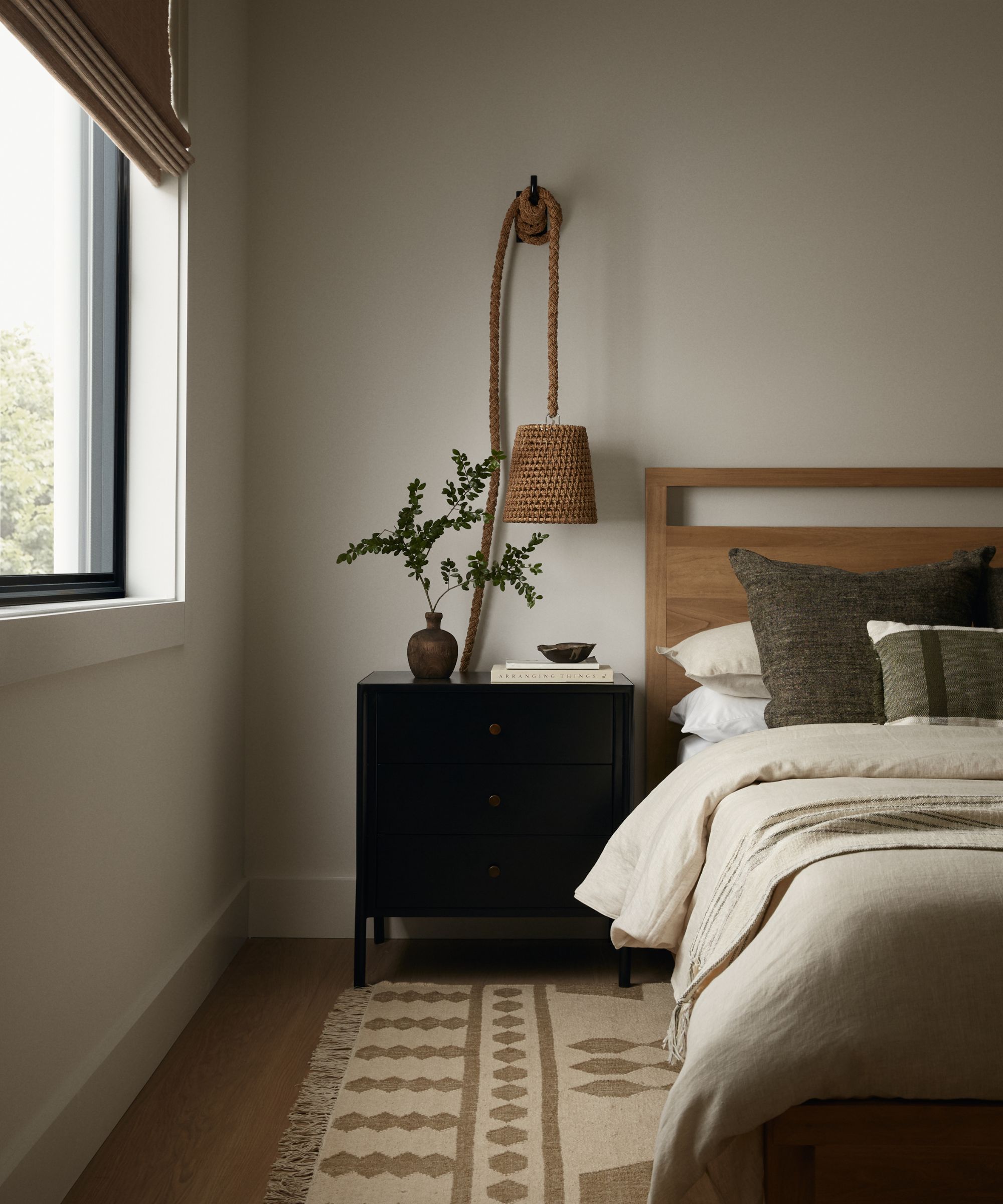
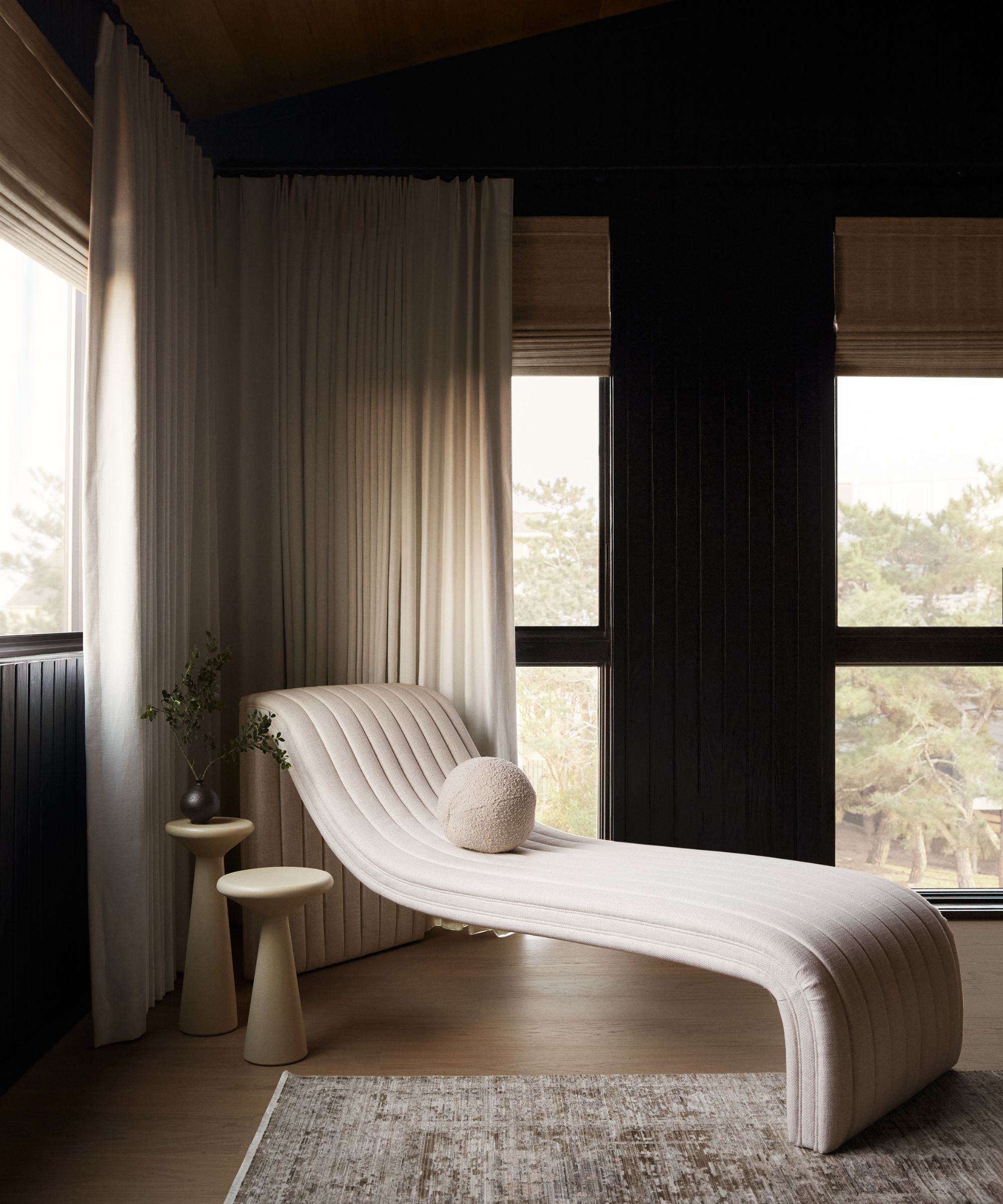
Although most of the home's color palette plays on the outdoor views and remains quite neutral, the bedroom features a dark, moody hue with black paneled walls. Combined with a wood-clad ceiling and a textured bedframe, the black wall pops and stands out from the rest of the home.
'We had a really trusting client, and that makes all the difference as an interior designer. I went to her with the idea of doing Shou Sugi Ban in there and playing up the black in volume and she loved it. I think it turned out beautifully. I love the coziness it gives the space ...The palette is still neutral but it does play a little differently than it does in the rest of the house, which I like,' says Kate.
According to Kate, the main bedroom is a perfect place to experiment with bolder colors – a statement shade gives a room added elevation, and makes it feel more like a 'retreat,' she says. Like powder rooms, bedrooms tend to be relatively small and function-forward, which calls for a bit of design exploration.
'That's a really fun space to incorporate something like that. A space like a master bedroom can handle it pretty well from a design perspective, and also just from a color perspective too,' she says.
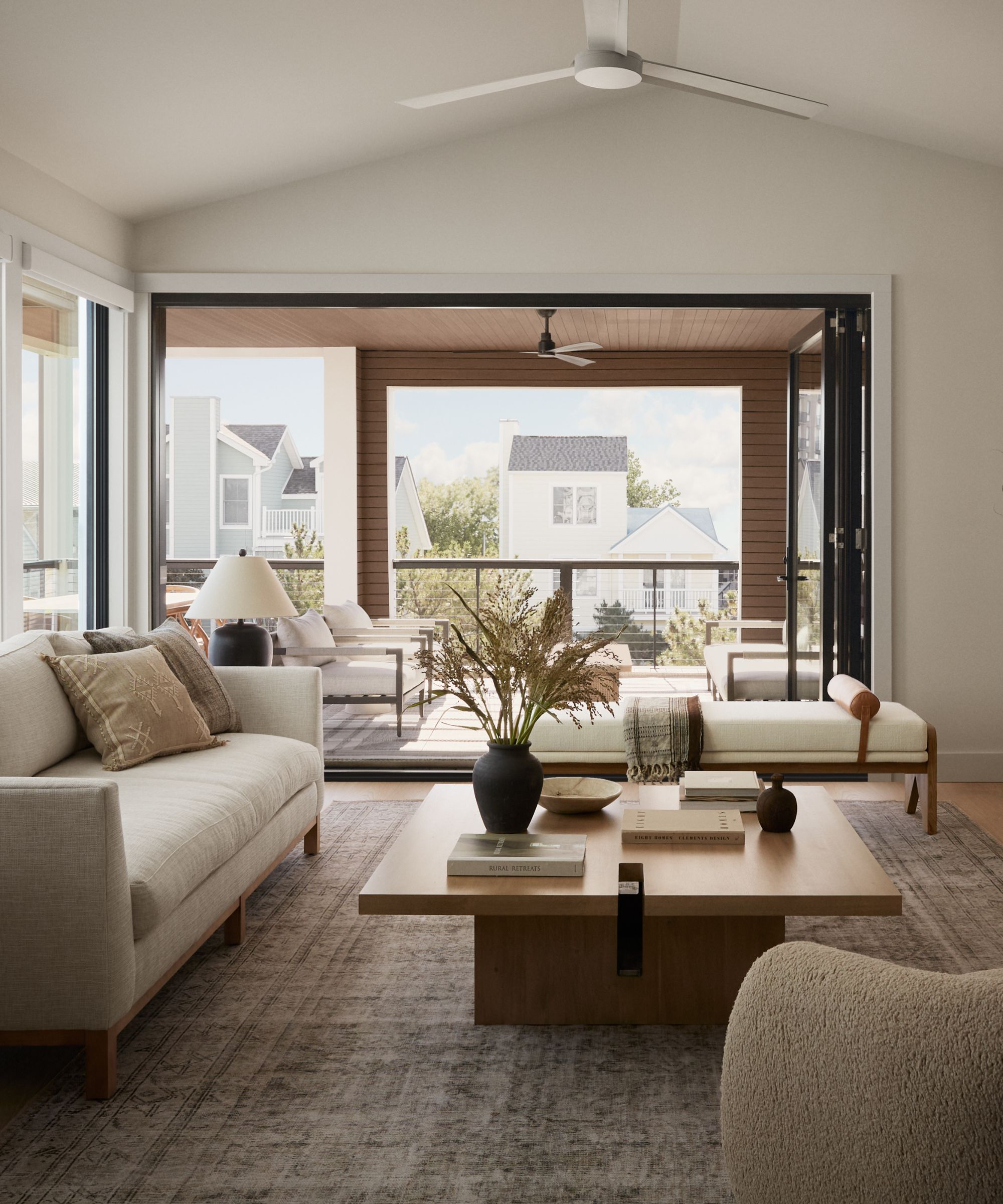
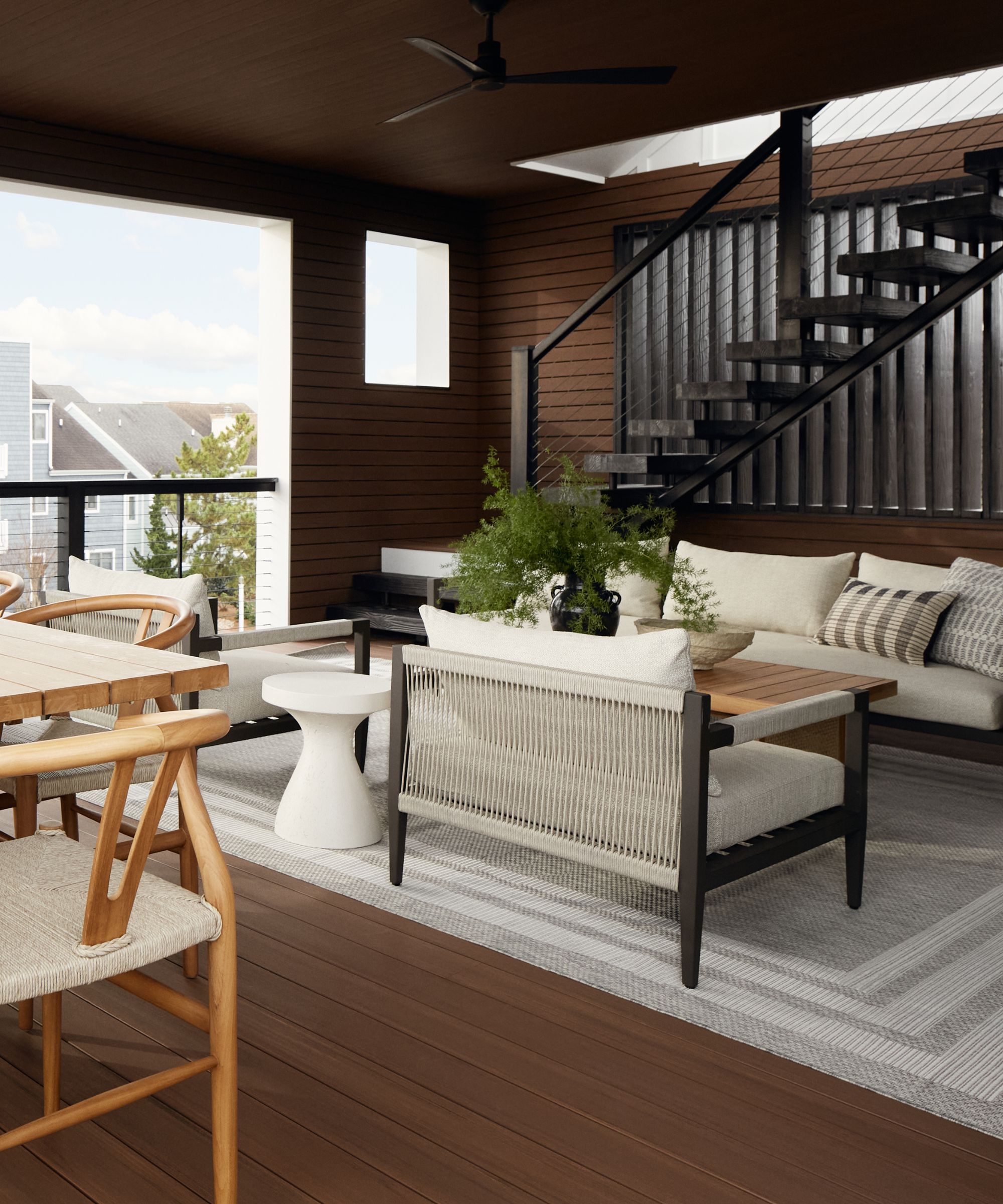
C&E's furniture finds its way into the design firm's work more often than not, but Kate says this project made incorporating the pieces easier than ever. 'We do this for all our projects, but we were really able to find pieces that just spoke to exactly what we wanted to do ... I think designers all have a project kind of like this where things kind of just start to all fall in place,' she says.
Furnishing the space is usually one of the last steps of C&E's design process, but the team didn't have to wait until the end to know where most of the pieces would fit. 'All the perfect pieces were there for us when we started looking for them,' she says.
Each piece is thoughtfully selected and plays into the nature-inspired look with ease. Whether a cozy outdoor sofa or streamlined wood coffee table, it's clear that C&E's vision carries all throughout the space.
'We wanted to bring in that organic element in a way, and I feel like that's kind of sculptural in the lines we brought in, so curves and details. And again, mixed materials – you'll see that in furniture a lot,' says Kate.
This Delaware build is a masterclass in coastal modern style, embodying the 'elevated' look synonymous with C&E. A cozy oasis that doesn't steal attention from the great outdoors, this home is certainly one to beat.
Sign up to the Homes & Gardens newsletter
Design expertise in your inbox – from inspiring decorating ideas and beautiful celebrity homes to practical gardening advice and shopping round-ups.

Abby was the Interior Design News Editor at Homes & Gardens and is now studying for her Master's degree in Journalism at City University, London. Prior to joining our team, she worked with Better Homes & Gardens, where she wrote and edited content about home decor, gardening tips, food news, and more. She studied Journalism and English Literature at New York University and moved to London to pursue her love of writing in 2023.
-
 Can you revive woody rosemary plants? Expert pruning advice from a professional gardener to save old, leggy herbs
With the right pruning approach, old and woody rosemary plants can be brought back to life
By Thomas Rutter
-
 Barbra Streisand spotted a 'little miracle' on her garden's rose bush – landscaping experts say you can grow her 'joyful' flowers on a smaller scale
The singer's rose bushes are among the most abundant and beautiful we've seen this year – with the right advice, you can follow her example
By Megan Slack