8 classic looks – timeless rooms that will never date
We show how timeless and elegant updates, simple home decor tricks, and classic room makeovers will help you transform your home
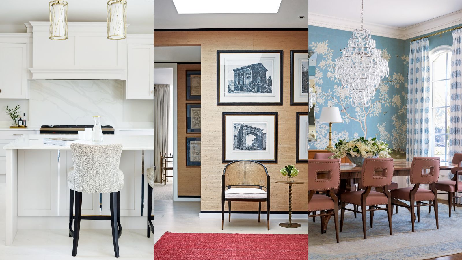

These classic room ideas are perfect if you want to give your home a beautiful new look that will never look tired or dated.
To ensure your home decor ideas have longevity, we have garnered expert decorating ideas, interior design tips, inspiration, and advice from the world's best designers and the Homes & Gardens team.
Between us, we have covered every space, and we will keep adding more classic home decor look that will never fail to impress so that you can continue to perfect your interior design skills.
1. Enhance classic good looks with pattern play
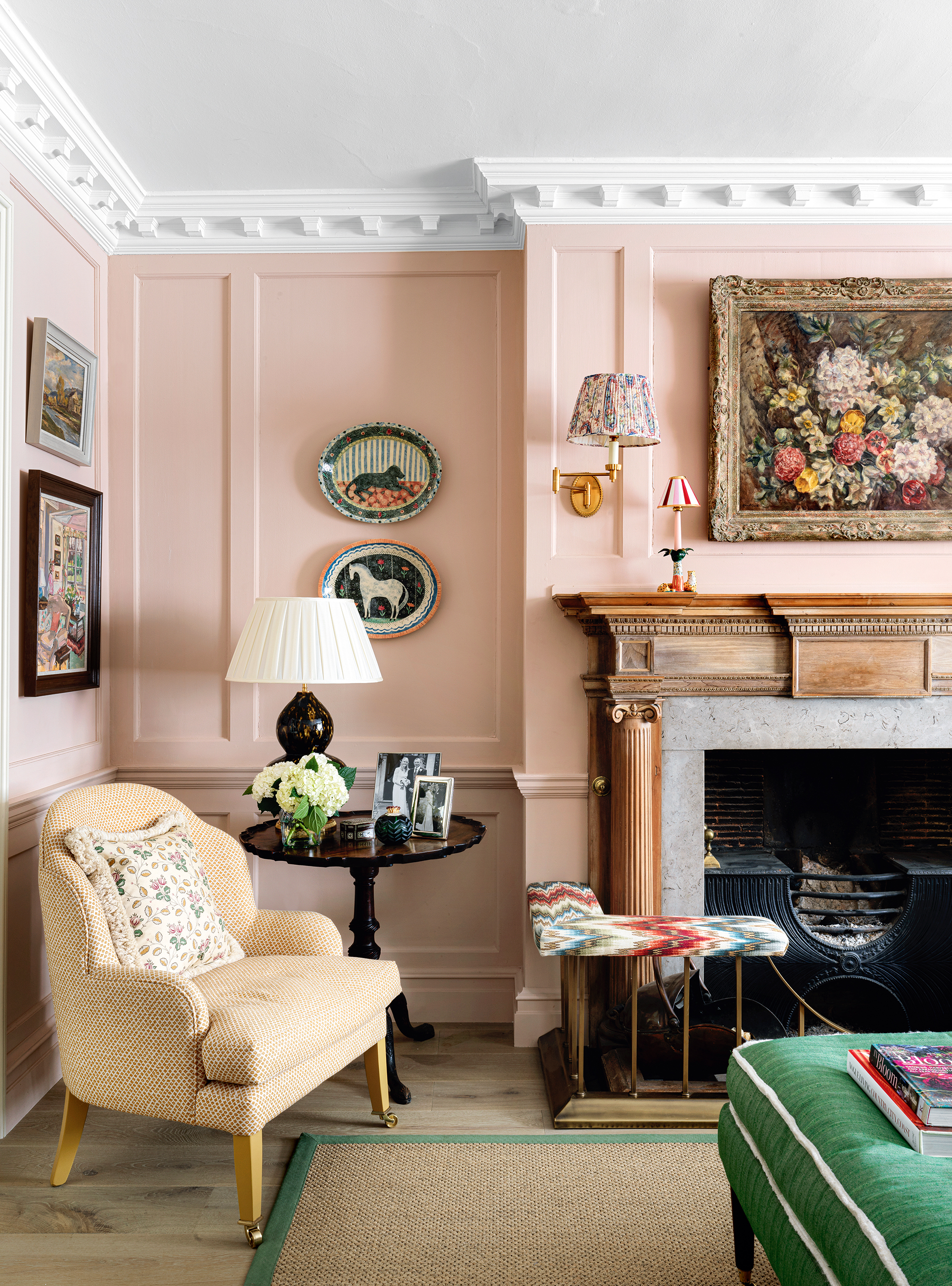
Club fenders sometimes conjure up dull renderings of fusty and formal living rooms or stuffy spaces in gentlemen’s clubs. They are, however, a secret weapon in the interior decorator’s armory. Not only do they provide vital extra seating but, as the upholstered parts are so slight in size, it also means you could use an expensive fabric that might break the budget for curtains or sofas and chairs.
‘Fire fenders bring a decorative element and they don’t require very much fabric so it is a great place to be bold with your fabric color choice,’ says Nicole Salvesen and Mary Graham, co-founders of Salvesen Graham, who put together this scheme in the home of Claire Vero, founder of Aurelia skincare.
2. Get pale tones right for elegance and charm
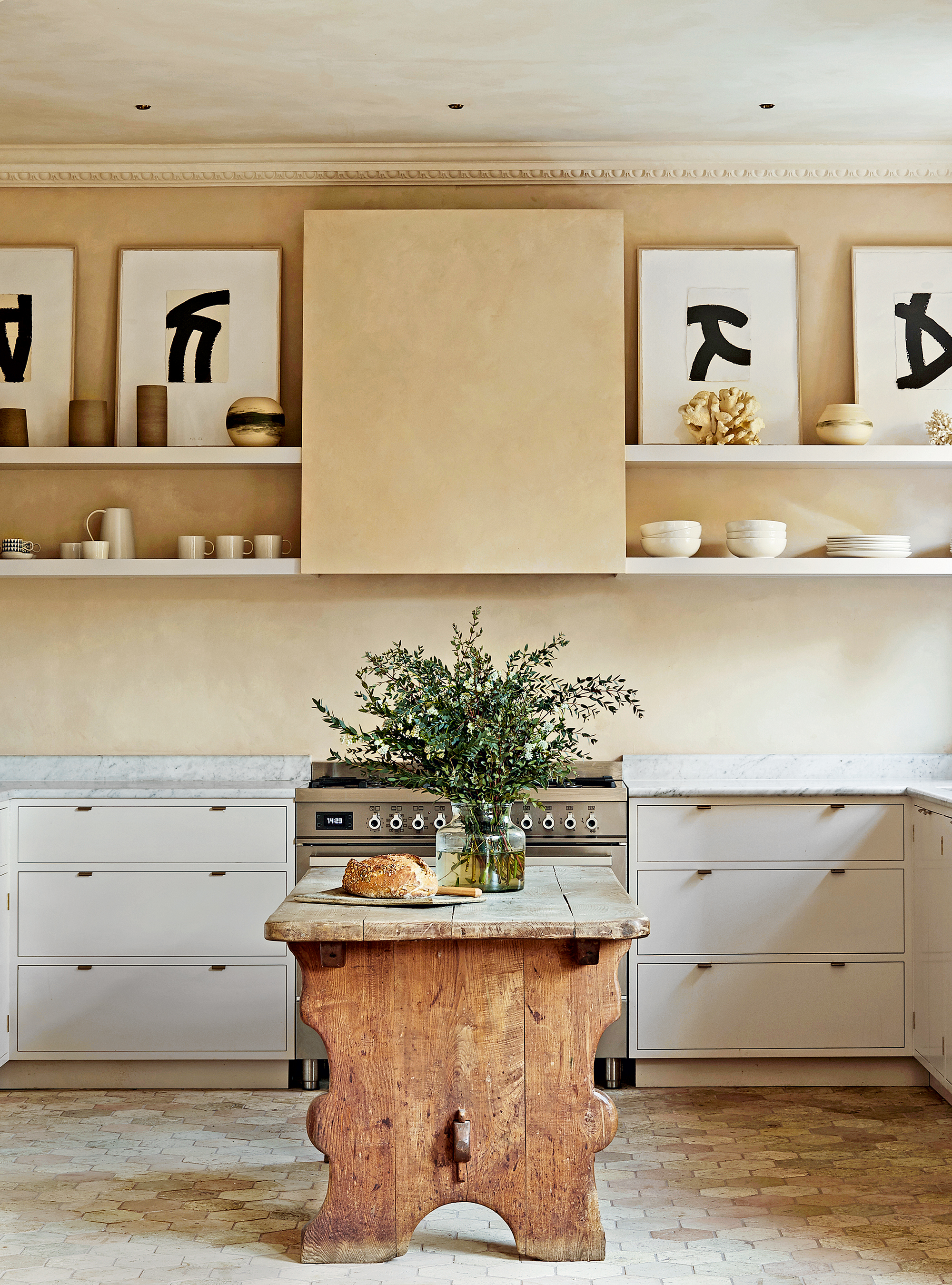
Perfecting pale tones and decorating with neutrals will embody a room scheme that will always look classic and timeless. While some decorators instinctively lean towards pale yellows, and others where green meets grey, many agree that new neutrals are largely inspired by colors emanating from the natural world, which help us to feel grounded in our homes. ‘They also comprise ivory base notes and a scattering of additional tones including rust, pink, beige, mustard, and burnt orange,’ says Charu Gandhi, founder, and director of Elicyon.
Here, interior designer Jessica Summer sets the scene with earthy tones and plenty of texture. ‘The cabinetry is minimal and contemporary to allow the materials to stand out, but also to balance the traditional features like the antique butcher’s block and open shelves,’ she explains.
3. Factor in a decorative ceiling light fixture for instant impact
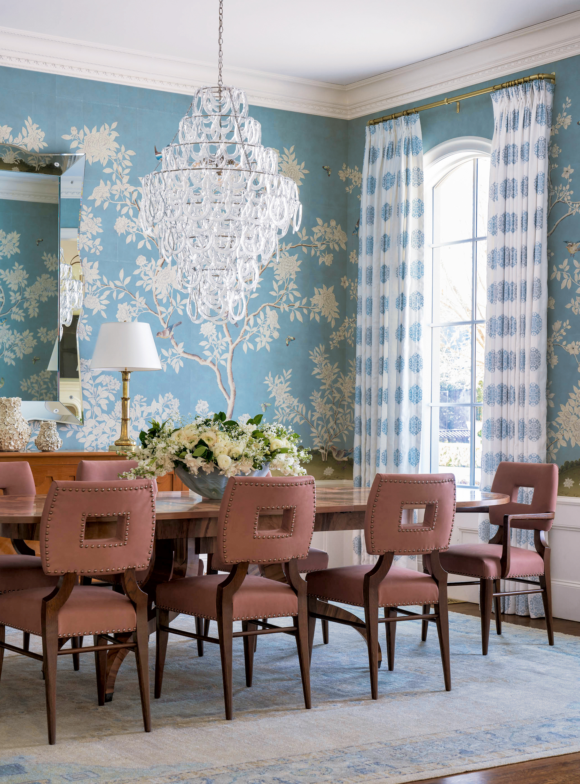
Some dining rooms simply call out for a traditional glass chandelier that not only looks stunning by day but will look even more dramatic at night as the light sparkles and reflects through the individual pieces of glass. This is particularly true of rooms whose sole purpose is for dining; traditional chandeliers will not easily make the crossover to task lighting for home working.
Ceiling heights are a critical consideration before investing in such a piece. For example, the Sorbonne chandelier by Vaughan Designs, which features hand-blown glass horseshoe shapes that cascade from a nickel frame, has a height of 34inches. Here, decorator Mary Beth Wagner has employed it to fill the otherwise empty space above the table.
4. Introduce textural elements for an easy win
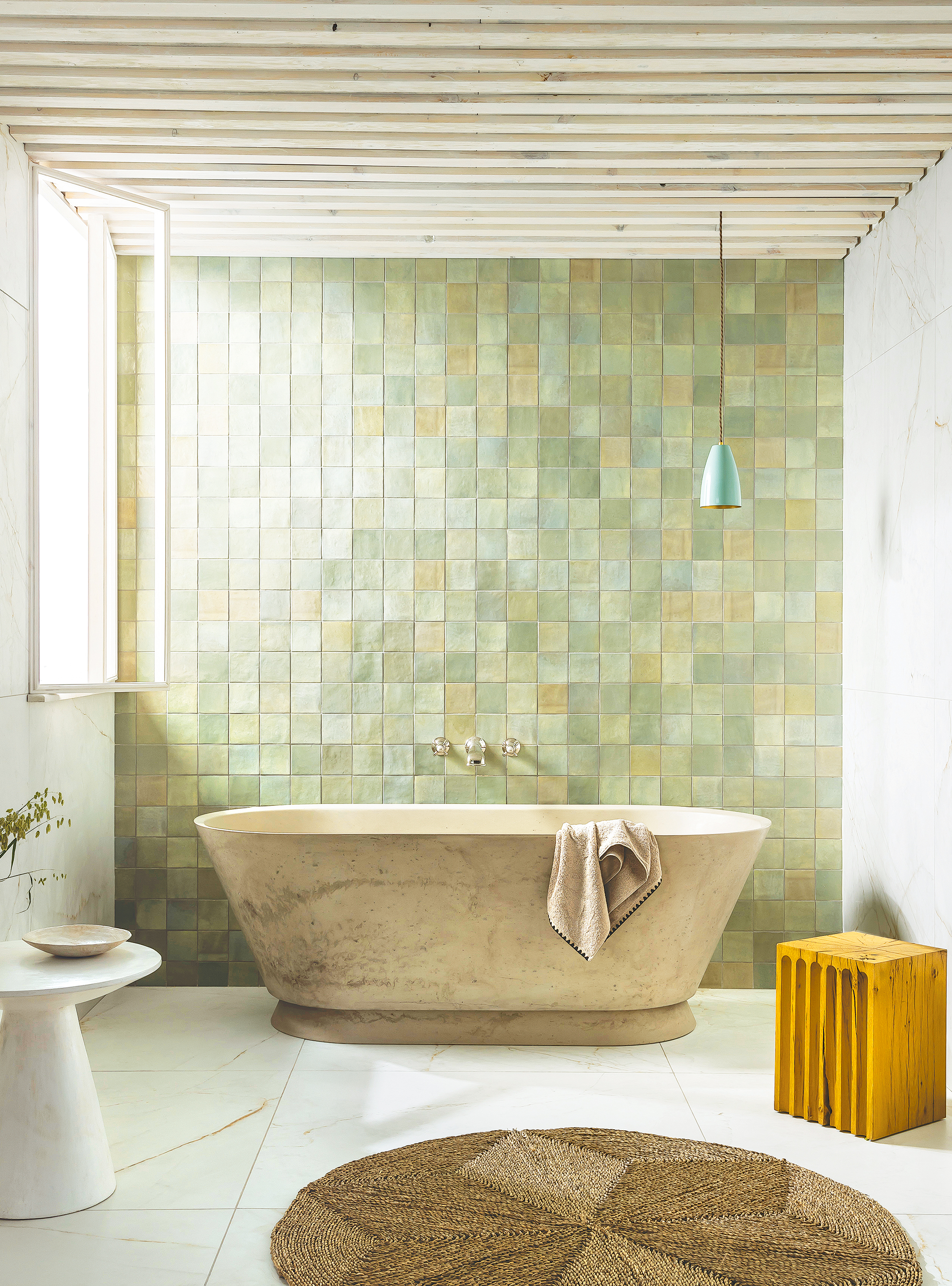
Raw organic finishes look fabulous in a bathroom – giving them a tactility that is truly captivating and timeless.
Forget perfectly flat gloss tiles, shimmering zellige designs yield a more sophisticated way to bring texture into your bathing space. ‘Zellige-style tiles provide a subtle shimmer that undulates rather than dazzles,’ says Louisa Morgan, creative director, Mandarin Stone.
Celebrated for their imperfect, artisanal appearance, Moroccan-influenced zellige tiles pair well with other rustic materials, such as untreated timber and raw concrete. ‘If you’re using zellige-style tiles to create one dramatic feature wall, be sure to pitch it adjacent to a window, or wash with downlights, to emphasize the light reflecting and refracting across their irregular surface contours,’ adds Louisa.
5. Lay down a timeless trend underfoot
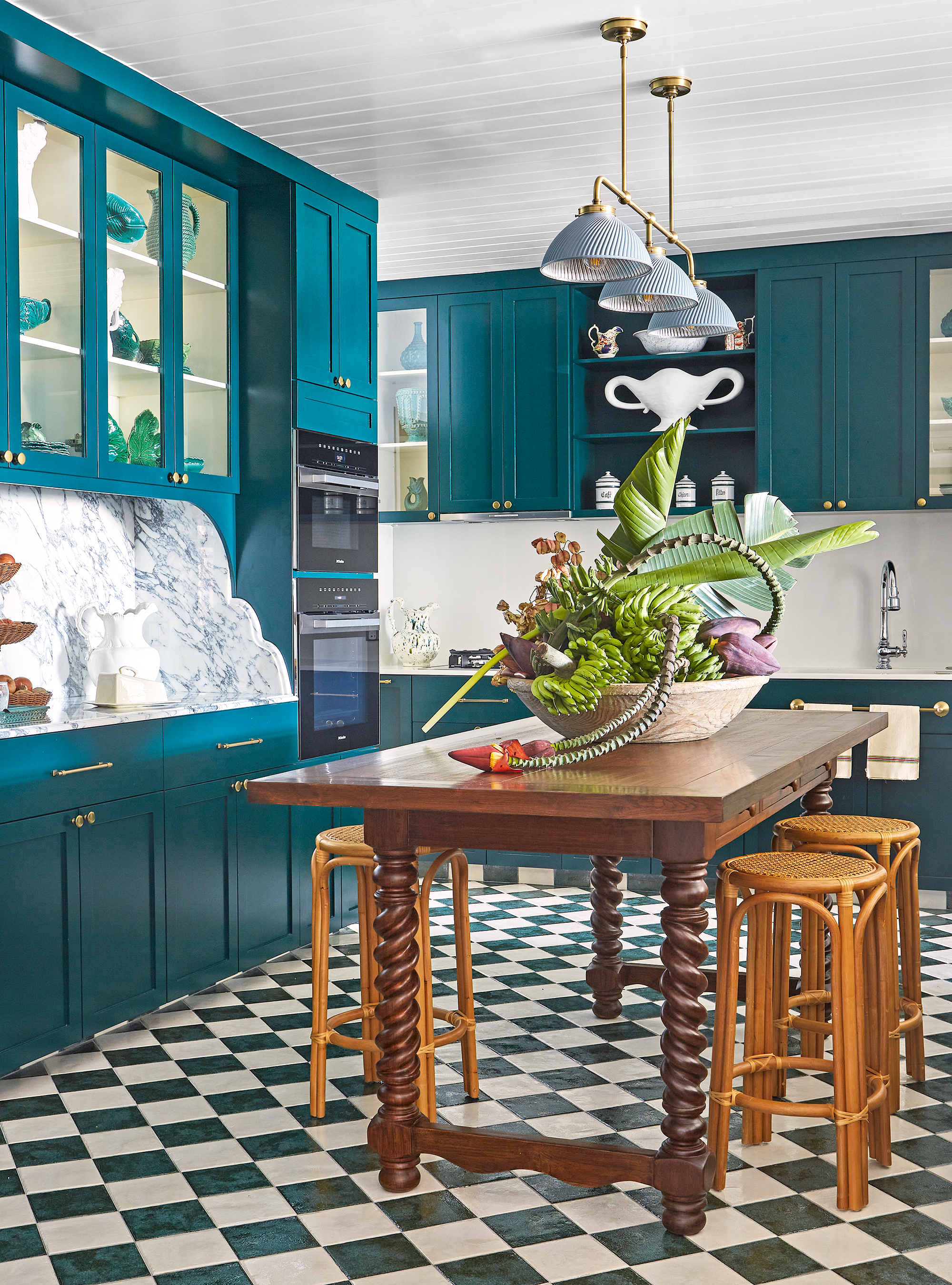
The materials used underfoot can set the tone of a room, so it pays to consider a floor type that will look classic yet confident. Checkerboard tiles are a timeless trend that has never seemed to disappear, so we predict that it is here to stay.
In a kitchen adding a patterned floor is a wonderful way to bring another decorative element to a room where it is mostly hard surfaces, says interior decorator Elizabeth Hay. She designed this kitchen with classic green-and-white floor tiles, teal cabinets, a teak table, and rattan stools for clients in Singapore.
‘The kitchen is now the heart of the home and we want it to feel like a room we can relax in rather than just see it as a utilitarian space,’ says Elizabeth. ‘Adding a pattern to the floor is one way of creating interest and can be achieved in a practical way through tiles which are easy to keep clean.’ After all, not all classic room schemes should be devoid of color.
6. Curate a gallery wall with your favorite photographs in classic frames
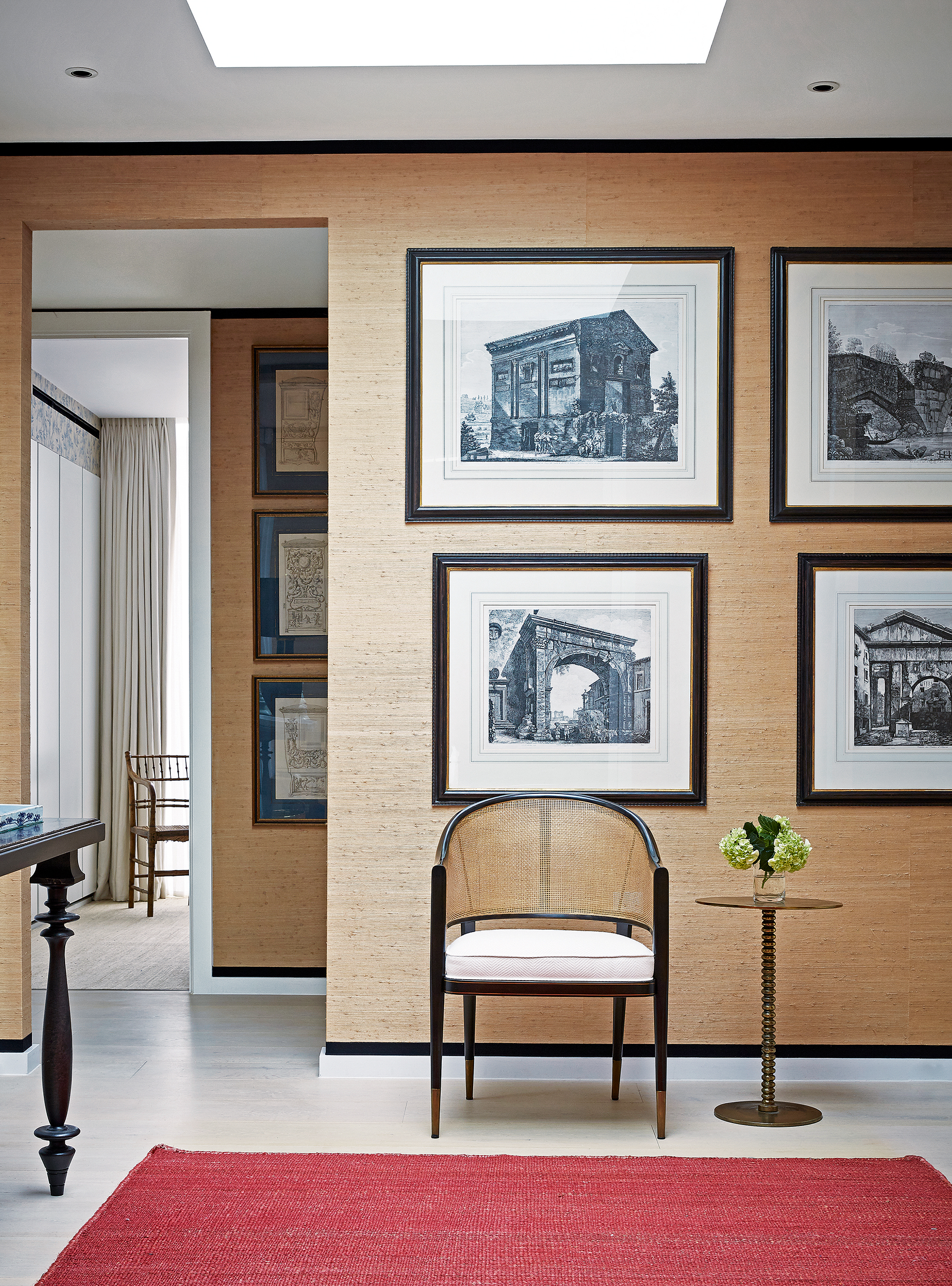
Whether you’re drawn to gallery-style walls or more traditional ways of hanging pieces, art will enliven a hallway and set the tone for the home. A piece of art framed well is a thing of beauty but it takes a lot of thought and care for a stunning end result.
From the perspective of a picture dealer, it’s worth trying to ensure the frame is in keeping with the date and style of the image. ‘And if you have the original frame, I would try to keep it,’ says Harry Moore-Gwyn, a dealer specializing in British art from the late 19th to the mid-20th century and who has a gallery in Mason’s Yard, London. ‘If the artist chose the frame, it’s integral to the piece.’
When deciding on a new frame, think about the quality of the finish, adds Harry. ‘You can really tell the difference between hand-finished frames and machine-made high street versions, which often look too clean and consistent.’ For mid-century pieces, consider adding linen or hessian slips to give the artwork space.
In this interior by Paolo Moschino for Nicholas Haslam, historical prints hung in an orderly fashion are exceptionally elegant and connect two different areas of a single hallway.
7. Heighten the senses with a sublime sanctuary
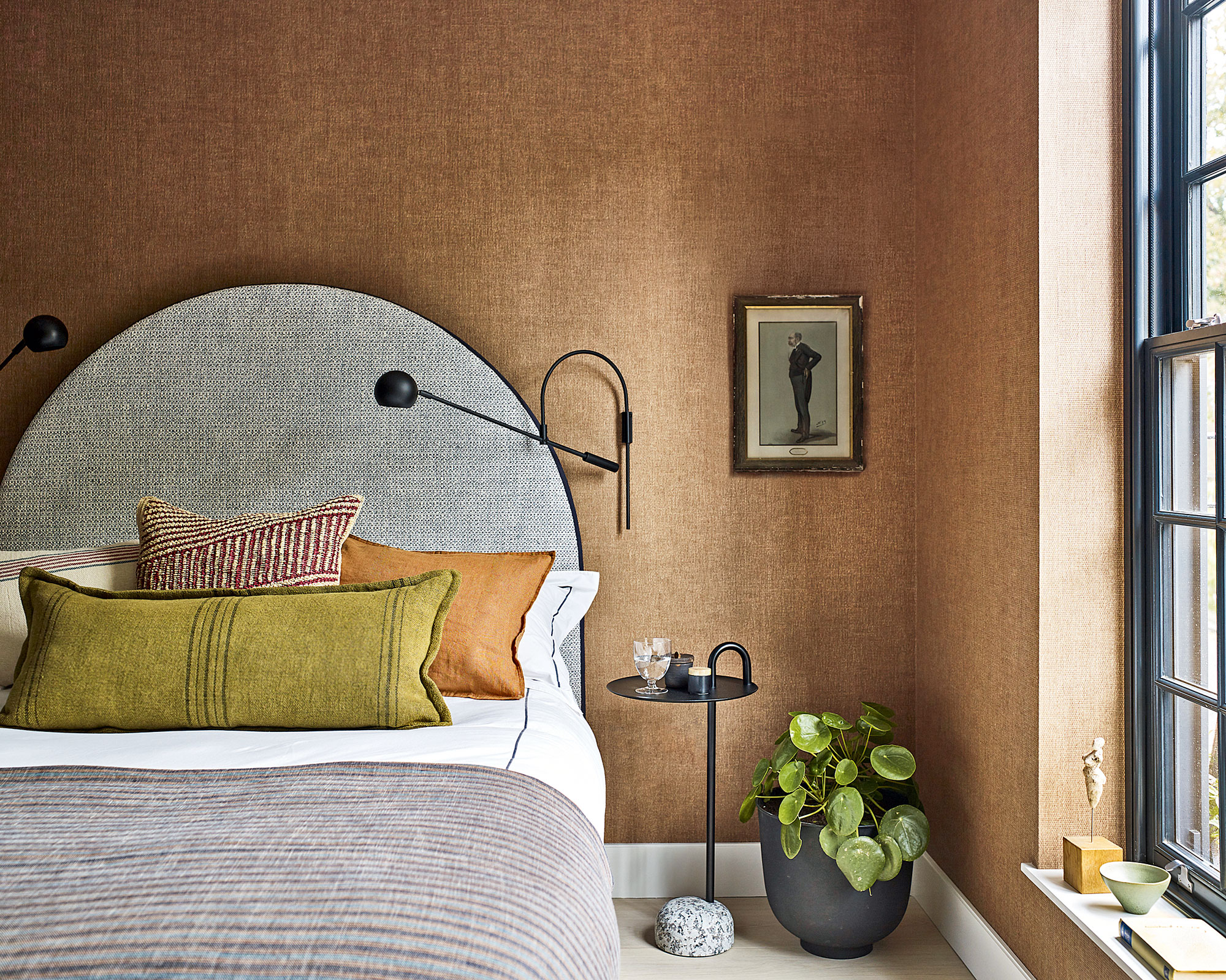
The best classic room ideas use plenty of textural elements and subtle color palettes to curate schemes that are simple yet sophisticated.
This is a modern bedroom but the use of rich tones, shapes, and details creates a connection with nature that makes it appear almost timeless. ‘For this Chelsea house project we worked to a selection of nature-inspired finishes with a strong preference for earthy terracotta and green and blue hues, which are offset against sleek black details,’ says Irene Gunter of design practice Gunter & Co.
Irene describes this room as 'cozy masterpiece that uses neutrals to aplomb', which is enhanced by the 'warm, enveloping' hand-woven texture of the wallcovering – Casablanca from Altfield.
8. Keep it classic with white
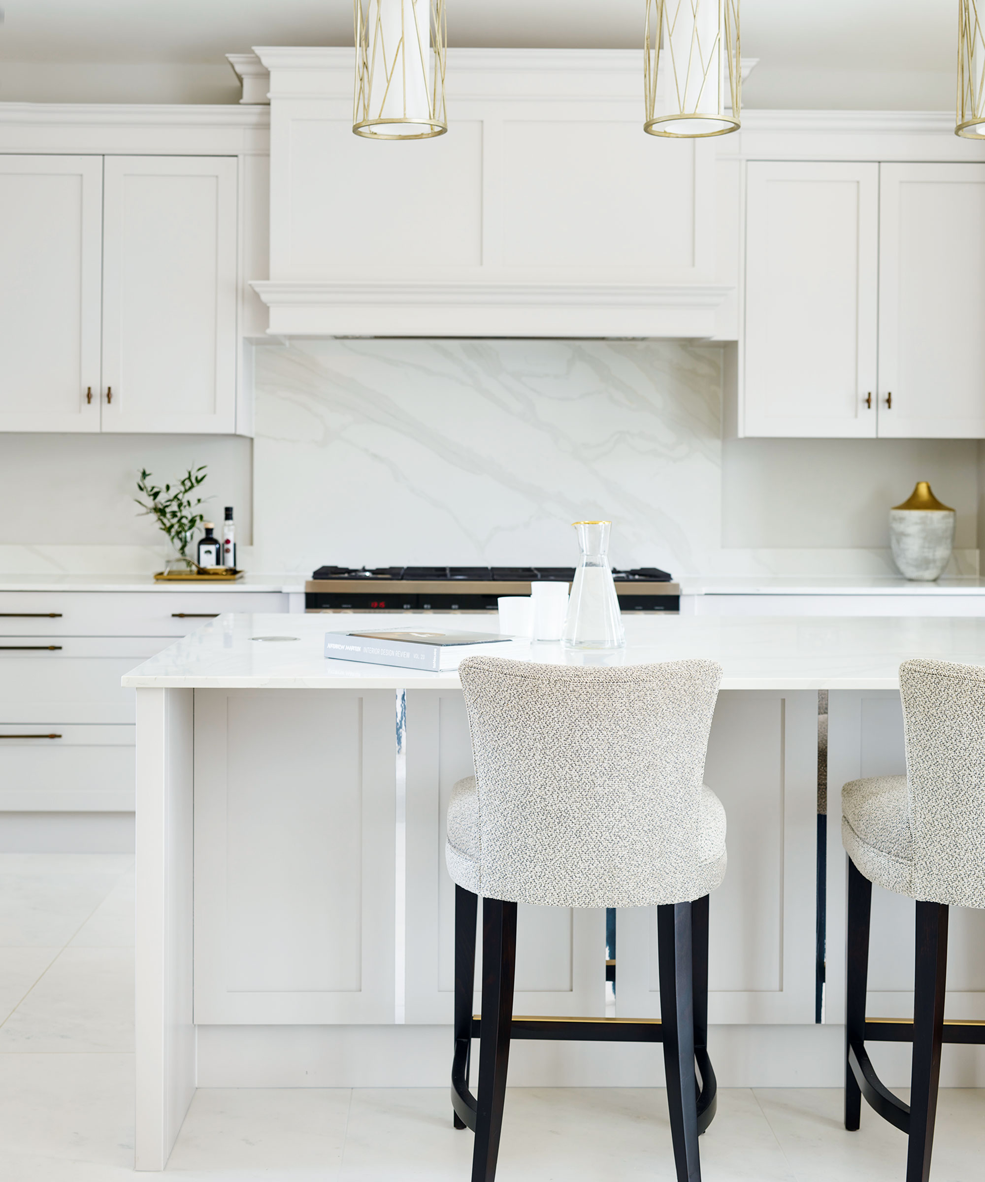
Beautiful craftsmanship and simple lines are the hallmarks of a traditional white kitchen. ‘White has become a popular choice for classical designs. It makes cabinetry look very crisp and sophisticated and the space feels instantly brighter yet also very calming,’ says Stephanie Dedes, design and marketing manager at Charles Yorke’s Pirbright showroom.
The pale tones of this white kitchen, painted in Farrow & Ball’s Cornforth White, are broken up and softened with elegant details such as brushed aged brass handles and warm grey veining in the kitchen countertop and backsplash. Mirrored details punctuate the paneling for a subtle touch of refined glamor.
Sign up to the Homes & Gardens newsletter
Design expertise in your inbox – from inspiring decorating ideas and beautiful celebrity homes to practical gardening advice and shopping round-ups.

Jennifer is the Digital Editor at Homes & Gardens. Having worked in the interiors industry for several years in both the US and UK, spanning many publications, she now hones her digital prowess on the 'best interiors website' in the world. Multi-skilled, Jennifer has worked in PR and marketing and occasionally dabbles in the social media, commercial, and the e-commerce space. Over the years, she has written about every area of the home, from compiling houses designed by some of the best interior designers in the world to sourcing celebrity homes, reviewing appliances, and even writing a few news stories or two.
-
 How to grow crepe myrtle in pots – and transform even the smallest of yards with dazzling flowers this summer
Growing crepe myrtles in pots will inject splashes of brilliant color into your outside space
By Thomas Rutter Published
-
 I've spent over 200 hours testing vacuums and swear by my two Dysons – this is how I properly clean a Dyson vacuum filter for longer-lasting appliances
Your Dyson vacuum will last much longer and clean at its best
By Dan Fauzi Published