Designers are choosing this really specific shade of brown to warm up rooms but keep them neutral
Considered the new luxurious neutral, this chestnut hue can be both sophisticated and down-to-earth
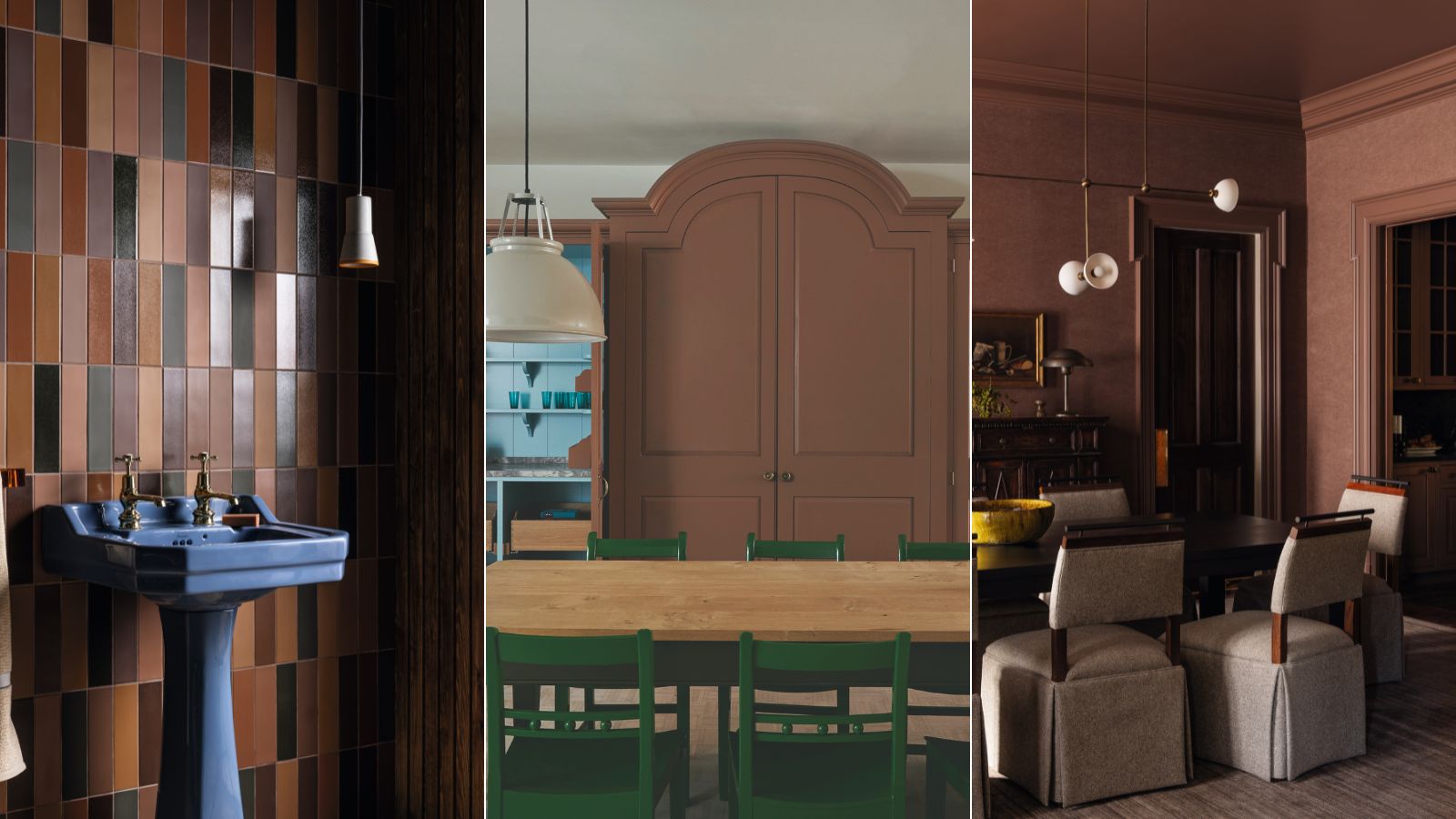

Designers are spotlighting chestnut brown as the decorating color à la mode, a new take on the recent rise in the use of brown in interior design. The rich tone is popping up again and again in the schemes of interior designers, and with good reason. We spoke to a handful of interior design experts about this very specific color trend, how we should use it, and the benefits of welcoming it into our space.
Repeatedly, we were told that this deep, but liveable color creates a cossetting feel. Its relation to the natural world as an earthy color builds that all-important indoor-outdoor connection, and its neutrality creates a great backdrop for lively pops of contrasting colors. We spoke with interior designers who are loving this soft yet slightly dramatic shade and got their tips on how to use it.
How to decorate with chestnut brown, according to interior designers
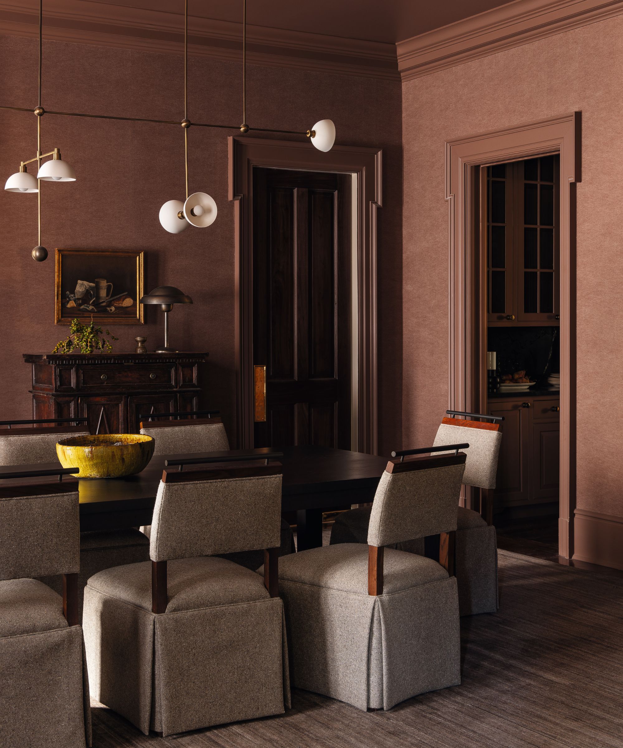
‘This rusty, dusty, blushy brown conveys a sense of regality, serenity, and comfort. This color is wonderfully suited to more intimate spaces such as a pantry, powder room, or bedroom', explains Sean Anderson, founder of Sean Anderson Design.
He continues, 'It’s compressive and encapsulating, giving the space a sense of comfort. Darker woods and brass tones pair beautifully, as do pops of lighter accents, seen in the lighting and chair fabric’.
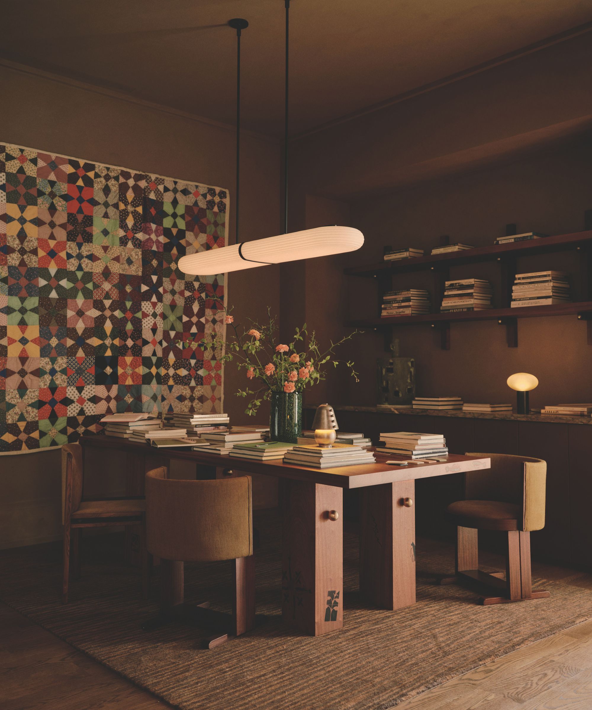
Felicia Hung, co-founder of the concept store Quarters explains the decorating choice she made in her retail space; 'We used a palette of natural, earthy, organic tones throughout Quarters – moss green, chestnut, muted reds, and burnt umber feature throughout the finish and textile selections'.
She goes on, 'We love the depth and richness of these tones and the warm, grounding atmosphere they provide. We chose a burnt umber for this library as we wanted it to be a comfortable, collaborative space.'
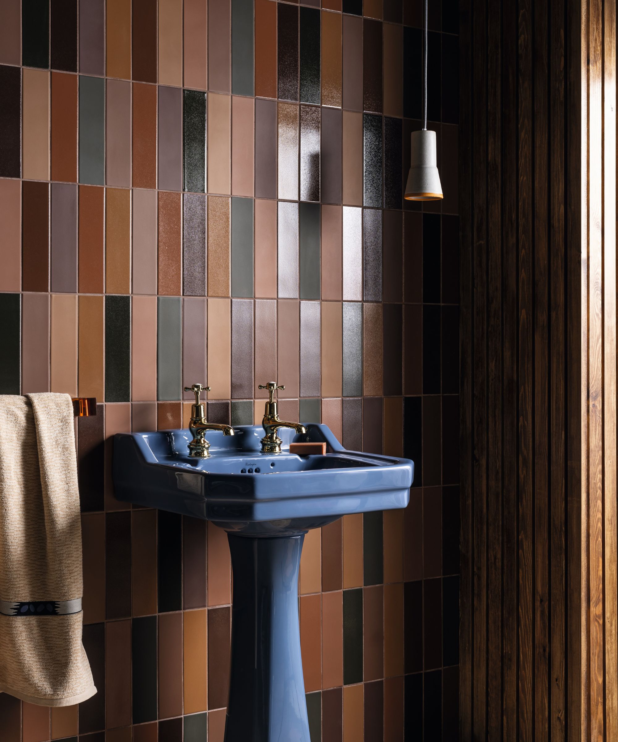
When we spoke to Louisa Morgan, the creative director of Mandarin Stone about this brown bathroom, she told us, 'The melange of rich brown and caramel tones with hints of deep forest green bring a warm and inviting atmosphere to this bathroom.'
Sign up to the Homes & Gardens newsletter
Design expertise in your inbox – from inspiring decorating ideas and beautiful celebrity homes to practical gardening advice and shopping round-ups.
'Brown can make you feel more grounded and secure, creating an almost cocooning ambiance. These brown shades, especially contrasted with the blue pedestal basin, are reminiscent of 1970s colors and create a sense of nostalgia.'
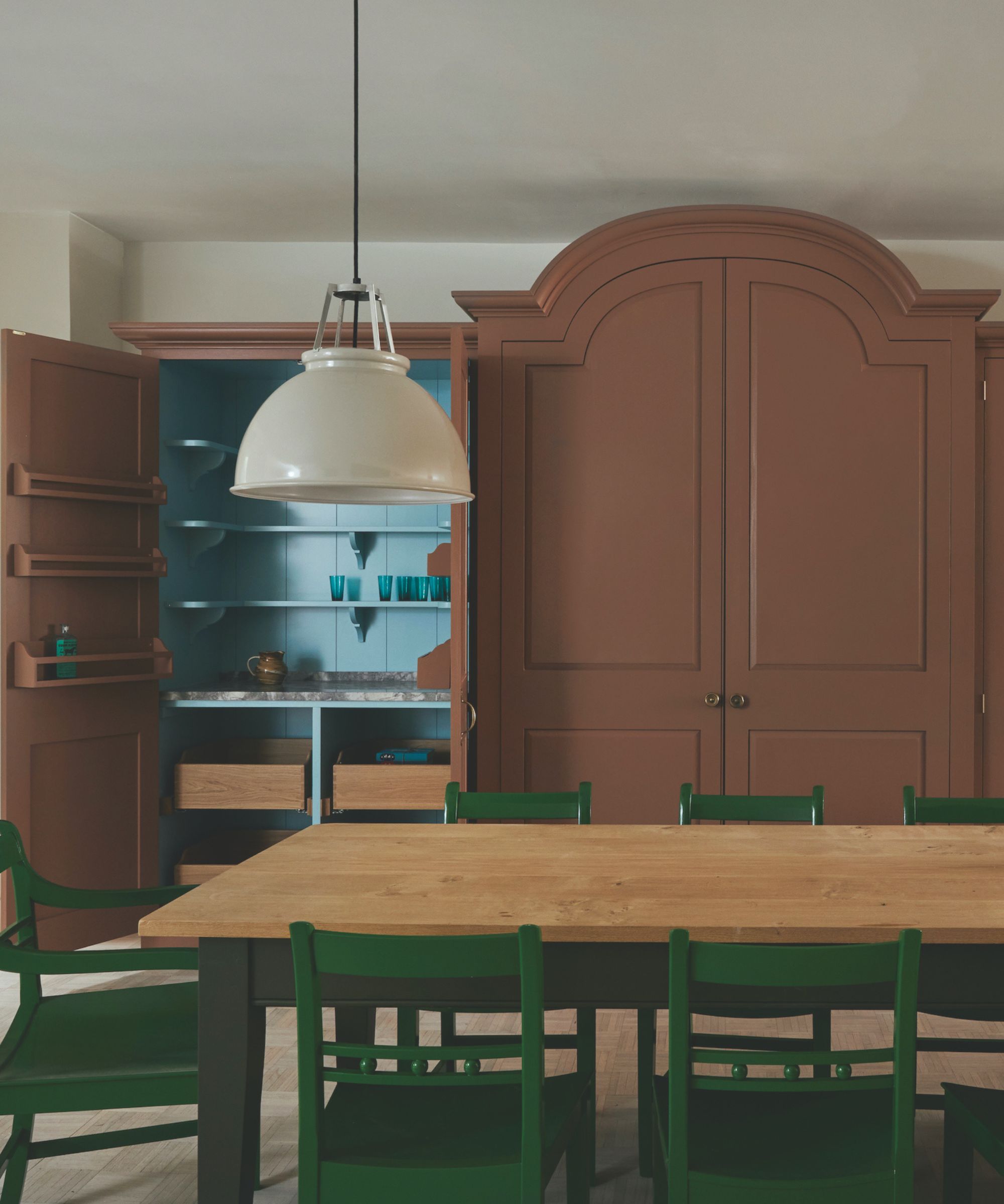
On the color he used here in one of Plain English's showrooms, Design Director Merlin Wright explained, 'The exterior of our Dutch Larder is in ‘Kipper’, a warm, chocolatey brown. It is a natural color that sits harmoniously with blues such as ‘Splash in a Bucket’ and our ‘Carbolic’ green'.
He continues, 'Brown, often used in contrasting shades, was a popular color for ‘below stairs’ joinery in Georgian houses as it is pleasing to live with and practical to clean and maintain.'
Mid-tone brown with pinkish undertones has stood the test of time. Popular in Georgian times, the rich color is certainly a useful one. Easy to clean, it brings warmth and feels cocooning while tying into the natural materials that many of us seek out for our spaces, like wood and jute.
It suits sophisticated brass and gold accents but also has a grounding quality. It refuses to be boring, particularly given it plays such a good backdrop for lively pops of cherry red and cobalt blue. It's a 'trendy' color now yes, but it's totally timeless too.

Pippa is a contributor to Homes & Gardens. A graduate of Art History and formerly Style Editor at Period Living, she is passionate about architecture, creating decorating content, interior styling and writing about craft and historic homes. She enjoys searching out beautiful images and the latest trends to share with the Homes & Gardens audience. A keen gardener, when she’s not writing, you’ll find her growing flowers on her yard for styling projects.
-
 9 things you can clean with glycerin – this cheap and natural cleaner is perfect for indoor and outdoor use
From patio furniture to silverware, this hydrating and gentle cleaning agent will work miracles
By Ciéra Cree Published
-
 Martha Stewart's houses – inside her most iconic properties, from Cantitoe Corners to Turkey Hill
The lifestyle guru built her legacy around her homes, some of which are the most recognized homes in modern American history – we explore her portfolio
By Megan Slack Published