5 ceiling mistakes to avoid – designer tips for the highest point of your room
Curating the perfect scheme begins at the top – here's what to avoid for a ceiling that continues to impress

Design expertise in your inbox – from inspiring decorating ideas and beautiful celebrity homes to practical gardening advice and shopping round-ups.
You are now subscribed
Your newsletter sign-up was successful
Want to add more newsletters?
When designing a room, you would be forgiven for forgetting about your ceiling. This fixture is, naturally, a permanent feature of your room – and it can feel notoriously hard to refresh. However, while it may seem ceiling ideas are less impactful than your painted walls or flooring, they are, in fact, highly influential in your space.
As the highest point of any room, your ceiling radiates grandeur – no matter the size of your space. This powerful feature is more than architectural – it is a canvas to (consider) playing with another color – and a base for your daring lighting ideas. So, it's vital to get your ceiling design decisions right.
And whether you're working with kitchen, bedroom, or living room ceiling ideas, the process of perfecting this feature begins with knowing what to avoid.
Article continues belowCeiling mistakes to avoid – according to experts
From the way you use your lighting to your ceiling's texture, these are the top mistakes experts steer away from when it comes to the highest point of your room.
1. Using excess recessed lighting
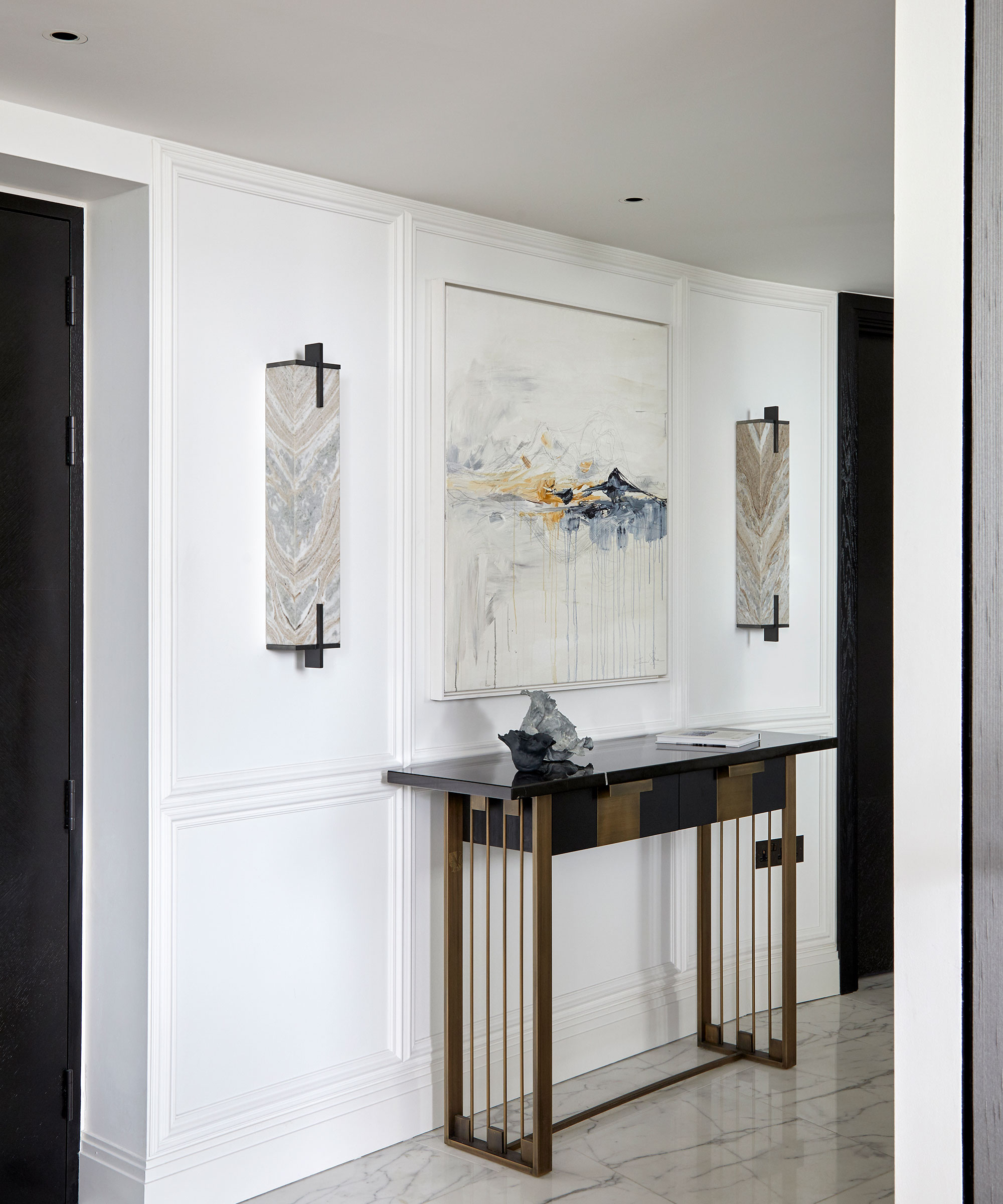
Recessed lighting has its benefits – most primarily because it can illuminate a space without feeling intrusive. However, in all its benefits, experts warn that excess recessed lighting can have a negative impact on your space and, most significantly, your ceiling.
'Try to manage the number of holes in the ceiling – it's easy to go overboard with recessed lighting and create 'Swiss cheese' on the ceiling,' warns Jill Shevlin, the lead designer at Jill Shevlin Design. So, while recessed lighting will always work in some spaces, it is better to avoid adding too many holes in your ceiling – for a feature that will stand the test of time for longer.
2. Not considering different colors
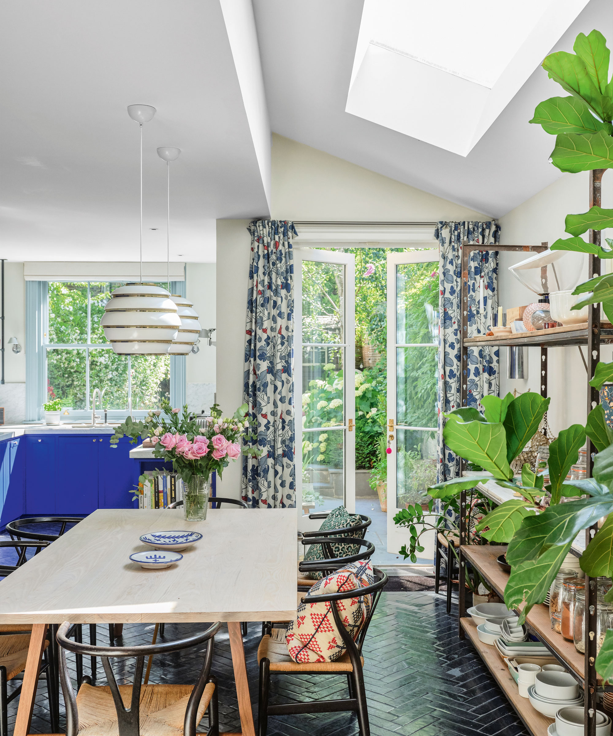
The trove of ceiling paint ideas stretches far beyond basic white and magnolia – though – the appeal behind this enduring shade is understandable, too. However, while white will never go out of style, Jill urges you not to forget other color ideas on your 'fifth wall' as this space can dramatically change the impact of your room.
Design expertise in your inbox – from inspiring decorating ideas and beautiful celebrity homes to practical gardening advice and shopping round-ups.
'The obvious ceiling color is white, but there are times when another color should be considered; for instance, with pitched ceilings, the ceiling can be painted the same color as the wall,' the designer says.
3. Not removing popcorn ceiling
Knowing how to remove popcorn ceiling may seem like a challenge; however, with the right preparation and tools, you can banish this retro classic for good. And if you're thinking about smoothing your ceiling, you're in good company. 'Avoid or eliminate popcorn ceilings at all costs,' Jill says. The designer adds that this ceiling appears 'very dated and unappealing' – meaning it is better left outside your scheme.
4. Not considering the proportions of the room
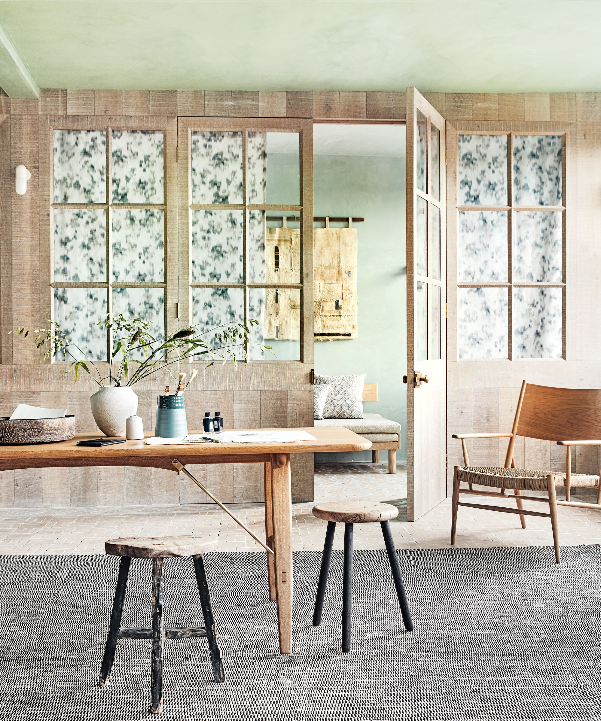
It may seem inevitable that your ceiling will sit in proportion to the other elements in the room. However, interior designer Emily Che warns this is not always the case.
'If you have tall windows, you'll want to ensure your ceiling is high enough to balance out their height,' the designer says. 'Likewise, if you have low ceilings, you'll want to be careful not to select light fixtures or ceiling fans that are too large or bulky, as they will make the space feel even more cramped.'
5. Forgetting about acoustics
Another mistake people make is forgetting about acoustics when it comes to their ceilings. This is especially important in a media room, as you will need to ensure your ceiling is properly insulated to help reduce noise.
'Likewise, if you have hardwood floors, you may want to add a rug to help absorb sound,' Emily says. 'Or, if you have a home office, you may want to install acoustic panels on the ceiling to help reduce noise.'

Megan is the Head of Celebrity Style News at Homes & Gardens, where she leads the celebrity/ news team. She has a history in interior design, travel, and news journalism, having lived and worked in New York, Paris, and, currently, London. Megan has bylines in Livingetc, The Telegraph, and IRK Magazine, and has interviewed the likes of Drew Barrymore, Ayesha Curry, Michelle Keegan, and Tan France, among others. She lives in a London apartment with her antique typewriter and an eclectic espresso cup collection, and dreams of a Kelly Wearstler-designed home.