'Bookshelf Wealth' has changed the way I style my home – here's everything you need to know about this designer-approved trend
This viral trend might just be the design world's new favorite aesthetic. Here's how to style your shelves to match

Abby Wilson
A far cry from the perfectly color-coded or hyper-minimalist shelf displays that dominated Instagram a few years back, the 'bookshelf wealth' trend champions the art of the full shelf – layered, lived-in, and rich with personality.
While the term might be new, the sentiment isn’t. Book lovers have been taking on the task for centuries, using stacks of hardbacks, heirlooms, vintage picture frames, and artful clutter to tell a story. It’s an interior design trend that feels quietly luxurious and effortlessly chic, like you’ve been collecting beautiful things for decades.
First coined by the San Diego-based interior design firm House of Hive Design Co., the viral aesthetic gained popularity on TikTok in 2024 and has truly grown into its own in 2025. Here, we dive into what the trend really means and how to achieve your own curated yet collected way of decorating with books and trinkets that have been adored (or are soon to be adored) over the years.
What is the 'Bookshelf Wealth' trend?
@houseofhive ♬ original sound - House of Hive Design Co
'What separates this from other interior design styles is that these homes look cozy and lived in. So obviously, there are books, but the difference is that these aren't display books; these are books that have actually been curated and read. Art is of the utmost importance, but it's not displayed traditionally,' Kailee Blalock, co-founder and principal designer of House of Hive, says in the TikTok.
As Kailee explains, the bookshelf wealth trend features books, art and decor displayed in unexpected ways – stacked on the floor, hung over bookshelves, or asymmetrical. The result is a casual yet refined look that suggests it's been collected over the years. Arguably, the most successful examples of this look have gained their class and character over time.
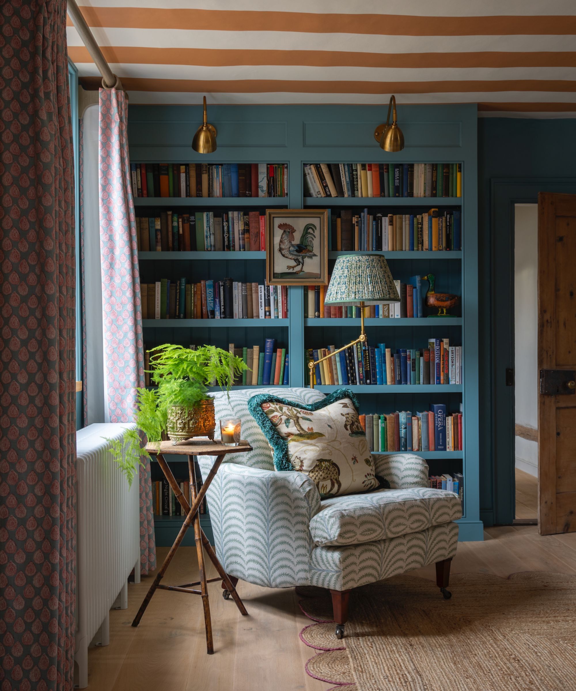
Elizabeth Krueger, principal designer of Elizabeth Krueger Design, says she loves to design personal bookshelves that spark conversation. This happens naturally when photos, books, and other decorative items are accumulated over time – and it's nearly impossible to replicate with a quick trip to the home store.
'You can always tell when the pieces have been discovered during the different seasons and moments of life. There is an inherent character and narrative that cannot be fabricated,' says Elizabeth.
By holding on to the books and objects that mean the most to you, your bookshelf styling will transform alongside you. And the intentional clutter and imperfections that come with the passage of time will appear too, bringing hard-won character.
'A well-curated bookshelf tells a story, just like a great piece of art. It's because of this that designing bookshelves is actually one of my favorite parts of an installation,' says Elizabeth.
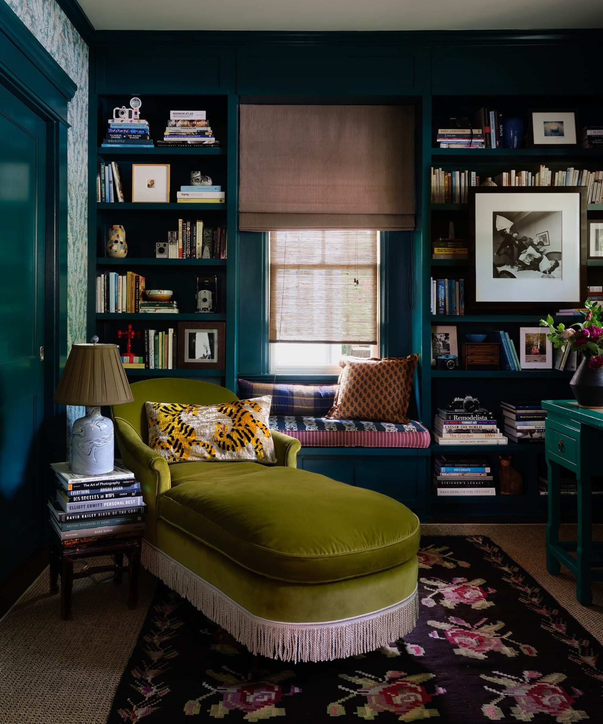
Other key features of the bookshelf wealth look include eye-catching patterns, comfort-forward seating areas like armchair corners or reading nooks, and clever mixtures of moody light fixtures.
Kathy Kuo, interior designer and CEO of Kathy Kuo Home, says that she sees the look as a seamless blend between the recent quiet luxury aesthetic and the '#shelfie,' or a snapshot of a shelf that represents someone's character.
'I love this trend because it involves a practical element as well as a personal one. Books and special objects like heirlooms, antiques, and art pieces are wonderful ways to add personality to your home, and displaying these things in artful ways on your shelves makes for a really lovely layer to any interior design motif,' she says.
How to achieve the 'Bookshelf Wealth' look
Whether you're channeling bookshelf wealth, or just want to refresh the way your books are displayed, there are a few points to keep in mind.
You'll note all these bookshelf wealth examples have one thing in common, they are all filled with character and depth, and interest. And that's what this look is all about. However, there is a knack to styling a bookshelf, even to achieve this very relaxed, 'unstyled' look. So we asked designers for their tips and what these beautiful bookshelves add to the rooms they are in.
1. Reflect what you love with your bookshelves
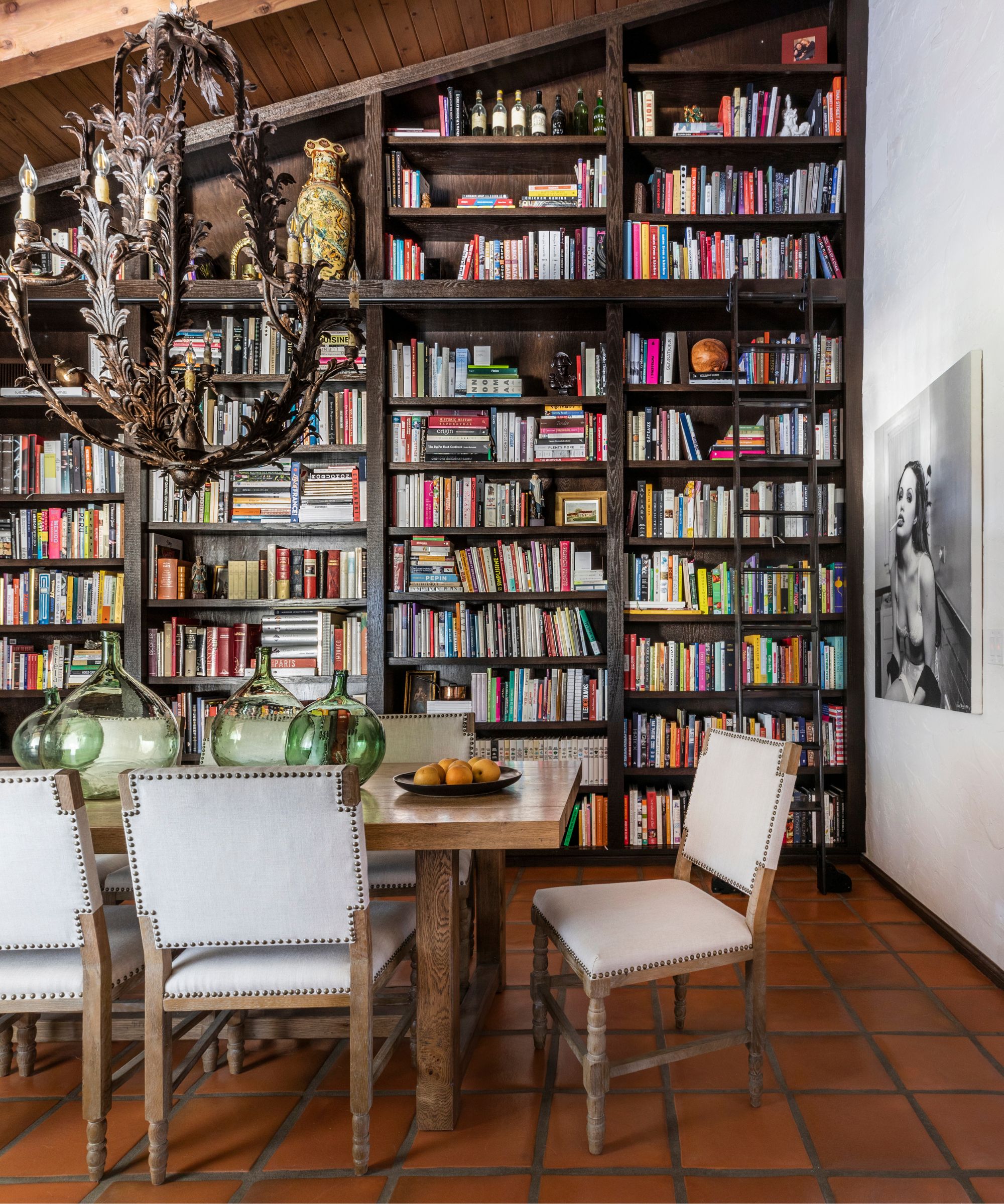
'Bookshelves are a beautiful way to display things that are important to a homeowner. Whether it is items from travel, inspirational books or stunning artwork, a bookshelf is a great place to incorporate meaning within a space,' says designer Marie Flanigan.
'In this case, we worked with Chef Ludo Lefebvre to fill his gorgeous built-in with his cookbook collection. His collection is extensive but important to his work, so we made sure that the books were accessible and mixed in a few other meaningful pieces to break up the space.'
Despite staying true to its defining aspects, bookshelf wealth doesn't stick to a rigid set of rules, meaning its style depends on you. It provides an opportunity to have fun with your interior design and let go of classic conventions.
'I believe a bookshelf only comes alive when it tells the story of the home and the family within. I try to steer clear of pointless styling and move towards a place of authenticity. The items do not need to be of a certain aesthetic so long as they resonate with you,' says Avery Cox of Texas-based Avery Cox Design.
2. Create a cozy reading room
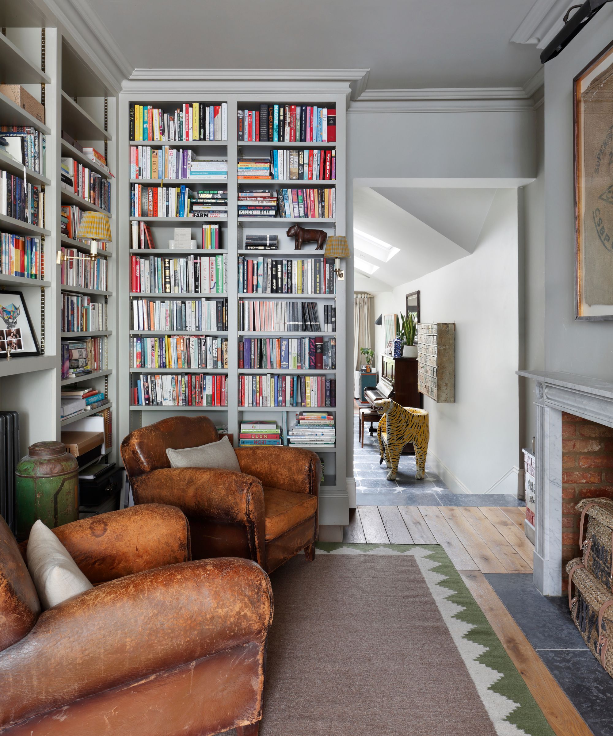
'A well-curated library or bookcase weaves warmth and personality into a home, transforming a space into one of comfort and charm. By displaying books alongside personal treasures and decorative objects, it reflects the unique personality of its inhabitants, creating an inviting atmosphere,' explains Thomas Cox, founder of HÁM Interiors.
'In our Hideaway project [seen above], we wanted to create a useful and distinct space from the adjoining living area. Moving away from the home's previous minimalist aesthetic, we introduced floor-to-ceiling joinery and a traditional fireplace with reclaimed brick. A choice of moody paint for the walls and woodwork added depth and character.'
3. Leave pockets of space for vignettes
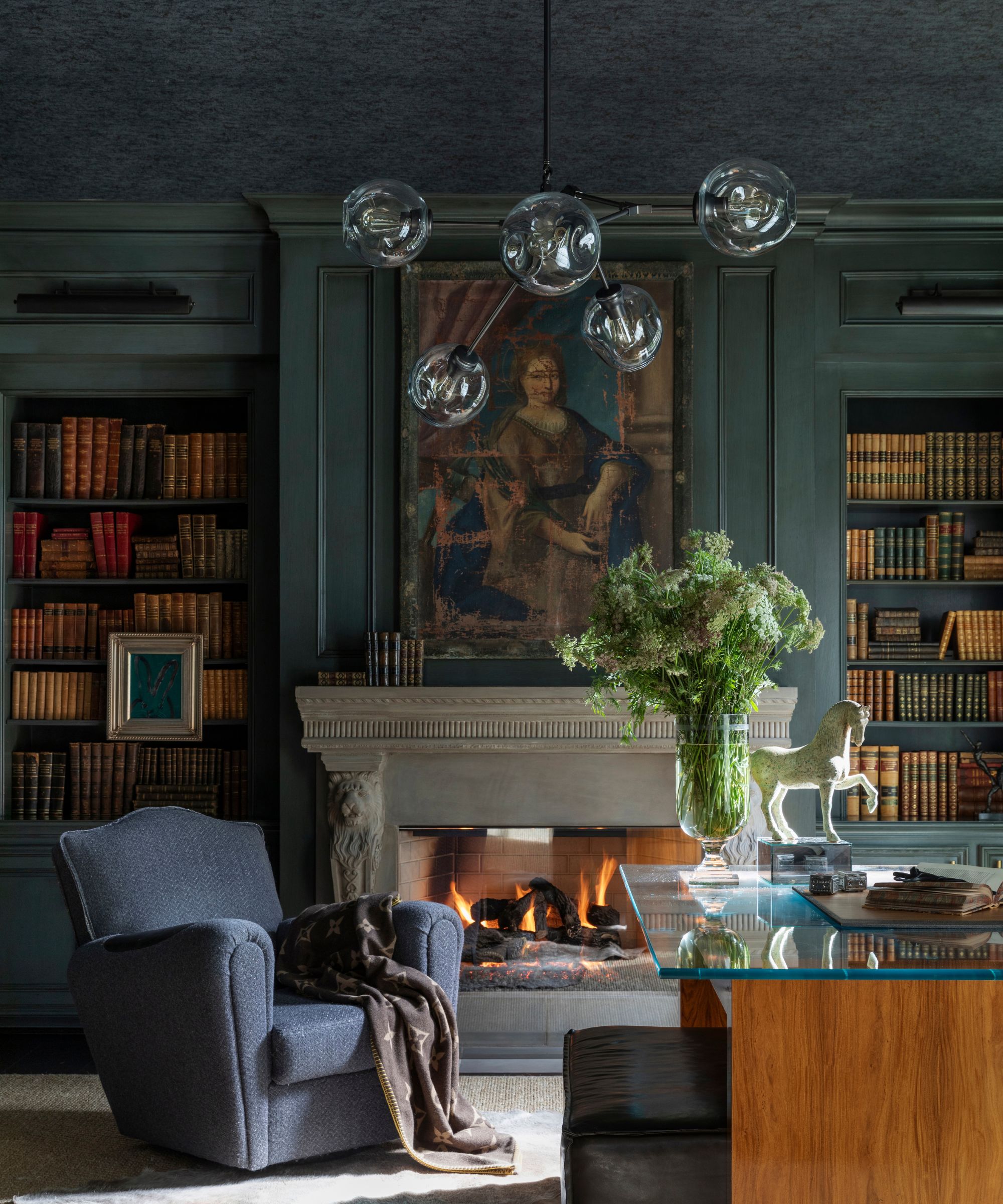
'Styling a bookshelf takes patience, but when done well, it establishes an elegant sophistication. I like pairing books of similar size and color to illustrate a streamlined flow. Lastly, I will fill in any holes with items of personal significance or hang small pieces of art for an unexpected surprise,' explains designer Kara Childress.
When curating your shelves, start with the books, but do leave the odd negative space to break them up and create little vignettes of meaningful pieces like decor or artwork to interrupt the rows of books.
To get the bookshelf wealth look down with items you already have, Kathy Kuo suggests showcasing two or three decorative items like picture frames, souvenirs, or potted plants alongside a small stack of books. Then, simply repeat as space permits.
Paul Corrie, principal designer of Washington, D.C.-based Paul Corrie Interiors, says that creating vignettes is 'an absolute art form.' 'It doesn’t matter how many pieces are involved, but the combination and relationship amongst pieces needs to be thoughtfully edited and executed,' he says.
4. Introduce some wallpaper
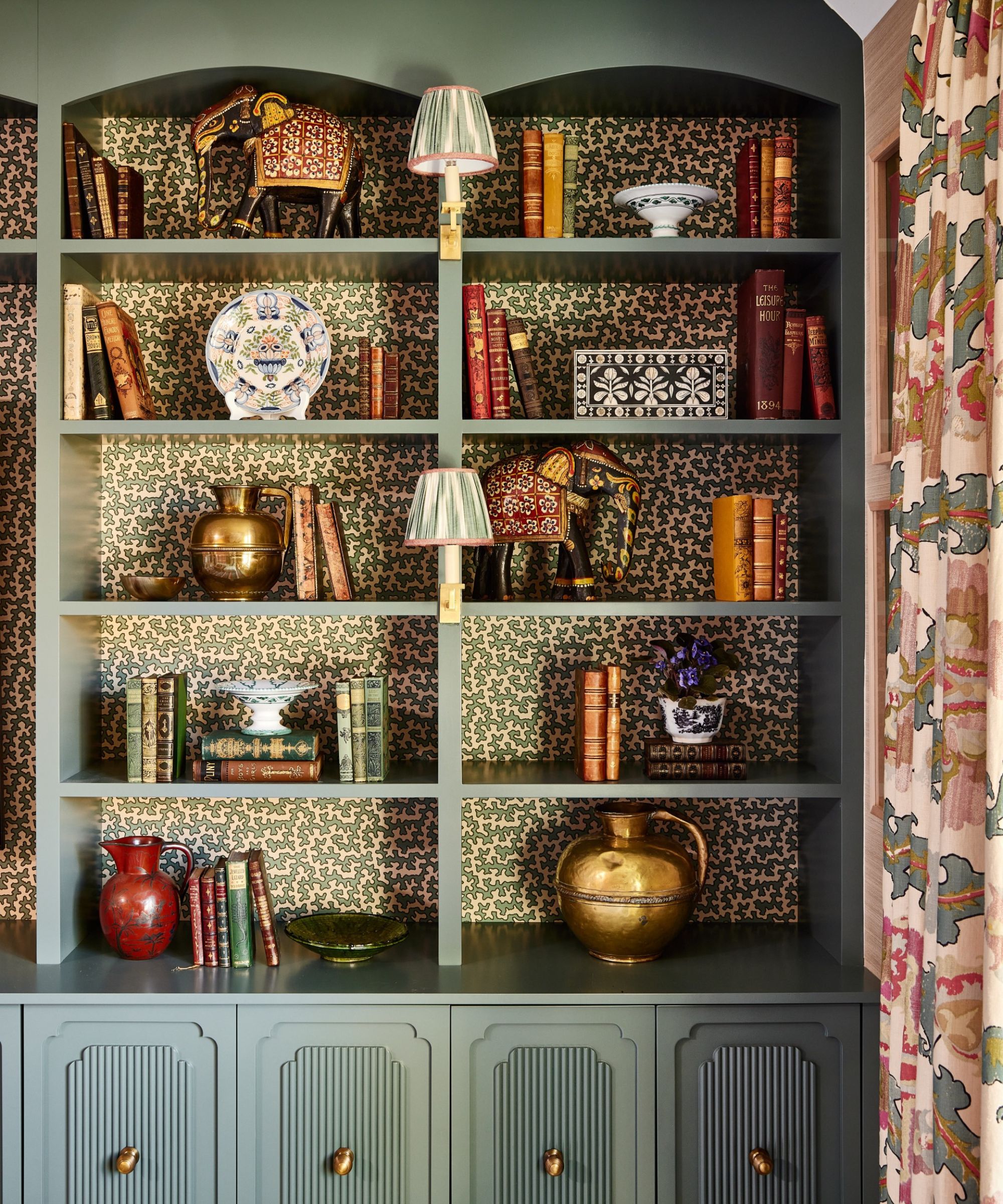
This is a great trick for adding even more character to a bookcase, especially if you aren't a book hoarder but still want that very maximalist look that bookshelf wealth is about. By adding a wallpaper to the back of a bookcase, you already have an interesting base to start from, you can leave gaps without the shelves ever looking bare.
'We love to cover the backs of our bookcases in a small-scale wallpaper to make them pop and add interest: this is particularly effective if you don't have a huge collection of books as it doesn't matter if the bookcase is full or not,' explains designer Elizabeth Hay. 'We always love to have some cute little library bookcase lights with shades which adds further detail and soft lighting in the evenings.'
5. Blend old and new
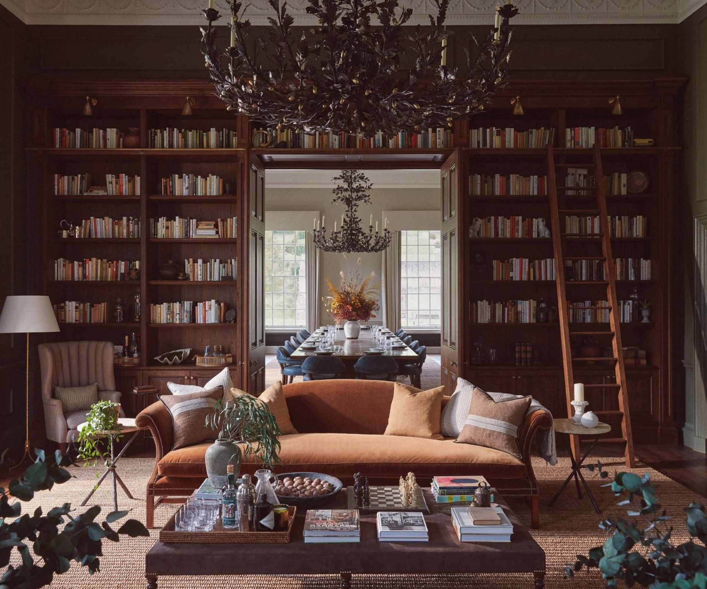
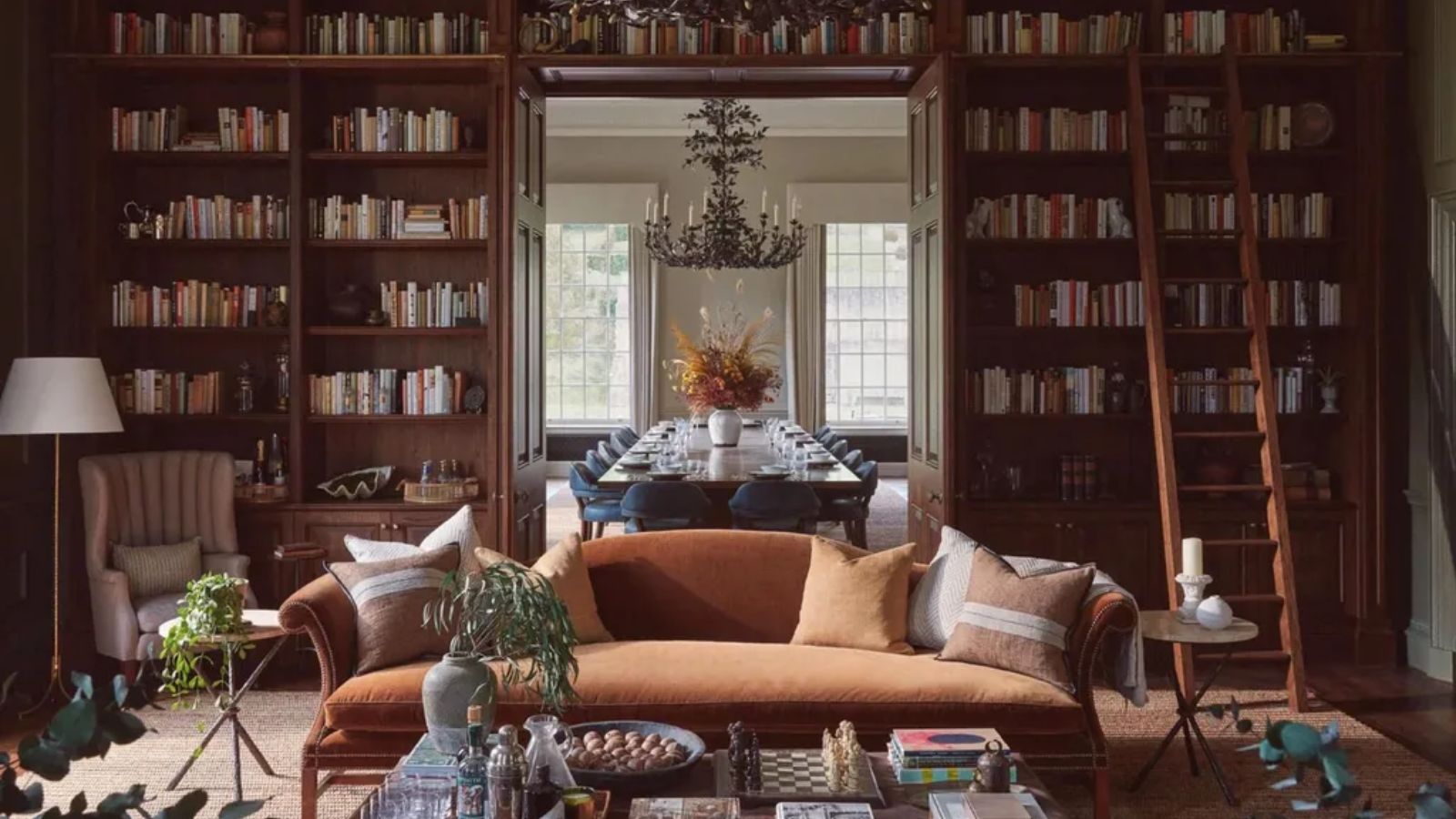
'For this living room, Albion Nord, a design studio known for its expertise in blending traditional and contemporary styles invited Ultimate Library, the bespoke book company to collaborate with them on the library at Benham Park; a former call center that they were transforming back into a period house, albeit with a contemporary twist.' explains Philip Blackwell, a book curator and founder of Ultimate Library.
'Gone are the serried ranks of dark leather-bound books, and in comes a more contemporary book selection of varying heights and shades, more casually shelved. And mixed with objects that give it a much more informal look. The book content gives it the gravitas and authority, the pale tones of some books, lift and lighten for effect.'
'It is as if the old family home has been passed onto the next generation who have injected their contemporary twist.'
6. Use bookshelves to create a room divider
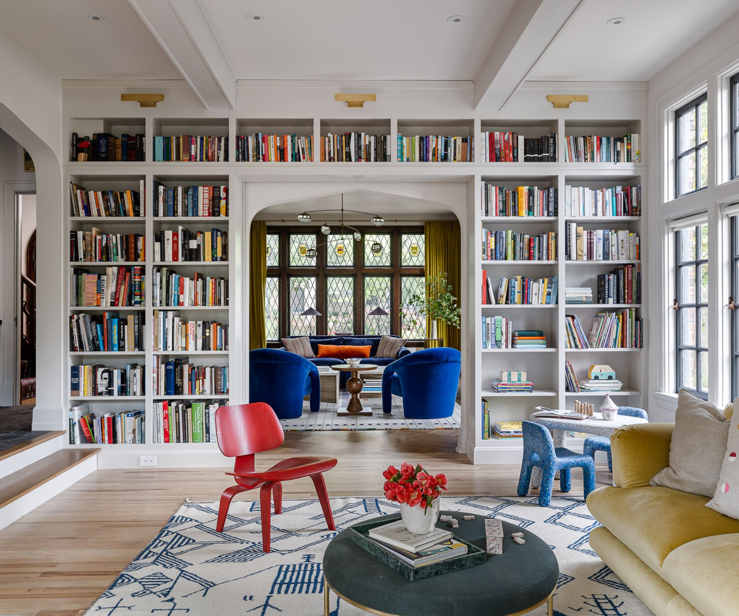
'With a combined five degrees between them, these clients made it clear from the beginning that their beloved book collection was going to play an integral role in their redesigned home,' explains Bethany Adams who designed the space above.
'Positioning the new floor-to-ceiling bookcase between the living room and the family room allowed for a wonderful continuity of the color scheme as it is unified by the rainbow of spines between the two rooms. Additionally, the new library wall hides a secret: pocket-reeded glass doors that can close the two rooms off when one partner is more in the mood for reading, and the other wants to watch TV.'
7. Group 'like' items together
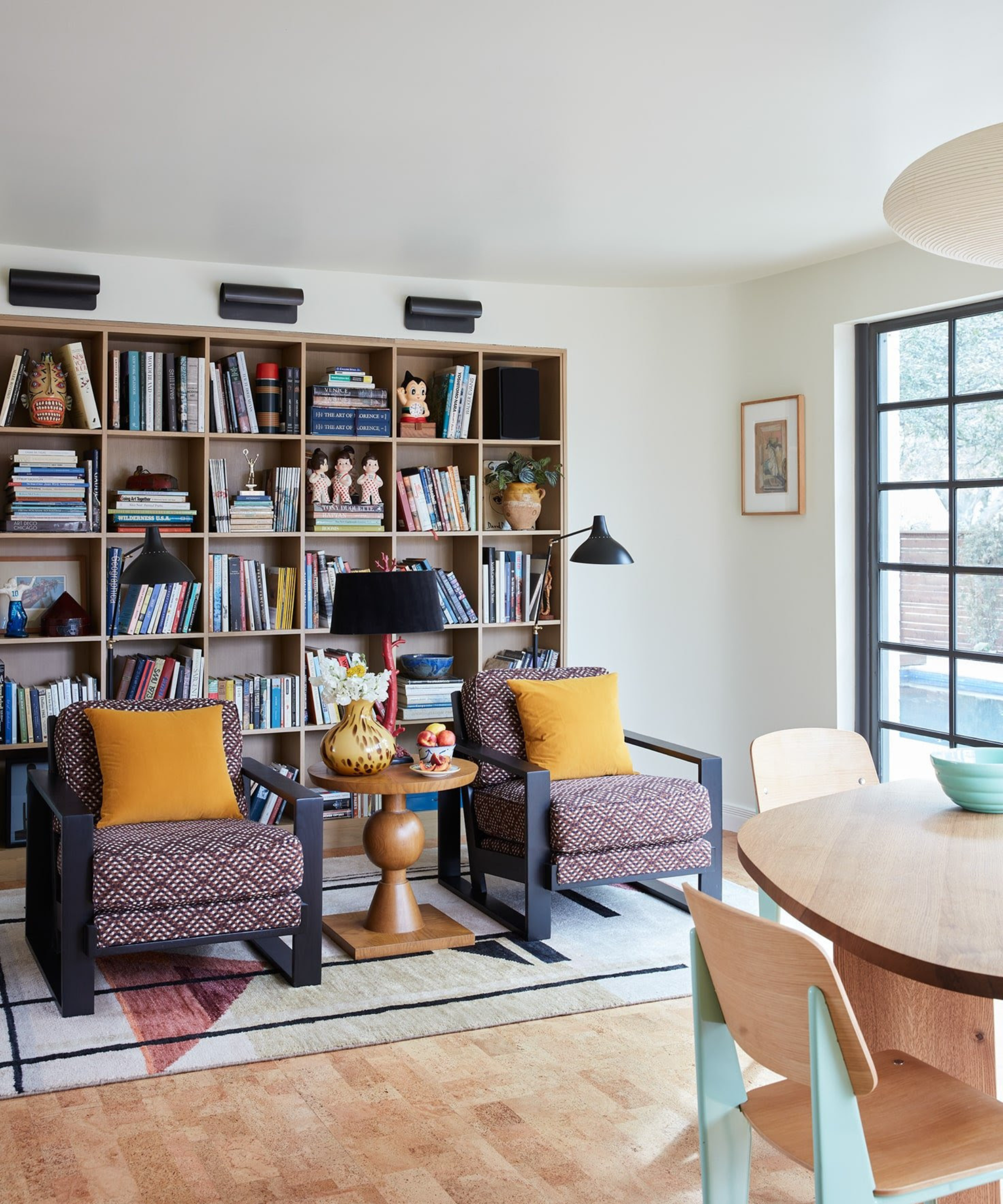
Avery Cox explains that her personal favorite shelving ideas incorporate a bit of whimsy, and she suggests displaying your quirkiest collections – 'antique toys, vintage cameras, or all of your favorite books' will do, she says. And if you're at a loss for how to set your bookshelves' foundation, Avery offers a bit of advice.
'The success is far more about how they are grouped and styled together, rather than each individual piece on its own. To create a successfully styled bookshelf, consider grouping like items together to make an impact on scale, and don’t be afraid to incorporate art or natural objects to create a change in depth, scale, and texture,' she says.
When working with clients that have prized collections, Paul Corrie says he also tends to group similar items to create strength in numbers on the shelves. Aside from that, he stresses the importance of blending aesthetic appeal with function. A beautiful bookshelf is useless if you're unable to find the book you're searching for, after all.
'We also like to be mindful of function and how the space is used, what will help utilize the space and its purpose better, and what marries with the overall aesthetic and design of the particular space involved,' says Paul.
Shop the 'Bookshelf Wealth' aesthetic
Sure, the best 'bookshelf wealth' is achieved over time with collected, personal pieces, but you can certainly make a head start on your collection with some of these pretty pieces.
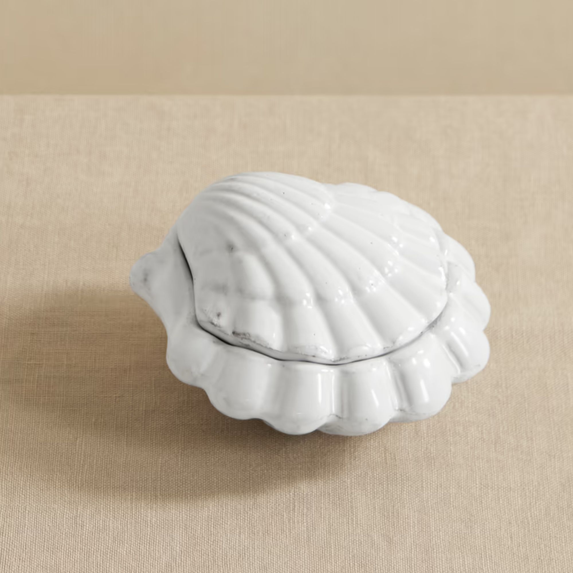
Fill your shelves with little trinkets, oddities, and items that spark memories like a shell from vacation – of this shell-shaped trinket dish, handcrafted in Paris and perfect for hiding precious items.
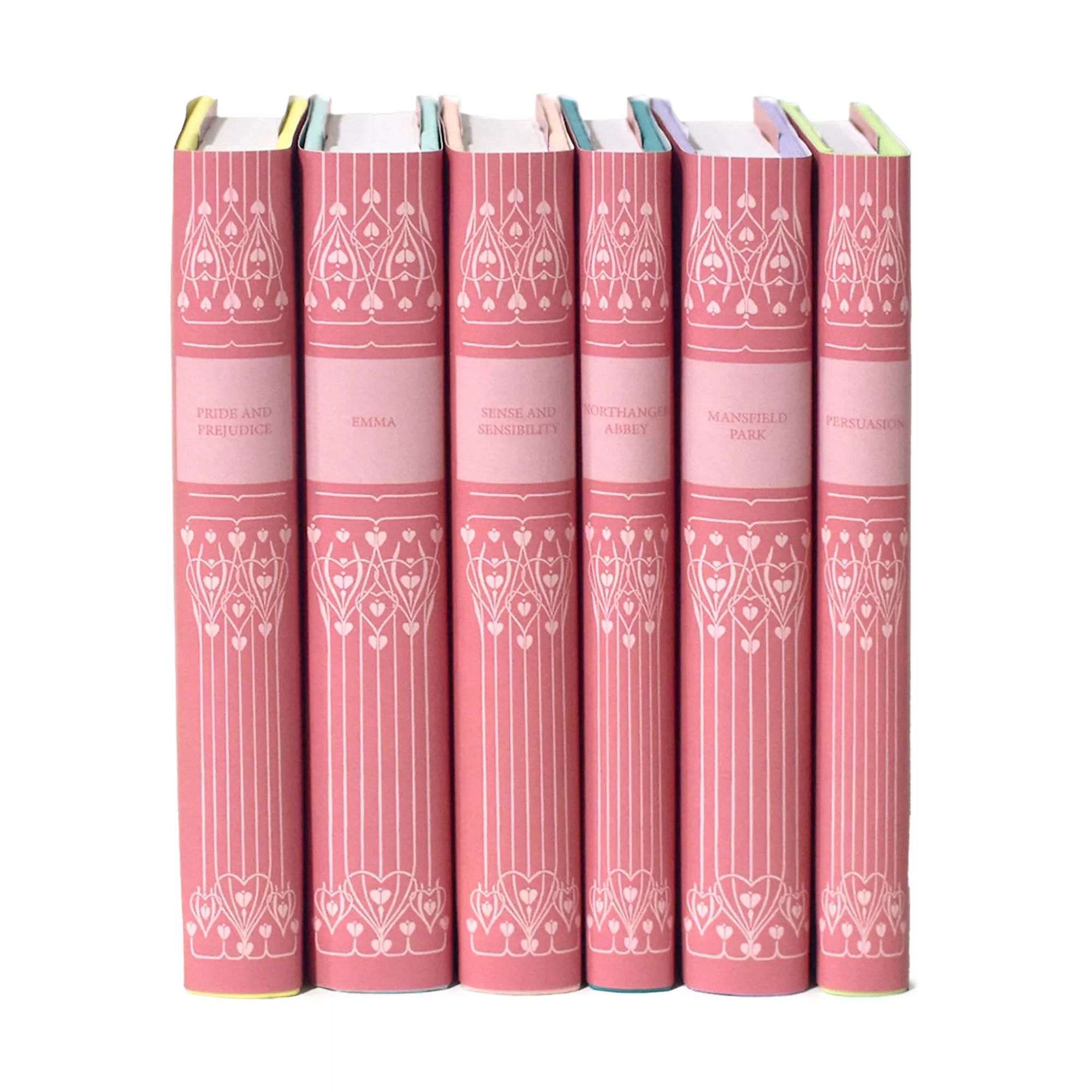
Of course, you want your bookshelves to be filled with books you've read and loved, but you can't go wrong with the classics. Whether you buy them to dive into or for display, these beautifully wrapped Jane Austen books are sure to look picture-perfect.
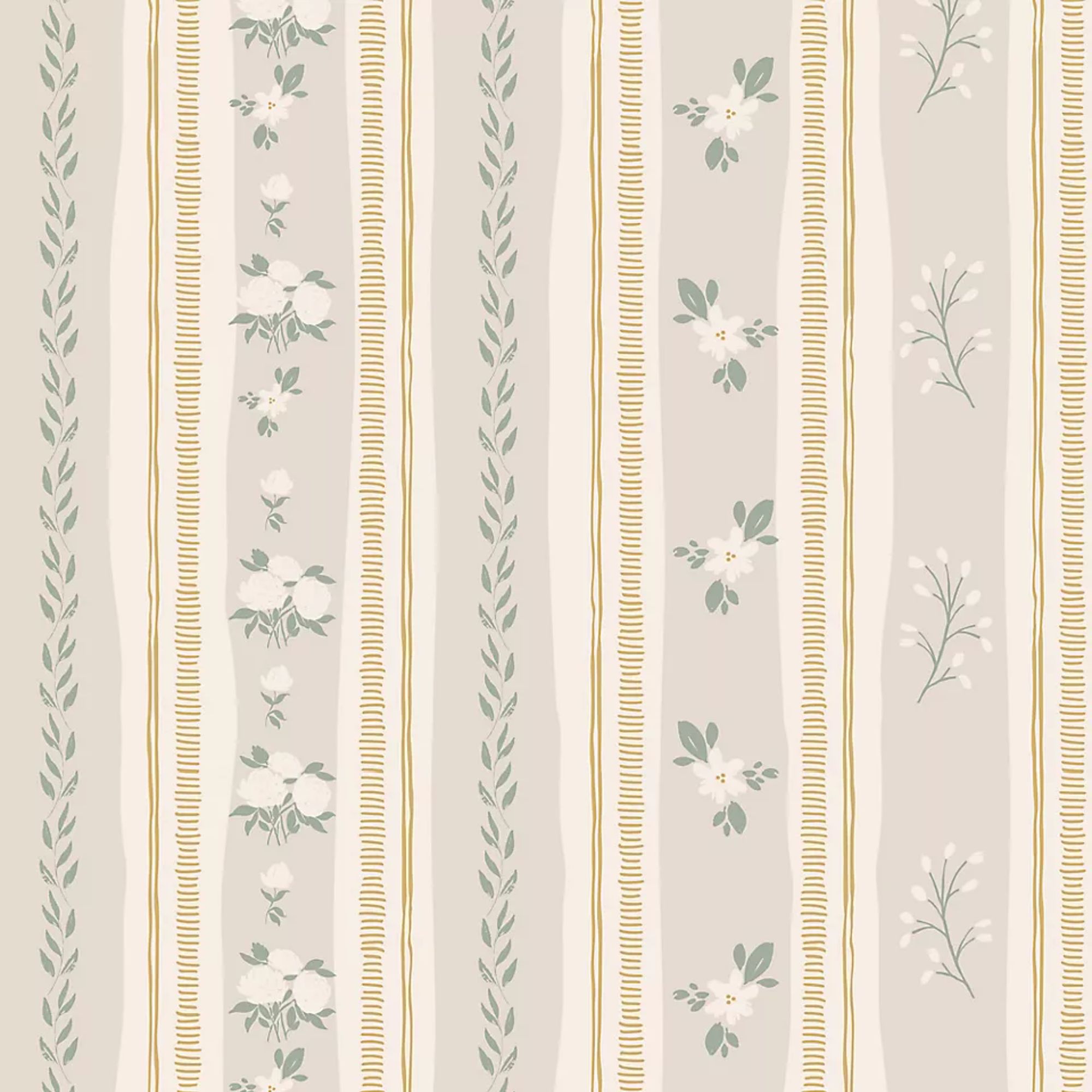
If you're keen to add some wallpaper to the backs of your shelves like designer Elizabeth Hay, Anthropologie has just dropped a huge new range of wallpapers, including this subtle floral and striped design.
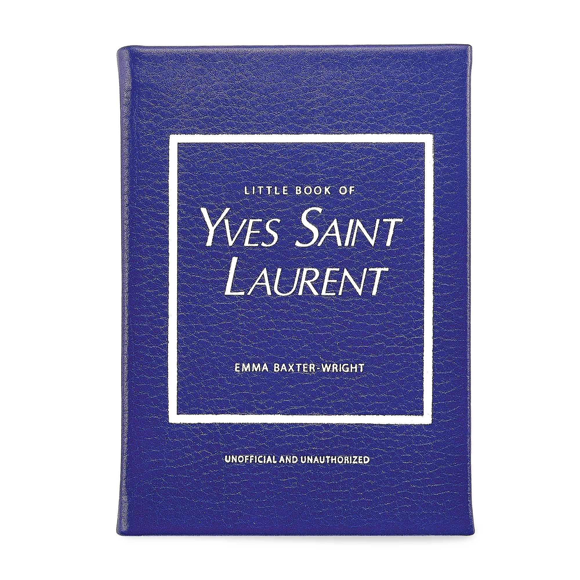
Among typical rows of paperbacks, I love a neat stack of coffee table books to balance out shelf styling and create a moment for vignettes. This Yves Saint Laurent book is covered in Yves' signature blue and takes you through his life in fashion.
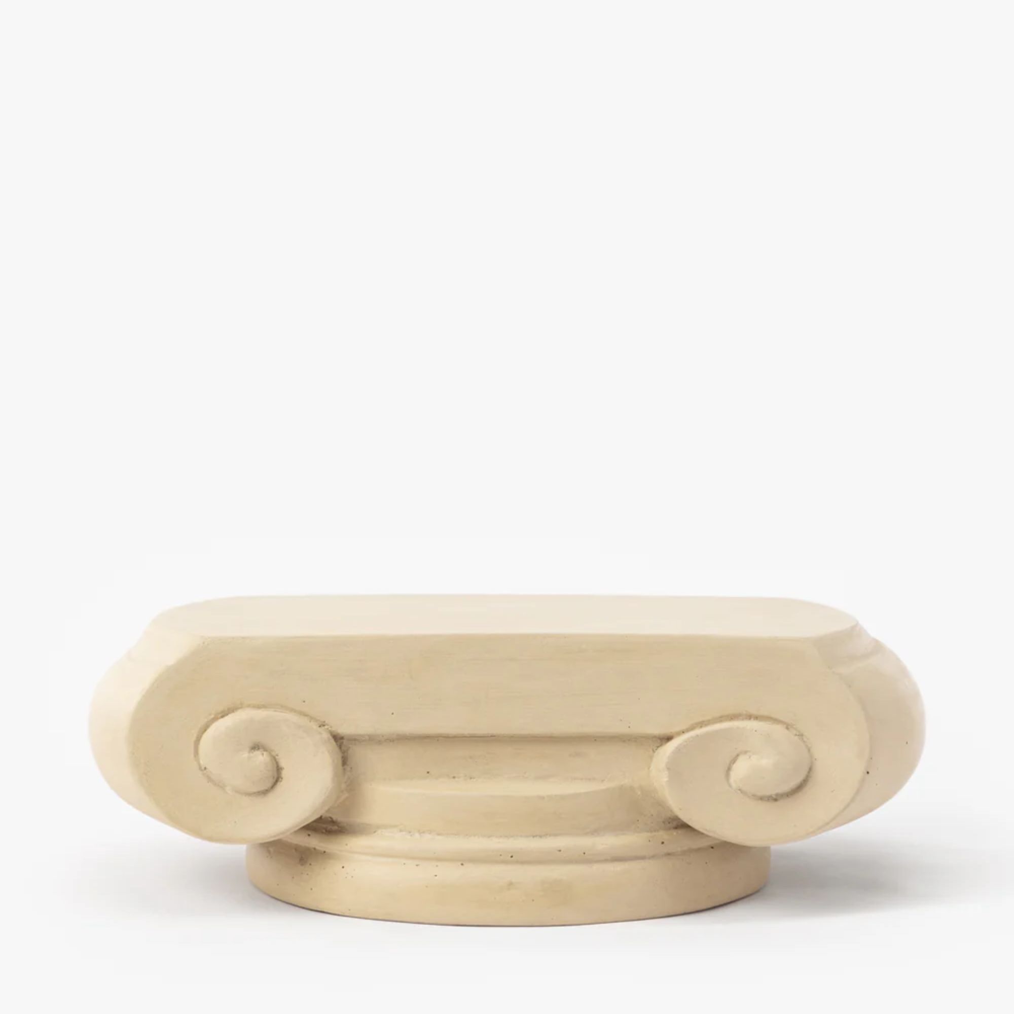
Released in the McGee & Co summer collection, this little pedestal has been designed by Shea to bring 'an abstract presence to your vignettes'. Inspired by vintage columns and pedestals, it offers a lovely vintage style.
Bookshelf wealth may be taking over social media, but its general idea has been celebrated by designers for quite some time. The combination of artful details and well-loved possessions creates a comfortable, nostalgic, and homey atmosphere that's hard to beat. According to Paul Corrie, the desire for 'a layered and collected look' probably isn't a fad at all but more a desire to design homes that feel like us and are transitional and timeless.
'Our designs are intended to be unique and personal to each client, effortlessly appearing timeless so that the look and feel isn’t “decorated.” Bookshelves, walls, and other groupings can tell the stories of our clients, and we love helping them do just that,' he explains.
Chances are, you've already got a bit of bookshelf wealth in your home – it's just a matter of harnessing the aesthetic. Display – and read, of course – what you love, and you'll be well on your way to crafting your own rendition of bookshelf wealth over the course of your life.
Sign up to the Homes & Gardens newsletter
Design expertise in your inbox – from inspiring decorating ideas and beautiful celebrity homes to practical gardening advice and shopping round-ups.

Charlotte is the style and trends editor at Homes and Gardens and has been with the team since Christmas 2023. Following a 5 year career in Fashion, she has worked at many women's glossy magazines including Grazia, Stylist, and Hello!, and as Interiors Editor for British heritage department store Liberty. Her role at H&G fuses her love of style with her passion for interior design, and she is currently undergoing her second home renovation - you can follow her journey over on @olbyhome
- Abby WilsonInterior Design News Writer
You must confirm your public display name before commenting
Please logout and then login again, you will then be prompted to enter your display name.
-
 Hailey Bieber's curvaceous toaster is an Italian design staple (with roots in the 1950s) – it blends retro style with modern capabilities
This toaster has stood on the countertops of 'It girls' since the '50s, and Hailey Bieber has just resurged the trend – you can follow suit for $250
By Megan Slack
-
 5 fast-growing tiny flowers – expert recommendations to fill your pots and borders with color in record time
These fast-growing tiny flowers prove that miniature can also be marvelous
By Thomas Rutter
-
 The biggest curtain trends to follow in 2025 – 8 key looks to shop that will instantly elevate your rooms
These are the colors, styles, and materials to embrace in your windows this year if you want desirable drapes, plus our favorite places to shop the trends
By Lilith Hudson
-
 Bookshelf trends – 8 stylish ways designers are displaying their books in 2025
Turn your collection of books into a design statement by embracing some of these chic, designer-approved bookshelf trends
By Lilith Hudson
-
 Want to introduce a coastal-meets-luxury feel to your home? The experts say it is time to get to know Riviera interior design
With a mix of influences, the eclectic, Mediterranean-inspired nature of Riviera style is popular among interior designers
By Charlotte Olby
-
 Love the trending Nancy Meyers aesthetic? Take it one step further with these '90s and 2000s rom-com-inspired design tips
Rom-com-inspired interiors are nostalgia-inducing and inviting. This is how to embrace the timeless look
By Abby Wilson
-
 Are curtains out of style? Designers share their thoughts on the timeless window treatment
Designers explain why curtains have enduring appeal and share their tips on how to choose timeless designs
By Pippa Blenkinsop
-
 I chose not to follow this key lighting trend – and now get why designers are doing lighting this way
Designers have been turned off by the idea of the big light, yet I've embraced them in every room in my house. Now, I understand why the mood is shifting
By Pip Rich
-
 The whimsical decor trend is taking over – how to channel the playful, out-of-the-box style designers can't get enough of
Your home should make you happy, and whimsical decor is here to help. This is how to get the look down in any space
By Abby Wilson
-
 How to create the old money coastal style in your home – one of this year's biggest summer design trends
Understated elegance meets coastal chic – here's how to make it work in any space
By Molly Malsom
