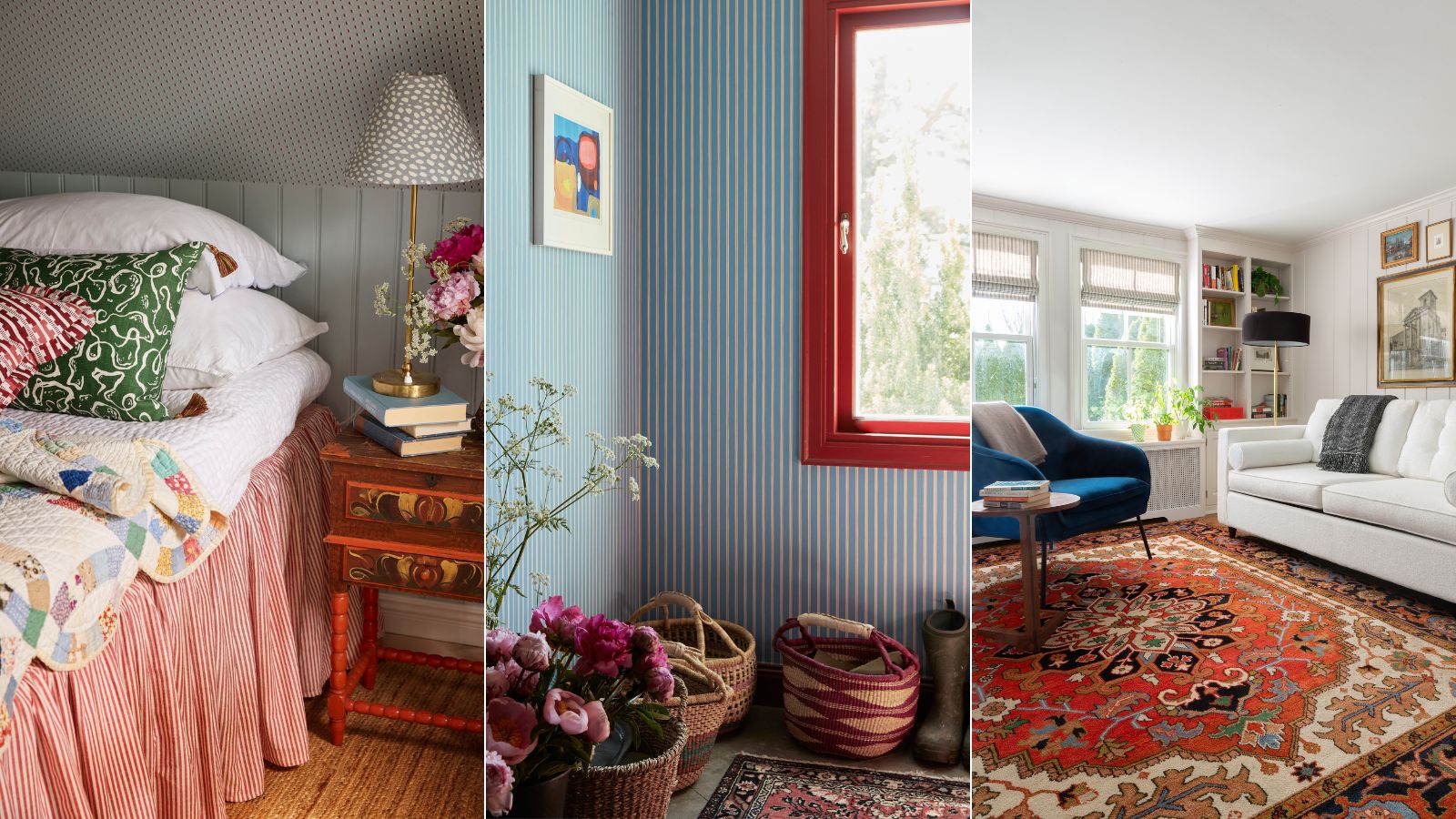
Blue and red is the unexpected color combination for fall 2024 – here's how designers are embracing this nostalgic pairing
Reinvent this bold color combination with these styling ideas, as suggested by designers

Design expertise in your inbox – from inspiring decorating ideas and beautiful celebrity homes to practical gardening advice and shopping round-ups.
You are now subscribed
Your newsletter sign-up was successful
Want to add more newsletters?
When dreaming up color combinations to use throughout interior schemes, blue and red likely aren't the first to spring to mind. Often conjuring images of saturated primary-colored nostalgia and Americana style, this once-loved color combination has been replaced in recent years with more subtle hues.
That said, I've noticed blue and red cropping up again, but not as I previously knew this color combination. Instead of ultra-saturated, lively schemes, decorating with blue and red has been reimagined to work as a stylish pairing with on-trend variations of these two colors.
Intrigued by this unexpected color combination, I've rounded up a few of my favorite projects channeling it right now. Read on for some inspiration on how to make this nostalgic pairing work for your fall color schemes.
Article continues belowHow to decorate with blue and red stylishly this fall
'Red and blue sit on the opposite sides of the color wheel, but can create a striking balance in interior design when used thoughtfully,' explains Miami-based Interior Designer Ania Agárdy.
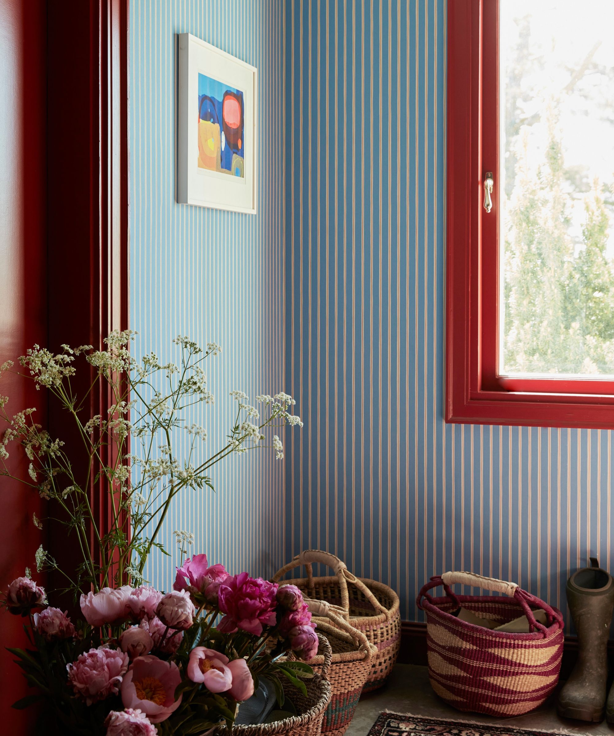
'Their contrast brings out dynamic energy, yet when paired correctly, they can harmonize beautifully,' Ania continues. 'Blue is a cool, calming color that evokes tranquility, while red is warm and bold, representing energy and passion. Together, they create a balanced dynamic with blue grounding the space and red adding a vibrant focal point.'
1. Use red in small doses
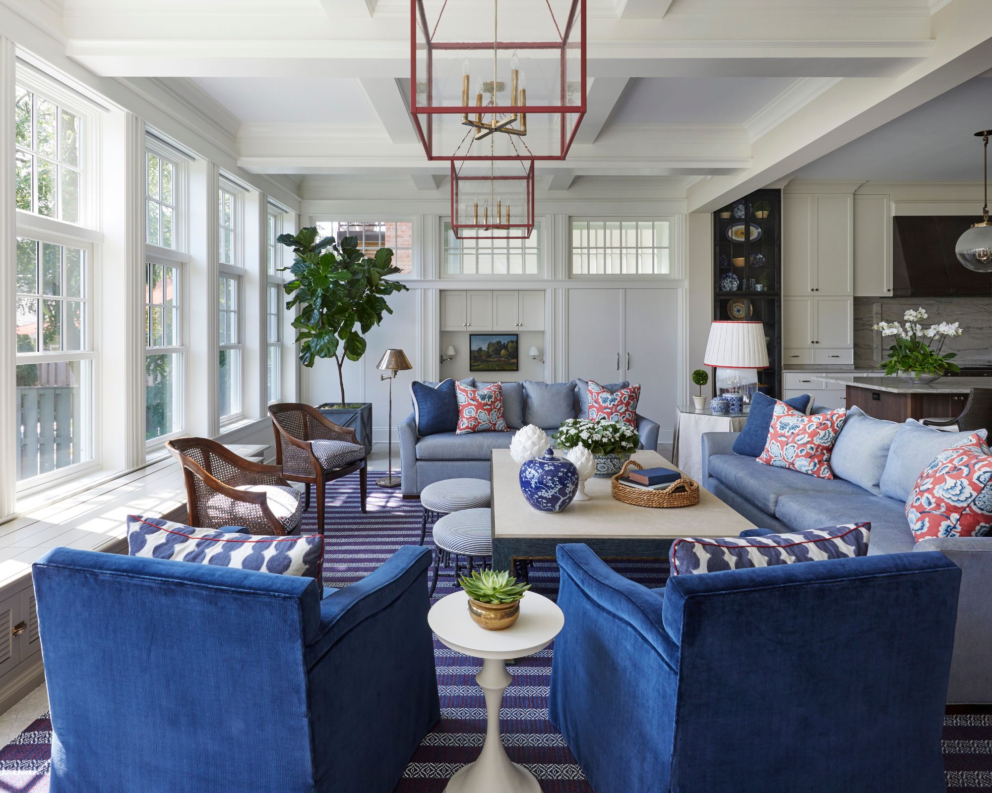
As the unexpected red theory has proven to all of us, you don't need a lot of red to make an impact. By decorating with red sparingly, the scheme won't feel too lively while the more dominant blue will ensure a calming feel.
'Blue and red always look good together,' designer Tom Riker of James Thomas tells me. 'While red can prove to be more challenging for many clients to use as the main color in a room, it shines when used sparingly alongside blue.'
Design expertise in your inbox – from inspiring decorating ideas and beautiful celebrity homes to practical gardening advice and shopping round-ups.
'In this great room, the interplay of blue and red infuses the space with a playful, preppy spirit while maintaining a sense of classic sophistication,' adds Tom. 'Here you will find the red in the cord trim on pillows and accent trim on a lampshade. It also appears as the accent color in the light fixtures and as the base color for the accent pillows on each sofa.'
2. Choose a very light shade of blue
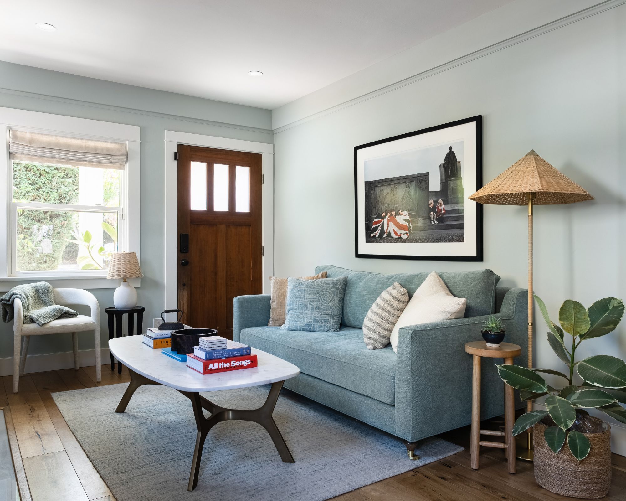
When it comes to sourcing the right blue paint for your red and blue scheme, you don't need to go for lively mid-tones, especially if you prefer a more neutral feel like I do. For a restful look that feels more timeless, opt for pale blue paints that will work essentially as a neutral across the walls.
This approach feels reminiscent of coastal color schemes, taking cues from nature when decorating with blue.
'In this home, we chose to use pops of red to give the blue saturated space just the right amount of contrast,' designer Allison Garrison of Allito Spaces tells me. 'By limiting the amount of red and pairing it with a softer blue, we steered clear of nautical territory, and instead, this coastal space is tranquil with some edge. When using blue and reds, I love to do it in an unexpected way.'
To create a similar look, opt for pale blue paint colors like Farrow & Ball's Borrowed Light, a serene and airy color.
3. Team blue and red with classic white
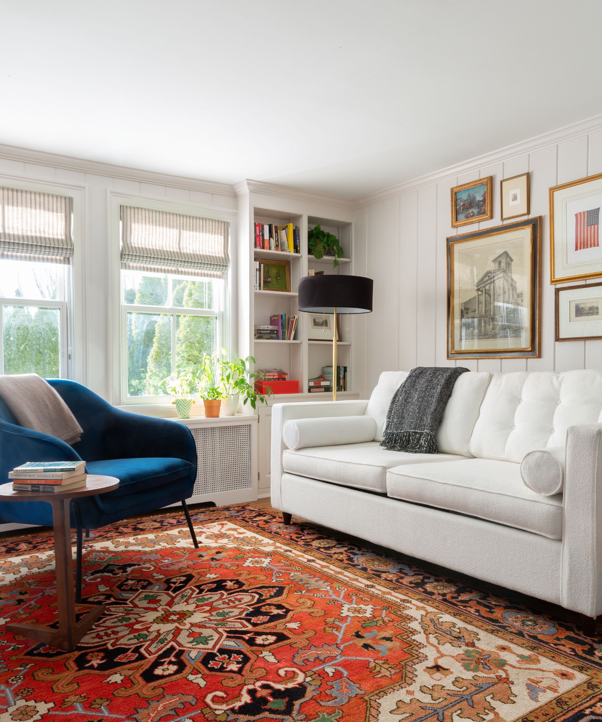
'Red and blue is a classic combination that can suggest traditional Americana-type decor, Scandinavian style, or a cool postmodern aesthetic,' says Diane Rath, founder and principal designer at The Rath Project.
'Both bold, primary colors, they have been used together in decorating and art for centuries, so not only have we learned to be comfortable with them together, but we are naturally attracted to the pair since they represent the coupling of a cool and a warm union,' adds Diane.
I'm taking plenty of inspiration from this living room, where the dark red rug and dark teal blue accent chair add interest to the otherwise neutral color scheme of white walls and decor. Since these two colors are so bold, they can risk overwhelming a room with too many competing colors, but the addition of classic whites here balances the scheme and provides a visual break.
4. Use red and blue for a colorful bedroom
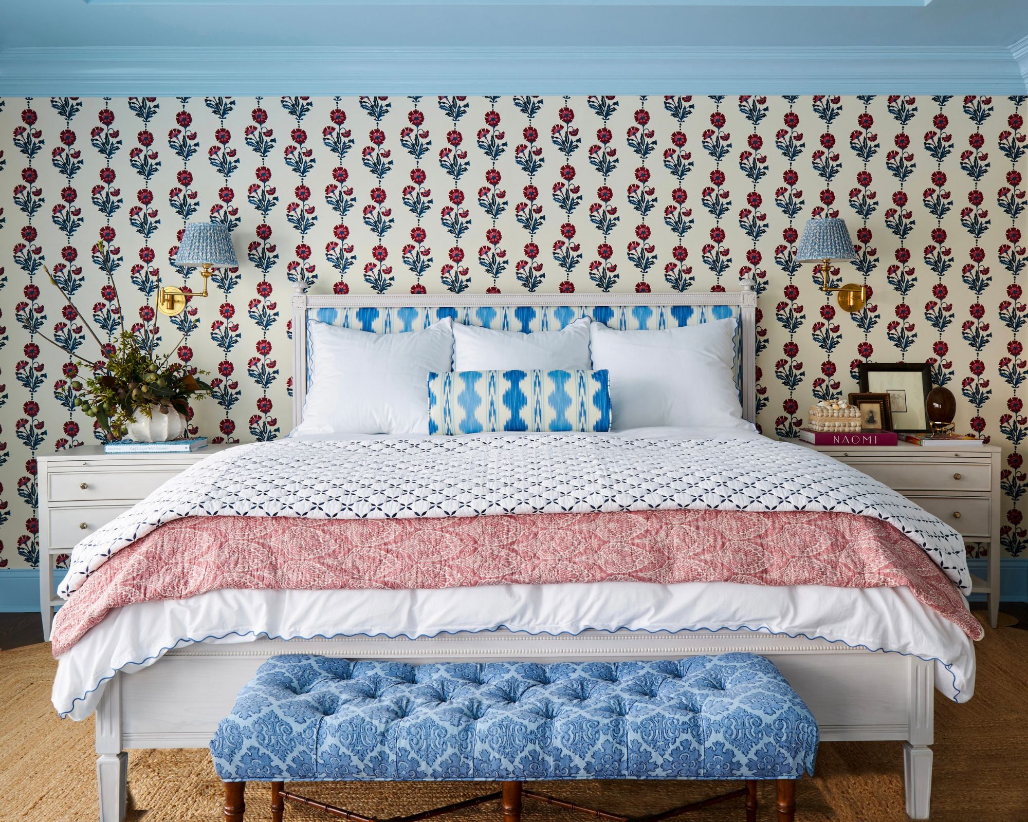
Most of us (myself included) tend to stick to failsafe neutrals when we think of bedroom color ideas. However, red and blue can work just as well in this restful space. The key to doing so successfully is to opt for lighter variations of the two hues for a welcoming feel.
For this uplifting bedroom, interior designer Sarah Vaile tells me how decorating with pattern acted as the starting point for the blue and red scheme:
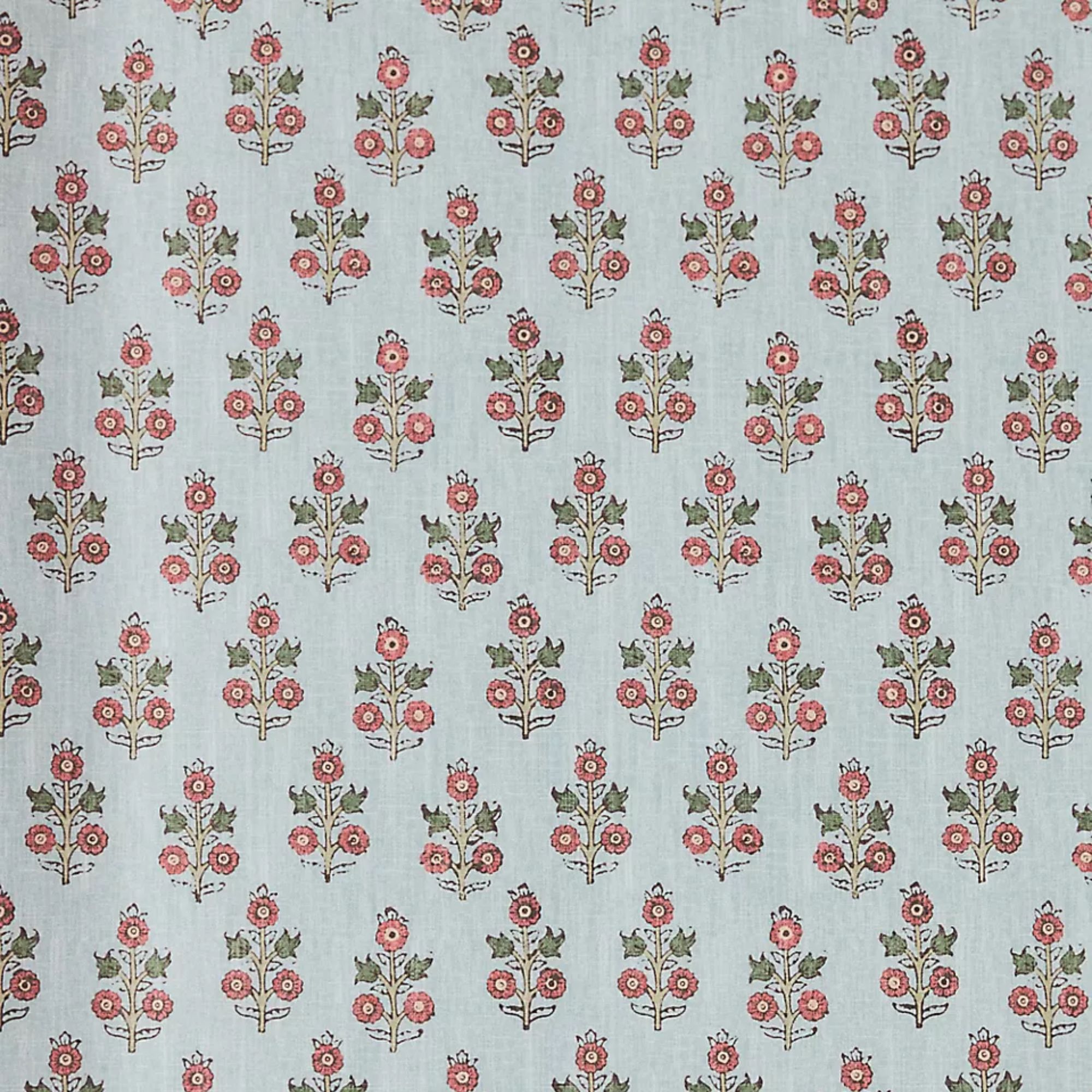
'This Schumacher fabric by Molly Mahon inspired the red and blue color palette,' says the Chicago-based designer. 'Our client immediately fell for the fabric and knew it had to be on the bedroom walls with an airy periwinkle blue on the trim to balance the earthy persimmon of the flowers. As the colors of fire and water, it’s easy to think that there may not be two more naturally complementary colors.'
Decorating with blue and red may be unexpected, but I for one love it for its cozy and nostalgic feel. Whether you opt for the lightest shades of blue and team it with raspberry red for a subtle look or embrace richer teal with dark red, this color trend is bound to add interest to your home this fall.

Emily is a freelance interior design writer based in Scotland. Prior to going freelance in the spring of 2025, Emily was Homes & Gardens’ Paint & Color Editor, covering all things color across interiors and home decor for the Homes & Gardens website. Having gained specific expertise in this area, Emily is well-versed in writing about the latest color trends and is passionate about helping homeowners understand the importance of color psychology in home design. Her own interior design style reflects the simplicity of mid-century design and she loves sourcing vintage furniture finds for her tenement flat.
