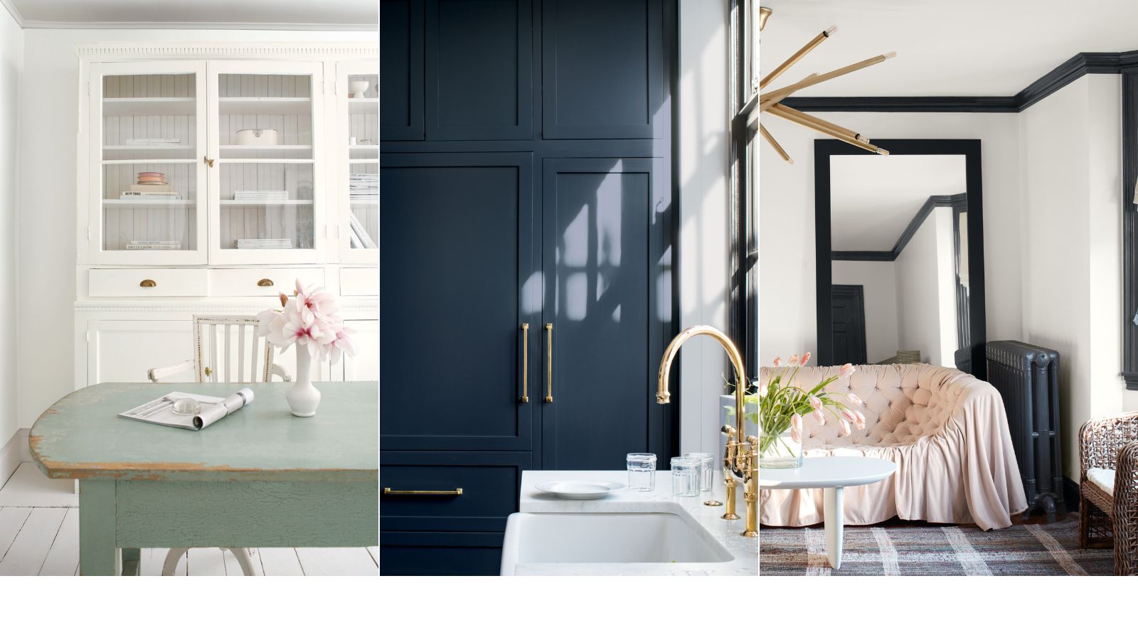
These are officially the best-selling Benjamin Moore paints of all time – unsurprisingly there's a lot of white
We spoke with Helen Shaw, Director of Marketing, at Benjamin Moore to get her insight into the brand's most popular paints in recent years

Design expertise in your inbox – from inspiring decorating ideas and beautiful celebrity homes to practical gardening advice and shopping round-ups.
You are now subscribed
Your newsletter sign-up was successful
Want to add more newsletters?
It's the time of year when everything is about looking forward. Predicting trends and deciding on our ins and outs for the year, however, while I am generally of the opinion it rarely helps to look back at what's past, I feel like with design trends there's an exception. Sometimes in order to see what's coming up you do need to look back.
This is particularly true with color trends. I find color trends to be a bit of a catch-22, these 'new' on-trend shades pop up all the time, but what's actually deciding on them? They tend to be a zeitgeist for a cultural moment - led so much by what we (and by we I mean those buying the paints) are loving and starting to use in our homes. So looking back at the best-selling paints over the last few years can tell us a lot about what's to come too - is there a slow resurgence in the love of pink, is gray on the rise again, is some random purple shade gaining traction?
So with this in mind, I spoke with Helen Shaw, director of marketing, at Benjamin Moore to find out about their best-selling paints and why she believes they are, and have been, so popular.
What are the best selling Benjamin Moore colors?
It may come as no surprise that topping the Benjamin Moore best sellers are a lot of white paints. Four of the seven Helen highlighted are all some form of white. But as Helen explains, 'Simple, clean and classic, the best white paint colors stand easily on their own as a design element or on ceilings and woodwork to harmonize with your chosen wall color, hence their popularity. They are versatile, timeless, and have the power to make a room feel spacious and fresh.'
And what about bolder shades? It's blues and greens that appear to be the most popular. We've seen both these shades be huge interior design trends in variating different tones, but they are clearly becoming classics too.
Here, Helen talks us through the best-sellers, why they are so loved, and how they can work best in your home.
1. Simply White
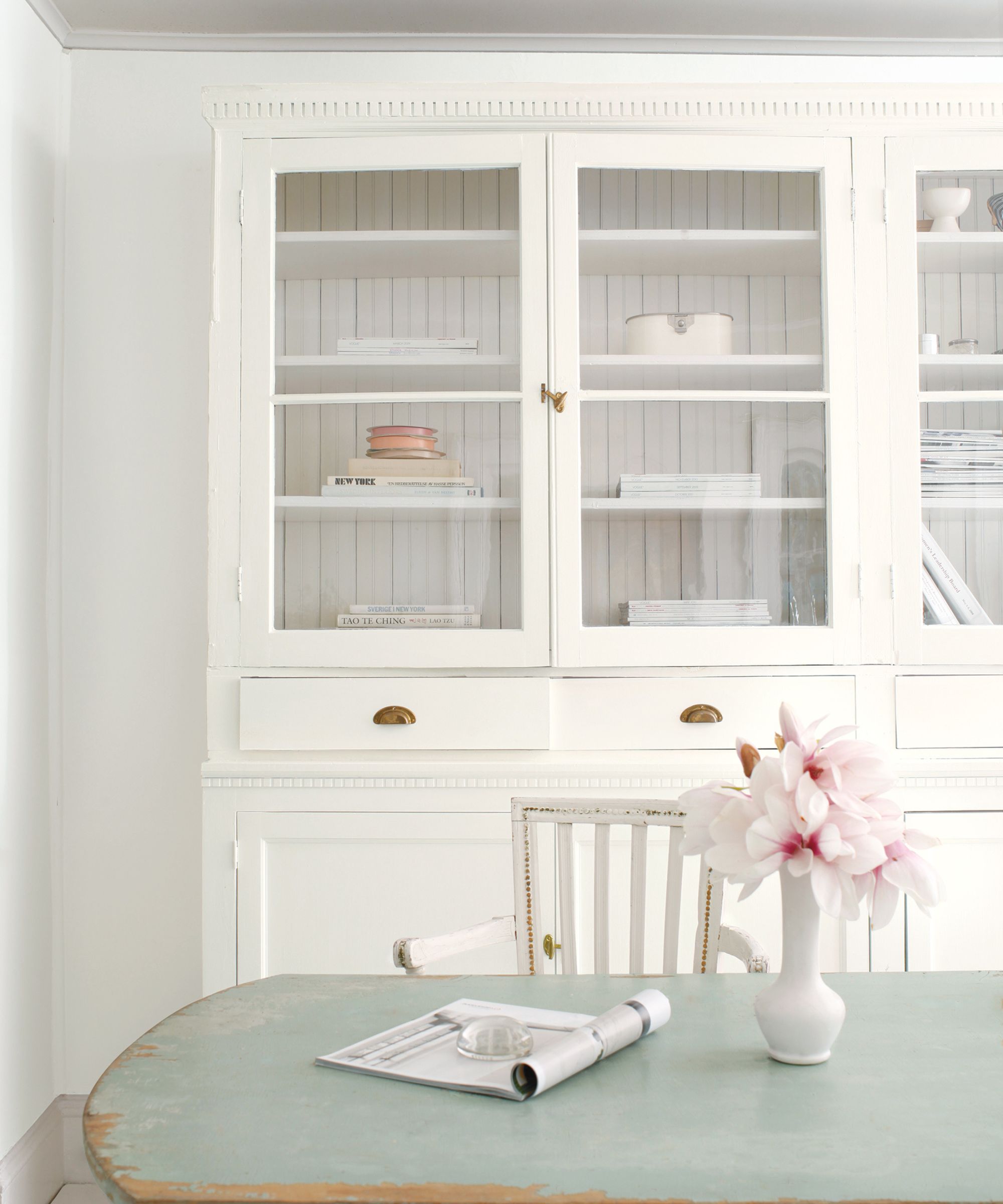
'Simply White OC-117 is a warm clean white with a subtle yellow undertone that makes spaces feel welcoming and sunny without looking too creamy. This hue is ideal for north-facing spaces or rooms without too much natural light because it is bright and uplifting due to its lack of grey pigments. The soft glow of Simply White works well as a woodwork or ceiling color when paired with a wall color with yellow, orange, and red undertones.'
Design expertise in your inbox – from inspiring decorating ideas and beautiful celebrity homes to practical gardening advice and shopping round-ups.
2. White Dove
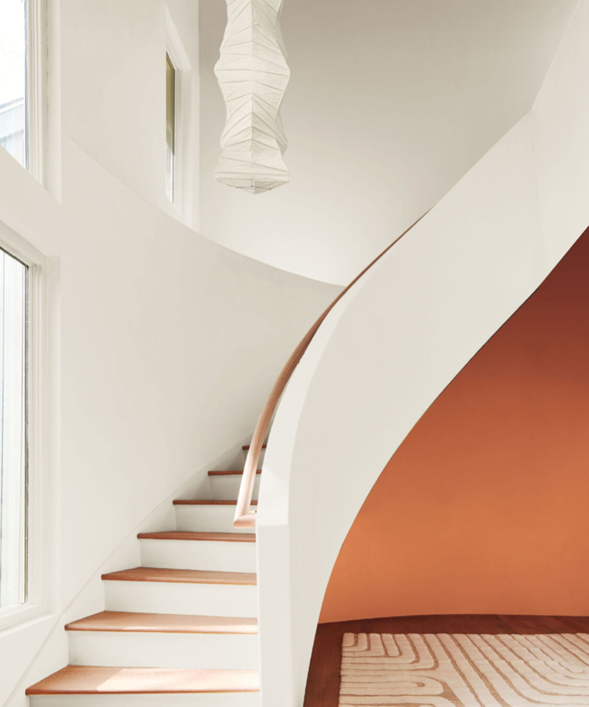
'In contrast, White Dove OC-17 is a warm muted white that has both grey and yellow undertones. This hue creates a more contemporary feel and is especially suited to spaces with a lot of natural light to create a soft, calming feel. Finish the look with natural colors and textures in throws, pillows, and fabrics.'
3. Chantilly Lace
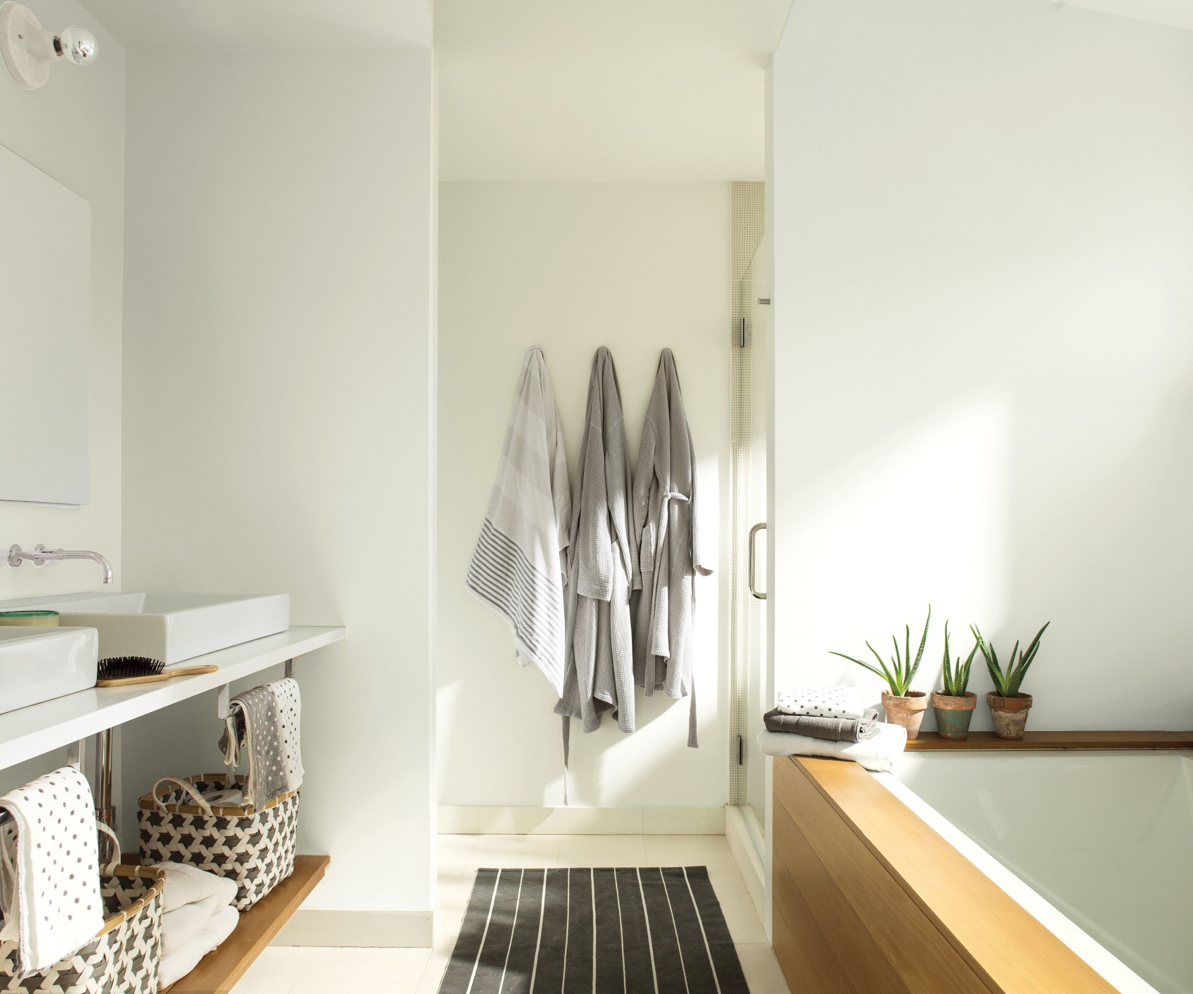
'Chantilly Lace OC-65 is the brightest white in the Benjamin Moore palette. This is a simple white with no cold blue undertones so common in other "brilliant whites" which make them feel stark. This pure aesthetic means Chantilly Lace is great for all-white spaces but it also sits comfortably with pretty much every other hue, so it is a safe choice for woodwork and ceilings, if you are uncertain what to choose.'
4. Swiss Coffee
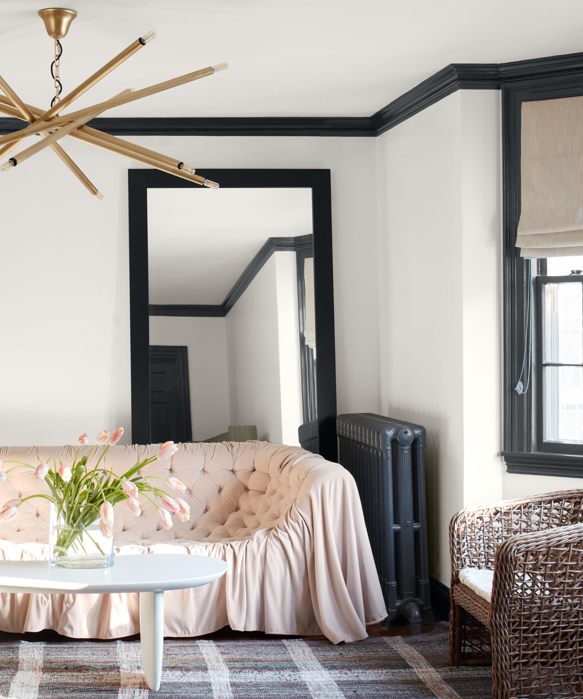
'Swiss Coffee OC-45 is an essential white with just the right amount of warmth. It is a popular choice for people looking to avoid the clinical feel of a pure brilliant white, while still creating a clean and understated look. This hue is very flattering in bathrooms as it brings a sense of softness to the space, contrasting hard elements such as tiles, mirrors and fixtures.'
5. Hale Navy
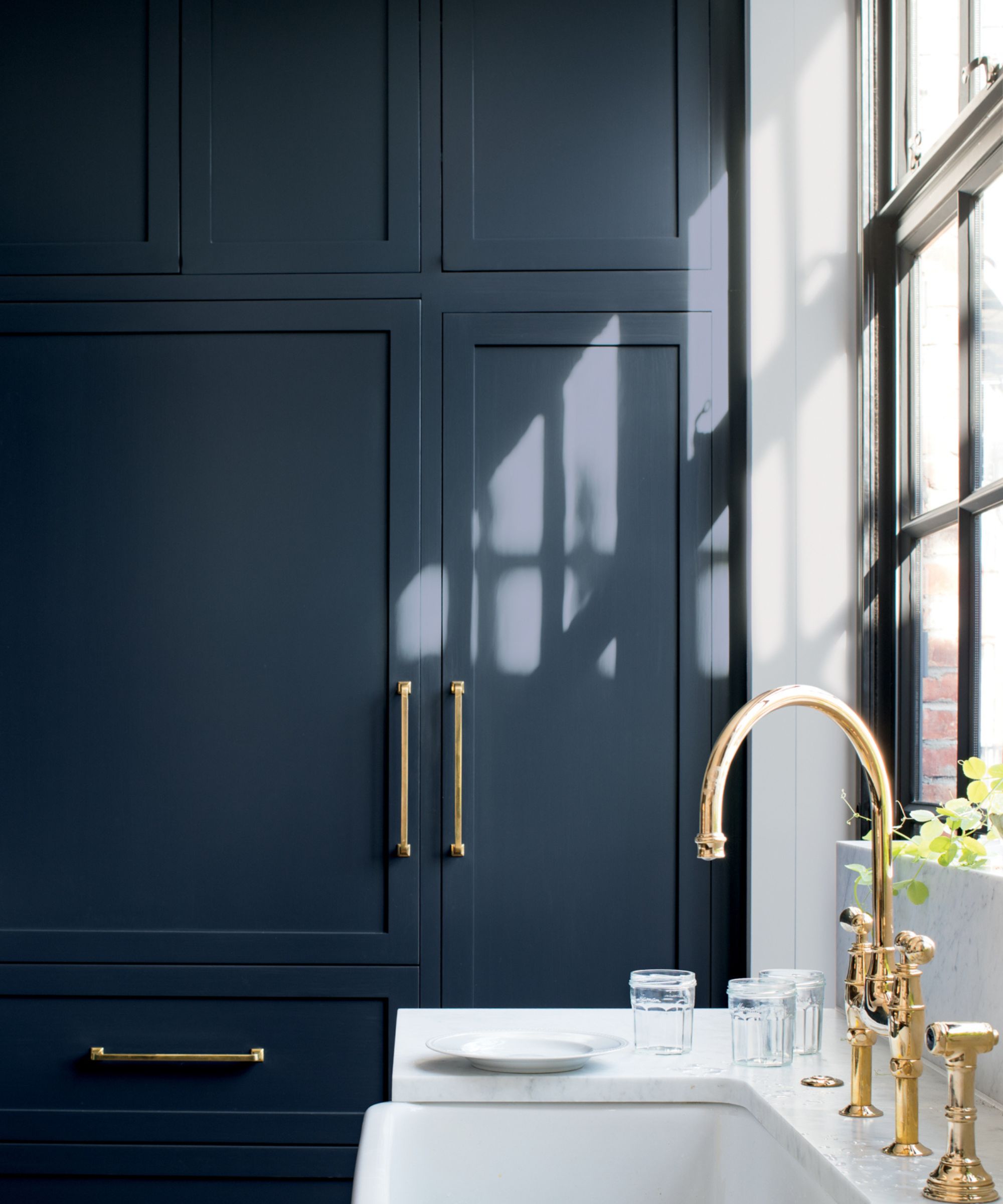
'Hale Navy HC-154 is hugely popular as people have started to adopt bolder shades in their homes. Decorating with Hale Navy works particularly well in busier spaces such as living rooms for making a versatile style statement, as well as in the kitchen, on cabinetry in particular, for industrial styles or more traditional Shaker designs. Pair this deep rich hue with a crisp white as the contrast between them creates a dramatic, yet calming effect.'
6. Revere Pewter
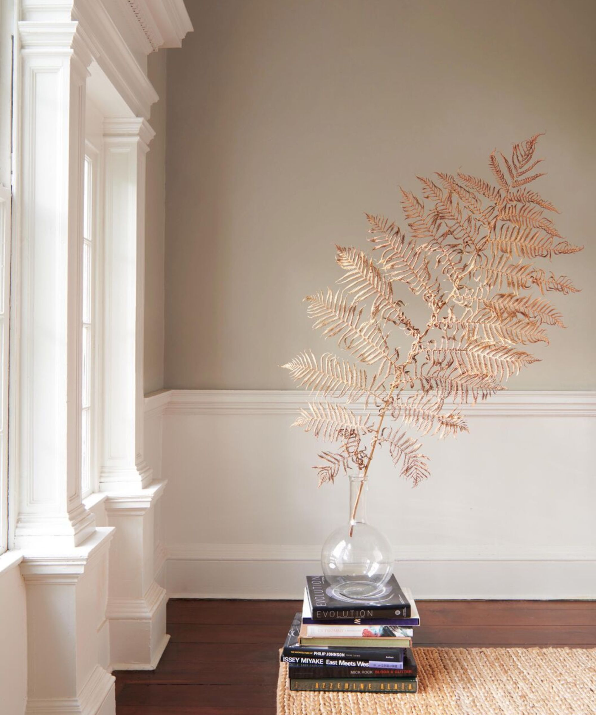
'Revere Pewter HC-172 is a versatile bridge between warm and cool tones and is fast becoming an iconic neutral. Grays can often feel a little lifeless, but this hue adds just enough warmth to make a room feel both contemporary and harmonious, and is versatile enough to work effortlessly with a range of accent colors and across any room in the house.'
7. Aegean Teal
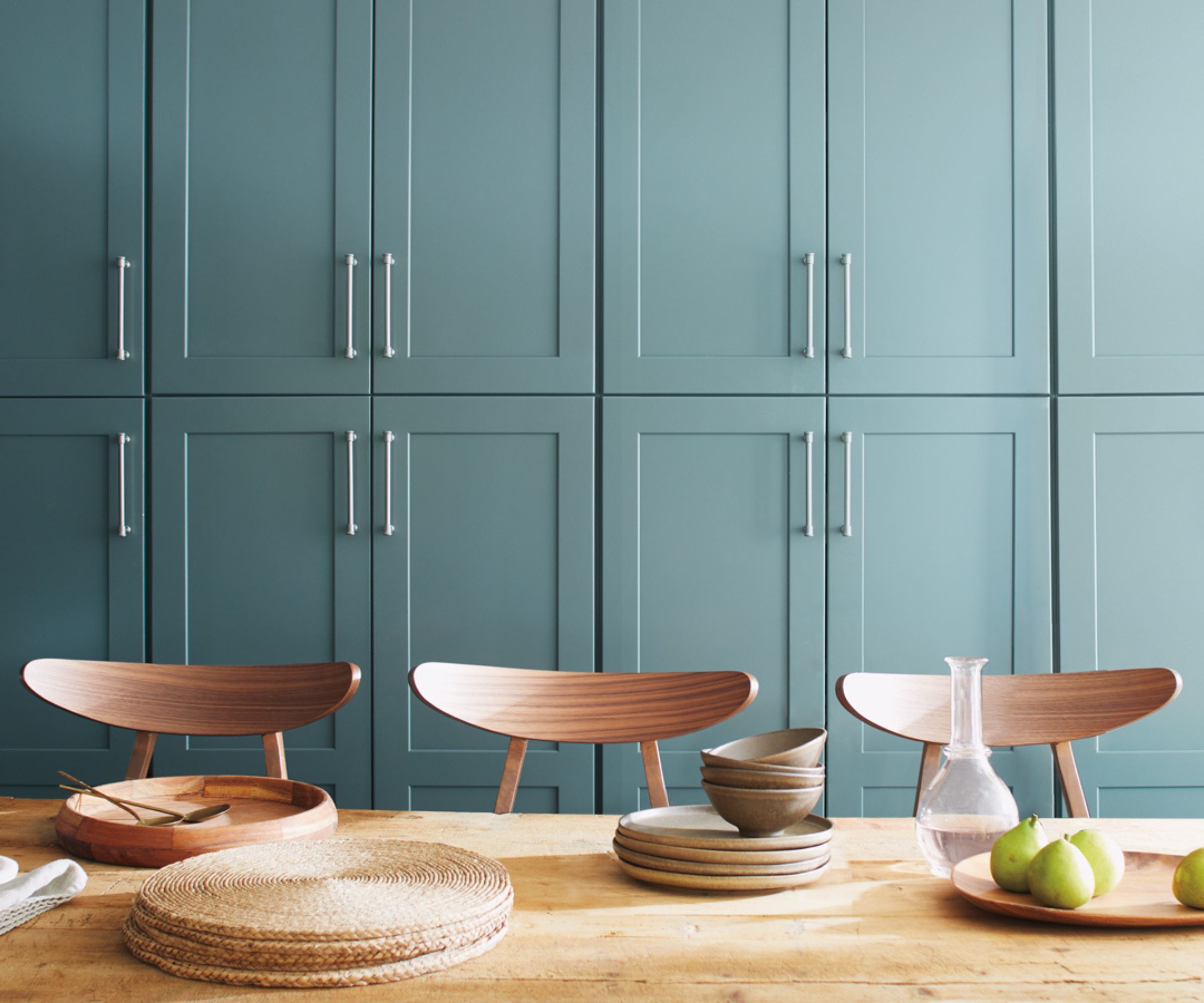
'Aegean Teal 2136-40's warmth and organic quality offers a casual elegance to a space. This mid-tone is a blend of blues, greens and grays and is liveable and approachable, making it suitable for all areas of the home.
Due to the natural, organic feel of the color, it works especially well on woodwork. Consider adding a splash of color to fitted furniture or shelving or painting wall paneling in this hue for added texture and depth in a room. For more of a statement look, paint the ceiling with Aegean Teal to create a cozy cocoon feeling in a bedroom or snug.'
Whites, a dark navy blue, and a teal make up Benjamin Moore's best-selling paints. What that's telling me for the year ahead is that color trends may come and go this year but white, in some form or another will always be on trend, and when it actually comes to being bolder with color, it's blues and greens that tempt homeowners the most.

I am the Head of Interiors at Homes & Gardens. I started off in the world of journalism in fashion and luxury travel and then landed my first interiors role at Real Homes and have been in the world of interior design ever since. Prior to my role at H&G I was the digital editor at Livingetc, from which I took a sabbatical to travel in my self-converted van (not as glamorous as decorating a home, but very satisfying). A year later, and with lots of technical DIY lessons learned I am back to writing and editing, sometimes even from the comfort of my home on wheels.