14 on-trend purple paints approved by interiors designers to use in 2025
From rich and moody purples to uplifting mid-tones, these are amongst the best purple paints
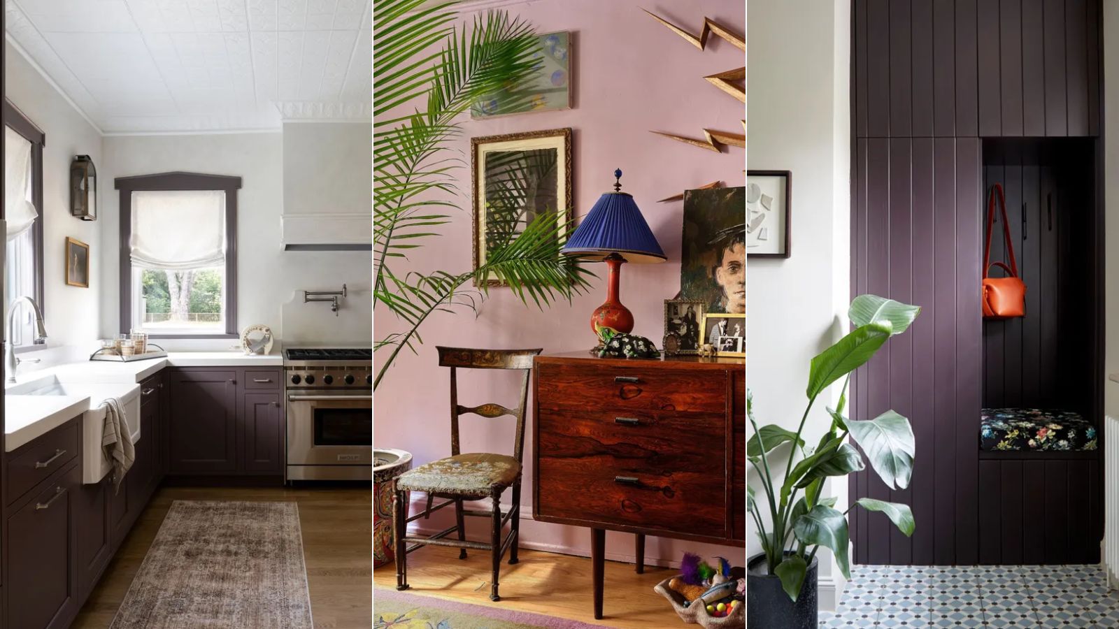
- Amazon Soil, Benjamin Moore
- Brassica, Farrow & Ball
- Adventurer, Little Greene
- Beach Plum, Benjamin Moore
- Brinjal, Farrow & Ball
- Cinnamon Slate, Benjamin Moore
- Pontefract, Paint & Paper Library
- Wet Concrete, Benjamin Moore
- Pelt, Farrow & Ball
- Iced Lavender, Benjamin Moore
- Peignoir, Farrow & Ball
- Sugared Almond, Farrow & Ball
- Caponata, Benjamin Moore
- Iris Bliss, Benjamin Moore

If you're up to date with the latest color trends, then you'll be well acquainted with the resurgence of purple in recent months. Coming to the fore through many leading paint brands' Color of the Year announcements, purple is expected to be big in 2025.
When incorporating this nostalgic, statement-making hue into your own home, decorating with purple paint colors is the best way to go all in. From dark and moody purple paints to softer lilacs, there's a wide range to choose from depending on your interior design style.
To help you navigate the paint-choosing process, we've rounded up the best purple paints below, as recommended by interior designers.
Best purple paints: 14 picks from interior designers
Including shades from leading paint brands such as Benjamin Moore, Farrow & Ball, and Little Greene, there are plenty of purple paint ideas below to inspire your next decorating project.
Amazon Soil, Benjamin Moore
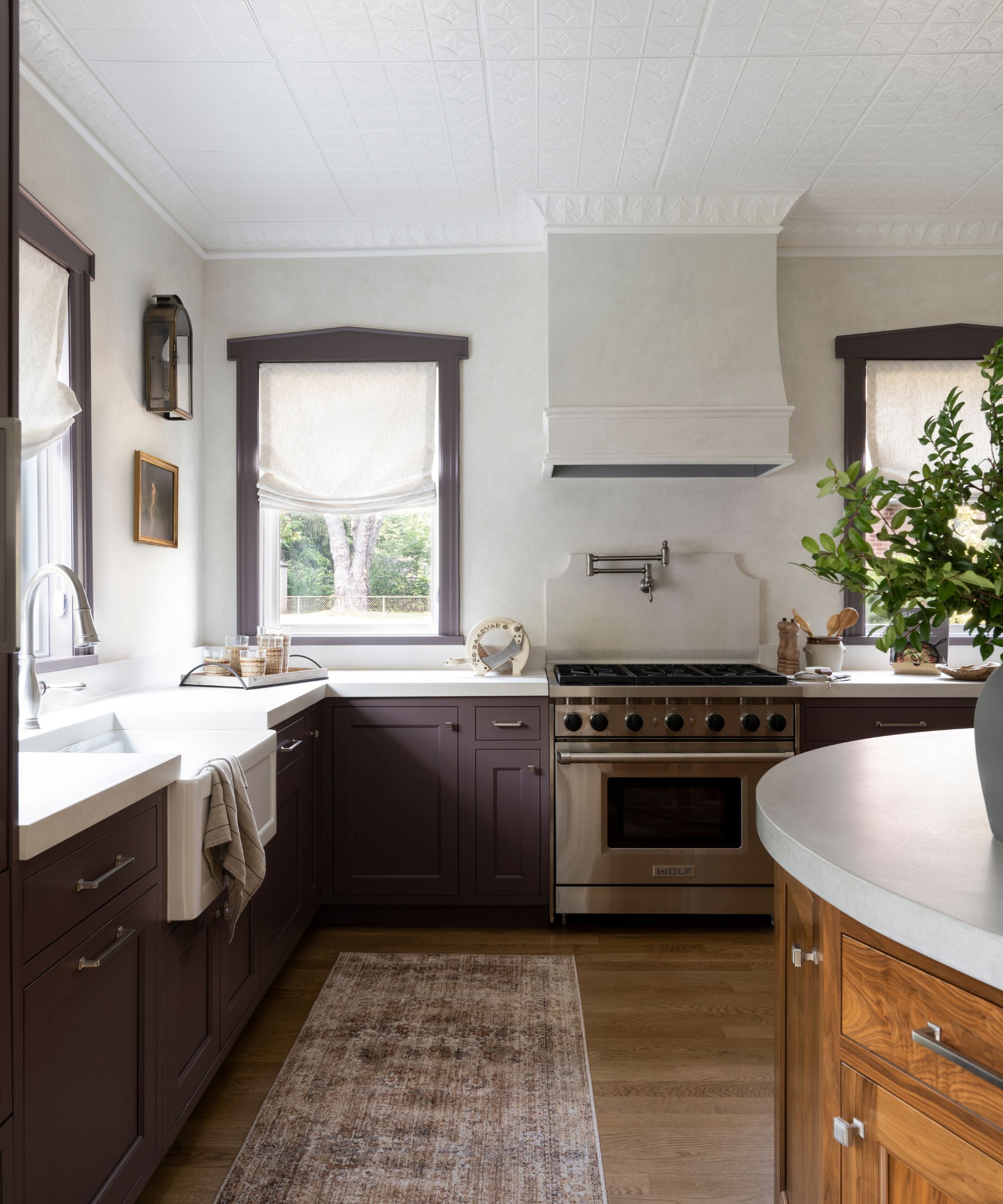
A favorite purple paint for designer Jaclyn Isaac of Doni Douglas Design is Benjamin Moore's Amazon Soil.
'It's more than just a color – it’s a mood,' says Jaclyn. 'It’s grounding yet vibrant, calming yet stimulating, and feels like a perfect balance between a sophisticated palette and liveable design. The richness of the shade gives it a luxurious feel, but it’s still subtle enough to be used in larger quantities without overwhelming the senses. Unlike many purples that can feel too vibrant or overwhelming, Amazon Soil doesn’t scream for attention but instead creates an inviting and cozy atmosphere, especially in this kitchen that houses eight on a daily basis.'
Brassica, Farrow & Ball
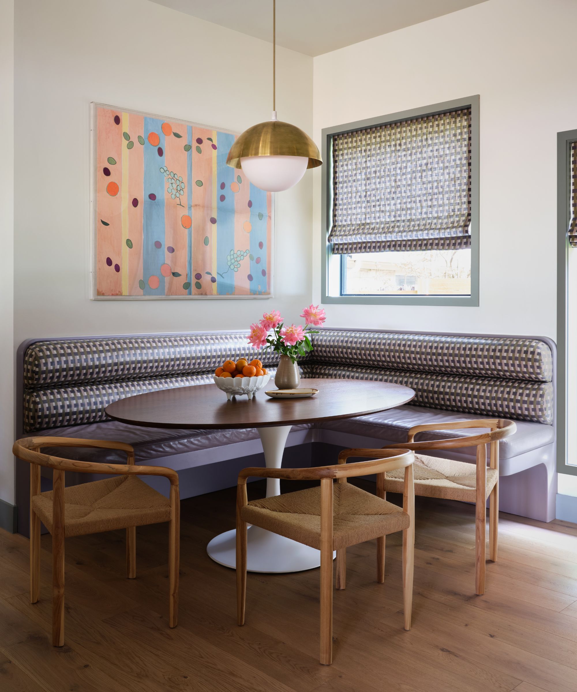
'I love Farrow and Ball's Brassica,' shares interior designer Annie Downing of Annie Downing Interiors. 'It’s subtle, sophisticated, and pairs beautifully with a wide range of colors, from ochre to deep emerald.'
'I love how it feels both grounded and a little whimsical, and it can definitely serve as a neutral. I used it on a dining banquette, paired with a matching leather seat and fabric with similar hues.'
Adventurer, Little Greene
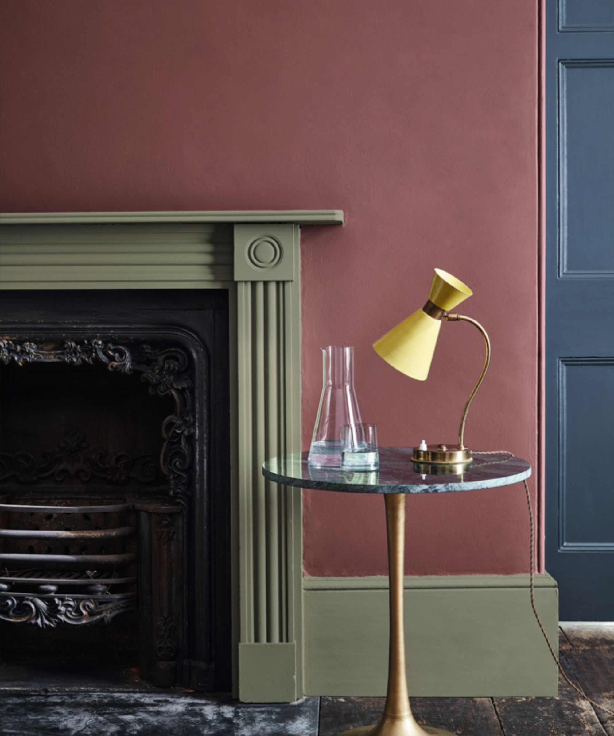
'Little Greene's Adventurer is my favorite purple,' says Hannah Goldberg, founder and principal of Hannah Charlotte Interiors.
'It is the perfect balance of plum and aubergine,' the designer adds. 'Bright enough to bring energy and vibrancy to a room while being earthy enough to bring calm and intimacy.'
Here, Adventurer is used on the wall, teamed with Little Greene's Sage Green on the fireplace and Hicks' Blue on the door.
Beach Plum, Benjamin Moore
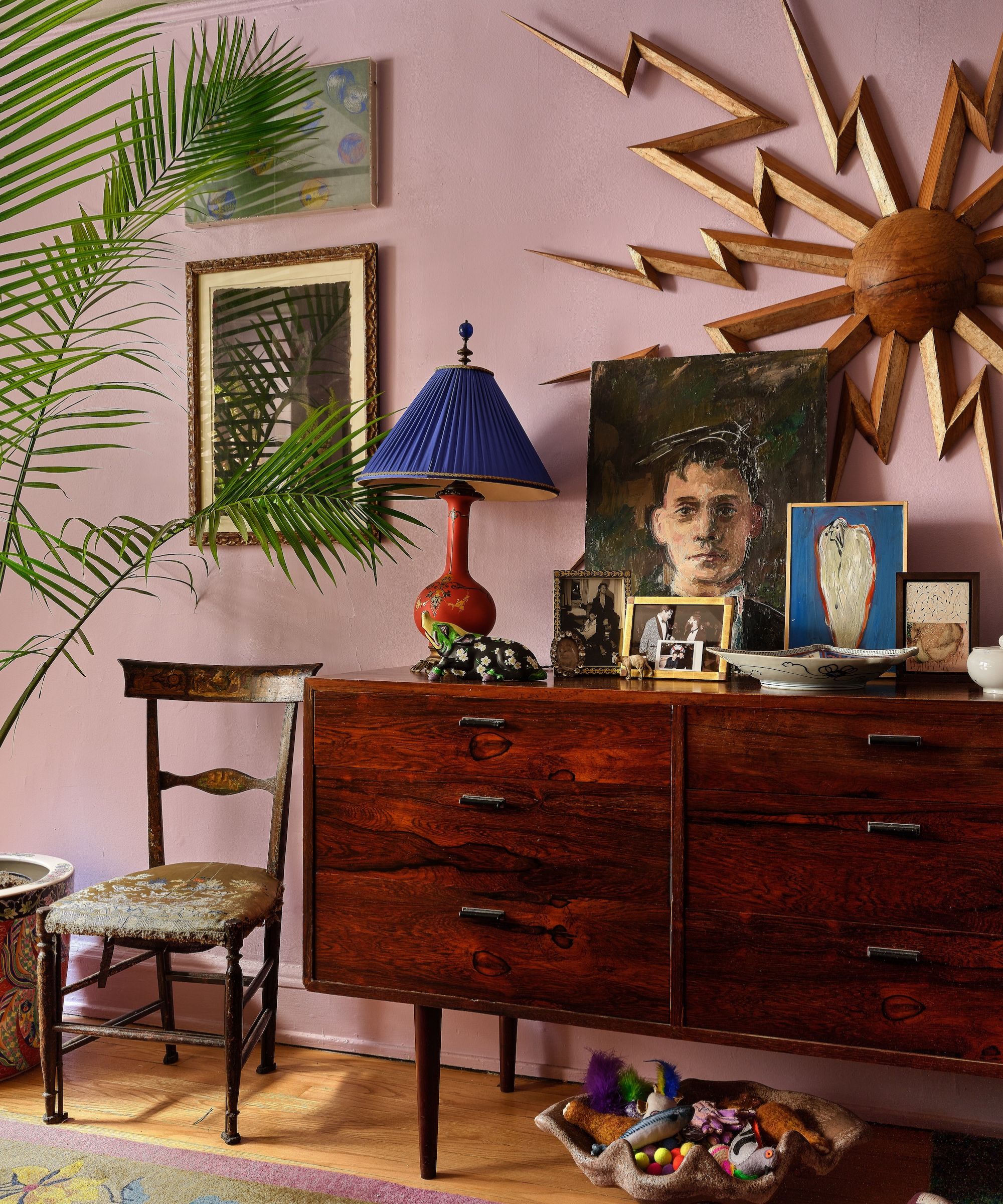
If you're looking for light purple paint, consider Benjamin Moore's Beach Plum, as seen on the walls in this maximalist living room.
'I love many shades but lilac is probably my favorite,' says William Cullum, senior designer at Jayne Design Studio. 'In my apartment, I used Benjamin Moore’s Beach Plum for our living room. It’s a frothy lilac color. I love the Victorian period and you see this color used frequently in design from that era. It's warmer than blue but cooler than most pinks and feels spring-like.'
Brinjal, Farrow & Ball
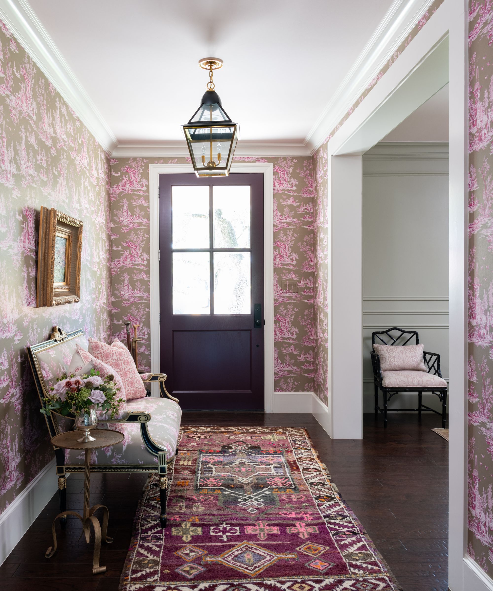
Bambi A’Lynn Interior Design
'My absolute favorite shade of purple paint is Brinjal by Farrow & Ball,' shares interior designer Bambi A’Lynn Bratton of Bambi A’Lynn Interior Design.
A rich and sophisticated purple paint, Brinjal is a good way to go for a grown-up take on the purple trend that avoids feeling too lively. 'It’s perfect for blending in or making a statement – I like to use it on a front door for a pop of color,' Bambi adds.
Cinnamon Slate, Benjamin Moore
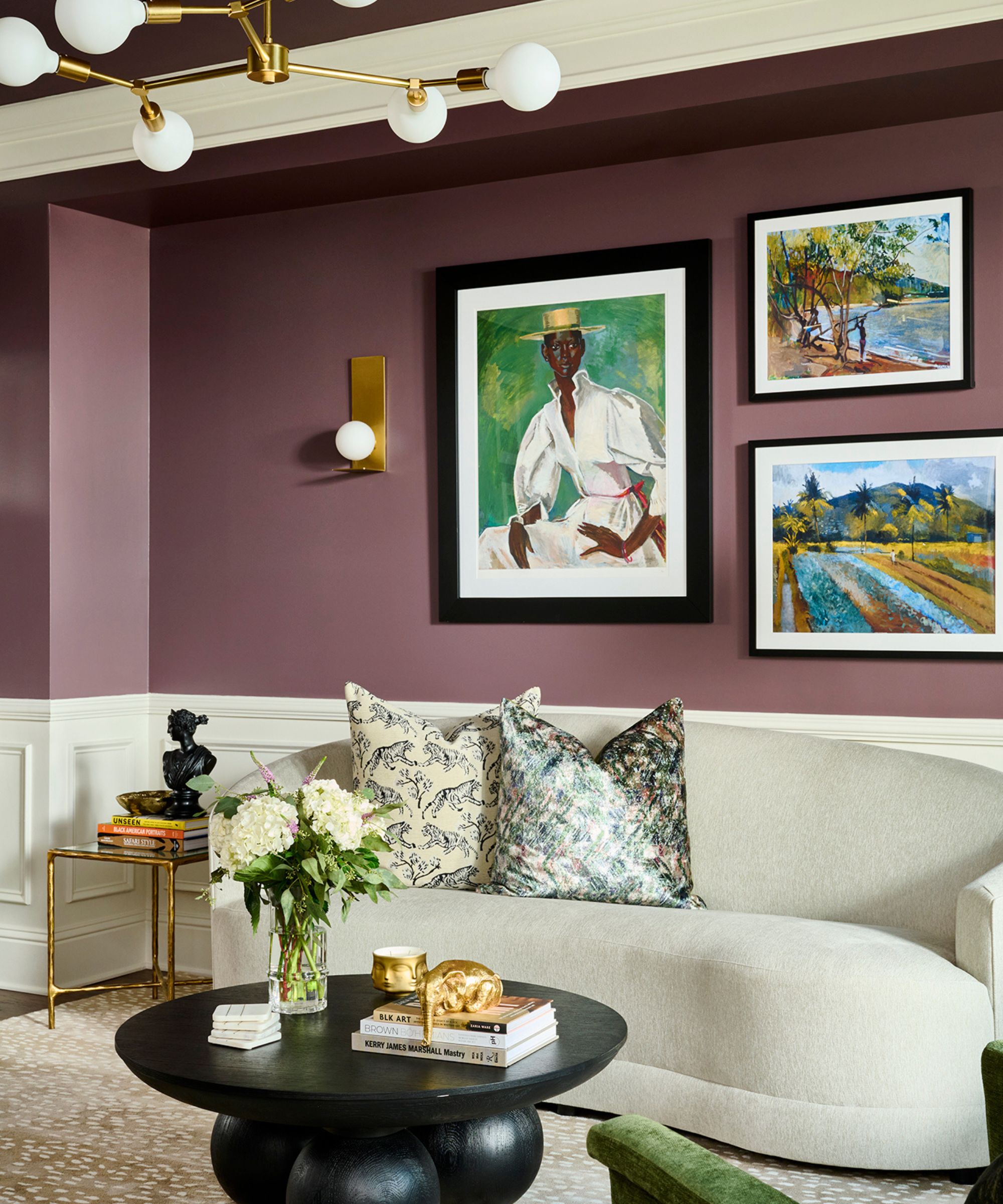
Benjamin Moore's 2025 Color of the Year – it's no surprise to hear of the appeal amongst designers for Cinnamon Slate.
This is a favorite purple paint for designer Amber Guyton of Blessed Little Bungalow, who says: 'I love purple hues that are serene and inviting. I think purple can get a bad rap as too bold sometimes, but you don't have to go as strong as Barney the Dinosaur. Seek out versions of purple that evoke the senses while adding a beautiful pop of color.'
Cinnamon Slate is also a top pick for designer Vyanca Soto of Market Studio Interiors, who adds: 'Its warm undertones pair beautifully with brass accents, walnut furniture, or leather elements. This color is bold yet refined, striking the perfect balance between modern trends and enduring style.'
Pontefract, Paint & Paper Library
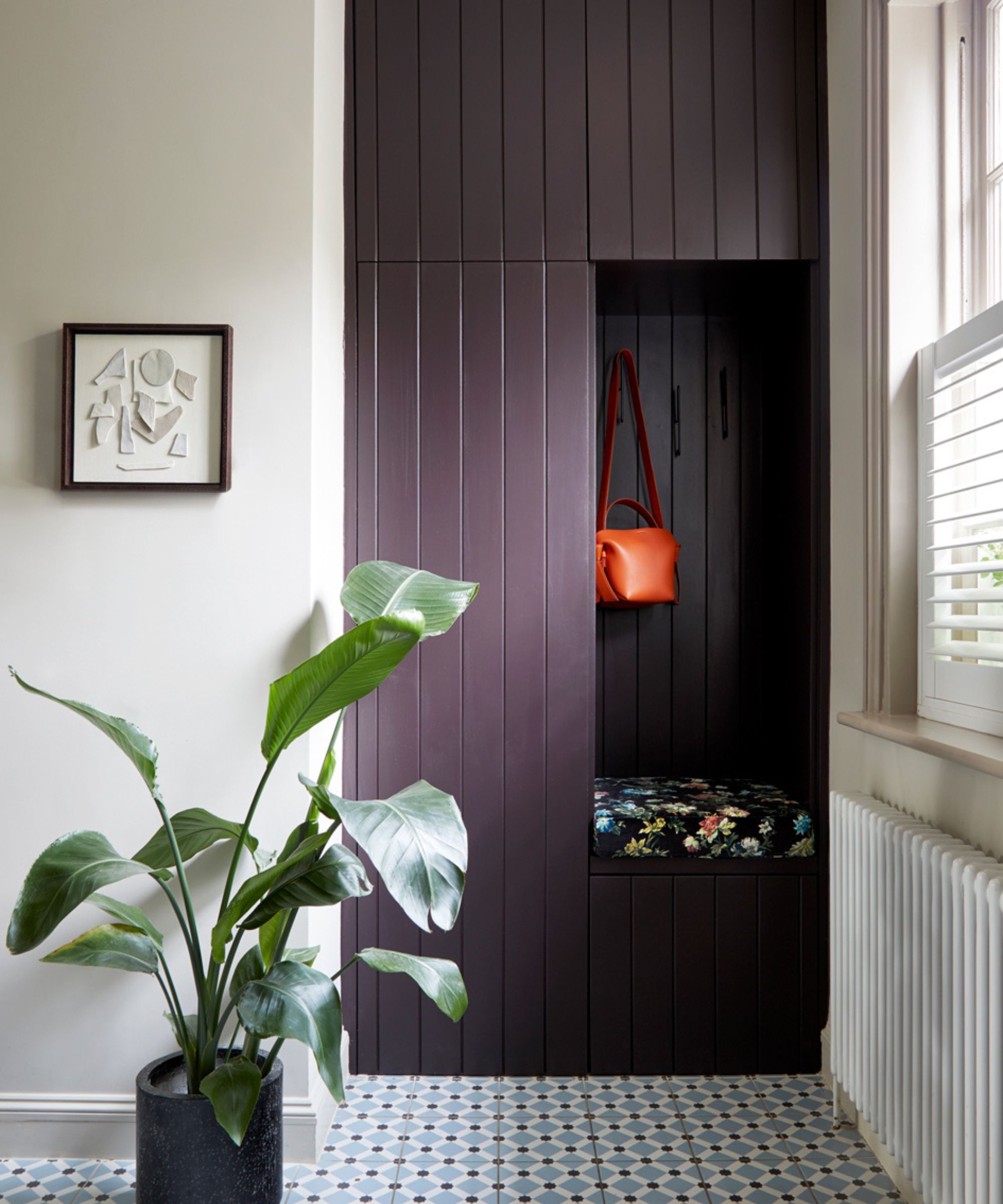
A New Day Interior Design Studio
Dark purple paints are an excellent way to add drama to a space while boasting a timeless and liveable feel.
'Pontefract by Paint & Paper Library is a really beautiful color – it's purple but with real warmth and drama,' says Andrew Griffiths, founder of A New Day Design. 'I love an earthy color palette and this shade mixes really well with wood tones and dirty pinks for a chic and sophisticated look. It's also a great color to bring definition to a space as it's dark and can look quite dramatic, but when the light hits it there is a really pretty softness to it.'
Wet Concrete, Benjamin Moore
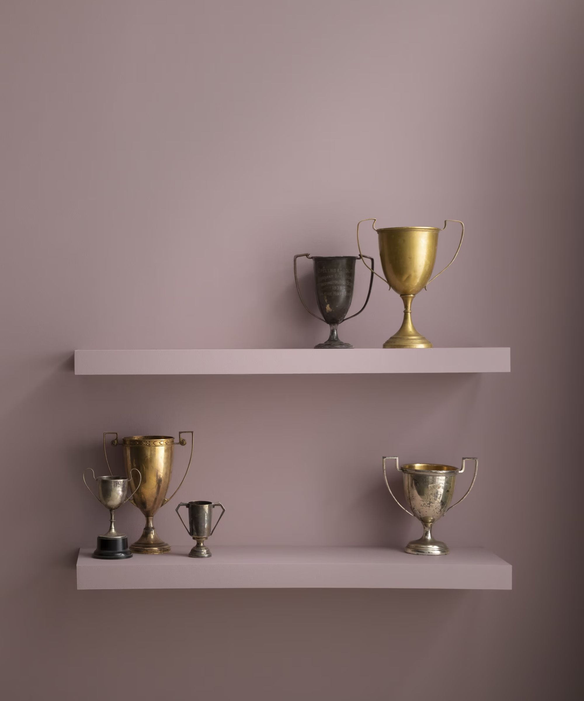
Decorating with mauve is a stylish way to embrace the purple trend while ensuring a grounding, soothing feel in the home, and Benjamin Moore's Wet Concrete is a recommended paint color.
'My go-to purple is Benjamin Moore's Wet Concrete,' says designer Cheryl Clendenon of In Detail Interiors. 'Its warm, earthy undertones and neutral base make it incredibly versatile and it doesn’t fall flat despite its lower light reflective value. It’s the kind of purple that feels modern yet timeless and is perfect for creating a subtle, moody ambiance.'
Pelt, Farrow & Ball
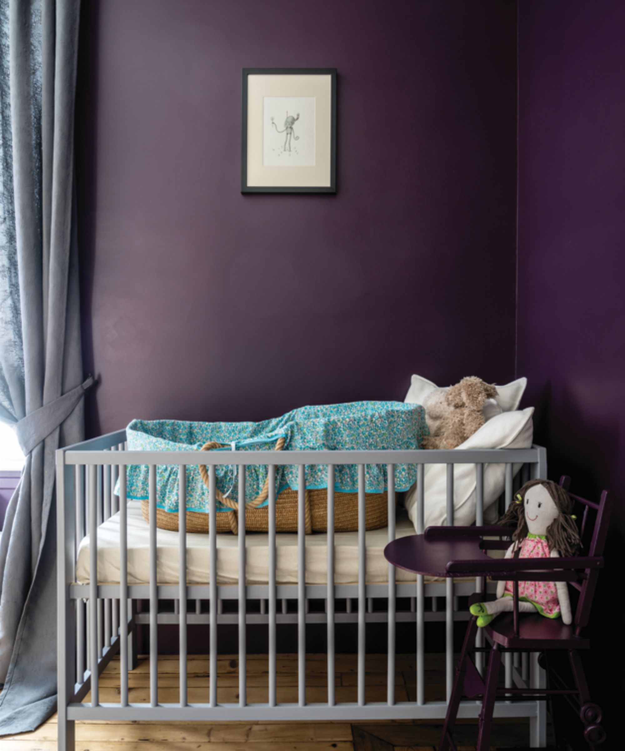
Another recommended dark purple paint is Farrow & Ball's Pelt which has a moody and opulent feel, as seen here in this nursery room.
'Farrow & Ball's Pelt is the most delicious, deep aubergine you could ever imagine,' shares interior designer Sara Malek Barney of BANDD/DESIGN. 'It never reads too clownish and is so sophisticated. I have seen it turn purple haters into purple lovers.'
Iced Lavender, Benjamin Moore
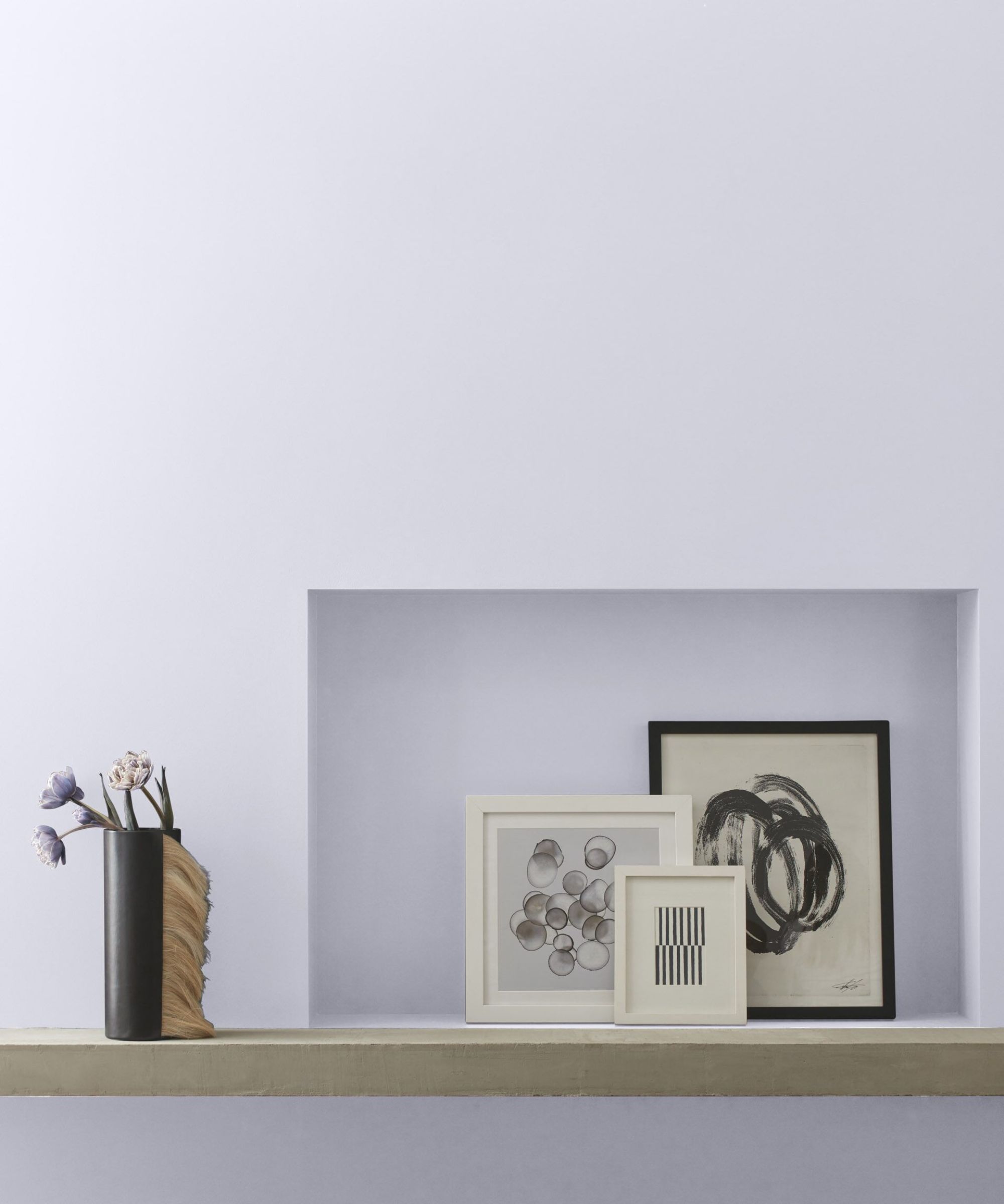
'I love the subtle elegance of Iced Lavender from Benjamin Moore,' says interior designer Kathy Kuo.
'This icy purple is honestly almost a neutral because it's very light and versatile, but there's just enough regal purple showing through to make it really special. I love the idea of using this color as a way to add intrigue to an unexpected space in the home, like a foyer, powder room, or stairwell.'
Peignoir, Farrow & Ball
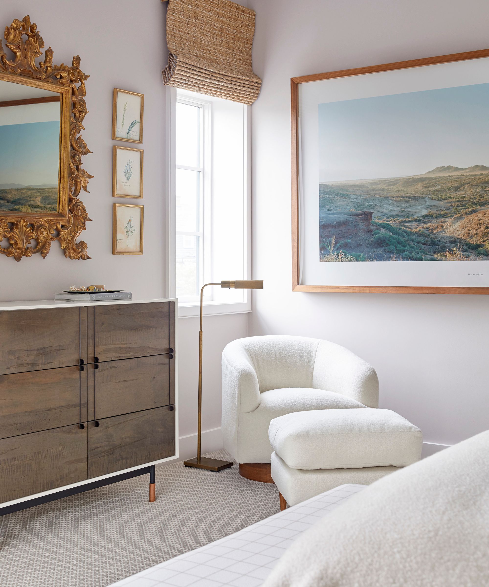
Another light purple paint is Peignoir by Farrow & Ball which feels dusky and soothing.
'This is a light color and very soothing and calm in a bedroom, but it has a lot of depth and nuance so it never feels saccharine,' explains interior designer Colleen Simonds. 'Purple and lavender paints without depth can feel juvenile, but this one never does – it's always chic and always grown up. It's also not overly feminine – in some lights, it feels gray; in some lights, it feels lavender – and it works with so many other colors and palettes.'
Sugared Almond, Farrow & Ball
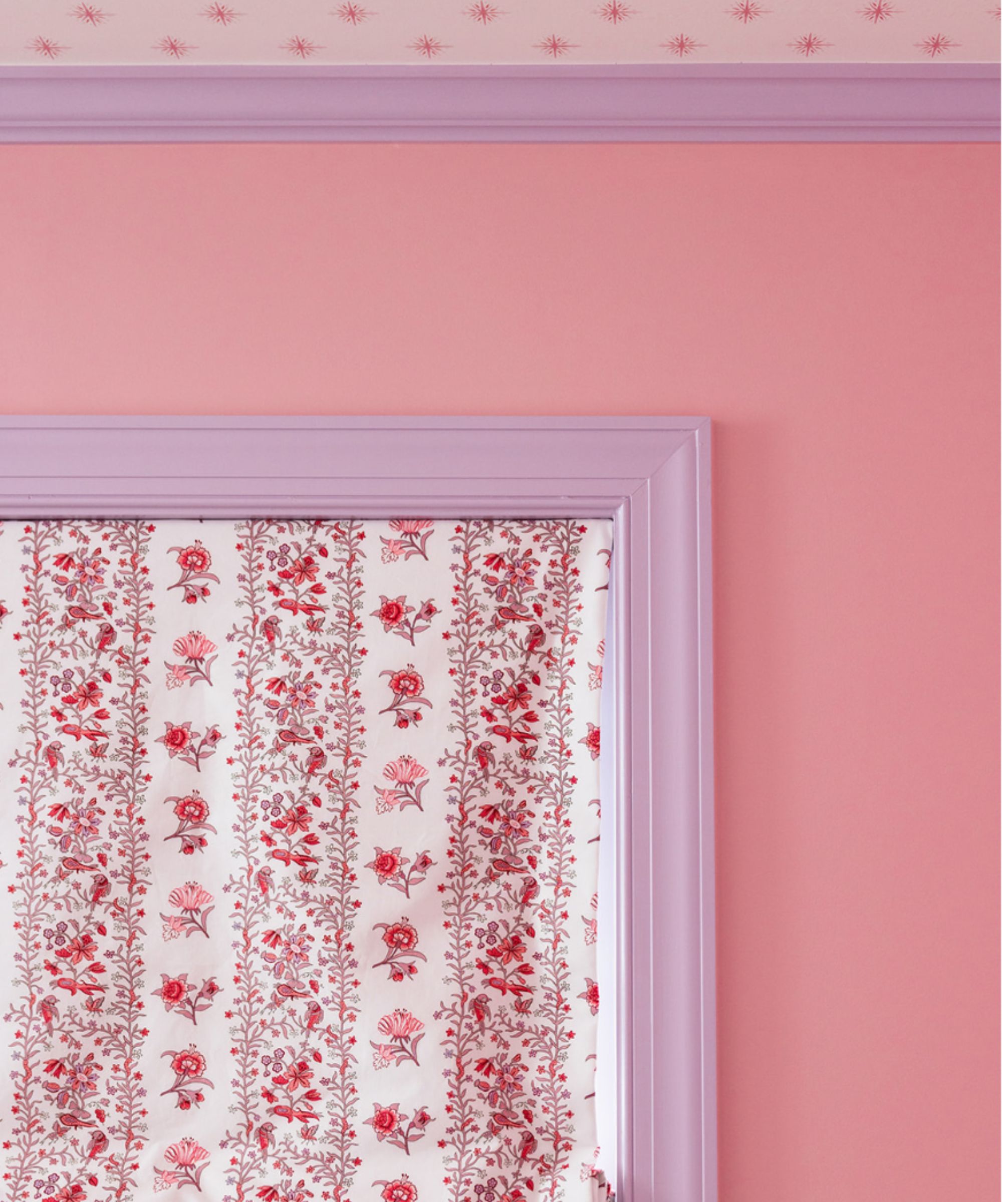
'Sugared Almond by Farrow & Ball is my favorite lilac,' shares interior designer Alexis Warren. 'It is light and airy enough to blend with other colors and patterns without overpowering them.'
'I find that purples can tend to outshine other colors in a space but the blue undertone in Sugared Almond prevents this from happening. This color has a beautiful powder purple finish that makes it feel soft and refreshing, even in bedrooms!'
Caponata, Benjamin Moore
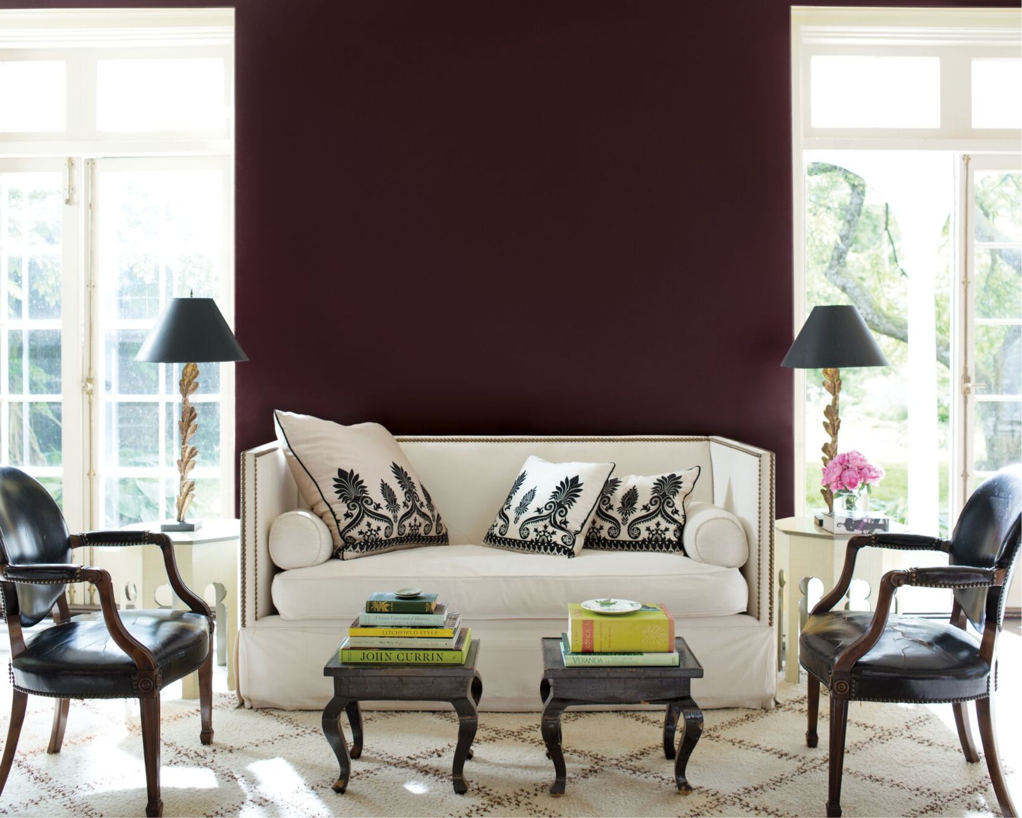
A much richer purple paint is Benjamin Moore's Caponata which is a deep and dark brown paint with purple tones. In this living room, it is used as an accent wall to add drama to the otherwise neutral color palette.
Interior designer Elizabeth Bolognino remarks on this paint color, adding that 'it has enough brown in it to make it sophisticated, but enough purple to make it interesting'.
Iris Bliss, Benjamin Moore
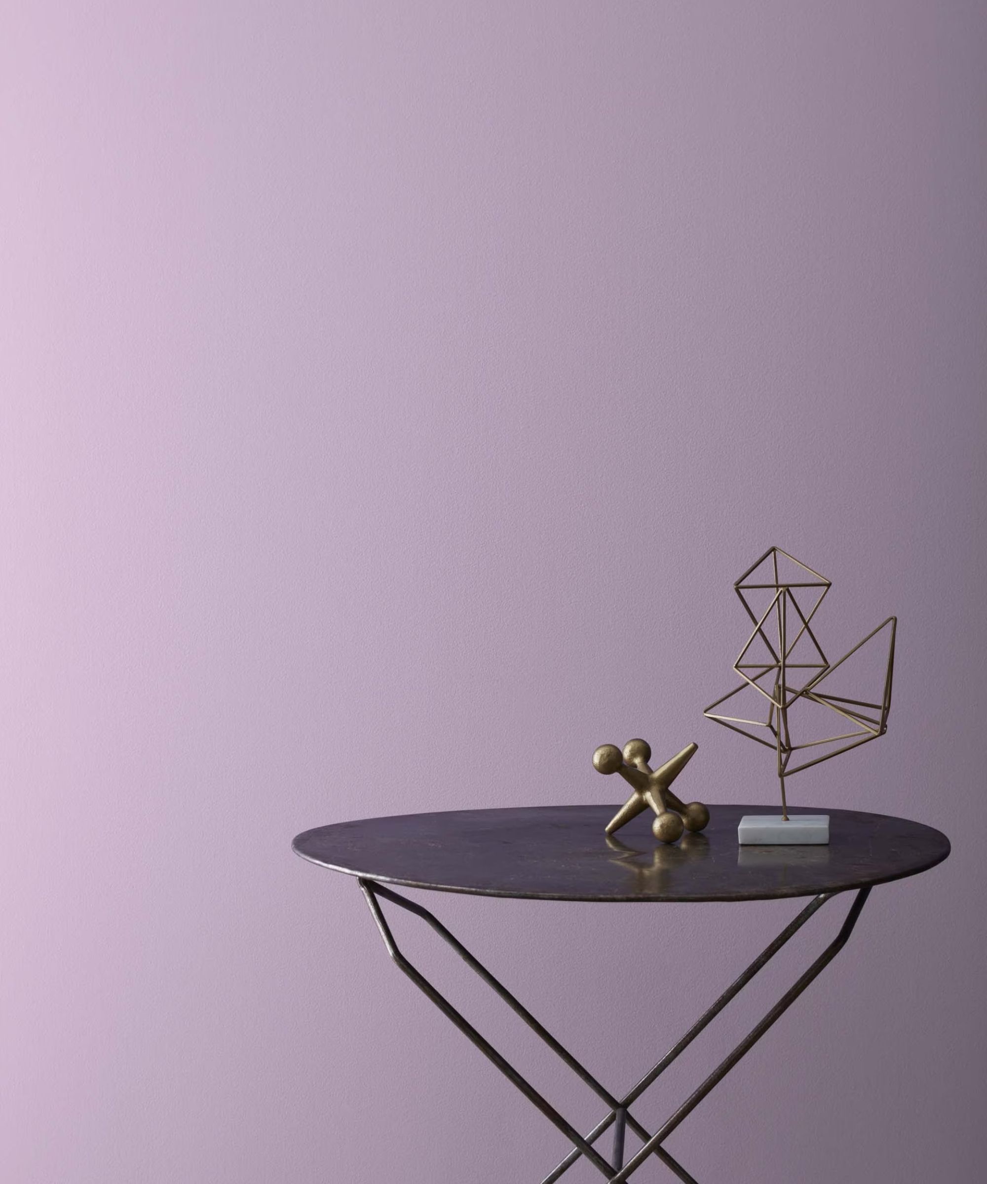
Lastly, Iris Bliss by Benjamin Moore is an uplifting mid-tone purple that feels instantly cheerful. It's a favorite of interior designer Nadia Watts, who explains:
'Iris Bliss is a mid-tone violet that works with just about everything. Not too light, not too dark; not too red, not too blue. Iris Bliss elegantly walks the line between bold and relaxing – it’s calming and enveloping and also makes a statement.'
From light to dark; muted to saturated, there are plenty of purple paints to choose from depending on the look you wish to create. Whichever you're most drawn to, make sure to test out paint colors as swatches before committing to ensure it's right for your space.
Sign up to the Homes & Gardens newsletter
Design expertise in your inbox – from inspiring decorating ideas and beautiful celebrity homes to practical gardening advice and shopping round-ups.

Emily is a freelance interior design writer based in Scotland. Prior to going freelance in the spring of 2025, Emily was Homes & Gardens’ Paint & Color Editor, covering all things color across interiors and home decor for the Homes & Gardens website. Having gained specific expertise in this area, Emily is well-versed in writing about the latest color trends and is passionate about helping homeowners understand the importance of color psychology in home design. Her own interior design style reflects the simplicity of mid-century design and she loves sourcing vintage furniture finds for her tenement flat.
-
 How to grow impatiens – garden experts reveal the secrets to growing this shade-tolerant, sparkling summer plant
Both 'Busy Lizzie' and 'New Guinea' impatiens can thrive in shady yards
By Ellen Wells Published
-
 Charli XCX's dining room is a 'treasure-trove' of one-of-a-kind pieces – it's the most unique hosting space I've ever seen (and surprisingly replicable)
The singer's Tudor-style dining room features eclectic furnishings, a mix of patterns and bright colors that all work together beautifully
By Hannah Ziegler Published