These are the best off-white paints according to interior designers – 10 perfectly balanced shades for a light and airy home
Discover the best off-white paints from Benjamin Moore, Farrow & Ball, and more
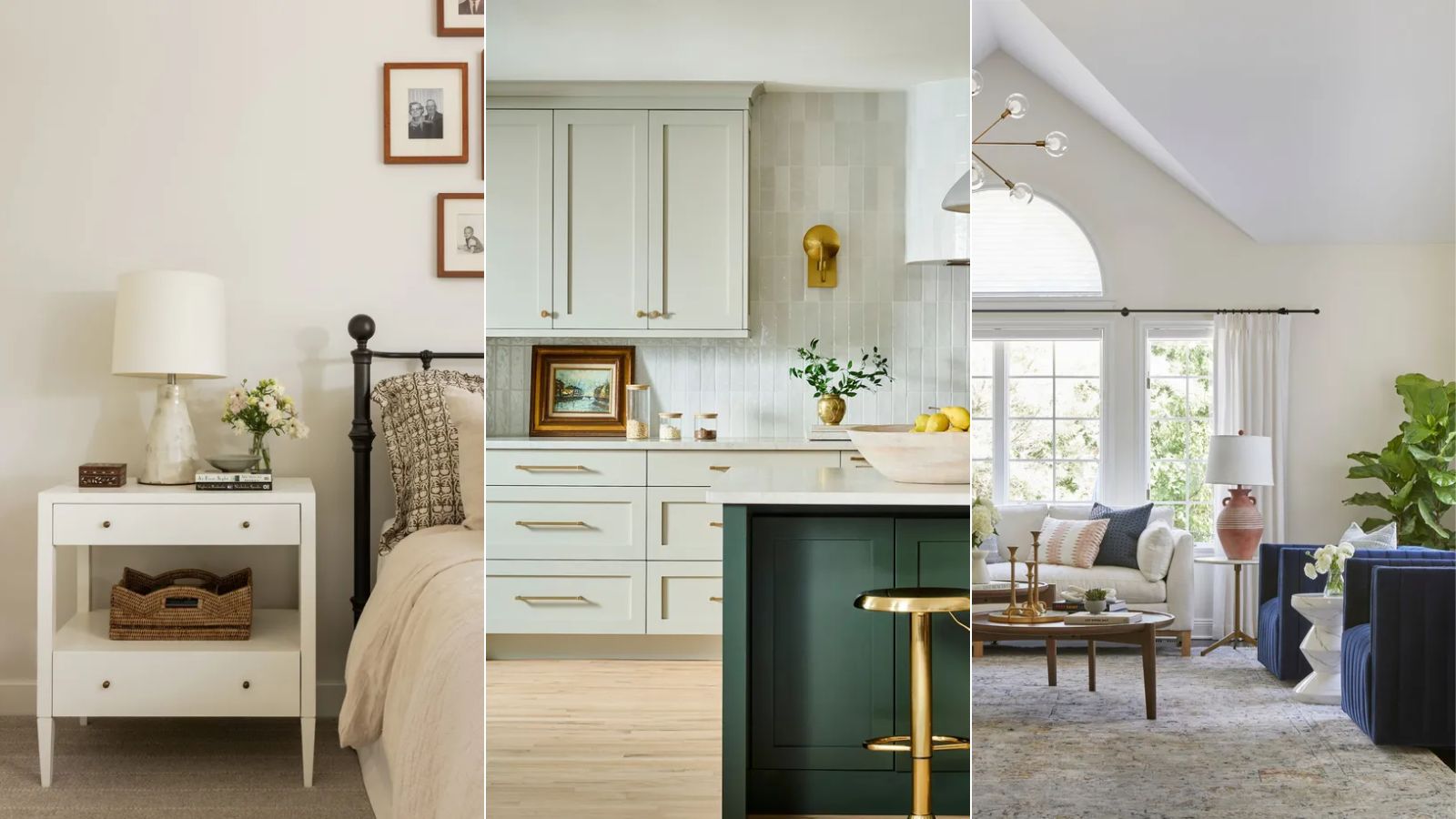
- 1. Linen Wash, Little Greene
- 2. Shaded White, Farrow & Ball
- 3. China White, Benjamin Moore
- 4. Cloud Cover, Benjamin Moore
- 5. Simply White, Benjamin Moore
- 6. School House White, Farrow & Ball
- 7. Alabaster, Sherwin-Williams
- 8. Mountain Peak White, Benjamin Moore
- 9. White Dove, Benjamin Moore
- 10. Slate I, Paint & Paper Library

The task of finding the right white paint for your home can be complex, with so many options each with varying undertones and intensities. While harsh white paints that lack warmth have fallen out of favor, off-white paints allow for a light and airy scheme with enough depth to feel inviting.
But what are the best off-white paints out there? We asked a selection of interior designers to get their verdict, who share 10 favorite picks below. If you're looking for a balanced hue to master decorating with white, read on.
'The right off-white is never just off-white, it’s about undertone, balance, and how it reacts to the natural light of the space,' says interior designer Melissa Read, creative director at Studio Burntwood.
1. Linen Wash, Little Greene
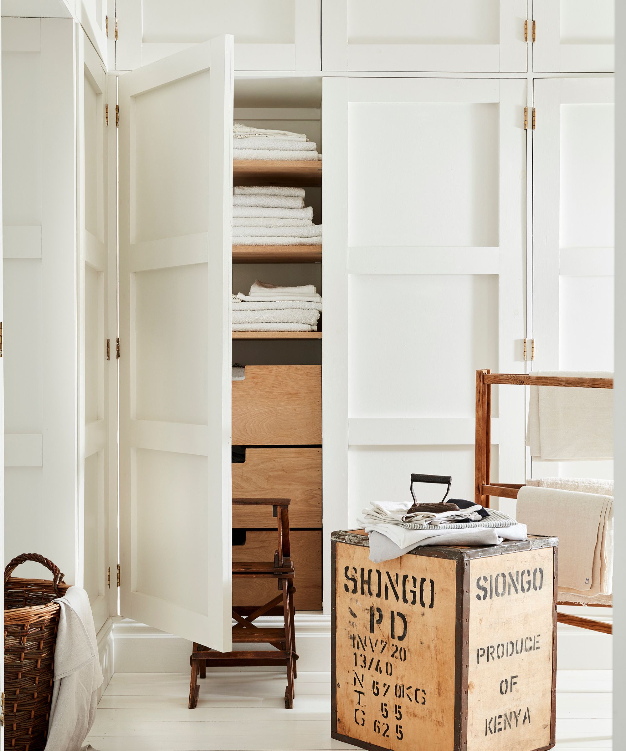
'Linen Wash by Little Greene carries an undertone of taupe, grounding it just enough to feel lived-in rather than pristine,' explains designer Melissa Read.
'It’s particularly effective in bedrooms and sitting rooms where you want an inviting but refined atmosphere. Pair it with natural linen, natural wood, and antique brass for a scheme that feels curated. In terms of finishes, I'd opt for Intelligent Matt for a beautifully flat yet durable finish on walls, and eggshell on woodwork for that seamless feel,' Melissa adds.

When you want to create a light and airy look without your space feeling cold or flat, Linen Wash makes a great choice with its gentle undertones.
2. Shaded White, Farrow & Ball
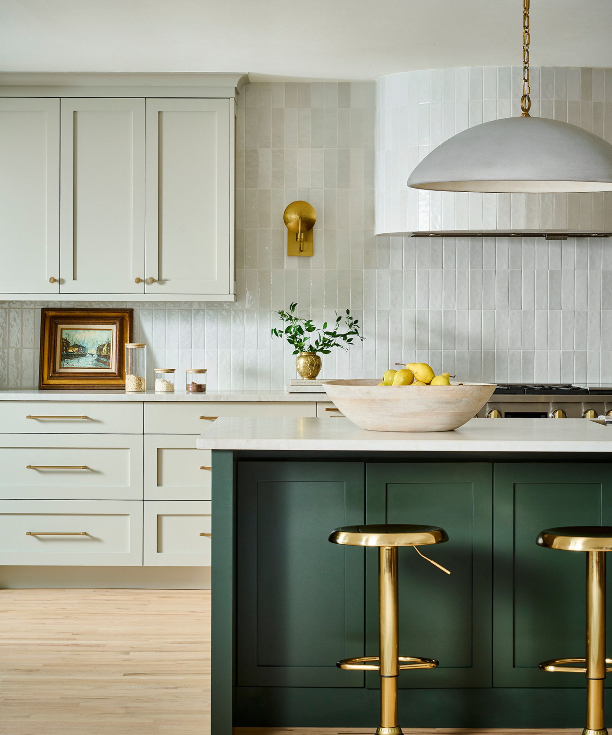
'Farrow & Ball's Shaded White is a soft off-white that works well when you want a subtle paint color that doesn't fall flat or feel too stark,' shares Gabriela Eisenhart, founder and principal designer at Silo Studios.
'We use it a lot on kitchen and bathroom cabinets, as it strikes a great balance with crisp white walls. It also works really well as a wall color, creating a muted soft canvas that's a great base for layering,' Gabriela says.

Shaded White is less of a white and more of a light neutral, with tones of gray and beige for a balanced scheme.
3. China White, Benjamin Moore
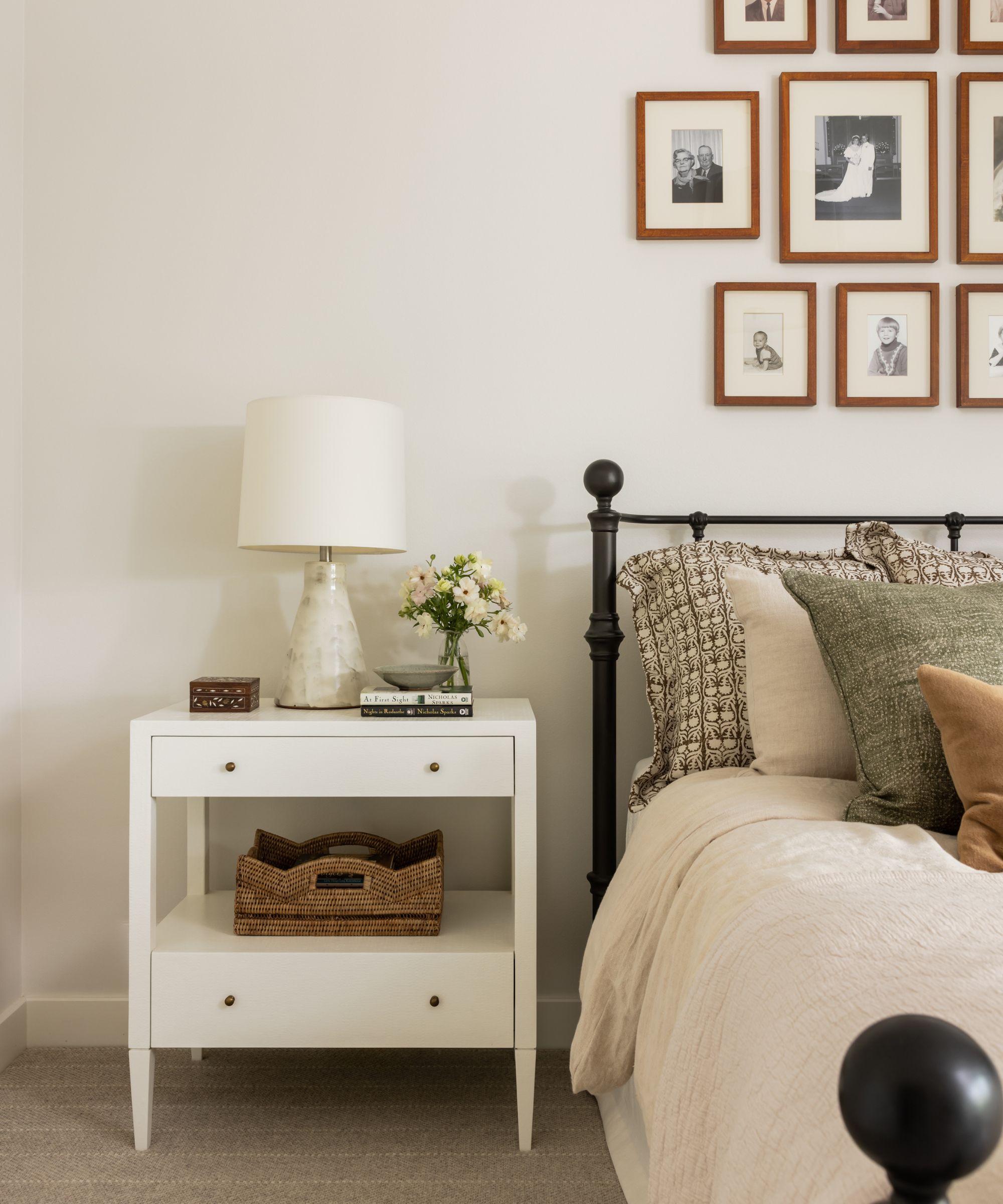
If you're looking for an off-white paint that leans cooler in tone, Benjamin Moore's China White is worth exploring – a favorite for designer Janna McCalley of Janna McCalley Interiors.
Janna describes this paint color as 'a fresh white with just a little gray in it' which 'works nicely on walls and allows you to layer other shades of white into the space on trim, furniture, and accents.'

If you're looking for an off-white that leans cooler in tone, consider trying China White by Benjamin Moore.
4. Cloud Cover, Benjamin Moore
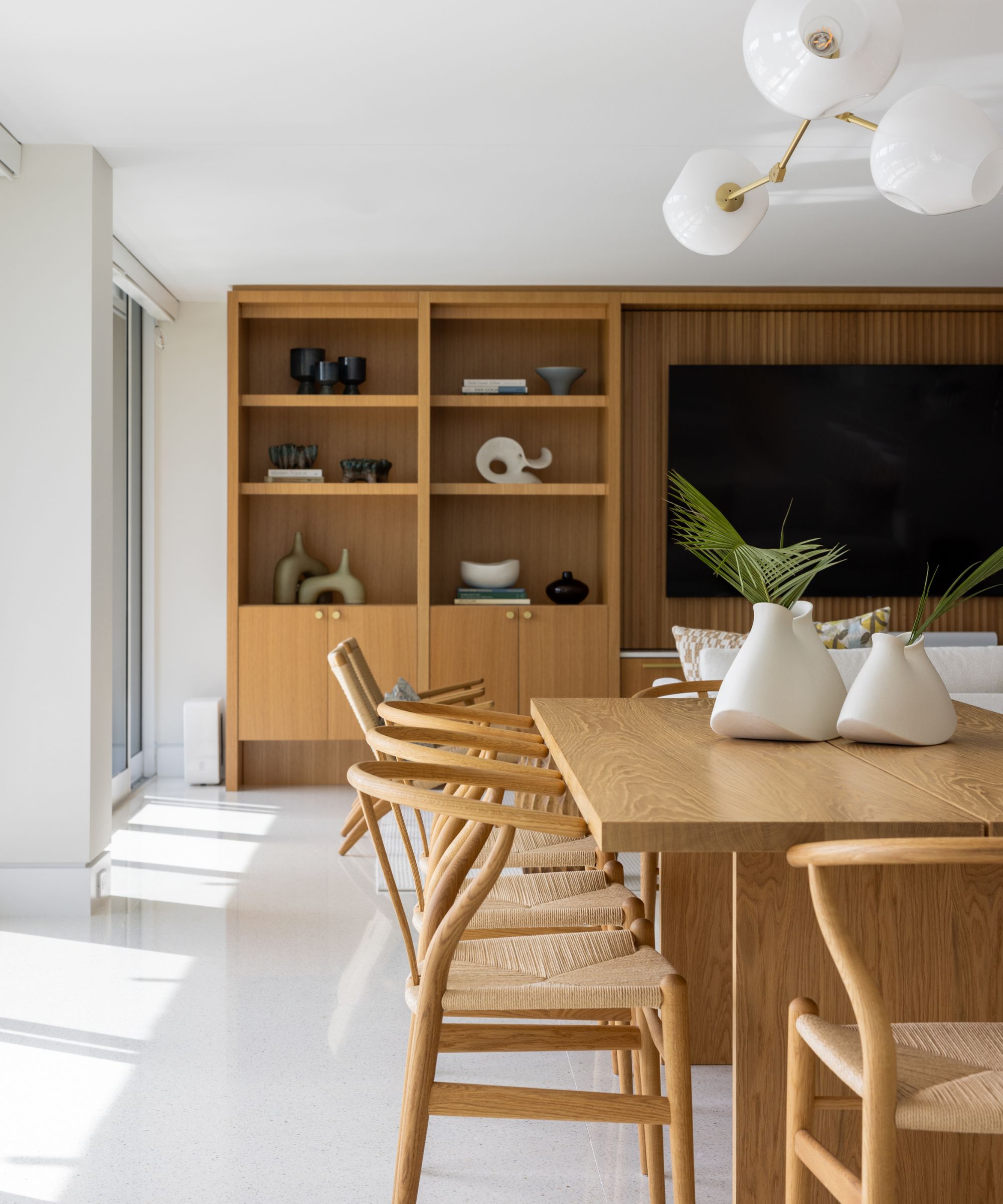
Another favorite off-white paint for designer Janna McCalley is Benjamin Moore's Cloud Cover which features subtle gray tones. Janna describes Cloud Cover as 'a soft white with a minimal undertone that doesn't read too cool or warm. This color works equally well in spaces with lots of natural light and interior rooms that have no natural light,' she adds.

Cloud Cover by Benjamin Moore is another slightly cool white that works as a versatile white paint.
5. Simply White, Benjamin Moore
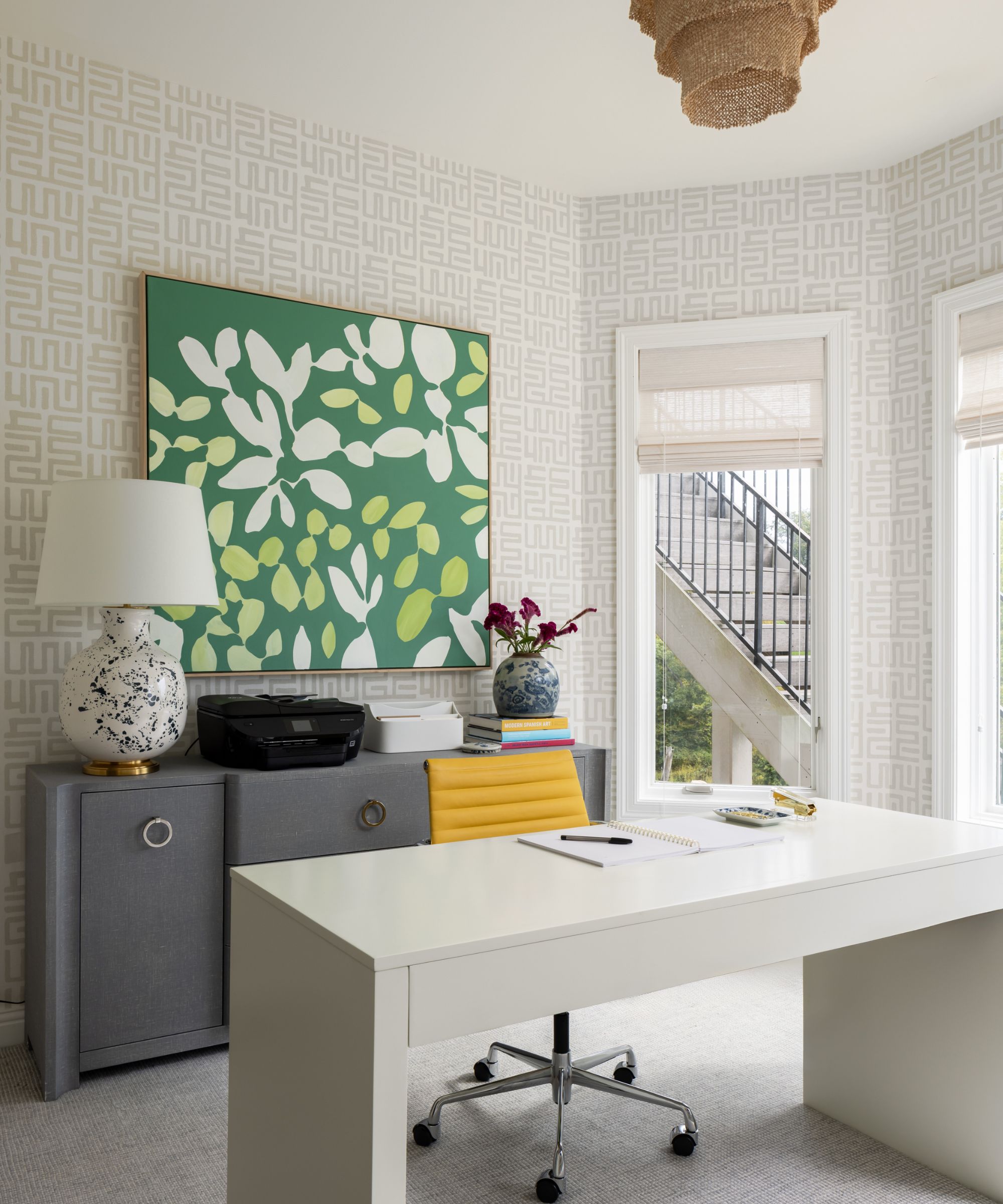
One of Benjamin Moore's best white paints, Simply White is a crisp white paint with subtle warm tones. Janna McCalley says that it has 'a hint of warmth but still works when you want it to feel clean and crisp with wallpaper.'
'It's a great white for trim work or in a space like a bathroom with cooler marble tiles and porcelain plumbing fixtures,' the designer adds.

Benjamin Moore's Simply White has subtle warm undertones which give it a welcoming feel.
6. School House White, Farrow & Ball
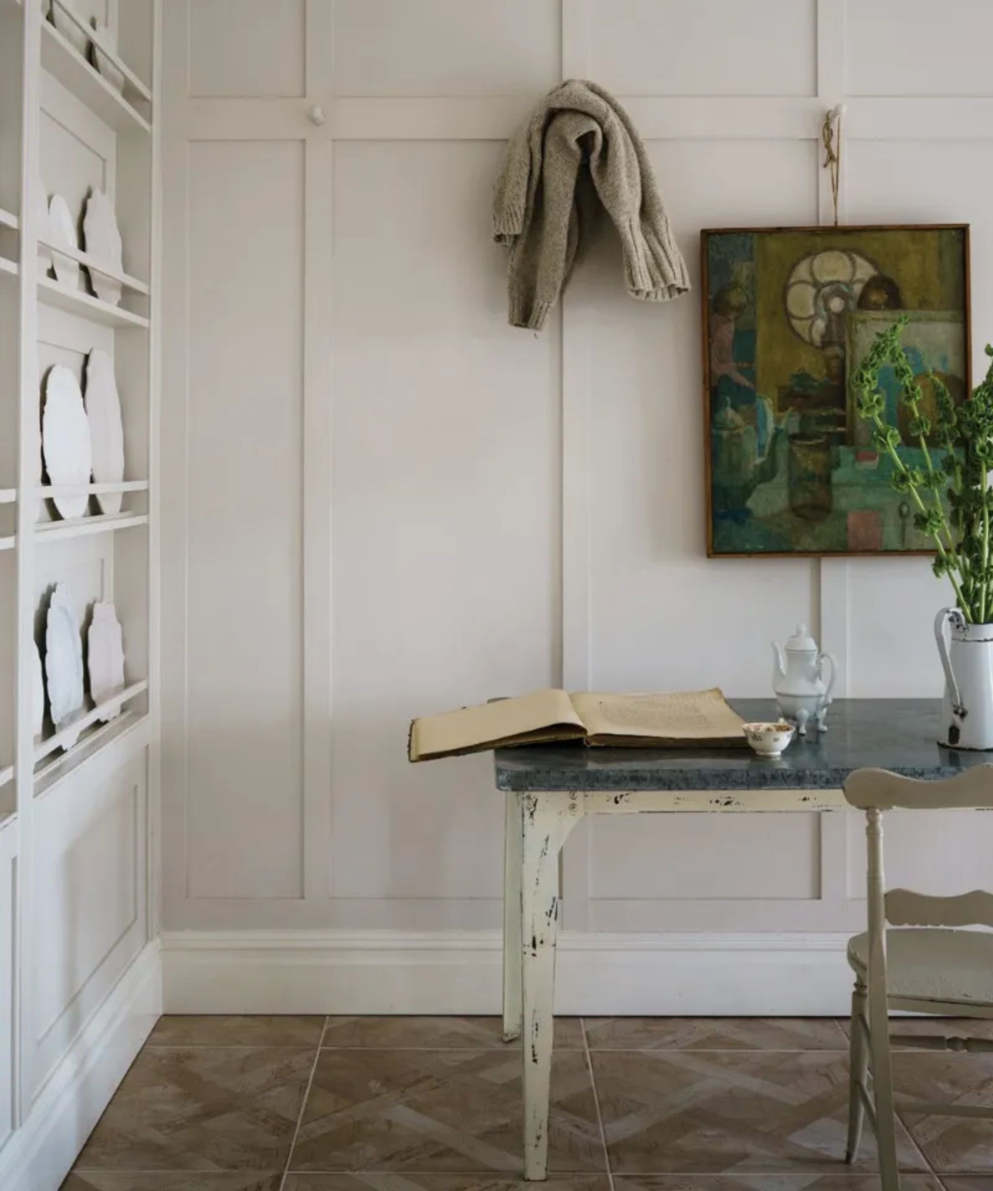
School House White by Farrow & Ball is another popular off-white paint that's a favorite for interior designer Nureed Saeed. A delicate white that warms spaces subtly, there's good reason this is a go-to white paint for many.
'I love School House White by Farrow & Ball,' says Nureed. 'It's creamy but not too yellow so it looks warm and fresh but not dated like your parents' house from the '80s.'

Another off-white that gently warms up rooms, School House White is a popular choice.
7. Alabaster, Sherwin-Williams
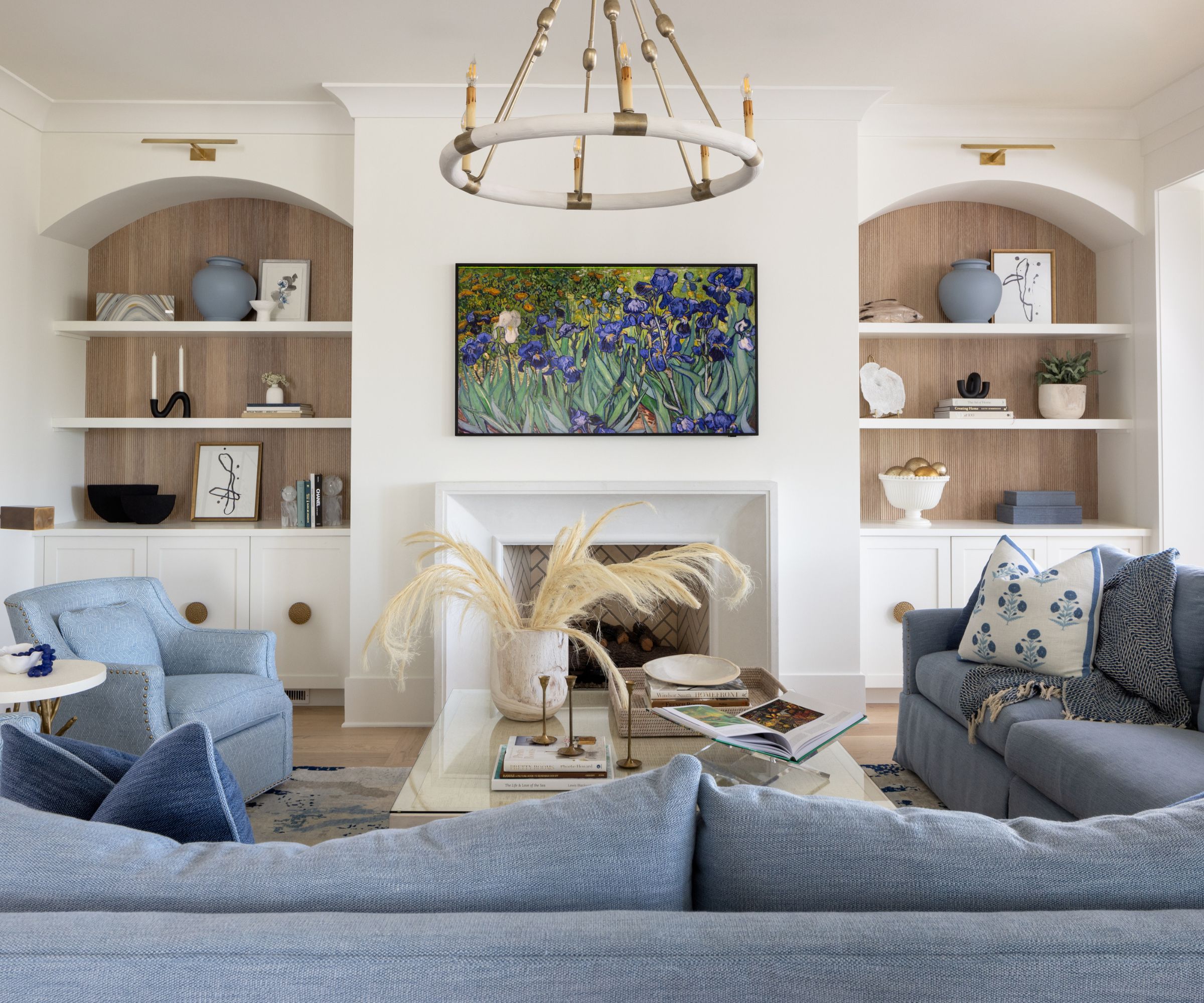
Sherwin-Williams' Alabaster is a soft white paint with subtle warmth, a favorite for interior designer Linda Burnside of LGB Interiors who used it in this living room.
Decorating with Sherwin-Williams' Alabaster is also a favorite for designer Amber Guyton of Blessed Little Bungalow who says: 'It's like a warm hug, not too yellow or cold. I also find that it's a nice solution for cabinetry when clients desire white cabinets, but not such a stark white.'

This off-white is known to create a welcoming feel without compromising on its brightness.
8. Mountain Peak White, Benjamin Moore
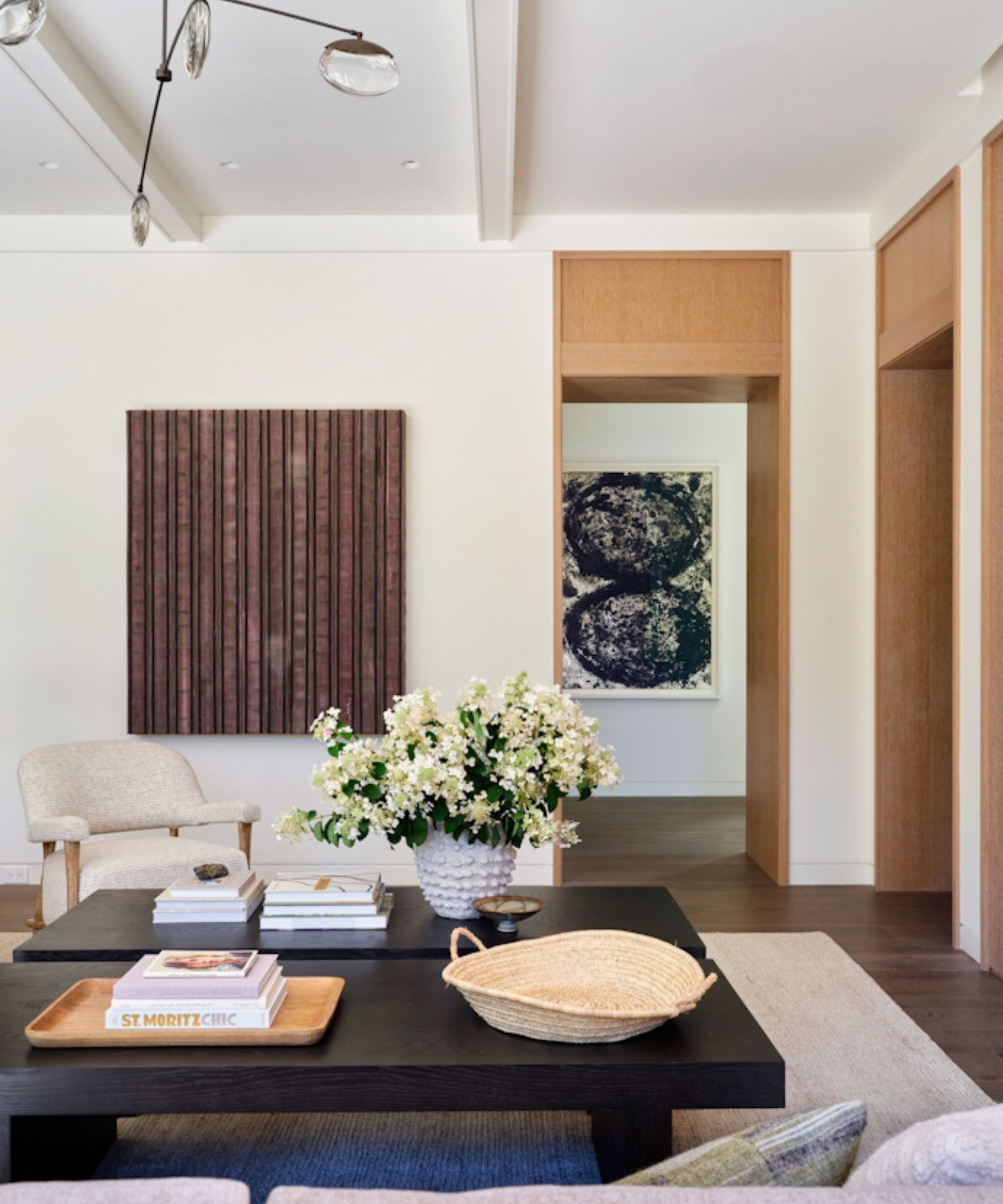
One of Benjamin Moore's lesser-known off-white paints is Mountain Peak White, a fresh white with just enough warmth to stop it from feeling stark.
'Our absolute favorite these days is Benjamin Moore’s Mountain Peak White,' shares interior designer Andrea Goldman. 'It is warm and inviting without pulling too yellow or green.'
In this modern living room, Andrea used this off-white paint for the walls and ceiling as well as the trim, of which she says: 'The final result is nothing short of delicious – if paint could be edible!'

If you're looking for an off-white with yellow undertones, try out Mountain Peak White by Benjamin Moore.
9. White Dove, Benjamin Moore
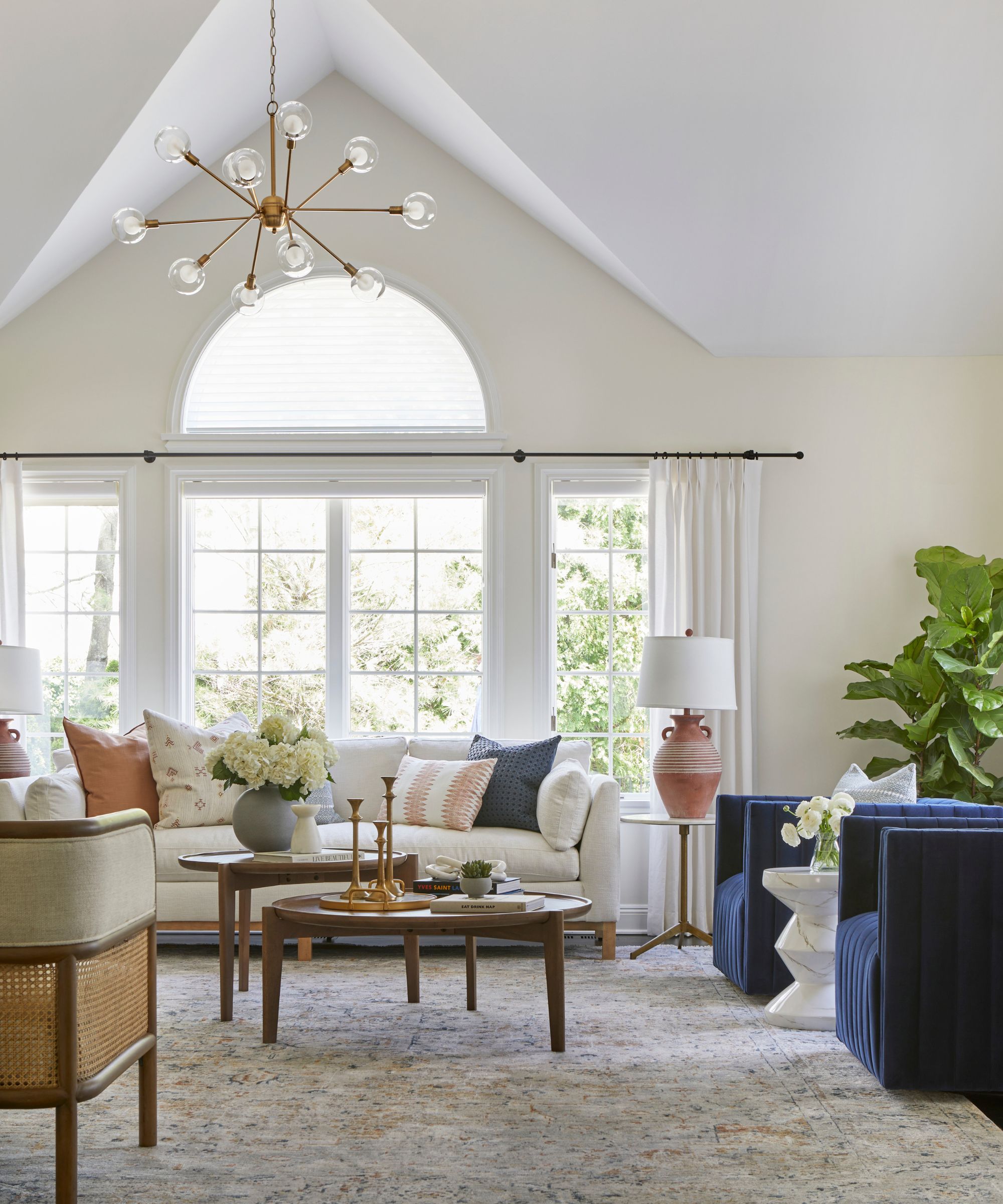
'We love Benjamin Moore's White Dove and Swiss Coffee,' says designer Lina Galvao of Curated Nest Interiors. 'Both are warm, creamy whites that work in lots of spaces, especially those that receive great natural light.'
'White Dove is a great color for cabinetry when you have a painted or stained island. The creamy tone offsets the island color with less contrast than a bright white, unifying the space and adding harmony to the palette. These colors also work with white trim nicely and tend to complement furniture with warm or cool tones,' explains Lina.
In this light and airy living room, Lina used White Dove to create a timeless color scheme, paired with richer accent colors through decor.

White Dove is a contemporary white with gentle undertones that stop it feeling stark.
10. Slate I, Paint & Paper Library
Another favorite off-white paint for Melissa Read is Paint & Paper Library's Slate I. 'State I is a near-neutral with the slightest warmth, preventing it from feeling stark or clinical,' Melissa explains. 'It holds its own in north-facing rooms, offering a softness that works in both contemporary and period settings.'

Paint & Paper Library's Slate I is a great all-rounder white paint, with just the right amount of warmth to feel inviting.
Which of these off-white paints will you try? Once you've decided whether a slightly warm or cool-toned white is best for your space depending on how much light your room receives, sample these recommended shades so you can see how they look throughout the day.
Sign up to the Homes & Gardens newsletter
Design expertise in your inbox – from inspiring decorating ideas and beautiful celebrity homes to practical gardening advice and shopping round-ups.

Emily is a freelance interior design writer based in Scotland. Prior to going freelance in the spring of 2025, Emily was Homes & Gardens’ Paint & Color Editor, covering all things color across interiors and home decor for the Homes & Gardens website. Having gained specific expertise in this area, Emily is well-versed in writing about the latest color trends and is passionate about helping homeowners understand the importance of color psychology in home design. Her own interior design style reflects the simplicity of mid-century design and she loves sourcing vintage furniture finds for her tenement flat.
You must confirm your public display name before commenting
Please logout and then login again, you will then be prompted to enter your display name.
-
 Kris Jenner's favorite air fryer, the Ninja Crispi, is the perfect small kitchen solution – it deserves a place on the most compact of countertops
Kris approves of this compact yet powerful air fryer, and so do our own kitchen appliance experts, praising it for its multifunctionality
By Hannah Ziegler Published
-
 Ina Garten's storage pantry is an insightful window into all of the best cookware used by the chef – and it's easy to recreate on your kitchen shelves from $48
The beautiful dishware in The Barefoot Contessa's Hamptons pantry showcases the tools she uses most often to cook – this is exactly how you replicate it
By Sophie Edwards Published