

Sourcing the right neutral paint involves many factors, but one of the most crucial things to consider is your room's orientation to the sun. Whether a room receives warm or cool light; limited or ample will hugely impact how a paint color appears in your space, and neutral paints are often the most important to get right.
When decorating with neutrals, paint colors should balance the light comfortably throughout the day (toning down extremely well-lit rooms and boosting warmth in naturally cool rooms) to serve as a backdrop for the rest of your room's decor.
But what are the best neutral paints depending on your room orientation? We enlisted the expertise of paint and color specialists, who explain all below. Read on for some expert-suggested paint ideas for your next decorating project.
How to choose a neutral paint for your room's orientation
The first step is to work out the orientation of any room you're planning to paint. You may find that one side of your home is much brighter than the other, and you'll also notice how the light moves around your home throughout the day.
Once you've established which direction your room faces, you can get set on choosing the right paint color. Of course, even within the realm of neutral colors, you should ensure your design style is reflected – you may prefer the look and feel of warm neutral paints, for example, so bear this in mind before deciding on neutral room ideas.
North-facing

Farrow & Ball Setting Plaster
North-facing rooms are often seen as the most challenging when it comes to decorating with neutral paint, but the trick is to go for those with warm undertones. Cool neutrals in north-facing rooms can appear overly drab and cold.
'In north-facing rooms, potentially the trickiest to decorate, you need to err on off-whites that contain some yellow or red pigment to inject some much-needed warmth,' says Patrick O'Donnell, brand ambassador at Farrow & Ball. 'Think of Dimity or White Tie as the perfect just off-whites here.'
'The light you get in north-facing rooms is the coolest of the lot,' explains Tash Bradley, Lick’s Director of Interior Design and Color Psychologist. 'Northern light casts a blue hue and tends to make cool colors feel flat, so it’s important to reach for warmer neutrals to balance it out.'
Behr's Blank Canvas is a popular white paint that will also keep a north-facing room feeling cozy. Erika Woelfel, VP of Color & Creative Services at Behr describes it as 'a warm, creamy white that counters cool, indirect light.'
Another warm white paint that works well is Lick's White 03, according to Tash, who describes it as, 'a soft, uplifting neutral designed to soak up rays of sun before reflecting them back into the room so you and your space feel lighter and brighter. Its warm undertones make it particularly comforting in a bedroom, where you want to snuggle up at the end of the day.'
Of course, decorating with neutrals doesn't just mean white, but richer shades too. 'If you want a bit more depth than a white can give you, opt for soft Beige 01, or even reach for a barely there Pink 02 for that neutral feel with a snuggly personality,' adds Tash.
South-facing

Lick Beige 02
There is a whole range of neutral paint colors for south-facing rooms, according to Patrick: 'For south-facing, you can run the whole gamut from cooler, bluer-tinged whites which will feel fresh and clean, making them good for a minimalist aesthetic but these rooms also work a treat with warmer-toned whites that will create a soft glow in full sun.'
As Patrick explains, the risk of error is less in south-facing rooms, although be aware that going too warm-toned with your neutral paint colors can make the room feel too yellow, depending on your design style. Consider paint colors like Farrow & Ball's Wevet in these rooms for a pared-back and timeless look – a classic white with a touch of gray for a bright and airy feel.
'South-facing rooms have a golden glow going on and the good news is, they pretty much suit all whites,' adds Tash. 'Make a southern room stay on the right side of light and breezy with white that has a soft gray base like our White 04 or White 02.'
'As south-facing rooms get the most natural light, you can afford to go a little darker with your neutrals here, too. Earthy and cocooning Beige 02 will balance the light given its blend of yellow and gray undertones, whilst making you feel calm and restful.'
Another popular neutral paint that works a treat in south-facing rooms is Behr's Swiss Coffee. Erika explains that it 'balances bright, direct sunlight with its soft, warm undertones.'
East-facing

Lick White 06
East-facing rooms receive bright daylight in the morning, while the afternoons and evenings feel cooler and shaded, so you'll need to choose a neutral paint that works for both.
According to Patrick, neutral paint colors with a subtle dose of green work well in these rooms. 'Err towards those with a gentle green shade such as the palest aqua of Pale Powder to the more drab and moody Shaded White which has a contemporary edge.'
However, it's important to consider how you actually use east-facing rooms before settling on a paint color. If you spend most of your time in these rooms in the morning, for example, you may want to prioritize how it looks then, and vice versa for the afternoon and evening.
'You should start by thinking, at what point of day will I use this space most and then play to its strengths,' explains Tash. 'Favor slightly warmer Beige 01 if you’re using it in the afternoon. For example, an east-facing living room in Beige 01 will fare better when the light can turn a bit gray so needs the yellow undertone to give it a boost.'
'Or, play up to the crisp morning light – ideal if you’re a before-work shower person and have an east-facing bathroom – and pick box fresh Beige 03 to enjoy it at its purest,' says Tash. 'If you want your room to look its best all day long, finding a neutral with a balance of warm and cool undertones is the holy grail. Take our chalky White 06 with its touch of pink, for example.'
If you prefer decorating with gray when it comes to neutrals, Erika recommends Chic Gray for east-facing rooms which 'provides a versatile, balanced tone that works well with shifting light.'
West-facing

Farrow & Ball Stirabout
Contrary to east-facing, west-facing rooms benefit from afternoon light while mornings are cooler with less direct natural light. Generally, you don't want to go too extreme with neutral undertones in these rooms, since they need to look good with the dramatic light change throughout the day.
'West facing is your afternoon light and loves warmer shades,' says Patrick. 'Think of an earthy off-white like Stirabout or the palest of red-based neutrals such as Joa’s White for a truly cozy look.'
'Just like rooms that look to the east, westerly rooms are the most changeable,' adds Tash. 'On the whole, they look all the better with a warmer white for company. So, swerve the grayish whites and follow similar advice to north-facing rooms – creamy whites like White 03 or White 05 for something oatier.'
If you want to venture away from white, consider something that reads as a subtle beige for added depth and interest. 'For west-facing rooms, Linen White complements the warm afternoon light with its soft beige undertones,' adds Behr's Erika.
This helpful guide will give you a starting point for choosing the right neutral paint for your space, but it's important to always try out colors as swatches before committing. Observing how the color changes throughout the day is a worthwhile exercise so you can be sure your neutral paint aligns with your design style – whether that's clean and classic whites in well-lit rooms or warmer neutrals in darker rooms.

-
 April is the ideal time to prune beautyberry shrubs – for a stunning display of vibrant berries this fall
Whether you choose to trim gently or hard prune, cutting back in spring promotes healthy and productive growth
-
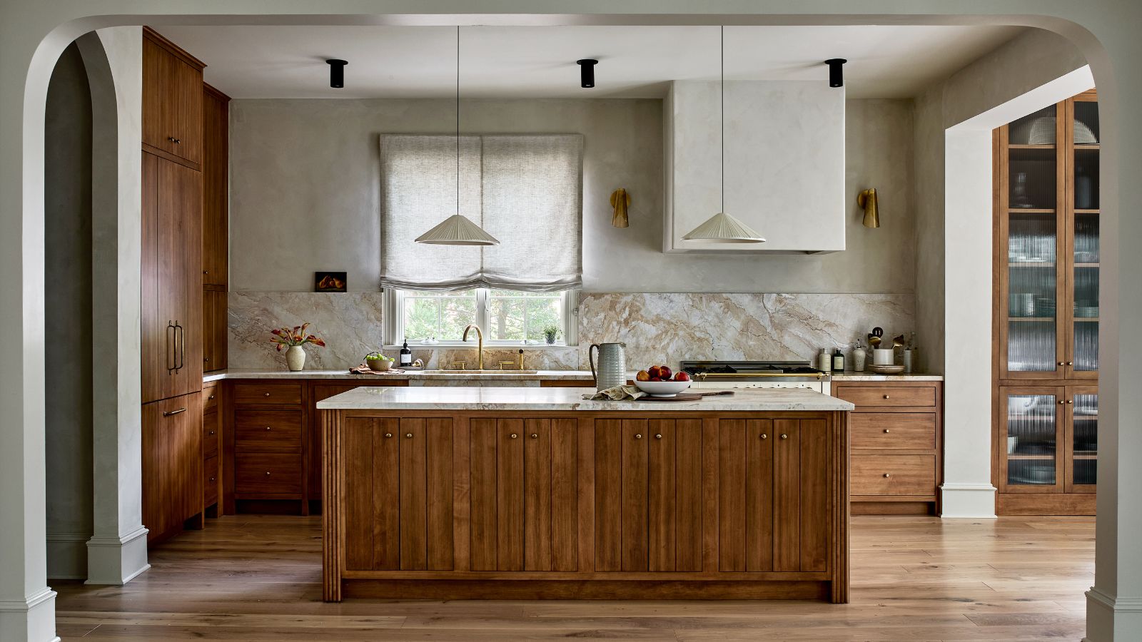 This kitchen has been transformed from cramped and outdated to warm and welcoming – and it's all thanks to a few thoughtful Japandi-style features
Warm wood tones, textural designs, and considered contrast are key to this beautiful transformation

