These are the 12 most timeless neutral paints, recommended by interior designers
Looking for a neutral paint for your next decorating project? Here are designers' favorite picks from leading paint brands

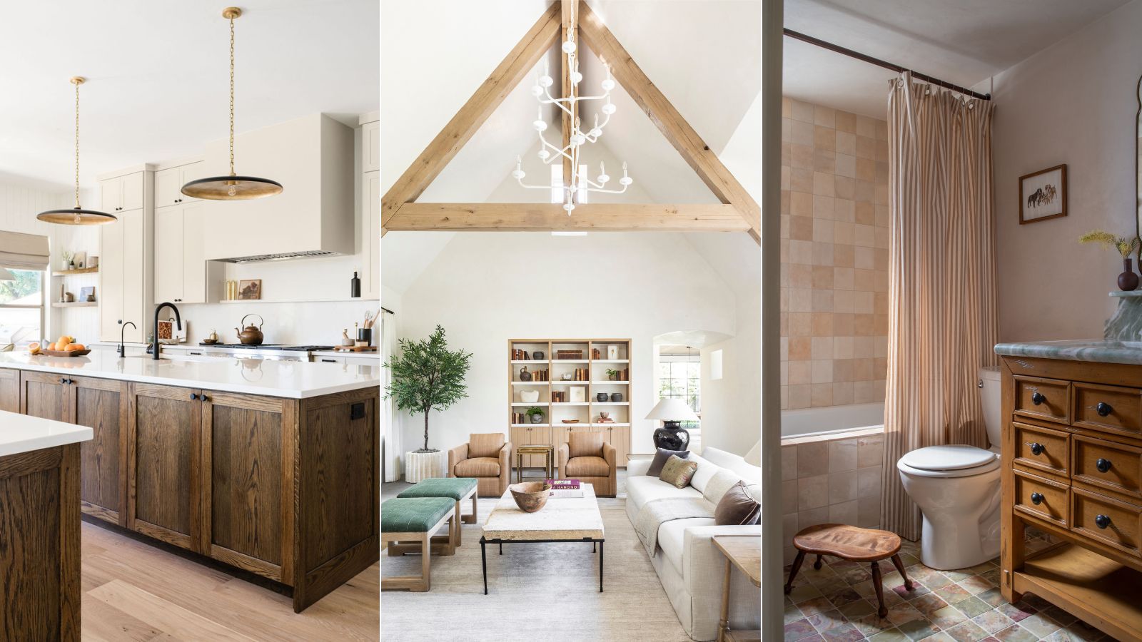
- Greek Villa, Sherwin-Williams
- Oatmeal, Portola Paints
- White Dove, Benjamin Moore
- Alabaster, Sherwin-Williams
- Baby Fawn, Benjamin Moore
- Accessible Beige, Sherwin-Williams
- Modern Gray, Sherwin-Williams
- White Down, Benjamin Moore
- Pure White, Sherwin-Williams
- Swiss Coffee, Benjamin Moore
- Rodeo, Benjamin Moore
- Bit of Sugar, Behr
Design expertise in your inbox – from inspiring decorating ideas and beautiful celebrity homes to practical gardening advice and shopping round-ups.
You are now subscribed
Your newsletter sign-up was successful
Want to add more newsletters?
The world of neutral paint colors is a varied one, ranging from classic whites to warm beiges, cool grays to soft pinks. In most homes, neutral paints are an important foundational element, often used as the backdrop color to set the mood of a room.
When it comes to choosing the right neutral paint for your home, there is a vast range of options that cater to all room types and design styles. But what are the very best among them?
We turned to the expertise of interior designers, who share below their favorite paints for decorating with neutrals. Tried and tested in their design projects, these neutral paints have become firm favorites that are repeatedly used for their timeless appeal and flattering finish. If you're looking for some steer with your neutral paint ideas, read on to gain some inspiration.
Article continues belowBest neutral paints: 12 top picks from designers
From Benjamin Moore to Sherwin-Williams, the below neutral paints come from leading paint brands, and the colors among them range from warm and cozy to cool and crisp.
Greek Villa, Sherwin-Williams
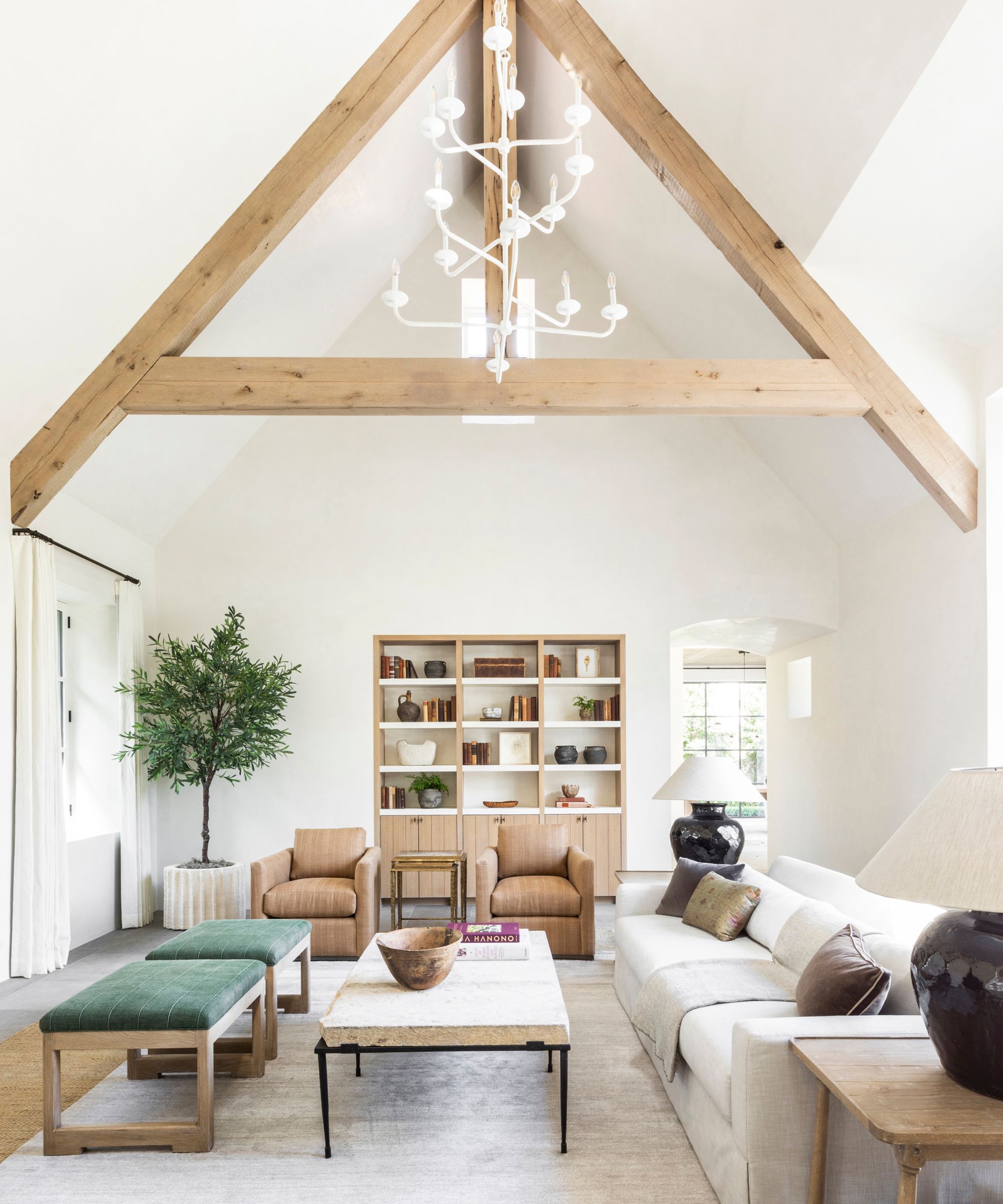
'My all-time favorite neutral paint is Sherwin Williams’ Greek Villa,' says Marie Flanigan, designer and founder of Texas-based Marie Flanigan Interiors. 'It’s a soft, creamy white that feels warm without leaning too yellow, making it versatile for any space.'
There are lots of ways to incorporate Sherwin-Williams' Greek Villa into your room color ideas and it's a warm white paint frequently recommended by designers for its versatility and flattering look without leaning too warm-toned.
'I love using it in living areas or bedrooms because it has an inviting, timeless quality,' Marie continues. 'The color reflects light beautifully, creating a serene, open atmosphere while still feeling grounded. It pairs well with both modern and traditional design elements, allowing you to create a cohesive and layered look.'
Design expertise in your inbox – from inspiring decorating ideas and beautiful celebrity homes to practical gardening advice and shopping round-ups.
Oatmeal, Portola Paints
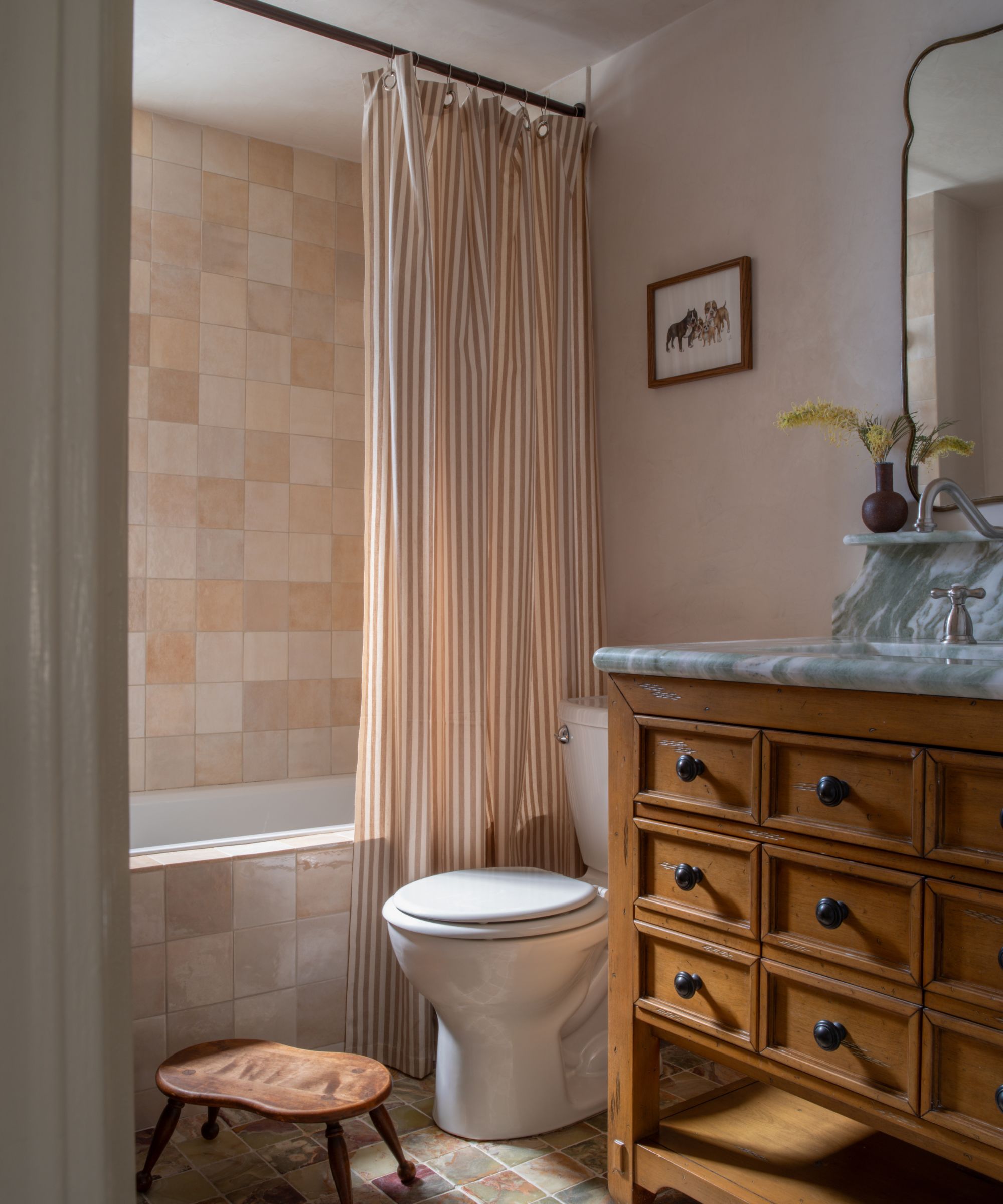
If you want to create an earthy look with your paint ideas, Portola Paints' Oatmeal available in the Roman Clay finish is a failsafe choice. With warm undertones, this neutral feels organic, perfect for adding depth to plain walls.
In STUDIO KEETA's Glendale Spanish project, this neutral paint color was used on the walls of this bathroom, teamed with textured tiles in a similar hue and a wooden vanity unit for an earthy, timeless look.
'We believe a neutral paint should be soft and easy on the eyes, hold a bit of warmth, and have a sense of familiarity, whilst avoiding too much of a yellow undertone,' says Kristina Khersonsky, founder of the Los Angeles-based design studio.
'We tend to reach for the perfected formulas of Oatmeal by Portola Paints that have more of a subtle peach undertone and provide a vintage effect. If we need a brighter shade of neutral, we’ll probably go for Harvest Moon by Backdrop. It still reads white but adds a creamier hue, rather than fluorescent.'
White Dove, Benjamin Moore
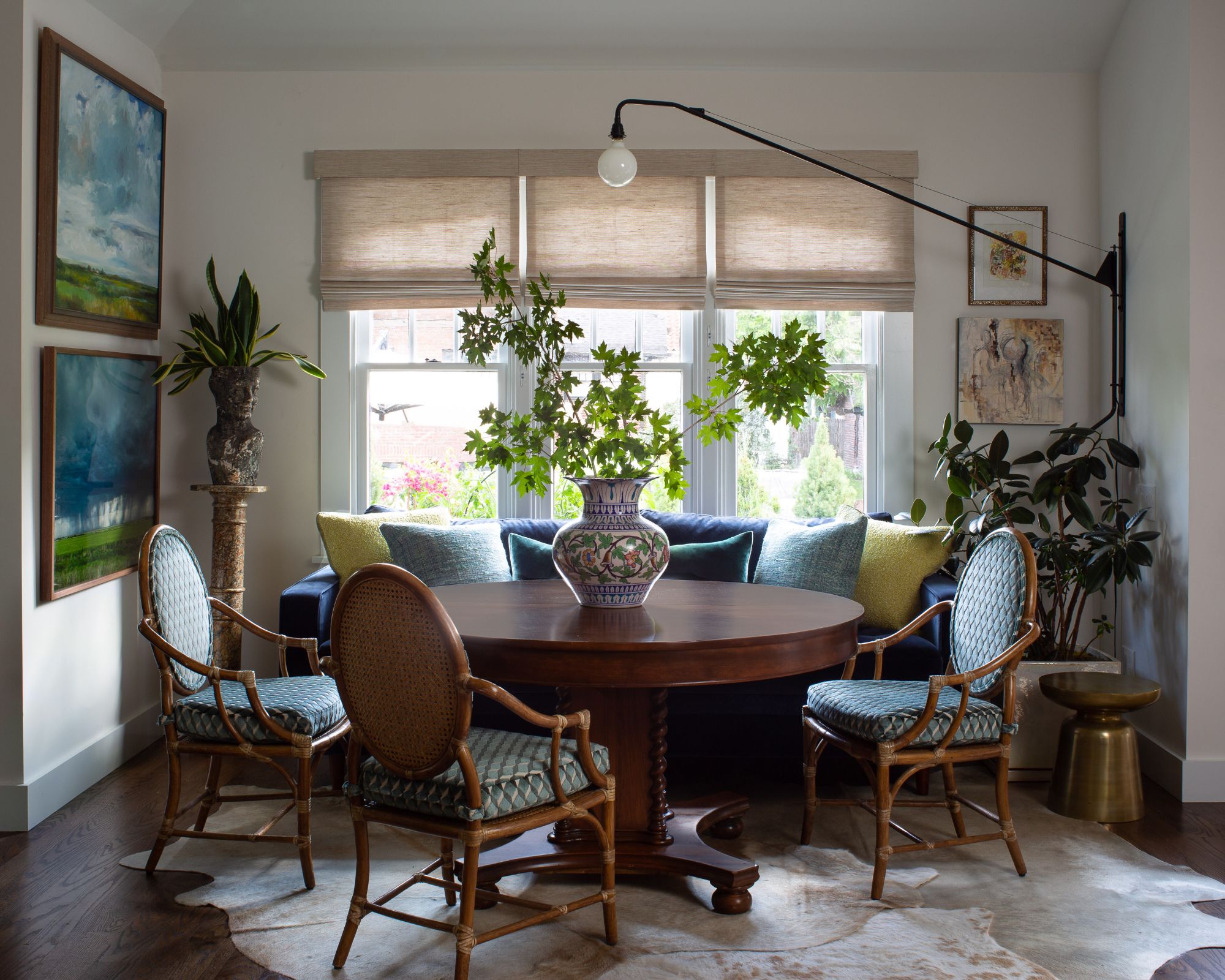
Benjamin Moore's White Dove is a classic white paint that leans slightly more cool-toned, a go-to backdrop color for a bright and clean space.
'White Dove by Benjamin Moore is a versatile white that I find myself using over and over again,' shares interior designer Nadia Watts. 'It has cool undertones making it incredibly user-friendly.'
While white paints like this one are amongst the most versatile, working well in many rooms, Nadia says it works particularly well in rooms with limited natural light with its brightening effect.
Additionally, the designer adds, 'White Dove is one of those chameleon colors that looks good no matter what it’s paired with. It looks rich and warm next to fall colors like red, orange, and brown; it’s the perfect pop of contrast for creamy neutrals.'
Alabaster, Sherwin-Williams
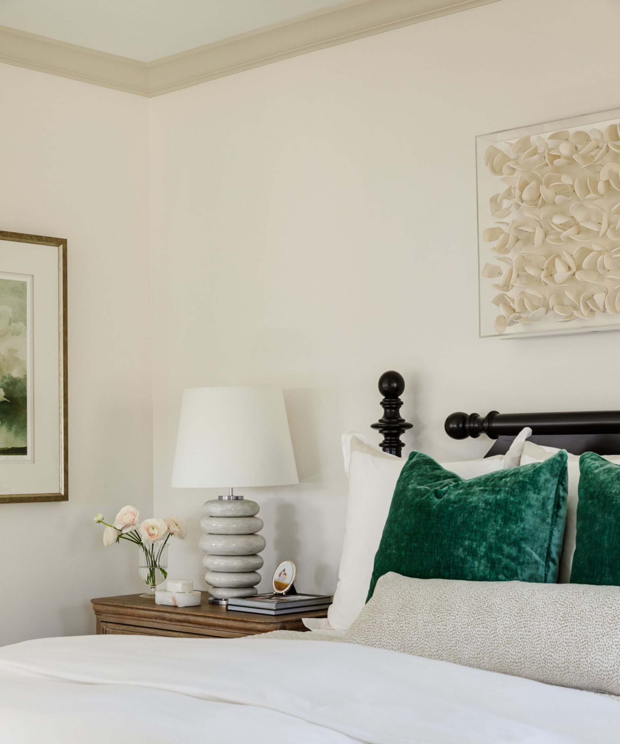
Another popular warm white paint is Sherwin-Williams' Alabaster, a bright yet cozy shade. Below, Ali Otterbein, Director of Design at Blakely Interior Design explains why this paint color made the perfect choice for this relaxing bedroom:
'We love this neutral pairing of Sherwin Williams' Alabaster and Gossamer Veil to create a serene and welcoming bedroom design. Alabaster was perfect for the walls because it's a beautifully balanced creamy white – it's warm and inviting yet bright and crisp, without feeling cold. For a subtle contrast on the trim, we used Gossamer Veil, which is a lovely soft warm gray. Its versatility makes it a favorite for many of our projects in various applications, whether the aesthetic leans coastal, historic, or contemporary.'
Tiffany Matthews, founder and lead designer at Motif Homes also highlights Alabaster as a favorite neutral paint: 'Sherwin-Williams Alabaster is our go-to neutral paint color due to its creamy, warm, and inviting qualities. While most warm whites contain hints of yellow, we suggest teaming Alabaster with bold blacks and earthy browns to minimize yellow.'
Alternatively, Tiffany recommends ditching color combinations altogether and embracing color-drenching ideas with Alabaster for a cohesive look: 'Ditch the flat white paint on the ceiling. Saturate the walls, ceiling, and trim in the same white and satin sheen to create a cohesive look.'
Baby Fawn, Benjamin Moore
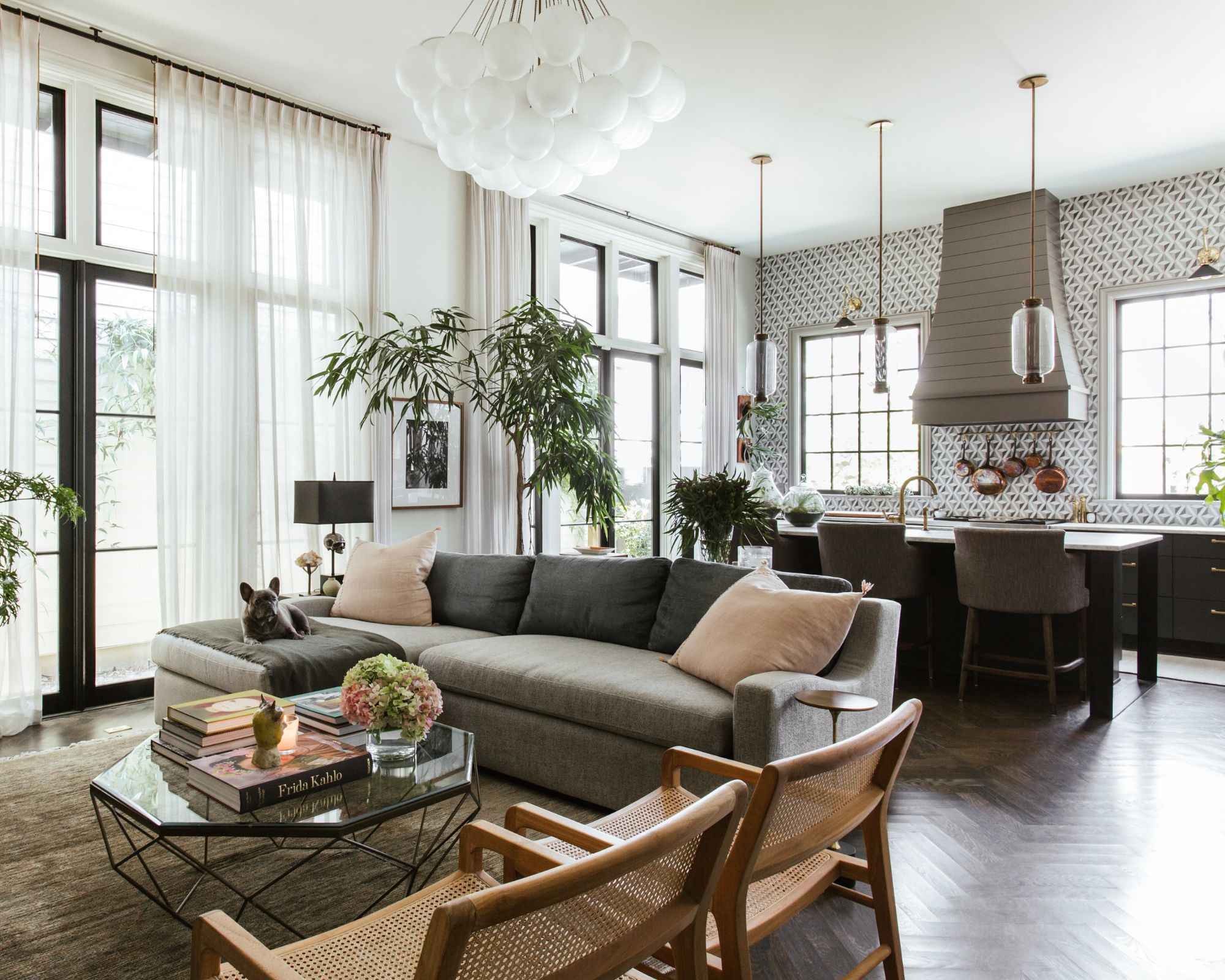
'For the past few years, my go-to neutral has been Benjamin Moore’s Baby Fawn,' says Ryan Austin Hagood, Principal Designer at r.a.d. Interiors. Described by Benjamin Moore as a 'go-to neutral' Baby Fawn is a pared-back shade that adds subtle warmth to the home.
'It's a warm, bone-white shade that strikes the perfect balance – neutral without feeling stark or cold, and it doesn’t lean too yellow or creamy,' Ryan continues. 'What I love most about Baby Fawn is its versatility. It works beautifully in almost any space and complements a variety of materials and textures. I often use it in a flat finish on walls and in satin on trim.'
Accessible Beige, Sherwin-Williams
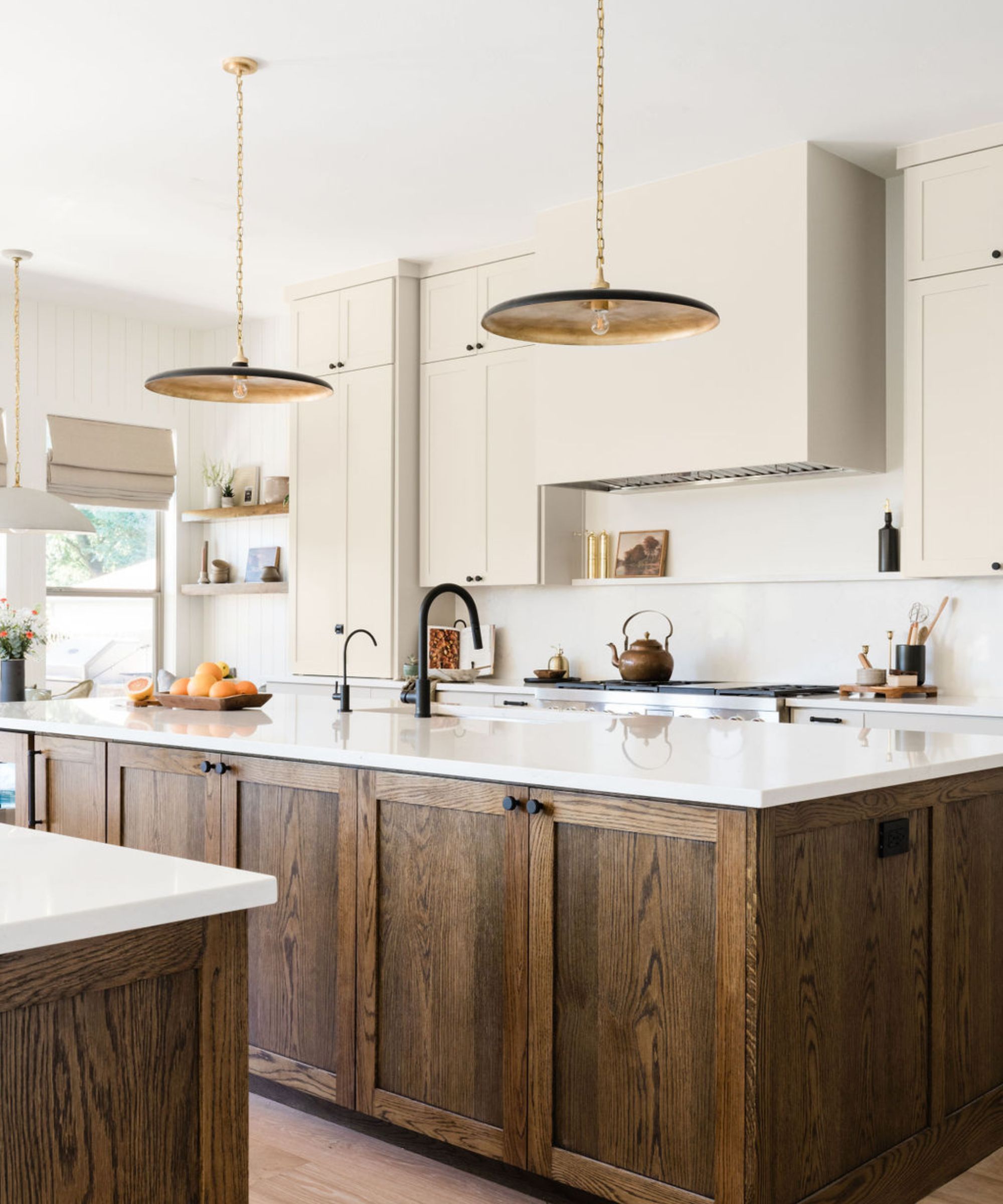
Looking for a tried and tested beige paint? Sherwin-Williams Accessible Beige is an earthy beige with subtle gray undertones which give it a modern look.
'I love Accessible Beige by Sherwin Williams,' says interior designer Laura Williams, the owner of Austin-based design studio ATX Interior Design. In this modern kitchen of its Oak Haven project, Accessible Beige was used to create a welcoming yet timeless look. 'It is the best warm tone to go with any other paint colors and it never leans too far brown or gray,' the designer adds.
This year has been all about warm shades when decorating with neutrals, and that's expected to endure into 2025 too. Colors like Accessible Beige are a great replacement for white, adding a warmer, cozier look whilst maintaining an overall pared-back aesthetic.
Modern Gray, Sherwin-Williams
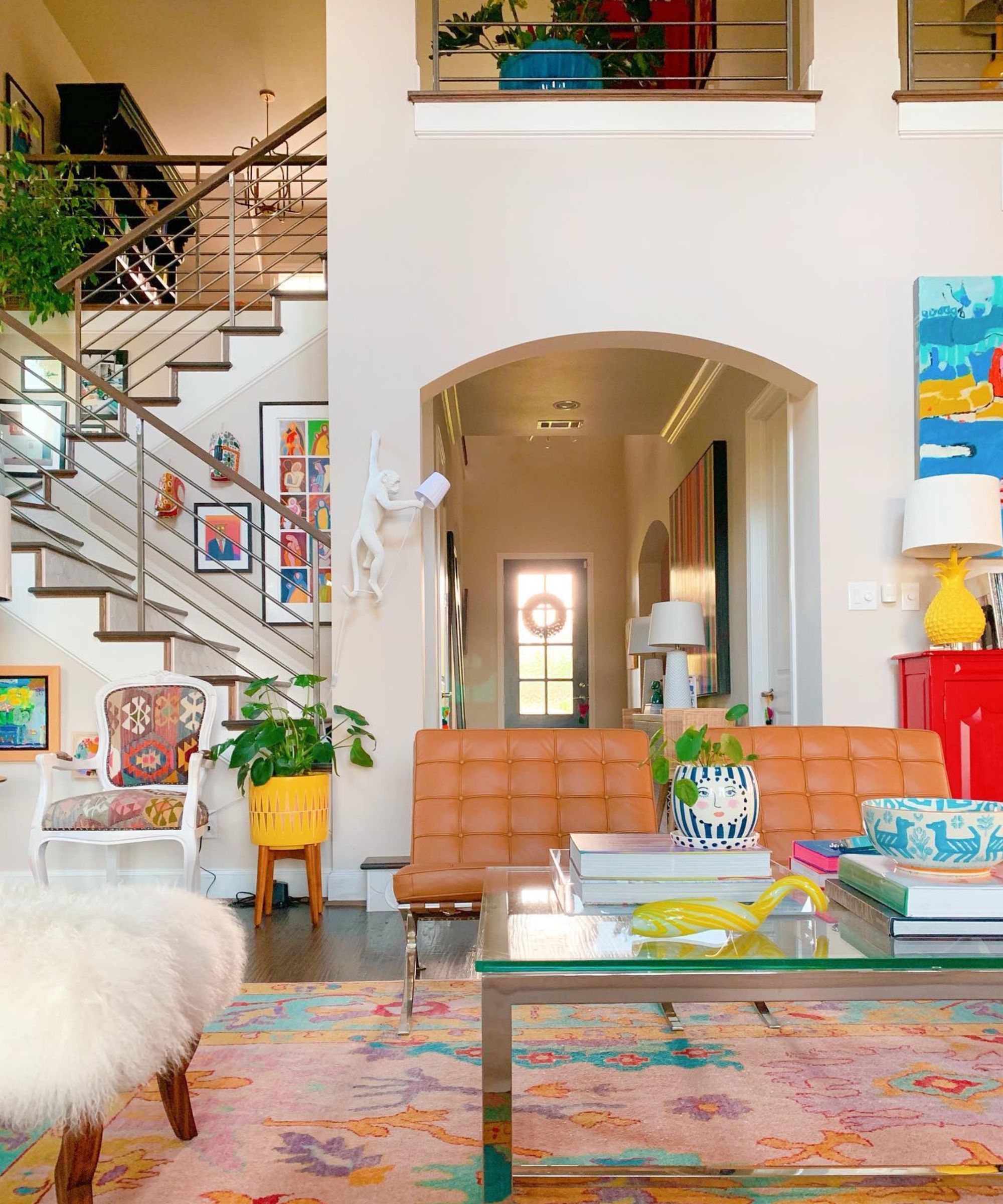
If you're looking for a gray paint that doesn't lean too cool-toned, Sherwin-Williams' Modern Gray should be on your radar. Falling into the category of 'greige' paints, this neutral is essentially a slightly warmer gray that works well as a timeless backdrop in many rooms.
Shauna Glenn Design used this paint color across the walls in this colorful living space, complete with Sherwin-Williams' Snowbound on the trim. 'Our favorite go-to neutrals are Sherwin-Williams' Modern Gray and Sherwin-Williams' Snowbound,' says Shauna Glenn, the founder of the design studio. 'Modern Gray is the perfect greige color.'
White Down, Benjamin Moore
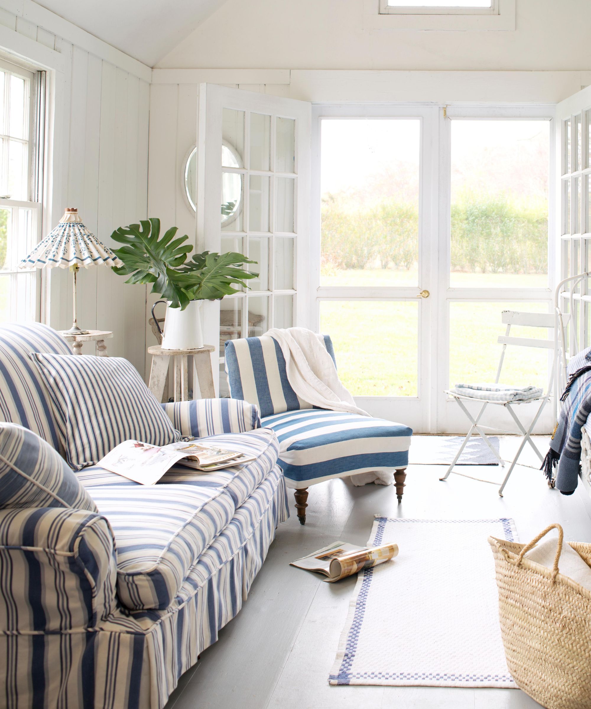
Another slightly more subtle greige paint is Benjamin Moore's White Down, used on the back wall of this light and airy living room.
'Sister color to well-known, designer favorite Benjamin Moore's White Dove, my new favorite go-to neutral is Benjamin Moore's White Down,' says interior designer Rebecca Bobroff of Rebecca Bobroff Design. 'It has a warmer undertone, pairs well with a wide breadth of colors, and gives the room a glowy, refined feel without leaning too yellow.'
'One important note when using this shade: if you have strong south-facing light, it will bend more heavily into its warmth, so apply a generous test swatch before committing, and view it at various times of day to ensure it appropriately complements the space.'
Pure White, Sherwin-Williams
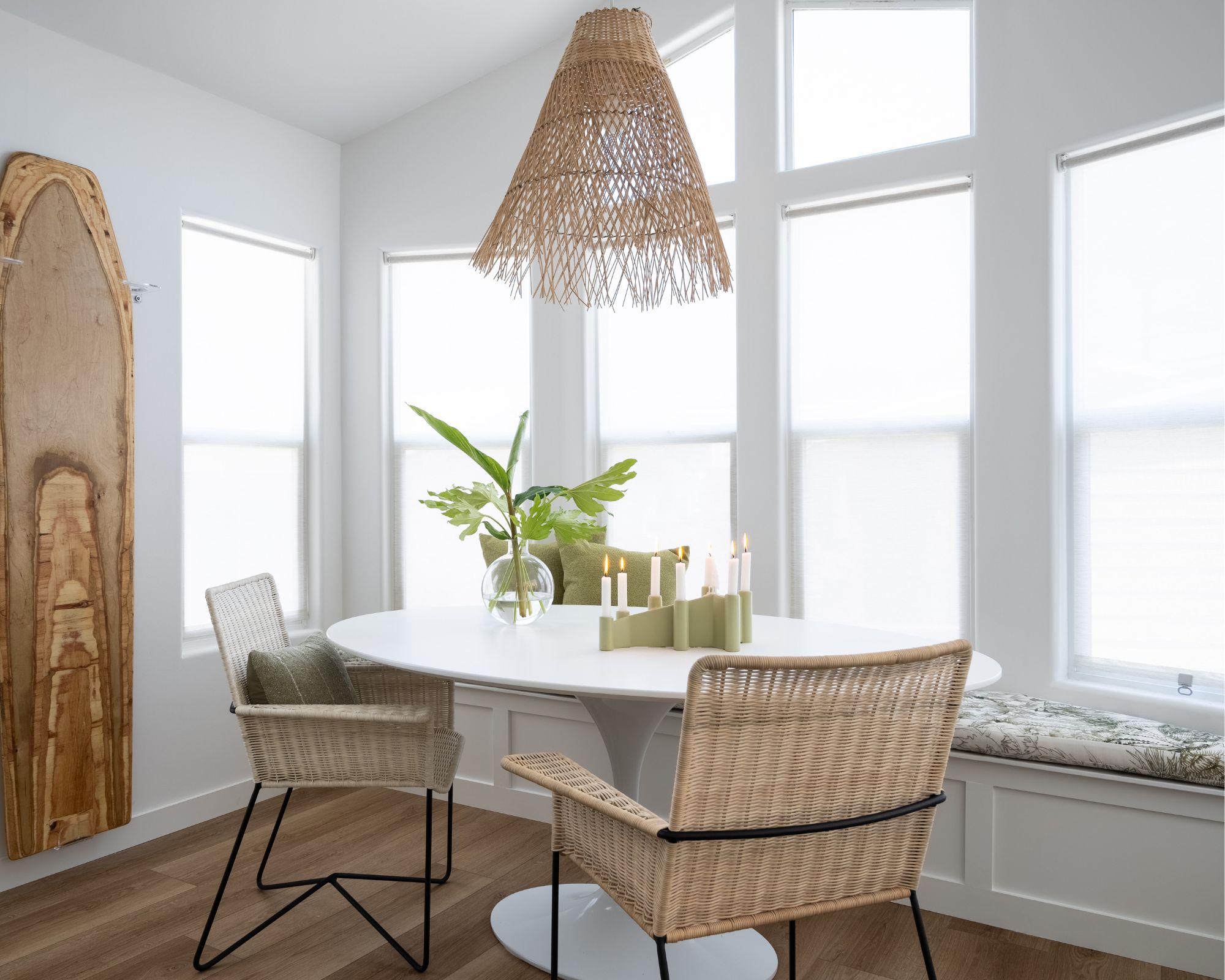
Another popular white paint is Sherwin-Williams' Pure White, a clean and classic shade with a hint of warmth to ensure a welcoming look that's not too harsh.
'Sherwin-Williams' Pure White is my go-to white,' says Allison Garrison, founder and principal designer at Allito Spaces. 'It looks totally fresh but never stark. It works amazingly with light from any direction and doesn't show any undertones. I have found that it plays well with other neutral shades whether other whites, beiges, or grays. It is hard to go wrong with Pure White.'
Swiss Coffee, Benjamin Moore
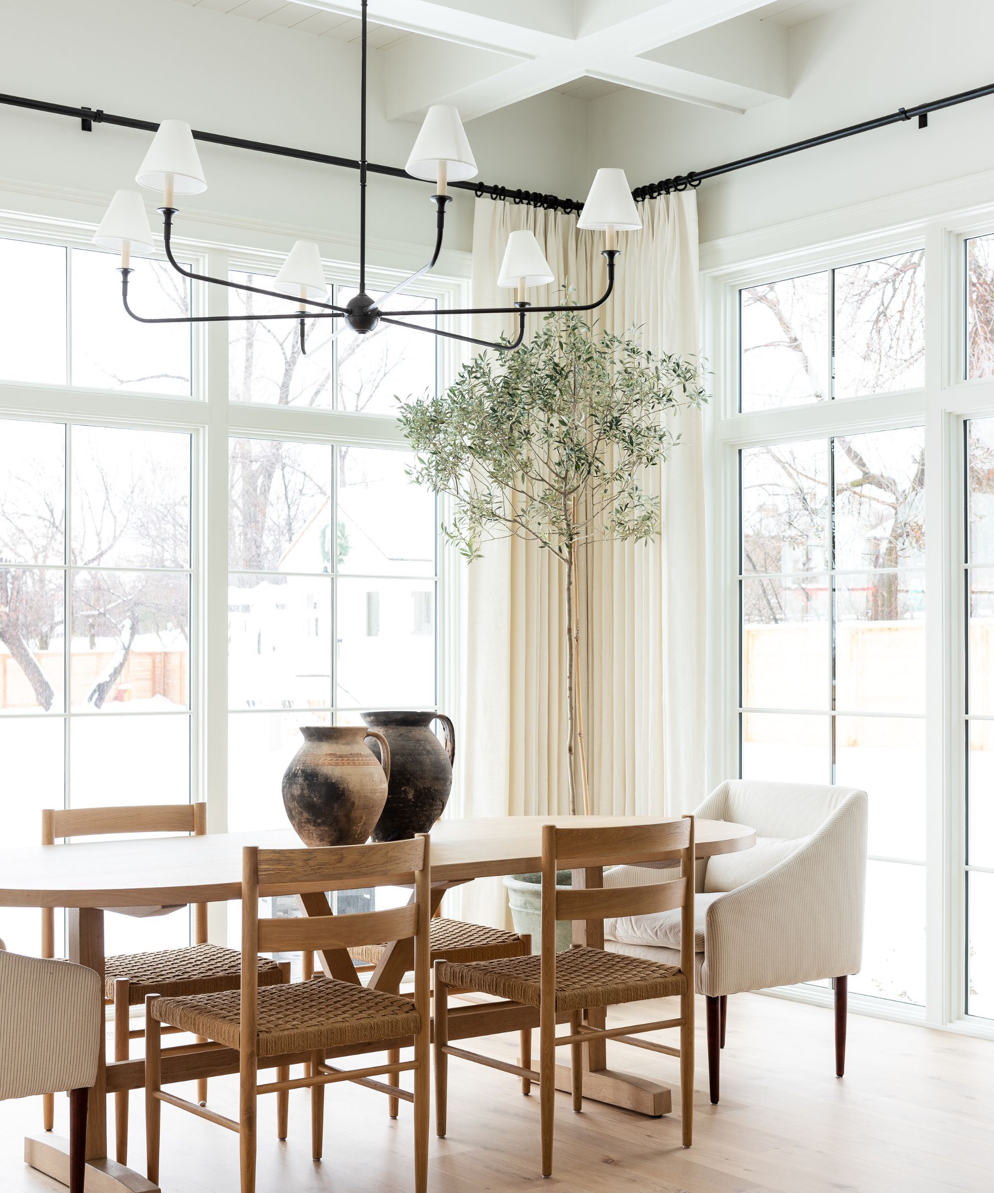
'My recent go-to favorite neutral paint color is Swiss Coffee by Benjamin Moore,' says Darci Tee, lead designer at TKS Design Group. 'It has a warmer undertone and tends to look good in every space. My clients are always happy with this color whether it be on the walls or on their kitchen cabinetry.'
Kathy Kuo is also a fan of Benjamin Moore's Swiss Coffee, adding that it's versatile enough to work well in both warm and cool color schemes: 'This is a soft and sophisticated neutral tone that has just the slightest touch of green in the undertones, which makes it super versatile – you can pair it with a warm color scheme or a cool one and it will always feel inviting and serene.'
Another great aspect of this popular neutral paint is that it lends itself well to wood tones, ideal for rustic or farmhouse decor styles. 'The color helps balance wood tones and adds warmth to a space without being stark white,' adds designer Sarah Latham of Latham Interiors.
Rodeo, Benjamin Moore
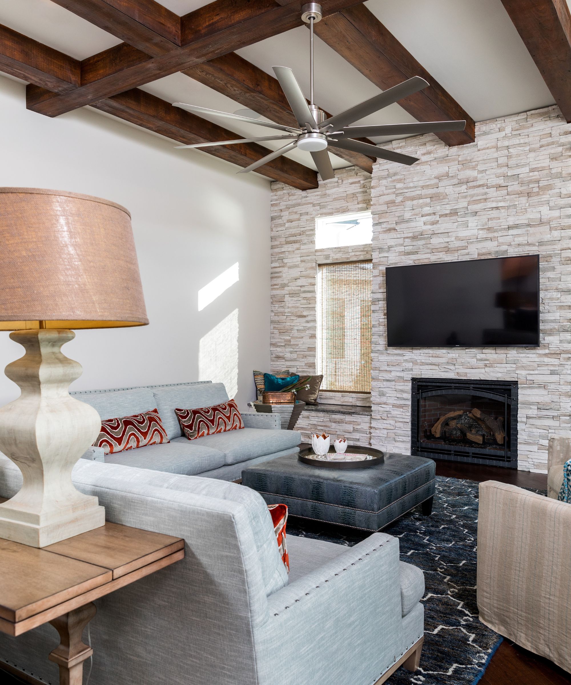
'My all-time favorite neutral has to be Benjamin Moore's Rodeo,' says designer Cheryl Clendenon, owner of In Detail Interiors. If you're looking for a neutral paint that doesn't feel as warm as beige yet not as cool as a true gray, Rodeo makes a great choice.
'It's incredibly versatile, seamlessly balancing between warm off-whites and cooler grays,' Cheryl continues. 'This flexibility makes it a go-to choice, especially in remodels where we may not have full control over existing finishes like flooring. It’s a timeless shade that adapts beautifully to different environments, so we find ourselves specifying it often.'
Bit of Sugar, Behr
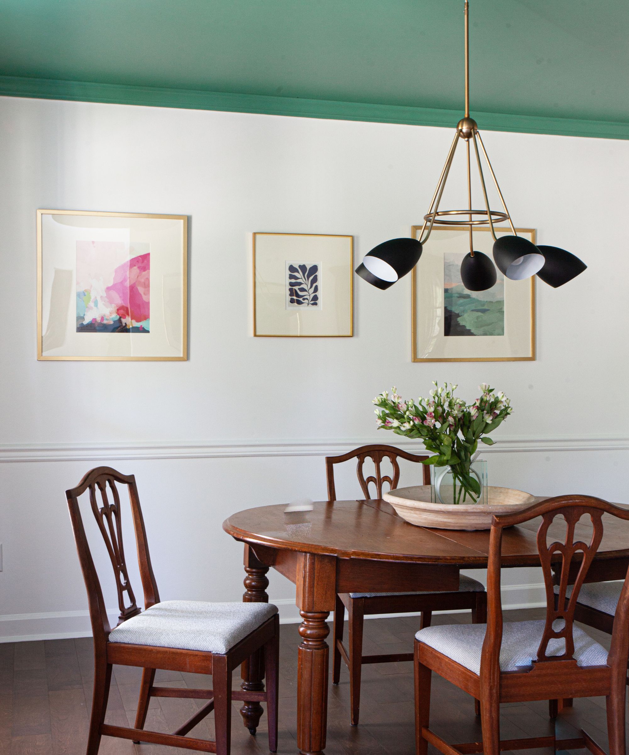
Lastly, Bit of Sugar by Behr is an off-white paint that makes for a flattering, versatile backdrop color.
'I’ve been loving Bit of Sugar from Behr – it’s the perfect off-white with warm undertones that don’t veer into antique white,' explains designer Thea Bloch-Neal, the founder of Curated by Thea. 'The subtle undertones make it incredibly versatile, complementing many of the popular accent colors people are using today.'
Neutral paints are a classic in design, providing our homes with a gentle backdrop to allow the rest of a room's decor to shine. Whether you're drawn to warm neutral paints that help achieve an inviting, cozy feel or prefer the fresh appearance of cooler tones, these specific paint shades are worth exploring.

Emily is a freelance interior design writer based in Scotland. Prior to going freelance in the spring of 2025, Emily was Homes & Gardens’ Paint & Color Editor, covering all things color across interiors and home decor for the Homes & Gardens website. Having gained specific expertise in this area, Emily is well-versed in writing about the latest color trends and is passionate about helping homeowners understand the importance of color psychology in home design. Her own interior design style reflects the simplicity of mid-century design and she loves sourcing vintage furniture finds for her tenement flat.