My 5 favorite Joanna Gaines paint colors prove that retro '70s palettes are back and better than ever
Curated to be 'comfortable, timeless and grounding', Joanna Gaines knows how to use color just right...
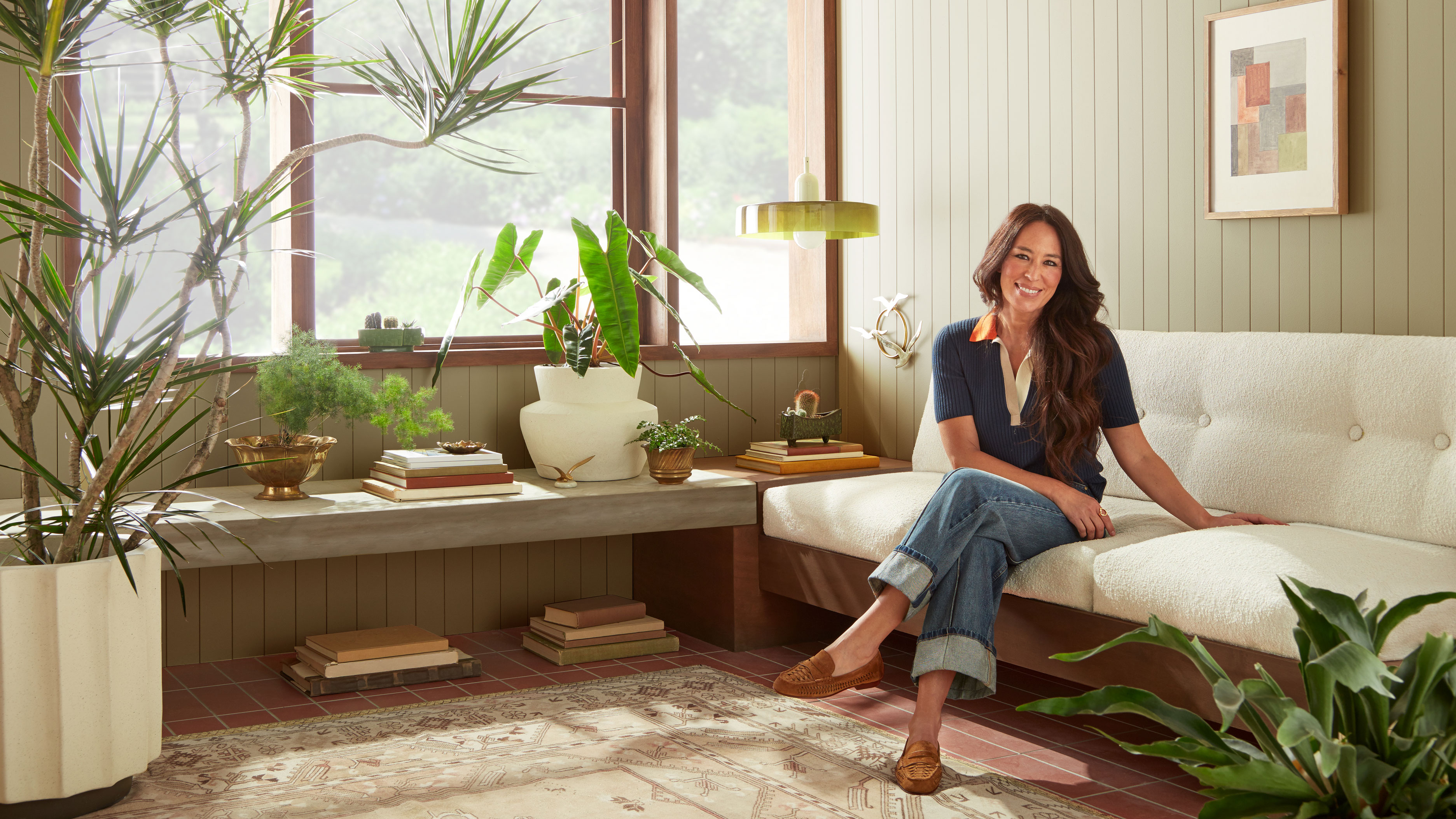

Color is a powerful tool in interior design and can change the atmosphere of a space. The beauty of paint lies in its potential to radically transform a room quickly and easily – all from one little can. Paint is affordable, accessible, and relatively simple to change should you tire of it so, in theory, we should all follow our hearts and make bold choices. But these days, the choice is a big dilemma. The variety of room color ideas is limitless, which makes pinpointing the right shade tricky, to say the least.
Discussing color trends and paint ideas is perhaps one of my favorite topics, so I was delighted when I heard that Magnolia Home by Joanna Gaines was launching new ultra-premium paint colors, inspired by the Lakehouse project in Lake Waco, Texas.
'The Lakehouse Collection' introduces seven beautiful paint finishes that are versatile, durable, and made from the finest ingredients. Crafted to reflect the beauty of lakeside living, this simple and timeless color palette is a true extension of nature.
While I love all seven colors from the latest collection with KILZ; five stood out to my nostalgic heart. With a hint of retro charm, the color palette offers a gentle nod to the 1970s, while still feeling right for a contemporary interior.
1. Remote Trail
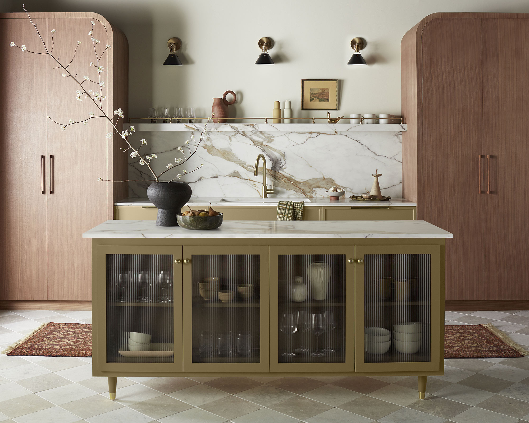
Decorating with green is always a good choice. Uplifting and tranquil, this nature-inspired shade of green has its herbal origins to thank for its soothing properties, making it the perfect choice for a restful room scheme.
One of the cleverest greens in the spectrum, Remote Trail is a color-shifting hue that shares subtle blue and grey tones, making it a sophisticated and soulful choice and bringing biophilic benefits.
‘Sage green is a comforting color. Even by name alone, it evokes the thought of foraging and nourishment in the natural world, growth, renewal and life as a whole,’ says Alice Hood, senior design consultant at Roundhouse. ‘It brings the outside in, even in the most urban setting, and studies have been conducted to show that being surrounded by green can relax our nervous system and help us to feel calm, and in some cases, even live longer.’
Sign up to the Homes & Gardens newsletter
Design expertise in your inbox – from inspiring decorating ideas and beautiful celebrity homes to practical gardening advice and shopping round-ups.
The color also acts as an effective bridge between the outdoors and inside when used in threshold spaces. When seen in enclosed rooms on wallpapers or furnishings, the color brings relief and reassurance and elegantly reminds us of the living world beyond our four walls.
'It took a while to find that perfect green,' explains Gaines. 'It's the vintage shade of green that makes you stop and stare in awe,' she says.
2. Tranquil Waters
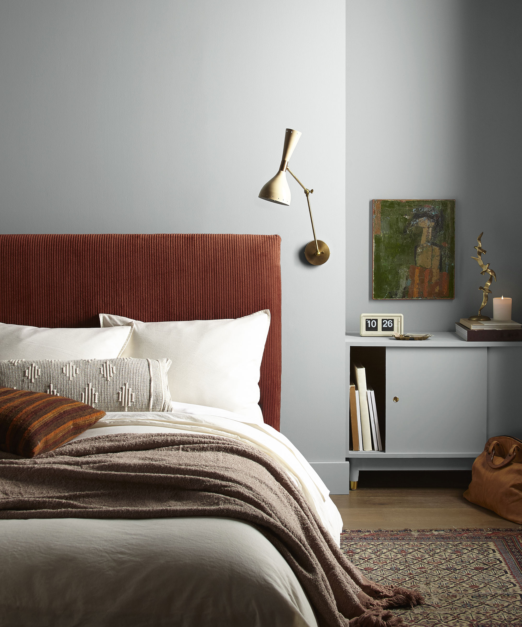
Of all the neutrals, gray is one that instantly brings gravitas. 'Gray harmonizes well with almost every other hue, making it a most adaptable neutral and giving good reason for its popularity,' says Helen Shaw, director at Benjamin Moore.
Tranquil Waters is enormously versatile. This beautiful gray is the answer when white is too white. Deeply pigmented, it's warm and welcoming and changes subtly with the direction of light.
Treat gray as a neutral and layer it with darker and lighter tones, including plenty of texture and some accent pattern. It makes a cozy and wonderfully dramatic statement at the darker end of the gray spectrum and at its lightest, it offers schemes a sanctuary of calm. Consider pairing it with contrasting colors, too.
Created to reflect the calming waters of Lake Waco, says Gaines. 'There's a sense of comfort and timelessness that happens when you set eyes on this shade. Nature has a way of doing that to all of us, and so to be able to translate that through color on the interior was really important,' she says.
Tom Cox, co-founder of HÁM Interiors, says they often turn to natural colors such as grey to paint expansive areas. ‘White can be too stark but choosing a subtle shade sets the scheme’s light and mood,’ he says. ‘To enliven a neutral scheme, we like to punctuate it with hits of color, as it adds so much personality.’ Claire Sa, director of De Rosee Sa, agrees. ‘There are grays and there are grays,’ she says. ‘Where possible, go for warmer grays and juxtapose them with warmer materials and highlights. There is perhaps a movement away from grays, but I think there are occasions where a gray, that has green or blue undertones, can work as the ideal neutral base.’
3. Superior
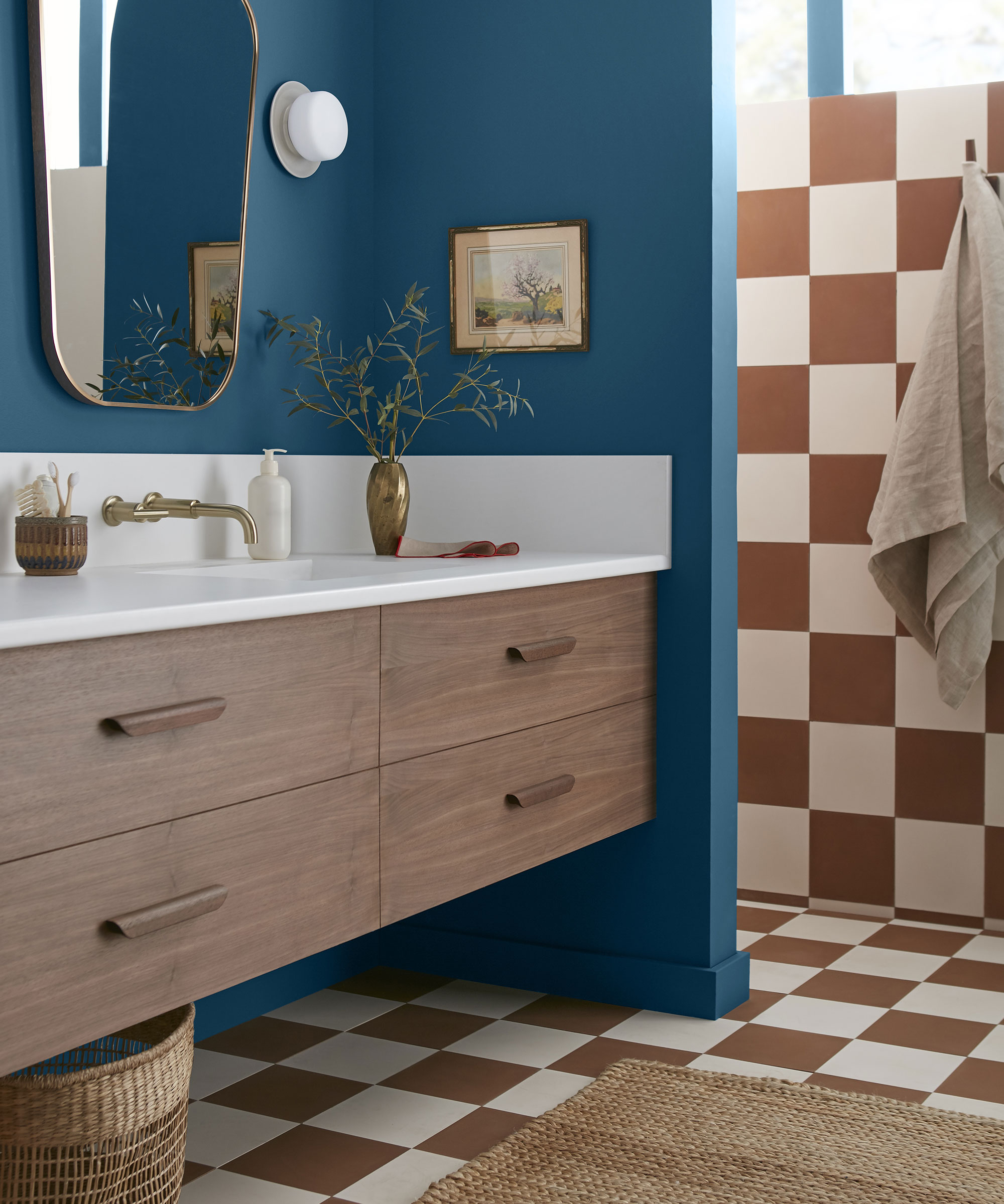
If you wish to decorate with a deep and captivating marine blue for spaces that are both relaxed and bold, you'll adore Superior. This historic hue feels very much at home in a contemporary interior, offering a sophisticated backdrop for bolder hues and treasured objects.
‘Joyful true blues are perfect for using in spaces you spend lots of time in, or simply want to relax in,' says Pandora Taylor, interior designer. 'If the room gets a lot of natural light the blue will appear quite pale, then when evening comes you get a stronger color developing, a bit like the perfect day-to-night outfit.’
‘Blue is the most wonderfully gender-neutral color,' explains Nicole Salvesen, co-founder, of Salvesen Graham. 'Avoid using cold blues in north-facing rooms. Instead, find those that have some warm tones in them and they will be a brilliant backdrop for florals, patterns and plains.'
Working with shades of blue is endlessly interesting – and playing with tones and textures can change it from subtle and serene to a vibrant jewel box. Joanna Gaines' Superior manages to excite and calm at the same time. When using this color, be brave and use it all over for impact, says Gaines. From here, you can build a space that tells a story.
4. Cognac
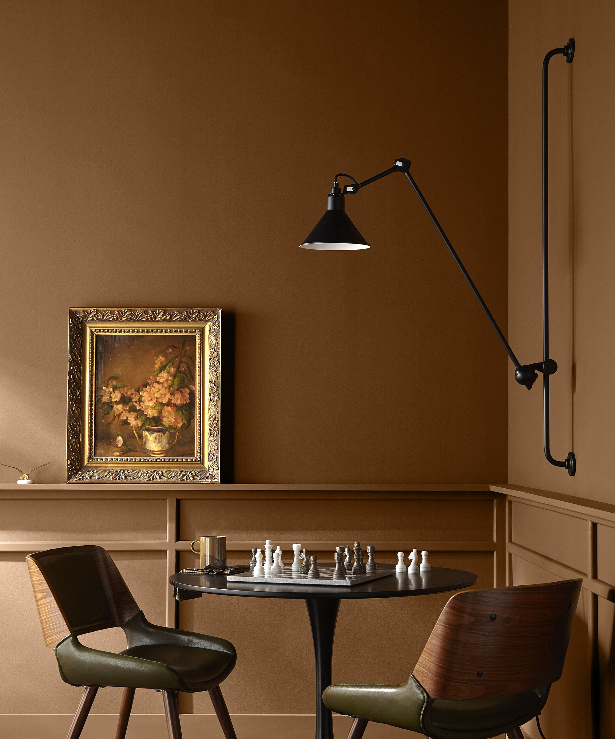
Warm, grounding and versatile, there's a lot to love about this earthy tone.
Considering a dark neutral, earthy brown is grounding but also has an elegance that is truly sophisticated. Versatile, it can be striking on its own or allow other hues to stand proud. Cognac feels old and nostalgic but it is really warm comforting and feminine.
‘Being polychromatic, cinnamon brown goes with everything, but in deeper, very rich hues it is particularly good at flattering beautiful, well-drawn patterns,' says Edward Bulmer, interior designer and founder, of Edward Bulmer Natural Paint.
I love this color because it’s flattering on your complexion, as the warm tones give off a lovely glow. It’s a gentle shade that won't darken a room with little natural light.
5. Juniper Tree
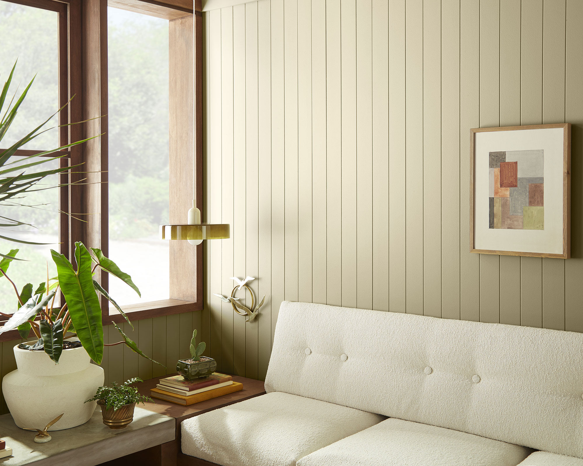
Green is such a calming, restorative color that is rooted in nature. Like a gentle summer breeze, the alluring Juniper Tree is refreshing and uplifting.
Pale green is entwined with the permanence and beauty of nature and is a timeless choice for interior decorating that shows no signs of abating. In addition to its mood-enhancing properties, light green is loved by interior designers for its versatility. Restful and calm, it works in any room and can be paired with so many colors.
‘This tone of green, which is both a subdued yet lively color, for me is a quiet neutral. It is a great backdrop for any interior and works well for displaying art, as well as in more functional rooms, such as kitchens. It will complement both warm and cool tones, allowing it to serve as a subtle backdrop, or take on a more prominent role in the overall color scheme.
Classic, calming and synonymous with nature, pale green is a hue that keeps the peace.

Jennifer is the Digital Editor at Homes & Gardens. Having worked in the interiors industry for several years in both the US and UK, spanning many publications, she now hones her digital prowess on the 'best interiors website' in the world. Multi-skilled, Jennifer has worked in PR and marketing and occasionally dabbles in the social media, commercial, and the e-commerce space. Over the years, she has written about every area of the home, from compiling houses designed by some of the best interior designers in the world to sourcing celebrity homes, reviewing appliances, and even writing a few news stories or two.
-
 I've spent over 200 hours testing vacuums and swear by my two Dysons – this is how I properly clean a Dyson vacuum filter for longer-lasting appliances
Your Dyson vacuum will last much longer and clean at its best
By Dan Fauzi Published
-
 Bethenny Frankel calls this $695 machine the 'Rolls-Royce Cullinan of coffee' – it's a must-have luxury buy for iced-coffee lovers this springtime
The Real Housewife swears by a luxurious machine that makes nitro cold brew, cold brew, and cold espresso at the touch of a button – here's why it's worth it
By Sophie Edwards Published