What are the best dark blue paints? We asked interior designers – these 6 shades came out on top
Moody and sophisticated, these dark blue paints are favorites among designers
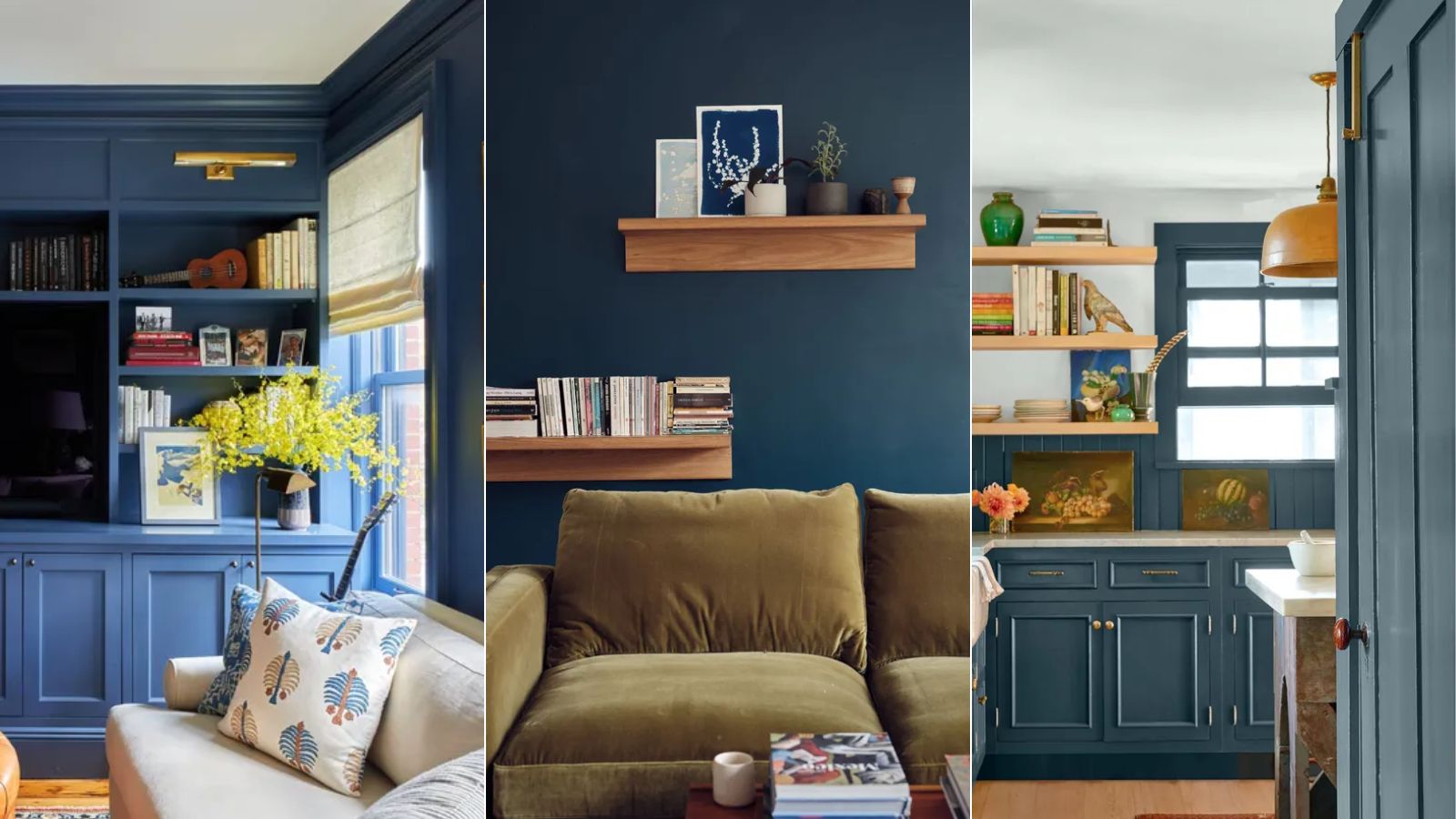

Decorating with dark blue makes for one of the most timeless color schemes. A go-to color choice for adding a sense of drama to the home while maintaining an air of sophistication, dark blue is an always-in-style hue.
From classic navy blues to those with gray or green undertones, there are many varieties of dark blue paint ideas to use in throughout interior schemes. Here, we've rounded up the best among them, according to interior designers who turn to these favorite shades time after time.
6 of the best dark blue paints
Farrow & Ball's color expert Patrick O'Donnell notes the positive effect decorating with blue, in many variations, has throughout the home, making it an ever-popular choice:
'They are easily the palette of choice for many, from amateur decorators to interior designers, as they're incredibly easy to live with and perfect for layering. Blue also comes with positive attributes in color psychology, such as enthusiasm, sympathy, and warmth.'
Below, we've rounded up six of the most loved dark blue paints from leading paint brands. If you're looking for the perfect moody blue to introduce into your home decor ideas, these suggestions will have you covered.
What is the most popular dark blue paint?
When we asked interior designers what their favorite dark blue paints are, one shade in particular came up time after time: Benjamin Moore's Hale Navy. A classic, dark navy blue paint, designers rave about this color. Praised for its versatility, read on to hear how to decorate with Hale Navy, as tried and tested by the experts.
1. Van Deusen Blue, Benjamin Moore
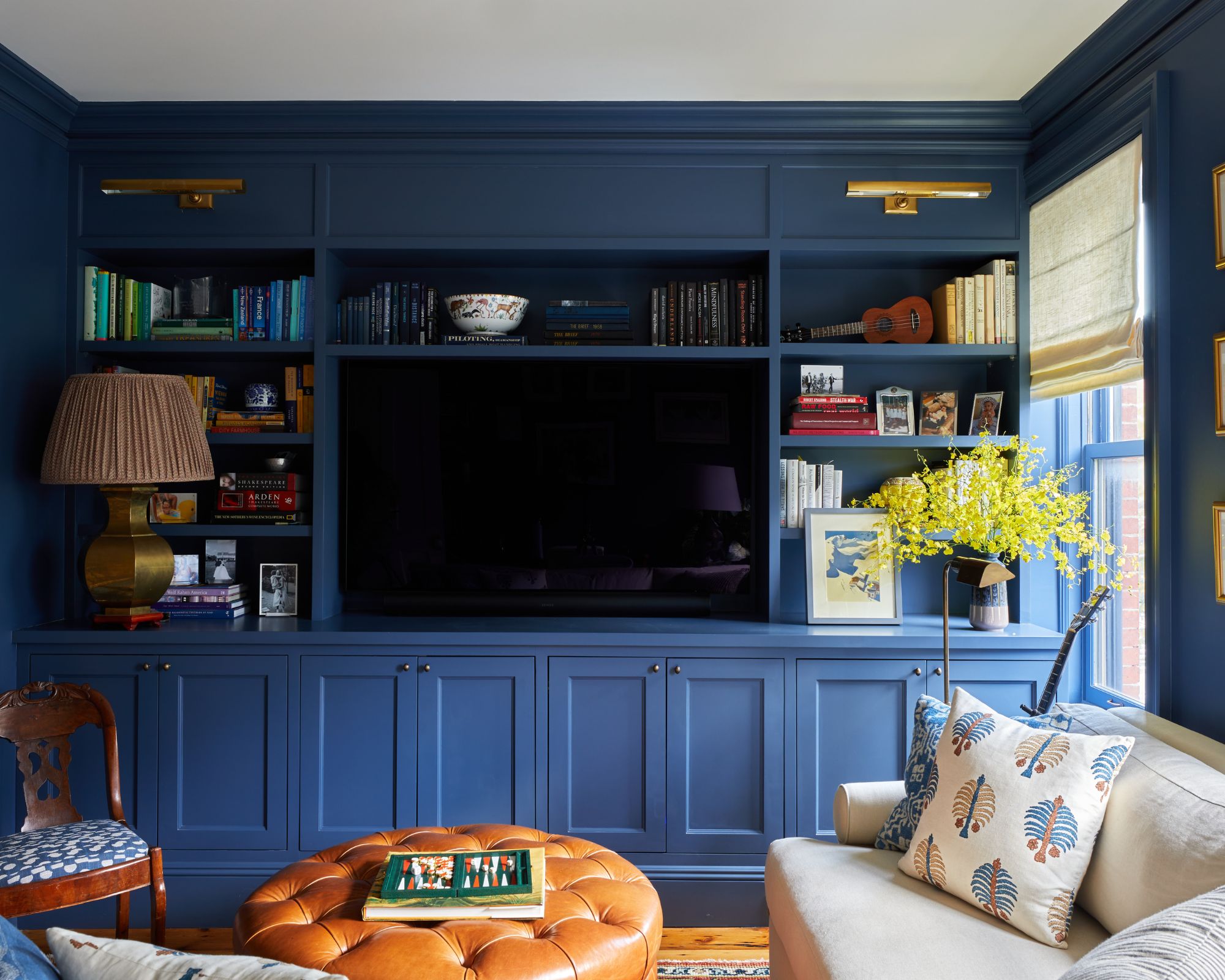
New York-based interior designer Rebecca Amir Design loves decorating with Benjamin Moore's Van Deusen Blue, which she used in this classic living room.
'I love to use Benjamin Moore's Van Deusen Blue to envelope a room in a bold color that still feels classic,' explains Rebecca. 'This space gets a lot of beautiful natural light, so we knew it could handle a dark, bold shade.'
Rebecca adds that she opted for warm brass accessories to complement the sophisticated look of the dark blue walls and cabinetry: 'I love the way brass lighting contrasts against this shade of blue, so we layered in brass and gold decorative touches in the art and accessories.'
Interior designer Margarita Bravo also says Van Deusen Blue is one of her favorite dark blue paints. Although bold, Margarita says that it makes a flattering choice for both traditional decorating ideas and modern decorating ideas: 'It's a beautiful color that works well in both modern and traditional interiors and can also be used as an accent wall or for custom cabinetry. I find myself going back to this color time and again for projects of all types.'
2. Foggy Day, Sherwin-Williams
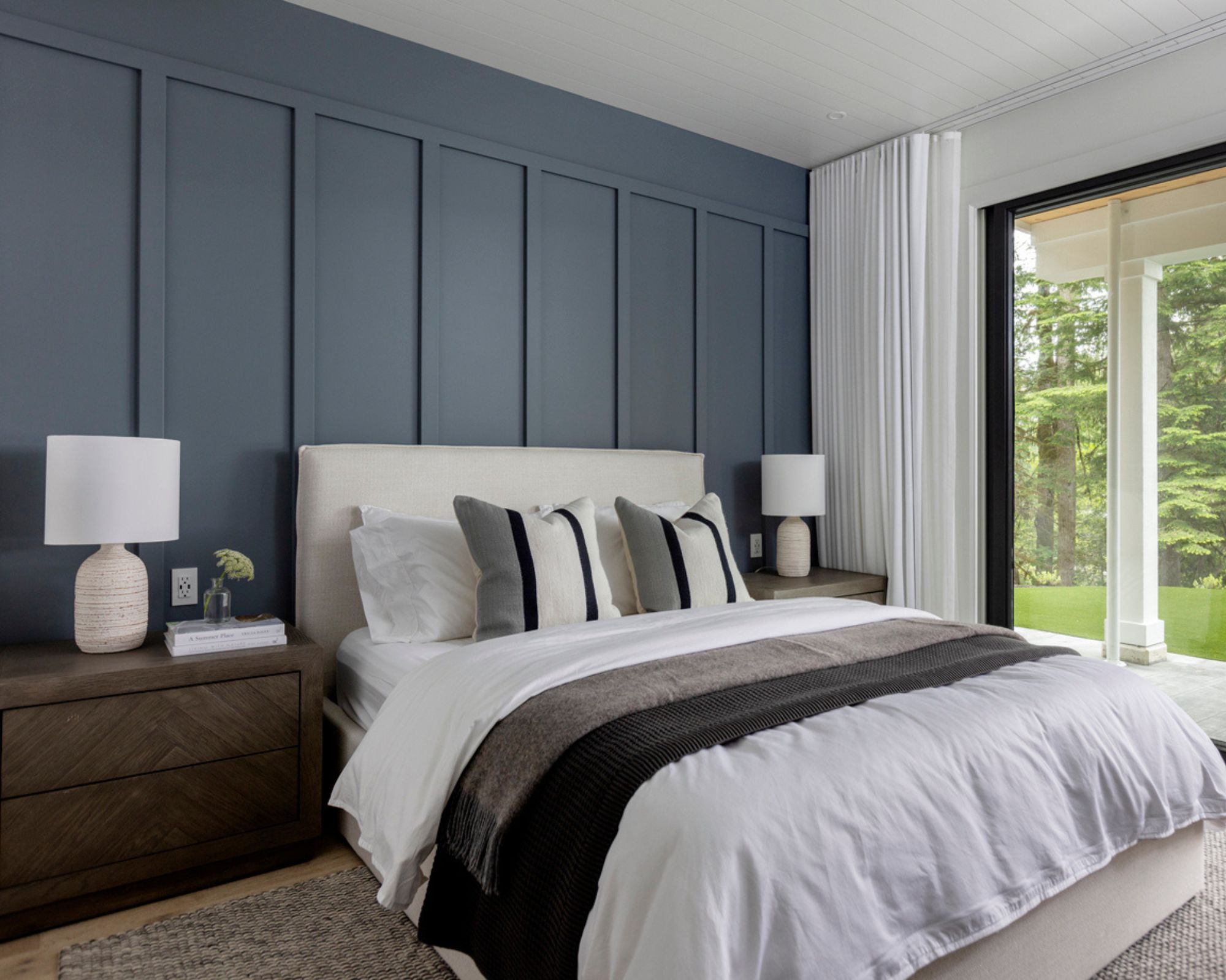
If you're looking for a dark blue paint that leans more gray, interior designers point to Sherwin-Williams' Foggy Day.
Co-founders of interior design firm Knight Varga Interiors Trish Knight and Nicole Varga used Foggy Day in this guest bedroom, demonstrating its calming yet impactful look.
'Sherwin-Williams' Foggy Day is a favorite deep blue with gray undertones,' the design duo explains. 'It is perfect for bedrooms with its peaceful and relaxing hue.'
Opting to use this moody blue paint across wall paneling ideas, the paint choice feels extra impactful against the otherwise pared-back decor.
'We used it as a feature over a board and batten wall detail in this guest bedroom', the designers explain. 'It is nicely balanced with natural wood-toned furniture and flooring ideas, along with crisp white linens and white walls. It is beautiful with the greens of the forest outside the window.'
3. Newburyport Blue, Benjamin Moore
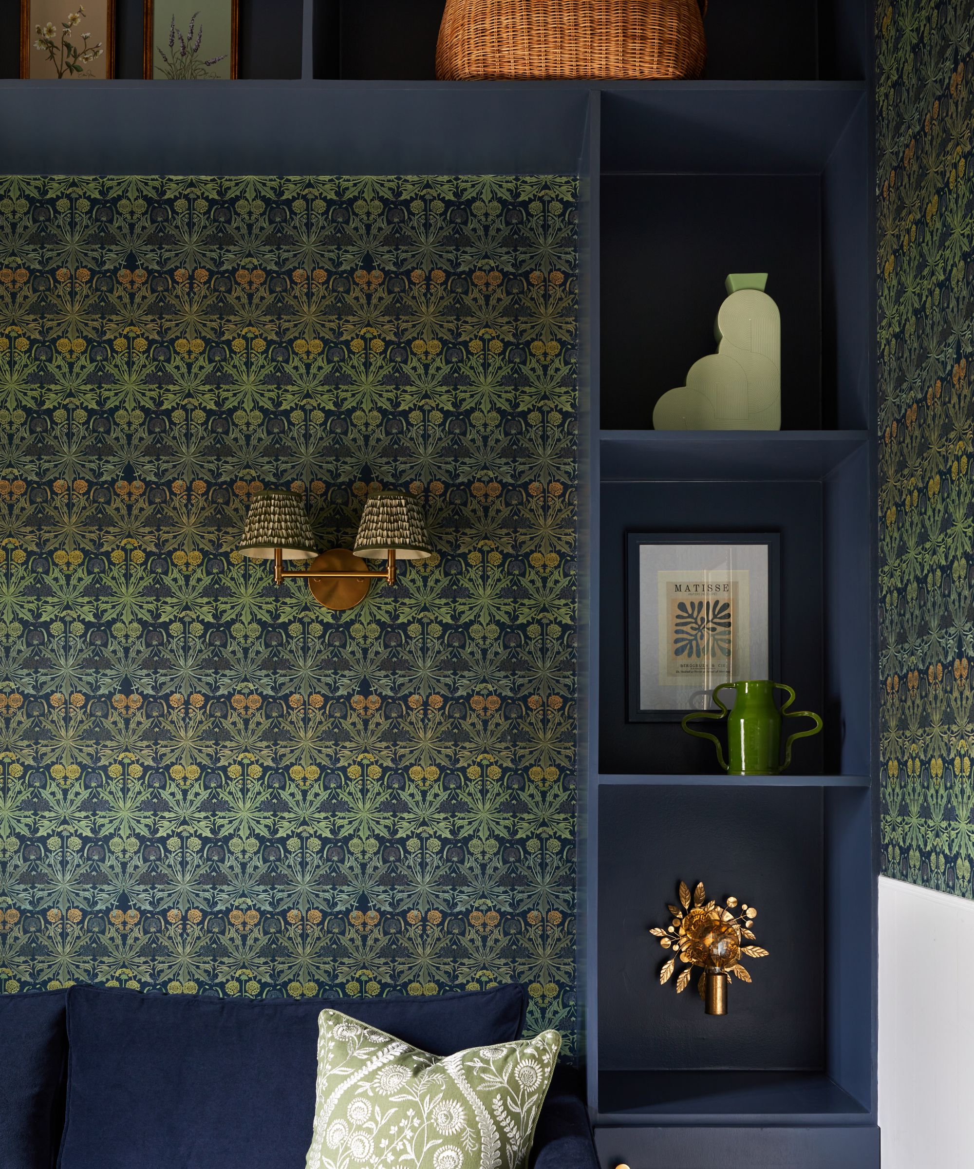
Benjamin Moore's Newburyport Blue is another favorite among designers. A classic dark blue but with a slightly muted feel, Newburyport Blue can be used throughout the home.
'One color I love to use is a deep, rich, but not too dark blue by Benjamin Moore called Newburyport Blue,' comments interior designer Isy Runsewe, founder and creative director of New York-based Isy's Interiors. 'It's my go-to choice to create a timeless, elevated atmosphere. It's versatile and effortless and can lean traditional or contemporary, and everything in between.'
Isy opted to use this Benjamin Moore shade on the millwork here, paired with intricate wallpaper ideas for a timeless look.
'One of my favorite ways to bring in color is on custom millwork, and Newburyport Blue is no exception,' adds Isy. 'When painting millwork in such a rich color, I love to really go for it and match fabrics and wallpapers and other elements within the space to really up the whimsy and sophistication.'
4. Hague Blue, Farrow & Ball
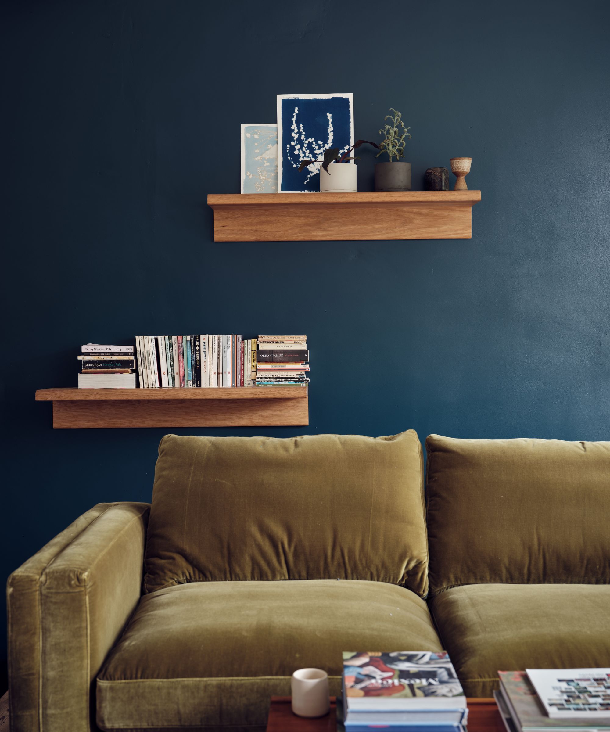
Hague Blue is one of Farrow & Ball's most popular paint colors, and for good reason. This dark blue paint has green undertones that elevate it from a classic navy blue, creating as much of a dramatic look in small rooms as in larger spaces. Time after time, we see Farrow & Ball's Hague Blue embraced by interior designers for its cozy effect.
Farrow & Ball's Patrick O'Donnell adds that it's an especially good dark blue paint for north-facing rooms: 'Our ever-popular Hague Blue works a treat, even in north-facing rooms, because the underlying green note prevents it from ever feeling too chilly.'
5. Hale Navy, Benjamin Moore
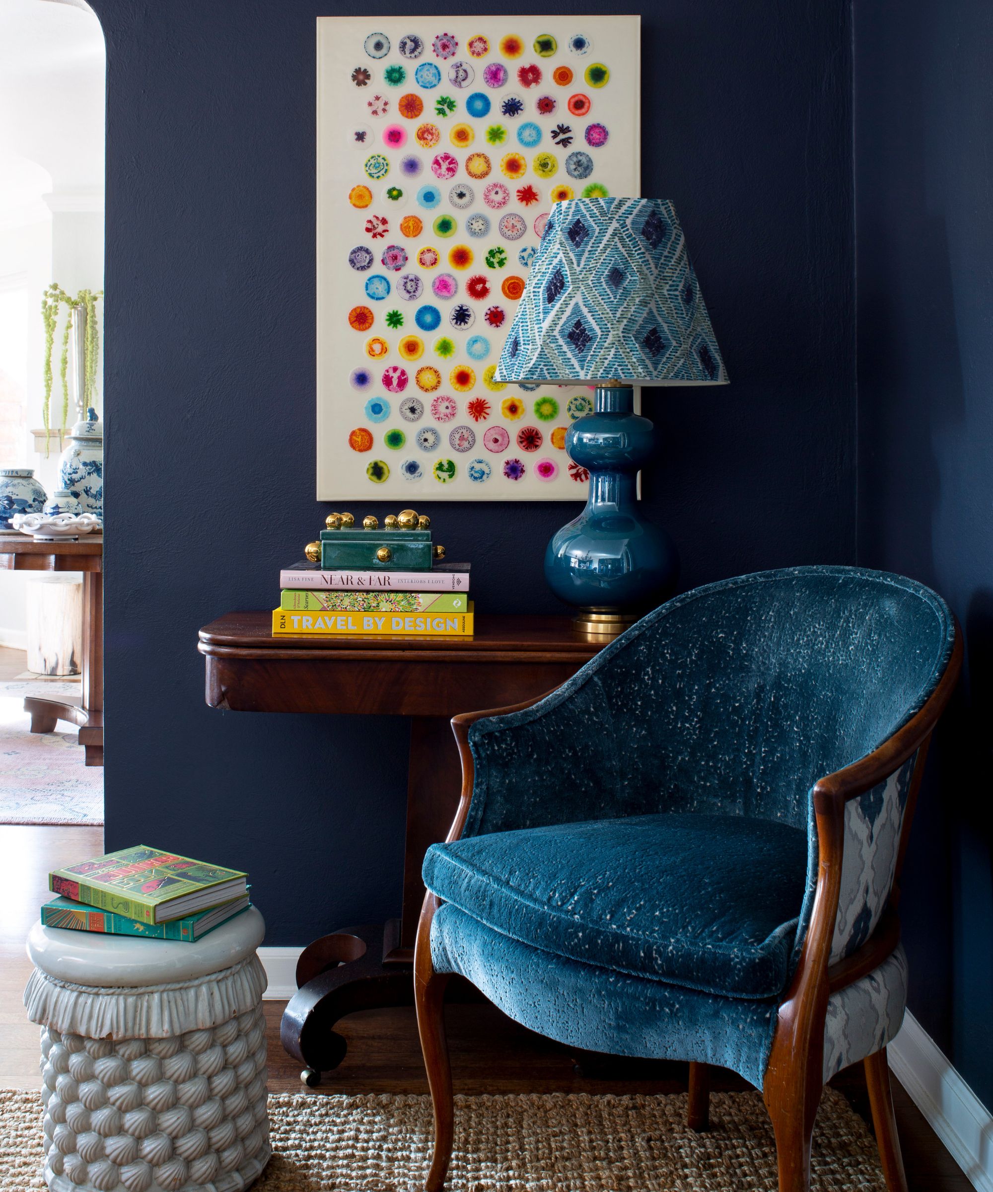
'Hale Navy by Benjamin Moore is my go-to blue,' says interior designer Nadia Watts. 'Hale Navy is the perfect balance of color; it has both warm and cool tones. It’s dark and moody but also provides a splash of color to compliment any palette.'
Nadia used Hale Navy on the walls in this cozy seating area, creating a sophisticated and dramatic look. Although dark, Nadia explains that this paint color is easy to integrate throughout the home, working almost like a neutral.
'Hale Navy works as a neutral, it perfectly complements almost any color scheme,' says Nadia. 'It's beautiful on its own, however, it especially pops next to a crisp white and also works really well with wood tones like mahogany, walnut, and white oak.'
We asked color specialist at Benjamin Moore, Helen Shaw, to share more about this dark navy paint. She reinforces its versatile nature, making it one of their most popular paints.
'Hale Navy is a ‘use-anywhere’ shade of navy with a classic maritime feel, giving it a good reason for being one of Benjamin Moore’s most popular dark blue paints,' comments Helen. 'This shade works particularly well in busier spaces such as living rooms for making a versatile style statement.'
'Alternatively, opt for this rich hue in the kitchen, on cabinetry in particular, for industrial styles or more traditional shaker kitchens. Pair with a crisp white as the sharp contrast between the two hues will create a dramatic, yet calming effect.'
6. Newburg Green, Benjamin Moore
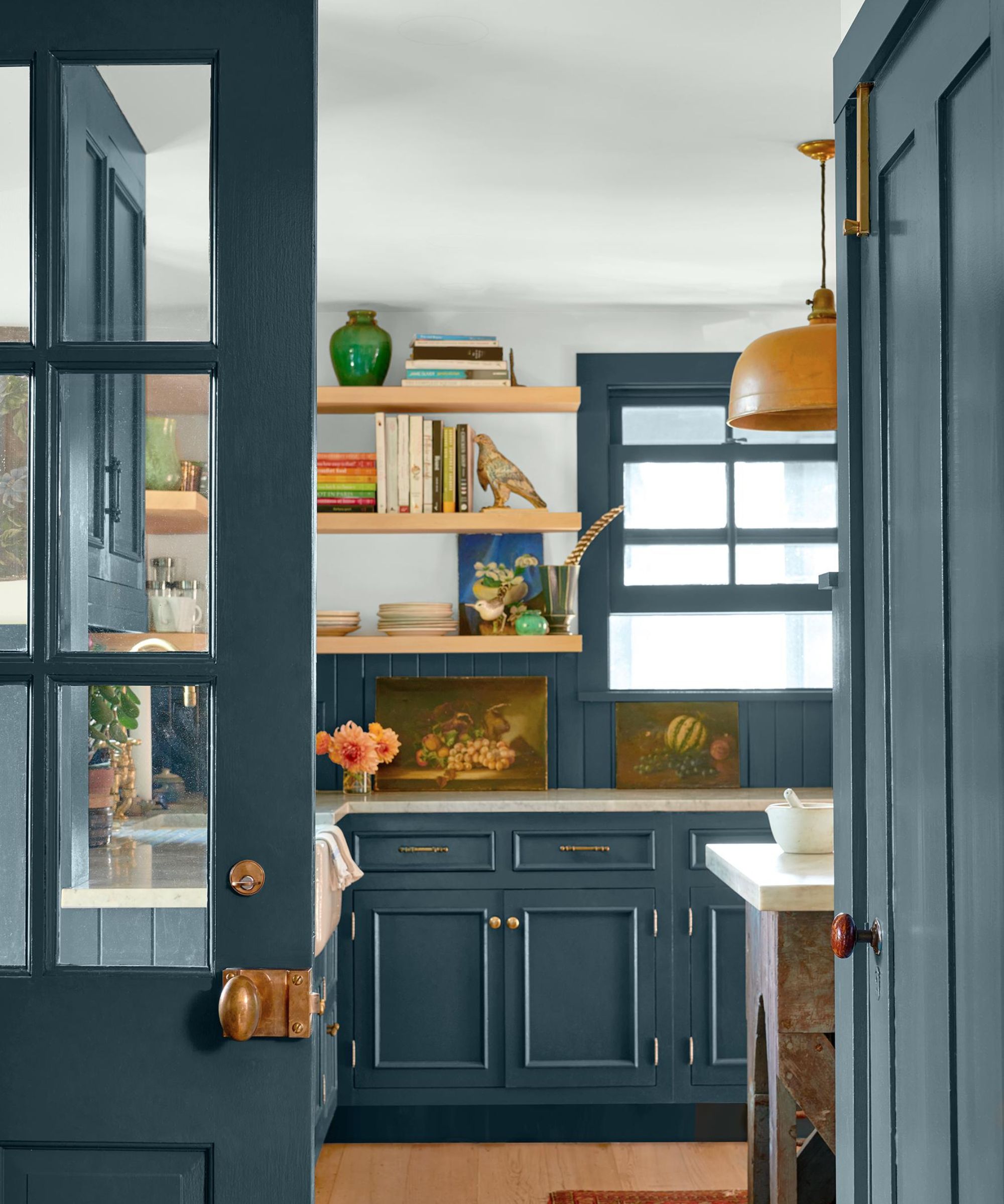
Despite its name, Benjamin Moore's Newburg Green is a dark blue paint recommended by interior designers for a slightly less intense take on this color trend.
A favorite dark blue paint for interior designer Susan Yeley, creative director and owner of design firm Susan Yeley Homes, she describes Newburg Green as a 'nuanced navy' that can be used as a dark neutral:
'We love Benjamin Moore's Newburg Green from their Historical Collection, which is really a nuanced navy – proving once again that you should never trust a color's name!'
'The green undertones elevate the color,' continues Susan. 'We have used it for front doors and contrast molding inside and find it to be a perfect dark neutral, with more depth and interest than a truer navy like Hale Navy.'
Dark blue is a classic color choice in interior design, creating a timeless, moody look. With these paint suggestions, you'll soon see the benefits this deep and dark hue brings to the home.
If you're looking for something lighter, these are the best pale blue paints for a much softer take on this color trend.
Sign up to the Homes & Gardens newsletter
Design expertise in your inbox – from inspiring decorating ideas and beautiful celebrity homes to practical gardening advice and shopping round-ups.

Emily is a freelance interior design writer based in Scotland. Prior to going freelance in the spring of 2025, Emily was Homes & Gardens’ Paint & Color Editor, covering all things color across interiors and home decor for the Homes & Gardens website. Having gained specific expertise in this area, Emily is well-versed in writing about the latest color trends and is passionate about helping homeowners understand the importance of color psychology in home design. Her own interior design style reflects the simplicity of mid-century design and she loves sourcing vintage furniture finds for her tenement flat.
-
 Plants never to grow next to fruit trees
Expert advice on which plants to keep away from fruit trees to encourage a healthy harvest
By Jacky Parker Published
-
 Martha Stewart's tips for arranging daffodils are unbelievably simple and effective – it's the only flower advice you need this springtime
Martha shows us that we can create gorgeous bouquets of this seasonal flower by simply trimming the stems and placing them in specific vases
By Hannah Ziegler Published