6 best brown paints to embrace the trend for this soft and moody hue
Brown paints are everywhere right now, so we asked interior designers for their favorite shades to work with
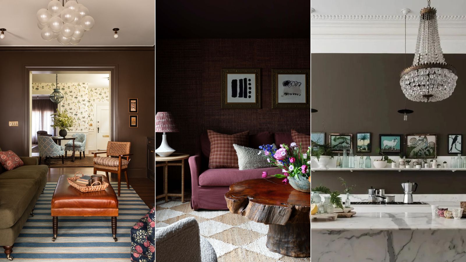

Brown paints weren't something that got a look in a few years back. Rarely would you see a brown room and now these moody, yet soft shades are a huge color trend for 2024, as we are all discovering how easy to use and versatile this seemingly daunting shade can be.
But not all brown paints were made equal and there are so many options to choose from super dark almost black shades to super pale closer to beiges. So to get the best picks we asked interior designers who have plenty of experience decorating with brown and how they work with the color.
The best brown paints to nail this ever-growing trend
'Brown paint can be a particularly daunting color because of perhaps its association with the “worst” of the ’60s, 70s, and 80s. But this is a bit unfair,' says designer Jacu Strauss.
'I believe it is important to think about the bigger picture when considering any color in an interior and brown paint in particular should not be thought of in isolation. Brown can be a great earthy and rich tone that really works as a good base palette when combined with strong accents like bright pinks and bright blues, even especially yellow.'
Brown can be a really easy shade to work with, and honestly, we would say treat it more like a neutral and don't be put off by its heritage of being a bit of a naff or dull color. Color trends are all pointing towards brown making a resurgence. It's soft and muted and far easier to bring into a space than a dark gray or those ever-popular navy blues. It's just about picking the right shade for your spaces.
1. Farrow & Ball, Salon Drab
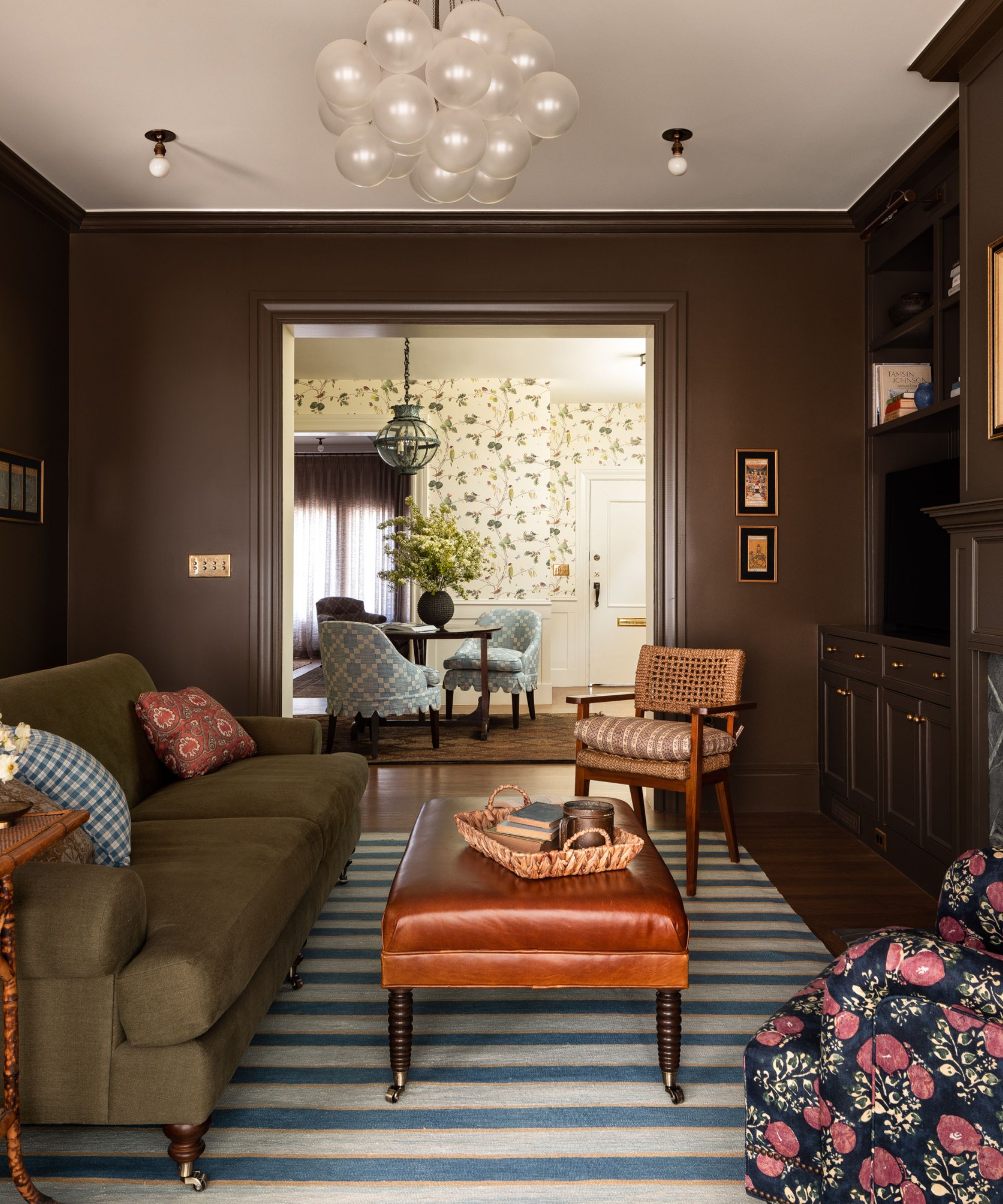
Salon Drab by Farrow & Ball came up a lot when we asked designers for their best brown paints. Despite the name, it's far from drab and is an incredibly rich and warm brown which makes it a very liveable shade that pairs wonderful as part of a tonal neutral palette.
The warmer undertones mean it looks lovely with earthy colors like olives, terracotta, oranges, and wooden-tones as can be seen in this brown living room designed by Heidi Caillier. And it works with the other side of the color wheel too, there's touches of blue in this room that give all those muddier tones a real lift.
'Farrow & Ball’s Salon Drab has the perfect neutral undertone that’s richer than say Mouse’s Back, without having any red undertones,' explains Anastasia Casey Editorial Director of The Interior Collective. 'For someone ready to commit to a moodier space but doesn’t want to go overboard, Salon Drab will saturate a space without overwhelming it.'
Anastasia Casey main business, IDCO Studio, is a creative agency specializing in beautiful and unique marketing solutions for interior designers. She is also celebrated for her interior design skills, and her monochromatic aesthetic, layered in texture and pattern, is highly sought after and admired. Anastasia launched The Interior Collective podcast last year, and is also founder of Design Camp, a business retreat for interior designers in Austin, Texas.
2. Caponata, Benjamin Moore
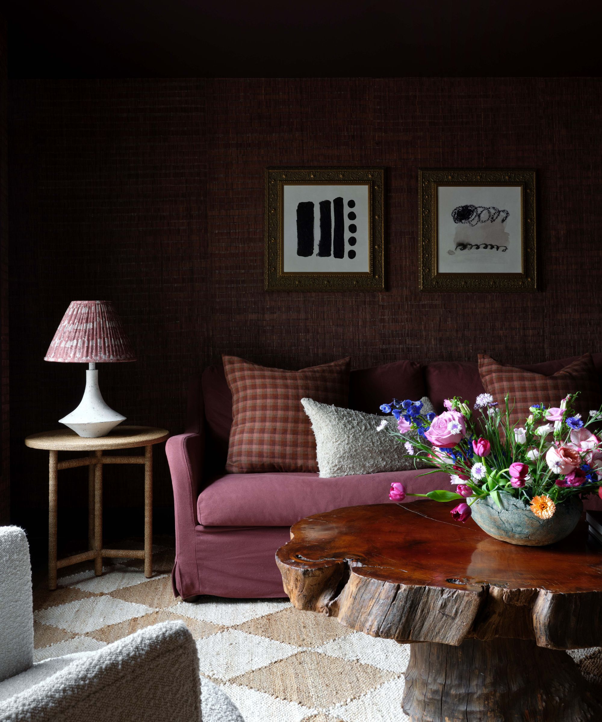
Another very popular pick, Benjamin Moore's Caponata is so warm it's almost a dark purple. And you can choose to really bring out those red tones by layering it with maroons and eggplant shades for a gorgeously sumptuous feel.
'We used Caponata on the ceiling and trim in this space. It’s a deep, rich, brown with deep red undertones,' explains Anastasia. 'This is the perfect color to ease into more bold hues, as it can read purple or brown depending on the light. As with any darker color, I highly recommend leaning into it fully and painting the walls and ceiling the same color for a fully color drenched look.'
Kristen Fiore of Kristen Elizabeth Design agrees, 'Benjamin Moore's Caponata is a gorgeous and rich brown with hints of purple undertones. We love the earthy feel of this color as a commitment to the whole house color paired with Sanctuary (a super pale lilac) on trim.'

Kristen Fiore, owner and lead designer of Kristen Elizabeth Design based in Sacramento, California Kristen Fiore, the founder of Kristen Elizabeth Design, is a talented interior designer with a lifelong passion for design. Growing up near New York City, she was immersed in a rich environment of inspiration and resources. She honed her skills and gained valuable experience in New York before moving to California.
3. Mouse Back, Farrow & Ball
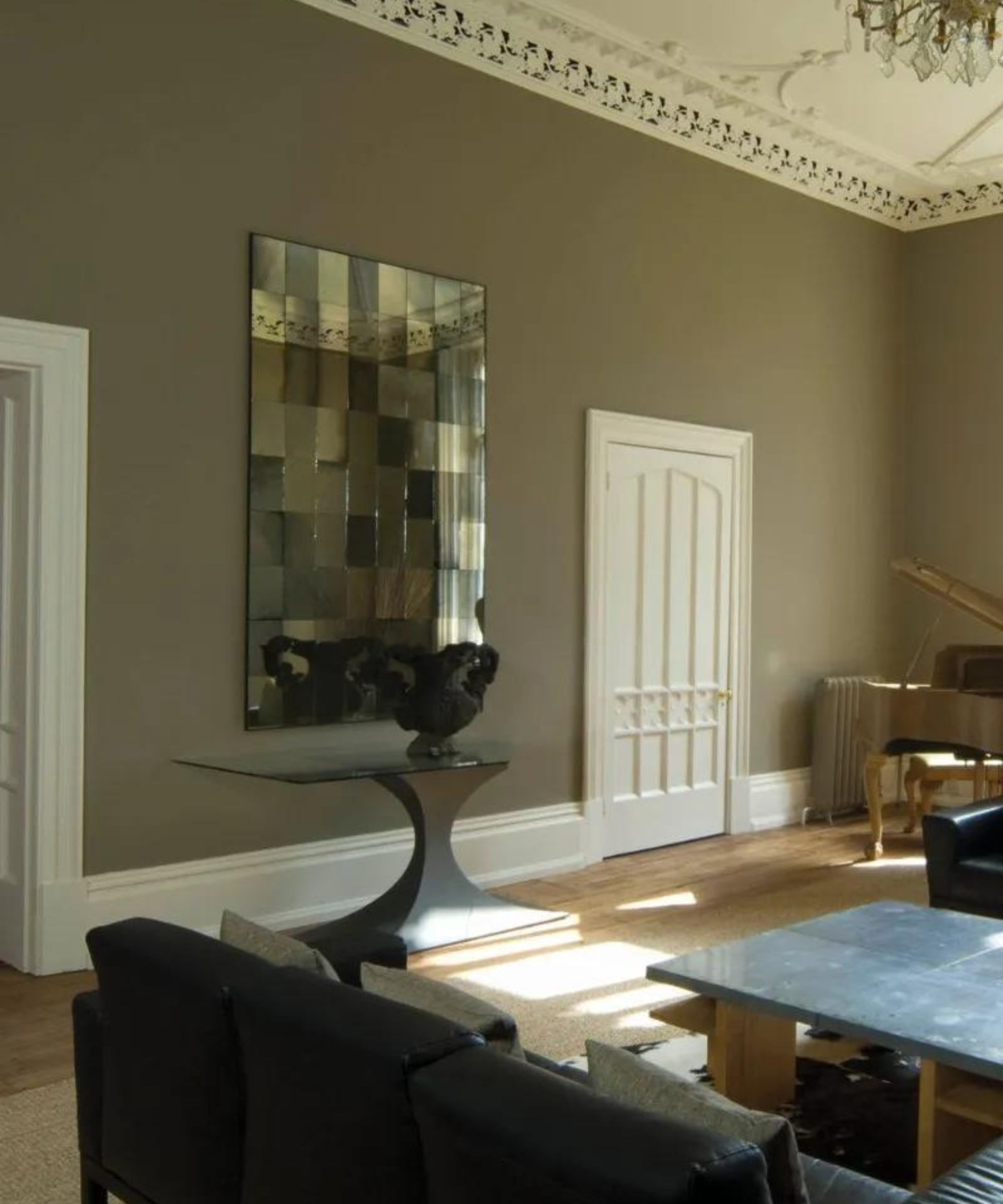
If you are after a brown paint that leans slightly gray, Farrow & Ball Mouse's Back is perfect. It's got green undertones so it's not as rich as the previously mentioned best brown paints but that does mean it has a freshness to it. It's a brown paint that doesn't appear too muddy or overly cocooning so you can pair it with crisp whites for a palette that feels both soft and light.
'Farrow & Ball’s Mouse's Back is a soft, gray-brown that has immense warmth and depth without feeling too “chocolate”,' explains Anastasia. 'The muddy, muted color makes a perfect option for cabinetry – especially built-ins. It gives a collegiate feel to a home library without being too dark.'
4. Chateau Brown, Sherwin Williams
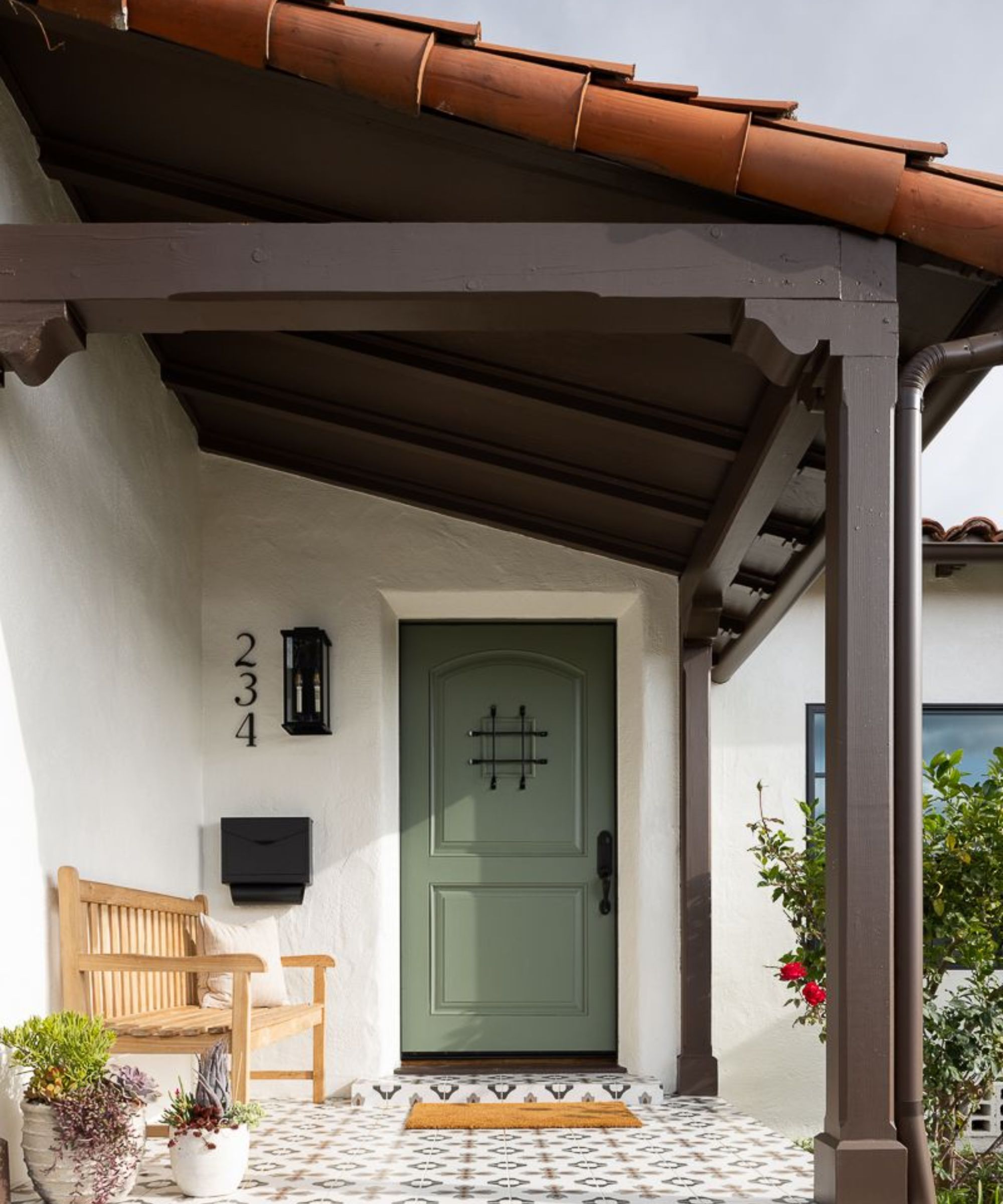
A very dark warm brown Chateau Brown is a bit of a chamleon shade and changes drastically under different lights and depending on what colors you pair it with so be sure to order samples. It does need quite a lot of natural light if you want it to appear more brown than purple, but it can make for the best brown paint if you want to cozy up a light-filled space.
'Sherwin Williams Chateau Brown can be a bit of a tricky one because depending on the light it could swing a bit purple. Which is less than ideal when you are searching for the perfect pure brown color,' explains Mollie Ranize, founder of Dmar Interiors. 'However, for an exterior with plenty of natural light, Chateau Brown is the perfect complement to a creamy exterior that has a slight yellow undertone.'
5. Hidden Valley, Benjamin Moore
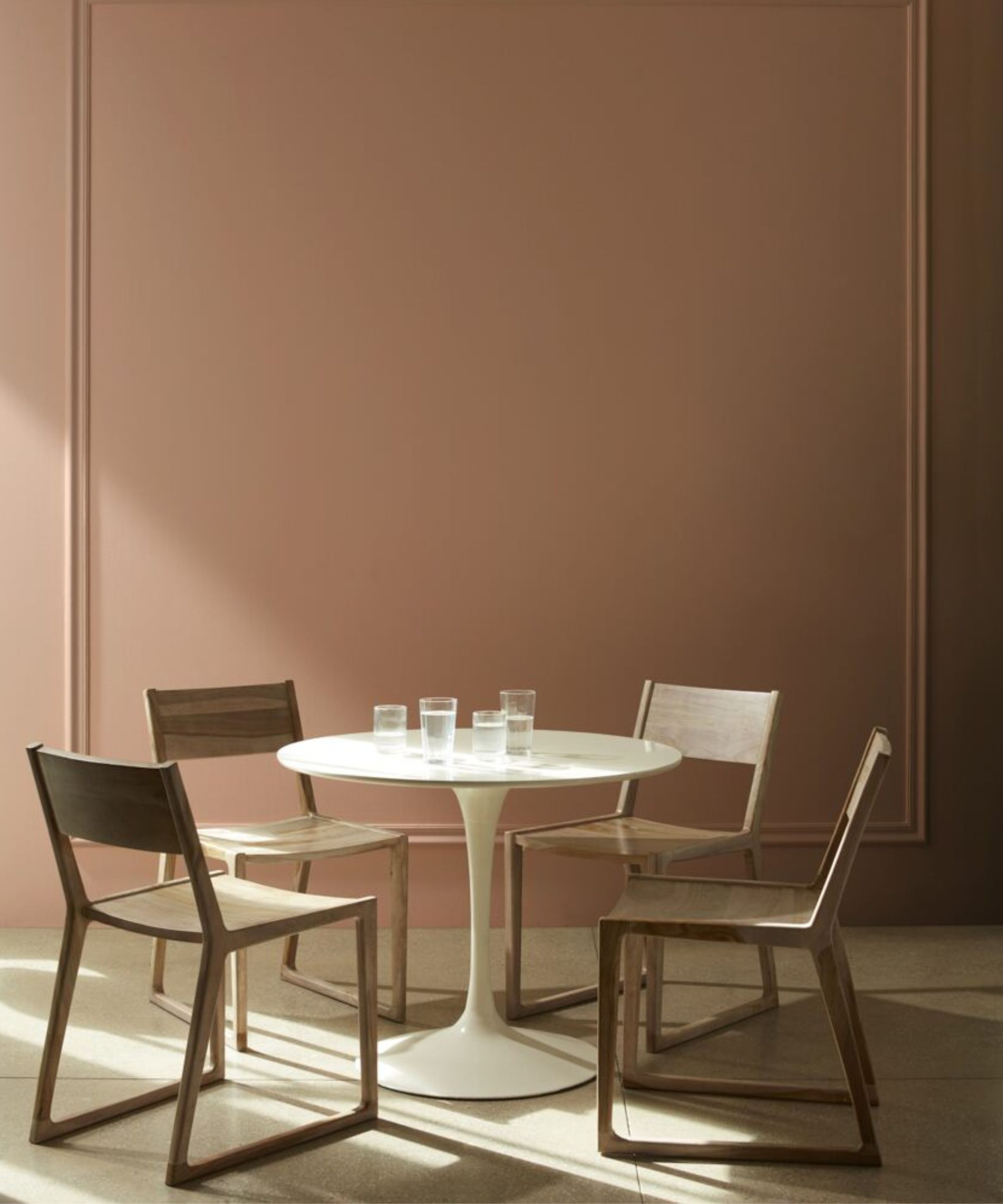
If you are after a really soft cinnamony-brown, Hidden Valley is perfect. It teeters being on a terracotta paint but with the orange tones toned down. It's perfect for rooms that don't get a lot of natural light as, even though this shade may get deeper in a darker room, it will never become drab or flat.
'One of my favorite brown paint colors is Benjamin Moore's Hidden Valley. This warm brown hue has a subtle touch of red in the undertone which makes it feel very homey and inviting rather than dark and heavy. I love this color for a room you want to feel very cozy and rustic – a den with a fireplace and hearth, or a tucked away study,' suggests Kathy Kuo.
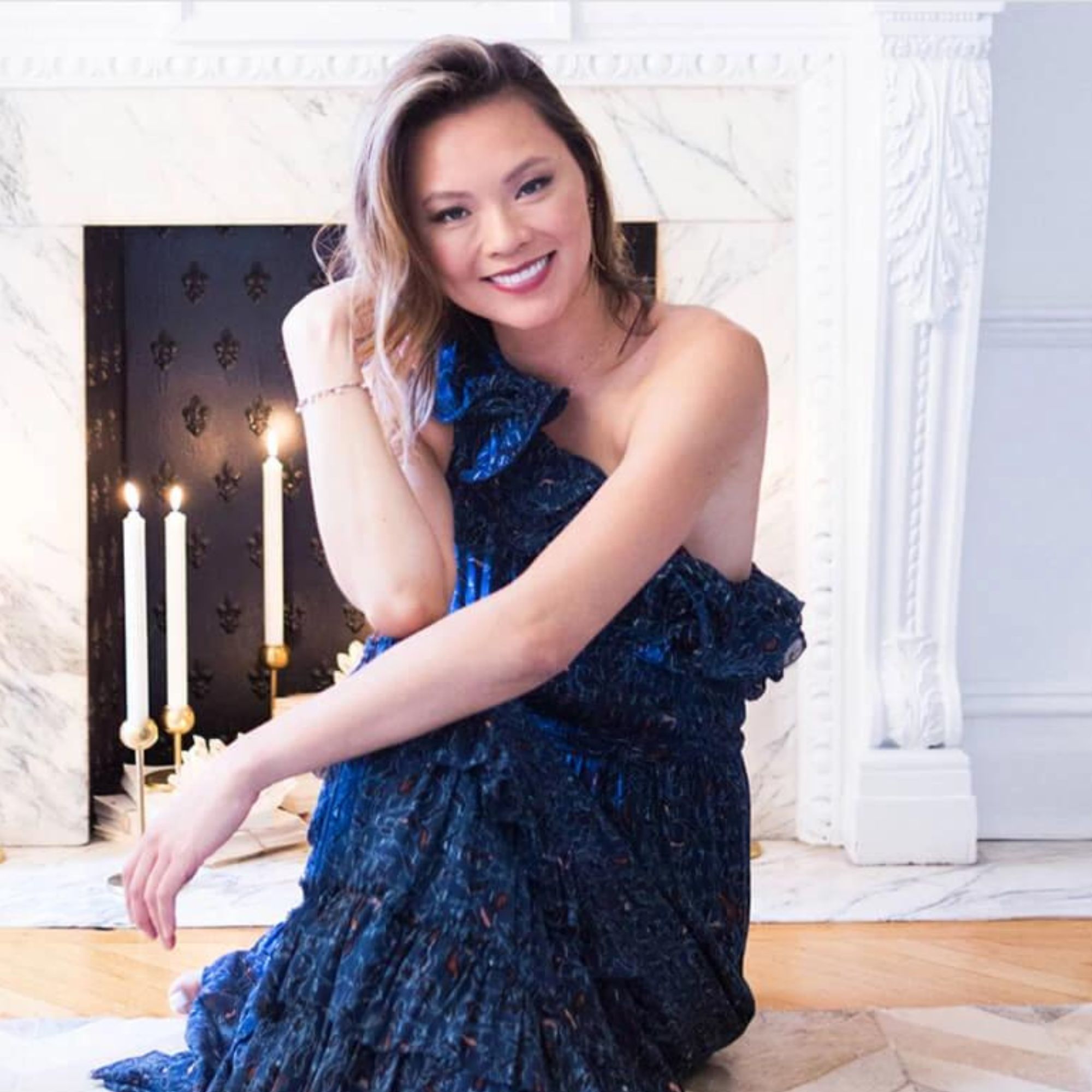
Kathy Kuo is a celebrated interior designer and international guru within the home and lifestyle space. She has 20+ years of experience in the design industry.
6.Universal Khaki, Sherwin Williams
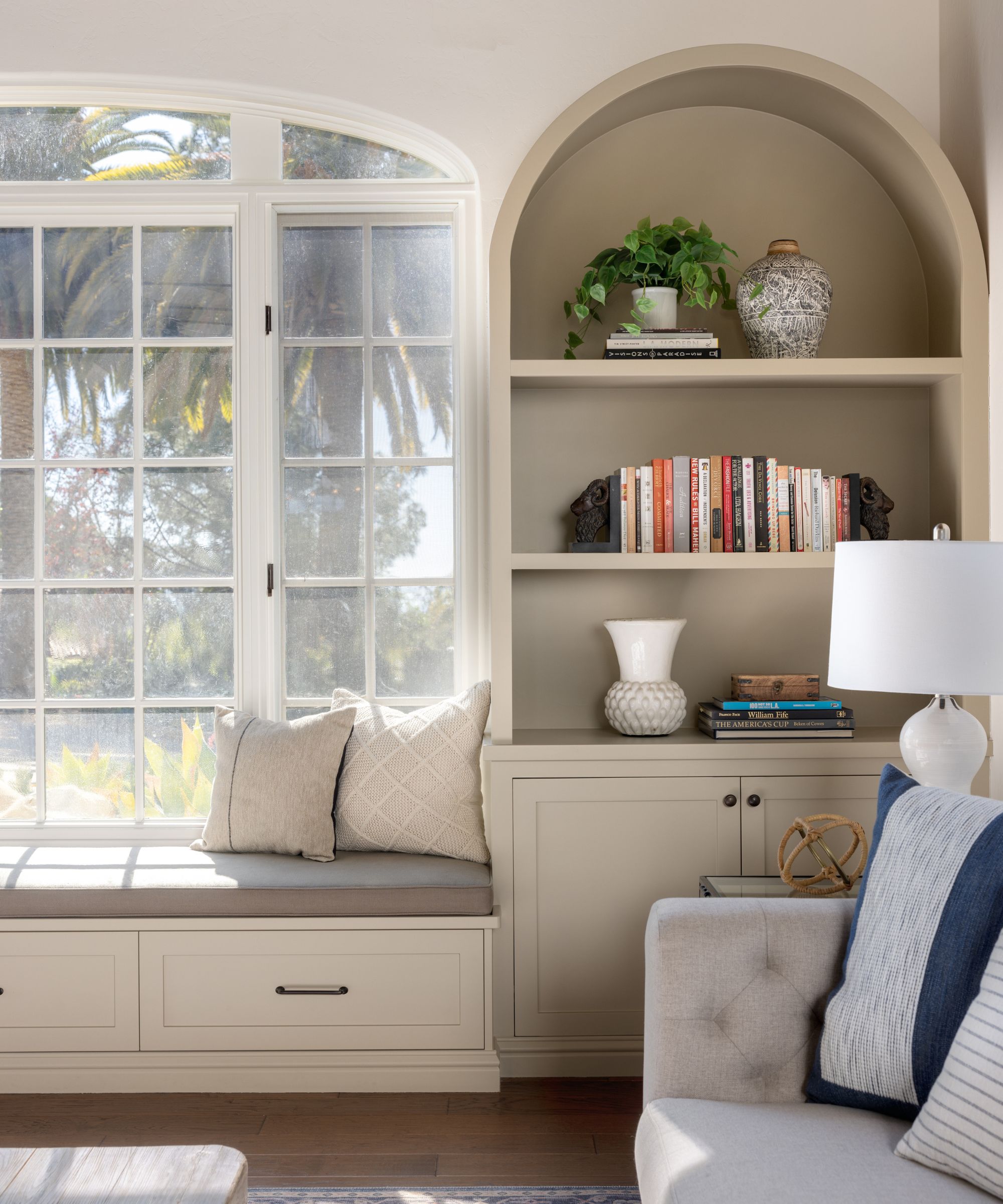
This is the first of our pale brown picks. Universal Khaki by Sherwin-Williams is a very pale yellow-toned brown that can appear darker or lighter depending on the light in the room. It's a very on-trend dark tan paint, that's perfect for creating an earthy color palette. Pair with crisp whites for a fresh look or even deep browns for something cozy and tonal.
'Sometimes a room just craves a dose of warmth and Universal Khaki steps up to the plate,' says Mollie. 'Like any good color, the amount of sunlight on this color dictates how saturated it looks. It's a very livable shade of tan that highlights custom woodwork nicely.'
Brown paints may be having a revival, but the rise in their popularity does point to a larger, more long-lasting shift away from cooler color schemes and sleek modern styles to warmer, more cozy, and lived-in spaces. 2024 is looking to be the year of the anti-trend, creating homes that feel gentle, and a brown paint is very in keeping with that feel.
Sign up to the Homes & Gardens newsletter
Design expertise in your inbox – from inspiring decorating ideas and beautiful celebrity homes to practical gardening advice and shopping round-ups.

I am the Head of Interiors at Homes & Gardens. I started off in the world of journalism in fashion and luxury travel and then landed my first interiors role at Real Homes and have been in the world of interior design ever since. Prior to my role at H&G I was the digital editor at Livingetc, from which I took a sabbatical to travel in my self-converted van (not as glamorous as decorating a home, but very satisfying). A year later, and with lots of technical DIY lessons learned I am back to writing and editing, sometimes even from the comfort of my home on wheels.
-
 Thoughtful modernism – how one Dallas home makes bold contemporary design feel warm, welcoming, and comfortable
With its mix of textural finishes and carefully curated furnishings, this modernist home is a refreshing retreat
By Karen Darlow Published
-
 'Wick away the ick' – 6 things people with clean laundry rooms always do to make this hardworking space shine
These tips on how to clean your laundry room will banish grime
By Seraphina Di Mizzurati Published