Best bold paint colors for kitchens – 6 brave shades recommended by interior designers
Give your kitchen a refresh with these bold paint colors – from bright and colorful to moody hues
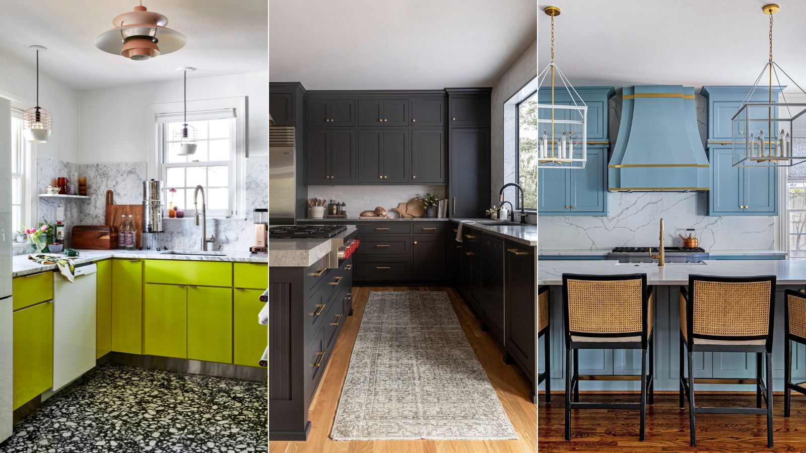

While neutral kitchens are amongst the most timeless, sometimes a bolder approach to color is needed to boost the appeal of these functional and social spaces. In 2024, designers and homeowners alike are transitioning from safe neutrals to lively hues in the heart of the home, and for good reason.
Since we spend so much time in kitchens, often doubling as dining rooms and spaces to entertain guests in addition to food preparation zones, the idea of commonly used neutrals can soon start to feel uninspiring. After all, 2024 is all about bolder colors, so why not extend this approach to the kitchen, too?
But when choosing a braver paint color to embrace in the kitchen, it can be tricky to know where to start, with so many shades to choose from. To help you on your way, we asked interior designers for their best bold paint recommendations for kitchens, which we've rounded up below. If you want to add some zeal to your home, read on to gain some kitchen color ideas.
6 best bold paint colors for kitchens
From vivid shades of green to deep and dark paint colors, these kitchen color trends suit both modern and traditional homes – guaranteed to add drama to the heart of the home.
1. New Lime, Benjamin Moore
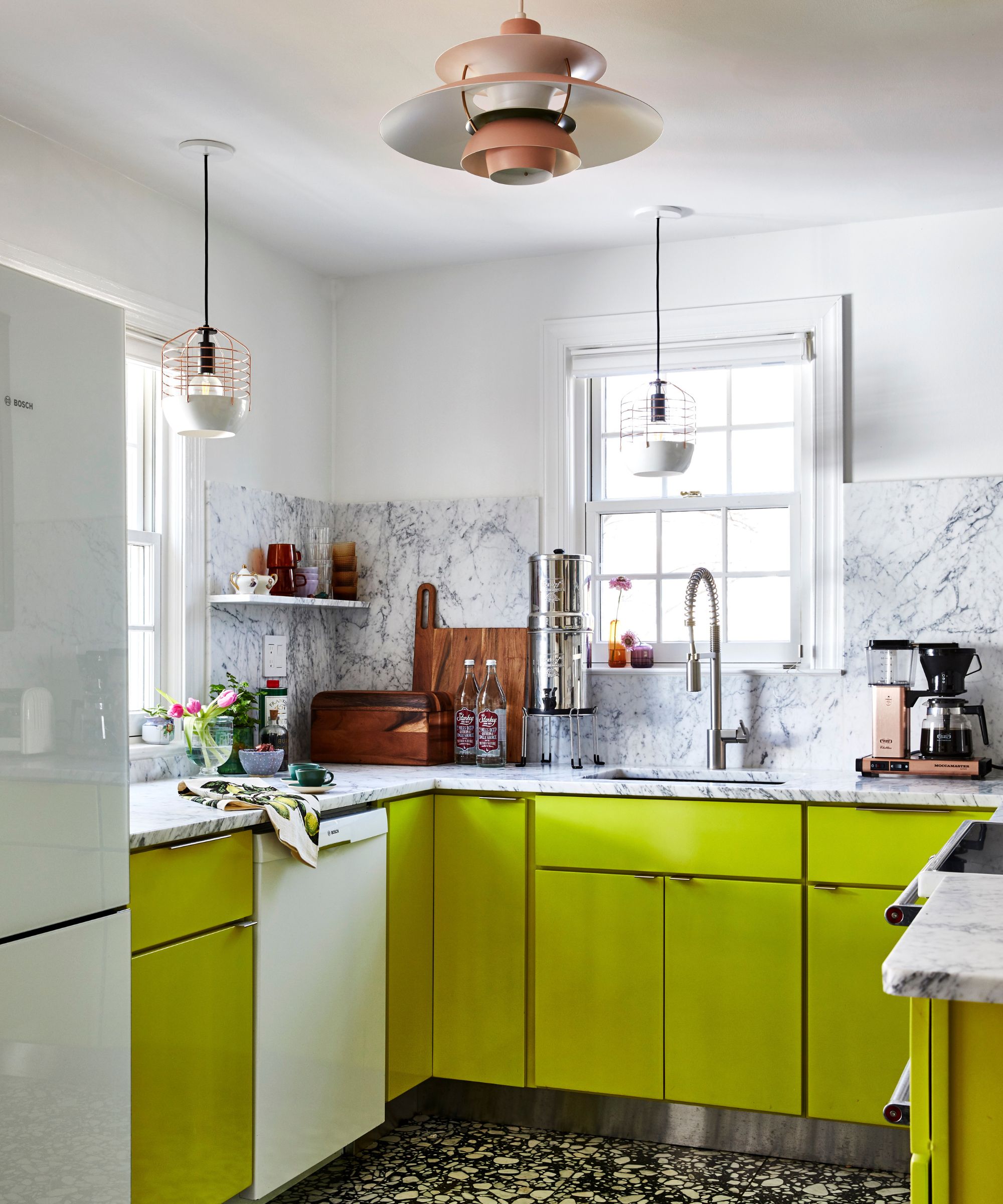
Starting with one of the most energizing shades, interior designer Nicole Lanteri opted for Benjamin Moore's New Lime for the lower cabinets in this modern kitchen. Below, the designer explains why this vibrant hue was the perfect shade to complement the room's otherwise neutral colors:
'This knockout lemon-lime neon is both energizing and delightful,' says Nicole Lanteri, Owner and Principal Designer at Nicole Lanteri Design. 'The zesty kitchen cabinets are an edgy companion to black-and-white terrazzo tile floors, all beautifully balanced with a white and gray marble kitchen countertop and backsplash. The result brings a lot of character to a small kitchen. I love this lively neon green so much that I couldn't resist using it on the fireplace, too.'
2. Energetic Orange, Sherwin-Williams
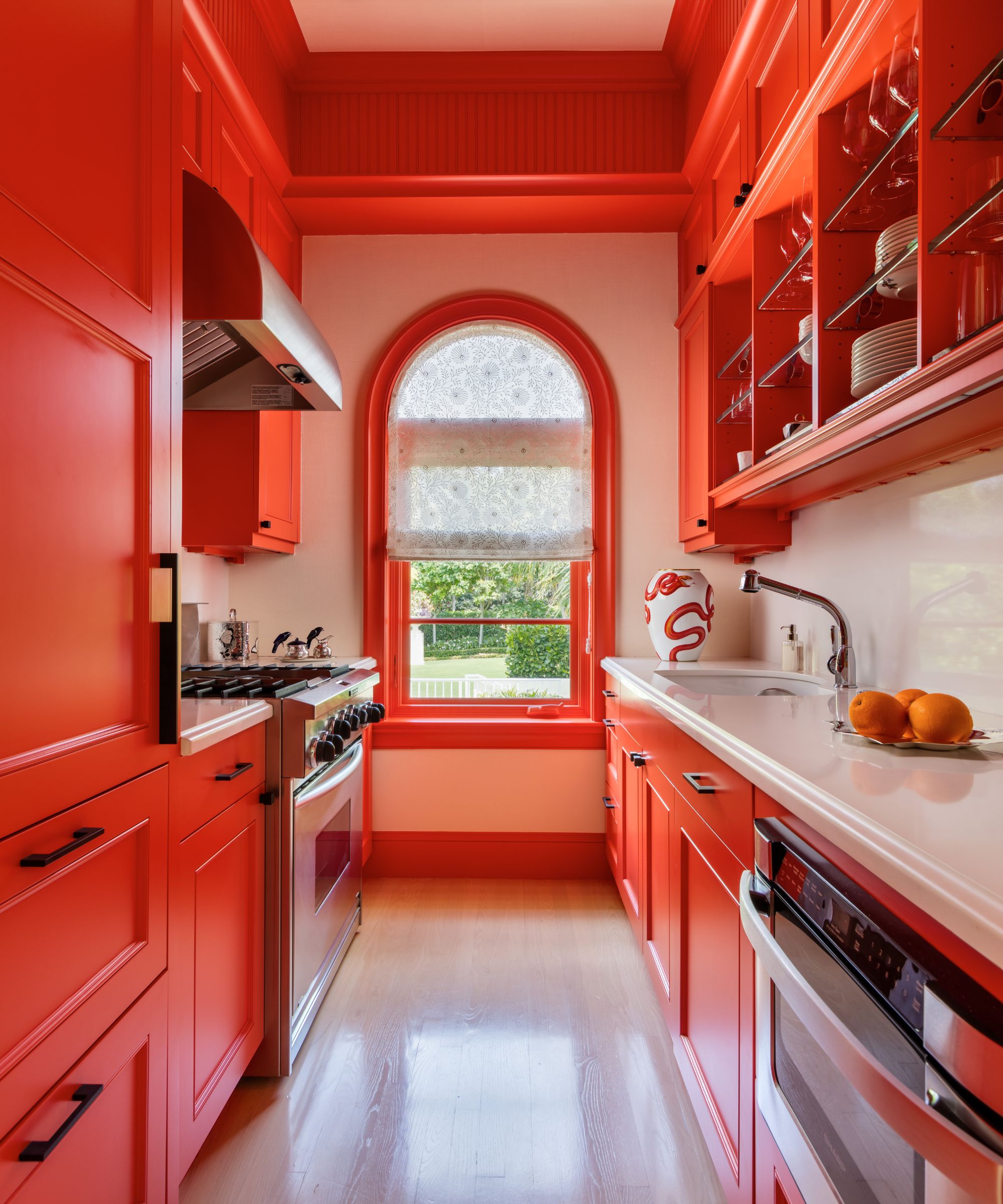
2024 has been all about decorating with red, thanks to the hugely popular unexpected red theory. But beyond small additions of this lively hue, we think that going all out with a red kitchen is one of the most stylish and playful design decisions.
Daring colors like orange-red can also give the illusion of more space, according to designer Matthew Boland of MMB Studio, who used Sherwin-Williams' Energetic Orange in this kitchen: 'Bold color is one way to grow a space that may physically have a small footprint. In this guest house, the kitchen is compact so I wanted to make it a star. The color is unexpected and generously applied.'
Looking for a more pared-back take on this kitchen color trend? Take a look at Farrow & Ball's Eating Room Red or Etruscan Red, both of which are deep, warming reds with an earthy feel.
3. Iron Ore, Sherwin-Williams
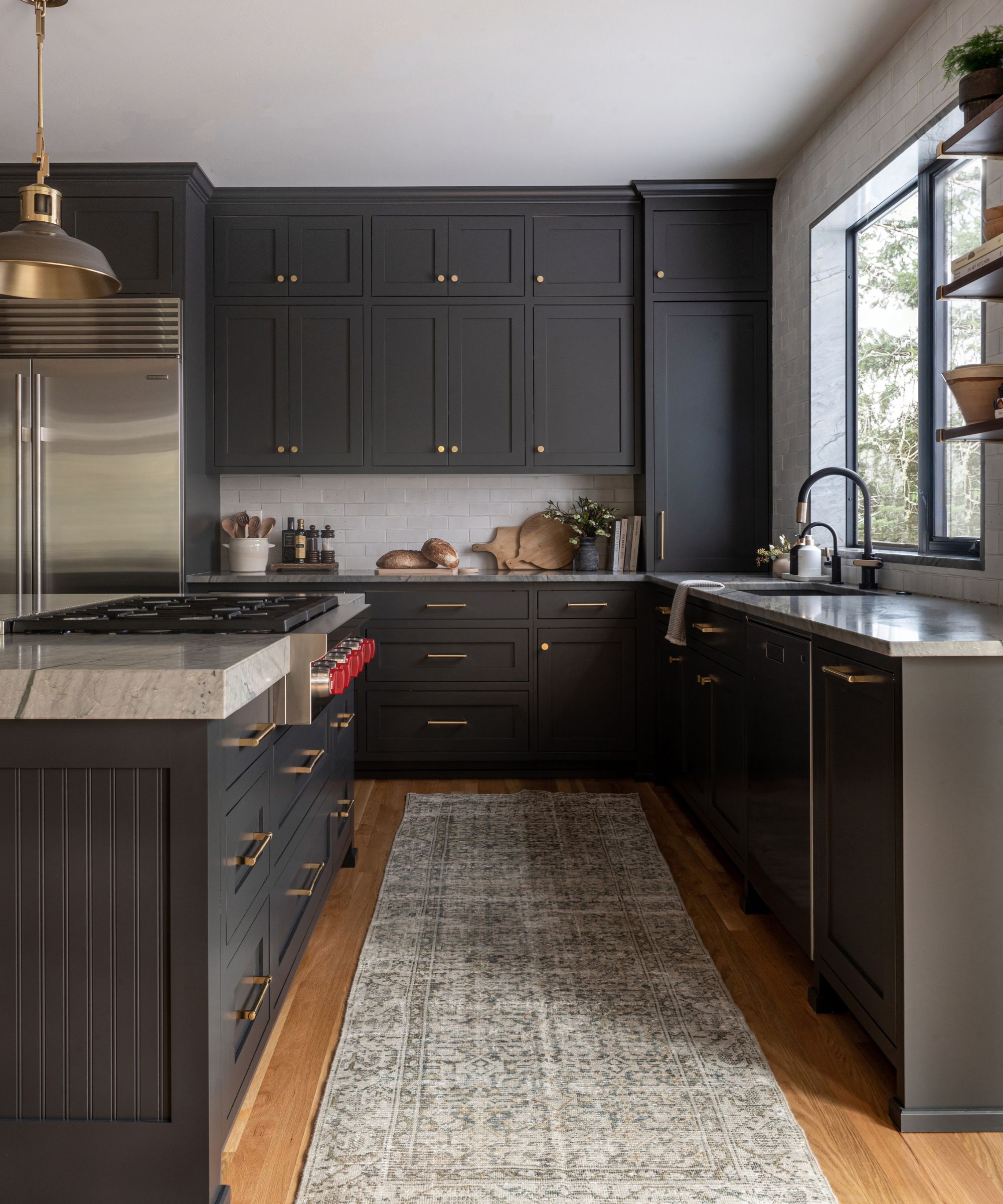
If you prefer your bold colors to take the form of less lively, deep hues, consider decorating with charcoal colors in the kitchen. Technically still a neutral, dark charcoal is a great way to create a statement look while maintaining timeless appeal, pairing well with lots of decor styles.
In this transitional kitchen designed by Cohesively Curated Interiors, Sherwin-Williams' Iron Ore is used across the cabinets as well as the kitchen island. Although bold, there's something soothing about this moody hue, offering a sophisticated and grown-up way to embrace bold kitchen colors.
4. Studio Green, Farrow & Ball
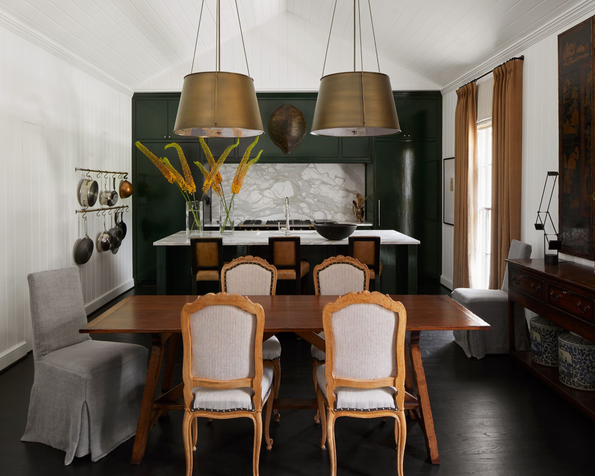
Decorating with dark shades of green is another popular kitchen color trend. While cool-toned dark colors can sometimes appear drab, green is a warm color meaning that it will generally feel more inviting.
In this open-plan kitchen-dining room designed by the NYC-based interior designer David Frazier, Farrow & Ball's Studio Green was used across the kitchen cabinets on the far wall. 'I love to use Farrow and Ball’s Studio Green in a kitchen because of its rich, bold color,' explains David. 'It has the allure of a black, with the unexpectedness of a green.'
If you're a fan of this color family but don't want to go quite so dark, consider Farrow & Ball's Bancha, a rich and warming olive green that gives a more colorful look.
5. Meditative, Sherwin-Williams
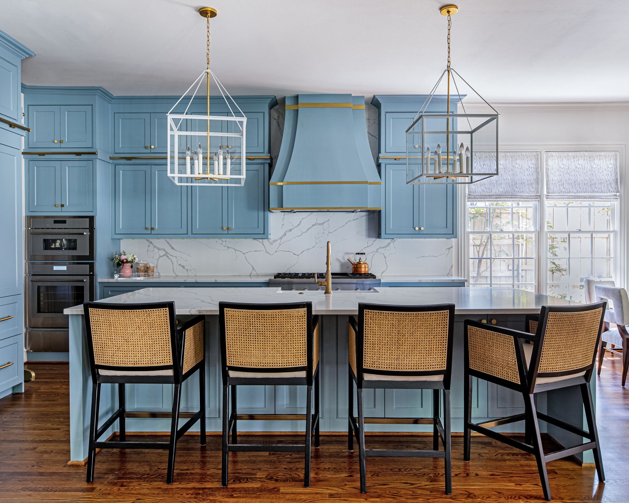
Prefer decorating with blue? Vibrant variations of this calming color can be a great way to enliven a kitchen with an uplifting look and feel, much like Sherwin-Williams' Meditative which was used in this kitchen designed by The Collective.
Although bold when used in large amounts, this blue paint maintains a liveable look, especially when paired with white countertops and neutral decor to tone it down slightly. Either way, this color strikes a balance between soothing and playful and will no doubt add interest to the kitchen.
6. Black, Benjamin Moore
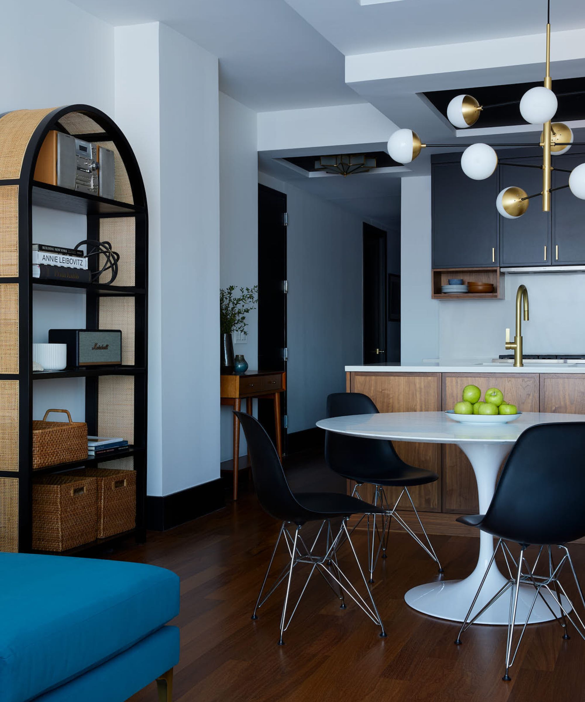
Lastly, if you're looking for a kitchen color that's both daring and neutral, consider decorating with black to make a statement.
'Our favorite bold color is both bold and neutral: classic black,' says designer Patrick Fox of Crafted Interiors. 'Our clients have moved away from the all-white kitchens and black is a perfect way to make a statement. It also works with so many other finishes and colors. Our favorite is a no-fuss Black 2132-10 by Benjamin Moore. In our Williamsburg project, we paired it with walnut and teal blue accents.'
These bold paint colors are some of the best shades to make a statement in the kitchen, whether you prefer bright colors or dark and moody hues.
Whichever you're drawn to, make sure you consider the best kitchen paint colors depending on its orientation. Whether your room is north, south, east, or west-facing will affect how each color reads in different lighting environments throughout the day.
Sign up to the Homes & Gardens newsletter
Design expertise in your inbox – from inspiring decorating ideas and beautiful celebrity homes to practical gardening advice and shopping round-ups.

Emily is a freelance interior design writer based in Scotland. Prior to going freelance in the spring of 2025, Emily was Homes & Gardens’ Paint & Color Editor, covering all things color across interiors and home decor for the Homes & Gardens website. Having gained specific expertise in this area, Emily is well-versed in writing about the latest color trends and is passionate about helping homeowners understand the importance of color psychology in home design. Her own interior design style reflects the simplicity of mid-century design and she loves sourcing vintage furniture finds for her tenement flat.
-
 Extend the lifespan of your appliance with 5 simple but crucial washing machine maintenance tips
From cleaning the filters to keeping the door open, experts reveal the washer tips they swear by
By Andy van Terheyden Published
-
 These are the 6 must-have colors to decorate with in April 2025
What do retro-inspired yellows and beautiful blues all have in common? They're on our hot list for the season ahead
By Sophia Pouget de St Victor Published