5 best blue paints as chosen by interior designers
From indigo blue to sky blue, these are the best blue paints according to interior design experts
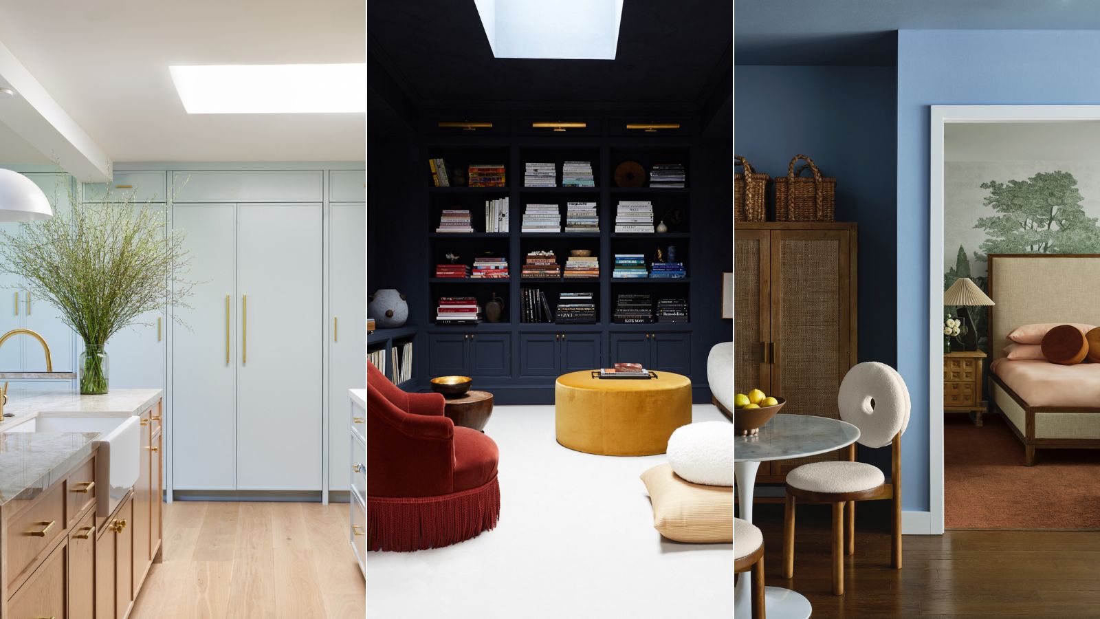

Blue has been top of the color trends for decades, it's up there with white and gray and some of the most popular colors to decorate with. This year it has totally dominated the Colors of the Year, with more than half being some variant of blue.
'Blues have a timeless allure. The color is a unique blend of sophisticated and tranquil,' says Anu Jain, founder and principal designer at Atelier Oleana. It is a shade that stands the test of time, and a fail-safe choice if you want to pick a shade that's big in color trends.
But what is the best blue paint? The options are almost endless, from super dark navy to a barely there sky blue. So we asked designers and color experts for blue paints that they love to work with.
5 best blue paints to try
It can be hard to choose blue paint as it can change the look of the room depending on whether it's North or South-facing for example. Decorating with blues works well for cooling down the latter and a space like that can take a chilly blue. But it might be you want a warming shade that's cozy. This is where our experts come in with their choices below and why they love them so much.
1. Glacier Point, Portola Paints
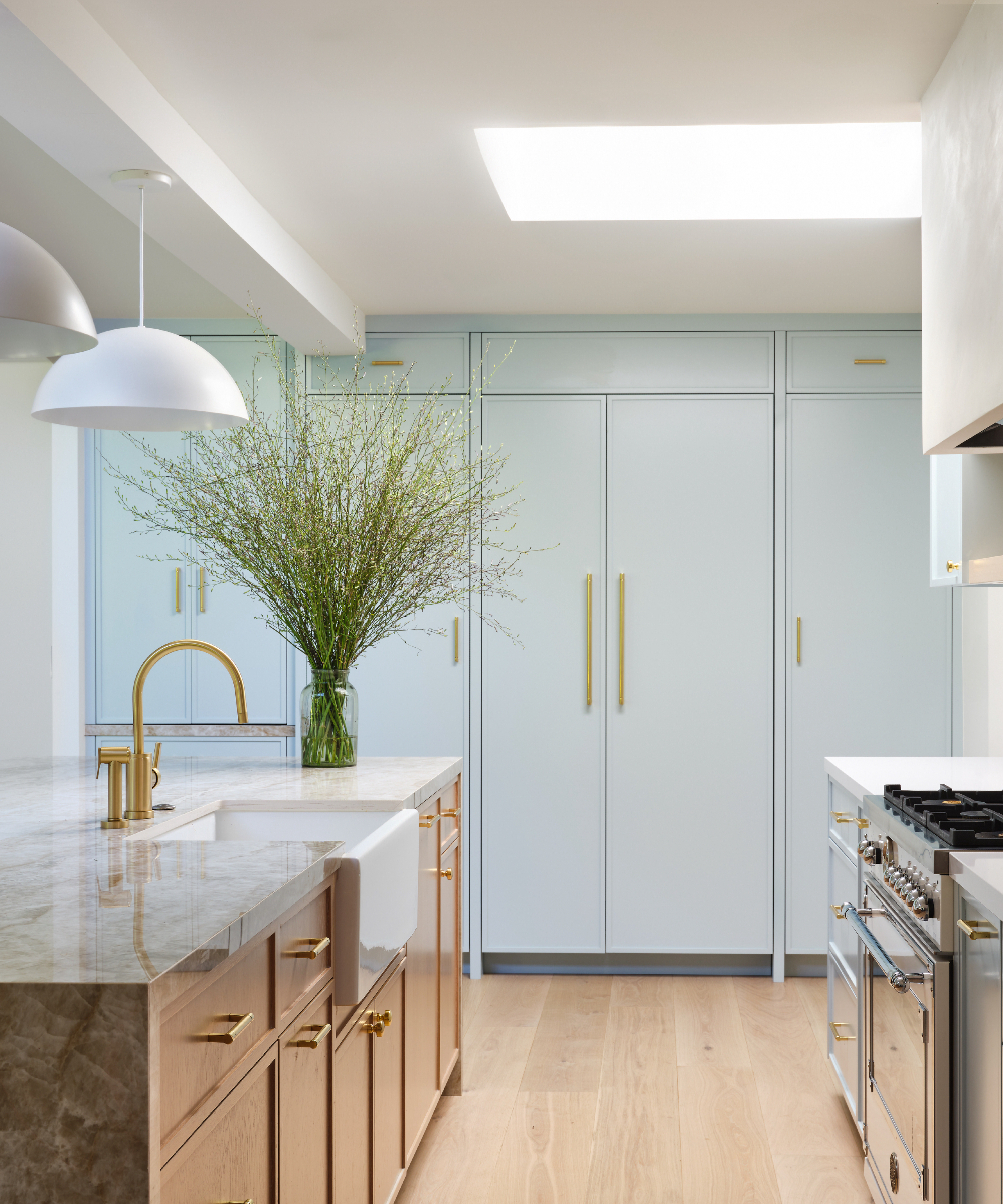
'Lately, I am drawn to lighter colors that are fun and playful such as this cabinet color we used in a recent project,' says Anja Michals, founder of Anja Michals Design. The color is Glacier Point by Portola Paints. It has a sea-foam feel to it that lends itself to not being too serious yet giving a nice pop of color in a soft way. It worked out perfectly in this beachy inspired bungalow.'
This barely-there shade is ideal for creating a light and airy space, it looks fabulous with white and metallics like warm brass.
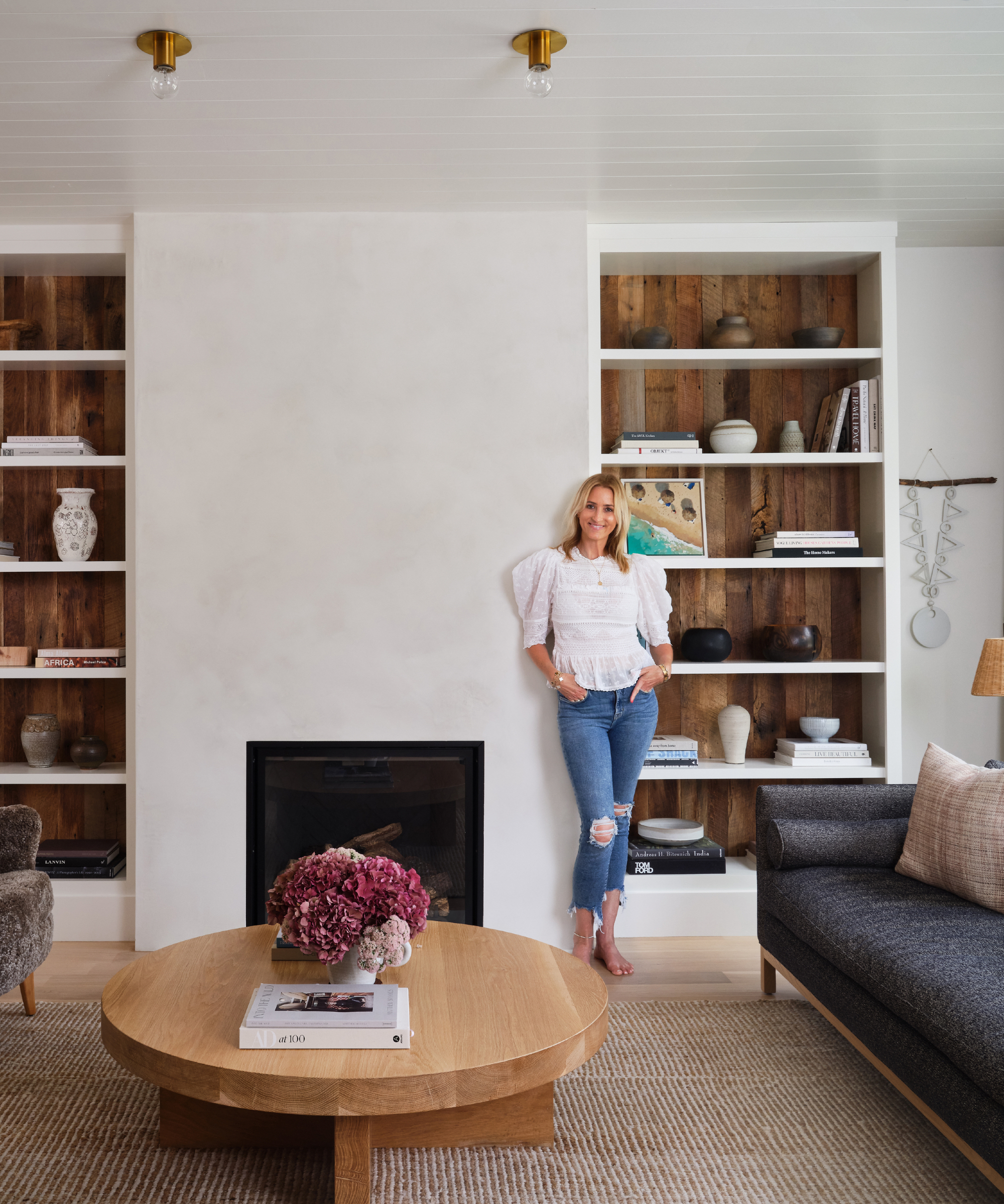
Anja Michals Design is a full service design firm with ten years experience, specializing in residential interior design. Anja prioritizes streamlined spaces and lived-in comfort, infused with eclectic and thoughtful personalization. Anja's approach to her design work is organic, with each and every project unique and tailored to her clients needs. Anja draws architecture, the bones of a home, and her client's specific lifestyle into her design inspiration, creating spaces that are meaningful and a reflection of the client in their best light
2. Hague Blue, Farrow & Ball
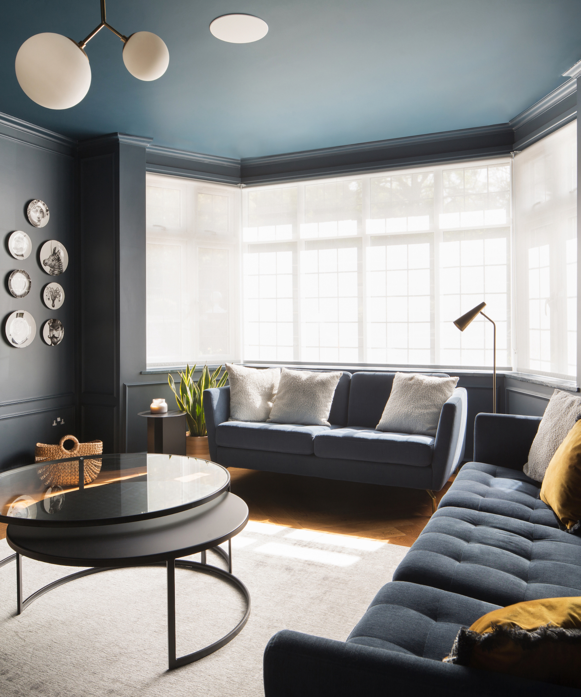
A perennial favorite, Farrow & Ball's Hague Blue is loved by Tom Rutt, director, TR Studio:
'It's a great blue which immediately defines a space and creates a feeling of depth and drama. We used it in a large living room painting the walls, ceiling and incorporating it into the cabinetry and AV unit. It has a slight green undertone which adds to its moodiness and whilst it is a rich, dark shade, it still exudes a sense of serenity and calmness.'
For a contemporary feel, Hague Blue is a great choice for color-drenching a room and really leaning into the cocooning qualities of the paint.
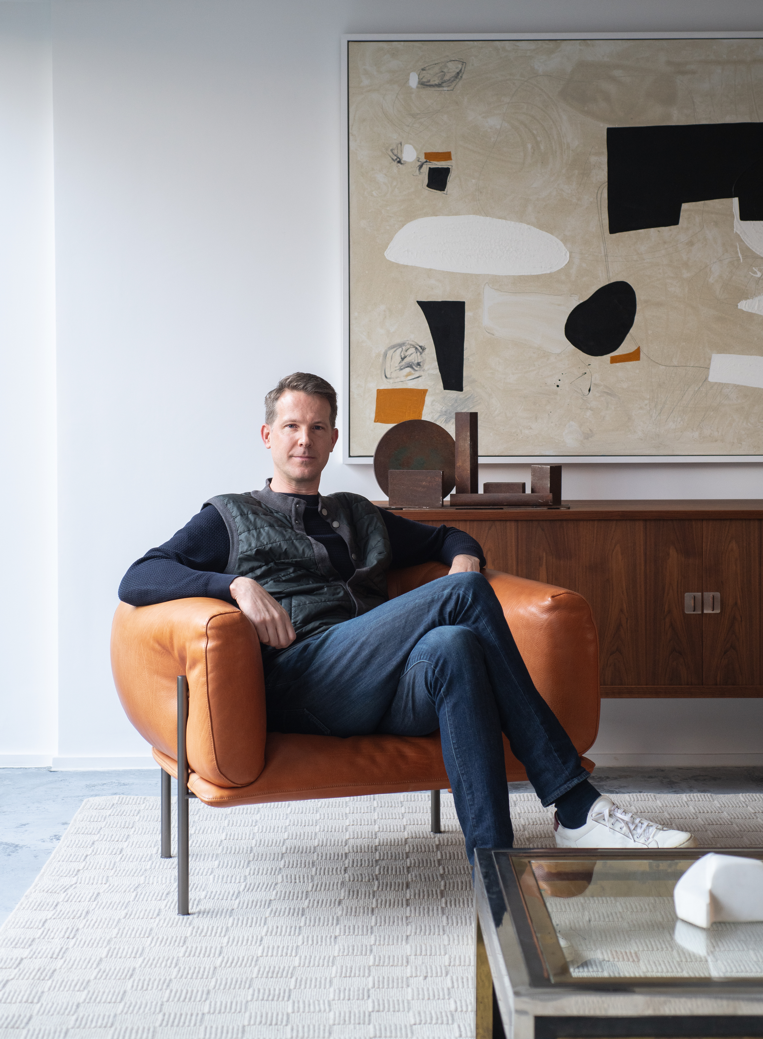
Tom Rutt is the founder of TR Studio, a luxury architectural and interior design practice based in the City of London. Before founding TR Studio in 2015, Rutt worked at Foster & Partners and Michaelis Boyd. Influenced by the likes of David Chipperfield, Vincent Van Duysen and Pierre Yovanovitch, Rutt has a crafted yet modernist approach to design, always paired with something that lifts it from minimalism in its purist sense to create something playful and uplifting.
3. Lulworth Blue, Farrow & Ball

'As a designer, when thinking of ways to elevate my client's spaces, while keeping it very effortless and serene, Farrow and Ball's Lulworth Blue is my go to color!' says Anu Jain, founder and principal designer at Atelier Oleana.
'It's a calm mid-blue, and the color's name comes from the Lulworth Cove in Dorset. As you can see in this vignette, we used Lulworth Blue in the client's breakfast nook right outside the guest bedroom, and Lulworth Blue livens up the atmosphere seamlessly and interacts beautifully with the greens in the bedroom.
Lulworth Blue is a subtle yet invigorating blue that provides the perfect backdrop to showcase curated artwork and furnishings. Further, its ability to play with natural light allows for dynamic transformations throughout the day. Of course, the superior quality of Farrow & Ball paint ensures a rich depth of color and a luxurious, velvety finish that enhances the architectural details of any room.'

Anu Jain is the founder and principal designer of Atelier Oleana, a residential design firm nestled in the heart of San Francisco. Anu specializes in creating contemporary luxurious interiors with a renewed take on classical elements. Her work is known for its use of color, texture and blend of eastern and western sensibilities.
4. In The Navy Roman Clay, Portola Paints

'For our family room, I craved a formal library, but with the comfort to slouch into a plush sofa and watch movies or read as a family. The initial vision was in line with the neutral tonality of the home, but something wasn’t working,' explained Athena Calderone, founder, Athena Calderone.
'The room felt incomplete, so we enveloped the walls and ceiling in deeply saturated In the Navy Roman Clay from Portola Paints, which offered a suede-like quality. The paint completely transformed the room and enveloped the space. Acknowledge when it’s time to pivot and change direction from your initial design. The walls were white at first, and although it matched the rest of the house… it was BORING! It’s okay for a room to have its own identity, even if it’s a departure from the rest of your home. Be bold and take a risk.'
We love what Athena's done with this space using such a dark blue, the cream for balance and the pop of rust and turmeric adding a spot of color that's uber stylish.
5. Templeton Gray, Benjamin Moore
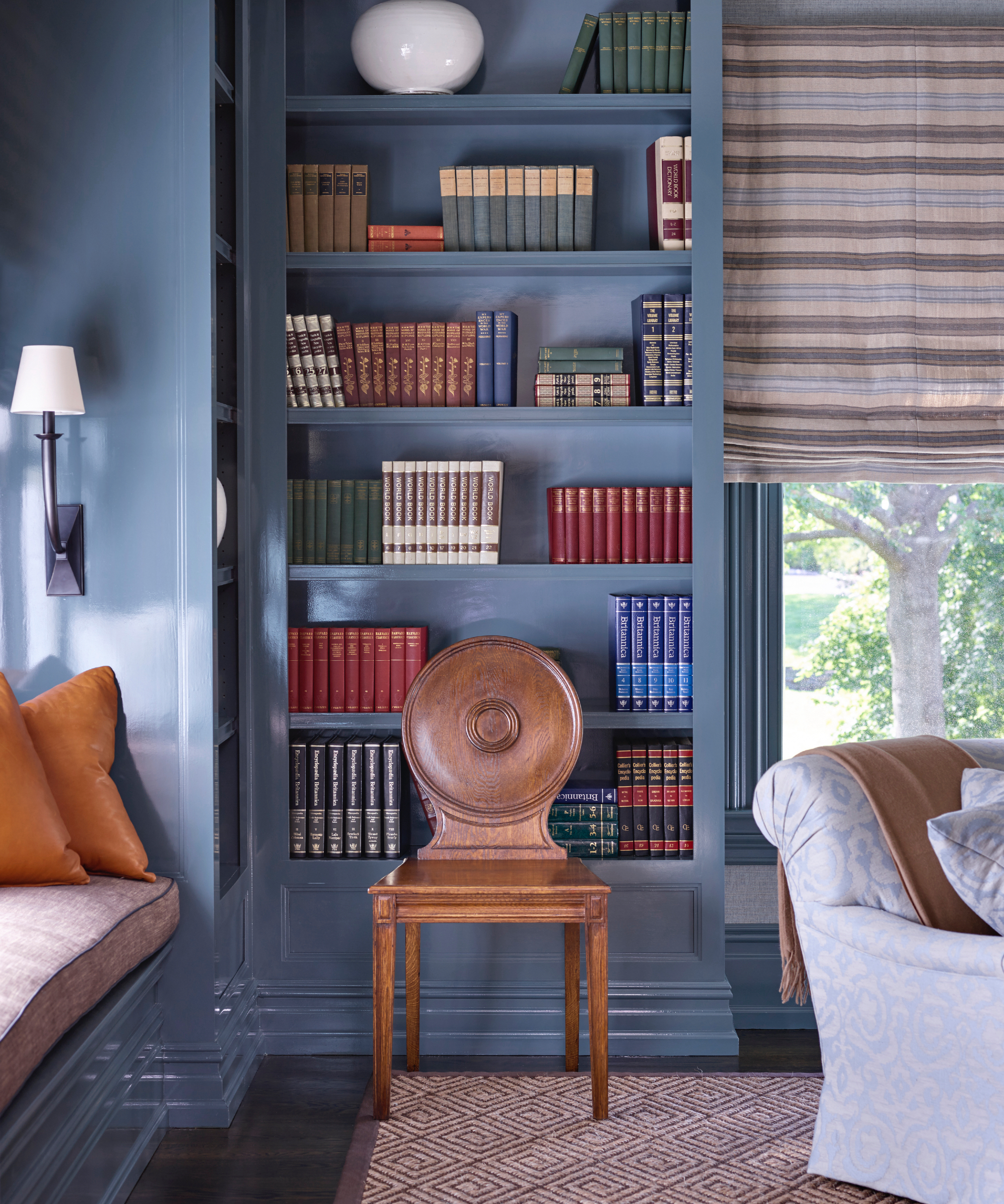
'Templeton Gray from Benjamin Moore’s Historical Colors collection is one of our most requested paint colors on the 'gram,' says Dan Mazzarini, creative director of ARCHIVE and BHDM Design.
'It sounds like it will be a gray, but it's definitely a blue with both gray and green in it, and another fabulous ‘chameleon color,’ as I like to call them. It takes on the character of the other deco in the room. Templeton Gray has become a great go-to for millwork – I love it on doors, to distinguish kitchen islands, and as entire libraries for depth and bold interest.'
Described as a 'stylish blue-green with intriguing depth' Templeton Gray is one of those shades that looks different from morning through to the glow of sunset. Team it with stone for a contrasting look or a darker blue for drama.

Since launching BHDM in 2012, Mazzarini has parlayed his craft of storytelling through the built environment to a multitude of project types, including hotels, restaurants, food halls, start ups, corporate interiors, showrooms, pop-ups, and single and multi-family residential. After 20 years of building brands across fashion, cosmetics, home, hospitality and more, Dan is bringing his designs, ideas, tips, and tricks and favorite essentials directly to your home with the launch of ARCHIVE (2023). ARCHIVE by Dan Mazzarini provides a curated selection of home and lifestyle products, shopped from all of his favorite resources.
Symbolizing spirituality and peace, blue is a good dependable color to choose if you want to decorate with it. The only aspect to remember is that it can be 'cool' so team it with warm accents of coral and blush and cosy textured pillow cushions and blankets. For a crisp contemporary look, team it with fresh white.
Sign up to the Homes & Gardens newsletter
Design expertise in your inbox – from inspiring decorating ideas and beautiful celebrity homes to practical gardening advice and shopping round-ups.

Sophie has been an interior stylist and journalist for over 20 years and has worked for many of the main interior magazines during that time, both in-house and as a freelancer. On the side, as well as being the News Editor for indie magazine, 91, she trained to be a florist in 2019 and launched Flowers Inside My Head where she curates beautiful flowers for modern weddings and events. For Homes & Gardens, she writes features about interior design – and is known for having an eye for a beautiful room.
-
 Bissell CleanView XR Pet 300W Stick cordless vacuum review – it's a great budget vacuum, but by no means perfect
Low price point, but with the cleaning performance to match it
By Camryn Rabideau
-
 Kevin Costner uses the 'ultimate color choice for interiors' in his kitchen – it masters a top 2025 trend that's 'guided by the calm of nature'
The Yellowstone actor embraces a subtle yet soothing trend that's influencing how we decorate this year, but it will look just as perfect in 100 years
By Megan Slack