These are the 8 best beige paints, as chosen by interior designers
Not all beige paints are made equal, and with thousands to choose from where do you start? We asked interior designers for their tried and tested, favorite beige paints
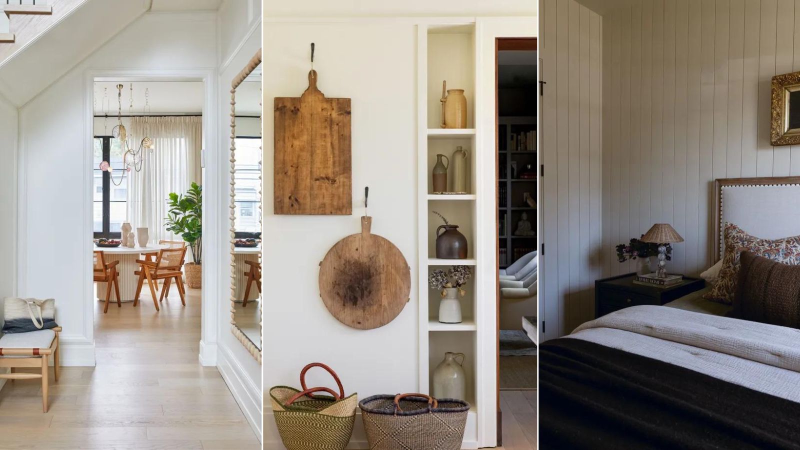

Beige may not have always been the on-trend color it is now, but over the last few years, it's shed it bland and boring skin and become so much more than the magnolia hues it was once associated with. Beige is the new neutral, replacing whites and grays as the most timeless and versatile shade to decorate with.
While it might not make it into Colors of Years, nor be used as an example for how bold we have all become with color, beige in fact makes up so many paint brand's best sellers and realistically it's a color that will suit any style and any space.
But not all beige paints are made equal and there are certain ones you want to look to that are more in line with color trends for 2025 than others. The ideal beige doesn't want to be yellow, nor too gray, you want it to be warm but far from cream. We asked interior designers and color experts for the best beige paints they love to use and why.
8 best beige paints chosen by interior designers
'A welcome alternative to harsh white, beige can be a sympathetic color for every room in the house,' explains Patrick O'Donnell, color expert at Farrow & Ball.
'Essentially a neutral, the yellow notes, while never too harsh or twee can create a really soft palette and a useful decorating color for any room, but especially appropriate for a charming cottage in a sylvan landscape either as your wall color or a complementary woodwork color to more earthy French grays or stone shades.'
Beige is an endlessly versatile shade, and really no version of it is off limits – we are even seeing a rise in yellow-toned beiges that have been shunned for years. It works with so many interior design styles, can be used in any room and there's a shade for any kind of lighting too.
1. White Dove, Benjamin Moore
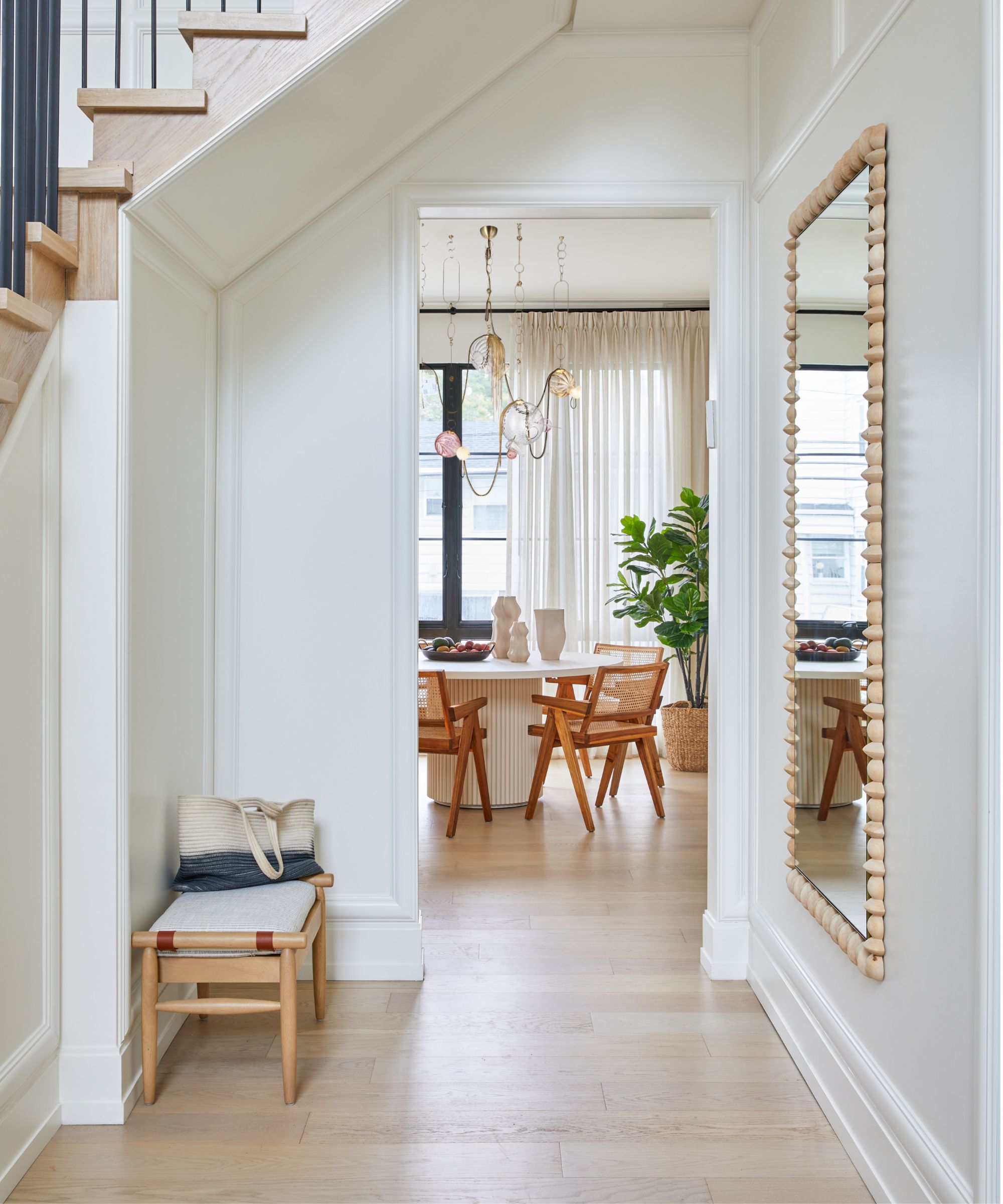
'Two of my favorite beige paints are White Dove and Pale Oak. I use White Dove in so many of the homes I design, and I particularly love using it in a foyer as my center hall base color,' explains designer Tova Kook of TK Design.
'I find that warm whites and taupes are more fresh versus cooler crisp whites such as Decorators White and Chantilly Lace, which used to be very popular, and tied to gray colors often. I have moved away from designing gray spaces and I think many designers would say the same! This goes along with the idea that beiges and taupes are the new grays and cool whites.'
'White Dove and Pale Oak both look great from morning until night, especially in spaces that do not have that much natural light. Some beiges turn too yellow, while White Dove and Pale Oak specifically always hold their ground. When working with base and casings, I do not like to do contrasting whites, as I think contrasting with stark white molding is passe. Additionally, White Dove looks clean on the walls and applied to the base and casings. I do an eggshell finish typically on the walls and satin on the base, casing, and doors.' adds Tova.
2. Swiss Coffee, Benjamin Moore

'Swiss Coffee OC-45 is an essential white with just the right amount of warmth. It is a popular choice for people looking to avoid the clinical feel of a pure brilliant white paint, while still creating a clean and understated look. This hue is very flattering in bathrooms as it brings a sense of softness to the space, contrasting hard elements such as tiles, mirrors, and fixtures.' explains Helen Shaw, Director of Marketing (International), Benjamin Moore.
'It's one of those wonderful colors that has just the right amount of warmth. These warm undertones add depth to any space and play well with other creamy shades and golden hues. It’s a great backdrop for any room as the design potential is endless. It is this versatility that makes it such a popular color.'
'A modern approach would be to pair the color with a contrasting black trim. The warm neutral provides the perfect base for experimenting with daring dark accents. Alternatively, layer with a range of subtle and muted color tones. Layering creams and whites on top of one another alongside different textures and materials will add depth and interest to your design,' suggests Helen.

Helen Shaw is a color expert and Director of Marketing (International) at Benjamin Moore. Helen and her husband Craig were also founders of Shaw Paints, acquired by Benjamin Moore in 2020.
3. Modern Gray, Sherwin Williams
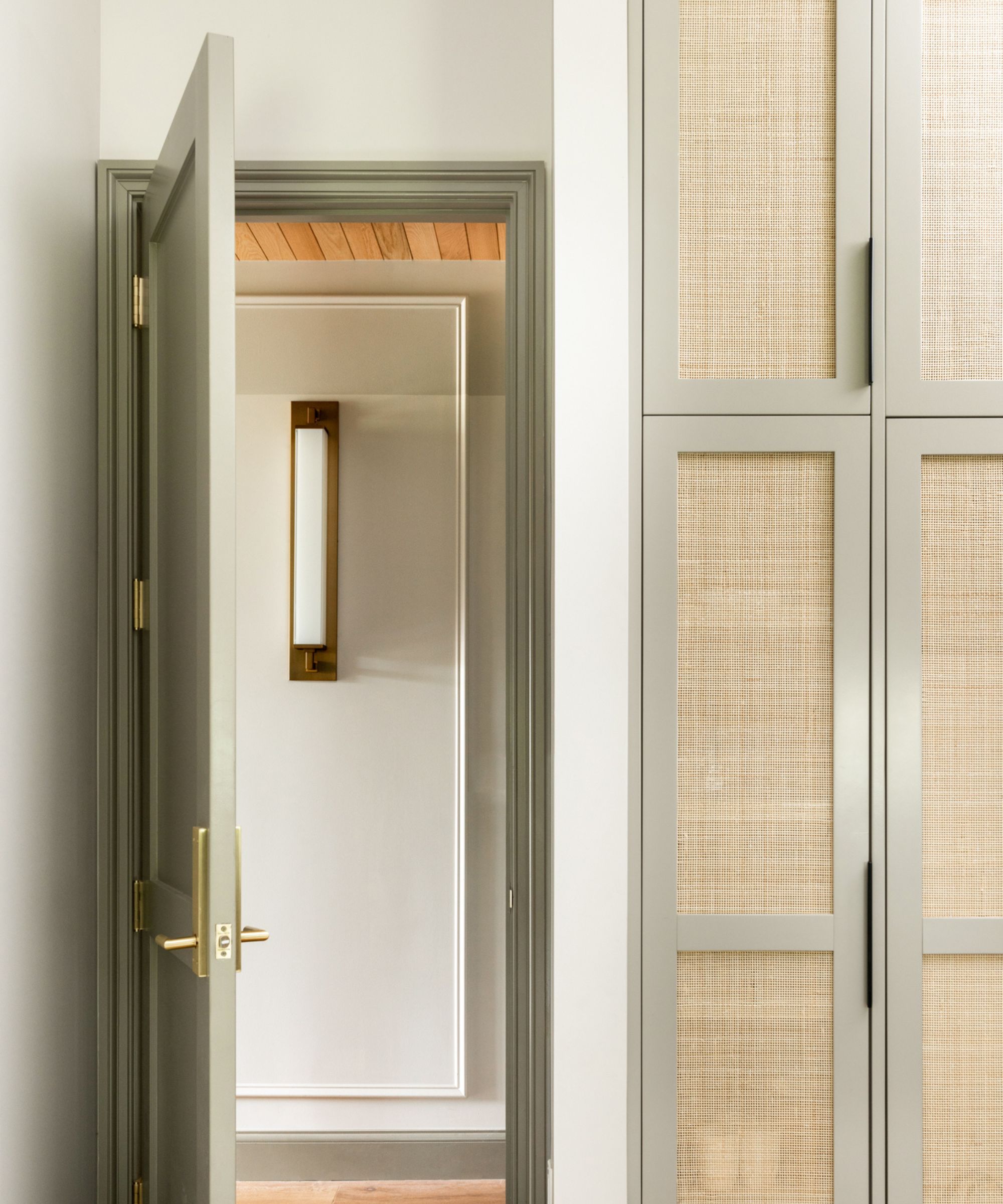
'Despite the word 'Gray' being in its name, Modern Gray by Sherwin Williams is actually a really lovely, warm and adaptable beige,' says designer Mollie Ranize. 'It definitely feeds off of its surroundings, so when paired with other warm tones like wood, it's a soft and soothing paint color.'
That is definitely something to bear in mind when choosing the best beige paint. Beige is one of those shades that can quite dramatically changes depending on the light or the colors you pair it with. As Mollie mentions you can usually up the warmth in a beige paint by combining it with a warmer color or wood tones. Likewise, if you were to pair it with a cooler tone like a gray or a crisp white it might show cooler.
4. Biscuit, Farrow & Ball
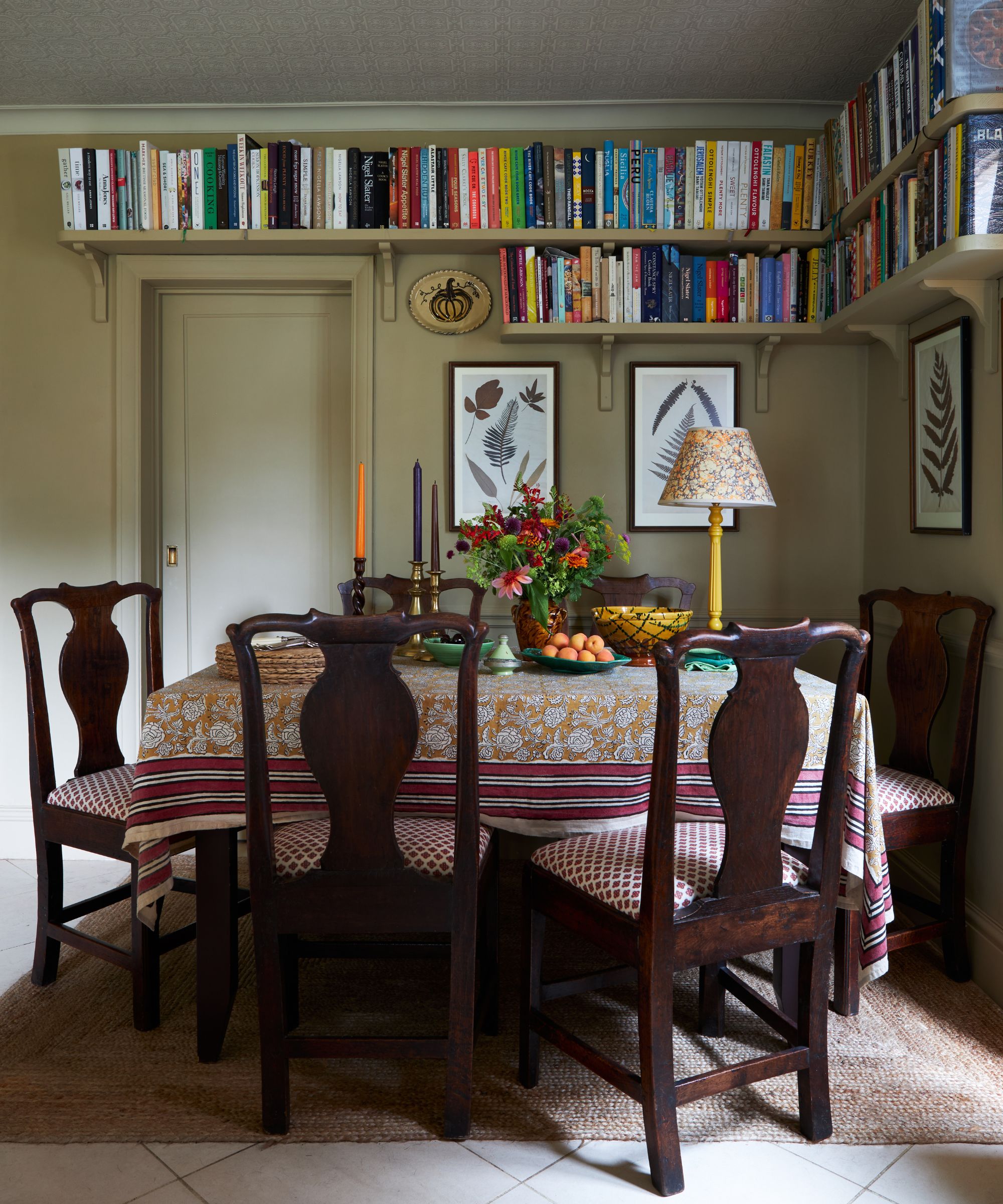
'First, it was beige then greige, and then gray became the paint color to which everyone turned most likely because it is reasonably straightforward to put together a neutral scheme,' explains designer Joanna Plant. 'And now it seems beige has returned, although reinterpreted as buff and biscuit, probably because we are still feeling nostalgic and these colors do speak of a ‘below stairs’ palette.'
'I am particularly faithful to Biscuit, an archive Farrow & Ball color which we are currently using for a laundry room. Farrow & Ball Cord I have used very successfully in drawing rooms for years as it’s impossibly smart and looks really great with pictures. Another favourite is Edward Bulmer’s Clove which we are using over and over again at the moment – it’s neither too pink nor too brown but a very pleasing, soft colour that works very well in bathrooms.'

Joanna Plant is a London based interior designer who works across residential and commercial projects in both the UK and abroad. Her spaces have a effortlessly elegant feel, and a key part of her style is creating rooms that appear timeless, with her use of antiques, colour and fabrics. The result are home that are sophisticated but comfortable.
5. Canvas Tan, Sherwin Williams
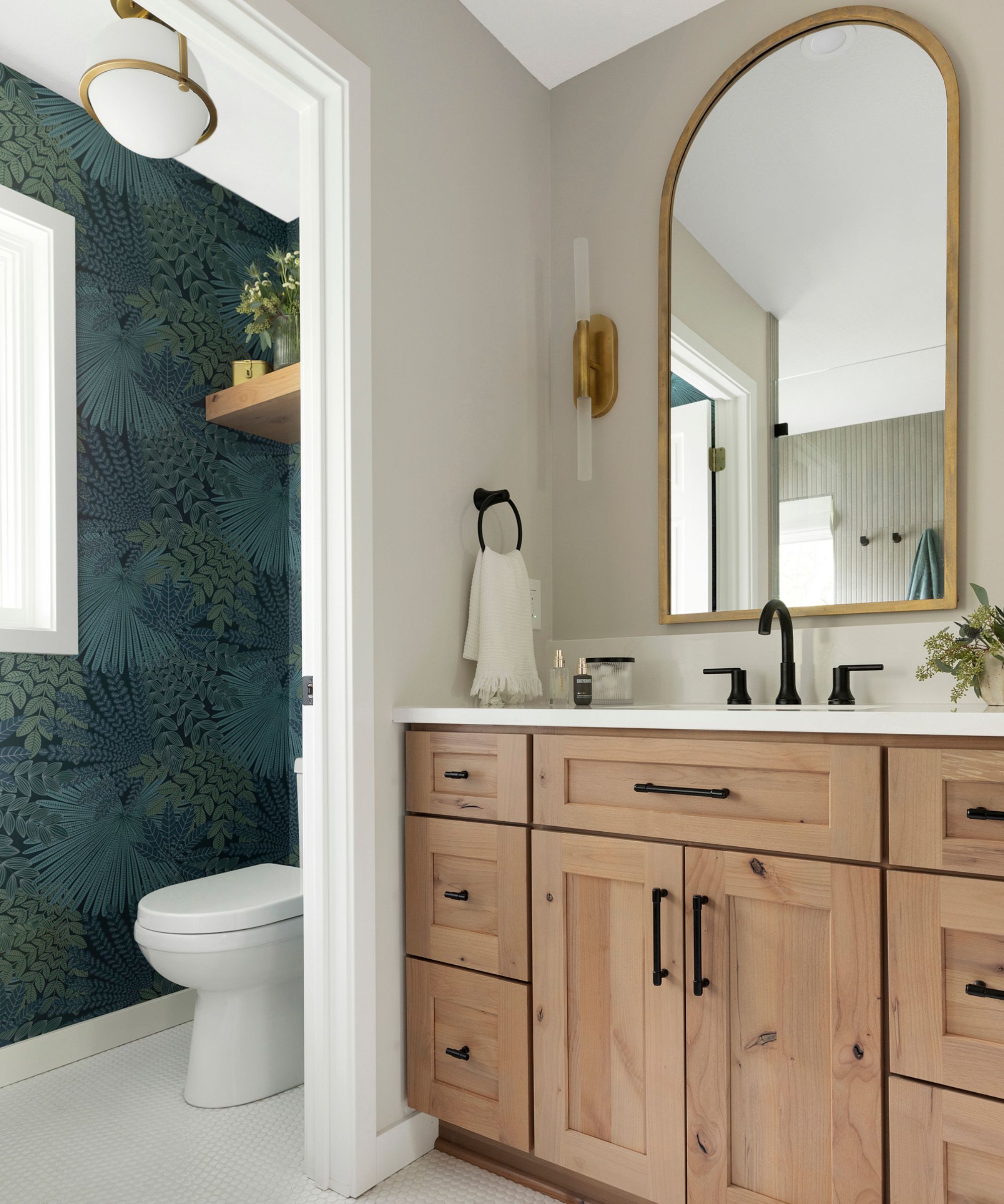
'When it comes to beige paint colors, our top recommendations include Accessible Beige, Canvas Tan, and Wool Skein all by Sherwin-Willams. However, Canvas Tan stands out as our favorite for its ability to infuse spaces with a soft, inviting warmth,' explains designer Jennifer Davis.
'It's a go-to choice because it effortlessly complements diverse design styles, offering a sophisticated backdrop that adapts beautifully to various lighting conditions. Canvas Tan's subtle warmth pairs beautifully with white woodwork, creating a clean, crisp, and fresh contrast.'
Canvas Tan is described by Sherwin-Williams as a 'khaki-tinted white', so it has more olivey undertones rather than yellow which gives it a fresher feel. It's still very warm as most beige paints are but it's less close to cream, more close to a griege paint.

Jennifer fell in love with design at a young age and has been working in the industry for over 25 years. She has developed an eye for detail and a talent for creating timeless designs. Jennifer offers a balance of creativity and forward-thinking with a structured, organized, and detailed mentality. Jennifer is driven by her deep passion for design while curating an exceptional client journey, ensuring pure delight from the very beginning to the end.
6. Accessible Beige, Sherwin Williams
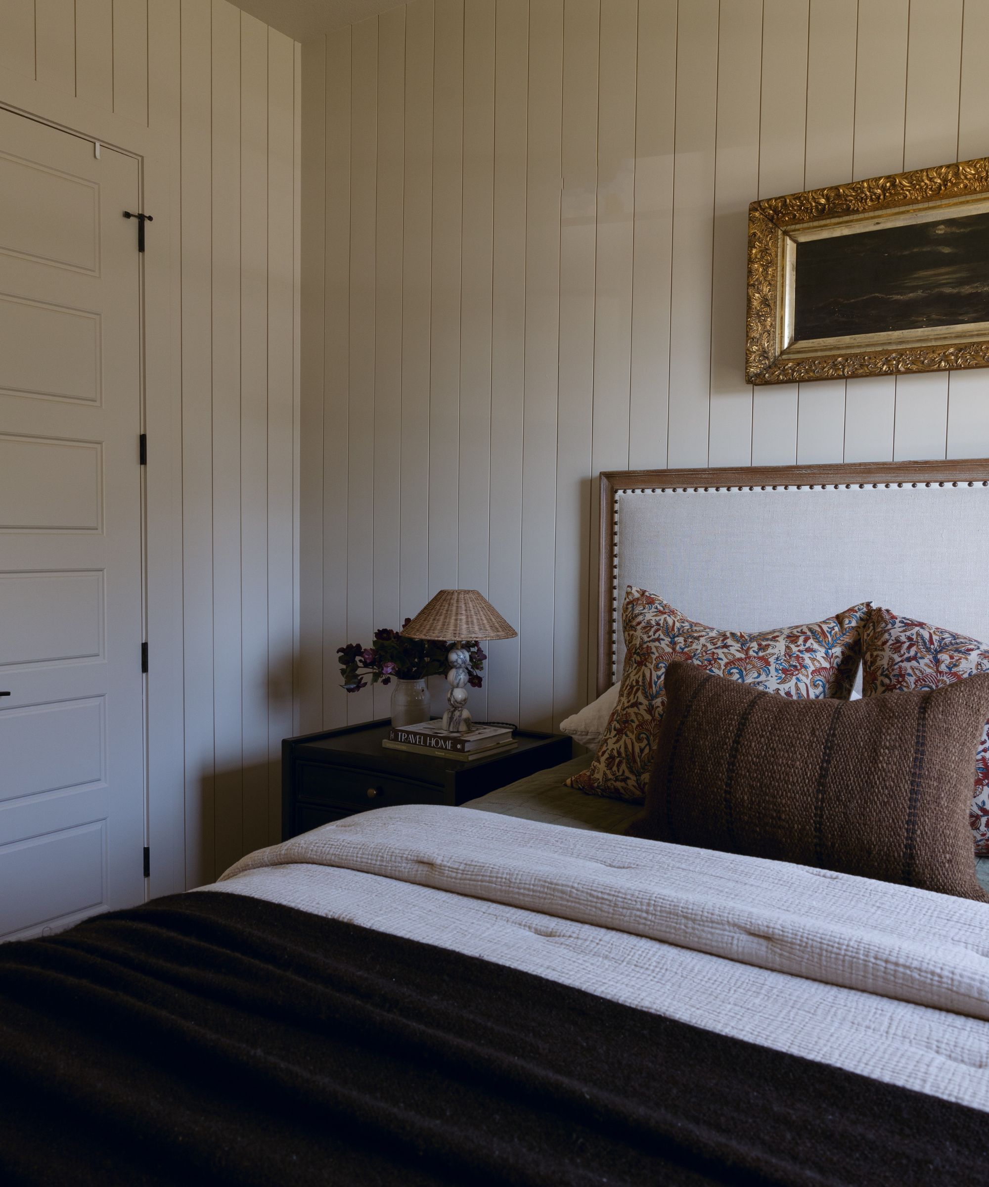
'Beige is both classic and complex, and is one of the most versatile colors that plays beautifully with any hue. I have many favorites, but if you’re looking for a classic beige color, Accessible Beige by Sherwin Williams is one of our go-tos, that has beautiful, warm gray undertones,' explains designer Audrey Scheck.
This beige paint is an ideal mid-tone, it's not too dark but it's got more going on than a white. It's a nice choice for softer spaces like bedrooms and living rooms. It also works well in rooms that don't get all that much natural light – it will appear darker and more gray in these spaces but still warm and snug-like.

With more than a half-dozen years of experience in remodels and renovations, Audrey Scheck leads Audrey Scheck Design, a full-service interior design firm based in Austin, Texas.
7. Revere Pewter, Benjamin Moore

'Revere Pewter by Benjamin Moore is a classic neutral that bridges both warm and cool tones that pairs nicely with an array of colors.' continues Audrey who listed this ever-popular shade in her list of best beige paints.
Decorating with Revere Pewter is simple, it's 'an iconic neutral that provides a versatile bridge between warm and cool tones. It feels contemporary and harmonious yet adds warmth to an otherwise sterile grey. Its versatility means it can effortlessly work with a breadth of design styles and accent colors, making it a perfect base to build any scheme,' agrees Helen Shaw.
8. Drift of Mist, Sherwin Williams
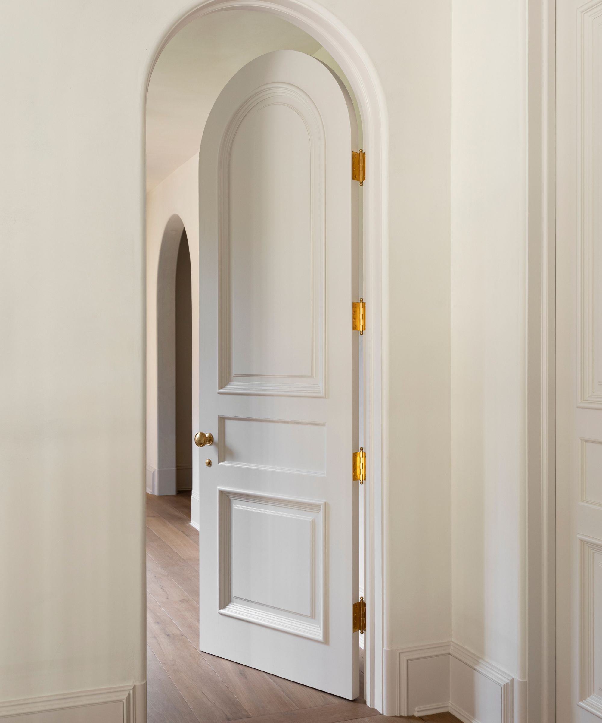
This is a shade that comes up time and time again when talking to designers about neutral color schemes. Drift of Mist by Sherwin-Williams is one of the brand's best-selling neutrals, and it's the perfect gray toned beige. It's ideal for rooms that lack natural light as unlike some beige paints it doesn't become too dark when used in a darker room.
'Although not a true beige, this greige is one of my favorite neutrals – especially for areas that receive a lot of golden hour light. With a hint of gray, it helps neutralize warm tones for an inviting yet airy feel,' explains Lauren Sullivan, founder of Well by Design.
Beige paints are some of the most versatile neutrals, many of them get that balance between warm and cool meaning they work with many other shades and look right in many different lights. As with any paint, but especially with such a chameleon shade like a beige, order swatches to see how they look in your space as these colors do change a lot under different lighting and in rooms of different aspects.
Sign up to the Homes & Gardens newsletter
Design expertise in your inbox – from inspiring decorating ideas and beautiful celebrity homes to practical gardening advice and shopping round-ups.

I am the Head of Interiors at Homes & Gardens. I started off in the world of journalism in fashion and luxury travel and then landed my first interiors role at Real Homes and have been in the world of interior design ever since. Prior to my role at H&G I was the digital editor at Livingetc, from which I took a sabbatical to travel in my self-converted van (not as glamorous as decorating a home, but very satisfying). A year later, and with lots of technical DIY lessons learned I am back to writing and editing, sometimes even from the comfort of my home on wheels.
-
 Zooey Deschanel and Jonathan Scott's breakfast nook is an innovative, effective use of kitchen space – it turns a 'dead area' into a cafe-style corner
Jonathan and Zooey have situated an eccentric yet elegant dining area in what may have been an otherwise underused corner
By Hannah Ziegler Published
-
 6 things you should never throw in the trash – and what to do for safe disposal instead
From batteries to space heaters, experts reveal what not to throw
By Andy van Terheyden Published