

Benjamin Moore is known for its vast array of paint colors. Whether you're on the hunt for a perfectly balanced neutral paint or a bold color to inject personality into a room, you can be sure to find something to suit your space.
And while many Benjamin Moore paint colors have become favorites in the interior design world, from its iconic Hale Navy to the universally flattering Swiss Coffee, there's just as much to say about its less-discovered shades.
As Homes & Gardens' paint & color editor, I consulted interior designers to uncover Benjamin Moore's lesser-known paint colors. To my surprise, there were a number of colors designers raved about that I'd never come across before, from dark paints to colorful hues.
Below, interior designers talk through each of these paint colors (which may also be new to you) to spark some fresh paint ideas.
1. Salamander

'Salamander from Benjamin Moore is a rich, sophisticated green paint that I just love,' explains Kate Pinney, interior designer at Inside Stories. 'Its deep yet vibrant tone creates a sense of calm and focus, making it the perfect choice for a home office. Pair it with neutral accents and warm wood tones to balance the boldness.'
2. Weimaraner

A favorite under-the-radar Benjamin Moore paint for designer Melissa Read, creative director at Studio Burntwood is Weimaraner, a cozy neutral paint:
'Weimaraner is a beautifully warm grey with a smoky brown undertone – think vintage leather and aged plaster. It’s perfect for sitting rooms, dining spaces, anywhere you want to create quiet luxury without resorting to obvious neutrals. Avoid pairing it with bright white, it needs something softer, like Classic Gray or a muted olive, to do it justice.'
3. Terra Bella

Terra Bella is another top pick for Melissa Read, a light terracotta paint that feels warming and uplifting, as used in this living room.
'Terra Bella is a muted terracotta that lands somewhere between weathered clay and aged brick,' Melissa says. 'It’s phenomenal in paneled dining rooms, on cabinetry, or even as an unexpected ceiling color. Paired with deep greens like Essex Green or soft, plastery neutrals, it creates an atmosphere that feels expressive. If you're drawn to a bohemian, eclectic, or maximalist vibe, this color is the perfect choice for you.'
4. Castleton Mist

'Benjamin Moore's Castleton Mist is a longtime favorite paint color of mine,' shares Liz Williams, founder and principal designer at Liz Williams Interiors, who used this cheerful yellow-green paint in this bathroom.
'It is a soft and subtle green in Benjamin Moore's historic colors that pairs well with many colors – infusing freshness into a variety of rooms! I love it with crisp white trim, but I also like to use it on both walls and trim in smaller spaces,' Liz adds.
5. Hazy Skies

Benjamin Moore has many popular calming neutral paints, but Hazy Skies is one that I'd not come across before. Below, designer Kelly Sutherland of Kelly Sutherland Designs explains why it makes the perfect choice for nursery rooms and guest bedrooms:
'People often get stuck selecting a gender-neutral nursery or guest bedroom paint color. It can be challenging to get these spaces right but look no further because Hazy Skies is the perfect hue. This putty gray-green immediately creates a calm and inviting atmosphere – attributes you’ll want for an infant and guests alike.'
6. Tate Olive

Benjamin Moore's Tate Olive is a dark green paint that looks moody and sophisticated, another favorite for designer Kelly Sutherland who explains below:
'Tate Olive is a paint color that deserves way more recognition. If you’re going for a moodier look, the undertones of a hue are especially important. This deep, rich green has just the right ones. It’s on the warmer side, which gives it an air of sophistication and as the name states, the olive undertones feel timeless and organic. Pair it with warm neutrals and browns for a refined look.'
7. Marilyn’s Dress

'One under-the-radar Benjamin Moore paint color is Marilyn’s Dress – a cool and breezy blue with a hint of periwinkle,' explains designer Bambi A’Lynn Bratton of Bambi A’Lynn Interior Design. 'It’s perfect for washing large-scale walls, as seen here in our Beverly project primary bedroom. I think the mix of colors (is it off-white? Is it blue?) gives it added interest and adds a calming and soothing quality to any room.'
8. Mink

'Mink by Benjamin Moore is that perfect brown-black color,' says interior designer Nadia Watts. It is used on the far wall in this space.
'Black paint can lack depth, so instead try a black-brown like Mink. It’s complex: a more interesting choice than black and will stand the test of time. Mink makes everything look elevated, it works as a neutral while providing interest and moodiness. I love it for vanities, kitchen cabinets, and for color-drenching powder rooms, hallways, and dens,' Nadia adds.
9. Hearthstone

'One of our favorite, lesser-known Benjamin Moore paint colors is Hearthstone,' says designer Andrea Goldman. 'It is a lighter shade of grey with blue undertones. We use it for painting walls, exterior doors and trim, and saturated cabinetry. It is a perfect complement to Benjamin Moore’s Sea Pearl or White Dove. This paint color provides a perfect contrast to light interiors while maintaining warmth and an inviting palette.'
10. Half Moon Crest

An example of one of Benjamin Moore's serene paint colors that is not so well known is Half Moon Crest – a gray paint that is a favorite of designer Dana Wolter of Dana Wolter Interiors, who explains below:
'Half Moon Crest is a soft, serene blue from Benjamin Moore that's perfect for creating a tranquil atmosphere, making it an ideal choice for spaces like bedrooms.'
11. Topeka Taupe

Topeka Taupe by Benjamin Moore is an on-trend brown paint that's not too dark or intense. While I frequently come across various brown paints from Benjamin Moore such as Wenge, Topeka Taupe is new to me.
'Benjamin Moore's Topeka Taupe is a phenomenal color,' says designer Amber Guyton of Blessed Little Bungalow. 'It's a warm brown with a drop of violet, perfect for a living room, or bedroom, and even color-drenched from wall to trim to cabinetry in any space.'
12. Trout Gray

If you're looking for a classic, mid-tone gray paint, Benjamin Moore's Trout Gray is one to explore. Interior designer Janna McCalley of Janna McCalley Interiors describes it as 'a great charcoal grey that has some coolness to it.'
'I like the blue undertone for a moody, more masculine feel,' the designer adds, who used it on the walls in the bedroom above. 'Here we used it on a portion of the wall in this basement room – an inexpensive way to add interest and keep the room from being too dark.'
13. Dark Olive

Benjamin Moore's Dark Olive is another moody hue that feels aligned with the latest color trends. Here, Janna McCalley used it on the spindles of this bed frame.
'I love to use this paint in semi-gloss on cabinetry, furniture, millwork, and doors,' says Janna. 'It works like a neutral tone but brings in a little color when needed.'
14. Gravel Gray

Benjamin Moore's Gravel Gray was used on the millwork here, adding depth and interest to the neutral color scheme, another favorite Benjamin Moore paint for designer Janna McCalley who describes it as a 'fail-proof dark paint for high contrast.'
'Not really gray at all, it reads as a very deep, inky blue-black. This makes beautiful millwork stand out and pairs well with grass cloth in an office, bedroom, or den,' says Janna.
Which of these Benjamin Moore paint colors is your favorite? While they may not be the most well-known, they're stylish shades that can make for timeless room color ideas.

You must confirm your public display name before commenting
Please logout and then login again, you will then be prompted to enter your display name.
-
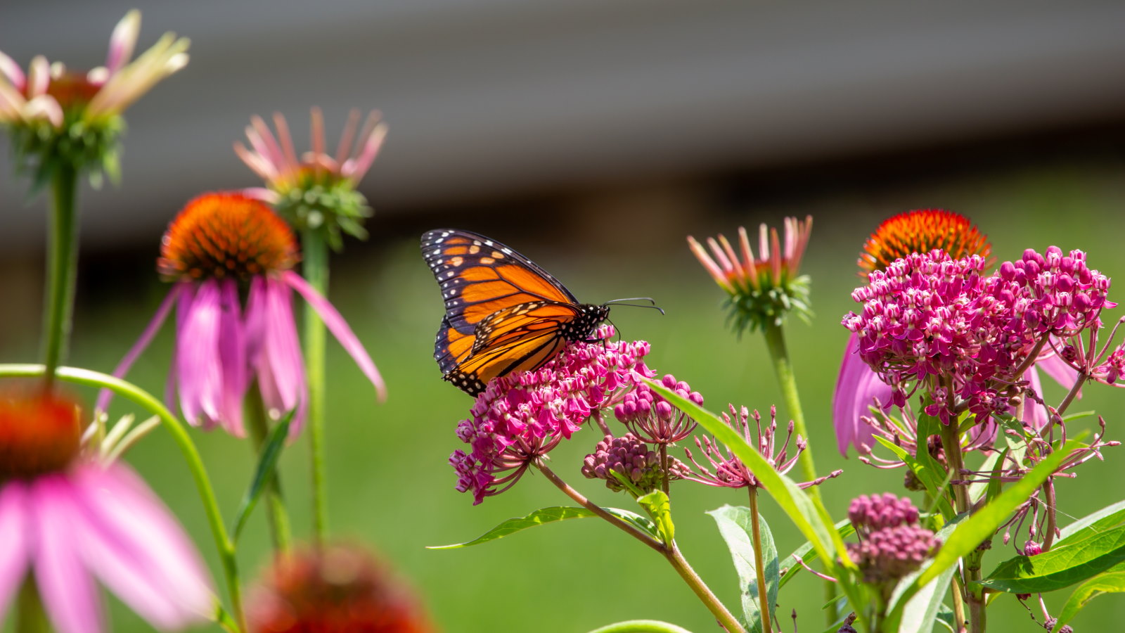 7 native perennials to plant in April – for glorious flowering displays to attract bees, butterflies, and hummingbirds
Discover some of the best perennials to plant in April to make your garden a hotspot for wildlife
-
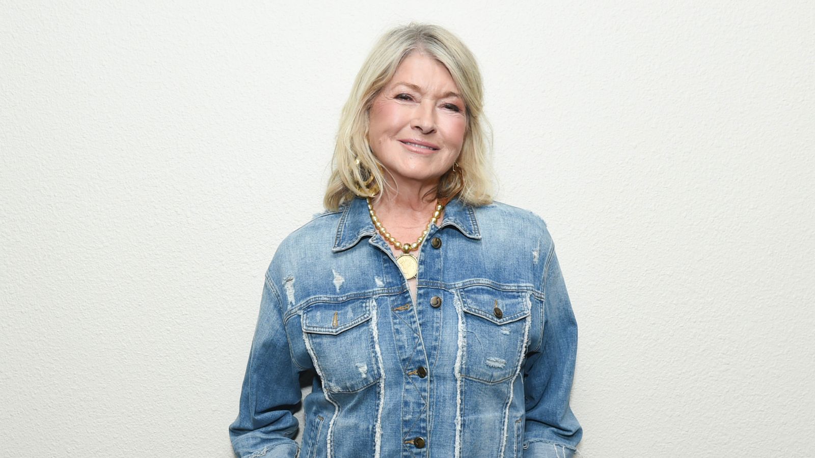 Martha Stewart's smart laundry room shelving makes exceptional use of every inch of wall space – it will turn your smallest area into an ultra-functional space
'You can greatly expand the usability of your space by just installing some of these great shelving units': You can follow her technique for under $34

