

When choosing the best paint colors for interior projects, Benjamin Moore is a paint brand used time after time by designers. Known for its durable formulas to withstand daily wear and tear, Benjamin Moore paints are not only practical, but their range of colors covers every base.
From their raved-about white paints to calming earthy neutrals; bold and saturated tones to the darkest of paint colors, Benjamin Moore is a great place to start for your room color ideas.
However, choosing the right color for your space can often be a minefield, with so much choice and variation between shades. To help provide some real-life examples of Benjamin Moore's paint ideas in situ, we've rounded up 10 of our favorite projects that feature some of the brand's most popular shades.
Benjamin Moore paint colors in real homes
From neutral bathrooms to yellow living rooms, these are some of our favorite interior projects featuring Benjamin Moore paint colors, covering the latest interior design trends as well as more timeless shades.
1. Hancock Green

Benjamin Moore's Hancock Green is a light shade of mint green that works as a calming neutral in this bathroom designed by Courtney B. Smith Design.
'I fell in love with this color the first time I saw it in person at Laduree in Paris, home of delightful macarons and the most stunning storefronts,' says Courtney Smith, founder and principal at the interior design studio.
'In addition to harkening happy memories of sweet treats, this shade plays well with friends: it’s soft enough to work well with the counter’s marble veining and saturated enough to stand up to the black marble floors. Green and unlacquered brass is always a winning combination, and bonus points for the way this color looks in sunlight and moonlight alike.'
2. Seapearl

An off-white paint with coolness thanks to its gray undertones, Benjamin Moore's Seapearl reads as a light greige color that makes for an excellent backdrop color throughout the home. In this living room designed by Lindsay Laine Interiors, Seapearl appears earthy and natural paired with darker browns.
'I have a tried-and-true, hands down, all-time favorite paint color by Benjamin Moore and it is called Seapearl OC-19,' says Lindsay Lucas, founder of the Rochester-based design studio.
'In my opinion, it is the dreamiest white because it plays with the sun. It has no yellow undertones. On the walls, we paint it eggshell and on trim, we paint it in semi-gloss. It is stunning.'
3. Habanero Pepper

While Benjamin Moore is a popular paint brand for its range of neutral hues, interior designers equally love its bolder and brighter shades. In this kitchen breakfast nook designed by MAP Architect, Benjamin Moore Habanero Pepper, a bold orange-red was used to make a colorful statement.
'It's just so warm and cheery and a nice respite from the creamy white elsewhere,' says Merritt Amanti Palminteri, owner and principal of MAP Architect.
4. Chantilly Lace

'My go-to paint color from Benjamin Moore is Chantilly Lace,' says interior designer Marina Hanisch. A bright and airy white paint, Benjamin Moore's Chantilly Lace is a great option if you're looking for a crisp white paint without strong undertones.
'Whether used in a bedroom or a living area, this white hue instantly warms up a room, making it feel more inviting,' says Marina. 'In one of our recent projects in the Hamptons, we applied it in a guest bedroom, enveloping the space with a serene ambiance that allowed the varied, organic textures and other juxtaposing elements to take center stage.'
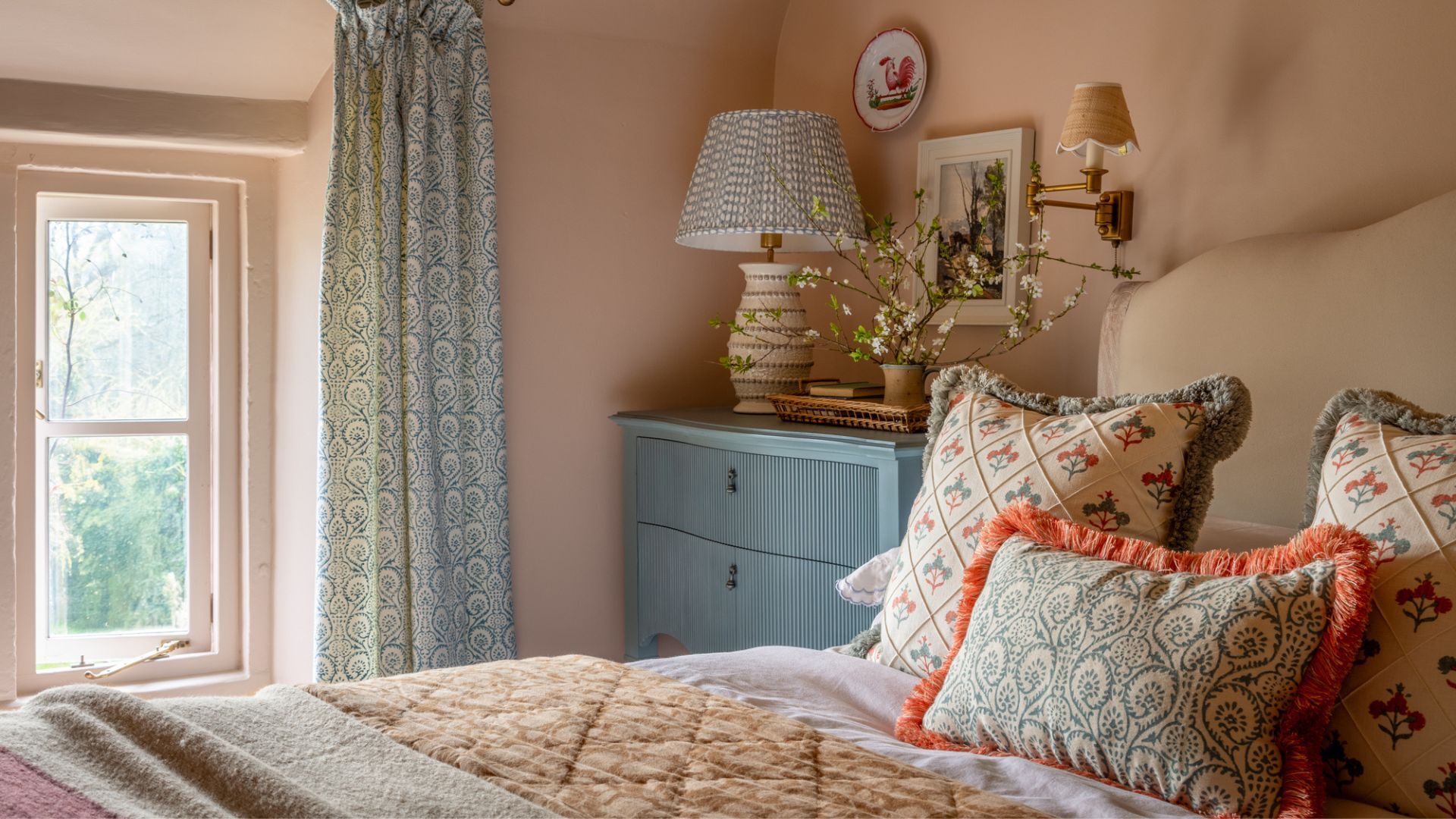
5. Revere Pewter

Neither too warm nor too cool, decorating with Benjamin Moore's Revere Pewter makes a timeless backdrop throughout the home. In this neutral bathroom, J. Fuller Interiors used this paint color across the walls, maintaining a light and airy look throughout.
'Benjamin Moore's Revere Pewter is a no-fail, go-to color for our projects,' says interior designer Judi Fuller. 'This paint’s neutrality does not mean boring. Revere Pewter perfectly compliments any other color we pair it with.'
6. Stuart Gold

Guaranteed to uplift any room, Benjamin Moore's Stuart Gold is a sunshine yellow paint that's endlessly welcoming, as seen in this living room designed by Emma Montgomery Design.
'We selected a rich gold wall color for a library-inspired living room in Philadelphia,' says interior designer Emma Montgomery. 'We were eager to find a color that felt moody in the evenings but sunny and bright during the day. Stuart Gold by Benjamin Moore was the perfect fit!'
7. Peruvian Chili

Similarly, Benjamin Moore's Peruvian Chili is a bold and warming orange hue that was used in this dining room designed by MDI Luxury Design.
'This dining room was painted with Benjamin Moore Peruvian Chili to create a bold, warm, and inviting atmosphere,' says Margaret Donaldson, founder of the Charleston-based design studio.
'The warmth of Peruvian Chili adds a sense of luxury and drama to the space. It's a statement color that can elevate the overall ambiance, making the dining experience more memorable and vibrant.'
8. Martha’s Vineyard

In this home office, Courtney B. Smith Design opted for Benjamin Moore's Martha's Vineyard across the walls and cabinetry. A dark and moody forest green, this shade is a sophisticated take on decorating with dark paints.
While certain dark paints with cool undertones can appear harsh, the subtle warmth of Martha's Vineyard gives it a cozy feel and works well in small rooms with color-drenching ideas for a high-impact look.
9. Silver Marlin

While gray paints can all too often look drab in spaces with their cool undertones, Benjamin Moore's Silver Marlin is the opposite. With a subtle dose of green, this gray paint maintains the classic appeal of gray with an inviting feel, as seen on the cabinetry in this bathroom.
'The primary bath at our Miami Falls project is the perfect place to unwind,' says Jamie Lyn Smith of Smith Home Studios. 'My favorite part is the custom reeded white oak vanity that stands opposite built-in cabinetry we painted in Benjamin Moore’s Silver Marlin.'
'This color is both soothing and beautiful as it plays off the inky Calacatta Monet marble and modern brass fixtures.'
10. White Dove

When it comes to white paints, Benjamin Moore's White Dove is one regularly used by interior designers, as seen in this light and airy closet designed by Nashville-based Debbie Mathews Antiques & Designs.
'I chose this color because I really wanted the clothing to have a neutral backdrop,' says founder and interior designer Debbie Mathews. 'My client likes to organize her clothes by color so I thought a bright white backdrop would work best. Her closet also functions as a small office and I wanted the space to be free from distraction with only the beautiful outdoors to compete with her thoughts.'
Whether your style is neutral and pared back or leans toward maximalist decor ideas, these Benjamin Moore colors cater to all styles, tried and tested by designers. Before landing on a shade for your next home decor project, remember to test the color first in different lighting throughout the day, as paint colors can look surprisingly different depending on the natural light a room receives.

Looking for more room color ideas? Browse more Benjamin Moore paint colors with this fan deck to find the best shade for your space.

-
 These are the 6 must-have colors to decorate with in April 2025
What do retro-inspired yellows and beautiful blues all have in common? They're on our hot list for the season ahead
-
 Plants never to grow next to fruit trees
Expert advice on which plants to keep away from fruit trees to encourage a healthy harvest

