5 best Benjamin Moore paint colors for creating cozy corners this fall – from rich reds to warm neutrals
Fill your home with warmth this cozy season with these expert-suggested Benjamin Moore paint colors
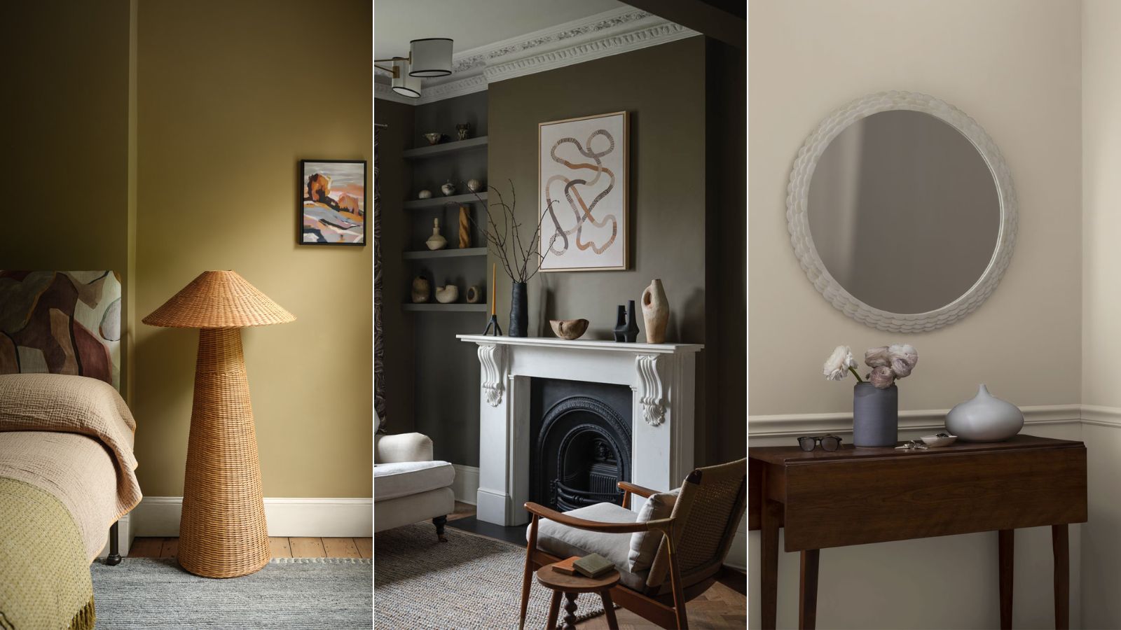

With fall upon us, most of us are looking for ways to make our homes feel cozy and snug as the nights draw in, and decorating with new paint colors is one of the most effective ways to do so.
As with any decorating project, knowing where to start with choosing the right paint colors can be tricky, and so to help you on your way, we enlisted the expertise of Benjamin Moore. Inspiring is to fill our homes with warmth, these shades are perfect for creating cozy corners in all sorts of rooms, from bedrooms to living rooms.
Read on for some cozy fall color schemes, as explained by Helen Shaw, Director of Marketing and color specialist at Benjamin Moore.
A post shared by Benjamin Moore (@benjaminmoore)
A photo posted by on
1. Mortar
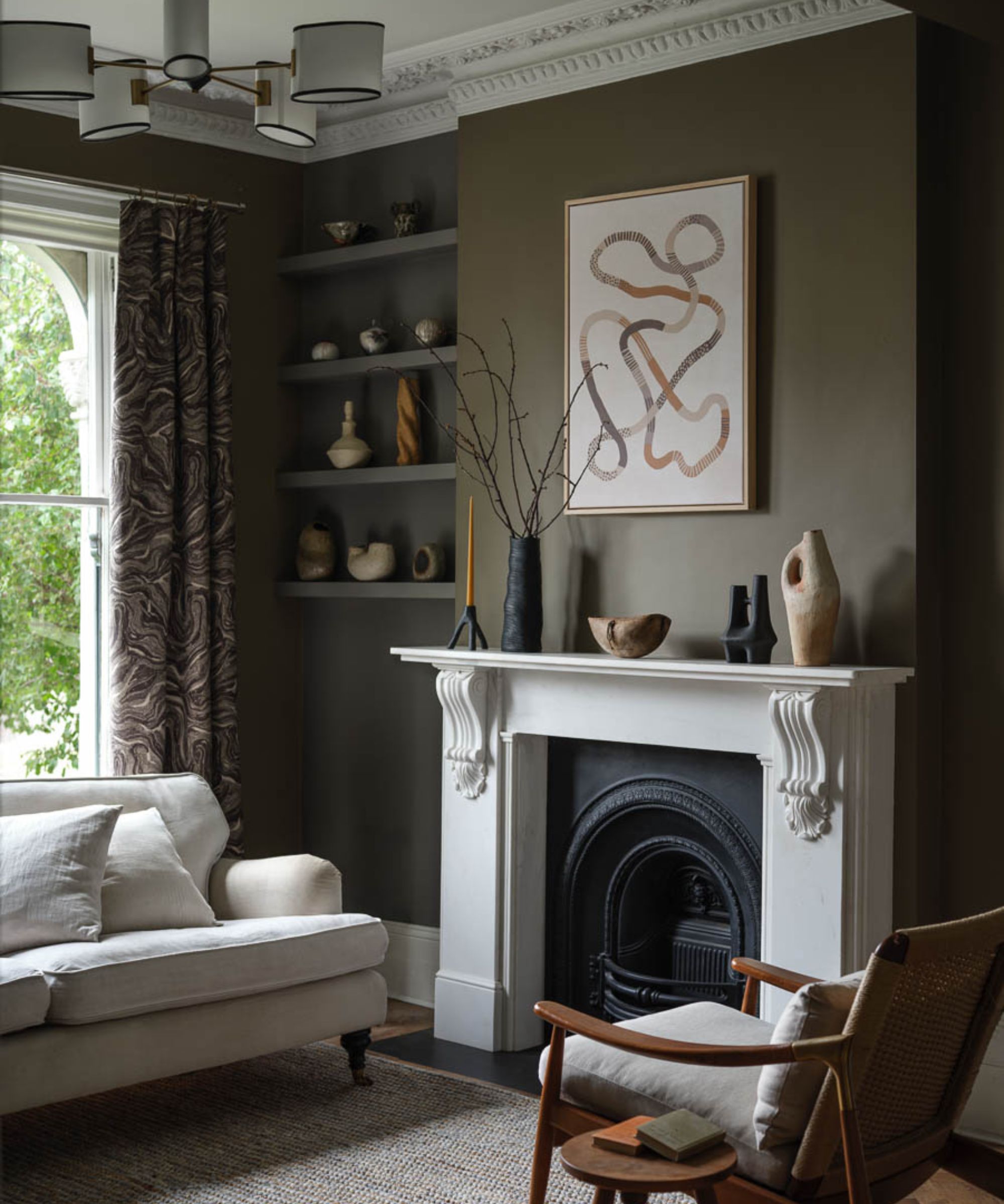
Decorating with neutrals isn't just for summer. During the cooler months, neutral hues should take on a deeper, richer tone to boost warmth and cozy appeal, while maintaining a timeless backdrop throughout the home. One paint color that allows this is Benjamin Moore's Mortar, a green-tinged taupe.
'Mortar CC-574 is a brownish taupe with earthy green undertones,' explains Helen. In this living room, Mortar provides the space with depth and a richness that's perfect for fall, but will also transition seamlessly into the spring months.
If you're looking to make more of a statement with this sophisticated paint color, Helen recommends experimenting with different paint finishes. 'Consider a higher finish such as semi-gloss or high-gloss to bring reflection and dimension to the slightly darker spaces.'
When deciding on the best color combinations for this shade, stick to lighter neutrals to provide contrast. 'A fresh white paint works beautifully with this deep neutral,' adds Helen. 'The clean contrast between the elegant, warm brown and a bright white creates the perfect balance.'
2. Pilgrimage Foliage
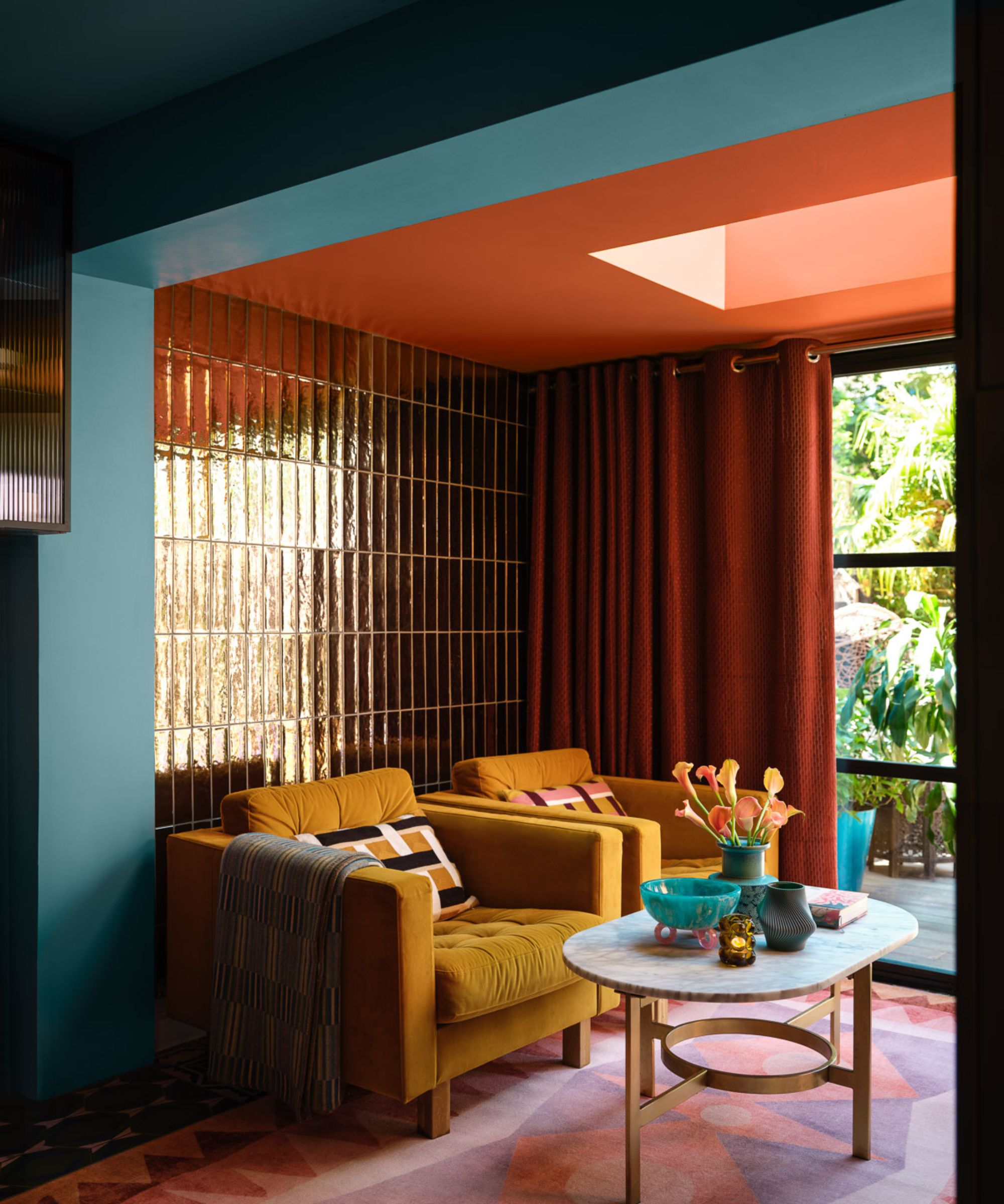
Red room ideas have seen lots of appeal so far this year, and for the fall months, this color trend is all about deep, warming shades of red that don't feel too vibrant. Benjamin Moore's Pilgrimage Foliage is a rich shade of topaz that lends itself perfectly to this time of year.
'This deep topaz hue instantly conjures the autumnal landscape,' says Helen. 'Rich tones are an ideal way to inject rooms with a refreshed sense of warmth as the seasons turn. Add tactile elements such as velvet upholstery and warm throws for the ultimate cozy haven.'
If you want to go bold with your room color ideas this fall, shades like Pilgrimage Foliage are an on-trend way to go, and you'll soon benefit from the welcoming feel they create. If using it on the walls, avoid pairing it with contrasting bright whites, and instead embrace a cohesive color scheme that layers rich tones, much like this inviting living room.
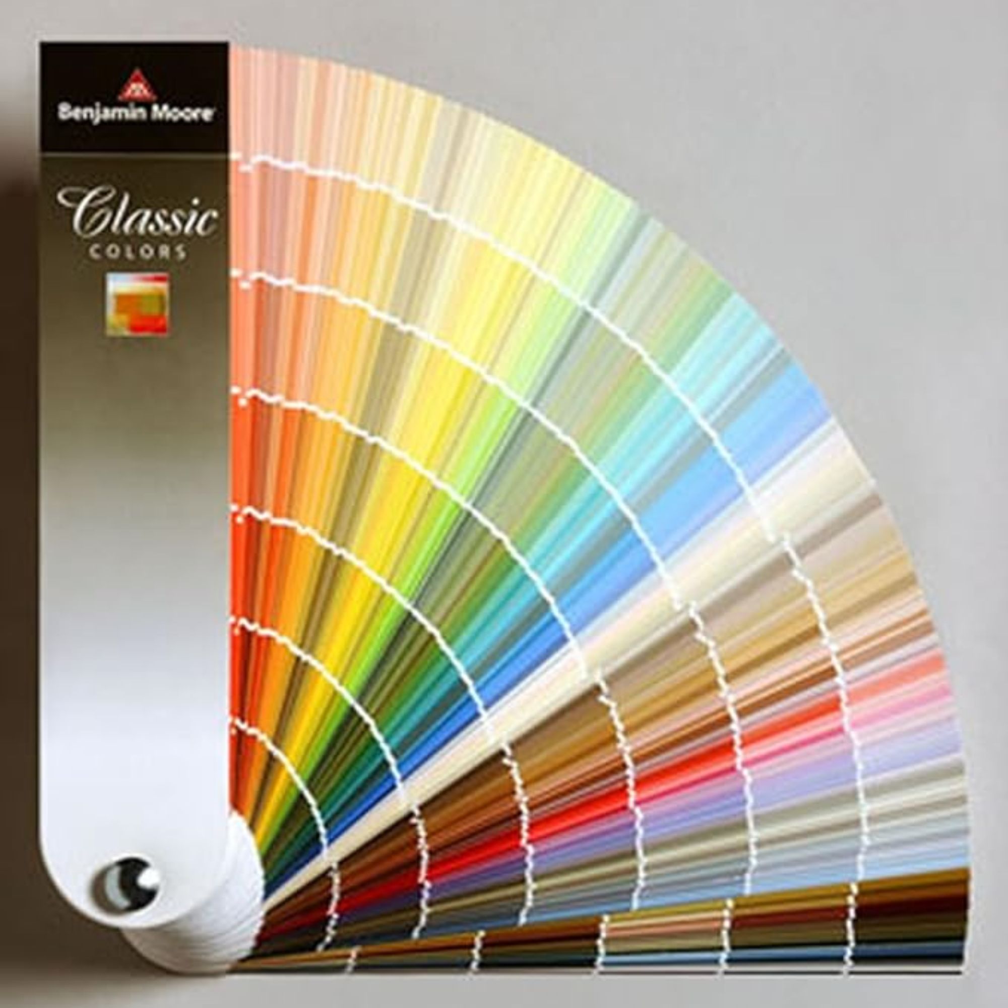
Browse the whole range of Benjamin Moore's classic paint colors with this fan deck to find the right shade for your space.
3. Summerdale Gold
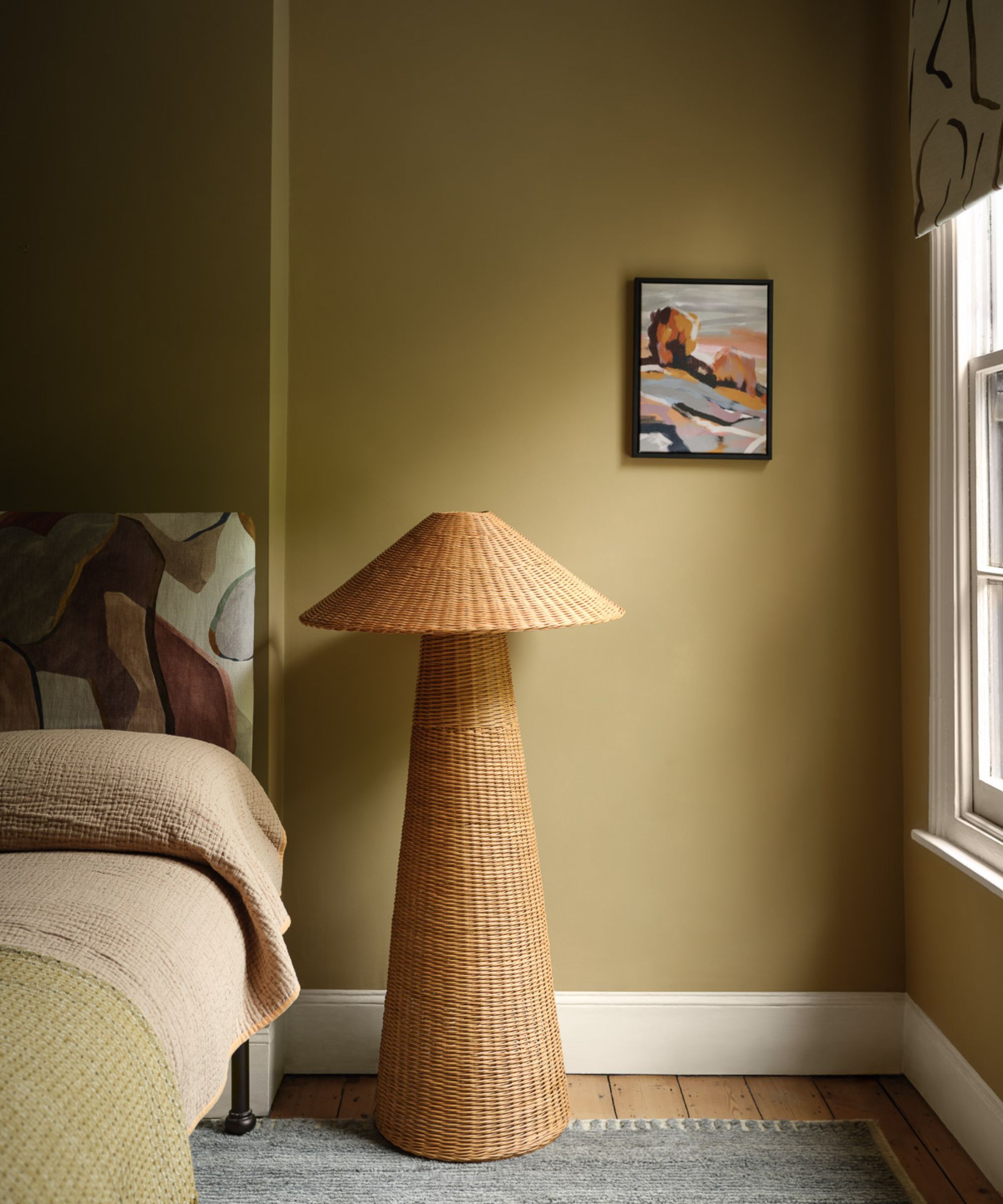
Looking for a warm neutral paint to make your bedroom feel more cozy this fall? Look no further than Benjamin Moore's Summerdale Gold, a warming honey shade that provides a cozy yet calming backdrop.
'Summerdale Gold HC-17, a grounded honey gold with hushed green undertones, is especially apt because its sandy tone is both confident and calming,' explains Helen. 'This ‘new neutral’ pairs beautifully with tactile materials, from wicker to appliqué.'
To enhance the grounded, relaxing quality of this paint color, stick to a palette of warm neutrals such as warm whites to complete the color scheme. Or, if you want to tap into a bolder look, consider neutrals at the darker end of the spectrum, such as trending chocolate brown for a winter-ready scheme.
4. Bewitched

If you're looking for another fall-appropriate way to decorate with red, consider tapping into the unexpected red theory. While the richest shades of burgundy red can be an incredibly bold color choice, using them in smaller doses allows you to benefit from their warming hue in a liveable way.
'A fluid oxblood red, Bewitched CSP-450 is beguiling in its depth of tint,' explains Helen. 'Pairing this rich hue with lighter neutral shades works particularly well as it adds a sense of warmth to these more everyday shades. Finish with staple vintage style pieces such as traditional gold brassware to create a classic and a timeless look.'
Wine red has been championed by many designers as the most on-trend color of the season, thanks to its incredibly cozy appeal and sophistication. From kitchen color ideas to living room color ideas, wine reds such as Benjamin Moore's Bewitched are a go-to this fall for good reason.
5. Cedar Key
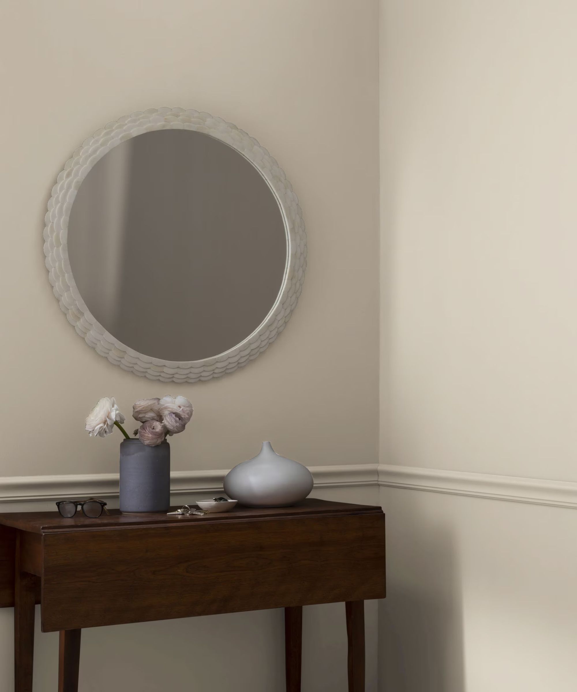
If your interior design style leans neutral and pared-back, Helen recommends Benjamin Moore's Cedar Key as a failsafe neutral color choice for the fall months. While rich and moody hues tend to lead the way at this time of the year, sometimes we want our homes to feel calming, providing a visual break from the intensity of autumnal hues.
'Cedar Key OC-16 is a crisp, confident neutral that conjures driftwood washed ashore,' says Helen. 'Boasting hints of warmth, it brings surprising depth and texture to a space.'
'Due to its earthy undertones, it's a color that pairs beautifully with deep mustard or spicy red, resulting in an energized space. Alternatively, pair it with a dusty mid-tone to reinforce an effortless feeling of calm in a space.'
Which of these cozy fall colors will you go for? Whether you want to embrace trending wine red shades for a deeply warming space or keep things neutral for the winter months, these paint colors will have your home filled with cozy corners in no time.
Sign up to the Homes & Gardens newsletter
Design expertise in your inbox – from inspiring decorating ideas and beautiful celebrity homes to practical gardening advice and shopping round-ups.

Emily is a freelance interior design writer based in Scotland. Prior to going freelance in the spring of 2025, Emily was Homes & Gardens’ Paint & Color Editor, covering all things color across interiors and home decor for the Homes & Gardens website. Having gained specific expertise in this area, Emily is well-versed in writing about the latest color trends and is passionate about helping homeowners understand the importance of color psychology in home design. Her own interior design style reflects the simplicity of mid-century design and she loves sourcing vintage furniture finds for her tenement flat.
-
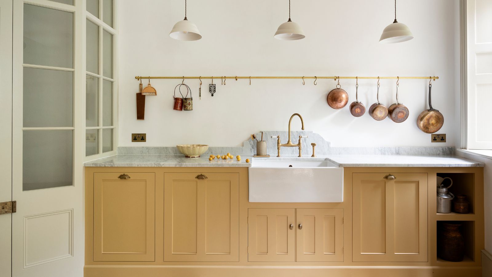 What colors go best with butter yellow? 8 equally delicious shades to pair with spring's hottest color trend
Inspired to elevate your home this spring with chic pale yellows? Here are the best colors to complete your scheme
By Emily Moorman
-
 Sarah Michelle Gellar's entryway is tranquil and elegant thanks to white and wood accents – her neutral style is replicable from $33
The actress's entryway features a wood console table, wood floors, and crisp, white paint for a warm and inviting atmosphere
By Hannah Ziegler