

If you're on the lookout for dark and moody paint color inspiration, Benjamin Moore has you covered with its 'Dramatic Deeps' paint palette.
A collection of Benjamin Moore's top dark paints, ranging from the popular Iron Mountain to the sophisticated Hunter Green, each of these shades adds drama to the home – aligning with the shift towards a bolder approach to decorating with color in our homes.
Below, we've rounded up all you need to know about these dark and moody shades to give you some stylish ideas for incorporating them into your paint ideas.
1. Vintage Vogue 462

Benjamin Moore's Vintage Vogue
Decorating with dark green paints is a great way to create a dramatic and moody interior without compromising warmth. Unlike cool blues or gray, green has a warming quality which gives it a cozy, comforting quality, such as Benjamin Moore's Vintage Vogue.
Arianna Barone, Color Marketing Manager at Benjamin Moore describes this green paint as 'a handsome smoky green with distinct notes of gray,' and adds: 'I love to pair this color with warm brushed metals, cognac-colored leathers, and matte black finishes for a sophisticated but still welcoming look.'
This would make for a timeless yet moody kitchen cabinet color choice, paired with white walls for balance.
2. Dark Walnut 1358

Benjamin Moore's Dark Walnut
Another deep and dramatic paint color that adds warmth is Benjamin Moore's Dark Walnut, a wine-red paint that veers on purple.
'A nuanced blend of red, violet, and brown makes this moody hue as adaptable as it is sumptuous,' explains Arianna. 'Pair this color with warm wood tones, dark stone or tiles, and chunky knits for a relaxed boho vibe.'
To lean into a bold color scheme, use this hue in a snug room or cozy living room with color-drenching ideas for a cohesive feel.
3. Iron Mountain 2134-30

Benjamin Moore's Iron Mountain
One of Benjamin Moore's best-selling paints, Iron Mountain is a popular dark and moody paint that's softer than pure black. 'This versatile charcoal hue brings depth and contrast to any space,' says Arianna.
'Use it on all four walls and the ceiling for an enveloping, statement-making space,' adds Arianna. 'Or, paint it on built-ins, or a front door for a smaller, but impactful dose of drama.'
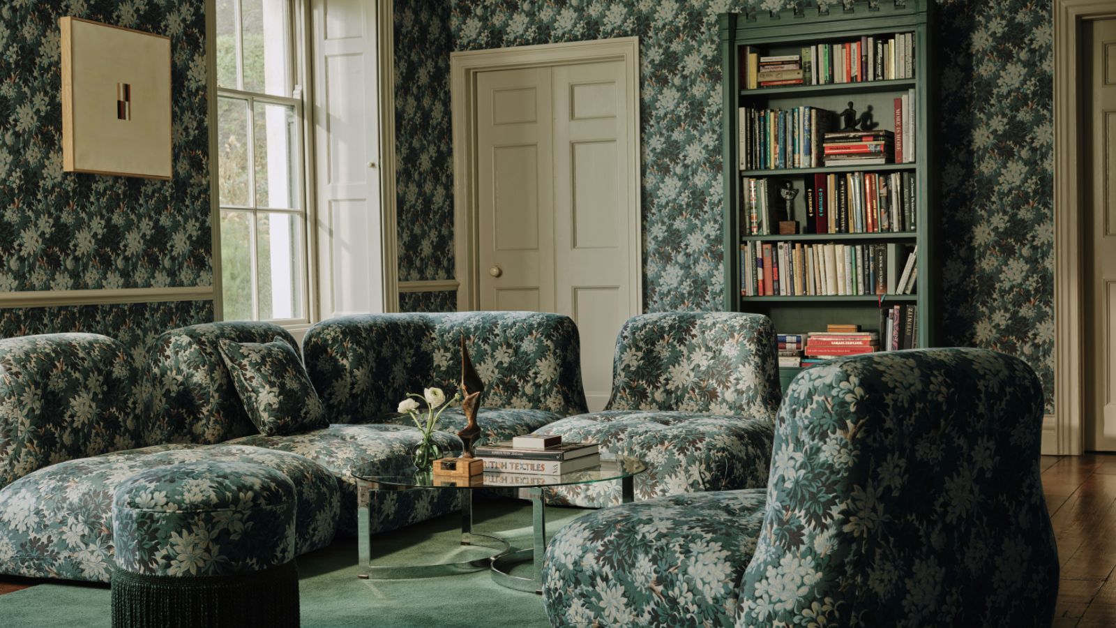
4. Hunter Green 2041-10

Benjamin Moore's Hunter Green
'Strong but subdued, this timeless green has an effortless elegance,' Arianna says of Benjamin Moore's Hunter Green which was used here in this home library.
'For the ultimate luxe look, layer in other jewel tones with this color through velvety fabrics and plush throws,' Arianna recommends. 'Or, bring in contrast and depth for a more classic look with crisp white millwork.'
We'd also love to see this sophisticated green paint used for a dining room color scheme for a moody look, paired with plenty of rich warm wood tones.
5. Onyx 2133-10

Benjamin Moore's Onyx
Decorating with black paint is a bold choice, creating an instantly dramatic look that makes a statement. If drama is your aim, Benjamin Moore's Onyx is a 'deep black hue with subtle notes of warmth', according to Arianna, that adds plenty of depth to rooms.
'With just a touch of warmth, this color pairs beautifully with warm neutrals and browns. I like to use it in smaller spaces, like powder rooms or home offices, for a more unexpected pop of color,' Arianna adds.
6. Wenge AF-180

Benjamin Moore's Wenge
If black paints feel too dramatic for your space, Benjamin Moore's Wenge is a warmer alternative. 'Warm and engaging, this dark chocolate hue has hints of brown, black, and violet in its undertone,' explains Arianna.
'Create an earthy, laidback look in the space by pairing it with natural fibers and rustic wood notes. Opt to create a more sophisticated and classic style by pairing it with gold and soft velvety textures,' suggests Arianna.
Whether used to color-drench a room for an unexpected hit of color or used in the main living spaces alongside lighter neutrals, these dramatic paint shades add plenty of depth and are a great way to add interest to your home this year.
If you're decorating a small space, Benjamin Moore's dark paints for small rooms offer plenty of bold but stylish ideas.

You must confirm your public display name before commenting
Please logout and then login again, you will then be prompted to enter your display name.
-
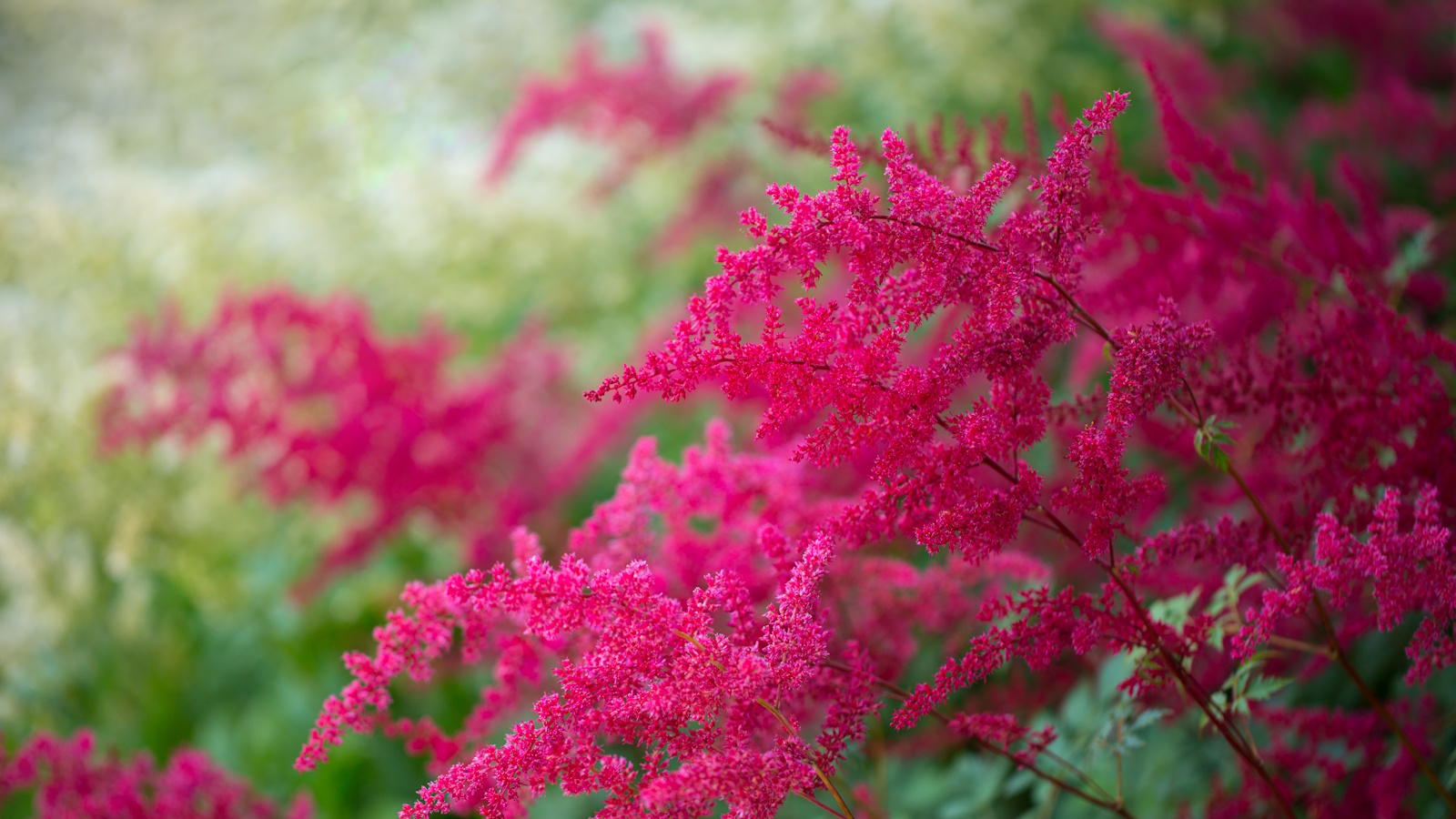 How to grow astilbe – expert advice on cultivating this shade-tolerant flowering perennial
Shade-tolerant and pest-resistant - astilbe are hardy and tough perennials that can thrive in many settings
-
 Vintage prints are making a comeback – designers say to look out for these 5 nostalgic patterns this year
These vintage-style patterns are all the rage right now, and we spoke with design experts to learn how best to style them in the home

