Benjamin Moore's 2025 Color of the Year is a muted, brown-toned plum – proving 'in-between' hues are the way forward
Here's all you need to know about Cinnamon Slate, Benjamin Moore's anticipated Color of the Year for 2025
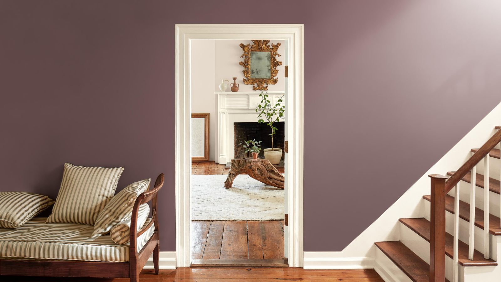

There's been much anticipation surrounding Benjamin Moore's color trend announcement for 2025, and all is now revealed. Cinnamon Slate, an 'in-between' hue that sits somewhere between purple and brown is the brand's 2025 Color of the Year, and we're fully on board with it.
Not too saturated, Cinnamon Slate combines the warmth of plum with more neutral brown tones, an incredibly liveable paint color. Appearing to have almost a powdery look, this hue is friendly and restful, allowing you to tap into the growing purple paint trend without veering too dark or bold. In addition to its Color of the Year, Benjamin Moore has unveiled a wider color trends palette for the year ahead, a continuation of grounding and relaxing shades.
Last year, Benjamin Moore's Color of the Year took on a more vibrant course, with Blue Nova, a mid-toned violet-blue. This year, Cinnamon Slate cements one of the most defining trends of the season: a shift toward rich and cozy colors with timeless appeal.
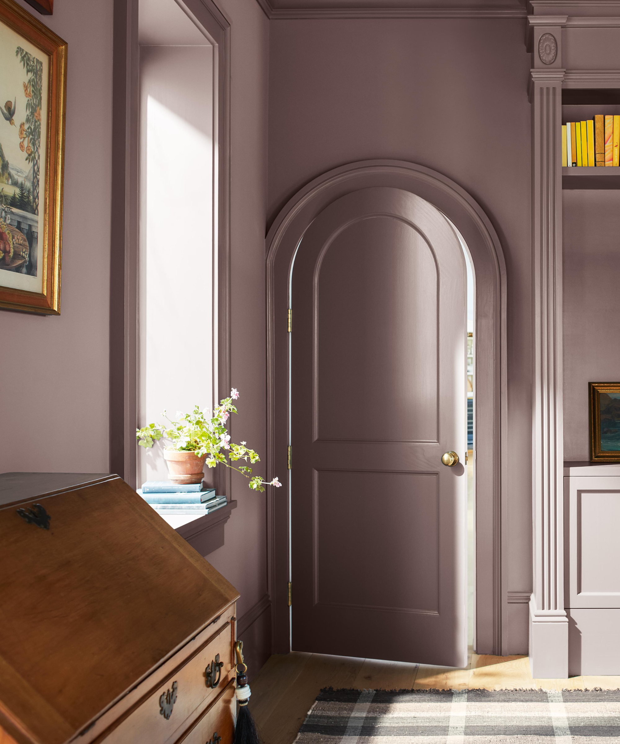
Cinnamon Slate
'Although saturated colors in design have been popular in recent years, we are now seeing a growing interest in more 'in-between' colors, whose undertones add intricacy and dimension to a space,' explains Helen Shaw, Director of Marketing (International) at Benjamin Moore.
'There is still a strong interest in embracing color, but the colors that feel most relevant have a beautiful, muted quality as seen in our Color Trends palette,' Helen continues. 'The quietly colorful nature of these hues also provides an excellent vehicle for finding color confidence without overwhelming a space or its occupants.'
'In Cinnamon Slate particularly, the rich undertones of brown, red, and purple create an undeniable sense of ease and soothing familiarity, a fundamental element in a warm and welcoming home.'
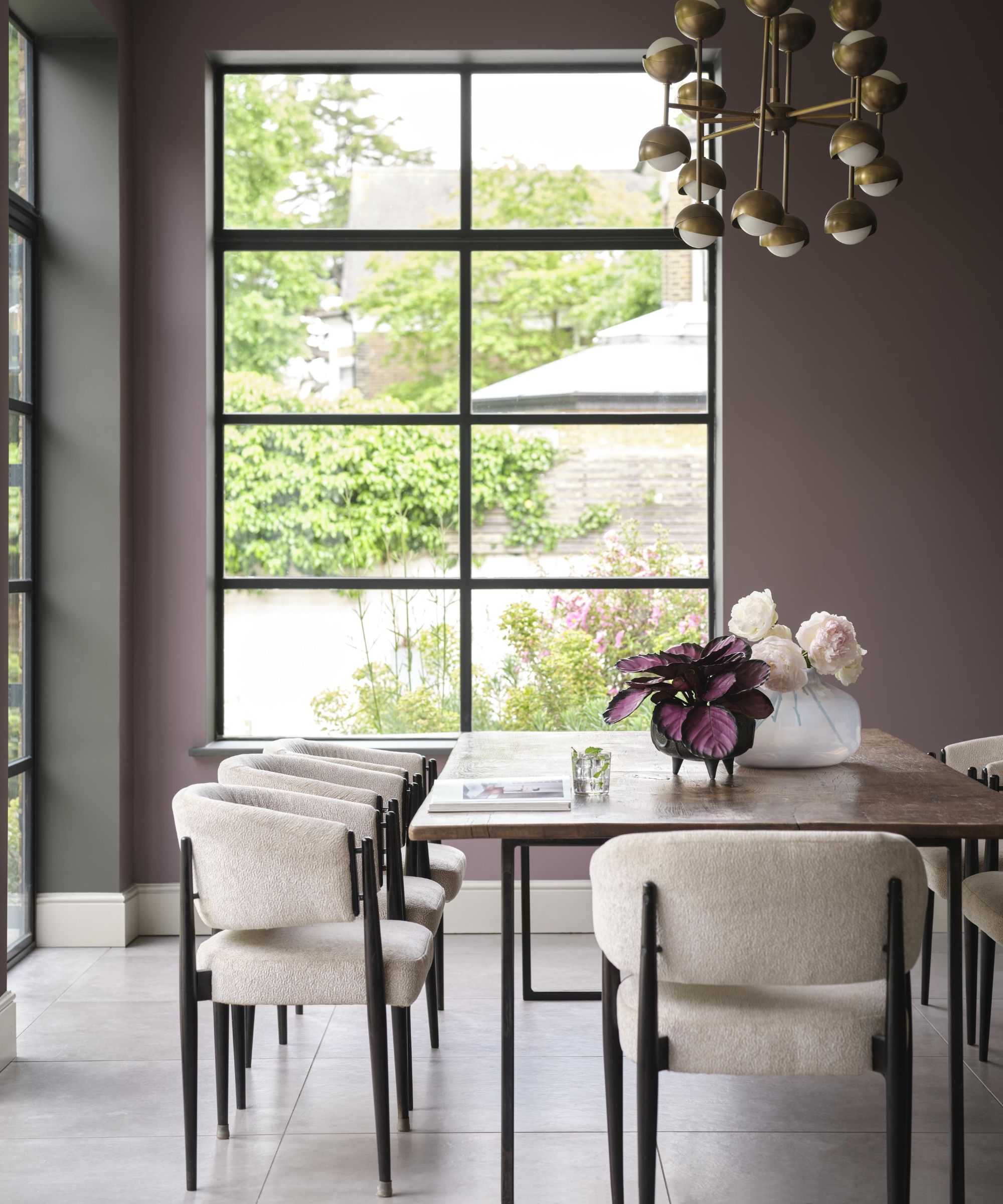
Cinnamon Slate
There are plenty of ways to incorporate Cinnamon Slate into your room color ideas, depending on the mood you want to create. Below, Helen shares a couple of her favorite ways to use this paint color throughout the home, ensuring a stylish result:
Sign up to the Homes & Gardens newsletter
Design expertise in your inbox – from inspiring decorating ideas and beautiful celebrity homes to practical gardening advice and shopping round-ups.
'Cinnamon Slate’s depth and richness make it a perfect hue for a dining room scheme. It oozes sophistication and when paired with leather, warm woods, and brushed gold accents, it creates the ultimate cozy ambiance perfect for hosting.'
'Alternatively, this delicate mix of heathered plum and velvety brown works beautifully in a hallway, particularly those with a skylight or windows. The unique undertones boast an intriguing interplay with light and dark that can transform a space from dawn to dusk.'
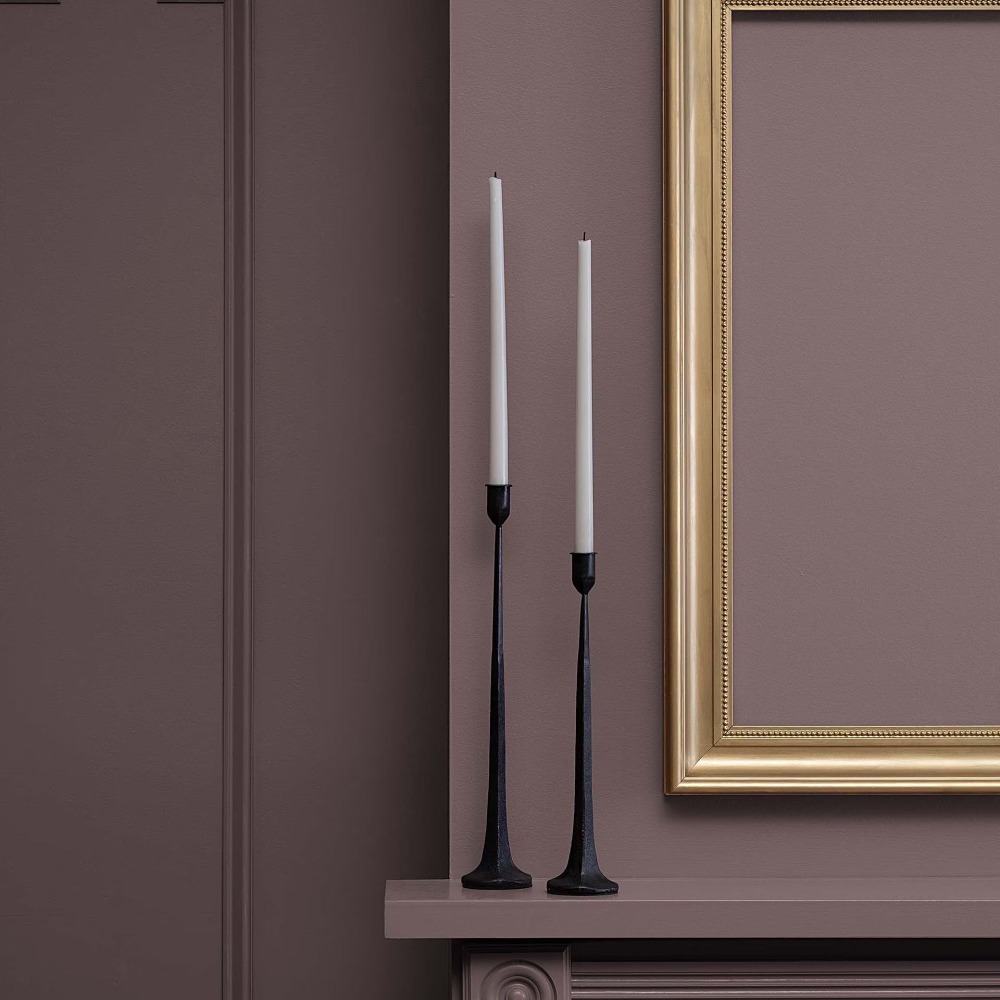
A purple and brown hybrid, Cinnamon Slate is an 'in-between' paint color that works to ground spaces with its comforting appeal.
Color Trends 2025 palette
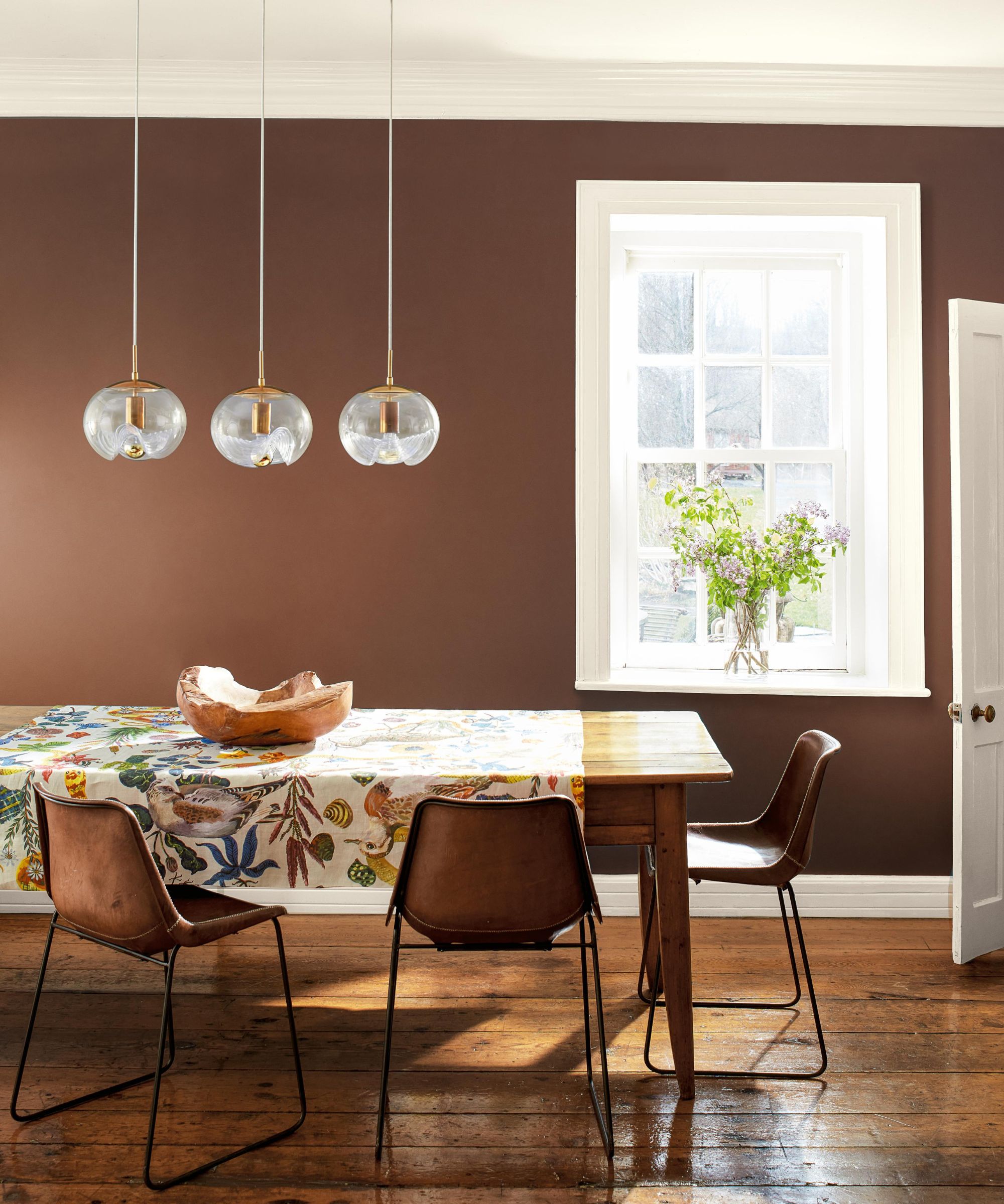
Leather Saddle Brown and Glacier White
Continuing the theme of in-between hues expected to inform our color choices throughout next year, Benjamin Moore's 2025 Color Trends palette for 2025 is made up of nine calming paint colors.
'The Benjamin Moore 2025 Color Trends are all about the beauty of quietly colorful hues that boast rich undertones,' adds Helen. 'The full palette celebrates the unique depth and versatility that these more nuanced hues bring to a scheme, creating a presence in the home without distraction.'
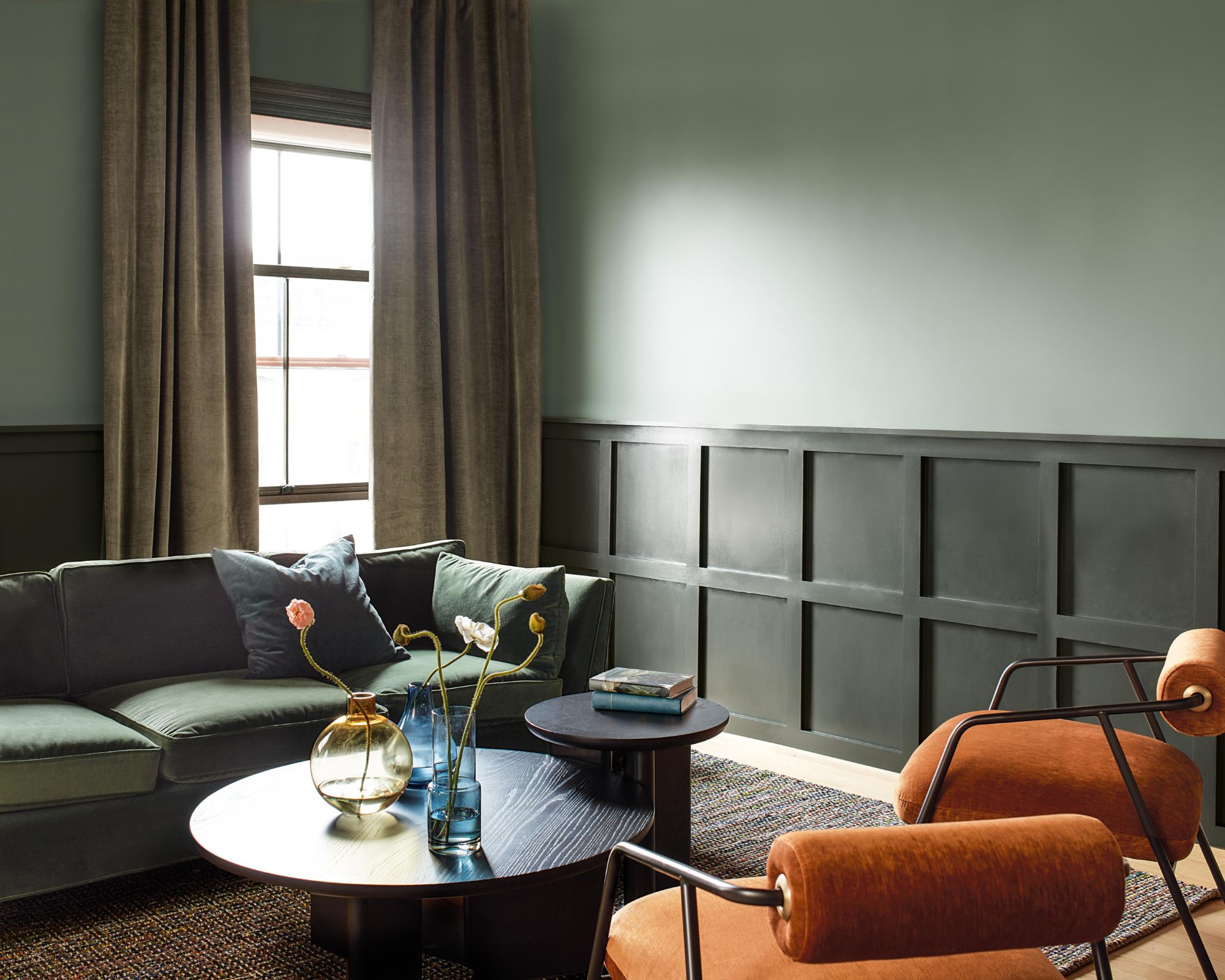
Rosepine and Ashwood Moss
Each of the paint colors provides a relaxed, earthy feel, serving as an on-trend take on decorating with neutrals for the year ahead. This includes lighter neutrals for a pared-back scheme, such as Paris Rain, a light, gray-green; and Sea Salt, a light, slightly warm gray paint.
There are also plenty of darker hues within the palette, serving as a way to introduce a bit more color into your home while maintaining a neutral, calming feel throughout. Leather Saddle Brown provides a go-to hue for decorating with brown; Ashwood Moss is a dark yet muted green that would work well for color drenching in small rooms; and Stained Glass is a toned-down teal that lends itself to calming bathrooms, to name a few.
If you're looking to refresh your color schemes, Benjamin Moore's 2025 color trends are filled with calming and grounding shades. Cinnamon Slate in particular allows you to incorporate the warmth of brown and purple in a slightly muted way to ensure a liveable space, whether used on its own or in tandem with lighter neutrals.

Emily is a freelance interior design writer based in Scotland. Prior to going freelance in the spring of 2025, Emily was Homes & Gardens’ Paint & Color Editor, covering all things color across interiors and home decor for the Homes & Gardens website. Having gained specific expertise in this area, Emily is well-versed in writing about the latest color trends and is passionate about helping homeowners understand the importance of color psychology in home design. Her own interior design style reflects the simplicity of mid-century design and she loves sourcing vintage furniture finds for her tenement flat.
-
 These are the 6 must-have colors to decorate with in April 2025
What do retro-inspired yellows and beautiful blues all have in common? They're on our hot list for the season ahead
By Sophia Pouget de St Victor Published
-
 Plants never to grow next to fruit trees
Expert advice on which plants to keep away from fruit trees to encourage a healthy harvest
By Jacky Parker Published