Beige-grey – the timeless paint color perfect for a barely-there backdrop
The experts discuss how this soft beige-grey neutral will strike a sophisticated note in any room – sitting comfortably within a historic house or contemporary setting
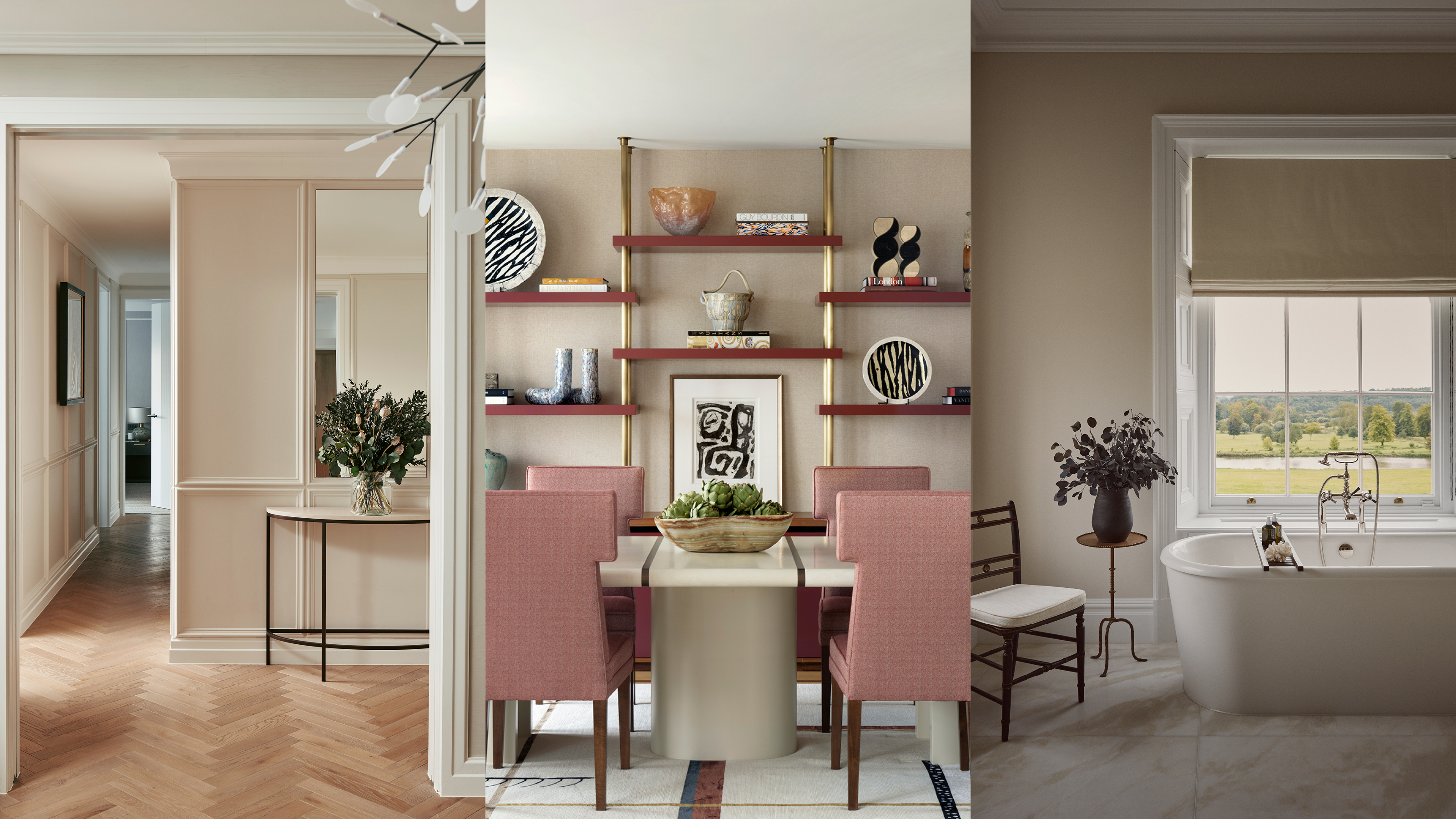

Want to know what color you should be decorating your home with for spring? This surprising beige-grey color trend will have us all re-painting our homes this month.
It's fair to say that at Homes & Gardens we've been championing vivid interior schemes and bold decorating ideas for some time, but a neutral backdrop can enable beautiful architecture, decorative furniture and bespoke artworks to make a true style statement within your home.
Using, what Rob Whitaker, creative director at Claybrook, describes as a 'smart neutral' as the overall paint color for a space, is an ideal framework for stronger pops of color elsewhere. When considering room color ideas, the experts are gravitating towards creative ways to add joyful shades to your home but ensuring that they're liveable and long lasting too.
How to get the most out of a neutral scheme
When it's comes home ideas and planning your scheme, it's often best to consider the overall palette of a room early on, this will assist with defining the other aspects within the space as the project moves forward. For example, a neutral shade, like this beige-grey, may need to be paired with other materials to truly sing: timber and marble work particularly well.
Charu Gandhi, founder & director, Elicyon, advises: 'Leathered finished marble is a favorite of mine, for its movement and tactility and it's rather delicious to touch. I also love pairing (neutrals) with suede and carved woollen rugs. Ceramic, clay and coloured glass are great for decorative elements in these spaces – throw in a couple of pieces and you will avoid the rooms feeling sombre.'
If you're unsure about what direction to take your scheme in then a neutral backdrop could be a good option. The most important thing is choosing the right tone for the space and then introducing colors in other forms via furniture, lighting and textiles. If in doubt, it's worth consulting the color wheel for inspiration – but luckily, with a neutral you're pretty safe!
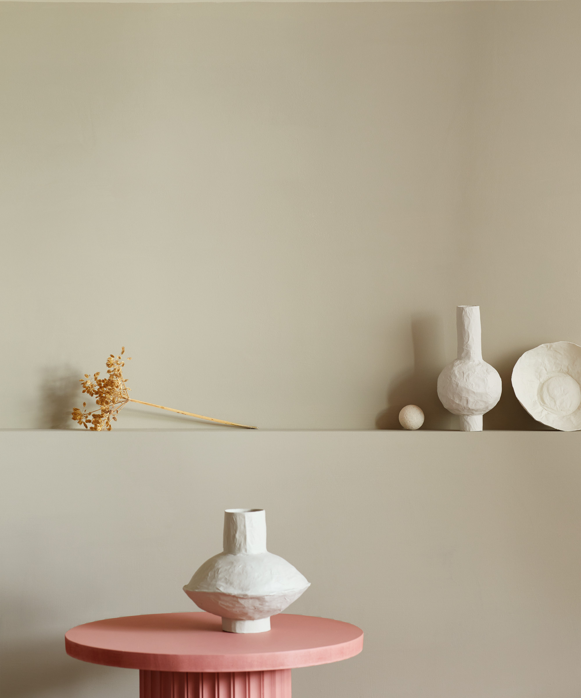
The benefits of beige-grey in the home
Some of our favorite insiders reveal their beige room ideas and explain how to use it creatively.
1. Get the tone right with paint samples
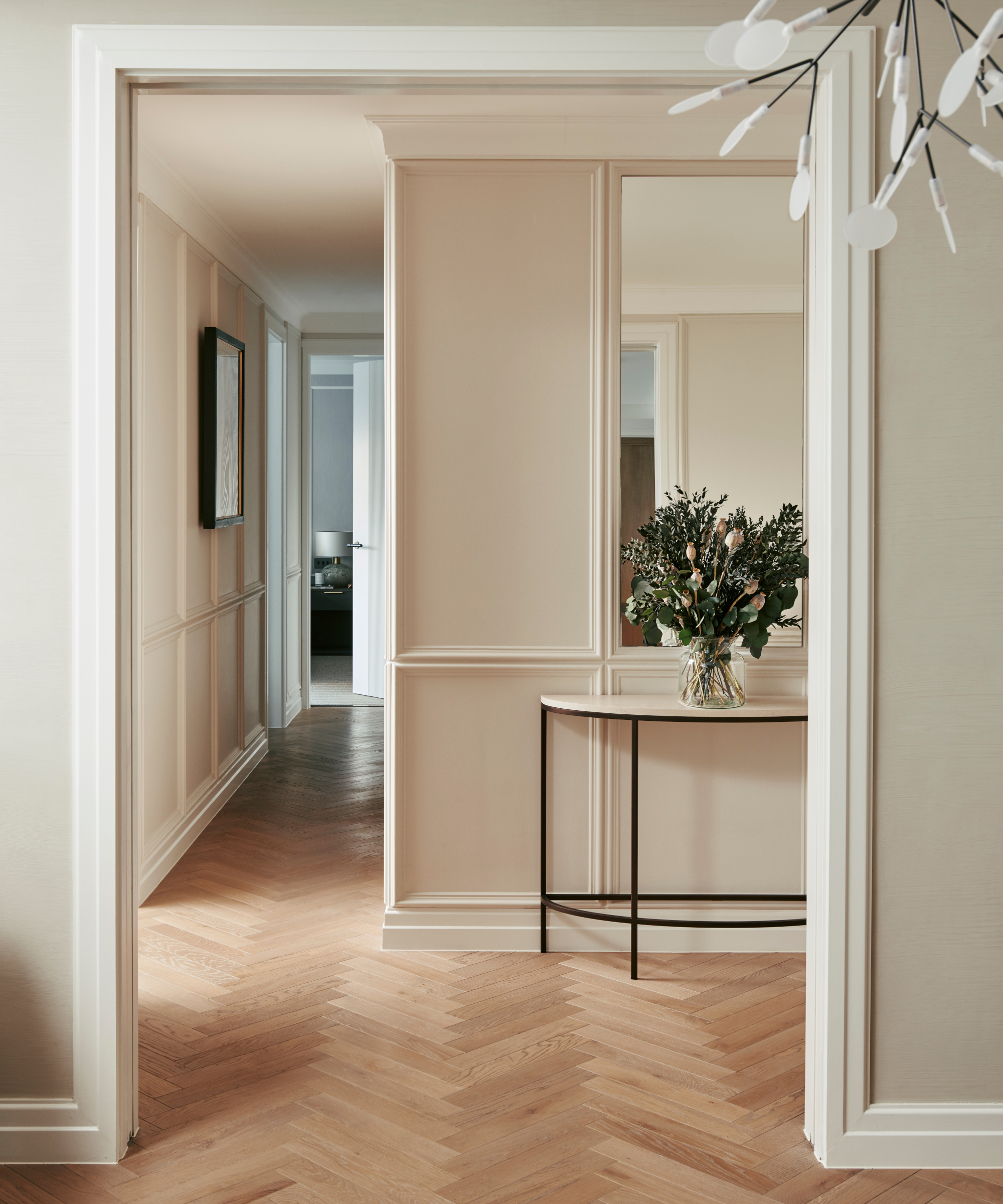
Classical details such as herringbone parquet flooring are paired with contemporary wall mouldings and lighting in the entrance all to a pied-a-terre in a mid-century apartment building in London’s Marylebone designed by Base Interiors.
'Using a neutral tone whilst avoiding a minimal or stark atmosphere is a delicate balancing act between the natural light, artificial lighting and the other textures and tones used throughout. Sampling on site, in various lights including artificial lighting, and at different times of day cannot be underestimated,' says Deborah Base, director, Base Interior.
Here, the walls have been painted in 30YY 78/035, Dulux Trade, providing the perfect backdrop for architectural details, grand mirrors and bespoke artworks.
2. Introduce warming accent colors
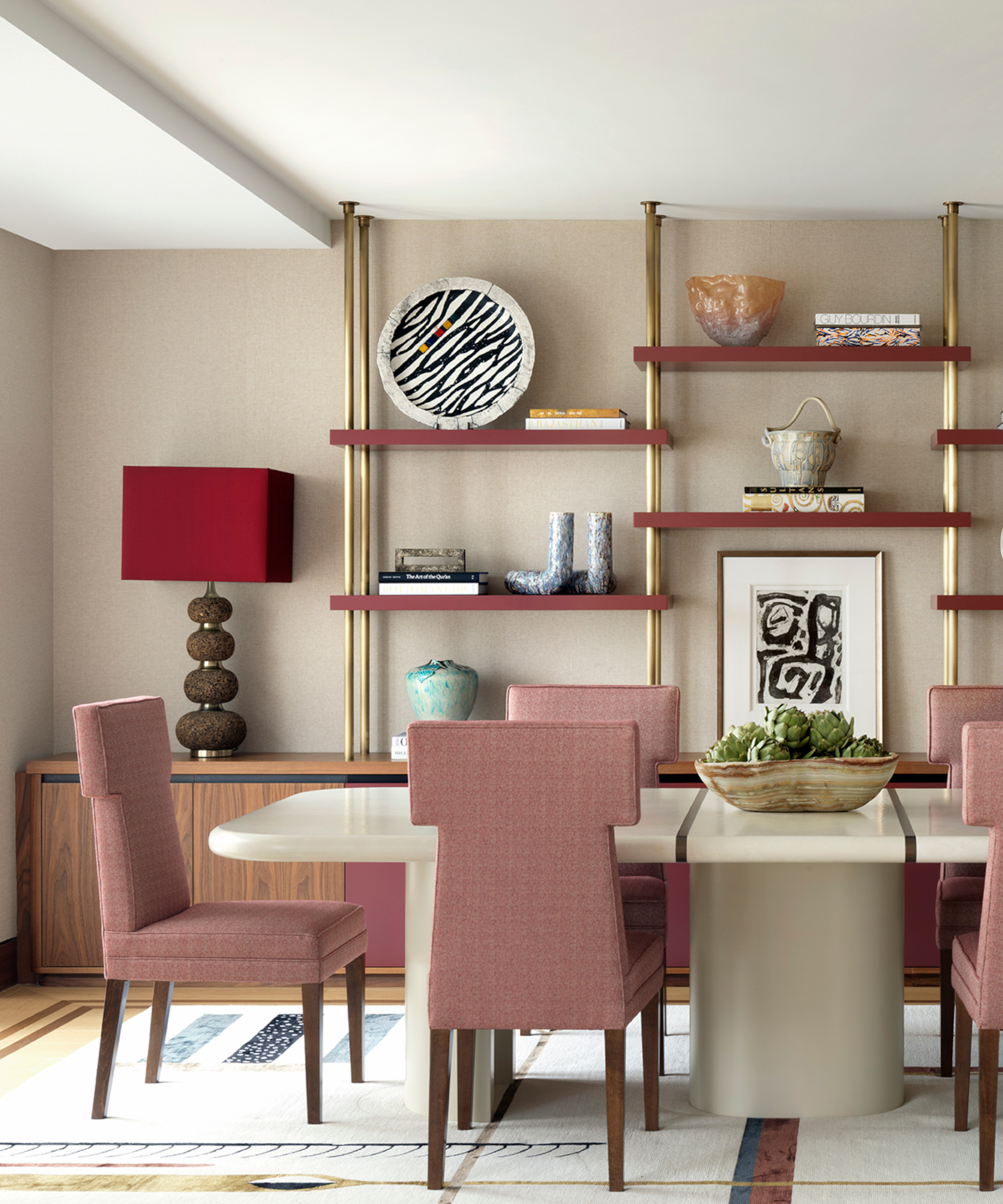
Against a neutral background, rosy shades add a warming accent to this dining room designed by Natalia Miyar who prevents the space from becoming too saccharine with the display of elegant objets and ceramics.
'Pink is a wonderful pairing with this taupe base color,' explains Natalia Miyar, director, Natalia Miyar Atelier.
'Often dismissed as too feminine or childlike, many don’t realise that it can make a surprisingly sophisticated statement. For my own London apartment, I chose a pink palette, partly because it presents something of a challenge, which I like. There is something very comforting about it and the warm tones feel especially cozy on a chilly day,' she adds.
To add something more challenging to an interior scheme, Judy Smith, color consultant at Crown, suggests to: 'Try it with burnt orange and mustard. If you are looking to bring the look into focus with some deeper points of interest, darkest olive, bitter chocolate or black will add touches to something stronger. For something sophisticated and slightly industrial, try with other washed tones of cream, grey and brown.'
3. Keep schemes clean and crisp
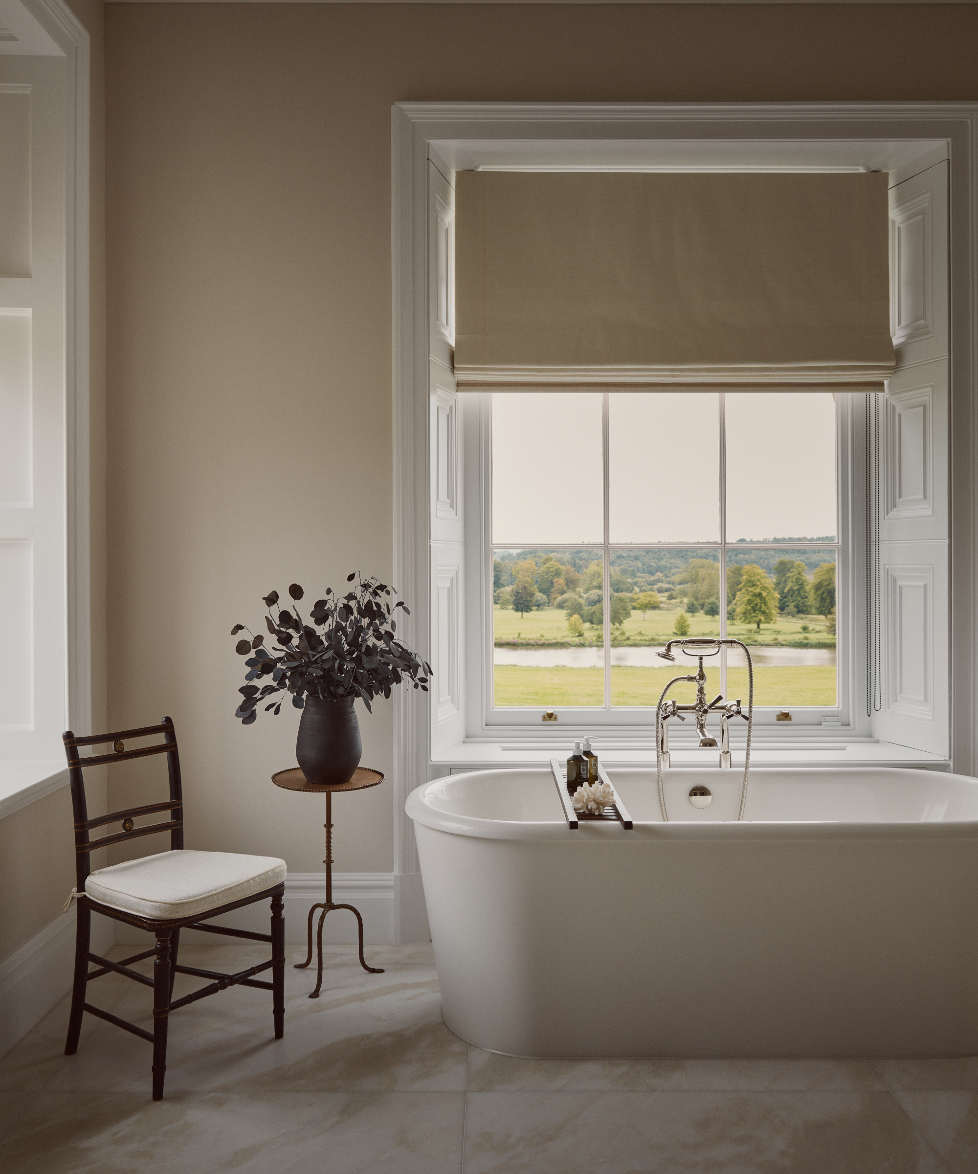
Colors are kept deliberately quiet in the main bathroom of a Grade II listed mansion in Berkshire decorated by Albion Nord, which has the effect of setting off the far-reaching rural views from the dual aspect windows.
'I love this versatile neutral which offers a warm, light and inviting tone which contrasts beautifully with crisp white ceilings and woodwork,' says Ottalie Stride, creative director, Albion Nord.
Alongside the statement freestanding Collete bath by Waterworks, Albion Nord selected Slate II by Paint & Paper Library for the walls.
Sign up to the Homes & Gardens newsletter
Design expertise in your inbox – from inspiring decorating ideas and beautiful celebrity homes to practical gardening advice and shopping round-ups.

Arabella is a freelance journalist writing for national newspapers, magazines and websites including Homes & Gardens, Country Life, The Telegraph and The Times. For many years she has specialized in writing about property and interiors, but she began her career in the early 2000s working on the newly launched Country Life website, covering anything from competitions to find the nation’s prettiest vicarage to the plight of rural post offices.
-
 Martha Stewart used this vintage-style pan to make cute bunny cakes for Easter – it's a real heirloom piece (and only $40 now)
It's not Easter without bunny-themed baked goods, and Martha set a precedent with a novel cake pan – it's American-made and has exceptional durability
By Megan Slack
-
 5 range alcove ideas that turn this awkward feature into the heart of your kitchen
These ideas are the perfect way to make a feature of awkward kitchen spaces
By Molly Malsom