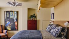
Minnie Driver used this space-expanding trick to make her bedroom look bigger, and designers share their adoration
This simple trick will make even the smallest space look bigger and bolder – and it comes with just a touch of eccentricity


British-American actress Minnie Driver knows a thing or two about style, and her maximalist bedroom wouldn't look out of place on pages of Homes & Gardens.
Where minimalism champions stripped-back design, the philosophy behind maximalism is that less really isn’t more; in fact, the busier the better. The aesthetic of excess, maximalism has found favour among interior brands and designers in recent times, but the principle is nothing new.
Where proportions allow, combining powerful colors, clashing ornate prints and rich textures can really make a statement. With its profusion of color, winter is a brilliant time to seek inspiration for a maximalist look, and the interiors world is bursting with prints to choose from. Nowhere is this bold yet charming eccentricity more apparent than in Minnie Driver’s bedroom. In fact, when done right, a maximalist design can make a small bedroom look bigger if you follow this one simple trick.
A post shared by William Abranowicz (@wabranowicz)
A photo posted by on
In Driver's bedroom, designer Peter Dunham of Peter Dunham & Associates used color and pattern across the ceiling and blinds to create the illusion of space.
All too often the 'fifth wall' is left untouched but it can be a great opportunity to incorporate color or pattern. We love how this Indian block print bedroom wallpaper provides a playful moment, yet doesn't detract from the elegant furniture and furnishings.
'Taking the pattern to the ceiling and on window treatments accentuates its size and height while also creating an enveloping feel,' says designer Beata Heuman.
Nicola Harding of Nicola Harding & Co. also swears by this space-enhancing trick for small bedrooms.
Sign up to the Homes & Gardens newsletter
Design expertise in your inbox – from inspiring decorating ideas and beautiful celebrity homes to practical gardening advice and shopping round-ups.
‘Ceilings are a great way of adding another layer of interest and making a space feel cozier. All too often they are an afterthought but we make sure to consider their potential. Using statement colors and patterns on the ceiling, and beyond, can help to extend the walls in any space.'
Ceilings are an excellent opportunity to take a bold wallpaper idea and supersize it. In this case, that means straight up the wall and right across the ceiling with a vintage patterned paper. To achieve this effect, it’s worth using an experienced decorator to deliver the best outcome.

Jennifer is the Digital Editor at Homes & Gardens. Having worked in the interiors industry for several years in both the US and UK, spanning many publications, she now hones her digital prowess on the 'best interiors website' in the world. Multi-skilled, Jennifer has worked in PR and marketing and occasionally dabbles in the social media, commercial, and the e-commerce space. Over the years, she has written about every area of the home, from compiling houses designed by some of the best interior designers in the world to sourcing celebrity homes, reviewing appliances, and even writing a few news stories or two.
-
 7 hotel housekeeping cleaning secrets for a spotless finish at home
Discover what experienced hotel housekeepers do for that professional sparkle
By Rebecca Shepherd Published
-
 Butter yellow is the color of 2025 – these 12 delicious pale yellow buys have convinced me to love this new neutral
If you’re color-shy but craving an on-trend change, butter yellow is the must-have shade to shop now
By Charlotte Olby Published