Best color combinations for a bedroom – 7 color pairings that designers and color experts love to use
A few of our favorite industry experts explain what makes compelling color combinations for the bedroom
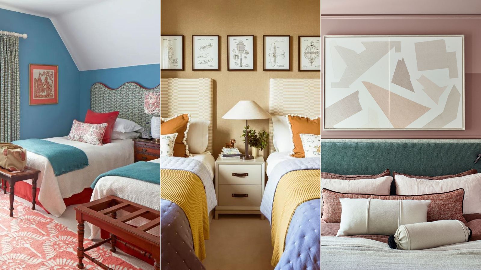

Arabella Youens
Bedroom color combinations ideas can start from a paint shade you’ve fallen for, or a wallpaper design you just have to have. But they might begin with an upholstery fabric, or a love of a particular accent shade, for example.
The most interesting color combinations for rooms can equally stem from a desire to create a particular mood or feel – with color the route to its creation. Color can soothe, warm, or nurture, and in doing so bring better sleep, make you feel more energized, or promote wellbeing.
Artists and color specialists have known this for centuries, there’s a term for it: simultaneous contrast; think of the pointillist technique used by Neo-Impressionists, for example. Careful consideration of how your colors will combine will be a key way to set the mood, pace, and personal style for your bedroom. Plus, there’s heaps of creative potential.
Here, we’ve curated bedroom color ideas to inspire your own room decor and suggested ways to color combine, too.
How to choose a bedroom color combination
Before you sprint to the paint store, says Alex Kirby, co-founder of The Pickleson Paint Co, your color combinations should consider your color ratios first: ‘A good guide would be to aim for 60-70% using your dominant color, 20-30% on your chosen secondary color, then 10-15% on a third complementary color and 5-10% on accents.’
For a calming bedroom space then, for example, you’ll want to reserve your high-octane hues in your accent colors (think cushions, lamps, and bedroom accessories). You’ll then want to think about the different ways colors can combine. From a color theory standpoint, there are four routes into it, Alex says.
The first: Monochromatic. ‘This involves using different shades of the same color. It could result in you using our pink on your walls and ceilings alongside more intense or subtle pinks on the woodwork, etc.’
Then, there’s Analogous: choose colors next to each other on the color wheel’; Analogue imbues a sense of relaxation and calm.
Next: Complementary. These are colors that are opposite to each other on the color wheel. This combination tends to evoke the highest contrast and impact.
And finally, Triadic. ‘This involves choosing colors that are equidistant on the color wheel. For instance, you could pair a color like our pink with shades of teal or lavender. This may sound a little complex, but there are plenty of tools online that can help you formulate color schemes.’
Our selection of bedroom color combination ideas is sure to inspire you, whether you are looking for bold shades for your walls, or accents to enliven a simple scheme. From snooze-inducing blues to earthy pinks, these Feng Shui bedroom colors and room color ideas will help you choose the perfect pairing for a good night’s sleep.
1. Deep purple and ochre
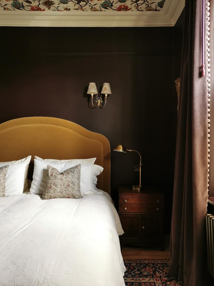
We often assume that to evoke feelings of relaxation and calmness in a bedroom, we should only sleepwalk to colors that are light, like baby blues, or pale pink. Not always so. Interior designer, Karen Knox, shows how you can also evoke sanctuary-like, cocooning feelings when you wrap your bedroom in darker, deeper hues.
‘I chose Little Greene’s Purple Brown, a rich mahogany brown. The creams, browns, and mustards provide a ‘sepia’ backdrop which helps create a timeless, traditional yet bold design. The room feels like an encompassing, delicious chocolate-laden hug,’ Knox says, ‘the darker walls provide a perfect space for deep, restful sleep.’
2. Blues and neutral grays
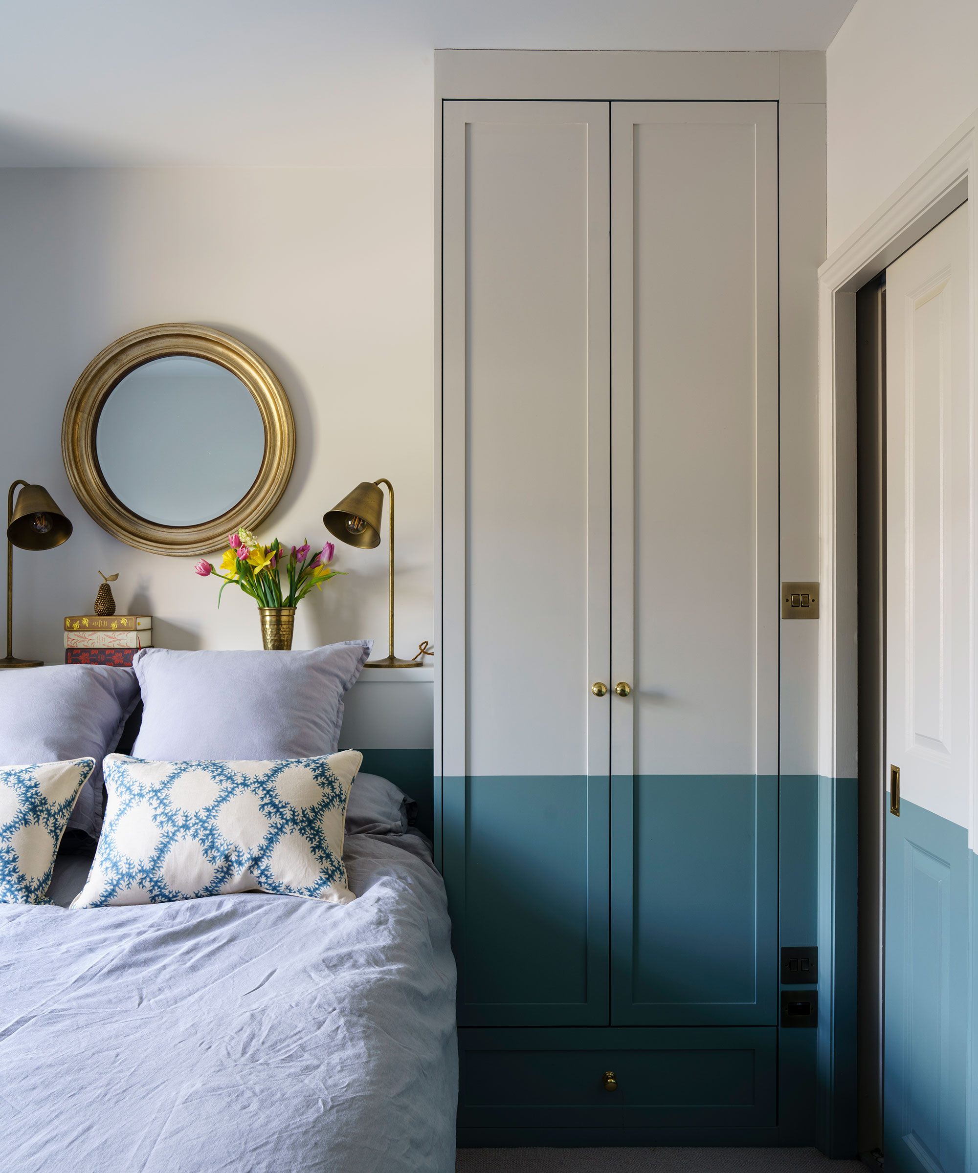
Moving off complementary colors towards a color combination more rooted in nature, blues and grays make an excellent pair, says Patrick O’Donnell, International Brand Ambassador for Farrow & Ball:
‘Blue, like green, is timeless combined with a soft neutral for an elegant and relaxed scheme. Combine an elegant mid blue such as Oval Room Blue, which has a dose of green undertone, with a soft neutral like Ammonite, a versatile brown-based gray, for a calming and timeless scheme that is utterly restful.’
3. Mix yellow with blue to mimic the sun and sea
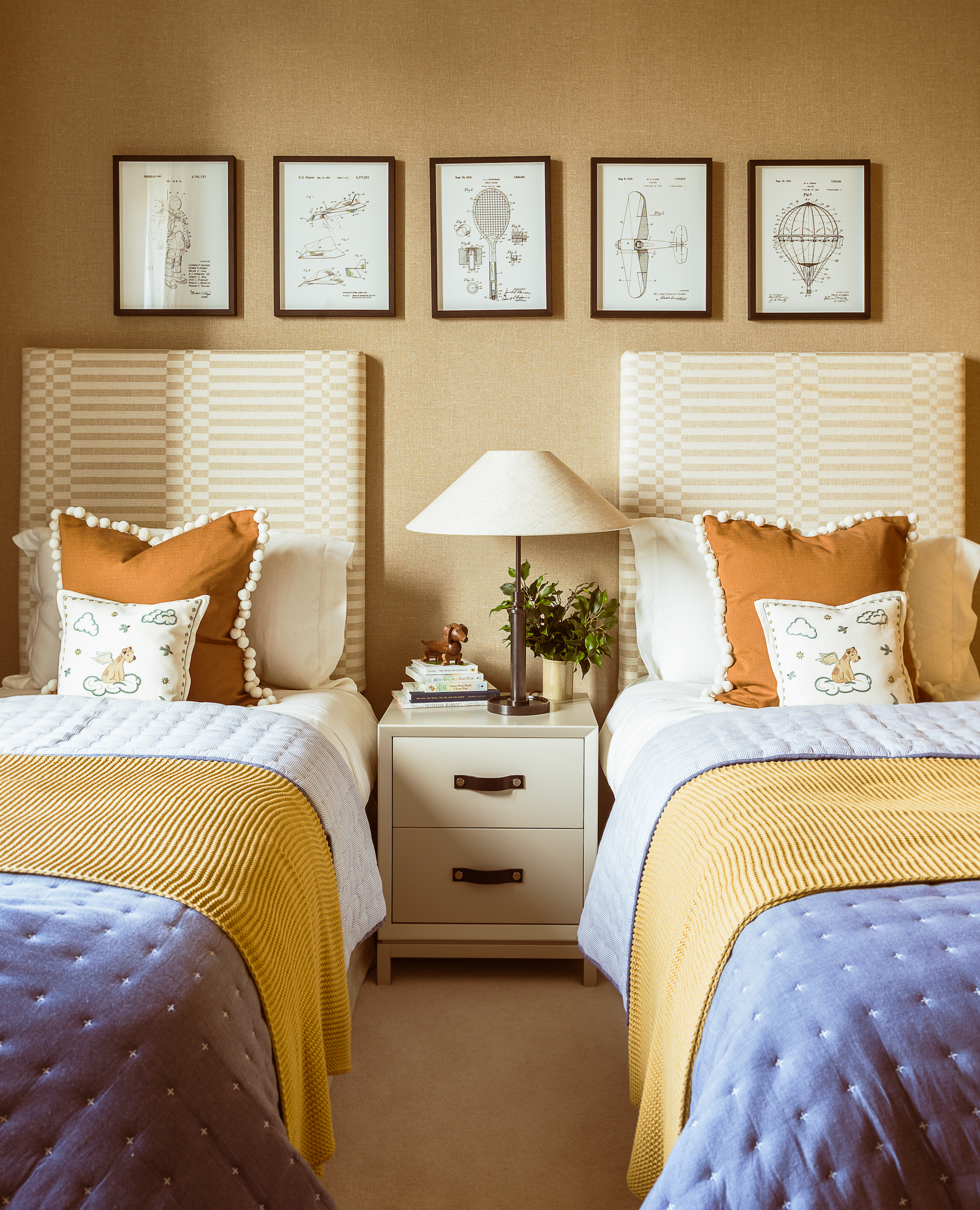
For a calming and balanced bedroom scheme, opt for sandy yellows or ochres and pair with blues – the colors of the sun and sea on a summer's day. ‘As a warm and vibrant tone, yellow creates an emotional response that is both joyful and evokes energy in a space. Blues bring a feeling of tranquillity and when paired with energetic yellows,’ says Camilla Clarke, creative director at Albion Nord.
In a classic pairing, sandy yellow wallpaper by Philip Jeffries is balanced by blue blankets in this bedroom scheme by Albion Nord.
4. Warm up a blue bedroom with red and oranges
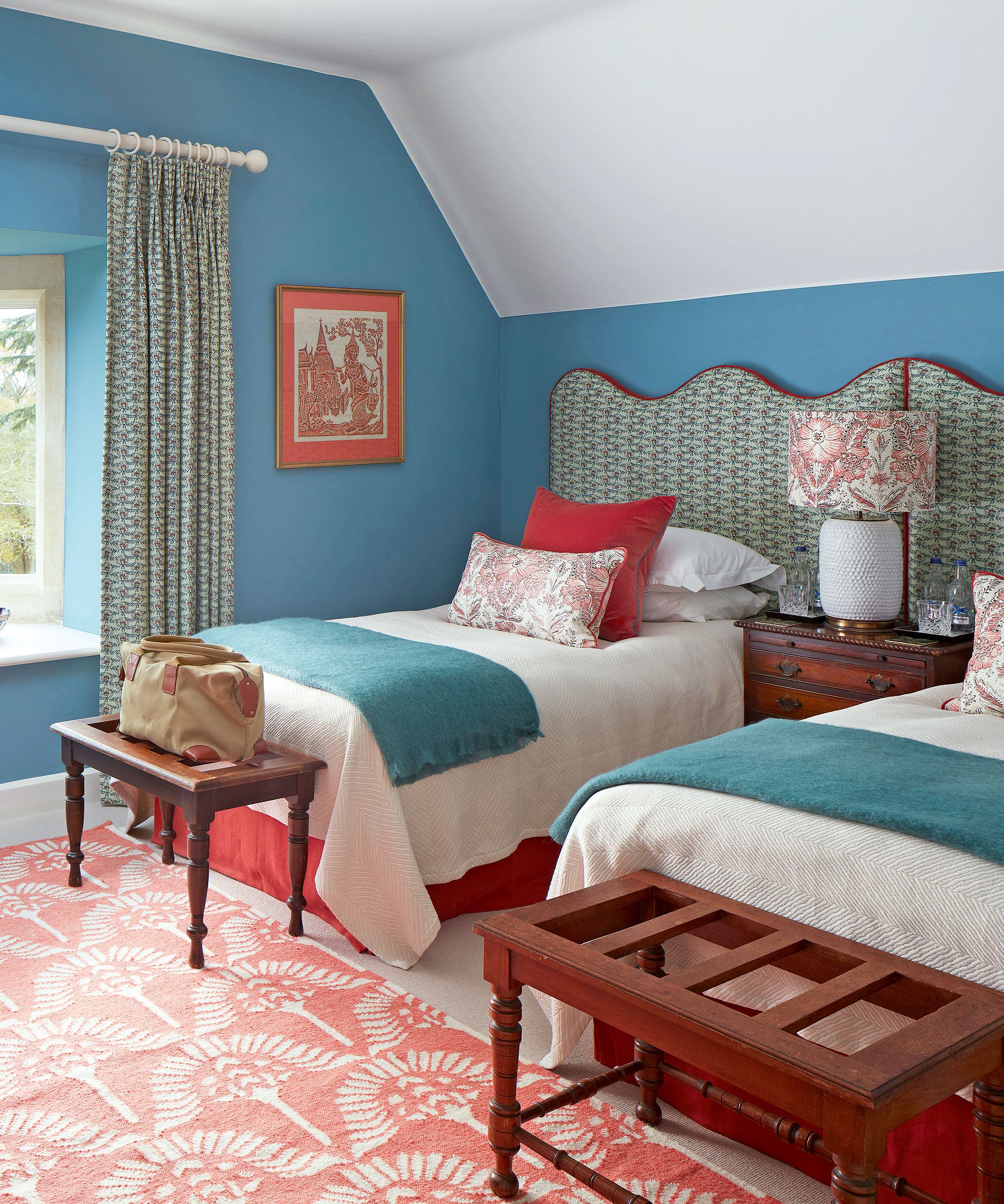
Pale blue meanwhile makes for a calming backdrop for a bedroom that can be instantly warmed up with reds, oranges, pinks and yellows. ‘We are very careful when picking blues for a room that doesn’t get too much natural light to make sure that the undertones are not too grey,’ says Liv Wallers and Cath Beckett, co-founders of Yellow London. Another way to ensure there’s warmth is by introducing a pattern, adds interior designer Rosanna Bossom. ‘I’d steer clear of geometric patterns for blue bedrooms and add some brown furniture. Brand-new shiny furniture can make a bedroom feel stark.
In this scheme by Yellow London, Blue’s Blue by Paint & Paper Library is tamed by pairing it with a pale aqua fabric while deep coral brings balance.
5. Pair pale pink with darker pink and gray
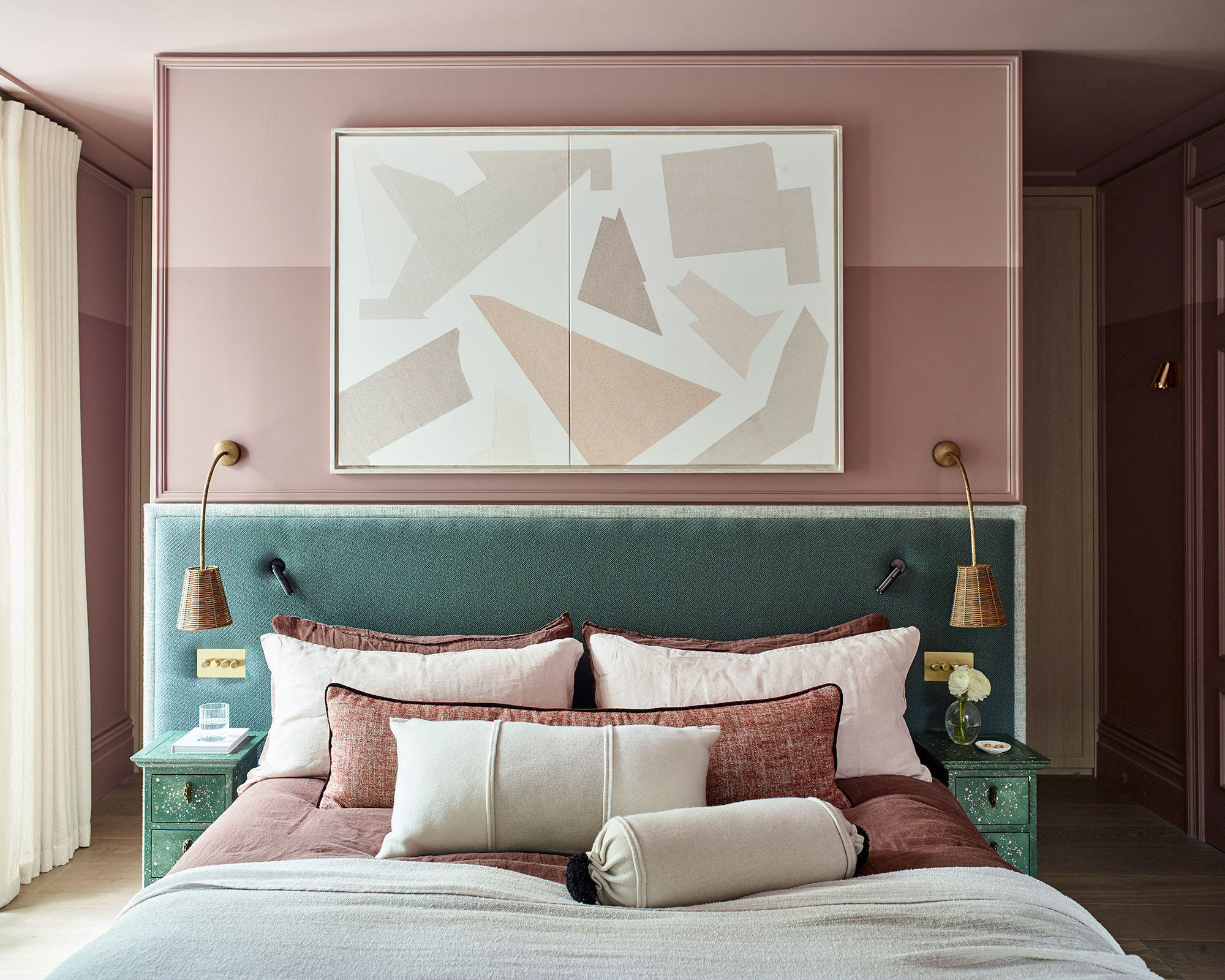
Pink is an excellent color choice for a modern bedroom as it doesn’t distract or stimulate the brain. ‘Choose a warm and cozy hue,’ recommends Irene Gunter of Gunter & Co. ‘My current favorites include Temple by Paint & Paper Library and Setting Plaster by Farrow & Ball. Using blush shades like these, particularly in a bedroom, creates a soothing and inviting atmosphere.’ She likes to pair these shades with natural wood floors and textured materials such as velvet in a deep grey
Irene Gunter used Paint & Paper Library’s Rouge II on the bottom of the wall and the same color with 50% white mixed in to create a lighter shade for the top, which increases the height of the room.
6. Blue and canary yellow
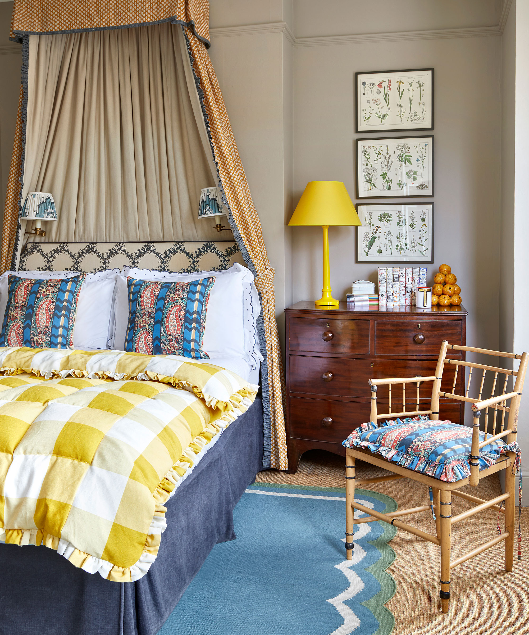
A wall color of calming blue leaves the door open for some vibrant accent colors – and what color could cheer a bedroom up more than a canary yellow? ‘Yellow is always such a great color to use against a neutral backdrop and a way to make antique furniture really sing!’ says interior designer Mary Graham at Salvesen Graham.
‘We usually layer patterns of a similar scale and tone when designing a bedroom, which will ensure it feels cozy and inviting. Nothing should shout louder than anything else so that the eye is not drawn to one feature and the space will not feel too busy.’
Too many competing colors, then, is like too many cooks in the kitchen.
7. Pair paler shades of blue with subtle green
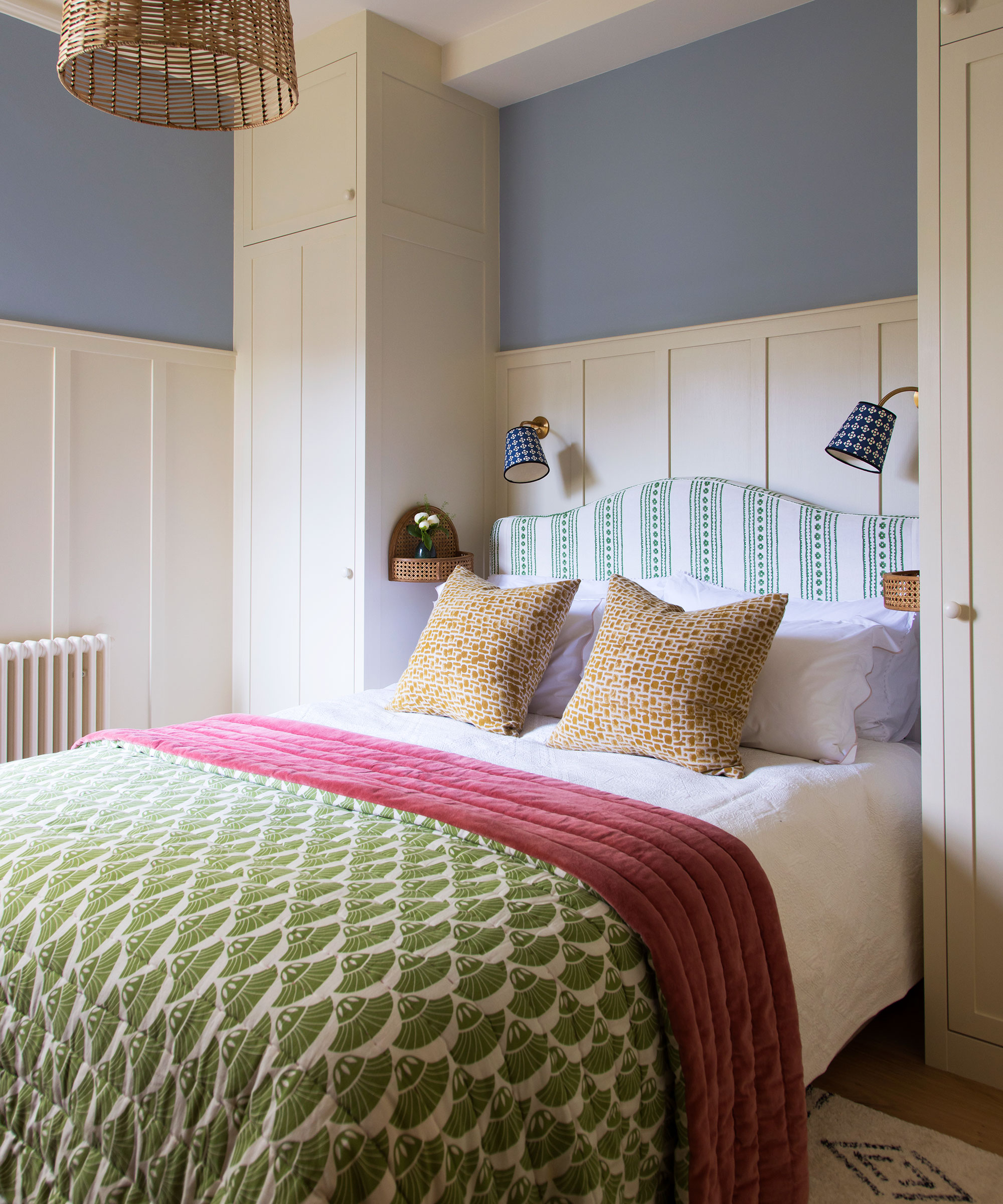
The source of the adage of never mixing blue and green has murky roots. Scratch beneath the surface and its origins are hard to fathom. One of the most likely theories, given that so much idiom in the English language derives from maritime vernacular and superstitions, is that sailors were warned not to paint the hulls of their boats green lest they become invisible when capsized. But it’s tenuous.
For decorator and designer Susan Deliss, it’s nonsense. ‘It just doesn’t occur to me to work with a rule book when it comes to color combinations for bedrooms. It’s about what feels right for the room, its light, and the environment around it. It’s a question of tone and judgment: in a sunny climate, you can probably get away with pairing acidic greens and cobalt blues for example but in a rural or period house, it’s important to rein things in and look at greens and blues from nature for inspiration.’
Sign up to the Homes & Gardens newsletter
Design expertise in your inbox – from inspiring decorating ideas and beautiful celebrity homes to practical gardening advice and shopping round-ups.

Charlotte is a freelance writer with a focus on design and interiors, writing for publications such as Inigo, Aesthetica, and Country & Town House. She divides her time between writing editorials and analyzing lifestyle trends for various global trend-forecasting agencies.
- Arabella YouensContributing Editor
-
 The rumours are true, the NYC trend for fringes and trimmings is actually happening – they are the secret weapon for making a room look expensive
A trim or a ruffle is the finishing touch that can take a scheme from ordinary to the extraordinary in an instant
By Jennifer Ebert Published
-
 How to grow impatiens – garden experts reveal the secrets to growing this shade-tolerant, sparkling summer plant
Both 'Busy Lizzie' and 'New Guinea' impatiens can thrive in shady yards
By Ellen Wells Published