This tiny bold entryway 'threw the rule book out the window and danced on it' – we take a tour of the award-winning space
Originally curated for a designer showhouse, this hallway space went on to win a Wayfair Tastemakers award. In an exclusive interview with H&G, designer Marie Cloud reveals the considered decisions that went into the room
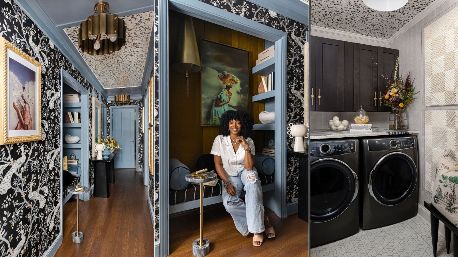

Blending bold pattern, bright color, and expressive artwork in a single space is no simple task – the fine line between eye-catching and overwhelming is easy to cross. But some designers nail the balance, blending color with comfort and character with class.
Marie Cloud, owner and principal designer of Charlotte-based Indigo Pruitt Design Studio, achieved it all in this entryway. Originally designed for the Junior League of Greensboro's 2022-23 Designer Showhouse, the space went on to win 'Most Innovative Design' in Wayfair's 2024 Tastemakers Awards.
The Brownstone Boys, two Brooklyn-based interior designers and renovators who judged the competition said she 'threw the rule book out the window and danced on it' – and we can't help but agree. The small entryway, with its bright blue accents and defining wallpaper, makes the space a world of its own in the best way.
'The vision for this space was rooted in a desire to celebrate its inherent classical charm and traditional ambiance while introducing a contemporary twist and artistic touch to create a sense of surprise and innovation. I take great pride in having achieved this delicate balance, and believe the result not only meets but exceeds my original intentions,' Marie tells H&G.
A look inside the award-winning entryway

There's a near endless supply of design inspiration to be found in this small space, but the wallpaper is undeniably the room's boldest feature. Following the natural architectural flow of the space, the wallpaper carries the eye with ease.
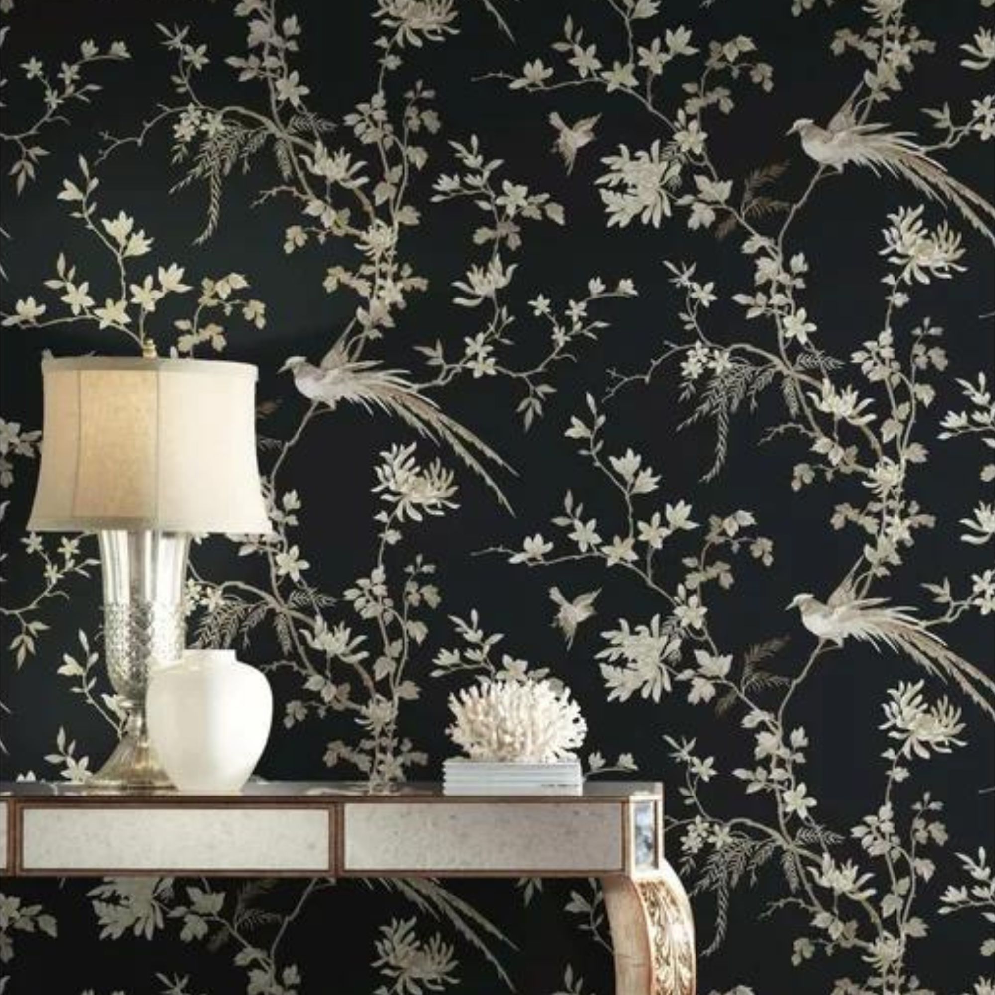
The graphic black-and-white pattern incorporates small touches of muted blue and gold to make a true statement, and a complementary pattern takes to the ceiling for added interest. Marie shares that the main wallpaper is Capiz Offering from York Wallcoverings.
'The decision to extend the wallpaper onto the ceiling transforms it into a fifth wall, making a bold statement that adds depth and character to the space,' she says. Opposite the wallpapered ceiling, natural wood floors 'offer warmth and a classic foundation that grounds the more eclectic design elements,' Marie adds.
Sign up to the Homes & Gardens newsletter
Design expertise in your inbox – from inspiring decorating ideas and beautiful celebrity homes to practical gardening advice and shopping round-ups.

Marie Cloud is the Owner and Principal Designer of Indigo Pruitt Design Studio, a full-service firm based in Charlotte, North Carolina.
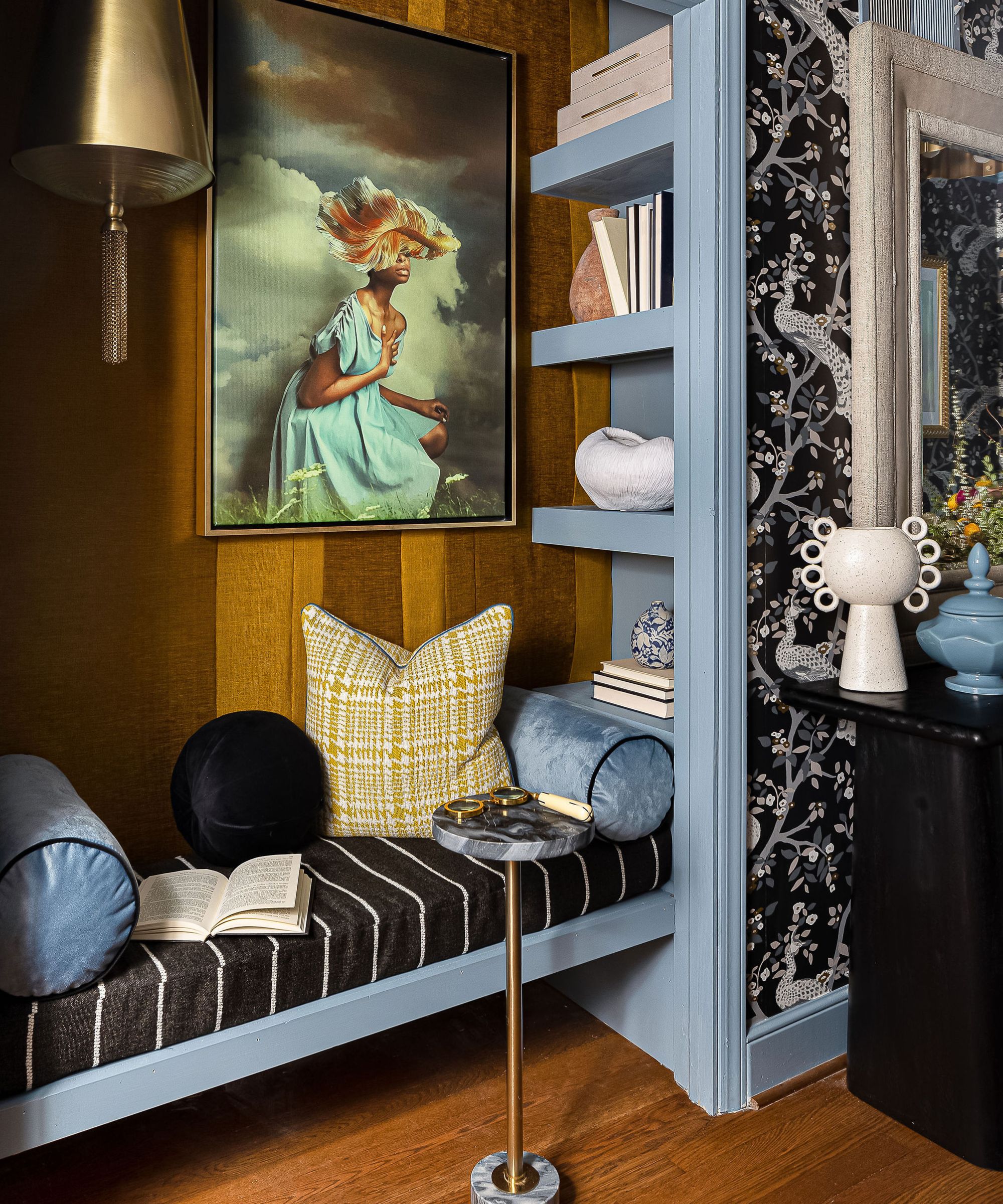
Though the space offers quite a bit of function, Marie has incorporated a comfort-forward reading nook design, perfect for cracking open a book and relaxing. Fitted with built-in shelves that easily hide from view, high ceilings, artwork and a convenient side table, the nook is an oasis within the highly patterned environment. The throw pillows, meant for function and comfort both, 'play off the wallpaper and seating, tying the space together,' says Marie.
'The nook seating area is designed to be a comfortable, intimate space that is conveniently located across the hall from the walk-in closet. The inner wall is upholstered with a textured chartreuse hue, which adds a tactile element and warmth to the seating area,' she tells H&G.

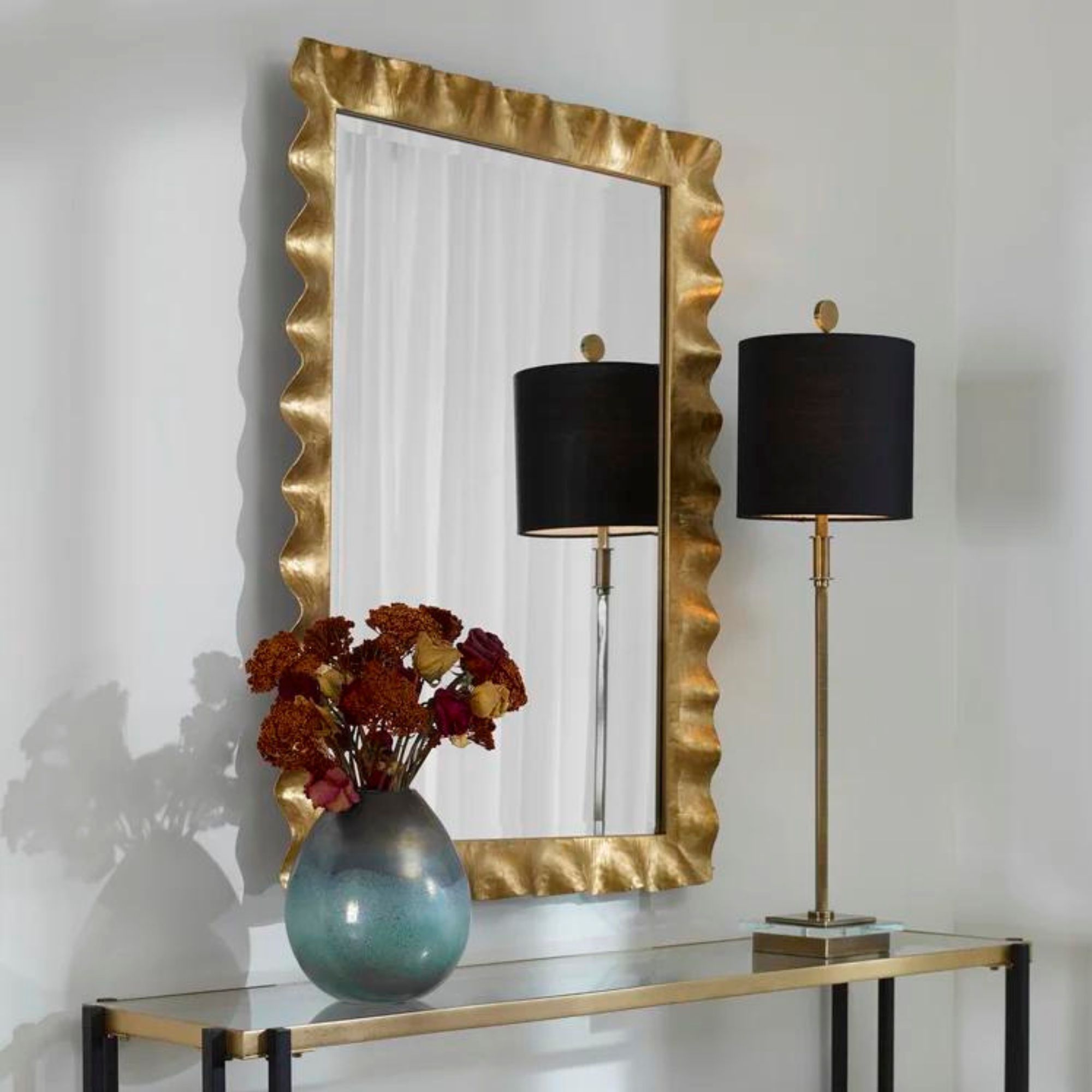
Pictured above, a large mirror rests atop an accessible console table, creating the illusion of a more expansive room. Carefully selected design accessories mimic the space's overall color scheme, which Marie says was integral to the design scheme from the start. Sherwin-Williams' Poolhouse, a bright yet understated blue, makes the trim and crown molding pop.
'I envisioned the color palette as grounded in tradition yet making a striking statement. The serene blue was selected first to harmonize with the classic interior architectural elements, setting a foundation for the space. Following that, the wallpaper was carefully chosen to further enhance and complement this palette,' she says.
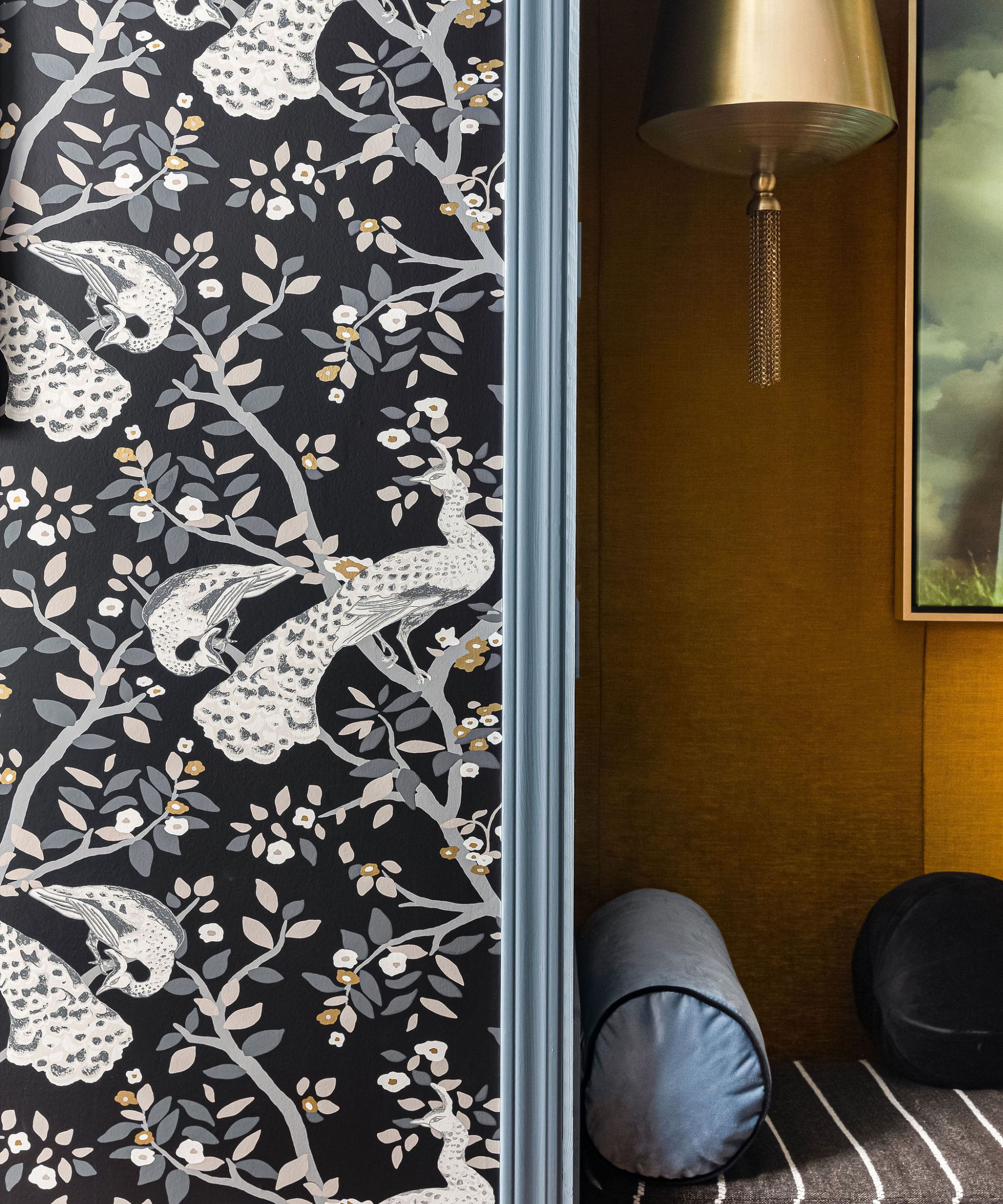
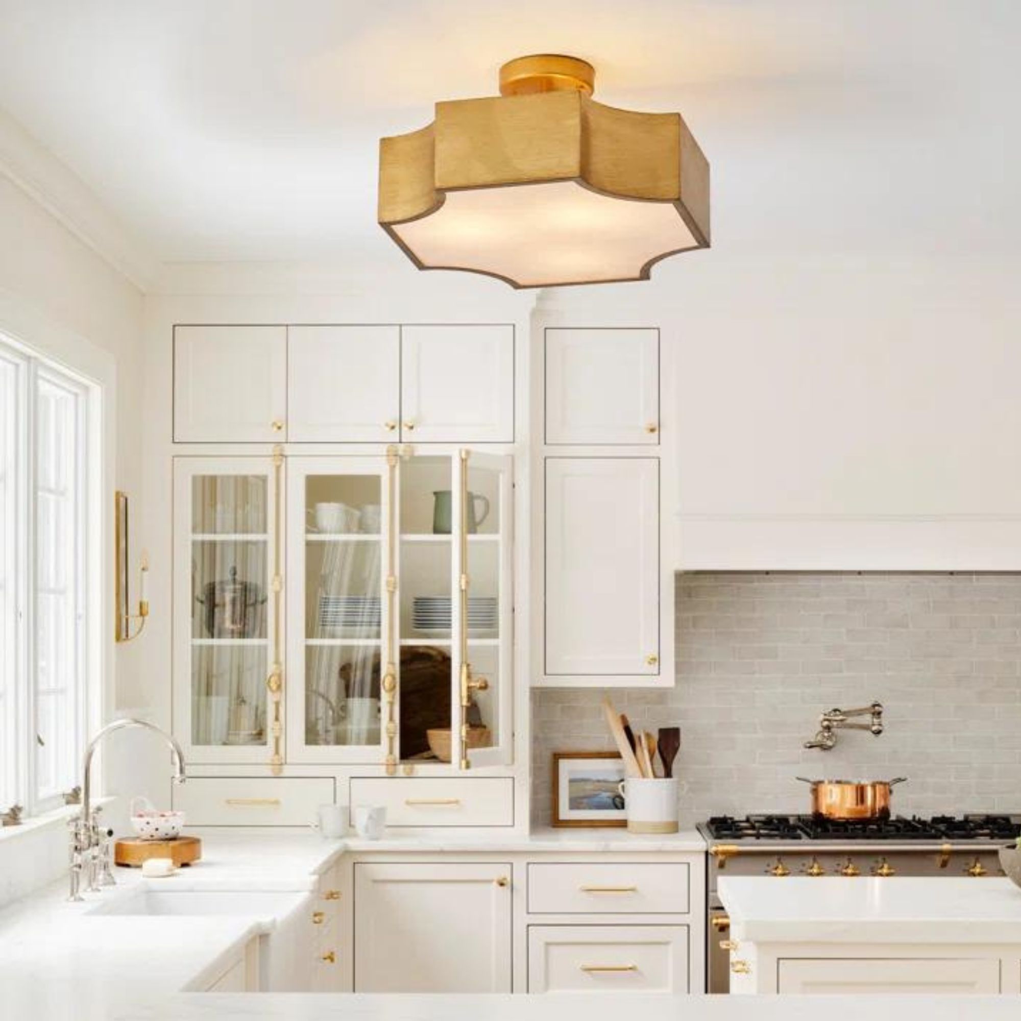
Hallway lighting isn't often prioritized in design schemes, as these spaces serve as more transitional areas, as opposed to moody living rooms or dining rooms. But in this hallway, Marie made sure to integrate a layered lighting scheme, placing gold light fixtures of different shapes and intensities throughout the space. A small pendant acts as a reading light inside the nook, while sculptural pendant lights hang from the wallpapered ceiling.
'The lighting fixtures are chosen not only for their functionality, but also for their design qualities. They complement the metal details found in the frames and hardware throughout the space, providing a consistent design thread,' says Marie.
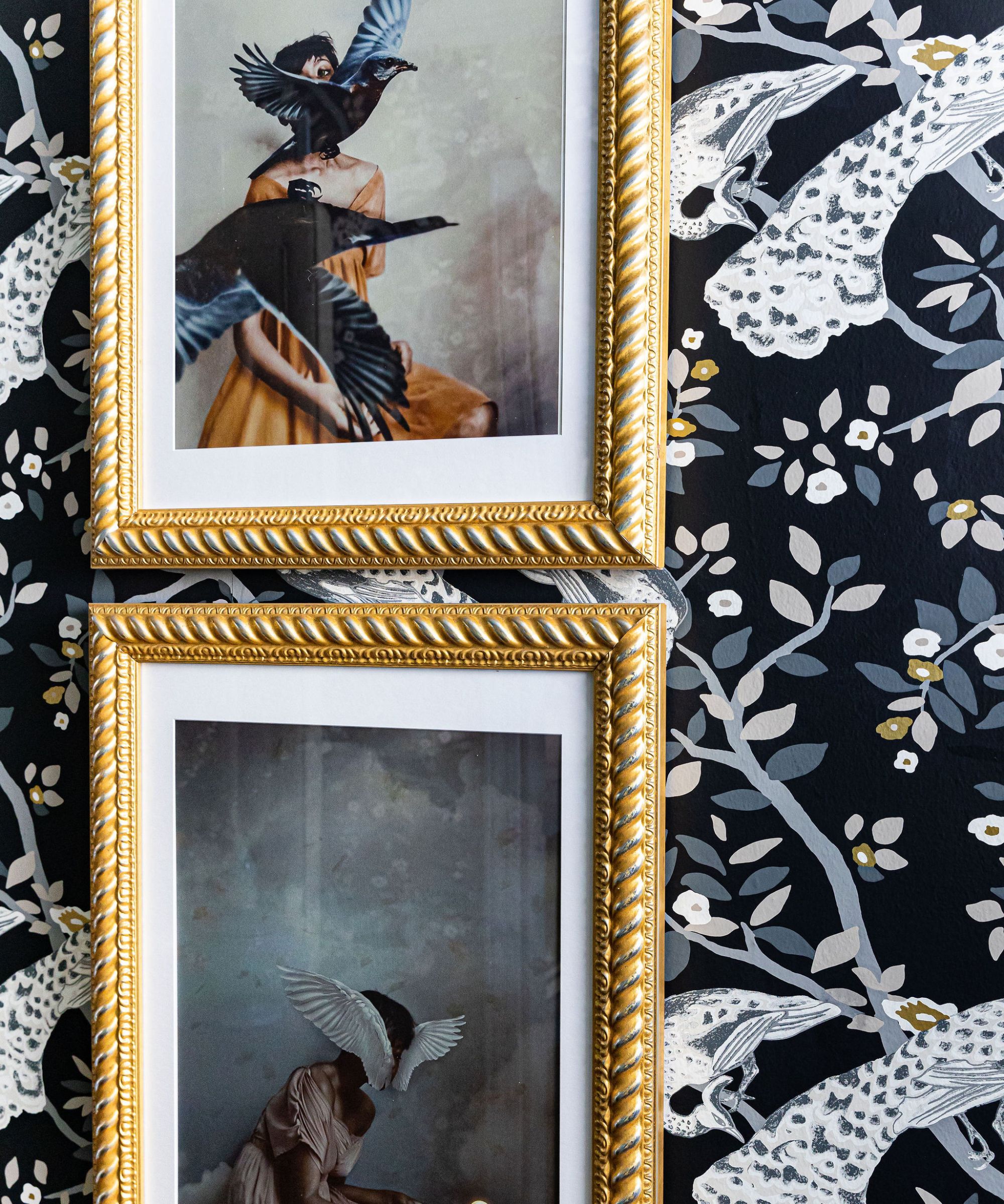
Art in a traditional gold frame hangs throughout the space, each piece emulating a striking motif. Marie says this was a 'deliberate thematic continuity,' with the characterful birds in each painting following from the wallpaper's design. She adds that each piece's name spoke to her when designing the space.
Titled 'Flow,' 'Sunset,' 'Anxiety,' 'The Light,' and 'Falling Apart,' each piece of art carries its own charm and emotion. Pictured above, 'Sunset' and 'Anxiety' (Marie's personal favorite) are stacked in a thoughtful vignette.
'The artwork is a compelling element, reflecting the space's ethos and adding a narrative layer. I loved the emotional triggers each piece sets off, it feels so personal and intimate. The bold gold frames contribute to the room's luxurious feel and highlight the artwork as key focal points,' she says.

Attention to detail was key in this space – though the entryway color scheme is impressive on its own, each design accessory contributes to the overall, award-winning look. Marie says that each element was curated intentionally, from the books that line the seating nook's shelves to the vases and artwork placed in the adjacent laundry room. Each item plays a role in 'enhancing the narrative of the space,' she says.
And because the space was originally part of a showroom, Marie had a bit more opportunity to make the experience truly unique for visitors.
'There is a hidden Bluetooth speaker that plays an intentionally curated playlist to set audio mood for the space. There is also a tiny table (not pictured) that has a glass bowl of golden wrapped chocolate for you to grab as you enter this hallway experience,' she adds.
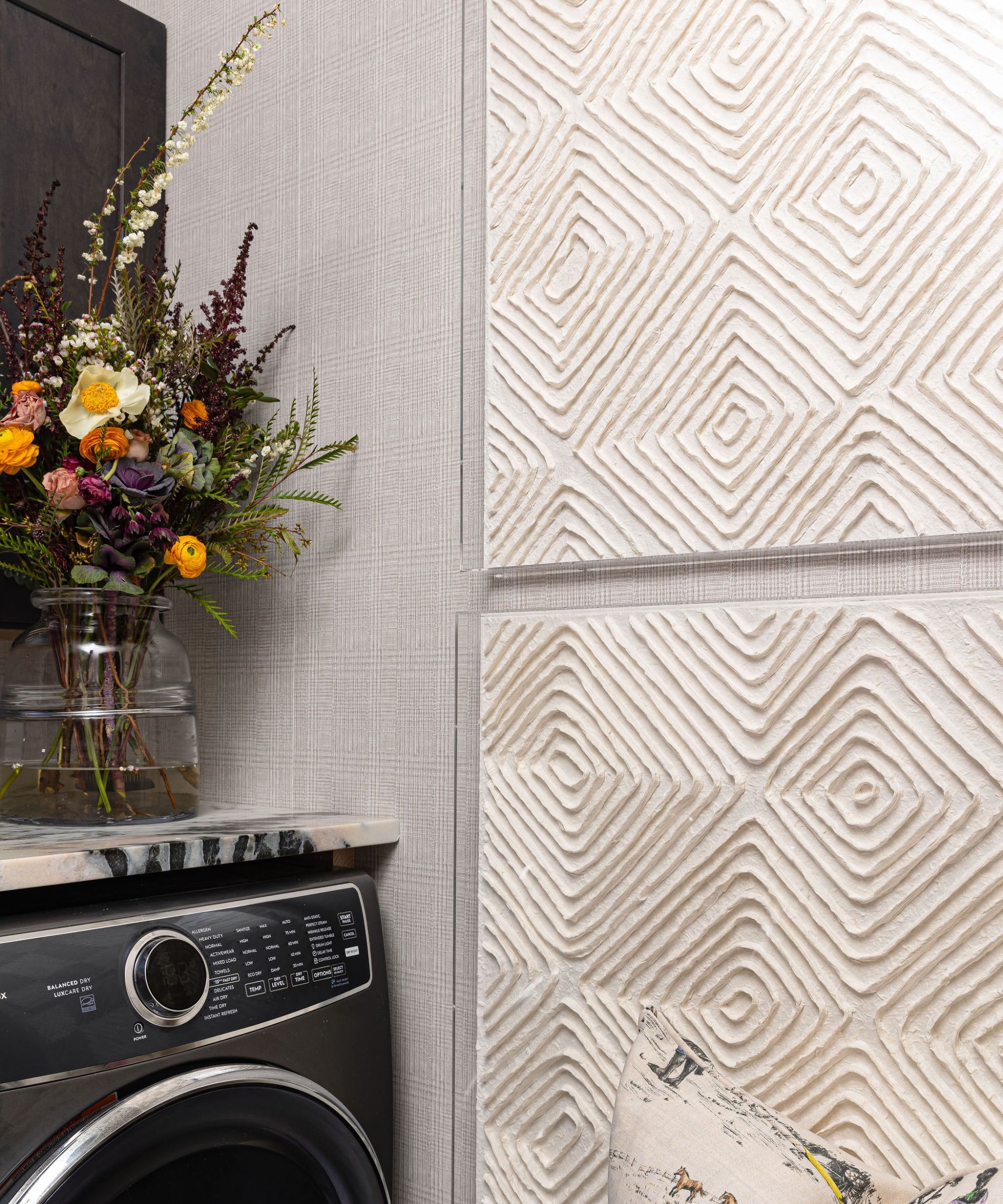
Ultimately, any successful design caters to the five senses, creating a peaceful retreat for anyone who visits. Marie says this was a key focus, from the beginning stages of design to the final product.
'I wanted the hallway to be an experience. One that was unexpected and intense in its punch. My goal was to push the envelope on innovation and leave guests wowed by the level of detail and artistry,' she says.
With this project, Marie took an often dull space – a hallway – and made it into something awe-inspiring. Combining just the right amount of function, comfort, and design expertise, the final result would serve as a stunning first impression in any home.

Abby was the Interior Design News Editor at Homes & Gardens and is now studying for her Master's degree in Journalism at City University, London. Prior to joining our team, she worked with Better Homes & Gardens, where she wrote and edited content about home decor, gardening tips, food news, and more. She studied Journalism and English Literature at New York University and moved to London to pursue her love of writing in 2023.
-
 The elegant suit color trend Lupita Nyong'o wore to the Met Gala will be in every home in 2025, say designers
Introduce this delicately balanced blue-green color that is at once calming and uplifting
-
 7 things to declutter in May 2025 – set your space up for summer success with simple, localized clear-outs
Give your home a May makeover without spending a cent
