We're predicting caramel tones to be the 'new neutral' for 2025 – here's what designers make of this comforting shade
There's much to love about warming caramel tones – here's why designers are embracing them for the year ahead
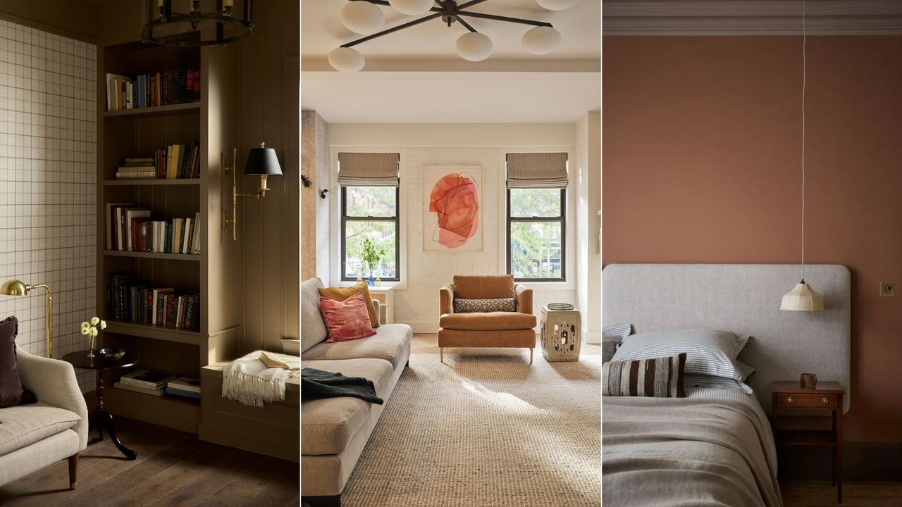

Color trends come and go, but neutrals are a constant in interior design. Often acting as the backdrop of a room on which more colorful decor can be incorporated, neutrals are understated and timeless.
But within the realm of decorating with neutrals, the variation is vast. This year, we've seen lots of appeal for warm white paints and darker chocolate tones which feel moody and sophisticated. For 2025, we're predicting a happy medium with the use of warm caramel tones.
We've already seen caramel tones crop up in the latest Color of the Year announcements with Dunn-Edwards' Caramelized, and we expect these mid-brown tones to make their mark on the year ahead.
And so, we spoke to interior designers to get their verdict on caramel tones as 2025's new neutral. Read on to find out why warming browns are set to endure next year and how designers recommend channeling this color trend.
Is caramel the new neutral for 2025?
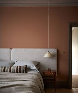
'The warm spectrum of light to mid-browns – from soft sand to rich caramel – is set to redefine neutrals in 2025,' says Vyanca Soto, owner and principal designer at California-based Market Studio Interiors. 'These tones introduce warmth and depth without overpowering a room, making them ideal for creating inviting, grounded spaces.'
While current neutral color trends favor those with warm undertones, the shift towards caramel tones cements this further, bringing more depth and warmth into our homes, says interior designer Kathy Kuo:
'The trend towards light browns – as opposed to lighter beige and ecrus tones – is an iteration of the neutral look that's a little bit warmer and earthier. These sandy browns pair nicely with laidback and boho-chic design elements and bright accent tones. It's all very 1970s inspired.'
Philadelphia-based designer Glenna Stone of Glenna Stone Interiors also sees mid-browns and caramel tones as go-to neutrals for the year ahead, adding: 'Unlike cooler grays, these shades add depth and a natural quality, creating spaces that feel cozy and approachable. They work beautifully across various styles and offer timeless comfort.'
How to decorate with caramel tones
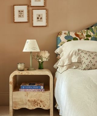
Caramel tones are versatile and pair well with many other colors and interior design styles, making them easy to incorporate into your space. 'Light browns trending in 2025 blend seamlessly with existing grey or white spaces, warming them up to be both friendly and approachable while maintaining sophistication,' says interior designer Rebecca Ward.
'The best part is that they can update a space without requiring a complete overhaul. Go big with a camel-colored sofa or incorporate sandy brown throws and pillows to instantly lift any living room. Too much grey furniture or flooring? Add a beautiful tan to the walls, like Sherwin-Williams' Row House Tan,' says Rebecca.
There are lots of ways to style versatile mid-brown shades, whether subtly or more boldly. Below, we've rounded up a few of our favorite ideas to give you some inspiration.
Incorporate caramel tones through cozy textiles
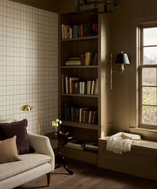
You don't need to transform your decor to benefit from the warmth of caramel tones – smaller accents work just as well.
'We've been shifting away from the cool, bright whites and open floor plans that dominated the design scene, and now we're craving cozy, intimate spaces,' says Utah-based Interior Designer Alex Adamson of Alex Adamson Design, who opted for warm browns in this cozy living space with textiles.
'Browns pair beautifully with all the natural woods we've seen being introduced in recent years. For the skeptic, try introducing browns through textiles like pillows and rugs that can easily be swapped out. I love a small room, like a den or dining room, enveloped in a rich brown for a touch of drama.'
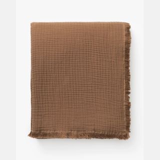
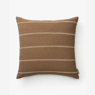
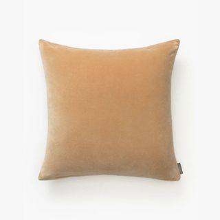
Layer this cozy throw onto your living room sofa to make a subtle nod to this color trend.
Add depth to a light neutral scheme
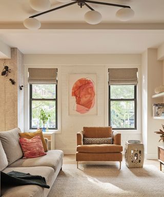
If you have a light neutral room, why not add some depth with the addition of richer caramel tones through furniture, as seen here in this living room designed by Method + Moxie?
'Browns offer a wide variety of tones, and with each tone, a different mood is evoked. This, combined with the association of earthiness and nature, makes brown a great new neutral. Darker, more earthy tones provide contrast while also adding a moody vibe. Brighter caramel tones are warm and classic and pair with many colors,' says Rebecca Roberts, Manhattan-based founder of Method + Moxie.
Decorate with wallpaper
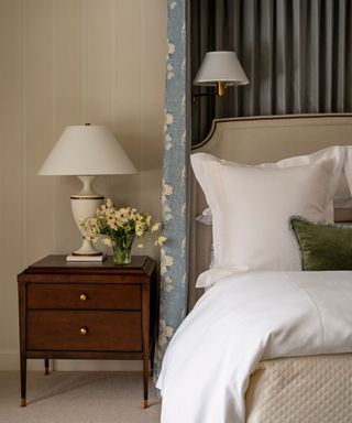
Another expert-approved way to incorporate warming browns into your home is through wallpaper ideas, a great option for traditional decorating styles.
'When paint isn’t enough but you’re not trying to make an overly loud statement, a subtly patterned wallpaper in a warm, neutral colorway is that perfect touch of ‘just enough’,' says Krysta Gibbons of Kipling House Interiors. 'In a room full of cool hues, we love a warm undertone to balance the tones of the scheme while proving the cozy factor so welcome in a bedroom.'
Refresh your paint color
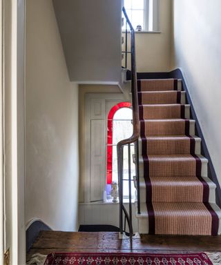
Cord by Farrow & Ball
Warm, light brown paint ideas make a welcomed change from neutrals such as white and beige. Adding slightly more depth, they're a great way to create a warming, grounded feel.
'We’ve been loving camel tones lately, with Farrow & Ball's Cord being a particular favorite,' says interior designer Laura Jenkins. 'It’s still neutral, but it also adds a wonderful warmth to a room. I love pairing the shade with colorful art, as it provides a warm yet subtle backdrop that creates a beautiful contrast to an all-white space.'
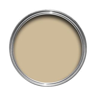
While darker brown paints can make a real statement, Farrow & Ball's Cord maintains a liveable feel that won't overwhelm rooms.
Whether you want to refresh your neutral rooms with light brown paint or are looking to incorporate caramel tones through smaller accents, we expect to see plenty more of this warming hue next year.
Sign up to the Homes & Gardens newsletter
Design expertise in your inbox – from inspiring decorating ideas and beautiful celebrity homes to practical gardening advice and shopping round-ups.

Emily is a freelance interior design writer based in Scotland. Prior to going freelance in the spring of 2025, Emily was Homes & Gardens’ Paint & Color Editor, covering all things color across interiors and home decor for the Homes & Gardens website. Having gained specific expertise in this area, Emily is well-versed in writing about the latest color trends and is passionate about helping homeowners understand the importance of color psychology in home design. Her own interior design style reflects the simplicity of mid-century design and she loves sourcing vintage furniture finds for her tenement flat.
-
 Alexandra Daddario's minimalist poolside 'oozes serenity' – and it's so easy to copy if you're a fan of calm, simple style
The White Lotus star designed a backyard worthy of the acclaimed show – the secret, designers say, is in her pared-back furniture styling
By Megan Slack Published
-
 5 minimalist decor myths designers urge you to forget if you want to embrace this style in 2025
These dated myths can give minimalism a bad rap, and designers say we should all be ignoring them
By Eleanor Richardson Published
