The monochromatic color scheme – ideas and expert advice for creating yours
Embrace the trend for monochromatic color schemes for a fresh – and dramatic – interiors update
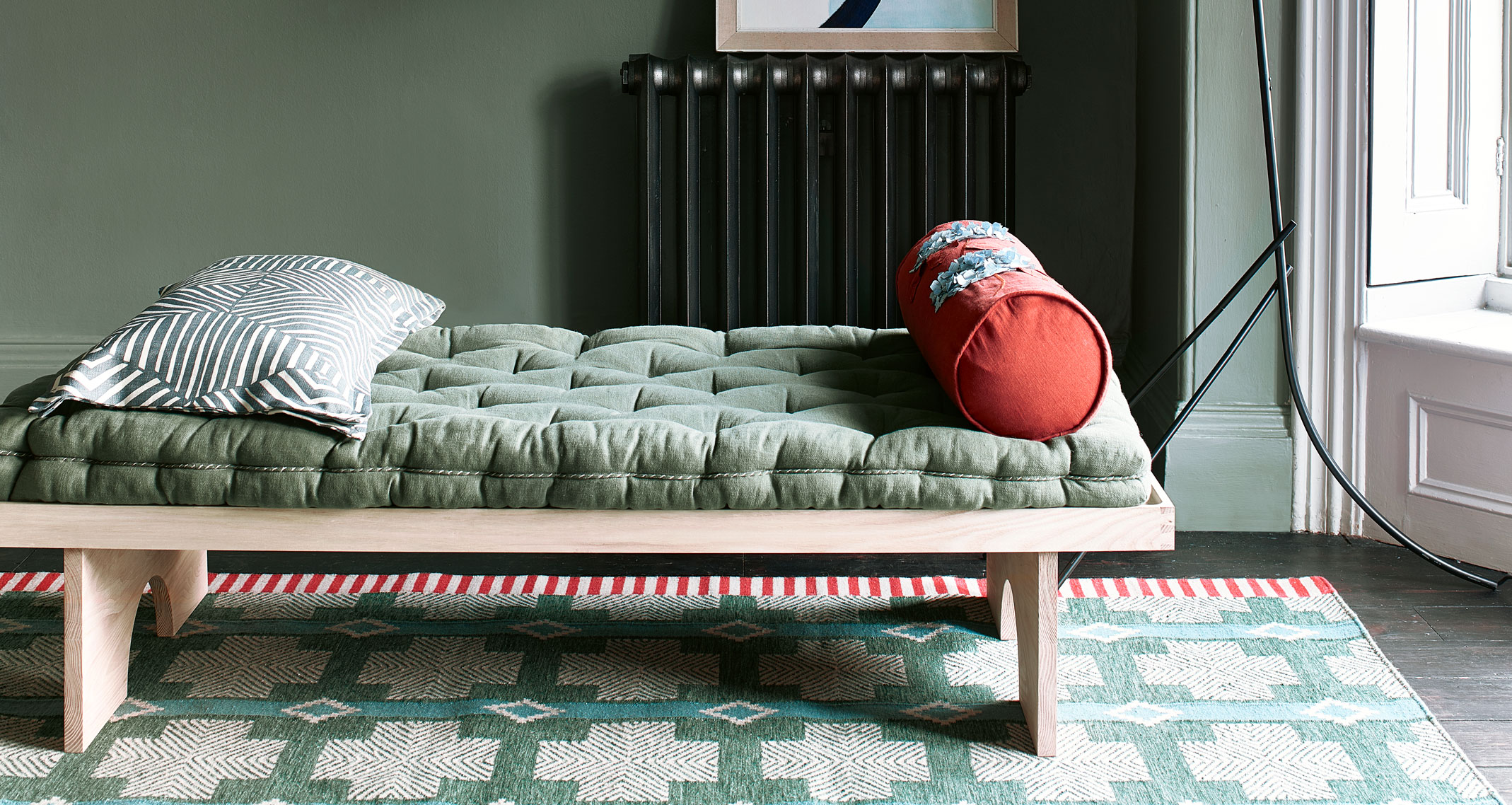

If you like colorful rooms, you will love the latest, joyful trend to seep into interiors: the monochromatic color scheme. Layering the same color on the same color, this bold, dramatic look is tipped to be huge for 2021 as a reaction to the difficult year we have all experienced.
See: Living room color schemes – the best color ideas for living spaces
Dominic Mylands of Mylands Paints comments, 'After a challenging year, we’re increasingly seeing customers want bolder, more playful colors in the homes that they have been spending so much time in. Designing spaces with cheerful, bold colors injects a sense of vibrancy and joy into the home allowing it to shine.
'It’s important to love the bold colors you will be using, and make sure that it will be appropriate for the room’s purpose, but as long as you are happy with the color and if it will create an environment that you will enjoy spending time in – go for it!
'We have seen customers create immersive spaces by painting the entire room one color, including the ceilings, which works particularly well in smaller rooms.'
So what's the best way to approach the seemingly daring same color-on-color look? We asked a number of top designers for tips on how to make monochromatic color schemes work in your own home.
What is a monochromatic color scheme?
A monochromatic color scheme is a one-color scheme that is created using different tones of that one color. Once you have chosen your base color, you can use a color wheel to help you choose different hues of that same color, varying the saturation and tone of the base color to pick out lighter and darker hues.
Monochromatic color schemes are easy to create but look dramatic because of their use of a single color. The monochrome you choose will largely depend on your preference for that single color, since you can choose warm, cool, light or dark shades to suit your room's orientation, daylight, size, shape and mood.
Monochromatic color scheme ideas
Use these ideas – and the expert advice provided – to get the look just right for your rooms. Below, we have more advice on getting monochrome rooms perfectly balanced.
1. Choose blues for a soothing atmosphere
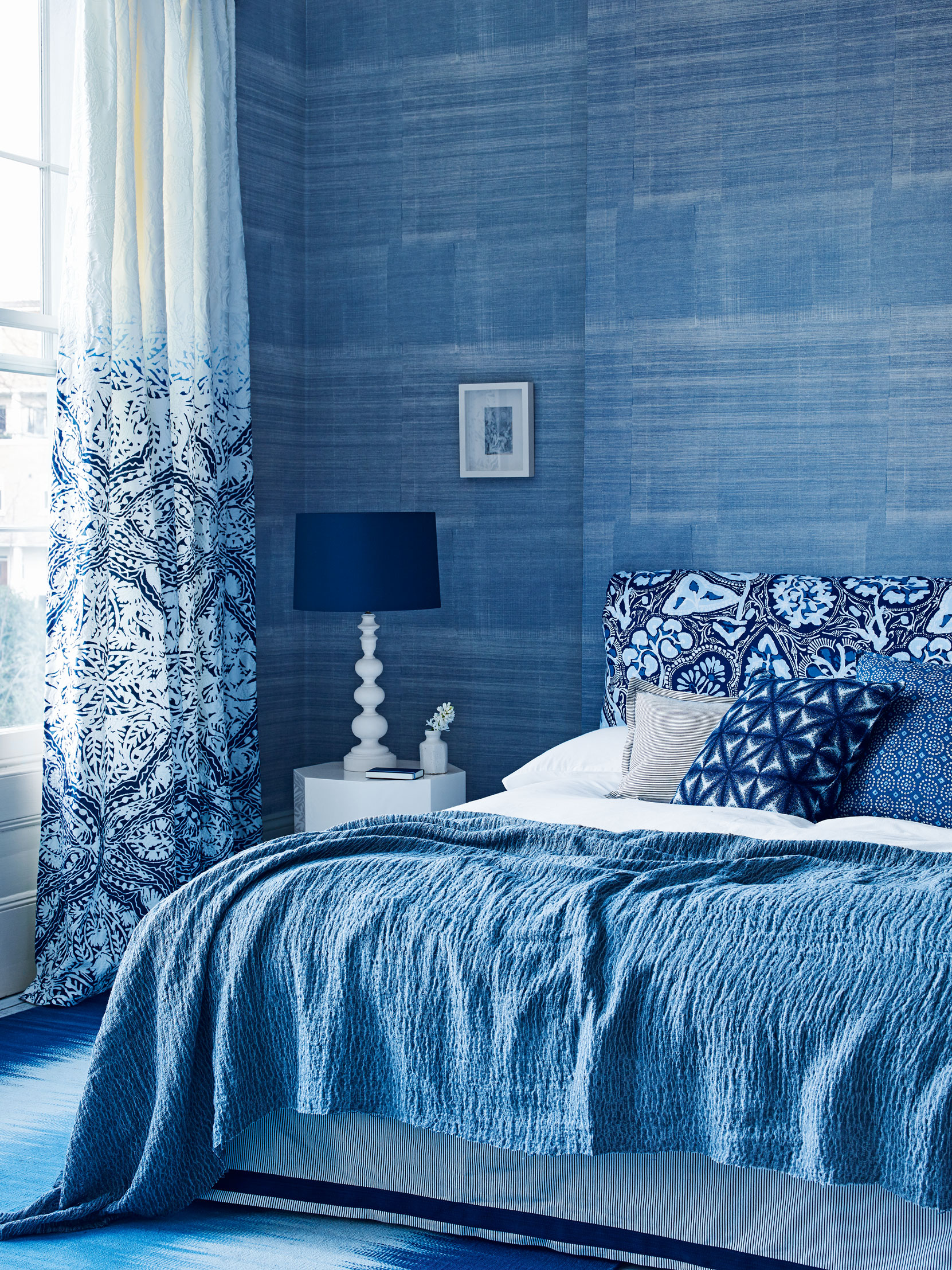
Blue comes in a whole range of tones that can conjure up hugely contrasting moods. Sky blue-on-blue is an excellent choice for a bedroom to offer tranquility and relaxation blended with the hope of a new dawn.
We love how the bedlinen exactly matches the walls in the room above, while the white punctuates but doesn't dilute. The shapely lamp is a clever touch – picked out in white it's a clever decorative accent.
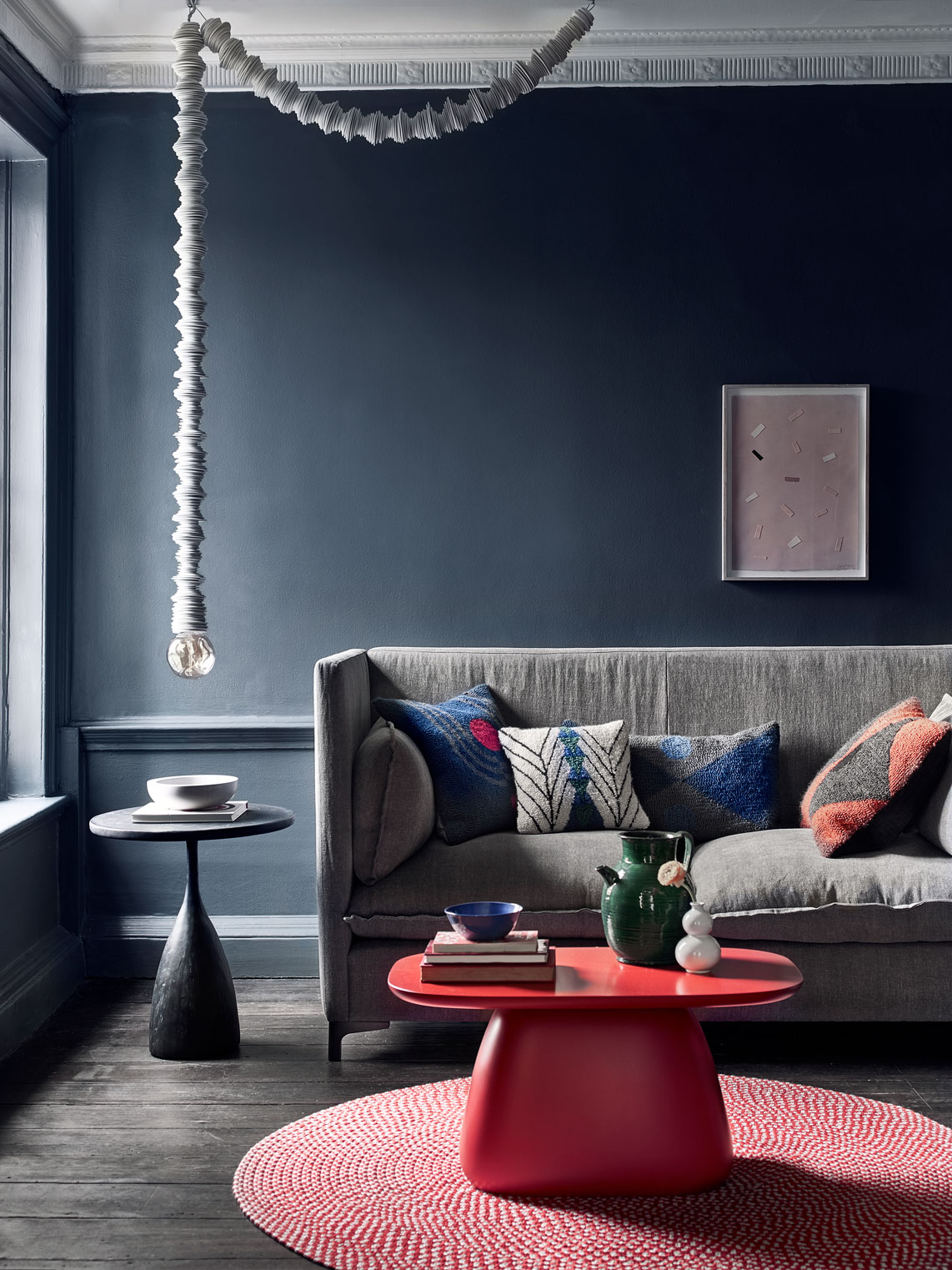
Below, you can see how a much deeper, moodier blue-grey can create a much cozier finish. This is a more difficult shade to work with since it can feel unremittingly gloomy in a light-starved room – which is why we have added some warmer elements to the scheme. A cheat on the monochromatic color scheme, but a worthy one.
See: Decorating with blue – more ways to give your rooms a fresh feel
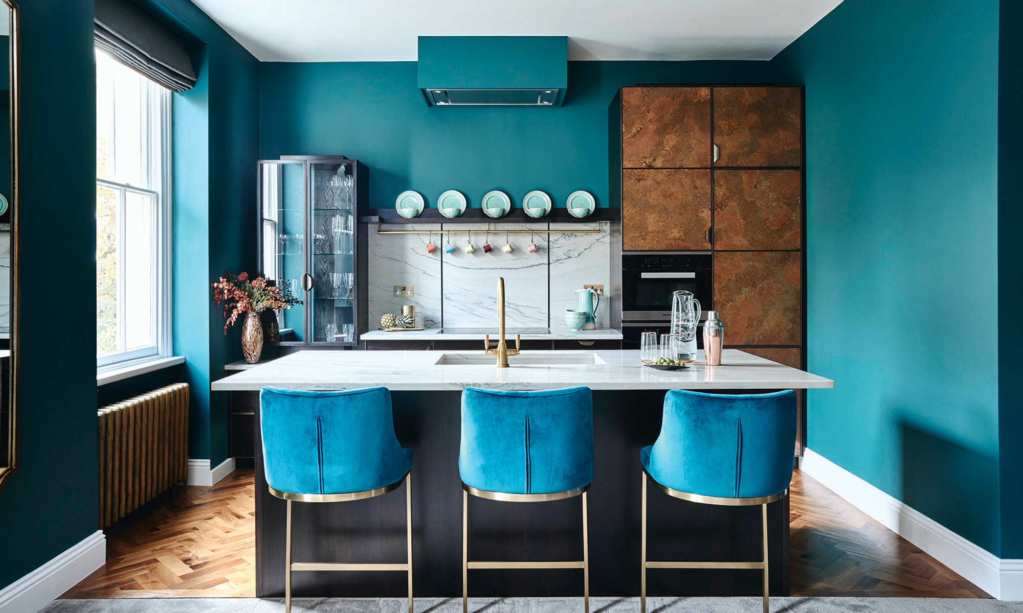
The kitchen is a good place to experiment the all-blue monochromatic color scheme, allowing you to use cabinets and wall space to great effect.
'For a style statement, create impact using the same color-on-color rule for kitchen cabinets and island counters,' says Tom Howley, Design Director. 'You can also expand this color into tiles, backsplash and soft furnishings in open plan spaces, such as sofas, cushions or upholstered bar stools.'
- See: Kitchen ideas – decor and decorating ideas for all kitchens
2. Think pink for joyful cocooning chic
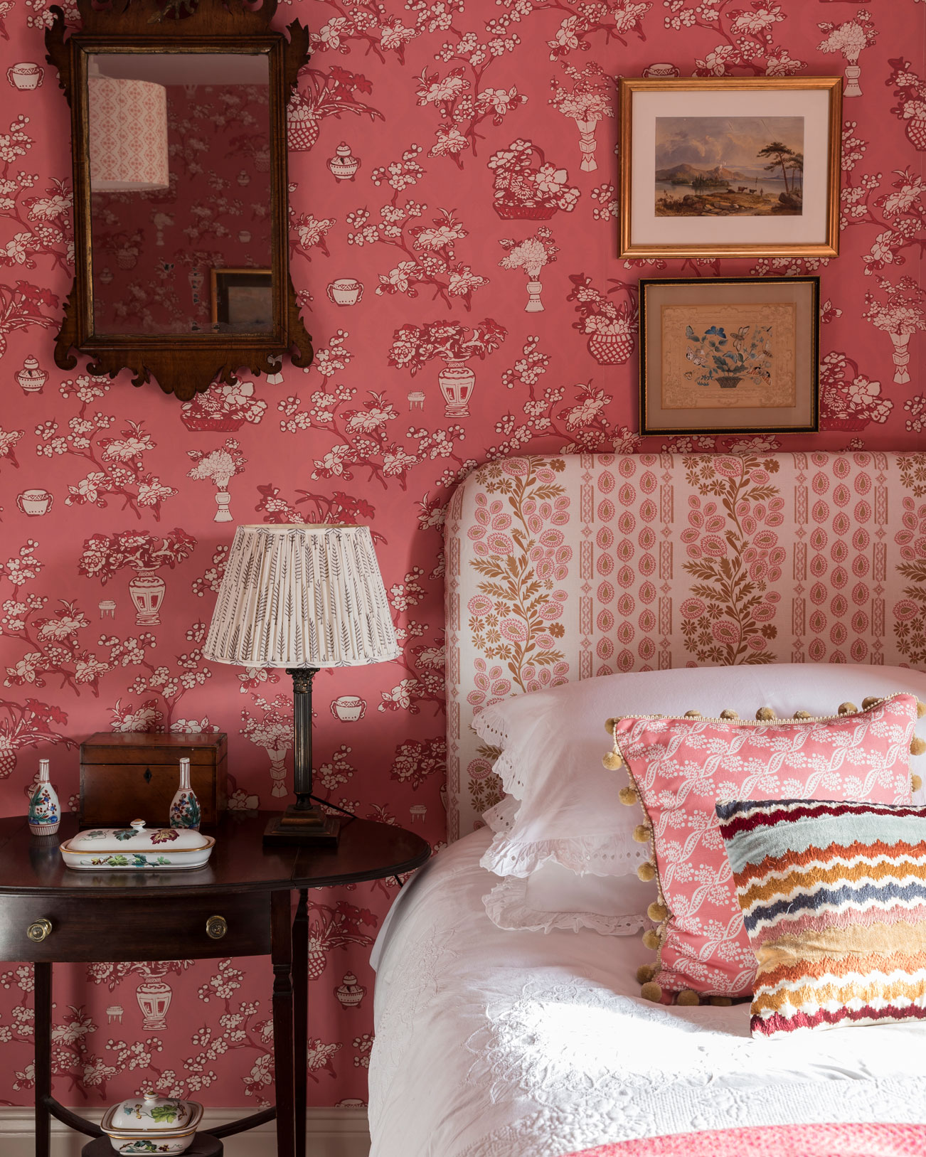
'Using color-on-color can be a great way to make a design statement in any room,' says designer Matthew Williamson. 'The best way to approach using a bold pink is to introduce the color in different mediums. For example, a pink linen sofa could work beautifully with a color-matched wallpaper featuring a pattern in an accent color.
'For another layer of pink in the same space, look towards soft furnishings like cushions and throws, or accessories like lampshades, artworks, trays and sculptures. The trick is to think about how you can build up layers of texture while staying true to your chosen tone.'
Below, Mylands’ FTT-005 pink has been used on the walls, fire surround and built-in wardrobes for a cosy and chic all-over look. The pink is also picked out in accessories and soft furnishings, including curtains, pampas grass and the artwork, for extra cohesion.
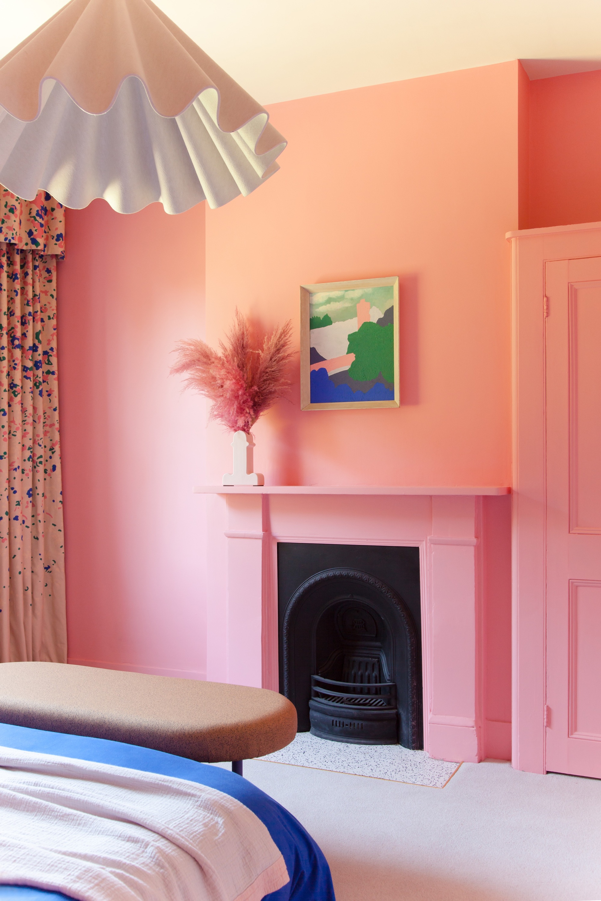
3. Tropical orange is vibrant yet sophisticated
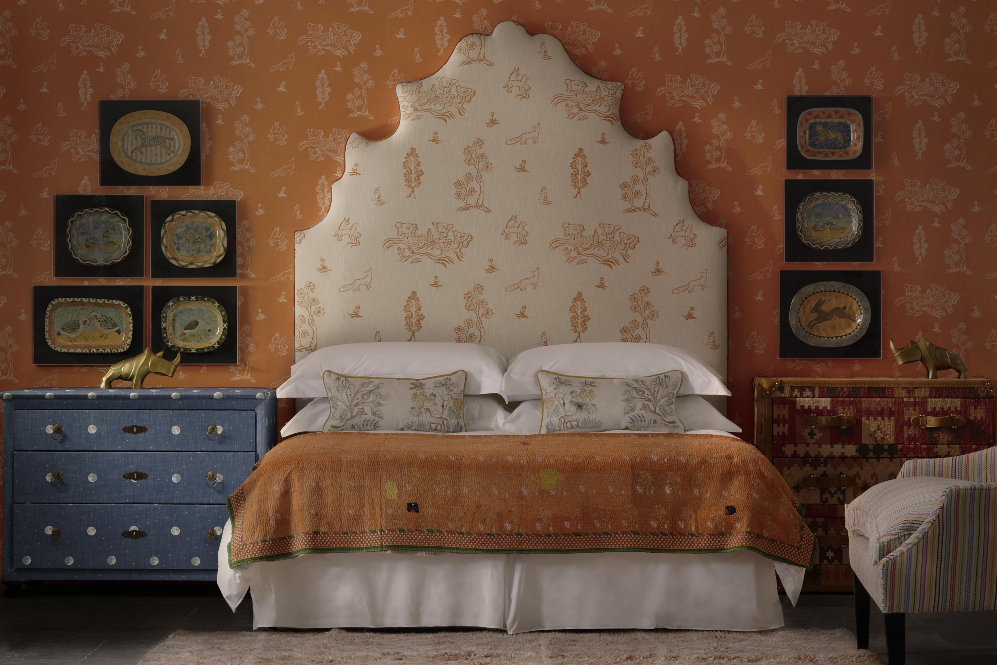
'A great tip for working this monochrome bold color trend is finding a print that has an inverse as well,' says Martin Waller, Founder of Andrew Martin. 'We complemented Kit Kemp’s Wychwood Melon Orange wallpaper with the fabric in the inverted version of the print for the headboard. This allows you to add texture and interest without introducing another color.
'Carry the color through the space in little details and accessories like artwork and throws, remember it doesn’t have to match exactly, as long as the tones stay consistent. A key part of finishing off this look is to balance it out with the opposite shade, just as the blue chest of drawers does in this beautiful orange bedroom (above).'
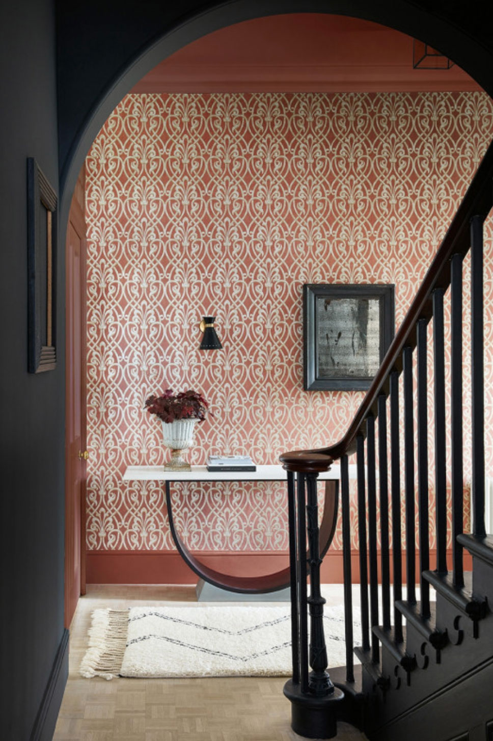
Below, you can see how two monochromatic color schemes can be used for impact in just a section of an open-plan space – the entranceway is bold and colorful, and leads to the contrasting, calmer staircase that's moodier in all-grey.
4. Pick a sunny yellow for a color scheme with punch
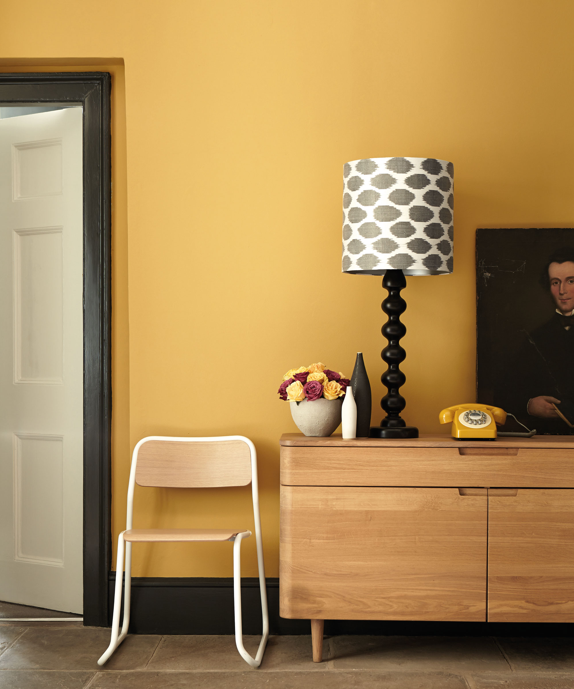
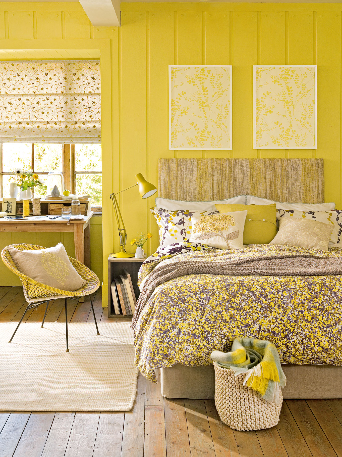
Yellow-on-yellow is perfect for creating an exuberant, warm room where natural daylight might be lacking or cool. Different tones and juxtapositions will create different effects. Above, an earthier yellow, contrasted with black, looks grown up and elegant, perfect for a living space or hallway; below, a sunnier yellow is ideal for a bedroom that might only be used in the half-light, when it will feel utterly cosseting.
See: Yellow room ideas – guaranteed to turn up the heat
- See: Bedroom ideas – designs and inspiration for beautiful bedrooms
5. Mint green is uplifting and serene
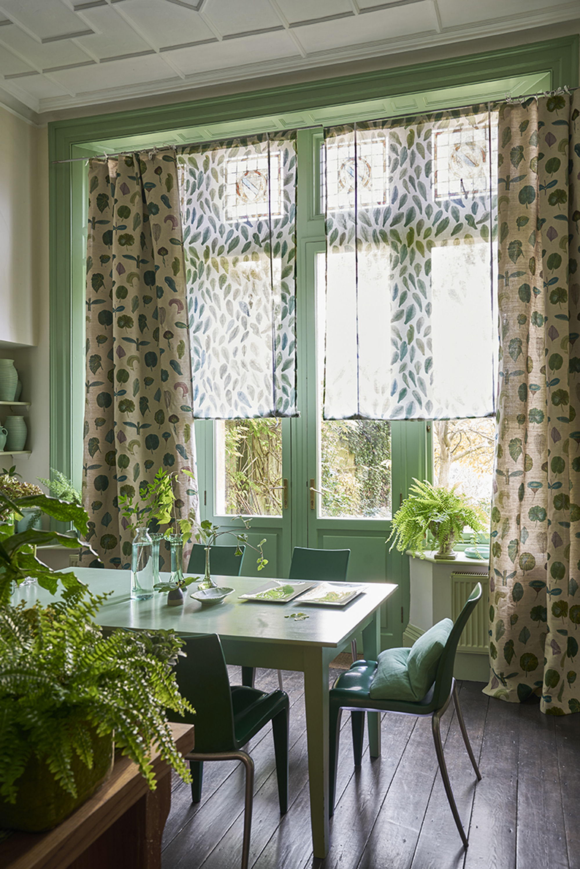
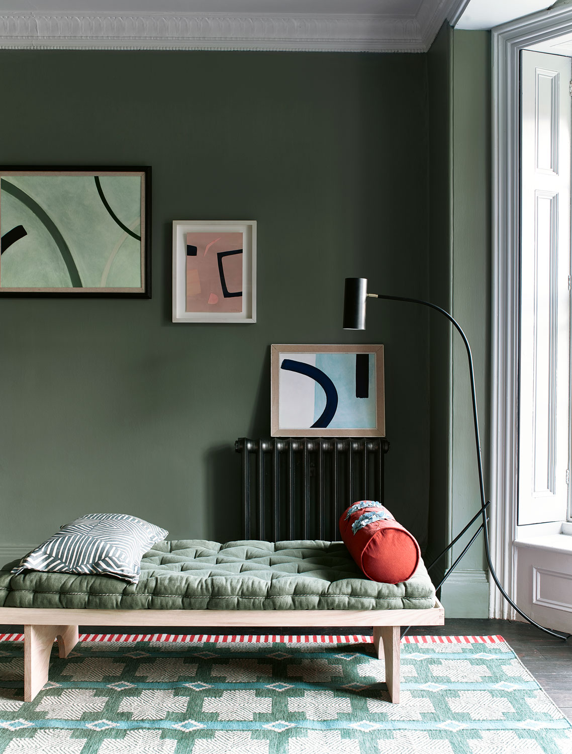
Mint green is bright but not overpowering - the perfect bold color to layer up for a refreshing finish that feeds into the biophilic trend.
'Think of green as a neutral and it becomes less frightening to use,' says a Designers Guild interior design expert. 'There are so many greens in nature and they rarely clash but, to be safe, choose greens that harmonize and have a similar undertone. In this picture (above) the greens have slightly more blue undertones, which pick up the colors of the leaves in the curtains.'
We also love how even the ceramics and the cushions got the memo.
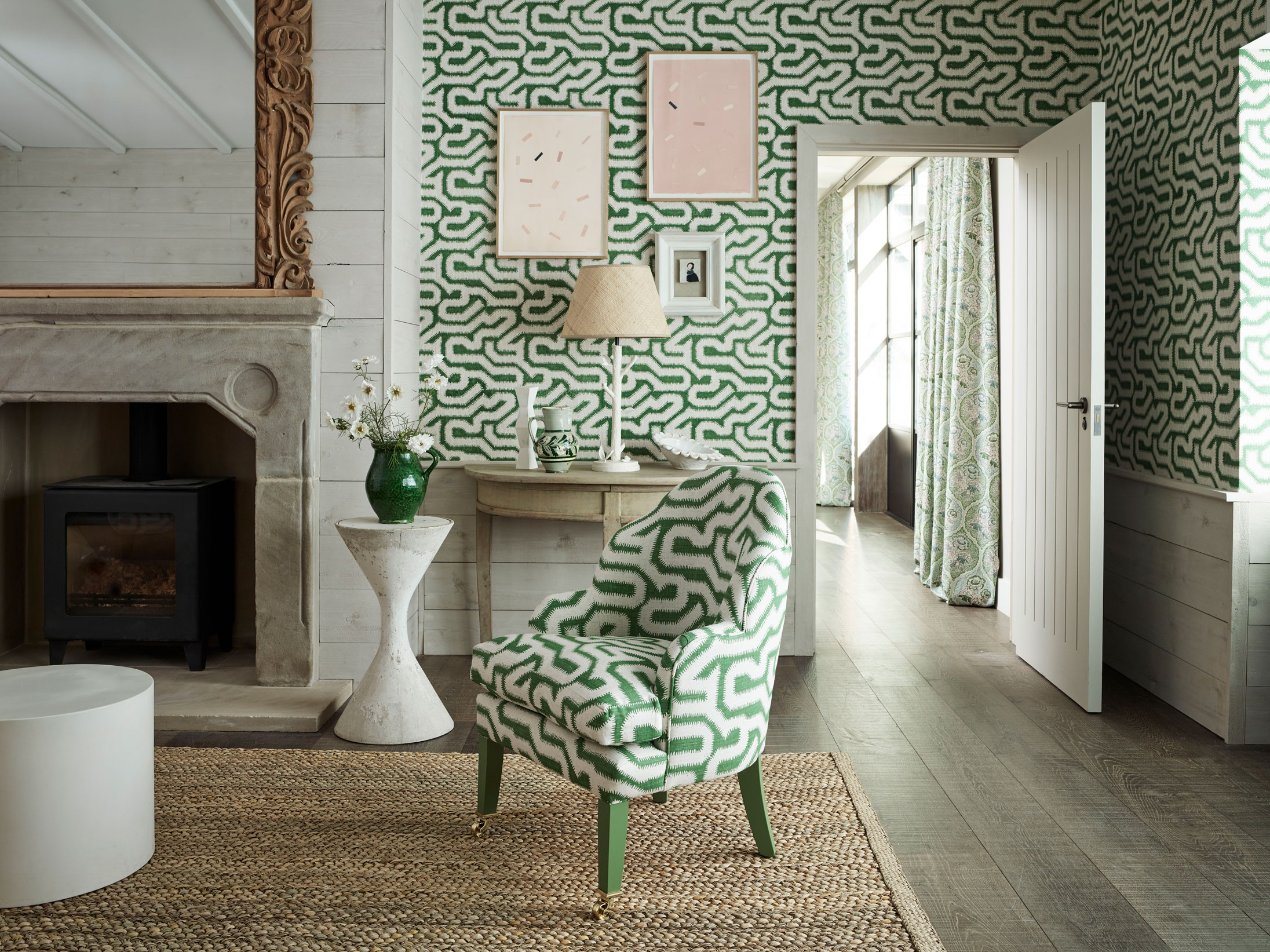
Above, a brighter green is used in a more tempered fashion – these more emerald green can be overpowering used as color blocks, so breaking up the shade with a neutral such as white is a wise move.
Below, a moodier green is used to make a bright living space feel calm and relaxing – the warmer color accents lift the scheme just the touch it needs.
See: Green room ideas – gorgeous ways to use nature's palette
What are the components of a monochromatic color scheme?
There are four components to a monochromatic color scheme: hue; tone; shade; and tint. Each has an important role to play.
Hue is your base – or dominant – color, such as yellow.
Tones are the more muted versions of your base color. Think of them as a grey-er, moodier version.
Shades are darker still versions of your base color – think a hint of black rather than grey. So, a cardinal red might be your base color, with deeper, dining room reds your shades.
Tints are your base color with a touch of white added. So, going back to the red, the tint would be a paler red that leant towards a dark pink.
Sign up to the Homes & Gardens newsletter
Design expertise in your inbox – from inspiring decorating ideas and beautiful celebrity homes to practical gardening advice and shopping round-ups.

Ruth Doherty is an experienced digital writer and editor specializing in interiors, travel and lifestyle. With 20 years of writing for national sites under her belt, she’s worked for the likes of Livingetc.com, Standard, Ideal Home, Stylist and Marie Claire as well as Homes & Gardens.
-
 Everyone is obsessed with vintage tiles right now – bring the nostalgic charm of this classic design feature into your home with our 5 design ideas
Honor the past with our favorite ways to decorate with vintage tiles, as suggested by interior design experts
By Eleanor Richardson Published
-
 'It's a fast reset button' – using the 1, 2 ,3 ,4, 5 decluttering method cleared my persistent mess in seconds
It's easy, effective and so quick to do
By Ottilie Blackhall Published